Wikipedia:Featured picture candidates/Liberty Leading the People
Liberty Leading the People[edit]
Voting period is over. Please don't add any new votes. Voting period ends on 12 Jun 2010 at 10:06:09 (UTC)


—Preceding unsigned comment added by PawełMM (talk • contribs) 10:24, 12 June 2010 (UTC)
- Reason
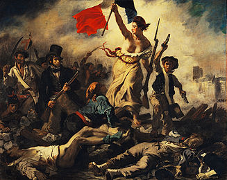
- Liberté, egalité, fraternité! A relatively good quality photo of an absolutely iconic painting. The number of articles it is used in is indicative of the amount of symbolism in this painting.
- Articles in which this image appears
- Liberty Leading the People, and many, many, many, others.
- FP category for this image
- Wikipedia:Featured pictures/Artwork/Paintings
- Creator
- Eugène Delacroix
- Support as nominator --NauticaShades 10:06, 3 June 2010 (UTC)
- Comment: I don't think the colours are as good as they could be- compare to this one. That one also lacks that horrible crack across the middle. We need more fine art FPs, so it would be good if we could get this through, but I'm not convinced right now. J Milburn (talk) 10:39, 3 June 2010 (UTC)
- Hmmm, I think the crack is unfortunately part of the canvas itself, so it's just been shopped out of your example. Perhaps someone could saturate this one ever so slighty? The one you linked has nice colors, but it's quite heavily artifacted and is also of a lower resolution. It also loses a lot of shadow detail with such saturation. NauticaShades 12:50, 3 June 2010 (UTC)
- Great, ok. New edit: what do you all think? NauticaShades 10:10, 7 June 2010 (UTC)
- That goes a bit far, don't you think? Particularly for red. Try somewhere in the middle. Adam Cuerden (talk) 18:32, 7 June 2010 (UTC)
- Strongly oppose edit. "Digital manipulation" is acceptable when it corrects flaws in the photographs, not in the objects (here:the painting) depicted in the photographs. The edited picture is clearly oversaturated. For the same reason, I would be dead against any edit that would not include the painting's cracks. I think the original is just fine, so I simply support (original). --Desiderius82 (talk) 07:54, 8 June 2010 (UTC)
- I could believe the original is a bit undersaturated compared to the original. Adam Cuerden (talk) 17:01, 8 June 2010 (UTC) —Preceding unsigned comment added by Adam Cuerden (talk • contribs)
- Well, this could only be decided for sure by someone with actual access to the painting itself, but I guess he or she would be difficult to find right now. The next best thing is to compare this picture with the picture on the Louvre museum's website, here. Desiderius82 (talk) 06:48, 9 June 2010 (UTC)
- I could believe the original is a bit undersaturated compared to the original. Adam Cuerden (talk) 17:01, 8 June 2010 (UTC) —Preceding unsigned comment added by Adam Cuerden (talk • contribs)
- Comment. This Louvre image shows that the crease is indeed part of the canvas, and so versions without it have been modified. NauticaShades 07:59, 9 June 2010 (UTC)
- Support original, oppose edit: Comparing the original to the version available on the Louvre's website ([1]), the colours are probably okay. If anything, ours is brightened too much, but without seeing the original it will be impossible to tell and is within reasonable bounds. The edit is way too over-saturated, but even half that boost would be too much, I think. Maedin\talk 16:15, 10 June 2010 (UTC)
Not promoted --Makeemlighter (talk) 14:44, 12 June 2010 (UTC)
- Not enough support. Makeemlighter (talk) 14:44, 12 June 2010 (UTC)
