
Wikipedia:Graphics Lab/Illustration workshop/Archive/Dec 2009
 | This page, part of the Graphics Lab Wikiproject, is an archive of requests for December 2009. Please do not edit the contents of this page. You can submit new requests here. |
Stale
Lunar phases
-
 Lunar phase diagram; improve see below
 -
 Moon phases diagram: correct, yet needs SVG-ing


-
 Lunar phase diagram; new version; first try

Article(s): Lunar phase
Request: The Lunar-Phase-Diagram.png image needs to altered; the phases of the moon need to be shown in a manner like the Moon phases.jpg /Phases_of_the_Moon.png image; eg in that the moons need to be colored white/black; depending on their phase. Also, arrows in a circle need to be added, similar like the Moon phases.jpg image
The Moon phases.jpg image itself needs svg'ing
Both images need to be maintained as they both have distinct characteristics; the Moon phases.jpg image eg also shows the formation of tides (the "blue" around the earth), and the Phases_of_the_Moon.png image also shows the timing. KVDP (talk) 09:22, 2 November 2009 (UTC)
Graphist opinion(s):I am a bit confused about your description. Which two images do you refer to when you say 'Both images need to be maintained'? The two shown here (Lunar-Phase-Diagram.png and Moon phases.jpg)? -->yes these two need to be kept in the database; as in "not deleted from database" (however do change them; see below)
And why do you mention the tides in The Moon phases.jpg (not shown here). -->sorry bout this, made another image with tides aswell, quite similar to this one. Offcourse in these images no tides are indicated. However, it still has other charisteristics as the timing is indicated. If I understood correctly, this picture should not be changed but used as a source for the moons at the different stages. Is that correct?! -->No; the picture does need to be changed, but 2 (somewhat identical images) need to come in place under the same name. Perhaps that your first try may be improved and then used to overwrite the first file. The other file can be overwritten with an improved version of that image. Reason for this is that I don't like too many (similar) files in the wikimedia commons; this leads to having a quantity of poorer quality images being used/linked to wikipedia.
On a general note, I would suggest to create a high-res png (or jpg) instead of a svg. Both the earth and the moon pictures are not very suitable for svging without loosing too much detail. -->no arguments here
SPLETTE :] How's my driving? 19:16, 2 November 2009 (UTC)
- Okay, I gave it a try. The rotating arrows are still missing. Did I get it right? What needs to be changed?
-->Aldough I didn't mention it at first, I think it's best to swap the yellow arrows with simply the sun; place it at the left; also, change the moons, as noted before they have to be white/black; different with every phase SPLETTE :] How's my driving? 01:25, 3 November 2009 (UTC)
- Ack, the new diagram and drawing are very confusing and misleading. You are trying to accomplish two different things with the new diagram at once (which cannot both be done simultaneously) - showing what the phases look like from the earth (instead of from an outside vantage point like the original), and showing the phases relation to the earth and sun. This needs to be divided into two separate diagrams - one showing what all the phases look like from the earth (and thus not including the earth in the diagram), and one showing the phases, the earth, and the sun as actually viewed from a distant vantage point (not earth). The 2nd diagram would be similar to File:Lunar-Phase-Diagram.png. Kaldari (talk) 19:11, 10 November 2009 (UTC)
File:Third party cookie.png doesn't render in Firefox, server version not legible
-
 Third party HTTP cookies

Article(s): HTTP cookie
Request: The server-rendered version of this image is rather too small to read, and some of the text at the bottom is cut off. Clicking through to the SVG version to see a larger version (e.g., at this URL) fails to render in Firefox 3.0.15 on Ubuntu 9.04 (Mozilla/5.0 (X11; U; Linux x86_64; en-GB; rv:1.9.0.15) Gecko/2009102815 Ubuntu/9.04 (jaunty) Firefox/3.0.15):
The error Firefox gives is:
- XML Parsing Error: prefix not bound to a namespace
- Location: http://upload.wikimedia.org/wikipedia/commons/5/50/Third_party_cookie.svg
- Line Number 16, Column 1:
<image xlink:href="data:image/jpg;base64,iVBORw0KGgoAAAANSUhEUgAAAvgAAAJZCAIAAABTANb/AAAABGdBTUEAALGPC/xhBQAAADh0
^
I haven't looked into what the SVG format problem might be. It would be nice if the SVG were rendered compatible with Firefox, and/or the server-rendered version were legible. -- JTN (talk) 17:02, 10 November 2009 (UTC)
Graphist opinion(s):
![]() Request taken by Certes.
Request taken by Certes.
New version uploaded. 99% of the SVG is embedded JPGs which use xlink without defining it. I've added the standard definition
xmlns:xlink="http://www.w3.org/1999/xlink"
That works on Firefox 3.5.5 on Windows XP. Can you check it with another renderer (such as Firefox 3.0.15 on Ubuntu) please? The text looks ok in Firefox; the cropping appears to be a separate server rendering problem which I've not addressed. Certes (talk) 23:14, 10 November 2009 (UTC)
Coat of Arms of Victoria, BC

Article(s): Victoria, BC
Request: I know it is fairuse, but can someone make a vector version of this? The quality is atrocious, and I think we'd benefit from a vector version. You can use this image for a ref, too. Thank you so much in advance. Connormah (talk) 03:59, 23 October 2009 (UTC)
- Can someone at least look at this? Connormah (talk) 18:19, 6 November 2009 (UTC)
- This would be very difficult to do, it's not simple lines or shapes, it's basically a painting. There are some people at Commons that have done COA's of this caliber before but off top of my head I can't remember, it was a recent FP nomination I think. Removed the stale btw. — raeky (talk | edits) 15:43, 13 November 2009 (UTC)
Graphist opinion(s):
Article(s): Kanhopatra
Request: I could find any free image to illustrate Kanhopatra, One online Kanhopatra picture. [1] (artist's impression), I also located 2 non-free Kanhopatra images in a children's book about Varkari saints. They are outline drawings. I can not upload them here as they are non-free, am I right? I can mail the pictures to anyone who is willing to accept the request. Thus, can someone please create images of Kanhopatra, based on the book or online images? Thanks a lot. --Redtigerxyz Talk 11:20, 24 October 2009 (UTC)
Graphist opinion(s):
![]() Request taken by Nvineeth.: will do this. --Nvineeth (talk) 10:05, 28 October 2009 (UTC)
Request taken by Nvineeth.: will do this. --Nvineeth (talk) 10:05, 28 October 2009 (UTC)
- Just checking on progress, it's been a while? Still working on it? — raeky (talk | edits) 15:40, 13 November 2009 (UTC)
Vectorize Request


Article(s): Operation Crossroads
Request: This article is nominated for a FA, and would benifit from SVG's for these images. — raeky (talk | edits) 15:17, 28 October 2009 (UTC)
Graphist opinion(s):
Extermination of bison to 1889

Article(s): American Bison, Plains Indians, William Temple Hornaday, Eastern savannas of the United States
Request: Needs turned into a SVG and maybe color changes to make the light color numbers/dates easier to see. — raeky (talk | edits) 15:36, 13 November 2009 (UTC)
Graphist opinion(s): I think we should make a separate map of the same thing for SVG. I don't think the topographical map lends itself overly well to SVG but we could use a stanrd North America map and overlate the buffalo range on it. gren グレン 17:12, 13 November 2009 (UTC)
Parasite Lifecycles


Article(s): Dracunculiasis, Wuchereria bancrofti, Pinworm, Hookworm
Request: Needs turned into a SVG... — raeky (talk | edits) 04:21, 2 November 2009 (UTC)
Graphist opinion(s):
Flag of Denton County

Article(s): Denton County, Denton, Texas
Request: Convert to SVG MahangaTalk 18:46, 2 November 2009 (UTC)
Graphist opinion(s):
Why?-Andrew c [talk] 01:48, 5 November 2009 (UTC)
- I'm not sure. I'm no graphics person. I was told at WP:FAC to request it here. MahangaTalk 03:51, 5 November 2009 (UTC)
- I see. Generally, since Wikipedia is the "free" encyclopedia, and because non-free content can only be used in very limited areas, not a lot of effort is put into improving non-free content (especially if the task is time consuming or difficult, which some SVG conversions can be). Often, it is better to simply try to find a better official image. This is for two reasons, first, it makes sure that the organization in question is being 100% represented the way they want to (often with SVG conversions, we can't be 100% identical, and we don't want to use a color, or font, or shape that the image creator never intended). The second reason is it is a lot easier on us (less work, obviously ;). That said, you may still find a graphist willing to fulfill this request. Personally, I wouldn't fail a FAC based solely on the quality/availability of non-free content (and it seems like the individual who made the remark has stricken the oppose). Hope this explains why I asked why. Handling non-free content, IMO, should have a good rational attached to it. -Andrew c [talk] 16:36, 5 November 2009 (UTC)
- I was the one who made the request. Considering we are talking about an FA here, I think we should have high-quality images as well as text and research. Also, Wikipedia's image policy suggests that logos be converted to SVG. Awadewit (talk) 15:40, 15 November 2009 (UTC)
- I do agree with the request made. The image is of a poor quality, and I think we would benefit from a vector version. Connormah (talk) 22:41, 16 November 2009 (UTC)
- But there isn't enough information present to make an SVG. What are those dots in the white circular bands? Stars? Maybe so, but are they pointing up, or down, or are they individually radially arranged? What about the even smaller dots surrounding the big central star? What are those? How many different color stars are on the flag? We cannot accurately recreate this flag because we don't have enough information to go on. Does anyone have any other pictures of this flag to help us out, or a written description or anything? Given the detail of this photo, any SVG made from it would be guesswork at best. Sorry. We can't work magic, or in this case, resolve detail out of blurry dots. (BTW, I agree completely that the image is in poor quality, and we could benefit from a vector version. But perhaps we should be seeking out official sources for this image, or at least higher quality images to start). -Andrew c [talk] 01:35, 17 November 2009 (UTC)
- I do agree with the request made. The image is of a poor quality, and I think we would benefit from a vector version. Connormah (talk) 22:41, 16 November 2009 (UTC)
- I was the one who made the request. Considering we are talking about an FA here, I think we should have high-quality images as well as text and research. Also, Wikipedia's image policy suggests that logos be converted to SVG. Awadewit (talk) 15:40, 15 November 2009 (UTC)
- I see. Generally, since Wikipedia is the "free" encyclopedia, and because non-free content can only be used in very limited areas, not a lot of effort is put into improving non-free content (especially if the task is time consuming or difficult, which some SVG conversions can be). Often, it is better to simply try to find a better official image. This is for two reasons, first, it makes sure that the organization in question is being 100% represented the way they want to (often with SVG conversions, we can't be 100% identical, and we don't want to use a color, or font, or shape that the image creator never intended). The second reason is it is a lot easier on us (less work, obviously ;). That said, you may still find a graphist willing to fulfill this request. Personally, I wouldn't fail a FAC based solely on the quality/availability of non-free content (and it seems like the individual who made the remark has stricken the oppose). Hope this explains why I asked why. Handling non-free content, IMO, should have a good rational attached to it. -Andrew c [talk] 16:36, 5 November 2009 (UTC)
READ Foundation logo
Article(s): Reading Excellence and Discovery Foundation
Request: Convert to a vector graphic. –blurpeace (talk) 03:06, 8 November 2009 (UTC)
Graphist opinion(s):
- Why? Non-free content really isn't the focus or mission of Wikipedia, and it's almost always better to use content sourced from an official source, as opposed to sloppy, reconstructed traces. We normally need a good rationale for non-free work. -Andrew c [talk] 16:36, 16 November 2009 (UTC)
José Martí Pioneer Organization
Article(s): José Martí Pioneer Organization
Request: clean up, trim away most of red background... Chris (クリス • フィッチュ) (talk) 19:20, 19 November 2009 (UTC)
Graphist opinion:
Water rising at topsoil
-
 Hand drawn image
Article(s): Tillage
Request: This image needs to be totally reworked: remake in color with graphics program. Note:saturated zone:entirely blue; striped zone: striped or dotted blue (only partially wet)—User:KVDP 11:12, 25 November 2009 (UTC)
Graphist opinion(s):
Oresund tunnel
-
 Grainy JPG
 -
 SVG 1
SVG 1 -
 SVG 2 (no text yet)
 -
 SVG 0(made before vectorisation request was made here)
Article(s): Oresund Bridge
Request: This could be a relatively easy vectorization which could add a decent amount of value to the article with minimal work. gren グレン 18:30, 21 November 2009 (UTC)
Graphist opinion(s):
![]() Request taken by Lokal_Profil.
Request taken by Lokal_Profil.
- Sorry, started vectorizing without request taking notice. --Justass (talk) 04:06, 22 November 2009 (UTC)
- eee, very sorry. I did take a look around (I had thought). I think the water top in SVG2 is a great idea since it makes it look like an underwayter tunnel and not just a sky. I also like the measurements! Thank you. gren グレン 15:58, 26 November 2009 (UTC)
- No worries. I think all four involved parties (me included) missed something. The preexisting image wasn't correctly categorised meaning I only found it by mistake. So measurements from SVG 1, water from SVG 2? Think wehicles from SVG 2 as well to avoid the Microsof icons issue./Lokal_Profil 19:07, 26 November 2009 (UTC)
- eee, very sorry. I did take a look around (I had thought). I think the water top in SVG2 is a great idea since it makes it look like an underwayter tunnel and not just a sky. I also like the measurements! Thank you. gren グレン 15:58, 26 November 2009 (UTC)
International Space Station Communication Systems
![]() Done
Done
-
 Diagram of the ISS communication systems.

Article(s): International Space Station
Request: Would someone please be kind enough to SVG this diagram, and make it a bit clearer (label-wise) in the process? Thanks in advance, Colds7ream (talk) 12:39, 28 November 2009 (UTC)
Graphist opinion(s):Okay done. SVG doesn't make much sense here but I went back to the source pdf and re-exported it & increased label size. SPLETTE :] How's my driving? 04:22, 12 January 2010 (UTC)
-
 Gray's Plate 570

Article(s): Superior petrosal sinus, and 11 others
Request: This Gray's image is important for the articles that it is contained in. However it doesn't appear very clear, for example the Inferior petrosal sinus can hardly be distinguished. And the text is difficult to read. Is there anything that you can do? Thank you very much in advance!! Captain n00dle\Talk 11:41, 3 December 2009 (UTC)
Graphist opinion(s):
- Probably the best solution would be a rescan. Anyone have a copy of Grey's Anatomy? -Andrew c [talk] 16:11, 4 December 2009 (UTC)
Diagram of Cultural Properties of Japan
Article(s): National Treasures of Japan
Request: I am currently expanding the National Treasures of Japan article (see here). In order to grasp the various types of cultural properties and designations, a schematic diagram like this (page 34 upper diagram) or this (page 4) would be very helpful. It would be great if a graphist could create such diagram. The generic terms (tangible/intangible/folk cultural properties, monuments,...) should be distinguished (by color or so) from the designations (Important cultural properties, national treasures,...). It would be nice to have the top designations (national treasures , special historic site, special place of scenic beauty, special Natural Monuments) distinguished (by color or so) from the lower grade designations. If necessary for readability, the small texts explaining what is included in the categories could be skipped. bamse (talk) 18:18, 7 December 2009 (UTC)
Graphist opinion(s):
Resolved
The Prodigy
For use in: Wikipedia:Wikiproject The Prodigy, {{The Prodigy Project}}
Request: Any chance someone could make an svg of the stylised text in this banner? PC78 (talk) 19:30, 28 November 2009 (UTC)
Graphist opinion(s): --Justass (talk) 20:19, 28 November 2009 (UTC)
Help!
-
 Original
 -
 MissMJ's cleaned up version


Article(s): Brachial plexus
Request: Help! I got fed up at always requesting vector versions, so I tried to convert one of the brachial plexus, which really needed doing. Anyway I've just uploaded the shiny new vector version to the commons, but it isn't displaying 100% as I intended. Would it be possible for you to have a look at what I'm doing wrong? Thanks very much in advance, a very humble Captain n00dle T/C 01:28, 11 November 2009 (UTC)
- p.s. I have tagged it with {{CleanSVG}} but I need to know what I've done wrong for future reference!
Gah! I just realised I missed out some labels too! :-/ Captain n00dle T/C 01:39, 11 November 2009 (UTC)
Graphist opinion(s):
- The fonts are not web-safe. Use Verdana for the labels, and you can use Times for the title. ZooFari 01:46, 11 November 2009 (UTC)
- Thanks for the quick reply, I just uploaded a new version without inkscape formatting but that didn't help, I shall now try changing the fonts. Do you know why the lines could be missing? Thanks, Captain n00dle T/C 01:56, 11 November 2009 (UTC)
- I'm not sure why. Change the opacity up to 100 percent for the red lines (and any other lines) and remove the slight blur from some of the lines. I don't think this will solve the issue though, but you can also try removing the round caps. Let me know if that's a solution. ZooFari 02:01, 11 November 2009 (UTC)
- Ta-dar! I think that it is working now, one of the lines is thinner, dispite reporting the same size in inkscape though (Suprascapular nerve) but thanks :-) Captain n00dle T/C 02:13, 11 November 2009 (UTC)
- I'm not sure why. Change the opacity up to 100 percent for the red lines (and any other lines) and remove the slight blur from some of the lines. I don't think this will solve the issue though, but you can also try removing the round caps. Let me know if that's a solution. ZooFari 02:01, 11 November 2009 (UTC)
- Thanks for the quick reply, I just uploaded a new version without inkscape formatting but that didn't help, I shall now try changing the fonts. Do you know why the lines could be missing? Thanks, Captain n00dle T/C 01:56, 11 November 2009 (UTC)
 Done Live tracing the original image was probably not the best way to go; it created a giant file with unnecessary detail, which kind of defeats the purpose of the SVG. I re-drew the diagram and made the labels smaller for a cleaner look; I also changed the fonts on the labels to "serif" and "sans-serif" for greatest compatibility. The file is now down to 26KB. I'm marking this as resolved. MissMJ (talk) 00:29, 1 December 2009 (UTC)
trim away edging


Article(s): various
Request: trim away edging... Chris (クリス • フィッチュ) (talk) 18:12, 30 November 2009 (UTC)
Graphist opinion: Trimmed the edges, and also slightly increased contrast on the second photo. Please check and revert if not acceptable. Indrek (talk) 01:21, 1 December 2009 (UTC)
- Splendid, thank you! Chris (クリス • フィッチュ) (talk) 14:05, 1 December 2009 (UTC)
Trading card game
-
 Here's an updated version of my rough and ready logo
 -
 It's based on this Tango, and on a familiar but non-free grey sphere


Article(s): None but it's used in Wikipedia:Trading card game and Wikipedia:Trading card game/Userbox
Request: I created Trading card game.svg for use at 150px on the Trading card game project and at 40px in its userbox. I have been asked to "improve the cards": any suggestions? The grey circle is meant as a vague reminder of the Wikipedia logo, as my legal skills aren't up to reconciling the Foundation's copyright and trademark protection with Tango's CC-by-SA licence. Certes (talk) 01:21, 1 December 2009 (UTC)
Graphist opinion(s):
- How about a puzzle piece instead of the circle? E.g. File:Puzzle.svg or similar. Makes a strong Wiki link without using copyrighted logos. Also using a more stylised W (such as File:Wikipedia-W-bold-in-square-Clean.svg would also make the link clearer. Like the idea though. /129.215.149.99 (talk) 11:09, 1 December 2009 (UTC)
Federation of Rhodesia and Nyasaland

Article(s): Federation of Rhodesia and Nyasaland
Request: straighten and trim... Chris (クリス • フィッチュ) (talk) 10:29, 6 December 2009 (UTC)
Graphist opinion:
![]() Done. If you have further uncontroversial requests like these, you may just tag them {{remove border}} and I (or another graphist) will get to them for sure. ZooFari 18:11, 6 December 2009 (UTC)
Done. If you have further uncontroversial requests like these, you may just tag them {{remove border}} and I (or another graphist) will get to them for sure. ZooFari 18:11, 6 December 2009 (UTC)
- Cool, thank you! May I add
 ? Chris (クリス • フィッチュ) (talk) 18:30, 6 December 2009 (UTC)
- Thank you! Can you straighten the coins? Chris (クリス • フィッチュ) (talk) 19:36, 6 December 2009 (UTC)
- correct and gorgeous, thank you! Chris (クリス • フィッチュ) (talk) 12:20, 7 December 2009 (UTC)

Vectorization
.svg)
Article(s): Metropolitan Toronto
Request: Please retrace to SVG. Connormah (talk) 20:00, 6 December 2009 (UTC)
Graphist opinion(s):![]() Done --Beao 10:46, 7 December 2009 (UTC)
Done --Beao 10:46, 7 December 2009 (UTC)
Add color to the drawing
-
 Black and white drawing of Newcomb's snail
 -
 Hand colored by Andrew c


Article(s): Newcomb's snail. (The article is also nominated to Template talk:Did you know right now.)
Request: Add colors to the drawing. How the real colors of this snail looks like can be seen on the photo in the leading image at
- U.S. Fish and Wildlife Service (18 September 2006) "Recovery plan for the Newcomb's snail (Erinna newcombi)". U.S. Fish and Wildlife Service, Portland, Oregon. 52 pp. (The photo is not public domain.) There are no other photos of this species on the internet.
Snek01 (talk) 15:29, 4 November 2009 (UTC)
Graphist opinion: Done. SPLETTE :] How's my driving? 01:18, 5 November 2009 (UTC)
- I'm impressed! ZooFari 01:31, 5 November 2009 (UTC)
- Thanks!! But it was easier than it may look... SPLETTE :] How's my driving? 01:43, 5 November 2009 (UTC)
- Hmm, would that be copying the texture from the linked image to the drawing? Even so, your work is great :) ZooFari 01:48, 5 November 2009 (UTC)
- yep, exactly :-) It fit almost perfectly. Just needed a little tweaking... Thanks again! SPLETTE :] How's my driving? 01:58, 5 November 2009 (UTC)
- Hmm, would that be copying the texture from the linked image to the drawing? Even so, your work is great :) ZooFari 01:48, 5 November 2009 (UTC)
- Thanks!! But it was easier than it may look... SPLETTE :] How's my driving? 01:43, 5 November 2009 (UTC)
Oh, I am sorry to say that, but if you accidentally used the texture of copyrighted image, then your derived work it is not free now. I am afraid it will need to be done again and correctly. --Snek01 (talk) 10:23, 5 November 2009 (UTC)
- I don't think it is a copyvio problem (then again, I am not an expert on the subject). I did use the texture from the pdf as a basis but have a close look at the two pics. Could you tell I did? All the scratches are gone. Some parts I had to recolor completely because they didn't match (like the 'bump' on the right). So, it wasn't just copy and paste. I used the texture as a start and then drew on top of it. I think if you would recolor it from scratch you would arrive pretty much at the same result (only that it'd take much longer). But well, you guys decide... SPLETTE :] How's my driving? 15:45, 5 November 2009 (UTC)
- I am also not sure. We will see. --Snek01 (talk) 15:51, 5 November 2009 (UTC)
- Hi. I'll ask at WP:MCQ. :) --Moonriddengirl (talk) 21:53, 5 November 2009 (UTC)
- Have done. Question is here. I've asked for feedback on this page. --Moonriddengirl (talk) 21:57, 5 November 2009 (UTC)
- Thank you! (I didn't even know such thing as MCQ exists) SPLETTE :] How's my driving? 23:09, 5 November 2009 (UTC)
- Just for the record, a little bit of conversation has been taking place there. :) --Moonriddengirl (talk) 22:29, 9 November 2009 (UTC)
- Thank you, I wasn't following that thread SPLETTE :] How's my driving? 23:27, 9 November 2009 (UTC)
- Just for the record, a little bit of conversation has been taking place there. :) --Moonriddengirl (talk) 22:29, 9 November 2009 (UTC)
- Thank you! (I didn't even know such thing as MCQ exists) SPLETTE :] How's my driving? 23:09, 5 November 2009 (UTC)
- Have done. Question is here. I've asked for feedback on this page. --Moonriddengirl (talk) 21:57, 5 November 2009 (UTC)
- Hi. I'll ask at WP:MCQ. :) --Moonriddengirl (talk) 21:53, 5 November 2009 (UTC)
- I am also not sure. We will see. --Snek01 (talk) 15:51, 5 November 2009 (UTC)
- Removing stale, someone else going to fix this without using a copyrighted image? — raeky (talk | edits) 18:06, 26 November 2009 (UTC)
Camp Fire Cooking Illustrations
— raeky (talk | edits) 05:44, 9 December 2009 (UTC)
-
 The first of the two in Steamingtechniques.jpg
 -
 The second of the two in Steamingtechniques.jpg
 -
 Vectorization of Earthoven hangi.jpg


Article(s): Double boiler, Outdoor cooking, Earth oven
Request: Hand drawn diagrams definitely should be made into a SVG. — raeky (talk | edits) 18:05, 26 November 2009 (UTC)
Graphist opinion(s): ![]() Request taken by Beao. --Beao 19:58, 3 December 2009 (UTC)
Request taken by Beao. --Beao 19:58, 3 December 2009 (UTC)
![]() Done What do you think? --Beao 11:52, 7 December 2009 (UTC)
Done What do you think? --Beao 11:52, 7 December 2009 (UTC)
Autotraced SVG
Article(s): NBA
Request: Can someone re-trace this logo properly from this image? Thank you. Connormah (talk) 05:34, 6 December 2009 (UTC)
Graphist opinion(s):
- What would be the original image? ZooFari 06:33, 6 December 2009 (UTC)
- The autotraced one is this image. Connormah (talk) 17:51, 6 December 2009 (UTC)
- Yes, but where was it autotraced from (raster)? ZooFari 18:00, 6 December 2009 (UTC)
- This one. Connormah (talk) 18:24, 6 December 2009 (UTC)
- I have uploaded a better processed trace. ZooFari 18:40, 6 December 2009 (UTC)
- It still looks a bit off. I may scan through some PDFs for a logo. Connormah (talk) 18:56, 6 December 2009 (UTC)
- Done. File:NBALogo.svg 19:06, 6 December 2009 (UTC)
- Okey doke. ZooFari 19:09, 6 December 2009 (UTC)
- I agree with Connormah. The one traced from the GIF is off. The ears are weird, the elbow is softer, the finger on the ball is all but missing, the the type has some weird curves. Please be more careful in the future, or better yet, find an official vector version for official logos. When we attempt to trace logos like this, we end up with bad knock-offs, that makes wikipedia seem unprofessional. Pet peeve of mine. Thanks for locating an official vector version!-Andrew c [talk] 16:20, 8 December 2009 (UTC)
- I have uploaded a better processed trace. ZooFari 18:40, 6 December 2009 (UTC)
- This one. Connormah (talk) 18:24, 6 December 2009 (UTC)
- Yes, but where was it autotraced from (raster)? ZooFari 18:00, 6 December 2009 (UTC)
- The autotraced one is this image. Connormah (talk) 17:51, 6 December 2009 (UTC)
Menstrual Cycle
-
 Existing PNG
 -
 Existing SVG (unusable)
 -
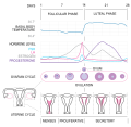 Isometrik's SVG v.1


Article(s): Menstruation, Menstrual cycle, Basal body temperature, Luteal phase, Follicular phase
Request: This is a significant project which I hope someone will want to put some time into. Right now, our diagram of the menstrual cycle is embarrassingly poor. This is a very important diagram for an encyclopedia and we should have something better to use. Rather than list off all the problems with the current diagram, of which there are many, I'd like for the graphist to take a look at some other examples on the web which are far superior:
- The Holistic Care
- UCSB Sociology Department
- Answers.com
- Britannica
- Pearson Education
- Women to Women
- Nursing Crib
Since the diagrams above are all copyrighted, we can't simply copy them outright, but hopefully they will give some ideas and guidance for someone willing to create a new diagram. Also, I don't think we necessarily have to include all the information in one diagram. The graphist may want to consider splitting the project into multiple diagrams to reduce visual clutter. Kaldari (talk) 16:58, 8 December 2009 (UTC)
Graphist opinion(s):
Hi, this is very interesting. I actually find it to be crucial that all of the charts are included in a single diagram, as the information is interdependent. Let me work on it for a bit. --Isometrik (talk) 19:19, 8 December 2009 (UTC)
Here, I worked on the first version of it. I made it so that you can include it in the article with the height of 430px and it stays readable. Things that came up:
- i changed the traditional representation of uterial wall
- the corpus luteum is not yellow because i looked at a real photo on the web, and it wasn't
- i still am not sure about the body max and min temp. as it was inconsistent at different sources, can you provide me with that?
- please also proof read it all.
cheers Isometrik (talk) 23:40, 8 December 2009 (UTC)
- Wow, nice work. Could you perhaps make it more clear in the diagram what the labels "Follicula" and "Corpus Luteum" are referring to (or perhaps remove them). Kaldari (talk) 00:50, 9 December 2009 (UTC)
- We done?--Isometrik (talk) 15:58, 9 December 2009 (UTC)
- Looks good to me. Kaldari (talk) 16:12, 9 December 2009 (UTC)
- One last thought. What do you think about removing the line above "Menses, Proliferative, Secretory"? It seems unnecessary to me. Kaldari (talk) 16:30, 9 December 2009 (UTC)
- Hm, I tried doing that, and the words seem to title the uteruses above them, and besides the line reflects the DAYS line, confining the whole diagram into a defined time span, thus making it easier to read. I added word PHASES under UTERUS CYCLE so it's less ambiguous. I guess we done! --Isometrik (talk) 17:28, 9 December 2009 (UTC)
- Hmm, that seems even more confusing than before. I don't know whether to read it as "Uterial Cycle Phases" or "Uterial Cycle" and "Phases" separately. Both the phase names and the uterus illustrations correspond to the uterine cycle, correct? If so, I think we only need one label on the left side. In my opinion, the label should just be "Uterine Cycle". (Note "Uterine" rather than "Uterial".) Also, if you prefer to keep the line above the phase names, could you at least move the line up a bit so that it is halfway between the phase names and the illustrations. Otherwise it looks a bit boxy. Thanks for your work on this! Kaldari (talk) 17:47, 9 December 2009 (UTC)
- We done?--Isometrik (talk) 15:58, 9 December 2009 (UTC)
World Scout Emblem
Article(s): World Scout Emblem, multiple others
Request: Trim away extra white/colored space, thank you. I know it says don't ask for a bunch at once, but since it is the same basic process for each, I thought I would ask... Chris (クリス • フィッチュ) (talk) 13:14, 29 October 2009 (UTC)
Graphist opinion:
- Will do some of them. I'm more focused on the SVGs and PNGs, so anyone else may take over the JPG rasters. ZooFari 06:08, 30 October 2009 (UTC)
- Thank you so much! Um, with the Plast one, removing all the blue reduces visibility. Perhaps a thin blue border? Thank you! Chris (クリス • フィッチュ) (talk) 06:48, 30 October 2009 (UTC)
- Thank you! Chris (クリス • フィッチュ) (talk) 17:15, 16 December 2009 (UTC)
Finished thank you so much for these!
- File:World Scout Emblem inverse.svg Done
- File:Ukrainian Plast membership badge.png Done
- File:Association of Scouts of Ukraine.svg Done
- File:Magyar Cserkészszövetség metal.png Done
- File:Scouts de France.svg Done- Vector version: File:Scouts de France.svg
- File:Korea Scout Association 1950.png Done
- File:International Scout and Guide Fellowship.png Done
- File:Homenetmen.png Done
- File:Iraq Boy Scouts and Girl Guides Council 2004.png
- File:Africa Scout Region 24th World Conference.jpg
- File:Movimiento Scout Católico pre 1999.jpg
- File:Scouts du Burkina Faso.jpg
- File:Slovenský skauting Sea Scouting.jpg
- File:Association des Scouts du Niger 1970.jpg
- File:23rd World Scout Jamboree theme.jpg
- File:Scoutlink (The Scout Association).jpg
- File:Gilbert and Ellice Scout Association.jpg
- File:Associazione Scouts Cattolici Italiani.png
- File:Lietuvos Skautija 1918.png
- File:Order of World Scouts.png
- File:Belarusian Republican Scout Association.png
- File:Savez Izviđača Srbije i Crne Gore.png
- File:Asia Pacific Region (World Association of Girl Guides and Girl Scouts).png
- File:Scouting Nederland.svg
- File:Scouts de France Guiana Antilles.png
- File:Eclaireurs Français Neutres.png Done
- File:Liga dos Escuteiros de Moçambique alternate.png Done
- File:Scouting in Lebanon NEA.png Done
- File:Tuvalu Scout Association.png Done
- File:Federación de Asociaciones de Scouts de España pre 2000.png Done
- File:Baden-Powell Scouts of Ireland.png Done
- File:Association Nationale des Guides d'Haïti.png Done
- This comment is just here for the date tag to stop the archiving bot. /94.193.242.248 (talk) 12:51, 12 December 2009 (UTC)
Learn To Fly

Article(s): Learn To Fly
Request: Trim down to just cover... Chris (クリス • フィッチュ) (talk) 09:36, 6 December 2009 (UTC)
Graphist opinion:
![]() Done. ZooFari 18:19, 6 December 2009 (UTC)
Done. ZooFari 18:19, 6 December 2009 (UTC)
Venous valve

Article(s): Venous system
Request: Convert to SVG. Connormah (talk) 01:02, 19 December 2009 (UTC)
Graphist opinion(s):
![]() Done How's that? ZooFari 21:43, 21 December 2009 (UTC)
Done How's that? ZooFari 21:43, 21 December 2009 (UTC)
Physics domains


Article(s): Classical mechanics
Request: Create an SVG equivalent. Cybercobra (talk) 06:43, 20 December 2009 (UTC)
Graphist opinion(s): ![]() Done by User:Surachit --Beao 22:54, 20 December 2009 (UTC)
Done by User:Surachit --Beao 22:54, 20 December 2009 (UTC)
Sports icons


Article(s): sport stub templates
Request: Can someone take a crack at vectorizing these? Connormah (talk) 06:37, 6 December 2009 (UTC)
Graphist opinion(s):
- File:Baseball.svg Should be useful for the first image There are more free svg baseballs at the Open Clip Art Library [2], [3], [4].
- As for bats File:Baseball bat.svg looks quite good. And File:Tennis stub.svg could be used as a basis for the puzzle piece layout. /Lokal_Profil 14:50, 6 December 2009 (UTC)
![]() Request taken by slashme.: I'll take a stab at the baseball one. --Slashme (talk) 17:40, 23 December 2009 (UTC)
Request taken by slashme.: I'll take a stab at the baseball one. --Slashme (talk) 17:40, 23 December 2009 (UTC)
![]() Done note, baseball made from PD images, will keep PD.
--Slashme (talk) 18:02, 23 December 2009 (UTC)
Done note, baseball made from PD images, will keep PD.
--Slashme (talk) 18:02, 23 December 2009 (UTC)
-
 Image with labels in German

-
 Vector image with labels in German
 -
 Vector image with labels in English
 -
 Second english vector version


.jpg&action=edit&redlink=1)
.png&action=edit&redlink=1)
Article(s): Cluster of differentiation on english wikipedia. Also used in other languages: see this link
Request: Translation would probably make this picture a lot more useful (and possibly easier to translate into other languages as well).
| Original | Translation |
|---|---|
| CD34 etc. | CD34, they remain the same (CD is short for Cluster of differentiation) |
| Stammerzelle | Stem cell |
| Granulozyten | Granulocyte |
| Monozyten | Monocyte |
| T-lymphozyten | T-lymphocyte |
| T-lymphozyten | B-lymphocyte |
| Thrombozyten | Thrombocyte |
| Helfer-T-lymphozyten | Helper T-lymphocyte |
| Suppressor-T-lymphozyten | Suppressor T-lymphocyte |
| aktivierte T-lymphozyten | Activated T-lymphocyte |
I'm wondering if an image map like this one: Template:Metabolic pathways would be a good idea. If no one here has the time/effort I will be happy to do this if you let me know :-)
If possible, .svg would probably be preferable to .jpg too.
Thank you very much in advance! Best regards, Captain n00dle\Talk 19:22, 5 December 2009 (UTC)
Graphist opinion(s): ![]() Request taken by Beao. --Beao 22:18, 20 December 2009 (UTC)
Request taken by Beao. --Beao 22:18, 20 December 2009 (UTC)
![]() Done Is that good? --Beao 22:52, 20 December 2009 (UTC)
Done Is that good? --Beao 22:52, 20 December 2009 (UTC)
- Dammit once again I start working on something and discover it's been done when I upload =(. Well well, now there is more choice. /Lokal_Profil 23:46, 20 December 2009 (UTC)
- If you want to take the request, be sure to post {{I take|your user name here}} after the request, so you can have time to work on that request, Lokal_Profil. Best regards. Ivan Akira (talk) 06:38, 28 December 2009 (UTC)