I believe the 3RR rules require us to attempt a discussion before blocking. So a Pravda opinion that the U.S. is deliberately spreading disease isn't considered a [[Wikipedia:Reliable source]], right? [[User:Art LaPella|Art LaPella]] ([[User talk:Art LaPella|talk]]) 21:21, 13 September 2014 (UTC)
I believe the 3RR rules require us to attempt a discussion before blocking. So a Pravda opinion that the U.S. is deliberately spreading disease isn't considered a [[Wikipedia:Reliable source]], right? [[User:Art LaPella|Art LaPella]] ([[User talk:Art LaPella|talk]]) 21:21, 13 September 2014 (UTC)
== WHO update? ==
why hasn't WHO given an update in more than a week?........--[[Special:Contributions/65.8.188.239|65.8.188.239]] ([[User talk:65.8.188.239|talk]]) 23:11, 13 September 2014 (UTC)
This article is within the scope of WikiProject Africa, a collaborative effort to improve the coverage of Africa on Wikipedia. If you would like to participate, please visit the project page, where you can join the discussion and see a list of open tasks.AfricaWikipedia:WikiProject AfricaTemplate:WikiProject AfricaAfrica articles
This article is within the scope of WikiProject Viruses, a collaborative effort to improve the coverage of viruses on Wikipedia. If you would like to participate, please visit the project page, where you can join the discussion and see a list of open tasks.VirusesWikipedia:WikiProject VirusesTemplate:WikiProject Virusesvirus articles
A news item involving Western African Ebola epidemic was featured on Wikipedia's Main Page in the In the news section on 31 March 2014.
Wikipedia
A news item involving Western African Ebola epidemic was featured on Wikipedia's Main Page in the In the news section on 29 June 2014.
Wikipedia
This page is not a forum for general discussion about politics of Ebola containment. Any such comments may be removed or refactored. Please limit discussion to improvement of this article. You may wish to ask factual questions about politics of Ebola containment at the Reference desk.
Aliko Dangote financial contribution
Can someone change the sentence "On 14 August, the Nigerian government said Aliko Dangote had donated $150 million to halt the spread of the Ebola virus outbreak.[117]". The reuters source given is actually incorrect. The correct amount was $150 million Nigerian Naira (approx $923,000 USD) as reported everywhere in Nigerian press. — Preceding unsigned comment added by 84.3.167.234 (talk) 21:06, 1 September 2014 (UTC)[reply]
Not sure if this is Aliko Dangote, the Dangote Foundation, or the Dangote group. Also not sure if it's appropriate to record individual contributions. Robertpedley (talk) 07:02, 2 September 2014 (UTC)[reply]
Better title?
I edited the box a little bit, just wanted to say it's great that an article about this event finally exists and I hope more information becomes avaliable so we can expand it. Does anyone think that "2014 West Africa Ebola outbreak" or "2014 West African Ebola outbreak" might be better options for the article's title? I was going to move it at first, but decided to go ahead and ask others before doing so. Skycycle (talk) 23:08, 1 April 2014 (UTC)[reply]
I support your suggestion Skycycle. I felt this article was important to share for the awareness factor and welcome help from more experienced contributors. Lozion (talk) 23:42, 1 April 2014 (UTC)[reply]
Moving the article to 2014 West Africa Ebola outbreak, for any further ideas or suggestions please keep the discussion under this heading. Skycycle (talk) 14:38, 4 April 2014 (UTC)[reply]
The article claims "Total mortality" is "729 deaths / 1323+ cases (55.1%)". This seems original and, in fact, pretty bad research. You simply can't calculate mortality like that, since it takes a while for a patient to die after diagnosis. So for real mortality, you need to divide the number of deaths today by the number of cases x days earlier (not today!), where x is the average number of days from diagnosis it takes a doomed patient (a patient who will be killed by the disease) to die. Such a calculcation, if done correctly, would obviously be too complicated for being WP:NOR compliant. Please consider deleting the misleading mortality percentage. It can be added back once the outbreak has stopped and the last patient has died. The alleged "mortality" percentage currently depends a lot more on the speed with which the disease is spreading (case growith) than on mortality. Because the speed is still increasing, we see this claimed "total mortality" percentage dropping every day... which is of course nonsense. --rtc (talk) 17:29, 31 July 2014 (UTC)[reply]
As i understand this figure could be used as an indicator about the virus evolution. So the graph shows how the mortality changes over time. However, it is unclear how reliable the numbers are, since it has been reported that people do not report when ill. And it could be different for Europeans or Asians etc. See also this section https://en.wikipedia.org/wiki/Ebola_virus_disease#Prognosisprokaryotes (talk) 01:22, 1 August 2014 (UTC)[reply]
Please actually read what I wrote before you reply. Even assuming perfectly reliable numbers, the calulated "total mortality" can be "used as an indicator about the virus evolution" only after the outbreak has ceased and the last victim has died. This is a mathematical fact! Please remove the number for now. It's original research and bad research. --rtc (talk) 13:20, 2 August 2014 (UTC)[reply]
The article claimed no such thing. It claimed a lower bound on the fatality rate of 55.1%. The rest of the (still included) section on mortality rate certainly does do a lot of hand waving original research to suggest a fatality rate of 65% for the current outbreak. The section deleted did no such thing, and should be restored, suitably updated as new figures come in. I'd hapily add 'apparent' or 'probable' lower bound to the description of the figure. In fact, added back in updated with latest figures Pmpdurrant (talk) 15:23, 26 August 2014 (UTC)[reply]
An estimated fatality rate of 55.1% is completely inaccurate for a myriad of reasons. These are outlined in the Wikipedia article under "Fatality Rate." To reiterate, the inaccuracy of a current Case Fatality Rate (CFR) is due to: Differences in testing policies, the inclusion of probable and suspected cases (these figures ebb and flow as some are confirmed to be/not to be Ebola), the rate of new cases, and actual cases that have not run their course. The rate of new cases to cases that have not run their course (people who have either succumbed to the disease or been declared disease-free) is possibly the most important aspect as to why there are accuracy problems with coming up with a CFR for a current epidemic. As Ebola takes an average of 10 days to kill someone who has become symptomatic, an exceedingly more accurate way to come up with a CFR would be to divide the most recent death toll by the infected toll from 10 days prior. This, throughout the outbreak, has displayed an approximate death toll of 70-75%. This CFR figure, while still far more accurate than a simple division of current epidemic figures, still has accuracy issues. The best way to figure the fatality rate is either once the epidemic has concluded, or by looking at the comparative percentage of those dismissed from Ebola clinics to those who have succumbed. I have yet to see any figures on the percentage of people who recover from confirmed Ebola virus disease.--Conker The King (talk) 00:31, 24 August 2014 (UTC)[reply]
Once again, that section doe not say what you suggest, and none of your criticisms apply. The figure was given as a _lower bound_, derived from the number of cases confirmed by laboratory tests and the number of those cases that have died. Yes, the figure will likely increase, as those who have only recently caught the disease either die or recover, but it is very unlikely to decrease, making it a valid lower bound. It could only decrease if there was a large number of new cases and the majority of them recover. A valid criticism would be the precision. 51% might be a more sensible number than 51.1%. Pmpdurrant (talk) 15:23, 26 August 2014 (UTC)[reply]
See: http://epidemic.bio.ed.ac.uk/ebolavirus_fatality_rate You can't get the CFR by dividing the current deaths by the current cases in an ongoing epidemic. The disease takes time to kill people after they have been diagnosed. As a direct result of this the number of deaths will rise even after the virus has stopped creating new cases. The only time a CFR can be accurately made from dividing the most recent figures on Deaths by the most recent figures on Cases is when the epidemic is over and all infected individuals have either died or recovered. To reteriate: when a living patient is diagnosed with Ebola, they are placed in the "Cases" category. As they are living with the disease, they throw off the current Cases/Deaths ratio, giving an inaccurate appearance of a "lower bound."--Conker The King (talk) 21:38, 26 August 2014 (UTC)[reply]
I understand what Pmpdurrant is saying with his lower bound comment, and I understand what Conker The King is saying. For the article, I don't think we need to provide a figure for the lower bound. The figure that we are interested in is an accurate CFR. We cannot calculate that ourselves right now, so we should only used sourced CFR figures. Even when a CFR figure is sourced, that does not mean we should include it in the article; if the source gives a naive estimate, I would not use it. Glrx (talk) 22:13, 26 August 2014 (UTC)[reply]
I actually misunderstood what Pmpdurrant was saying, due to my misconception of what a "lower bound" is. After re-reading his most recent edit to "Fatality Rate" I see my mistake, that a "lower bound" is the minimum fatality rate in this case, as opposed to an "upper bound" which would be a figure for the maximum fatality rate. That being said, I don't think the article necessarily needs a "lower bound" figure, as I think it is unnecessary and misleading, but I certainly think it's up for discussion.--Conker The King (talk) 05:12, 27 August 2014 (UTC)[reply]
While it is not possible to give an accurate fatality rate for an ongoing outbreak without much more detailed information, I think it is useful to give bounds where possible. Ebola has a very well known upper bound of 90%. This is quoted very widely in numerous sources. I think it is very useful to give, in this article, a lower bound on the fatality rate for this outbreak, which is easy to do from the figures provided by WHO on confirmed cases and deaths of confirmed cases. Again, I don't think a division counts as original research. If the general opinion is against providing a lower bound, we should at least remove the comment about the rate in this section, which is not official and is unsourced (the reference being just to WHO news). Pmpdurrant (talk) 10:41, 27 August 2014 (UTC)[reply]
Now that I understand what a lower bound is, I am much more inclined to agree. Perhaps it would be better to include the information on the lower bound after the statement in "Fatality Rate" on why it is difficult to create an accurate CFR rather than before and follow the lower bound statement with a reiteration of the upper bound approximation for clarity.--Conker The King (talk) 18:47, 27 August 2014 (UTC)[reply]
The Sierra Leone Ministry of Health and Sanitation reports on their Facebook page that there are 333 confirmed deaths and 236 confirmed cases which have survived and been discharged. That is a fatality rate around 58%. Whether those numbers are accurate is anyone's guess. Donners (talk) 02:12, 24 August 2014 (UTC)[reply]
Thank you very much, Donners! That is very interesting. It is also interesting that Ebola spread quicker in Sierra Leone than it did in any of the other affected countries in this outbreak, and yet their recovery rate is immensely better than that of Guinea and Liberia. I have read reports that say Nigeria has confirmed 5 deaths from Ebola and released 5 patients. If recent recovery rates for Guinea and Liberia are also available, then a more accurate CFR could possibly be made. Whether or not creating a CFR from separate sources counts as original research and whether or not a CFR belongs on the page while the outbreak is ongoing is up for discussion. --Conker The King (talk) 03:00, 25 August 2014 (UTC)[reply]
I have removed the statement that gave an unreferenced 65% mortality rate in view of the fact that we now have official figures from WHO. Of course, these figures are wrong, since they don't take into account the number of newly infected people in the numbers whose lives are still in the balance. Looking back at the 16th June update, we had figures from Guinea of 394 cases, 263 deaths, 113 recovered and discharged, leading the the assumption that there were only 18 still hospitalised. This gives (ignoring the 18 still in hospital) a mortality rate of 70%. I fear that that is likely to turn out to be closer to the final mortality rate than the 52% overall the Who have just published. Either way, it's an astonishingly deadly disease, if you catch it. Pmpdurrant (talk) 13:05, 31 August 2014 (UTC)[reply]
Table suggestion
Can we please modify the table of cases and fatalities to add an extra column for each nation and in aggregate showing a mortality percentage? It would be really useful. Neukenjezelf (talk) 16:28, 12 August 2014 (UTC)[reply]
But we don't know the mortality percentage. It's not a simple deaths/cases: some patients alive today may die tomorrow. Neither is it deaths / cases-delayed-by-n-days because there isn't a magic value of n. The mortality rate may also depend on the condition of the patient when first treated: those entering a hospital early may have a much better chance than those who come in very ill. We need a source for the mortality rate. Glrx (talk) 16:52, 12 August 2014 (UTC)[reply]
Please remember the context in which this is occurring, and do not use American abbreviations with separate local meanings. "CDC" occurs with great frequency in Liberian publications, but virtually always as a reference to the Congress for Democratic Change. I can't remember ever seeing "CDC" used for the Centers for Disease Control in any Liberian publication. Regardless of the usage of "CDC" in publications from other countries, the full name is unambiguous in all contexts. Nyttend (talk) 13:27, 7 April 2014 (UTC)[reply]
Numbers are regularly reassessed. They included suspected and probable cases - some turn out to be negative. Also, some turn out to be double-counted on review.Donners (talk) 23:10, 19 July 2014 (UTC)[reply]
Incidentally, I noted that the latest edit contained figures not reported by the CDC. I initially reverted it, but I decided to change the reference to the WHO, as the CDC link (which is ostensibly relied upon for the table) is lagging behind. Donners (talk) 23:16, 19 July 2014 (UTC)[reply]
Numbers are constantly reviewed. If suspected and probable cases test negative, they are removed. If previously unknown cases turn out to be Ebola, they are retrospectively added. Donners (talk) 22:04, 2 August 2014 (UTC)[reply]
The problem is that adding the new cases to the previously reported total number of cases isn't even close to what they're now reporting for the new totals. It's not like they're reducing the previous number via case they found weren't ebola. They're increasing them. There's nothing we can do about it I guess. --66.41.154.0 (talk) 16:50, 3 August 2014 (UTC)[reply]
So we think that these totals should reflect the WHO/CDC numbers like the timeline? (It would be cleaner and official, not speculation).
Also the notes that are added after some countries really don't need to be there as that information can be added in the main article. (And why is the note of the Nigerian case of the Liberian that traveled to Lagos there, but not, for example the notes of the many Guinean cases that travlled to Sierra Leone and Liberia? added too).
And Finally the US being added, aren't those cases of the health workers counted by WHO/CDC (and that list) as Liberian cases already?, so why do they need to be added twice. Shouldn't we count the WHO/CDC, as they will only count them once, and where they are first registered. Rump1234 (talk) 14:53, 3 August 2014 (UTC)[reply]
Agreed, it should be a quick-reference to the latest data in the table. Having conflicting numbers is confusing, especially when there is no citation for the casualty list. At present, it is unsourced and contradictory to the offical numbers, which is particularly bad when it's the first thing page visitors see. Donners (talk) 05:42, 5 August 2014 (UTC)[reply]
Agreed, I removed the superfluous info. already prior to reading this (what's it they say about "great minds" ;) ?), but those numbers should absolutely be consistent with the table and based on the same reliable sources too. -Oosh (talk) 06:04, 5 August 2014 (UTC)[reply]
Yeah official numbers are best. I edited the tally to reflect the latest WHO/CDC info like the timeline. So hopefully it stays consistent with the timeline now.Rump1234 (talk) 10:59, 5 August 2014 (UTC)[reply]
WHO can take several days to release a new update. Any numbers confirmed by a country's ministry of health should go on the table - such as the second Nigerian death and the Saudi death.70.209.201.191 (talk) 15:27, 6 August 2014 (UTC)[reply]
Then you wind up with a table from multiple sources, reliant on the mainstream media which is often outdated or inaccurate. See the Moroccan "case" as a prime example. Media were still publishing it as a confirmed case - and people were adding it to this page - based on an old and refuted announcement. The Saudi case is not confirmed as being Ebola. Donners (talk) 23:09, 7 August 2014 (UTC)[reply]
I'd like to believe that Wikipedia should be able to get accurate information out quicker than the WHO, but I'm not convinced. We will see whether the WHO confirms that Saudi case. As mentioned elsewhere on this page, suspected cases in new countries come and go with alarming regularity. For now I think I'll enforce the policy agreed above Armouredduck (talk) 00:34, 7 August 2014 (UTC)[reply]
I am worried that case reporting is so difficult that we don't know the extent of the Ebola outbreak. Can anyone provide a description of how the reporting system is supposed to work? — Preceding unsigned comment added by 67.247.35.33 (talk) 19:21, 12 August 2014 (UTC)[reply]
Actually, news sources are starting to discuss the likelihood that the "official" WHO numbers substantially understate the size of the outbreak, because of widespread reluctance to report cases. I just added this point to the article with a citation. —Patrug (talk) 10:00, 14 August 2014 (UTC)[reply]
Ebola-Like Symptoms
Should the article cover suspected cases at all? Ebola symptoms are very similar with a wide variety of illness, thus i don't see the need to add reports on symptoms, without confirmation (i.e. see recent addition of New York case). prokaryotes (talk) 21:59, 4 August 2014 (UTC)[reply]
I'd say a little mention would be warranted, if we have sources discussing outbreak-related hype and hysteria: have one thing on people imagining outbreaks all over the world, and have another on the lunatics who think that Mr Brantly's disease is a national emergency for the USA. For example, 2009 flu pandemic in the United States has comments about crazy responses (e.g. a school district closing all schools after one student was found with the disease), and Oklahoma City bombing mentions the fact that investigators originally thought that it was the work of some Middle Eastern men. In the same way, we might as well mention the inaccurate initial assessments and off-the-wall ideas that spread among some members of the general population. Nyttend (talk) 04:18, 5 August 2014 (UTC)[reply]
Not unless they're reported by WHO, in my view. There have been over 10 countries reporting "suspected" cases which turned out to be false, including Spain, England, Gambia (three times!), Mali (13 cases) and Canada. It'll just become a mess, especially with the media hype at the moment. Donners (talk) 05:04, 5 August 2014 (UTC)[reply]
That's my point — mentioning it amid a section discussing the media hype. WHO probably won't pay that much attention to the media hype; if we cover it (which I say we most definitely should), we'll have to depend on sources that aren't primarily medical. Nyttend (talk) 05:19, 5 August 2014 (UTC)[reply]
Ah, for that use I agree. I was concerned about it being conflated with the facts of the outbreak, especially as some media reports of suspected cases had been creeping into the casualty list. A section on the media coverage, and the high level of awareness to potential cases (to put it politely) is certainly relevant. Donners (talk) 06:24, 5 August 2014 (UTC)[reply]
And at the same time, we ought to mention the use of the media to fight the disease. Here's where the rap song belongs, for example. At the same time, see today's Heritage article, "As the Fight Against Ebola Intensifies: Ellen Pleads with the Media"; President Sirleaf is calling for the media to do more to increase awareness, in part to persuade people who think it's all a hoax. By the way, I apologise for relying so heavily on Heritage; it's been carrying more articles with wide-scale relevance than competitors such as The New Dawn (today's biggest headline) or The New Democrat (today's biggest headline, three weeks old), while I've not seen any recent coverage in The Inquirer, and the website of The Analyst is currently under major maintenance. I really know nothing about Leonese or Guinean publications, so I can't bring in anything but Liberian. Nyttend (talk) 13:01, 5 August 2014 (UTC)[reply]
Examination of sources for determination of strain
I'm a writer who has researched Ebola as a hobby for almost 10 years. I have zero Wikipedia experience other than using it for research. I often follow sources randomly and is how I found this oddity. I had to make an account to just post this and did so because I consider it so important.
This is what I found when I looked at the sources saying this is Ebola Zaire and I believe it needs more eyes on it.
There were 3 reports listed as sources 11-13.
11. (http://www.nejm.org/doi/full/10.1056/NEJMoa1404505?query=featured_home&&#t=article) This source is the initial study done to determine the strain. It's dated 4.16.14. It appears to be solid research backed by a large number of doctors. It shows this not to be Zaire, but something 97% similar and shows where those differences are in the genome.
12. (http://epidemic.bio.ed.ac.uk/ebolavirus_phylogeny) This is the second source and the first one that says it's Zaire. It seems to be a more general, much less precise reanalysis of the data. It also seems to reference the first study and is dated only the day after.
The first source says explicitly that it is Zaire, not least in the title. It is a 97% match for particular Zaire strains in the past (that's based on analysis at the Pasteur Institute at the very early stages). All Zaire strains vary a bit because of genetic drift. What it concludes is that it is an new clade; ie. a strain of Zaire which evolved parallel to the others in the rest of Africa. However, that conclusion has been twice refuted by later studies which place it in the known lineage of Zaire. Donners (talk) 22:27, 9 August 2014 (UTC)[reply]
You don't understand what I'm saying. This second study you say refutes it doesn't exist. That's source 13. The April 16th study was the first study and shows only 97% similarity to Zaire. Then the source 12 link is the second study that was completed within 24 hours of the first that shows opposite results. (Edit: Opposite results here meaning not diff strain but Zaire.) Then the source for the third study is dated March 30. That's 17 days BEFORE the second study. Upon further study, I can't find anything on the internet that would be a legitimate source for the last/3rd study. All sources for it leads back to this fake source dated 18 days before it could have been done.--jerry — Preceding unsigned comment added by Ephiroll (talk • contribs) 23:01, 9 August 2014 (UTC)[reply]
You're said, in reference to source 11, "It shows this not to be Zaire, but something 97% similar". Read the source. It says explicitly in the abstract "Virologic investigation identified **Zaire ebolavirus (EBOV)** as the causative agent." How can you say it shows it not to be Zaire when it explicitly says that it is?! The studies which refute its conclusions about the **clade** are these, which were published subsequently:
Okay, very interesting links there. But still, nothing is saying the 3% isn't right. 'The overall genetic diversity within the Zaire ebolavirus species is low, with a maximum 2.7% nucleotide difference between sequences. Within a single outbreak, genetic diversity was even lower.' According to that, 3% is more than it should be and would make a new strain. Source: http://jvi.asm.org/content/87/5/2608.full --jerry — Preceding unsigned comment added by Ephiroll (talk • contribs) 01:36, 10 August 2014 (UTC)[reply]
I swear, I'm not a nut or conspiracy theory person. The actual sources given in this Wikipedia article don't show a third study. If someone has a real source for #13 then I would love to see it. I'm trying to find one and can't. Been trying all day.--jerry
Edit: This is the sentence clearly showing that #13 is the 3rd study, aka the second to refute. (An initial report suggested that it was a new strain of ebolavirus,[11] but this was refuted by later studies which placed it within the lineage of the Zaire strain.[12][13])
— Preceding unsigned comment added by Ephiroll (talk • contribs) 23:49, 9 August 2014 (UTC)[reply]
Please. If anyone reading this who doesn't think I'm a nut can get a message to them over there. It's got to be tested again.--jerry www.ephiroll.com — Preceding unsigned comment added by Ephiroll (talk • contribs) 00:33, 10 August 2014 (UTC)[reply]
"Got to be" - why? All viruses drift somewhat, that's why the criteria say things like "> or < 50% difference" rather than "is identical". A virus that drifts slightly more or less is probably going to be no different for vaccine or treatment purposes - the treatment so far for all species (which are a lot more than a few percent different) is identical: rehydrate etc. Any current vaccine will surely be developed and tested against this strain and not some arbitrary reference strain, or target commonalities between all 4 species. So I'm not sure what "has" to be said, or has "got to be tested again", ore why anyone needs to "get a message through". Even if it is more of a drift than a few percent I'm pretty sure that will be within spec for research on the virus as explained. If not, then Wikipedia is not the place to look for communication on it, we just write articles based on current recognized information. As above, currently this is that it's firmly within EBOV as of now. FT2(Talk | email)14:33, 12 August 2014 (UTC)[reply]
Could be intesesting to have a graph with the deaths and cases vs date. The source should be Center for Dis. Cont. But should be splitt by country or add all to one? I can do it fast in Mathematica but I think is better to use a Wikimedia SVG Chart in order to let anyone update it. Could anyone help me on that? — Preceding unsigned comment added by Leopoldo Martin R (talk • contribs) 07:32, 9 April 2014 (UTC)[reply]
I've created a new one, but prior to reading this and Wikimedia SVG Chart's in general, so it's SVG but not easily updatable unfortunately (converted from Excel). I'll try to keep it up-to-date until I can get my head around these or someone beats me to it. -Oosh (talk) 03:27, 3 July 2014 (UTC)[reply]
I've created an SVG plot that also has switch translations for several languages. The data is plotted as points rather than a piecewise linear function. New points can be added by following the pattern in the SVG file. That is, download the most recent SVG file from Commons, edit it in a text editor, and then upload the changed file. The data portion looks like:
<!-- Data points --><!-- x coordinate = Julian Day * 2 (1 Jan 14 = 0, 2 Jan 14 = 2) --><!-- y coordinate = -0.1 * individuals --><!-- 1 Aug 2014 1604 887 --><usexlink:href="#markCt"x="424"y="-160.4"><title>1604</title></use><usexlink:href="#markXt"x="424"y="-88.7"><title>887</title></use>
It would be great to see graphs for each individual country. I have done so in Excel for Liberia and Sierra Leone, and they are really different, L seems like a curve, SL a straight line. Dekritischelezer (talk) 08:40, 6 August 2014 (UTC)[reply]
I'm getting ready a new one by using OpenOffice Calc to be able to update easily, as your language detection didn't seem to work out properly (and for personal use to detect bad updates through lots of rules). It's taking some more time though, as I'm reviewing all data according to CDC, thus having to cope with lots of issues, even with some incorrect sums. Sums are sums, I can't believe CDC making this kind of mistakes with such an international official media plus such an important matter that is reviewed million times! -.-
What do you mean the language detection didn't seem to work out properly? WP requires language to be selected specifically with lang="zh"; I added a Chinese language version above.
Yes, the data is buggy. I'd like to include earlier points from CDC, but I'm about to give up on that data.
The country plots are very different. I thought I could throw all of them on a semilog plot, but they ran over each other.
I have plotted cases on semilog too. I encourage someone to set it up, maybe just the cases is enough and plot up to 4 countries for comparison. Liberia looks to be dominant now and different infection patterns - unless the graph reflects under-reporting.
Cases per day and Deaths per day graphs are both wrong. They should be bar graphs. For example, look at the highest peak of "Deaths per day". It's plotted as 60.5 deaths on Aug 18th and it slopes downwards on both sides -- as though on the preceding day, and on the following day, there were fewer deaths. That's absolutely false! The WHO reported 121 new deaths for the two-day interval of Aug 17-18. That gives 60.5 deaths for each day: Aug 17th and Aug 18th. The graph shows the correct number, 60.5, but it fails to plot it on each of the 2 days! Instead, it's shown for just one day! Those sharp peaks should **all** be histogram bars, and both Aug 17 and Aug 18 should be plotted as having 60.5 deaths each. I can provide a correct bar graph, to replace this one, and which could be updated by any Wikipedia contributor or editor. KingMidasTheSecond (talk) 02:25, 31 August 2014 (UTC)[reply]
What is not realiable, the fit, the derivative, the the points of cases vs time or the points cases per day vs time?
The fitting was done to the cases vs time and the derivative of this fit was shown as cases per day line, and the points are what some people is asking to add as the cases per day of each data step.--Leopoldo Martin R (talk) 10:04, 30 July 2014 (UTC)[reply]
All of it. I'm not questioning the accuracy of your work. The problem is it is your work (WP:OR). It is not taken from a reliable source in the wiki sense of the term(WP:RS).
I suggest you remove the fit on the cases, make it a simple scatter plot, the trend is self-evident anyway so we lose nothing and remain within the bounds of wii.
I think this is a poor graph. The data is discrete, so it should not use a piecewise linear graph. There's also a problem with timing. If there are no reports for 3 days, and then there's a report of 60 cases, should those cases be assigned to the day of the report or spread out over the three days? The graph has too many problems. Glrx (talk) 02:41, 6 August 2014 (UTC)[reply]
I count two problems. That's not very many problems... and I'm not even convinced they are actually problems. I don't understand why you think a piecewise linear graph is inappropriate for discrete data. For timing, I think it's obvious that the proper thing to do is have one data point for each report, in units of new cases per day. So, 60 cases over 3 days would give you 20. I assume that is what he's been doing. I support updating the chart and putting it back in the article.--Taylornate (talk) 05:31, 6 August 2014 (UTC)[reply]
As an informed layman it was not clear to me that this was a graph of total cases and not new cases. I'd like to see a little more explanatory text of precisely what measurements are depicted and I think a graph showing NEW cases per unit time in the manner of the daily cases graph on the talk page. Such a graph makes it more obvious how the outbreak is progressing. While total cases will only go up, the number of new cases will peak (perhaps already has) and begin to decline, giving a better graphic representation of the extent of the disease at any one time. Think of it like a population. The total historic population of even an extinct species cannot go down, but saying that the total historic population of dinosaurs is presently six make-a-guess-illion doesn't really help you understand that the current population is zero. (Depending a little on your cladistic definitions, of course.) The total number of cases in the outbreak thus far may well be a couple thousand, but how many people are suffering from the disease right now? (And how many were there yesterday and last week.) New cases isn't a precise measure of that, but at least it gives you an understanding of extent. (And I'd guess it's easier to measure.)
We had something a bit like that, averaging the number of cases between dates, but as it was derived from the data at hand (i.e. original research) it had to go. If you can find a reliable source providing the necessary data I'm sure it would make a re-appearance. -Oosh (talk) 00:21, 12 August 2014 (UTC)[reply]
In the mean time I've updated the description text to "Cumulative totals of cases and deaths over time." Hopefully that's a little clearer. -Oosh (talk) 01:26, 12 August 2014 (UTC)[reply]
(e/c) Cases per day is not a very good metric because the number is small and has a lot of variance. In two days, the cases went up by 68 (34/day); three days later, cases were up by 69 (23/day). I hope that's a tapering off, but it might be due to randomness, the way cases are discovered, or even structural timing such as the weekend (more transportation delays; some labs closed or understaffed). The thing we want to see is a slowing growth in cases (such as around May 1) rather than the horrendous exponential since June 1.
In some ways, it would be better to show the trend on a semilog graph such as the one at right; it will also give more room for individual countries. The semilog plot shows exponential growth as a straight line and gives a better impression of the long term trend. The semilog plot, however, does not have the same impact as a linear plot. Glrx (talk) 01:28, 12 August 2014 (UTC)[reply]
I understand what you're looking for, and agree that it is something that would be useful to have. But like Glrx indicates, the 'new cases per day' number jumps around so badly that you can't see any meaningful trend when it is plotted. Maybe if you plotted 'new cases in last three weeks' you might get something more meaningful. --Aflafla1 (talk) 15:40, 12 August 2014 (UTC)[reply]
In my opinion a good way to reach the point would be something like a 4-week relative value. I've been doing by mind to reach the real situation of the illness developement. Just an example, 6 AUG data is 1779 cases. This numer would be checked for 3 JUL wich is not official day, i have done an aritmethical media between closer days considering same infections for those days, doing this on 3rd July there were 773 affected, this is a groth of +130%. Doing the same for the 9th Aug the data would be 1848 affected for 816 on July 6th for a total increase of +126%. Doing this calculations for all the data we have we could reach much more closer how the outbreak is moving and would give much less moving info as if we take just the last infected data. Excuse my english i'm not native ilasamper (talk) 19:38, 12 August 2014 (GMT+1)
Here's a CDC bar graph for earlier numbers that uses weekly averages. The graph is not very illuminating. Even summing 2 or 3 weeks does not look like it would help.
Although we can use various moving averages to smooth the data, it's not clear what such smoothed data means. Infection is something that by its nature has burst characteristics. A family member gets infected, theres some delay, and then 3 or 4 family members get infected.
Intriguingly, the graph can supply earlier Guinea numbers for cases for the weeks ending:
Jan 1, 2 = 2
Jan 8,
Jan 15,
Jan 22,
Jan 29, + 5 = 7
Feb 5, + 3 = 10
Feb 12, + 6 = 16
Feb 19, + 2 = 18
Feb 26, + 5 = 23
Mar 5, +18 = 41
Mar 12, +10 = 51
Mar 19, +33 = 86
Mar 26, +24 = 110
Apr 2, +35 = 145
Unfortunately, the data doesn't quite sync. The ending Mar 19 = 86, but 86 is Guinea cases for March 26 in the article. The ending March 26 = 110, but that does not match the article's Apr 2 value (which is 127). The Jun 18 total is 398, and that exactly matches the article's Jun 18 value. (I didn't total the 398.) The 528 number also matches Jun 18.
I can't Agree, calculating the increase of the number of infected in % is not interpreting nothing, interpreting would be to give an opinion about the outbreak is going up or down, the interpretation would be done by readers. I would agree on the minimal manipulation necessary to reach the real data of non-official-data days, but it could be unnecessary also if we do not place numbers but just a grafic calculated over estimated points, and the numbers just for the real points.Ilasamper (talk) 05:32, 13 August 2014 (UTC)[reply]
It is exactly the same manipulation we are doing at this moment on the graphic displayed. When we draw a line between 2 real points we are doing exactly the same i'm asking for here. If you don't agree to this then we should remove that line graphic and replace it by one representing data by dots Ilasamper (talk) 08:19, 13 August 2014 (UTC)[reply]
Ok I agree, in my opinion is a bit extreme, but your argumentation is reasonable. I'll try to find another way to represent how the infection is advancing without using any non-official data Ilasamper (talk) 11:15, 13 August 2014 (UTC)[reply]
I have to agree with Ilasamper here in that simple manipulations of data are not original research, as long as you're not interpreting what they mean. Calculating a % increase in a number over a previous one is not original research. WHO's numbers, though are pretty rough. They seem to be numerically challenged, unable to understand basic accounting. Hard to say how they reach their counts when the summing the 'number of new cases' doesn't add up, even closely, to the totals.--Aflafla1 (talk) 11:56, 13 August 2014 (UTC)[reply]
There are more issues than just WP:OR or WP:CALC or even WP:SYN. There's editorial judgment.
We have sources that provide data points. We can certainly plot those points (or make bar graphs). We can also plot the points on a semilog plane; that's manipulation, but it is a common practice for presenting data. Such a plot helps show a linear trend line for an exponential function.
There's an issue about whether we can connect (interpolate) successive points with a line. I don't exactly love the practice because it is a continuous represention of a discrete process (a person is either infected or not). When the numbers get large, the effect is small, discrete processes begin to look continuous, and there is little harm. But how large is large? When we start looking at day-to-day changes, the numbers are still small.
Instead of a piecewise linear fit, there may be some better trend lines to use. I think it is WP:CALC to make a least-squares fit of a function to a set of points. The problem is choosing which function to fit. There are plenty of functions out there, and nobody is telling us a good one. We could choose a bunch of functions, perform the fits, and select one based on its degrees of freedom and reduced chisquare. Maybe we can fit a simple function, but better fits are probably WP:OR; we'd be exercising our judgment.
There are some simple calculations that could be done. A percentage increase over the previous value is simple enough to do. The problem is that when we do it, we get a number that jumps around and does not provide any significant insight. I would use editorial judgment to exclude such numbers rather than OR or SYN. There might be a better simple calculation, but point-to-point calculations will be noisy because the numbers are small.
A moving average is also a simple calculation, but then we get into the same function trouble: which moving average should be used? If some RS on diseases told us a resonable calculation to make, then we might be able to do that calculation without treading too hard on WP:SYN.
To me, the real bottom line is whether the plot or calculation provides something reasonable. If it doesn't look reasonable, then we should not put it in.
This would be the data. Consider it and decide. In my opinion gives a lot of information. ANd working by countries more... would also avoid initial info because until spread reaches al least around 100 infections data appears to be superbig, and it's not realistic
The problem is that when we do it, we get a number that jumps around and does not provide any significant insight. — User:Glrx
This is not a problem. There is no reason not to show the noisy cases per day graph, and no reason to try to smooth it out. I agree that any sort of smoothing would be WP:OR while a simple calculation of cases per day would not. I strongly disagree that the noise inherent in the data decreases its insightfulness. As I stated in the earlier discussion, I also see no problem with connecting the dots (piecewise linear). I prefer the piecewise linear plot, but I would be ok with a scatter plot. I propose we add this plot back to the article. For reference, there is some discussion higher on the page at Talk:2014_West_Africa_Ebola_virus_outbreak#Trend.2FFit_line. The author of the graph has been good about updating it, and has indicated that he is willing to make changes.--Taylornate (talk) 21:16, 13 August 2014 (UTC)[reply]
We don't have any "cases per day" data, what we have is overall figures updated every few days, it is a routine calculation but the resultant number would be an average and that would need to made clear. -Oosh (talk) 23:35, 13 August 2014 (UTC)[reply]
Would changing to a scatter plot clear that up from your view? What else would you propose? Personally, I don't see what is unclear. Cases per day is number of cases divided by number of days. It is explicitly clear and does not imply that there is one data point per day. I wouldn't be opposed to some explanatory text as a figure caption, or to changing to a scatter. Anyway, I'm going to put it back in for now. We can continue to discuss and make improvements, but I don't see how any of this discussion implies that there are such egregious problems that it should stay out of the article for now. Looking at previous discussion, it was removed for reasons that have since been resolved.--Taylornate (talk) 00:46, 14 August 2014 (UTC)[reply]
We may be able to come to a compromise position... please don't jeopardise that by jumping the gun and acting unilaterally. Let's get this right. -Oosh (talk) 02:34, 14 August 2014 (UTC)[reply]
I wouldn't say the objection is totally without merit. It is a narrow objection because the resulting plot may not reflect the actual cases per day. I'm sympathetic to the objection, but I'm willing to accept simple averages. Glrx (talk) 01:30, 14 August 2014 (UTC)[reply]
Dismissive? You are the one being dismissive of this chart. You removed it because it contained a trend line that violated WP:OR. I agree with that reasoning, but the WP:OR trend line has been removed. So I added it back, with an edit summary stating that the WP:OR issue has been resolved.[2] You reverted me, stating that it has not been resolved.[3] So please tell me, what is the WP:OR issue with the current chart, or what other policy reason do you have for removing it now? I'm happy to continue to discuss and to compromise on specific details of the chart, but we can do that with the chart in place. If you remove it again, please back your reasoning with policy.--Taylornate (talk) 20:59, 14 August 2014 (UTC)[reply]
There are many issues being addressed here. There's whether an average is appropriate (OR v CALC), the level of disclosure such a graph should make ("but the resultant number would be an average and that would need to made clear"), the appropriate presentation (scatter, piecewise linear, bar), and whether the graph is appropriate to include. I think there is consensus that providing a cases-per-day graph would be permissible, but some issues still remain as evidenced in the discussion below. We are in the discussion stage of WP:BRD. Glrx (talk) 21:49, 14 August 2014 (UTC)[reply]
Oppose insertion of the cases per day graph. It has lots of noise and little insight. Even if I were to support its inclusion, then I'd want it in the form of a bar chart where the width of the bars varied to show the number of days for the data point and the area represented the new cases. Glrx (talk) 01:30, 14 August 2014 (UTC)[reply]
Would you please explain why you think the chart is not insightful and what the noise has to do with that? I don't understand at all.--Taylornate (talk) 21:07, 14 August 2014 (UTC)[reply]
As I've stated above, there's a lot of variance in the data. That variance is due to randomness and other factors (e.g., timing, discovery, diagnosis, or political whims). If we were to discuss the national economy, a detailed look at a day-to-day stock market index would not provide a lot of insight. The long-term trend is important. If someone looks at the current plot, he will wonder what happened around Aug 1. The chaotic jumps (noise) have too much impact. Glrx (talk) 21:49, 14 August 2014 (UTC)[reply]
I have two separate but related points. First, people are good at pattern recognition. The average reader should have no trouble looking at this plot and recognizing the overall trends. Second, the scenario you describe will still happen without the chart, as people look at the new rows in the table coming in, and new points added to the cumulative chart. The cases per day chart won't make this worse, rather, it will help by providing context. Without the chart, someone looking at the table (and cumulative chart) when the August 1st data point came out may wonder what happened, just as you say. The cases per day chart in this scenario would show the reader that the data is noisy and that this spike may be a nonsignificant outlier. To put it another way, the noise is absolutely present in the table and cumulative chart, and the cases per day chart helps people understand it. Attempting to hide the noise just causes more confusion.--Taylornate (talk) 22:20, 14 August 2014 (UTC)[reply]
Well put, Taylornate — I strongly agree. Long-term trends and short-term randomness are the two most-important aspects of any time series, and a straightforward graph is usually the quickest way for people to see both aspects in perspective. —Patrug (talk) 08:49, 15 August 2014 (UTC)[reply]
Conditional support While I'm inclined to agree re: its (lack of) utility to the article, I'm not fundamentally opposed to its inclusion, provided it's done right. Not sure about the bar graph but I think we can hash out the details of how best to represent it BEFORE it's re-included within the article. -Oosh (talk) 02:34, 14 August 2014 (UTC)[reply]
Conditional support.
Cumulative totals of cases and deaths over time (Linear scale)Cumulative totals of cases and deaths over time (Log scale)Average new cases and deaths per day (Linear scale)
In the cited source (Disease Outbreak News), WHO itself is beginning each report with a sentence like: "Between 7 and 9 August 2014, a total of 69 new cases of Ebola virus disease as well as 52 deaths were reported." Surely it's a routine calculation to compute "Average Cases Per Day" and "Average Deaths Per Day" by dividing WHO's "new" reports by the number of included days. WHO and SymphonicPoet are correct that this is important and useful information. Oosh is correct that any numerical smoothing would be inappropriate original research. Taylornate is correct that the jumpiness is an important part of the data. Glrx is correct that each WHO average must be displayed for the corresponding number of days, whether it's a line graph or bar graph, so that the visual impact of 1-day averages and 9-day averages will be proportional. The simplest solution might be to repeat each average for each of the included dates. For example, the sentence that I just quoted from the WHO source could be graphed as (69÷3=) 23.0 "Average Cases Per Day" for 7 August and 8 August and 9 August. (Note that we could occasionally see negative averages, if the removal of suspected cases ever outnumbers new patients.) I would also recommend including the Cumulative graph twice, once with the linear vertical axis (which emphasizes how fast the number of cases is increasing), as we've been showing, and once with a logarithmic vertical axis (which emphasizes the proportional growth rate), as Aflafla1 helpfully plotted near the beginning of this section. The Timeline table is already large enough that there's plenty of space for displaying three thumbnail graphs to the right of the table: Cumulative (linear), Cumulative (log), and Average Per Day (linear). See what you think. —Patrug (talk) 06:41, 14 August 2014 (UTC)[reply]
I support your proposal of having all three graphs, as they each provide their own insight. I'm undecided on how best to represent the cases per day. I think a scatter plot would be best, as a bar graph may be sort of clunky and harder to interpret visually. Though, I do understand the need to give weight based on the number of days. I oppose the idea of repeating data points, but maybe we could have heavier-looking data points for more days averaged, or have horizontal wings come out from each point.--Taylornate (talk) 22:32, 14 August 2014 (UTC)[reply]
I'm realizing that my idea with the horizontal wings on a scatter plot is quite similar to a bar graph, except that only the tops of the bars are included. Could be a good compromise--It seems to be the best of both worlds.--Taylornate (talk) 22:37, 14 August 2014 (UTC)[reply]
I think that could work well. Regarding your use of the word average in the caption--I'm not going to revert it because I appreciate the compromise, but I don't think it is appropriate. To me, it implies that multiple data points have been averaged together, which is not the case. The units (cases per day) unambiguously explain that each data point total would be divided by number of days. Any specific frequency of data points is not implied by these units. Actually, as I think more about it, I'm not 100% sure it is inappropriate, either. I'd like to hear other people's view on this, preferably from those with backgrounds in statistics.--Taylornate (talk) 00:21, 15 August 2014 (UTC)[reply]
After a long career in applied statistics (yes, you smoked me out), unfortunately I'm sure many casual readers assume that "cases per day" would represent an exact day-by-day count, rather than the result of a division. Even though the word "average" might not be strictly necessary, it helps reduce misunderstanding, so let's keep it as we continue to tweak the phrasing. However, the current graph still gives "undue weight" to WHO's shorter versus longer reporting periods. In choosing an appropriate graph format to convey the number of days represented by each data point, ideally we should try to keep it simple enough that multiple editors could update it without difficulty. Would this be true of your proposed bubble charts, or points with horizontal wings? If so, can someone post sample graphs of the WHO data in these formats, to see if they're visually better than simple line or bar graphs with repeated values? —Patrug (talk) 08:49, 15 August 2014 (UTC)[reply]
Conditional support.
Same reasoning as for Oosh. As for the inclusion of the log plot, Glrx mentioned above a drawback, it doesn't have the impact of a linear plot, and I agree. But it does support that the growth in the last couple of months is exponential. I'm on the fence with it's inclusion, and leave it up to the community to decide whether or not it should be included. --Aflafla1 (talk) 12:30, 14 August 2014 (UTC)[reply]
As an aside, one can fit a line to the data from end of May to present, and calculate the equation for the cumulative number of cases. Take the derivative of this and you get a good idea of the number of cases per day. (Turns out to be close to 50 presently, if you assume that the exponential growth rate is still continuing.) --Aflafla1 (talk) 12:30, 14 August 2014 (UTC)[reply]
The observation from a log plot would not be cases per day but rather a ratio per unit time. Right now, the plot shows the cases are doubling every month (table above showing about 100 percent every 4 weeks). That would be a slope (increase) of 2.3 percent per day: 1.02330 = 2. Glrx (talk) 22:06, 14 August 2014 (UTC)[reply]
Well, finally you added a graph. In my opinion this graph gives the same info as the cumulative one, and drives to confusion. Having a 100 new infected when the previous day they were 1000 is much worse than having 1000 when the previous day were 100000. We can't forget that the more agents infected there are, the most easy to cause more infections, so the real data to know the evolution of the spread is not the absolute number of infected but the relative. I really don't care if you want to add as the las 4 weeks as i placed before because its more stable o just add the easiest one, the refered to the previous info (11AUG would be 3,44% more infected per day than the 9 AUG) This would be real info about the spread and would allow people to realise if Ebola is spreading or fading. Ilasamper (talk) 06:25, 15 August 2014 (UTC)[reply]
Ilasamper, a decrease in the percentage growth rate would indeed be welcome news. But Ebola won't be "fading" until the "absolute number" of new daily cases eventually trends downward, and the graph starts to become a bell curve. Almost everyone would say that 1000 cases per day are "worse" than 100, contrary to your argument. If new cases had a "relative" slowdown to a steady 1% per day, Ebola would still be "spreading", and still with exponential growth.
Glrx, I was also thinking about the doubling time, and that it might be a simple, intuitive, and powerful item to include in the Timeline text of the article. Not a statistical fit (original research), but pure lookups from the WHO table and routine calculations of time intervals, with an academic citation confirming the concept — maybe a sentence like this:
Note that, as the WHO death toll rose past 80 (1 April) and 160 (5 May) and 320 (18 June) and 640 (20 July), each of these doublings occurred in 5 or 6 weeks, characteristic of an epidemic's exponential growth phase.<ref>{{cite web |url=http://www.bu.edu/today/2014/tracking-the-virus/ |title=Battling Ebola: Tracking the Virus |last=Seligson |first=Susan |publisher=Boston University |date=6 August 2014 |accessdate=15 August 2014}}</ref>
What do you think? Meanwhile, great if someone is able to build & post a Log version of the Cumulative graph, matching the format of the Linear version as closely as possible, as the simplest way to graph the proportional growth that Ilasamper sensibly wants to convey. —Patrug (talk) 08:49, 15 August 2014 (UTC)[reply]
A log plot is available. See above right. The trace colors are chosen to match the colors on the column headings in the article. Changing the one to red would be no problem. Eliminating background shade altogether also not a problem. One thing though: the graph contradicts what Susan Seligson states. An initial exponential growth segment (ending about mid April) showed much higher growth rate than 6 week doubling time. The later section (since end of May) shows a doubling time of a bit less than a month, also less than the 6 week doubling time she states. And between - it wasn't exponential at all. --Aflafla1 (talk) 18:56, 15 August 2014 (UTC)[reply]
Yes Patrug, I agree, a doubling rate would be enough to show much more realisticly how the spread is evolving, i look at the cumulative or daily infections and I see it both exponential, and this could be too "scary" for readers. Having a Doubling time that mantains Stable will show much more clearly that the spread is not completelly "out of control" or if it is, WHERE it is will be much more clear to be seen than the other 2 graphs. This data makes real differences for each of the 3 affected countries. People should be ase Scared in Liberia than in Guinea Ilasamper (talk) 20:32, 15 August 2014 (UTC)[reply]
Semilog graphs
Ive uploaded a scatter and line-conected version of the graph. I want to upgrade it a little by tightening the margins, but please let me know if you think this row-style graph is Ok or single files are better. I´m more on the line-connected version of the graphs, its much more visual.
Cases, cases in log scale and cases per day of the 2014 Ebola outbreak. Using scatter plotCases, cases in log scale and cases per day of the 2014 Ebola outbreak. Using line conected plot.
And this is the semiLog plot:
Evolution of the 2014 Ebola outbreak in semiLog plot.
I think your row form display is too small. It also aligns the ordinates, but the ordinate scales are different. A column display would match the meaningful axis.
I did a scatter logplot of totals and countries yesterday. I give it below and put the linear display in column below to match abscissas. There's no legend for the countries, but Guinea (green), Liberia (blue), Sierra Leone (yellow), and Nigeria (pink). It looks like Guinea and Liberia had control for awhile, but then it got away. Sierra Leone never had control. Nigeria looks like it has control.
I thought it would be less confusing that it is; many points cover other points. Converting it to a line plot would make it less busy and possibly easier to follow. It has the problem that the low end of my log scale is a single case.
The data errors are troubling, but the difference is large only for 18 and 24 June.
I agree, the line-connected charts are more visually appealing and easier to read, and to me this outweighs the arguments against it, which I think are overblown. The scatter plot of cases per day is especially difficult to read.
I think separate files arranged vertically on the page is the way to go. Vertical will fit better next to the table, and separate so they can each have their own figure text.--Taylornate (talk) 23:45, 16 August 2014 (UTC)[reply]
Scatter plots look fine to me. As you say any crowding on per country one can be alleviated by using separate charts, if the axes ranges are kept the same they're still easily comparable.
But if despite that any of it remains a bit of a mess I don't think that's a problem, it is instructional in the way it highlights the state of the underlying data, case in point (which I've added by way of example on the right) is a plot of results from opinion polling for the Scottish independence referendum.
example of a graph for the 2014 Ebola virus outbreak
What about just using a scatter plot but adding a trendline with the r-squared values? I'd hope that's not considered "original research." It's representing the data in a clear way. Snd0 (talk) 01:24, 17 August 2014 (UTC)[reply]
Trendlines were discussed above; it's not clear that we should add them. Reporting R2 values does not fix the problem. How are the point variances chosen? Which function should be used for the fit? How many degrees of freedom should be used? Glrx (talk) 15:10, 17 August 2014 (UTC)[reply]
Despite there being disagreement on the optimal formatting of these charts I would suggest including the total cases semilog chart in the main article asap. This is the most pertinent chart for visualising the progression by eye given its exponential nature, the line connected chart is most consistent with the charts already in the main article so woudl be tempted to start with that. Nanoblade (talk) 17:18, 24 August 2014 (UTC)[reply]
I'd agree, the semi-log format seems a necessary addition. (Many people will need the linear but those interested in identifying turning points will be much better served with the semi-log format). I suggest at the moment the best would be to have the existing linear plots showing cumulative and daily cases & deaths. But to add a semi-log of cases (without deaths) identified by country. This is something I did last night quickly in Excel. I'm sure it doesn't conform to wikipedia standards but guessing someone else will have a way to replicate this and tidy it up.
Plotting the different countries separately highlights that countries have different characteristic exponential rates of infection - something that is not at all obvious on linear graphs. Compare slope of cases for Guinea vs Liberia. Why they are different is an interesting question to ponder. It might just be delayed reporting - the cases existed but weren't known or reported during earlier stages, or it might be dramatically different social processes having an impact on infection rates.
|Semilog Plot of Ebola outbreak from data on Wikipedia page as of 28-Aug-2014.
Cases per day and Deaths per day graphs are both still wrong. They should be bar graphs. For example, look at the highest peak of "Deaths per day". It's plotted as 60.5 deaths on Aug 18th and it slopes downwards on both sides -- as though on the preceding day, and on the following day, there were fewer deaths. That's absolutely false! The WHO reported 121 new deaths for the two-day interval of Aug 17-18. That gives 60.5 deaths for each day if you want to average it: Aug 17th and Aug 18th. The graph shows that number, 60.5, but it fails to plot it on each of the 2 days! Instead, it's shown for just one day! Those sharp peaks should **all** be histogram bars, and both Aug 17 and Aug 18 should be plotted as having 60.5 deaths each, if you want to average it. The way it is now is terrible! KingMidasTheSecond (talk) 05:49, 31 August 2014 (UTC)[reply]
Do you have any references that show this is inappropriate, or is it only your opinion? I think you are incorrectly inferring things that are not implied by this type of plot. They are just lines connecting each data point, to make it easier to follow them. The idea that the data between samples is following the line is not implied.--Taylornate (talk) 20:44, 1 September 2014 (UTC)[reply]
Is it only my opinion? Is 2 + 2 = 4 an opinion? The current graph shows neither the official data (121 deaths for Aug 17-18) nor that the data covers a two-day period. There's no way to infer **anything** correct from that graph. There *is* a proper way of presenting the official WHO data (see "Liberia New Ebola Cases" on the right for an example of what I mean). Putting lines to connect the peaks would only make a mess of the chart.
I forgot to add the month names. The graph begins with Jul 2 and ends with Aug 20. The numbers above each column are the official WHO numbers for new cases for the corresponding intervals. Those numbers also refer to the **area** of each column. No "cases per day" written nor implied. We don't really *have* data for cases per day. Anything we calculated would be *average* cases per day -- not nessarily true cases per day for the desired day. We shouldn't make those calculations.
Liberia New Ebola Cases from Jul 2 to Aug 20, 2014
Again, each *area* represents the number of new cases over the official interval. That's **exactly** the data WHO provided. Nothing more. No cases per day. The numbers don't represent the *height* of the columns, but the *area* -- as would be the case with bubbles. The second column from the left, 11, is taller than the leftmost, 16. But those numbers represent the areas and are the official WHO numbers over the shown interval. The height *does* represent an average case per day value but **let the reader figure it out** if they want -- since the result would not be official WHO numbers anyway, only a calculated average.
Notice there's *no* Y axis. There should not be a Y axis with graduations. The number of new cases for the interval is represented by the **area** in the bar, not the height of the bar. The *height* must remain basically unmeasured, unlabeled. Therefore, no Y axis at all. A Y axis would only tempt people to try to eyeball the height of the bar, to work out cases per day. We don't want that. We don't want people to eyeball the height. We're not offering calculations nor average cases per day. No Y axis. It's the **areas** which represent the number of deaths, not the heights. That's all. Though the height *does* represent case per day but since they're not official numbers, we don't calculate it for the reader. We provide the interval and the total for that interval. Those are the official WHO numbers. Let the reader make their own assumptions. We provide just the exact WHO data.
I know it's a reflex that we have to ask where the Y axis is and what does the height represent. Too bad. Bubbles don't have Y axes. We're not plotting heights, we're plotting **areas** so we don't provide a measure for the heights -- though they are correctly represented. KingMidasTheSecond (talk) 12:54, 2 September 2014 (UTC)[reply]
One final thing. Instead of putting the numbers *above* each column, as I did for this example, we could put them **inside** each column. This could help convey that the numbers represent the *area* rather than the height. KingMidasTheSecond (talk) 13:05, 2 September 2014 (UTC)[reply]
Cases and deaths per day is the relevant information that people want to know. Deliberately obscuring this would be incredibly counter-productive. All I see here is a bunch of opinions stated as facts.--Taylornate (talk) 02:26, 3 September 2014 (UTC)[reply]
"Cases and deaths per day is the relevant information that people want to know." Then here's an opinion of mine: you don't **have** that information. Oops, that's not an opinion, it's a fact. Here's another opinion of mine: you performed a calculation to produce your so-called cases/deaths per day. Oops, that too is not an opinion, it's a fact. Here's another opinion: what you calculated is not a cases/deaths per day, it's a cases/deaths per day **averaged over the interval reported on by the WHO**. Oops again! That's also not an opinion. It's a fact. Yet none of these facts are stated. They are "deliberately obscured", as you say. Furthermore, when data says 20 deaths over 2 days, there isn't just *averaging* which can be performed. If the previous 2-day interval had zero deaths, and if the following 2-day interval had 40 deaths, then the 20 death 2-day interval between the two could be distributed as 7 deaths on the first day and 13 on the next. That's a more sophisticated way of distributing the 20 for the interval but distributes it in accordance with the numbers on *each side* of the interval. This type of distribution of data over intervals is an active area of algorithm research. So, again, *averaging* over an interval is **not** the only way to proceed, it's the least sophisticated way, and you **should** clearly write that you *did* choose to proceed with averaging.
If you insist on presenting averages of cases/deaths per day, your Y axis should clearly state ***average # of cases/deaths per day over reported interval** or **cases/deaths per day averaged over reported interval**, or something similar. Now **that's** an opinion this time: that you should be transparent and honest, rather than creating the illusion of having daily numbers that you don't truly have and that the WHO never provided, and which could actually be distributed in more sophisticated ways than simple averaging.
Finally, after having clearly named your graph and clearly labelled your Y axis, you should plot it as a bar chart. Each bar should clearly span its proper interval. The only difference with the graph example I provided above is that you would emphasize the *heights* of the columns -- by providing a Y axis, removing my new-case number labels, and perhaps replacing my labels with your own **average cases/deaths per day** number labels. KingMidasTheSecond (talk) 15:21, 3 September 2014 (UTC)[reply]
For someone who claims to value transparency, you sure do modify your posts a lot (On Wikipedia, this is somewhat discouraged). I'm not necessarily all that opposed to the histogram if most people prefer it and it is labelled as average cases per day rather than cases per reporting period. Consensus has been that this simple calculation is allowable.--Taylornate (talk) 00:40, 4 September 2014 (UTC)[reply]
I am getting close to the conclusion that the variations in plotting (if not the provenance of the data) are beginning to not just smell like OR. Juan Riley (talk) 00:45, 4 September 2014 (UTC)[reply]
Could you be more specific with your concerns? Many of the proposed plots would certainly have violated WP:OR, but I think the current plots as well as the histogram would be compliant.--Taylornate (talk) 00:50, 4 September 2014 (UTC)[reply]
Answer these questions yourself: Most innocuously, are the cumulative data being plotted in some open source (without manipulations)? Is inventing a workable way of estimating daily average cases/death from this data not OR? Should I go on? Juan Riley (talk) 00:56, 4 September 2014 (UTC)[reply]
look, I admire the work that went into this but...look at the notes to the data table. Are those not indicative of OR? Perhaps good OR..but OR nonetheless? Juan Riley (talk) 01:21, 4 September 2014 (UTC)[reply]
At the risk of everyone ganging up on me, I am going to boldly delete the "average cases per day" plot. I think such a plot is quite informative but it must be based on secondary sources (and methods) that are referenced. Juan Riley (talk) 01:28, 4 September 2014 (UTC)[reply]
I agree that raw tabulated data and/or plots from another source would completely clear up the issue. However, I believe the WHO material is copyrighted..unlike the CDC. I'd like to find out otherwsie..however. Juan Riley (talk) 23:31, 4 September 2014 (UTC)[reply]
Taylornate --> "For someone who claims to value transparency, you sure do modify your posts a lot" -- I'm an ignorant newbie here. I had no time for this, when my disagreement with the graphs came up. I still don't know how to properly format and enter my comments here. Secondly, modifying one's own posts, when nobody has yet responded to them, is not anti-transparency. What kind of *truth* would I be hiding? (You labelled everything I said as opinion anyway.) KingMidasTheSecond (talk) 10:08, 4 September 2014 (UTC)[reply]
Taylornate --> "I'm not necessarily all that opposed to the histogram ... labelled as average cases per day rather than cases per reporting period." A histogram could provide it all. Look at my latest example on the right here. Avg new cases per day - with cases per interval You get your Y axis of average # of cases per day, per interval, and the corresponding correct column heights (slight inaccuracies in this quick handmade version, though). I get columns of the correct interval widths, and correct areas corresponding to actual reported # of new cases per interval. You can have horizontal grid lines to help eyeball the avg # of cases per day from the graph. My own labels, in red, of the actual reported # of new cases for each column/interval, could also be present to make the graph even more informative, or left out. KingMidasTheSecond (talk) 12:10, 4 September 2014 (UTC)[reply]
Example of two ways to distribute data reported in two-day intervalsTaylornate --> "Consensus has been that this simple calculation is allowable." Calculating averages is allowable *if* it's properly identified. Calculating averages is only one way out of many, and also the *least* sophisticated way, to distribute numbers in a reporting period. A more sophisticated way looks at the *neighboring* reporting periods and distributes the numbers in such a way as to smoothly join the neighbors. Take a look at the histograms on the right. Each column represents a 2-day interval. The data comes as follows: 10 cases during the first 2-day interval, 20 cases during the next 2-day interval, and 30 cases in the final interval. Focusing on the middle columns, you can see two ways to distribute its 20 cases: on the left, a single column with a height corresponding to the average cases per day (10) ; and on the right, a more sophisticated distribution of the 20 cases -- assigning 8 cases on the first day of the interval and 12 cases on the second day. This more sophisticated distribution is likely to be closer to the truth. But if you prefer plotting an average instead, like on the left, then you must *at least* label it that way: **average** cases per day over interval. KingMidasTheSecond (talk) 10:08, 4 September 2014 (UTC)[reply]
Snd0 --> "I'm reverting. There has been significant discussion of this, and consensus has been that this is a routine calculation permitted under WP:CALC" It is impermissible to **mislabel** an axis. "Cases/deaths per day" falsely implies those numbers are *WHO reported numbers* rather than *created numbers*. The correct label is "Average Cases/deaths per day per reporting period/interval" (or something similar). KingMidasTheSecond (talk) 09:13, 5 September 2014 (UTC)[reply]
The axis need only be labelled with the units. Cases per day is the correct units. The averaging is explained in the figure text exactly how you are saying you want it.--Taylornate (talk) 20:58, 5 September 2014 (UTC)[reply]
Good for that but the plotting is still problematic. When the average cases per day is 127.6 over 5 days (which is exactly the case for the data of Aug 31), that 127.6 should be plotted for each of those 5 days. Plotting it on just one day forces you to choose which day to use and to explain/justify it in some text. Which day did you choose to plot on? Is it the the last of the five? The first? The middle one? Your choice is completely creative, arbitrary, not a natural or conventional one, and so must be explained, since there are five days for which that 127.6 actually applies. The only option which would require no explanation is to plot 127.6 for each of the 5 days. KingMidasTheSecond (talk) 23:47, 5 September 2014 (UTC)[reply]
Support replacing the current cases/deaths per day graph with a bar chart/histogram type graph. Primarily this is because I believe the area under the graph should represent total cases/deaths. I don't see that is the case for the current version. Presenting the data this way also seems to be a more accurate reflection of the data on which the chart is based and less open to OR criticism. Not fussed about the inclusion (or not) of a Y-axis. Mattojgb (talk) 11:45, 8 September 2014 (UTC)[reply]
Ebola in West Africa: New Cases per day (evenly distributed per reported period)
Mattojgb --> "I believe the area under the graph should represent total cases/deaths." That's correct. The area under the graph should equate to total cases/deaths. Currently, it doesn't at all. The way to fix it is to use columns (a histogram) where the averaged cases/deaths per day are plotted for each day, as in the example on the right. KingMidasTheSecond (talk) 13:10, 8 September 2014 (UTC)[reply]
Should data for Guinea/Sierra Leon/Libearia be graphed (continuation Graph discussion)
If I understand correctly Ilasamper has requested that this information be plotted on a log scale. The data that's come out of WHO for the last week doesn't look promising for getting this thing (as a whole) under control. It looks that things are ok in Guinea and Nigeria, but things are looking bad in Liberia. The rate is actually slightly worse than exponential, if you examine the data closely. The doubling time is roughly 24 days, down from around 30.66.41.154.0 (talk) 21:03, 15 August 2014 (UTC)[reply]
I Think it's out of control everywhere, maybe Sierra Leona is starting to control it a bit, it's just that in Guinea the spread is not in the cities and their infected has never reached the exponentinal phase yet. That's Why I would like to represent this data. I would do it by myself but i'm not very good at excel work. 31.221.226.72 (talk) 06:25, 16 August 2014 (UTC)[reply]
fitting different curves to Ebola case number
Yeah, the exponential line doesn't fit very well. A log scale could be useful in the near future (unfortunately). Of course the best fitting line are higher-order polynomials. Snd0 (talk) 01:43, 17 August 2014 (UTC)[reply]
There's more to a good fit. Polynomials are poor choices for flat sections. This figure makes projections for future cases, and that treads on OR. Glrx (talk) 15:18, 17 August 2014 (UTC)[reply]
I agree, but currently the exponential curve doesn't fit the data well. It's expected that it will eventually fit to an exponential trend (even in the Congo and Uganda outbreaks the initial growth didn't fit that line) [5]. Maybe curve fitting is premature. You're right though, I shouldn't have included any projection. Snd0 (talk) 20:27, 17 August 2014 (UTC)[reply]
I have been looking at the WHO data for about 2 weeks now and have come to the conclusion that that a model of the form C(t)= A exp(B t) (C(t) is total cases at time t) fits the data very well and is statistically significant. Early on in the outbreak it looks like efforts to control it were working - the rate of increase in cases was decreasing. Around May 23 something changed and the rate of change started increasing rapidly. I decided to run log linear regression from May 23 to the current date. I used the Analysis ToolPak add-in for Excel because it includes ANOVA for the regression model. Here are the results:
Regression Statistics
Multiple R	        0.997814618
R Square	        0.995634012
Adjusted R Square	0.995426108
Standard Error	        0.043899408
Observations	        23

ANOVA
	        df	SS	        MS	         F	        Significance F
Regression	1	9.228983058	9.228983058	4788.908202	2.86679E-26
Residual	21	0.040470319	0.001927158
Total	22	9.269453377

	        Coefficients	Standard Error	t Stat	        P-value	        Lower 95%Upper  95%	        Lower 99.0%	Upper 99.0%
Intercept	4.227729909	0.038913634	108.6439232	2.26515E-30	4.146804576	4.308655242	4.117551418	4.3379084
Day	        0.024098764	0.000348238	69.20193785	2.86679E-26	0.023374563	0.024822966	0.023112777	0.025084752
The regression model is C(t)= 68.56141 exp(0.024099 t). The data follows this line quite closely and results in very small residuals and a small standard error. This is important because the standard error is used in calculating prediction intervals which statistically bound model predictions with an upper and lower bounds. The value 0.024099 corresponds to a doubling time of 28.8 days. If this growth continues unabated in ten months the total number of cases will grow from thousands to millions. The doubling time is a good metric to use in evaluating the success of current efforts to control this outbreak.
I think that plotting data on a log scale is a good option because exponential relationships show up as straight lines and because it will keep things simple if the number of case grow into the millions.
Hi Marty. While interesting, this is not really a proper place to publish your work. We don't put WP:Original_Research into articles, and the talk pages are used only for discussion on how to improve the associated article.--Taylornate (talk) 18:00, 23 August 2014 (UTC)[reply]
Hi Taylornate,
Thanks for the complement!! I hadn't considered what I wrote as "original research" in the sense something that would be published in a journal. I been using Wikipedia for years and this was my first experience in editing. Is there a better forum for discussion of these results? With that said my strong recommendation for improving the article is to also display the data (total cases and deaths) in a log linear plots. The data presented in this format will speak for itself and it is a also practical step if one anticipates that the range in data will span several orders of magnitude (LOL, I obvious do).
Marty, for one thing, finding a function that is "significantly" correlated by ANOVA (or t-test, chi-squared, whatever) to already observed data is trivial unless you have reasons for choosing certain parameters in the function based on some or other theoretical model(s). Just because you can fit an exponential function with arbitrary coefficients to the observed data and get a small p-value does not mean anything has been discovered. Sure, the growth in cases and fatalities has been roughly exponential or otherwise of polynomial order greater than 1, but that is not a surprise given what we know about contagious disease dynamics. Although perhaps the doubling time in your regression model reminds you of a particular horror movie. Supporting the use of a log scale plot primarily to accommodate the millions of cases of EVD you expect from this outbreak is disturbing and in poor taste. I suggest you go back to studying statistics and spend less time imagining the possibilities of million-person epidemics. The people in this region have suffered enough at the hands of callous Euro-Asian hegemony. They should not be further used to stoke your 28 days-later, zombieland, apocalyptic fetish. -178.196.22.237 (talk) 22:06, 25 August 2014 (UTC)[reply]
Someone shouldn't be branded as having an "apocalyptic fetish" for simply noticing the trend could quickly extend to a large number of cases. The "several orders of magnitude" Marty suggests is also predicted by the WHO [6], but that could be months from now. It seems like the scale of the plot should be changed when it's necessary. Snd0 (talk) 21:11, 1 September 2014 (UTC)[reply]
Type of English
I've just put {{Use British English}} in the article, as I believe it's the most appropriate, but it probably is up for debate...
My case is that the language variant used falls along colonial lines, Sierra Leone & Nigeria were British, Liberia American, and Guinea French (so we can safely ignore that for the purposes of this discussion). Given it's 2 vs. 1, and there are (slightly) more cases/deaths (as of 12 August 2014[update]), UK should win out over US in this instance. -Oosh (talk) 03:45, 12 August 2014 (UTC)[reply]
Is there such a thing as Leonese English? West African Commonwealth English? Liberian English is well recognised, but it's a weird mix of US and UK along with occasional influences from Mandingo and other native languages, and I'd advise against attempting to declare it our standard here. I've read lots of Liberian publications from the 1960s to the present (including checking the major newspapers' websites daily), but I still can't write in their style — let alone writing in a more-rustic style with vocabulary from Warren d'Azavedo's Some Terms from Liberian Speech, which I can't do at all. The best I can do is the use of occasional weird-in-other-contexts terms, such as "boss" twice in Drug Enforcement Agency, and I doubt that people less familiar with LR English could easily do better. It might be equally hard writing in Leonese English, if it's even a recognised variety. Nyttend (talk) 04:18, 12 August 2014 (UTC)[reply]
Patient Zero in the Ebola outbreak, researchers suspect, was a 2-year-old boy who died on Dec. 6, just a few days after falling ill in a village in Guéckédou, in southeastern Guinea. Bordering Sierra Leone and Liberia, Guéckédou is at the intersection of three nations, where the disease found an easy entry point to the region.
A week later, it killed the boy’s mother, then his 3-year-old sister, then his grandmother. All had fever, vomiting and diarrhea, but no one knew what had sickened them.
Two mourners at the grandmother’s funeral took the virus home to their village.
The WP article states
Researchers believe that the first human case of the Ebola virus disease leading to the 2014 outbreak was a 2-year-old boy who died on 6 December a few days after falling ill in the Guinean village of Guéckédou. A week later the same illness killed his mother, then his three year-old sister became ill and died, and then his grandmother. They all had fever, vomiting, and diarrhea, but it was as yet unknown what had caused their illness. Next two people who had attended the grandmother's funeral carried the disease to their village and a health worker carried it to yet another village.
I've now had a go at recounting the same facts without the use of as much literal copying / close paraphrase as the previous wording. It now reads:
Researchers believe that the first human case of the Ebola virus disease leading to the 2014 outbreak was a 2-year-old boy who died in December 2013 in Guéckédou Prefecture, Guinea.[9] His mother, sister and grandmother then died shortly afterward, after falling ill with symptoms consistent with Ebola infection. Following this, the disease was carried to other villages by people infected by this first outbreak.[1]
The only remaining duplicated fragment, other than individual nouns, is now the text "was a 2-year-old boy", which is pretty much dictated by the combination of the facts and the constraints of normal English grammar and word ordering. Any extra sources that can be provided so that this text can be multi-sourced would be greatly appreciated. -- The Anome (talk) 16:50, 15 August 2014 (UTC)[reply]
@The Anome. Good job. There's no problem with repeating facts. There's a problem when the presentation follows original outline and says the same thing. Simple substitutions don't avoid copyright problems. Thanks. I think 3-year old sister is important because they probably played together. Glrx (talk) 20:10, 15 August 2014 (UTC)[reply]
Censored news about real reasons for Liberian outbreak?
Yesterday the office of the National Chronicle of Liberia newspaper was raided by the police "Police Besiege Chronicle Newspaper". Daily Observer. and their publisher arrested "Liberia: Chronicle Publisher Arrested - Newspaper Shutdown". . Their newest articles informing about the coming coup and likely reasons for the ebola outbreak (corruption, incompetence) have been pulled down.
I have quickly archived them (e.g. here) and compiled them all together here, with a quick intro:
http://futurepresent-past.blogspot.com/2014/08/true-stories-about-ebola-part-4.html
Do you think we should dig into such reports of the underlying cause here? National Chronicle of Liberia is not a newspaper of record by far, but e.g. the All Africa newspaper would foot the bill.
The table in the timeline is a mess now. It seems to have too much info, plus some death and case totals have been deleted. All that really is needed is the WHO case/death totals for the countries in the different updates. A line or two at the bottom to inform people of any other information (like that some totals do not match or that some cases were reclassified, etc) would be cleaner. Rump1234 (talk) 04:59, 19 August 2014 (UTC)[reply]
Although the table looks authoritative, it is far from it. The data is full of errors, unsourced, and some of it may be WP:SYN. Many numbers do not match the sources and do not have an explanation. Many of the notes I added show that the table fails WP:V. The data in the table needs to be fixed. Look at March 25 and 26; it looks like those rows can be fixed by just correcting some counts and sums. Jun 18 and 24 are harder; the WHO text gives some guidance for SL; the refs may provide enough to calculate better numbers from interval changes.
Right now, there is no short answer to describe what is wrong with the data. Some of the dates are wildly off. Some of the data looks wrong. It's not clear right now. The standard way to deal with confusion is placing {{cn}} on the suspects; if it isn't dealt with, then the text/data is eventually removed.
I've essentially been doing that. Instead of just tagging, I'm adding the citations to show from where the data came. I'm also finding a lot of bad or suspect data. The dates are also poorly tied to the data.
I have not deleted any numbers, but I have gone through all the WHO reports in DON. I uncovered some reports that were not used, and that resulted in several new lines.
The data is only clear after 1 July.
In general, Guinea was reporting totals all the time, and that data seems reasonably stable. WHO was reporting no change since day X for other numbers.
In large part, the table became ugly when auto sizing decided to make the data columns larger than they needed to be. I'm sure there is a way to shrink the fields to make the table pretty, but I'm not interested in pretty right now.
The notes should be left in for a few days at least. Then there can be a debate about moving the data to another page, stuffing details into footnotes (possibly a special section), or employing some other method.
However, before I go changing numbers in the table, I want the reasonableness of those changes discussed on the talk page. There have been many reasonable discussions in the sections above -- and some editors have remarked about problems with the table's data.
I as a start think altering the date field from "reported" to "as of" would be more accurate and go a long way to cleaning of the ref field. -Oosh (talk) 06:29, 19 August 2014 (UTC)[reply]
Yes, "as of" dates make a lot more sense. The problem is what to do when a single report has several "as of" dates. I propose a narrow narrow view there because we don't know the actual value at that date. Put each "as of" date is a separate row and leave the columns for countries that don't have data for that date blank. Each ref used in multiple rows can get a name="DON 2014-xx-xx". Glrx (talk) 21:26, 19 August 2014 (UTC)[reply]
Works for me. Although style-wise I think I'd rather have an em dash in the blank fields to indicate they've been intentionally left so. -Oosh (talk) 23:32, 19 August 2014 (UTC)[reply]
Totals
Generally, the totals are interesting, but they were only included in WHO reports starting 1 July 2014. That means that all the earlier totals are calculations done by us. I propose we keep the totals, but make the totals be the sums across the row. Blank entries would use the first number below. Then we can delete many of the warnings at the bottom of the table. Glrx (talk) 21:26, 19 August 2014 (UTC)[reply]
I've worked my way through most of the table, but there are several spots that the data are confusing. The row for 29 March is troublesome, and I'd like some other editors to look at it. A couple days earlier, there were 8 suspected cases with 6 deaths. By 29 March, 7 suspected cases were tested, and 5 were negative for Ebola. That should drop cases to 3 (= 8 - 5). Following report is back to 8, but it might using cases that were negative. Deaths are similarly confused. Glrx (talk) 02:22, 30 August 2014 (UTC)[reply]
30 April deleted.. no source found. Updated 1 and 2 may (as of date ) reports. Cumulative Totals in 2 may is calculated on 2 May Who report BrianGroen (talk) 08:53, 30 August 2014 (UTC)[reply]
I reverted BrianGroen's edit because it confused reporting dates from the WHO source.
The GN numbers are quoted in the CDC source. CDC apparently is looking at official GN reports, so I left it. I replaced CDC numbers for LR and SL with "—" because CDC apparently bases its number on WHO reports. Glrx (talk) 16:12, 30 August 2014 (UTC)[reply]
10 Jun
I'm tempted to put emdashs in LI and SL. Its ref is CDC, but the CDC report is based on numbers from GU and from WHO. The GU numbers look OK, LI don't quite match, and SL numbers match but could be stale. Glrx (talk) 02:22, 30 August 2014 (UTC)[reply]
Here some cumulative totals are given, but they don't match the deltas for the neighbors. I don't know what is happening. Any ideas? Glrx (talk) 02:22, 30 August 2014 (UTC)[reply]
outlandish opening line
How can anyone state this was a leaked bioweapon from the CIA - see second line of this article and use a crazy conspiracy web site as "the proof".
Censorship of Possible US Government Role in Ebola Outbreak!
Numerous times today, I attempted to shed some light on a very underreported yet IMPORTANT aspect of the Ebola tragedy, namely the research done by US Department of Defense agencies on Ebola vaccines and bioweapons applications. It is very unfair for close minded people to CENSOR even mentioning this possibility.
It seems unlikely that the US government deliberately started the epidemic, but there are numerous indicators that they opened a Pandoras Box, and a lab accident unleashed this. Here are sources:
I'm currently not able to check the what the sources actually say, but wouldn't Fox News count as reliable? I'm just an IP, but would like to know more about our Wiki's policy. Thanks.72.224.172.14 (talk) 21:23, 21 August 2014 (UTC)[reply]
The Fox article might be reliable, but it doesn't support the assertion that a DoD lab accident caused the current outbreak, or that the US was involved in the outbreak inany way. It seems to have been used speciously to support a conspiracy theory. Cheers, Dawn Bard (talk) 21:32, 21 August 2014 (UTC)[reply]
Only if the theory was notable enough to have widespread recognition and be noted as such in RS. A fringe theory on a couple websites is not the same as, say, the theories regarding JFK's death, moon landing etc. The latter may be equally crazy, but they're notable, if for nothing more than they have staying power crazy. Until this theory starts showing up in discussion as RS's, I think it's superbly fringe.12.11.127.253 (talk) 22:18, 21 August 2014 (UTC)[reply]
The reliable sources referenced aren't supporting the conspiracy theory's claims. That Fox News article is entirely logical but says nothing about a current US bioweapons program. The US and Soviet bioweapons programs were closed (as far as I know) prior to Ebola having been well-studied. The DoD, DTRA, DARPA, and others fund Ebola research (and research for many other Select Agents), and that's public knowledge. (The NIH has very little interest.) But researching the weaponization of Ebola and others isn't be performed. On top of that, most of the research isn't done with the infectious agent, but with less infectious models, since BSL-4 work is so expensive. Snd0 (talk) 03:17, 23 August 2014 (UTC)[reply]
"Under-reporting of cases is a problem especially in Liberia and Sierra Leone. The WHO said it was now working with Medecins Sans Frontières (MSF) and the U.S. Centers for Disease Control and Prevention to produce "more realistic estimates"......http://www.reuters.com/article/2014/08/22/us-health-ebola-who-idUSKBN0GM0RW20140822....... there is a real concern, cited in this reliable source, should we not note this on the ongoing- CASES _table_ -to give the reader a better appreciation of where the virus is in real numbers?,,,,,,,,,,,--65.8.188.239 (talk) 19:19, 22 August 2014 (UTC)[reply]
It seems that there is a lot of confusion about several aspects of the Cases/Mortality table---for example, search this edit page for occurrences of the word 'probable'. The article doesn't note that 'probable' cases are included in the cases estimate, and thus we get weird numbers. At the time of writing, there were 13 cases in Nigeria on 9 August, and then only 12 cases on 11 August. People posting queries for clarifications to this talk page probably represents only a small fraction of people confused by the table.
Might I suggest that some additional notes are added below the table, to the effect of what several people have already stated on this talk page? Something like: "Numbers for cases and deaths are in constant flux. Numbers reported for cases may include probable or suspected cases; numbers are revised downward if a suspected case turns out to be negative".
— Preceding unsigned comment added by 81.187.29.210 (talk • contribs)
But it's not related to this outbreak. One tested positive for the Sudan ebolavirus, not the Zaire ebolavirus which is responsible for the West Africa outbreak, the other tested positive for a mix between Sudan and Zaire (which seems unlikely; perhaps an issue with the testing, but we shall see). Donners (talk) 00:13, 25 August 2014 (UTC)[reply]
Not related to this outbreak, though. It should only be mentioned on this page for context. It's actually a bit misleading to have it under the "subsequent spread" section as it is now. Donners (talk) 05:41, 25 August 2014 (UTC)[reply]
I'm unable to verify the existence of any "National Institute of Biomedical Research" cited in the article. Statement by Numbi may be designed to prevent panic. Better to wait for a statement by WHO or MSF. Robertpedley (talk) 11:26, 25 August 2014 (UTC)[reply]
I think we need to be cautious, apparently we have 70 people dying of hemorrhagic gastroenteritis, and two of the eight tested show different Ebola "mixtures". I share Robertpedley and Donner's trepidation over taking this initial report at face value. All the best: RichFarmbrough, 14:42, 25 August 2014 (UTC).
http://www.cnn.com/2014/08/25/world/africa/ebola-outbreak/...... one is to be objective it would seem this source is clear
in its indication of Ebola, in Congo,no one wants to report another case or country, logic however dictates it has; granted of the strains of Ebola this seems to be the Zaire EBOV , however, since one is unaware as to the exact source or sources (of reservoir) it would be wise to include it in the table .......--Ozzie10aaaa (talk) 18:17, 25 August 2014 (UTC)[reply]
More Information on Purported Biological Weapons (BW) Origin of Ebola Pandemic
This really merits inclusion, given the vast number of sources and emerging information that strongly suggests Ebola has either been engineered, deliberately released, and/or is the subject/product of weaponization research by various governments, the USA, or a non governmental entity.
is rt.com, which I believe has a low rating as an RS
is 2. rewritten
is a conspiracy post "In a 24-minute Special Report prepared for public broadcasting on Vimeo’s Revolution Television channel, "
is a conspiracy post
says "it might be possible" and "Ebola has not been used as a bioweapon"
a random letter to the editor of a local paper
"Politics / Conspiracy Theory"
self-published conspiracy theory site
Net RS result: some people in the field have considered the possibility that Ebola could be used as a bio-weapon and not ruled it out. Not relevant for this article, and a stretch even for the Ebola article.
All the best: RichFarmbrough, 15:16, 25 August 2014 (UTC).
Agreed. The above does not meet WP:RS. Since the Ebolavirus has been knocking about since at least 1976, presumably the conspiracy theorists believe that whatever evil mastermind they think is behind it has been playing this as a long game -- and keeping it a secret -- over 40 or more years. Regardless of the plausibility or otherwise of any other aspect of these theories, keeping any kind of secret over that sort of timespan is an absolutely extraordinary claim. Extraordinary claims require extraordinary evidence. (On another note, it's nice to see IPv6 deployment is at last getting real traction.) -- The Anome (talk) 19:33, 25 August 2014 (UTC)[reply]
This is an occurring event which is far from played out yet, therefore it is inherently unstable, and fails the GA criteria. I will therefore quickfail this nomination. Feel free to nominate it again once the outbreak is over. See also.[8]FunkMonk (talk) 03:52, 26 August 2014 (UTC)[reply]
Cases before casualties
There seem to be certain users who constantly switch the cases/deaths infobox, so that it mentions the number of deaths before the number of cases. Considering that this infobox is based on the official statistical announcements by the WHO, it should also list the number of cases and deaths in the same way the WHO does, with cases before deaths. Wackelkopp (talk) 04:28, 27 August 2014 (UTC)[reply]
I agree with this, though I understand people wanting to put number of deaths first since it seems a lot more intuitive that way (it implicitly hints at a case fatality rate I guess - which of course can in fact be quite misleading for reasons already discussed on this Talk page). 132.216.234.227 (talk) 12:01, 27 August 2014 (UTC)[reply]
Now that two separate EVD outbreaks have occurred in west Africa in 2014, Guinea in spring, D.R. Congo now, the current title of the article is probably no longer specific enough to distinguish between the two separate outbreaks. It will probably be the case that a separate article for the D.R. Congo outbreak is created (if it hasn't already). So I'm proposing that the article be renamed something like 2014 Ebola virus outbreak (Guinea, Liberia, Sierra Leone) or Spring 2014 West Africa Ebola virus outbreak. --Aflafla1 (talk) 14:39, 27 August 2014 (UTC)[reply]
Eh - On second thought, since D.R. Congo is not really in West Africa, but in Southern Africa, maybe the title is still accurate enough. --Aflafla1 (talk) 14:42, 27 August 2014 (UTC)[reply]
Yes, it has been confusing perhaps because the WHO refused to confirm an epidemic until they had done their own testing. But they did finally come out with a statement on 8/26. I did take the info we had and create a new section with it because even though it is not part of the current outbreak people will want to know its status. I'm going to clean up the section now that we have some sound information when I have time, though of course anyone is welcome to do it. Gandydancer (talk) 18:11, 27 August 2014 (UTC)[reply]
Didn't the Guinea outbreak start in 2013, not 2014? Or is that being too pedantic. And if the DR Congo outbreak is identified as being genetically similar to the Guinea one, should we then regard it as still being part of the same outbreak? Saxmund (talk) 18:50, 27 August 2014 (UTC)[reply]
I propose moving the current section about the Ebola outbreak in the Democratic Republic of the Congo into a new article. The outbreak has been confirmed to be unrelated (at least to the best of our knowledge), so it does not belong in this article, especially since it's clearly been shown (even in this article) to be completely unrelated. Thoughts? Llightex (talk) 23:38, 27 August 2014 (UTC)[reply]
I don't think that would be a good idea. It is not at all unusual for an outbreak to occur in this area every few years and unless this one becomes large, which is less likely than as has occurred in West Africa, it is not notable of and by itself. It is, however, appropriate to include a brief section in this article because the spread to other areas is a great concern for this outbreak. Gandydancer (talk) 11:40, 28 August 2014 (UTC)[reply]
Hi Gandy. This outbreak might be related to the west African outbreak due to the migration paterns of the fruit bats. I have seen it in a article . will see if i can find the source.
Seen at WHO press page. Those numbers are pretty much the same as the ones that came out a day or so ago for figures from the 21st to the 24th, and not for the 25th or after. Just 2 sources to verify that are here and here. Not sure why the WHO report suggests that it includes the 25th and 26th unless they removed enough cases from the official count to come suspiciously close to the 24th numbers. — Preceding unsigned comment added by Blehair (talk • contribs) 10:04, 28 August 2014 (UTC)[reply]
Under the Timeline section, change 26 Aug 2014 to 24 Aug 2014 because the report cited doesn't actually specify the time period. Further details provided on the Talk page under Aug 26th WHO update.
Blehair (talk) 11:54, 28 August 2014 (UTC)[reply]
This will be the last time I press this edit request. Under the Timeline of the outbreak, "26 Aug 2014" should read "24 Aug 2014". The WHO incorrectly assigned the 3069 figure to "26 Aug 2014" when all the primary sources from the field point towards 24 Aug 2014.
Here are the figures for cumulative cases for each affected country:
Aug 31
Liberia 1690
Guinea 771
Sierra Leone 1216
Nigeria 19
Total: 3696. The average daily rate over 4 or so days is over 100, and so it's reasonable to assume that the WHO's figure for 31 Aug 2014 is correct even though it differs by 11 cases. Tested suspected cases could have later been shown to be negative for Ebola.
Aug 26
Liberia 1416
Guinea 663
Sierra Leone 1057
Nigeria 14
Total: 3150. There were actually comparatively few new cases during Aug 25th-26th. For the WHO to report 3069 instead, or a number that is 81 less than 3150, seems to raise some red flags. Why would the average number of cases ruled negative for Ebola suddenly increase by a factor of more than 7? Doesn't make sense.
Aug 24
Liberia 1378
Guinea 646
Sierra Leone 1025
Nigeria 17
Total: 3066. This is only 3 away from the reported WHO figure for Aug 26, which suggests that it was in fact the Aug 24th number.
If you look at previous WHO numbers, you find that they all correspond very closely with the primary sources, never off by a ridiculous 81 cases.
Previous WHO updates are also far more specific about the time period that they attribute new cases to. For instance, they'll state "Between __ and __ August 2014" (with the exception of the Aug 28th and Sept 4th update) and title the Disease update table to include the date, like "Confirmed, probable, and suspect cases and deaths from Ebola virus disease in Guinea, Liberia, Nigeria, and Sierra Leone, as of __ August 2014" (again, with the exception of just the Aug 28th update).
I think the evidence is compelling that the WHO reported Aug 24th numbers incorrectly as being as of Aug 26th. WHO's reports are secondary sources, and for the Aug 28th update it is pretty clear it incorrectly used the primary sources. Rather than leave an incorrect datapoint up there, it would be better if it were simply removed if it can't be fixed.
Blehair (talk) 17:22, 4 September 2014 (UTC)[reply]
Still unable to. As of the new roadmap, we can see that the WHO themselves counted far less than 700 cases for week 35, making the reported Aug 26 number impossible. Considering there is no CDC or WHO source that corresponds with the primary sources from the Health Ministries, the Aug 26 row should simply be removed from the section. That is unless we decide to start using the primary sources, but per Wikipedia rules, the WHO source for Aug 26 is factually wrong, even disproved by its own Roadmap 2. At best, the WHO did not intend for us to think "as of Aug 26" meant Aug 26 numbers were included. Regardless, the way the Aug 24th numbers are presented as Aug 26th is misleading and needs to be changed or removed.
Blehair (talk) 21:47, 5 September 2014 (UTC)[reply]
Hi Blehair. I spent the whole day looking at the numbers. The date on the Who site is wrong for 26 August as well as the numbers. Found sit/rep 1 from WHO stating date as 25 August. With Regards to Sit/rep two the date of the report is 5 Sept, but the case load correlate with 3 Sept. Hence i changed the date. I have e-mailed Afro Who to get clarity but i don't expect a response soon. Regards BrianGroen (talk) 18:39, 10 September 2014 (UTC)[reply]
Hey BrianGroen, the Timeline is looking better. For the Aug 24, it may in fact be Aug 25, we know the numbers don't always align perfectly between the WHO and Health Ministries, and, in fact, Aug 25th was a low caseload day afterall. As you can see, the WHO is not reliable at all about what dates they are actually reporting on. Regardless, As long as the timeline is averaging about 90-100/day for the past couple or so weeks, then it's good enough from an analysis stand-point. On another note, since the WHO did not specify Sept 3rd, how do we cite that particular date without resorting to the primary sources? If we're going to go down that road, we might aswell go all the way because, unlike the WHO, the Health Ministries have consistently reported the daily numbers without ambiguity. There is also the issue that the Sept 6th citation explicitly stated that the Sept 6th numbers for Liberia were not included. Blehair (talk) 20:19, 10 September 2014 (UTC)[reply]
Hi Blehair i understand your reasoning as to site a report without validation of correct date , but i will see if i get a response from WHO else we scrap that line in two weeks or so, but for statistical analysis it will be useful i think. As for the 6 Sept number Liberia number did increase so i can only assume WHO used there own sources for numbers. Problem we have here is governments reporting late and WHO getting additional input from the field as well. At some stage we will have to condense that timeline if this epemic continues. i.e we will have to group up on a monthly basis older timeline figures else the timeline is going to become massively long. Kind Regards BrianGroen (talk) 05:34, 11 September 2014 (UTC)[reply]
Sorry BrianGroen, I wasn't clear about the Sept 6th number for Liberia, but from the roadmap report the WHO states "For Liberia, information is as of 5 September 2014.", which would explain why it had increased since Sept ~3rd. Blehair (talk) 06:25, 11 September 2014 (UTC)[reply]
Hi Blehair sory for all the updates but i decided to Use Primary Source OCHA for 3 Sept ties closely in with my above calculation. 5 September is definitely wrong. Source OCHO [10] Hope this clarify figures better. Date is 3 September except Nigeria which is 1 September . Greetings Brian BrianGroen (talk) 09:56, 11 September 2014 (UTC)[reply]
Containment section
I removed this copy:
Animal to human transmission through contact with dead/alive animals (bush meat) infected with the Ebola virus is an added complication. Animal to human transmission is indicated as the initial source of the outbreak in the Democratic Republic of the Congo. This type of transmission is an important risk factor at the beginning of an Ebola outbreak.
This is not a containment problem. It is suspected that all of the outbreaks begin with an initial contact with a wild animal and then spread from human to human. Gandydancer (talk) 11:56, 28 August 2014 (UTC)[reply]
Hi Gandy
I Agree with you on this statement. It is covered under the Ebola page.
I have removed this map to the talk page for discussion.
Countries with active transmissions, as of 26 August 2014[update].
For one thing, we already have a good map with the names of the involved countries on it. Also, we should not include the Congo on it as that outbreak is not related to this one and it's confusing to include it here. BTW, what is the third area? Gandydancer (talk) 13:40, 28 August 2014 (UTC)[reply]
Hi Gandy the first map was very unclear so i updated it with a new clearer map. The third district is Nigeria who now have confirmed cases from the original outbreak. .
This article is about the 2014 West Africa Ebola Outbreat. The WHO has made it very clear that the Congo outbreak is not related to this outbreak. Gandydancer (talk) 21:55, 28 August 2014 (UTC)[reply]
Hi Gandy i haver added a new map to the Congo indicating the current region of spread. As soon as CDC or WHO release a map i will add that one. BrianGroen (talk) 18:46, 2 September 2014 (UTC)[reply]
Are there any countries to which this applies? I would think that there might be value in keeping track of the responses of the countries, even if no cases? For example, the article states that Ghana built special facilities in response to 'suspected' cases. I think that even if the cases do not turn out to be accurate, the information is still relevant. So then maybe instead of "removing" countries, they can be *moved* to the "Other" section? F Camp (talk) 21:58, 28 August 2014 (UTC)[reply]
Agreed ghana can be moved "responses" as there are relevant sections, however the first reported case was dated 11 August.. Will move it after 21 days or confirmation of no active case. BrianGroen (talk) 06:01, 29 August 2014 (UTC)[reply]
Copyright CDC
In certain cases it may be necessary to use CDC wording. The CDC is not copy right protected and in public domain.
CDC copy right rules
Emerging Infectious Diseases is published by the Centers for Disease Control and Prevention, a U.S. Government agency. Therefore, all materials published in Emerging Infectious Diseases are in the public domain and can be used without permission. Proper citation, however, is required.
Which is why I would prefer time plots of cases/deaths originating at CDC. I understand that failing those existing we must attempt to reconstruct said same as best we can. Still.... Juan Riley (talk) 21:28, 1 September 2014 (UTC)[reply]
Senegal case
Hi all i think this should go on the subsequent spread. On 29 August the Senegalese,Health minister, Awa Marie Coll Seck, announced the first case of Ebola in the country. The patient arrived from the neighbouring country Guinea, where the virus was first reported. The case has been confirmed in Senegal. BrianGroen (talk) 14:17, 29 August 2014 (UTC)[reply]
The previous report is very unreliable as the publishing editor was fined on a previous report. Also if translated it states the passenger carried the virus in it's luggage. On 29 August, the Ministry of Health and Social Action reported that the first confirmed case of Ebola virus has now been discovered in Senegal. The young Guinean national carrying the infection is being treated in Dakar, and all measures are being taken to prevent the infection from spreading.["(Audio) Urgent: Le premier cas d'Ebola au Sénégal confirmé". Carrapide Xibar. 29 August 2014. Retrieved 29 August 2014.] BrianGroen (talk) 15:55, 29 August 2014 (UTC)[reply]
Until there is local transmission in Senegal, it should not be in the same section as Nigeria et al. Let's wait until the next WHO report to change the subheading if necessary. F Camp (talk) 19:56, 29 August 2014 (UTC)[reply]
Hi Gandy,F Camp i was searching for previous cases in Senegal. There was 6 unconfirmed from a very unreliable web source. Agreed let's keep in the same section as Nigeria et al till further confirmation. Was planning to move it but i net dropped. BrianGroen (talk) 07:18, 30 August 2014 (UTC)[reply]
Working on virology. Mutation happens in the infected persons. I've got a link to a medical journal, but the link is only open to paid users. Will add as soon as i get an open reference BrianGroen (talk) 07:34, 30 August 2014 (UTC)[reply]
Thanks Juan, with other references i can now start on the virology edit. The common reservoir would indicate that the initial outbreak might have occurred way earlier, but the genetic patterns differs due to rapid mutations. this in essence it might be likely that the congo outbreak is related to this and was carried due to bat migration. Will work on it this week.BrianGroen (talk) 03:13, 1 September 2014 (UTC)[reply]
What you may already know, the grim aside to that Science article is that 5 of the 50 co-authors were dead of Ebola by the time of publication. This is discussed in other science mag articles as well as news media stories and may be sufficiently notable to include in the Health Care Workers subsection. Juan Riley (talk) 16:17, 1 September 2014 (UTC)[reply]
(opps, edit conflict) Yes, thanks Juan. I see that they lost five researchers to the disease. Do you all think that that is noteworthy for our article? Gandydancer (talk) 16:23, 1 September 2014 (UTC)[reply]
I think it is if in the correct section...though if in Health Care Workers it may have to be renamed "...Workers and Researchers". Though that might be pure semantics and unnecessary. Juan Riley (talk) 16:33, 1 September 2014 (UTC)[reply]
Sorry for saying this all not at once...but the article I gave a link to above is already secondarily referenced in the Virology section (i.e., via an International Business Time reference). Though in some sense primary, I also think the reference to this article should also be given. Note I hesitate to do these myself because I only have a glancing familiarity with WP articles organization. Juan Riley (talk) 16:38, 1 September 2014 (UTC)[reply]
(edit conflict) Juan I understand you very well. Though a primary source, I agree that the actual study should go in the virology section as it is obviously too soon to find a review of it. My preference would be to include the deaths in the virology section, but if others feel that the other section that discusses the deaths of health workers is better, I feel no need to change the heading (though I could certainly change my thinking on that). Incidentally, I note that neither the Ebola nor the Ebola virus articles have picked up on this yet. It should be in those articles as well. I view the study as quite important and it was fortunate that the researchers had a chance to follow the genetic changes from early in the start of the outbreak. Did you notice that the death rate is below both the Zaire and the Sudan strains? Gandydancer (talk) 17:03, 1 September 2014 (UTC)[reply]
Gandydancer: that would be OR (and I know you are just asking)...perhaps more importantly am sufficiently research orientated not to jump to conclusions with numbers that may be at this stage questionable. Moreover, being a physical scientist, I have always cocked an eyebrow at epidemiological conclusions. This however is now POV. Having violated the first two commandments of WP I am laughing. Suffice it to say I would wait for any such conclusions. Juan Riley (talk) 17:25, 1 September 2014 (UTC)[reply]
Hi Gandy/Juan with regard to the fatality rate. I have glanced over the figures and it seems the percentage is calculated on the current as of Who report. Bearing in mind that from contraction to death, the time span may vary from 5 to 21 days. In essence that place the death rate at about 75% if we work in a factor of 14 day to death. I assume we will only know the final figure once the final tally is known, but lets keep it at WHO for now.BrianGroen (talk) 06:32, 2 September 2014 (UTC)[reply]
I think that we have created an excellent article but today I note that there is not a direct to this page when one searches for "Ebola". Does anyone here know how to fix that by adding this article to the list? We'd get a lot more views...I think. Gandydancer (talk) 13:10, 31 August 2014 (UTC)[reply]
Google algorithms follow a pattern of key words . The page is named 2014 West Africa Ebola virus outbreak . hence the first keyword is 2014
I created a redirect for 'Ebola virus outbreak in West Africa in 2014', hopefully it will soon show up in the list when you enter 'Ebola...' in the search field. Wackelkopp (talk) 19:16, 31 August 2014 (UTC)[reply]
Well...I boldly changed the name to 'Ebola virus outbreak in West Africa' (it's the first and only outbreak in West Africa) and it now shows up with a google search for 'Ebola Africa' - though it may have nulled your redirect--please check. Gandydancer (talk) 21:12, 31 August 2014 (UTC)[reply]
Uh, the 2009 WHO map shows an Ebola "outbreak or isolated case" in Nigeria; Nigeria is part of West Africa. I think the year should stay in the title. Glrx (talk) 20:26, 1 September 2014 (UTC)[reply]
The current ebola outbreak is not the first one in West Africa, as there had been a case of Taï Forest ebolavirus (TAFV) in Côte d'Ivoire in 1994. Therefore, the title of this article should be reverted to readopt the '2014' at the beginning of the name. Wackelkopp (talk) 15:24, 1 September 2014 (UTC)[reply]
That was not an outbreak. She got it from a needle prick while doing research and survived. If I remember correctly, that is the only case of TAFV ever. Gandydancer (talk) 15:49, 1 September 2014 (UTC)[reply]
One case is per definition an outbreak, regardless of how the infection started. For the sake of accuracy, I moved the article back to its previous address. Wackelkopp (talk) 17:32, 1 September 2014 (UTC)[reply]
That makes no sense at all. And if the study was done in the US and she got a needle prick, would you say that there was a TAFV outbreak in the US? The WHO has called it the first West African outbreak, which I think I trust more than a Wikipedia editor. Gandydancer (talk) 18:21, 1 September 2014 (UTC)[reply]
"It is the first Ebola epidemic that West African nations have experienced..." <-- from the introduction section of the article [11]. So, yeah, we can all argue over the term "outbreak," but this is certainly the first Ebola virus epidemic in West Africa. Snd0 (talk) 21:02, 1 September 2014 (UTC)[reply]
In epidemiology, the standard is to name outbreaks with (1) the year of the outbreak, (2) the area of the outbreak, and (3) the name of the virus in that order. Wackelkopp was correct to move the page back to 2014 West Africa Ebola virus outbreak. This rationale for the previous move here made absolutely no sense. Also, any case of the virus is an outbreak. Statements such as: "That was not an outbreak. She got it from a needle prick. . ." are not correct. Any expression of the virus is by definition an outbreak. SW3 5DL (talk) 14:07, 2 September 2014 (UTC)[reply]
This isn't an epidemiological journal. As explained at Wikipedia:Article titles, "usually, titles should be precise enough to unambiguously define the topical scope of the article, but no more precise than that." Exceptions are made in accordance with consensus. Did a community discussion result in consensus to use the "year/area/virus" title format across the board?
Setting aside the contextual meaning of "outbreak", is there any dispute that this is the first Ebola virus epidemic in West Africa? —David Levy14:38, 2 September 2014 (UTC)[reply]
If that's true, then wouldn't be true that the term "outbreak" is substantially less informative than "epidemic"? If I prick my finger in the hoodline at USAMRIID, the news media would be correct to say "there's now a second 2014 Ebola outbreak," but it would seem a bit exaggeratory (my finger categorized with something infecting thousands). Maybe it's more precise to say "2014 West Africa Ebola virus epidemic"? (Supporting David's idea.) Snd0 (talk) 14:55, 2 September 2014 (UTC)[reply]
I'd like "2014 West Africa Ebola virus epidemic". Rethinking my removal of "2014", I'd agree that it was a mistake since there could be another outbreak at another time. The WHO has been calling it an outbreak because they are, of course, speaking of it as part of the many outbreaks to date. But for our article that is about only the current outbreak, I think "epidemic" would be better. Gandydancer (talk) 15:21, 2 September 2014 (UTC)[reply]
We don't preemptively append disambiguation on the basis that a hypothetical event might occur in the future. If we did, this would apply to almost any descriptive title. (A second Amish school shooting could occur at any time, but we won't rename the article "2006 Amish school shooting" unless and until one does.) —David Levy15:45, 2 September 2014 (UTC)[reply]
Though I suppose that a person could argue that if there had been a dozen or so other shootings in which only a couple of children were killed...no let's not go there. :) Gandydancer (talk) 19:13, 2 September 2014 (UTC)[reply]
It's not an epidemic. It is not fast moving like say measles, it is not airborne, which epidemics usually are, and it has not infected a large number of people over a short period of time, say a week to a month. This is slow moving, not airborne, has not infected a large number of people over a short period of time. The correct term here is outbreak. SW3 5DL (talk) 20:36, 3 September 2014 (UTC)[reply]
I did a little reading to be sure we get it right. I learned that it does take two cases to be called an outbreak, so yes, this is the first outbreak. While I did not find a hard and fast rule re outbreak/epidemic it seems that outbreak is most appropriate when a disease first "breaks out", but if it proceeds and infects many, epidemic is the better word. See here pages 396-397:[17]. I know that this is intuitive, but it's good to see it documented as well. Gandydancer (talk) 09:33, 4 September 2014 (UTC)[reply]
There are mitigating factors in West Africa that have facilitated the spread, not the least of which is the cultural behaviours and the general living conditions, including a total lack of personal and institutional sanitation, and a lack of infrastructure for the handling of human waste. Why did two Americans using heightened universal precautions come down with Ebola virus? Because their surroundings did not support universal precautions. Notice that when the two Americans were brought to Emory University, the virus did not spread. The Ebola virus in West Africa is low-transmission. It is not the virus causing the spread, it is the humans. They leave dead bodies in the streets. They hunt, handle, and eat fruit bats, which are the reservoir for Ebola virus.
If the virus were more virulent, and spreading to other countries despite heightened universal precautions, then yes, that's an epidemic. If Ebola were more virulent, far more people would have been infected over a very short period of time by now. The spread would have extended into other countries, like the the EU countries, UK, America, Canada, etc., primarily due to air/train travel. Smallpox, Spanish flu, and measles are good examples of true epidemics.
If the virus mutates and becomes airborne, it will be an epidemic of proportions not seen since the Spanish flu pandemic, and much faster than that pandemic because of air travel. SW3 5DL (talk) 17:07, 4 September 2014 (UTC)[reply]
I repeat:
Numerous reliable sources have called it an "epidemic". Please explain why we should defer to your expertise instead.
Now I'm really embarrassed! I remember that I thought I'd check to be sure that I got it right and looked up as far as your statement "...Setting aside the contextual meaning of "outbreak", is there any dispute that this is the first Ebola virus epidemic in West Africa? —David Levy 14:38, 2 September 2014 (UTC)" and decided that I got it wrong. Sorry for all the trouble I caused. I was feeling pressured because there are several other things I have been wanting to get done both here and in my real life. It's too bad that I reverted my first attempt as I think it does sound a little better and of course if anyone is up to it it could be changed (groan) again. Gandydancer (talk) 13:44, 7 September 2014 (UTC)[reply]
Suggestion on new possible cases reported in other countries
I suggest we refrain reporting possible cases on new countries by 48 hours. There was a possible case reported in Canada of a child, but turned out negative on the following day. i refrained from adding it as we are not here to create fear, but rather report facts.BrianGroen (talk) 15:36, 31 August 2014 (UTC)
A young man who recently had traveled in an Ebola-hit African country was placed in medical isolation in Stockholm after developing a high fever Sunday evening, local media reported.[reply]
Responses by airlines were removed on the basis that "airlines are not organizations in the sense that WHO, etc. are". I am not sure I see how an airline is a different type of organisation than Samaritan's Purse, etc. (I mean, there are different types of organisations: non-governmental, not-for-profit, etc., but, in essence, the point here was about non-governmental actions). Putting the information about airlines under the 'response by country' heading seems misguided to me because 1) many airlines are not nationally owned, so the 'national response' is not directly related to them (unless a country explicitly tells an airline to stop service to specific regions) and 2) it is unintuitive because it makes it difficult to find the information. I suggest reverting back to the previous layout where airline responses were separated from national response and easily accessible. F Camp (talk) 09:33, 1 September 2014 (UTC)[reply]
One thing that might help: what if we created subheadings like for the 'response by country' section? Say: United Nations organisations, Aid organisations, etc.? That way, it would be more consistent and maybe deal with the unease of associating airlines with UN organisations? F Camp (talk) 09:40, 1 September 2014 (UTC)[reply]
There is no question but that it did not fit in the same section as the WHO, the CDC and NGOs and it is not of enough interest to the average reader that it needs its own section. Gandydancer (talk) 11:54, 1 September 2014 (UTC)[reply]
This seems a rather arbitrary decision about what the "average" reader cares about, Gandydancer. If anything, the "average reader" is more affected by airline disruption than what Samaritan Purse does. Your answer does not seem to take into consideration my suggestion re: separating by types of organisations. WHO and CDC aren't the same type of organisations at all either. Let's see what others think, but so far, I'm standing by my proposal - your change seems too arbitrary to me. F Camp (talk) 13:17, 1 September 2014 (UTC)[reply]
I think that most people check with their airlines rather than check Wikipedia. Furthermore, WP should keep information up to date rather than hit or miss. If this issue were important we would have a source to check to keep the info current, but there is none, at least that I know of. Gandydancer (talk) 13:28, 1 September 2014 (UTC)[reply]
Thanks for the answer Gandydancer. Let's get additional input from the rest of the community, as I think we might not come to an agreement. I am not suggesting that people should check here to see if their flight is cancelled, just that 1) I personally think it noteworthy to see what airlines do (written from a 'historical' perspective; not as "X airline is currently not flying"); and 2) news outlets seem to consider this noteworthy as well if one is to judge by the amount of articles published on the topic. As for having a source "to keep the info current", it'd be easy to set up a website to do just that and then claim that it exists so we should use it, but that wouldn't really be good faith, right? ;-) In any case, here's a recent source that sums up the info on airlines. — Preceding unsigned comment added by F Camp (talk • contribs) 13:59, 1 September 2014 (UTC)[reply]
Thanks, good info. We'll see what others think but I was thinking that maybe we could combine the WHO's (and other's) plea that airlines not shut down with this info? Gandydancer (talk) 15:52, 1 September 2014 (UTC)[reply]
I think the responses of individual airlines were relevant earlier in the outbreak, as an indication of a developing trend. It's now reached the point where it's more appropriate to treat it as generic - very few airlines are flying into the area which affects both the economy and the humanitarian response. Robertpedley (talk) 09:04, 2 September 2014 (UTC)[reply]
Order of list
I suggest that we keep an alphabetical order for the section describing the response by organisations. I had fixed the order, but my changes were reverted without justification other than "restore to previous arrangement which is more appropriate for this section". There is no clear logical ordering at the moment. Why does the U.S. CDC come before Médecins sans Frontières, whose presence on the ground has been a lot more crucial to containment? Why does the World Bank come last, when it has pledged far more than other organisations? Why is the WHO named first, when other aid organisations recognised the epidemic before? I fail to see how the current arrangement is more "appropriate" for the section, given that the current ordering seems rather arbitrary: it is neither organised chronologically, nor by importance of resource commitment. Unless there is a source showing that the current ordering reflects the relative media attention each organisation currently named has received, I suggest that we stick to an alphabetic order - as we have done for the list of countries. Thanks for your input! F Camp (talk) 13:25, 1 September 2014 (UTC)[reply]
Here is my rationale:
The WHO, the largest and most well known medical informational organization in the world, should be listed first.
The CDC, while based in the US, is (again) the most well known medical informational organization in the world when it comes to direct patient care guidelines.
Doctors Without Borders is (again) the most well known organization in the world when it comes to assisting with medical disasters.
I next list the NGO Samaritan's Purse because, IMO, anyone willing to put medical workers into such dangerous working conditions ranks above organizations that have pledged cash or pledged food.
Incidentally, you said, "Why does the World Bank come last, when it has pledged far more than other organisations?" How much, money wise, has the World Food Program pledged? Gandydancer (talk) 14:25, 1 September 2014 (UTC)[reply]
Thanks Gandydancer for explaining your rationale for the ordering. I think that it is arbitrary and not intuitive, and, as such that it exposes us to criticism under WP:Neutral point of view. However, I will leave the list as per your liking unless the community's consensus evolves towards preference for a different order. As for your question about the total pledged by the WFP, I am not aware of total sums having been advertised, but adding up their projects listed in their operations database does not seem to get us passed about US$15 million. Thanks again for contributing to this discussion! F Camp (talk) 15:42, 1 September 2014 (UTC)[reply]
I can't imagine why you suggest that my answer is intuitive. Or why you would suggest that it is problematic because it may expose the article to criticism for using NPOV. Your statement as to why the WHO should not be listed first, "Why is the WHO named first, when other aid organisations recognised the epidemic before?", suggests to me a lack of understanding of the chain of command, so as to speak, when it comes to world-wide medical matters. Gandydancer (talk) 16:12, 1 September 2014 (UTC)[reply]
Not to throw a curve into this debate...but one might suggest that the first division would be between Governmental organizations (WHO, CDC, World Bank, Country Ministeries of Health, etc...) and NGO's (Doctors without Borders, Samraitans Purse, etc...) Juan Riley (talk) 17:05, 1 September 2014 (UTC)[reply]
Regarding NPOV: you stated that "IMO, anyone willing to put medical workers into such dangerous working conditions ranks above organizations that have pledged cash or pledged food." That doesn't sound very neutral to me, it is a value-based judgment. I'll ignore the point about my so-called "apparent lack of understanding of the chain of command" to reiterate the point I am trying to make, namely that the order should not seem arbitrary. The section is not called "Response by levels of chain of command in world-wide medical matters" but "Response by organisations". F Camp (talk) 17:42, 1 September 2014 (UTC)[reply]
False statement of WHO 20,000 prediction - actually reverses what they have said
This article now contains the false statement:
"The WHO stated that the acceleration could see the number of cases reported exceed 20,000."
If you go to the WHO site and read the documents that several sloppy news stories are referencing, you'll see this is the REVERSE of what WHO have predicted - they are saying that a reasonable guess at the minimum cases, if upwards of half a billion is spent immediately, is 20,000 - NOT the maximum cases that might occur under present circumstances! The figure 20,000 is the projected EVD caseload *necessary for containment* - that is to say that containment requires the ability to professionally isolate and treat 20,000 people, far more than the present capacity. It is precisely NOT a prediction of the maximum extent of the outbreak, even if (as is unlikely) the EVD treatment and isolation capacity can reach this level soon enough. It is how low the caseload COULD be, if and only if the most optimistic (and expensive) "roadmap" were followed - which it can't be as things stand, because those resources (a half billion dollars) haven't been provided.
Note, in this WHO statement, six months isn't the maximum pessimistic downside as this Wikipedia article now states, *it's the minimum optimistic upside.*
Reversing the truth about this (as even the NYTimes has done in a recent story) obviously makes it even more unlikely that governments will commit the half-billion ($489,850) in additional resources, almost immediately, that WHO and MSF say is needed for containment. See http://apps.who.int/iris/bitstream/10665/131596/1/EbolaResponseRoadmap.pdf for the $489,850 estimate. And note that this is an estimate for what it would take to contain the outbreak at six months and 20,000 cases, if that half-million is made available now - but WHO money doesn't have that money, it's asking (and hoping) for that money.
As just one example of what isn't being done (and can't be with their present budget) now that would need to be done, according to WHO, to keep the caseload at or under 20,000 and avoid millions of deaths over the next decade or two:
"In total it is estimated that the equivalent of approximately 158 such referring/isolation centres will need to be established."
http://apps.who.int/iris/bitstream/10665/131596/1/EbolaResponseRoadmap.pdf
The figure of 20,000 is, to quote WHO: "Total cases managed, including with complementary approaches - Cases scenarios (for a 6-month period)" [That is, in the most optimistic 6-month scenario, which requires a half-billion to be donated now, and for nothing went wrong with implementing the roadmap]
http://apps.who.int/iris/bitstream/10665/131596/1/EbolaResponseRoadmap.pdf
The WHO's statements could certainly have been clearer, but of course they have to try to walk a delicate tightrope, and provide hope that containment is still very possible, in order for them to get get that voluntary half-billion from governments.
The clear logical implication of WHO and MSF statements is that at this point, given present and likely resource commitments, Ebola will not be contained, will become endemic in Africa, and will kill millions.
just a penny for my thoughts. I suggest we refrain from speculative numbers and rather stick to the facts, The disease is scary as is already and we are not here to add fuel to that fire, unless the situation change drastically we can consider a new course of of reporting these facts. BrianGroen (talk) 20:02, 2 September 2014 (UTC)[reply]
A big problem with these predictions, beyond the fact that they're frightening, is that they quickly become irrelevant as the trends of the epidemic shift, the interventions alter the spread, or the economic/political situations change. Things can quickly get better or worse. W. Africa is an effective PR campaign away to fixing a lot of problems, so the WHO should stay away from projecting # of cases/deaths.
I see the point, but I don't think the statement is technically false. The statement simply states that it could exceed 20,000, not that 20,000 is the maximum expected cases. Maybe changing "could" by "is likely" would be more helpful. But I don't think that the statement as is is false. 24.97.182.162 (talk) 14:42, 3 September 2014 (UTC)[reply]
Ebola is in Congo
You people keep on saying that Congo should not be excluded because it is a different kind of Ebola that is killing people there. Ebola is Ebola, no one cares about the kind of ebola except doctors. wikipedia is not made for doctors but for everybody, and everybody sees EBOLA as EBOLA!!!...Why can't you people add congo then explain d kind of ebola in d subsection. the title of this article is on 2014 Ebola outbreak in west africa and not a particular kind of ebola. I came to wikipedia to read about the 30 dead people in congo just to find out that you people refused to add it. I believe congo shud be added. many people do not care about the type of ebola in congo except doctors. majority carries the vote on wikipedia. — Preceding unsigned comment added by Seanord (talk • contribs) 22:27, 2 September 2014 (UTC)[reply]
There are two major reasons for not adding Congo
1. The strain of the Ebolavirus causing the deaths in Congo is another then the one in westafrica, so the two outbreaks are not linked together
Also - there is a long section in this article titled 'Unrelated Outbreak in D. R. Congo' (too large for this article imho). Your assertion that D.R. Congo is excluded from this article is baseless. --66.41.154.0 (talk) 00:42, 4 September 2014 (UTC)[reply]
This graph needs to lead, in upper right hand position, to make point cases are going parabolic
I added a section titled "Projected Casualties and Deaths", which was reverted by Juan Riley with the comment "(Undid revision 624060888 by Craigster0 (talk) reverting good faith edit..upon reading it seems to contain numerous instances of primary source, RS, and perhaps OR issues.)". The added section can be found here
[18]
It seems to me that a section on the projected number of casualties and deaths is quite relevant to an article on the Ebola outbreak. The fact that the estimated range is quite large does not detract from the value of the estimate, it simply shows that there are a lot of unknown or unpredictable variables. The fact that the projected number of casualties and deaths might change based on actions taken by local, state, or international actors does not detract from its value, particularly when the projection is frequently updated with current information. This is even more true if the projection includes the effects of taking action, or not taking, certain actions are made explicit.
The added section includes a summary of a report published by WHO which predicts 20,000 casualties (which is also under discussion here in this talk page [19]. Note that that discussion (not the article) states that 20,000 casualties is the projected minimum under optimistic assumptions, and not a maximum. The fact that a large number of projected casualties might "scare people" does not seem like a good reason to suppress the projections.
Full disclosure: much of the information I posted comes from an analysis performed by Robert Van Buskirk, who is a friend of mine that I've worked with on a couple of successful third-world development projects. He has a PhD in Math and Physics from Harvard. He was the key driver of a succesful project (that I also worked on) to bring email connectivity to the country of Eritrea in 1998[1]; he has made significant contributions to Meteorology research in Eritrea[2], and has published, in peer reviewed journals, at least 16 papers on subjects ranging from the economic effects of energy efficiency standards to "Observation of chaotic dynamics of coupled nonlinear oscillators"[3].
Juan Riley (talk) listed his objections to the section I added as "primary source, RS, and perhaps OR issues". Taking these cursory objections in turn:
primary source -- the added section is indeed primarily based on primary sources: information from the World Health Organization (WHO) and from Robert Van Buskirk, with most of the material coming from Original Research (really original analysis) performed by Robert Van Buskirk based on the data published by WHO. That is significant, but by my reading of Wikipedia policies, not a reason to reject the submission outright. For an epidemic where new information is published daily and the fundamental situation changes on a weekly basis, you must necessarily rely on primary sources with newspapers, as a secondary source. Publication in peer reviewed journals takes months to years to occur.
Reliable source -- i think the WHO can be considered a reliable source. The analysis by Van Buskirk is more debateable, since he is not an expert in infectious diseases. However, he is an expert in math and physics, and there is precedent for the application of math (statistics) to infectious disease outbreaks. For an interesting historical perspective there is the example of an application of statistics to determine the source of a Cholera outbreak in 1854 by a physician, Dr. John Snow[20]. Also, see the information about Robert Van Buskirk that I included, above.
OR issues -- the article contains no original research. The added section contains a number of citations and I believe the contents of every sentence in the added section are based on information in the cited material. If you feel the article contains Original Research, please be more explicit as to where it lies.
# One of the problems with primary sources is that it's difficult to assess their reliability, and that applies especially to the Buskirk piece because it's not published in a peer-reviewed journal in epidemiology, applied math, theoretical ecology, or a related field.
# While mathematically-trained individuals can and often do make contributions to the field of biology (e.g. Gregor Mendel), the source does not inspire confidence by assuming exponential growth instead of more refined epidemiological models developed for the purpose. See for example epidemic_model.
# Choosing a model to apply to a data set is research. The source also makes little attempt to explain and justify the model used.
Primary sources should only be used for raw facts/data, and never for the opinions expressed, which should be left to secondary or tertiary sources. - Floydianτ¢14:32, 6 September 2014 (UTC)[reply]
Floydian, I think your analysiss is incorrect, but after a Google serach of Wikipedia I'm unable to locate the exact text that you are quoting. As I read the policy on WP:NOR and as i generally understand the term Primary source, Van Buskirk is a secondary source since he is presenting an analysis of data published by WHO, not reporting first hand on his experiences in West Africa. (In fact, one could argue that WHO is a secondary source since their role here is to synthesize data on deaths and infections from doctors and clinicians--the primaray sources--located in the individual countries, and Van Buskirk is therefore a tertiary source, but that's not really relevant.)
I'd support bringing back this projection section if several more sources (from different researchers) are supplied. For instance, look at this article in the news section of Science magazine: [21] talking about data from these PLoS papers, and others -->[22][23]. As long as the section is framed by the fact that these models can be very helpful for the WHO and other organizations in deciding how/when they should respond, there shouldn't be any complaints about the numbers being "scary" (and then removed for that reason). Snd0 (talk) 15:48, 7 September 2014 (UTC)[reply]
I have not seen any objections to the first paragraph of the new section, which talks about the forcecast in the [Ebola Responses Roadmap] published by WHO, so I'm going to to restore the section with that bit of information. I"m going to strike the sentence that says "It also includes assumptions that some experts have called "extremely aggressive"[80]." since its not really accurate -- the statement about "extremely aggressive" assumptions is about an assumption that any outbreak in a Western Country could be contained within 8 week, which is not really relevant to a section on Projected Casualities. My mistake -- I should have read the NY Times article more carefully. But I'm going to add another paragraph qoting the Director of NIH's National Institute of Allergy and Infectious Diseases saying the outbreak is "out of control" and growing exponentially.
Philip here. Today I added a few lines on how virus forcasting works. I confirmed Author Chowell is at Arizona State U. The
Has been already quoted in Canadian press. I specfically did not state what the model projects. We have a duty to not make the situation worse. Remember we teach. We are historians. Pbmaise (talk) 11:19, 12 September 2014 (UTC)[reply]
paoer
Why timeline numbers is to be empty for 3rd September? Who is not exposing?
So we have to substract the DRC numbers from the totals because they are not related. This gives 3403/1801. And the report is from August 31st as you stated. --Halbarath (talk) 16:18, 4 September 2014 (UTC)[reply]
This appears part of a blog with no particular focus on Ebola or epidemics. Doubt it is sufficiently significant to justify diluting the "External Links" section of the main article.
Could we please reinstate the semi protection to contributing editors to the whole article. I spent hours looking for reference changed by an i.p user.BrianGroen (talk) 05:20, 5 September 2014 (UTC)[reply]
Not done: as you have not requested a specific change - and why only the US? If you want to suggest a change, please request this in the form "Please replace XXX with YYY" or "Please add ZZZ between PPP and QQQ". Please also cite reliable sources to back up your request. - Arjayay (talk) 15:11, 5 September 2014 (UTC)[reply]
I moved the Spanish death to health care workers as Spain has no more active cases. Original below
Spain
On 5 August, the Brothers Hospitallers of St. John of God confirmed that the Spanish Brother Miguel Pajares was infected with the Ebola virus while volunteering in Liberia. His repatriation, coordinated by the Spanish Ministry of Defence, occurred on 6 August 2014.[1] Spanish authorities confirmed that the patient would be treated in the 'Carlos III' hospital in Madrid. The decision attracted some controversy, amid questions as to the authorities' ability to guarantee no risk of transmission.[2] Brother Pajares died from the virus on 12 August.[3]
That seems an unwise decision to me. The fact that Brother Pajares died does not seem relevant to containment efforts. The information about Spain could simply have been moved to "other countries", given that there is relevant information about a national response. I would encourage you to at least partially undo this edit. (Plus, Spain already was in a section about 'non-transmissive' cases, so it didn't need to be moved.) 35.2.241.165 (talk) 19:45, 5 September 2014 (UTC)[reply]
Agreed with 35.2.241.165, restore Spain to where it was; the UK also has no active cases now (as the only confirmed case is considered non-infectious now and has been discharged from hospital), but it is still in the non-transmissive cases list. One day this will be a historical event, it makes no sense to move countries out of the 'suspected cases' list as soon as no active cases are known. 90.205.54.181 (talk) 02:39, 6 September 2014 (UTC)[reply]
Someone used it to update the figures on the List of Ebola outbreaks. Should consistency be restored by reverting that update, or by updating this article?
WHO documentation is subject to Copyright therefor we will have to request usage, but i believe it is fair use. On of my file has been earmark for deletion from the previous sit/reps. The fatalities map. I will post there response for my request for usage here. BrianGroen (talk) 06:51, 6 September 2014 (UTC)[reply]
Senegal
Why is Senegal currently listed as a country with active transmission? I would suggest the fact that there is only one reported case means that there has been no transmission so far... 90.205.54.181 (talk) 02:41, 6 September 2014 (UTC)[reply]
On WHO graphics: See User:BrianGroen's comment above in 'New WHO Ebola Response Roadmap Situation Report: 5 September 2014'. I believe he is now ascertaining their "fair usage" conditions. I would hesitate to add new WHO graphics until he completes this. The graphic you mention however is apparently copyrighted by the International Business Times and I suspect is a no-no. Juan Riley (talk) 15:52, 6 September 2014 (UTC)[reply]
Your updated WHO treatment center graphic may have complicated things--I don't know. I think you should either consult with User:BrianGroen or wait for further clarification from him about "fair usage" of WHO graphics. I am hoping WHO stuff is usable...but waiting. Juan Riley (talk) 18:25, 6 September 2014 (UTC)[reply]
Hi Juan Juan Riley, Monochrome Monitor there is a problem with licensing on the file. I have sent a request to WHO for permission to use. Awaiting their response. It constitute fair use as Monochrome Monitor stated. My file is marked for deletion, but i have responded to the deletion request. Will keep you updated. WHO is copyright protected by Bern convention but as of July certain articles my be reproduced under the commons licence. waiting for that response from wikimedia as well. Greetings BrianGroen (talk) 06:32, 7 September 2014 (UTC)[reply]
In the meanwhile lets keep the map, we can always say "oops" afterwards. I have a image converter that sharpens up the "pixilation", so i will be using it on future maps from WHO, that's to say if we get the okay.BrianGroen (talk) 07:31, 7 September 2014 (UTC)[reply]
Hi Juan Juan Riley, Monochrome Monitor i see that wikimedia has deleted my file stating it is not fair use. Although they have still kept Monochrome Monitor file with a citation for licence. Still waiting WHO response so lets keep it on. I still think this file is of paramount importance. Regards BrianGroen (talk) 07:25, 10 September 2014 (UTC)[reply]
Oddly enough one the few things the US gov does right...any officially published work by them is in the public domain..as long as correctly cited. Juan Riley (talk) 23:32, 12 September 2014 (UTC)[reply]
The primary sources for the cases and deaths are taken from the affected countries' own daily Sit-Rep updates. It is factually wrong to attribute the Aug 24th numbers as Aug 26th, and mostly Sept 3rd numbers as Sept 5th. How else do you explain how the WHO reported Sept 5th numbers during Sept 5th, before any Sept 5th updates were released? The WHO clearly does not always intend "as of (date)" to include that particular date, but, rather, as of reports released by that date.
I go into detail regarding the Aug 26th numbers under the section regarding the Aug 28th WHO update with the primary sources. The primary sources refute what the timeline is saying as of Aug 26th and Sept 5th. Even on the Roadmap 2, which is the source for the Sept 5th number, they include the number of cases per week. Simple math points out the impossibility of the Aug 26th numbers with respect to the accurately labeled Aug 31st numbers.
In short, those 2 rows should be eliminated, or the timeline section should consider supplementing WHO sources with the primary sources from the Health Ministries themselves.
UN has reported figures from the Ministry of Health (same source for WHO figures) of the 3 major affected countries as of Sept 6th, corresponding with figures released directly from the ministries. There were 4354 cases as of Sept 6th. Obviously there were not nearly 400 new cases from Sept 5th so please remove Sept 5th and Aug 26th figures.
Blehair (talk) 21:44, 8 September 2014 (UTC)[reply]
From my modeling of the ebola number of cases. The data for 5th Sep 2014 is rubbish as it does not fit into the model at all. Where as the data for 6th Sep 2014 is compatible with the model. This indicates the 5th Sep 2014 data is either outdated or inaccurate. 202.177.218.59 (talk) 23:52, 9 September 2014 (UTC)[reply]
Certainly the data from Sep 5 should be avoided is nonsense and belongs to some report, probably non-updated to Sept 5.
Is not in the graph. Let me know if you think it should be inlcuded.--Leopoldo Martin R (talk) 17:11, 9 September 2014 (UTC)[reply]
With regards to 5 September figures it is not unlikely that the results might have jumped drastically in one day, but since it is not stated as off, but rather as at this figures could be called into question.My opinion on this result might have been hastily drawn up by WHO in the Geneva meeting and it is likely that the date is incorrect. Kind Regards Brian BrianGroen (talk) 06:32, 10 September 2014 (UTC)[reply]
Name of article
Shouldn't this article be named ...Ebola virus disease epidemic....,not ...Ebola virus epidemic...?
For example, we don't say P. falciparum epidemic(s), rather we use Malaria epidemic(s). — Preceding unsigned comment added by Valjevo123 (talk • contribs) 14:30, 8 September 2014 (UTC)[reply]
Oh noooo! *Gandy pulls a big chunk of her hair out* This editor is absolutely correct - here it's been staring us right in the face all this time and we didn't see it. It seems we could just skip the word "virus" or add "disease" to the title. Thoughts? Gandydancer (talk) 21:00, 8 September 2014 (UTC)[reply]
The word "virus" in the title is unnecessarily redundant. "West African Ebola epidemic" would shave two words from the currently unwieldy six-word title, but is still problematic down the road as future renaming would be required if the present outbreak jumps regions, or another outbreak in later years occurs in the same region.--Froglich (talk) 23:48, 11 September 2014 (UTC)[reply]
Funerary practices as sources of transmission
Opening section has a "citation needed" tag for the phrase sentence "Other factors include belief in – and reliance on – traditional folk remedies, magical beliefs, and cultural practices that predispose to physical contact with the deceased, especially death customs such as washing the body of the deceased." Due to the article's semi-protected status, I cannot add citations directly, but I can put a few sources here:
OK, I can take some of the blame here, not that I've ever seen a problem because according to WP lead guidelines, uncontroversial statements in the lead need not be sourced. I wrote that lead section based on info from the Containment difficulties section but then another editor came along and added a lengthy addition to it, so, for instance "magical thinking" and "folk remedies" were, if I remember correctly, his/her words (the addition was too detailed for the lead and I shortened what s/he put in). But according to the editor that added all those "citation needed" requests, Ebola is not at all contagious so they are all controversial statements. Go figure. At any rate, I will try to help with the refs. Gandydancer (talk) 21:18, 8 September 2014 (UTC)[reply]
Better to use the Sept 6 WHO source that specifically excludes Liberia Sept 6th numbers, while keeping the erroneous Sept 5th number as if 300 new cases came in a single day. Whoever is in charge of the Timeline section keeps putting up wrong information.
Blehair (talk) 19:31, 9 September 2014 (UTC)[reply]
Yes, it is pretty well documented that bats are the common reservoir and that they carry several species of the Ebola virus. It can be difficult to understand why this outbreak is not considered to be related to past outbreaks. Reading the main article and the virus article may help. I added a illustration that may help as well. Gandydancer (talk) 17:15, 10 September 2014 (UTC)[reply]
When discussion has ended, remove this tag and it will be removed from the list. If this page is on additional lists, they will be noted below.
What should this article's title be? The convention in epidemiology is to name outbreaks/epidemics with the 1) Year of the initial outbreak, 2) the location of the outbreak and 3) the name of the virus. This format is supported by MEDMOS. Article titles should be based on what is accepted in the scientific community and is reflected in the scientific literature here for example (see first line of article) and at the Centers for Disease Control.
Should we:
1) Keep the current title "Ebola virus epidemic in West Africa"
OR
2) Move the page to "2014 West Africa Ebola virus epidemic" ? 20:28, 9 September 2014 (UTC)
Please indicate support for either #1 or #2 below:
This RfC is malformed. Firstly, it presents a false dilemma, as there are many possible article titles other than those two (and, in fact, several have been suggested). Secondly, instead of using neutral wording, you reiterated your rationale (with no mention of the counter-arguments raised previously). As discussed above, Wikipedia is not an epidemiological journal. Per Wikipedia:Article titles, "usually, titles should be precise enough to unambiguously define the topical scope of the article, but no more precise than that." As no other Ebola virus epidemic has occurred in West Africa, appending "2014" to the title is superfluous. No such disambiguation is needed. I also noted that the current title's structure is clearer (because "West Africa Ebola virus epidemic" could be misinterpreted as a reference to an epidemic involving a virus called "West Africa Ebola"). Such ambiguity is easily avoidable, and "the convention in epidemiology" isn't a valid reason to tolerate it here. —David Levy21:20, 9 September 2014 (UTC)[reply]
Close please - We just came to a consensus regarding the article title 9 days ago, and now you want an rfc to change it back or keep it the same? No thanks. - Floydianτ¢22:50, 9 September 2014 (UTC)[reply]
Comment: 1) There's been no real consensus on the title. The RfC is the best way to do that. 2) The RfC is not 'malformed' as it offers what is accepted scientific practice in naming outbreaks. 3) There shouldn't be any confusion as to the name of the virus as the ICTV has established the accepted nomenclature which WP follows in all virus articles. 4) As far as saying, "There's no other Ebola outbreak" therefore, "use of 2014 is superfluous" makes absolutely no sense. The whole point of using dates is to mark when the outbreak occurred. There will be other outbreaks in future and what then if the 2014 outbreak has not been dated? Who is going to go back and add in the date? Best to get off on the right foot from the start. SW3 5DL (talk) 00:11, 10 September 2014 (UTC)[reply]
I think it's fair to say that this will continue into 2015 at this point. There's no sign of stopping soon based on the latest numbers over the past month. 2014 is superfluous in this case, since no other outbreak has occurred in West Africa. The title can always be revisited when another outbreak occurs in the future (assuming this one doesn't end with a cure or vaccine). Also, for the reasons given above / in the first move, it's best if number 2 was changed to 2014 Ebola virus epidemic in West Africa, to avoid confusing the name as an outbreak of "West Africa Ebola virus disease" - Floydianτ¢00:22, 10 September 2014 (UTC)[reply]
It doesn't matter if it extends into 2015. It's the year the outbreak starts that matters, that's the identifier. That is how the scientific literature will refer to it. The title 'Ebola virus epidemic in West Africa' was decided by one editor as his personal preference. It was not by consensus, and it is not based on any WP policy or scientific sources. In addition, WP titles says that where there is controversy over a title, the title should go back to what it was before the controversy. It was 2014 West Africa Ebola virus outbreak. It can say 'epidemic' but it should go back to the correct format. SW3 5DL (talk) 12:10, 10 September 2014 (UTC)[reply]
To SW3 5DL - The first instance of the current outbreak was believed to be in December 2013 (not recognised as Ebola until 4 months later). Maybe best to put this discussion on hold until the outbreak is over? I vote for option 1 Robertpedley (talk) 14:33, 10 September 2014 (UTC)[reply]
You just stated that "it's the year the outbreak starts that matters". Now that yet another factual inaccuracy has been brought to your attention, you've backpedaled. You seem to be inventing these supposed rules (with the goal of pointing to your preferred title) as you go along. —David Levy17:30, 10 September 2014 (UTC)[reply]
The title 'Ebola virus epidemic in West Africa' was decided by one editor as his personal preference.
Some degree of misunderstanding occurred, but similar titles were discussed, and the current title has since received support (including mine, despite my previous suggestion of a different title).
It was not by consensus, and it is not based on any WP policy or scientific sources.
It's based on the article titles policy and numerous reliable sources identifying the article's subject as the first Ebola epidemic in West Africa.
In addition, WP titles says that where there is controversy over a title, the title should go back to what it was before the controversy.
The RfC is not 'malformed' as it offers what is accepted scientific practice in naming outbreaks.
Firstly, along with several other claims (all of which turned out to be original research comprising your personal opinions and/or flat-out incorrect statements of fact), you've made an uncorroborated declaration and expected us to accept it.
As evidence, you've provided links to two articles from reliable sources, both of which contain descriptions with contradictory formats. The first refers to the "2014 West African Ebola virus outbreak" and the "West African 2014 Ebola Outbreak". The second refers to the "2014 West Africa Outbreak", the "2014 Ebola outbreak", and the "2014 Ebola Outbreak in West Africa". Neither page contains the phrase "2014 West Africa Ebola", let alone the full construct that you advocate using as the article's title.
Secondly, even if it is the accepted scientific practice in describing outbreaks, we aren't bound by that. Again, Wikipedia isn't a scientific journal. We rely on our article titles policy and Manual of Style for guidance. (You've cited MEDMOS, but a description of an event is very different from the name of a disease or drug.) We certainly can consider outside literature, but we don't blindly defer to it on the basis that [x authority] knows best. What makes sense in the context of a specialist publication isn't necessarily the most practical solution for a generalist encyclopedia.
Thirdly, an RfC statement is supposed to summarize the issue in a neutral manner (explaining any relevant disagreement without taking sides). Yours describes the aforementioned epidemiological convention (represented as an undisputed matter of fact), followed by the assertion that "article titles should be based on what is accepted in the scientific community and is reflected in the scientific literature". This is your position in the dispute, presented in isolation (with no acknowledgment of dissenting views) at Wikipedia:Requests for comment/Maths, science, and technology. Do you seriously not see how that's non-neutral?
As far as saying, "There's no other Ebola outbreak" therefore, "use of 2014 is superfluous" makes absolutely no sense.
You needn't agree with the pratice, but you surely can understand the logic behind it.
The whole point of using dates is to mark when the outbreak occurred.
At Wikipedia, we include such information (a year, month and year, or the complete date) in an article's title is to distinguish the event from others that the title otherwise would describe. Unless and until West Africa experiences a second Ebola epidemic, no such disambiguation is called for.
There will be other outbreaks in future and what then if the 2014 outbreak has not been dated?
We'll append the date if and when that occurs, as is standard practice.
David Levy You've not made one policy based argument for keeping the title you choose because you thought it 'sounded better.' Instead, you've made offensive, condescending comments and are exhibiting WP:BATTLE and WP:OWN behaviour. The literature supports the move that will include the date. Stop taking it so personally. SW3 5DL (talk) 22:44, 10 September 2014 (UTC)[reply]
for keeping the title you choose because you thought it 'sounded better.'
I neither chose the current title nor argued that it should be retained because it sounds better (or anything of the sort). I'm baffled as to why you would attribute such a statement to me.
Instead, you've made offensive, condescending comments and are exhibiting WP:BATTLE
By expressing disagreement with you and contesting your incorrect and inconsistent claims?
Including the date is unnecessary disambiguation, and speculation about future outbreaks is WP:CRYSTAL. We don't preemptively disambiguate articles, we disambiguate them when disambiguation is needed. It isn't. The present title is WP:CONCISE. RGloucester — ☎13:57, 11 September 2014 (UTC)[reply]
Why are IP editors locked out of helping? No evidence of problems. 02:06, 10 September 2014 (UTC) — Preceding unsigned comment added by 64.21.211.131 (talk)
Persons who are or have been infected can be divided into three classes: those who are currently sick (active infection), those who have died, and those who have recovered (virus was cleared from their bodies by their immune system). So why do we have no statistics for the recovered class? JRSpriggs (talk) 05:51, 10 September 2014 (UTC)[reply]
The respective Ministries of Health regularly and publically release those numbers, in addition to the overall cases and deaths. The figures published by the WHO and CDC come from those. Donners (talk) 03:18, 12 September 2014 (UTC)[reply]
Donners --> "The respective Ministries of Health regularly and publically release those numbers, in addition to the overall cases and deaths". Are you sure about that? I've been looking specifically at Guinea, in French, and I've not found any of the numbers you claim are publically released -- via the Web, anyway. KingMidasTheSecond (talk) 11:09, 12 September 2014 (UTC)[reply]
What is the exact definition of cases and of death?
For example, on the 6 July the cases in Guinea decreases from 412 to 408, indicating this number is the number of person currently ill. Is this number, the number of the previous period plus the number of new cases minus the number of recoveries minus the number of death? A number that, everybody hope, will eventually goes down to zero.
While the number of death seams to be the cumulative number of death. A number that increase and, at best, will become stationary (horizontal).
Nope, a case is a person who is suspected, probably or laboratory confirmed infected with ebola, including all deaths. The decrease you mentioned is caused by the fact, that a suspected or probable case can be confirmed by laboratory to be not ebola, and is therefore subtracted from the number of cases. --Halbarath (talk) 19:37, 10 September 2014 (UTC)[reply]
EVD outbreak timeline
I have problems with this sourced statement in the current version of this article:
The outbreak began in Guinea in December 2013, but was not detected until March 2014,[3] after which it spread to Liberia, Sierra Leone, Nigeria and Senegal.
: Last week [that is around 27 February 2014] it was disclosed by the Acting Medical Director of Ganta Hospital that two suspected Ebola cases were transferred to JFK Hospital in Monrovia. After further observation of the patients it was announced that the cases were not Ebola.
As we know by now, in fact these alerts were right, while the false negative ebola tests were wrong, as they were detecting the previous strain of the virus.
I think the recent rename was premature. Pandemic usually requires multiple continents, and I haven't seen the WHO (or other reliable sources) calling it that yet. Please revert. --99of9 (talk) 07:38, 11 September 2014 (UTC)[reply]
Oh heck, this must be the 4th or 5th rename so far. I though we had reached a consensus (see above). A please from the ehart - please stop changing the name, it makes it difficult for search engines to index the page and it messes up the traffic statistics. Is it possible to protect?? — Preceding unsigned comment added by Robertpedley (talk • contribs) 09:25, 11 September 2014 (UTC)[reply]
I agree: moving it to call it a "pandemic" was a bad idea, and I've let the editor in question know this. Since, as you say, there's a consensus here for the current name, I've now move-protected it for one month. -- The Anome (talk) 09:35, 11 September 2014 (UTC)[reply]
I think the nest of redirects created by that move has now been sorted as well. I've speedy-deleted the "pandemic" redirect itself, as it was both recently created and implausible, thus meeting the speedy deletion criteria. -- The Anome (talk) 10:33, 11 September 2014 (UTC)[reply]
You guys are all wrong about this on multiple levels: 1) the present name is a hideous clunker. 2) the spread and distribution of the disease already satisfies the definition of "pandemic" (note: it is not necessary for a pandemic to be global -- the Ancient Greeks certainly didn't have any capacity to verify such when they coined the term; if the presently affected area were transposed over the Mediterranean, it would cover half the known world of Greek Antiquity). 3) The disease is out-of-control and accelerating exponentially, with half of all known cases in the last month; the death rate is now up to 200/day when it was only 100/day last week. With the WHO already predicting 20,000 deaths eventually (and that number almost immediately regarded as optimist), I submit that responsible agencies are already supplying far more "hysteria" than a mere name change would impart. 4) It would have killed no one here to toss "ebola pandemic" into Google instead of just assuming a lack of RS. In summation, you are going to have to rename this article very shortly anyway. (If you think it's a rat-race now in west-Africa, just wait until the Hajj begins next month.)--Froglich (talk) 17:44, 11 September 2014 (UTC)[reply]
All very interesting, but at this rate, we'll have to protect the page from the many unsupported rogue moves. Please suggest page moves here or at WP:RM, and we'll see how it goes. In the meantime, thanks for your enthusiasm. The Rambling Man (talk) 17:54, 11 September 2014 (UTC)[reply]
Such processes are generally glacial; and this is a swiftly-developing topic. Instead, let's try to reach consensus here:
I submit that take the current name is a poor one and that virtually any other name is less unwieldy.
Of course. Why is the current name "poor"? It's an epidemic of the Ebola virus that has struck West Africa hard. Why is this a poor description? Why would you need a year in your new proposed title, are there any other Ebola pandemics? Do you have evidence to support that the COMMONNAME of this news item includes "pandemic" in generality? In the meantime, your enthusiasm is certainly exciting. (PS, try Googling your terms.) The Rambling Man (talk) 18:19, 11 September 2014 (UTC)[reply]
IMO any article title regarding a historical event with six words in it is a clunker. The spread of the disease already satisfies the definition of pandemic (and certainly will going forward). Regards "commonname" problems; it should be the mission of an encyclopedia to educate the layman, not cater to "definition-drift" in language. Regards placing the year in the title, now that EV is well-established across a vast and still-expanding region, there are likely to be subsequent outbreaks in the future, and attendant subsequent Wikipedia articles will be best delineated by year. For the time being, would you object to "2014 Ebola epidemic"? (This hedges a bet that the disease halts its presently inexorable spread.) "2014 Ebola outbreak" is another possibility, but "outbreak" is a less-desirable and non-technical term.--Froglich (talk) 18:46, 11 September 2014 (UTC)[reply]
Didn't I just say I was trying to reach consensus? That's what I'm doing here: attempting to convince you why the suggested renaming is superior.--Froglich (talk) 18:53, 11 September 2014 (UTC)[reply]
Well, I for one disagree. A simple search will reveal that "Ebola pandemic" is not the common name for this outbreak. Your suggestion is clearly inferior to the current name I'm afraid, as yet you have nothing substantive to demonstrate why your preferred name would be better (other than your own personal opinion). But thanks for your enthusiasm. The Rambling Man (talk) 19:01, 11 September 2014 (UTC)[reply]
We'll see who's "stupid" in a couple weeks. Say, are you aware that Prof John Edmunds, an epidemiologist at the London School of Hygiene and Tropical Medicine and on-site in Monrovia, is now predicting that Ebola will infect "the majority" of the population of Liberia? Given a (generous) lethality of 50%, that means he's predicting over one million people will die of this disease in just Liberia. But hey: I'm @#&*% stupid, so don't listen to anything coming from me, OK, Tiger? Jeez.... --Froglich (talk) 20:13, 11 September 2014 (UTC)[reply]
Sorry, I was referring to the constant moving of the article to satisfy personal preference as stupid, nothing else. Your personal interpretation is entirely inaccurate, but unsurprising. (P.S. "Experts" suggested we'd have a Creutzfeldt–Jakob disease pandemic a decade or so ago, Wikipedia isn't a crystal ball) The Rambling Man (talk) 20:16, 11 September 2014 (UTC)[reply]
The broadening of your condescension prompts me to doubt the sincerity of your "sorry". Everyone: Understand that as of 11 Sep 2014 there is in play a prediction from an in situ paramount luminary in his field that 25% of the population of an entire nation will croak with a seven-figure death-toll.[24] In light of this, I would like to not-so-gently suggest that the "discordant mob" [25] take a back-seat and leave the article to those with timely expertise in the subject matter. As to CJD, to attempt to make an analogy between dithering over the course of an ailment transmitted by certain avoidable foods (or transfusions) with an ongoing highly virulent infectious plague is a confession of ignorance in the subject-matter. --Froglich (talk) 20:52, 11 September 2014 (UTC)[reply]
If/when the epidemic spreads to other continents, then call it a pandemic? Very few would argue that a multi-continent epidemic is not a pandemic. Most non-crackpots will not make projections beyond a few months [26], and even though models have been published that put probabilities on its spread, they're pretty conservative [27]. But wait a little while and see if the models are correct (or even close?). Snd0 (talk) 22:18, 11 September 2014 (UTC)[reply]
Edmunds isn't a crack-pot; he's with Médecins Sans Frontières at ground-zero. If MSF's estimate that they're recording only one in four actual cases in Liberia is correct, then we're surging past the WHO's prediction of 20,000 cases by the end of this week. The WHO assumed a linear or logarithmic rate of spread when it's gone exponential.[28]. More worrisome, lethality has climbed back up to 70% (Frontline, 9/9).--Froglich (talk) 23:41, 11 September 2014 (UTC)[reply]
Once again you entirely misunderstand my point. There are plenty of actions that can be taken to prevent the spread of Ebola, just as there are plenty of ways to reduce the chances of contracting CJD. Just as in the CJD case, there are usually a couple of people proclaiming the Doomsday scenario, while most others remain realistic. Even those shouting for Doomsday are keen to stress that there's plenty that can be done about. Anyway, this discussion is going nowhere, the article has been protected from being moved and that's a good thing. The Rambling Man (talk) 06:09, 12 September 2014 (UTC)[reply]
Hey, these are real people who are getting sick and dying at an exponential rate. Those who treat and count the sick are getting sick and dying themselves too. So have a little patience. Lklundin (talk) 18:21, 11 September 2014 (UTC)[reply]
Hi The Rambling Man,Lklundin As for new data i expect a substantial (staggering) increase in case within in the next day or so which will whack out any linear line . Iris- where WHO store the data is unfortunately down for maintenance till Monday. Hoping to find another source -- Regards Brian BrianGroen (talk) 04:16, 12 September 2014 (UTC)[reply]
Graph vs. table
Why doesn't the graph match the big table? The graph caption is "Average new cases and deaths per day (between WHO reporting dates)", which should be verifiable from the table by subtracting cases in one reporting period from the next period, and dividing by days between (compare #Data definition). But that calculation shows a steady rate of about 100 new cases since August 20 (details next paragraph), and the graph peaks at about 127 cases, about August 31.
Details:
20-25 August, (3071-2615)/5 = 91.2 new cases per day
25-31 August, (3707-3071)/6 = 106 new cases per day
31 Aug - 3 Sep(4001-3707)/3 = 98 new cases per day
3-6 September,(4293-4001)/3 = 97.3 new cases per day
I don't have a cite immediately handy, but not more than 48hrs ago I read a news piece suggesting *2,000* new cases in Liberia in just the last week, and that said numbers are likely under-reported due to the breakdown of medical infrastructure. It is therefore unrealistic to hope for charts indicating a linear progression when exponentiation is already in play.--Froglich (talk) 18:59, 11 September 2014 (UTC)[reply]
But my point isn't to argue which set of statistics we should use. My point is that whatever numbers we use, be they linear, exponential, WHO figures or rumors from the Ivory Coast, they should be the same in our graph as in our table. Art LaPella (talk) 19:51, 11 September 2014 (UTC)[reply]
Hi Art LaPella,Froglich it took a while to get the closest correct 25 August and 3 Sept Totals. I don't know who does the graphs but the new info was only placed yesterday for the two days. I hope they will pick it up and update. As for new data i expect a substantial (staggering) increase in case within in the next day or so which will whack out any linear line . Iris- where WHO store the data is unfortunately down for maintenance till Monday-- Regards Brian BrianGroen (talk) 04:12, 12 September 2014 (UTC)[reply]
The graph would be much smoother if they did a 4-day moving average. For instance, the last 7 4-day periods starting with Sept 7th-10th were 127/day, 105, 104, 101, 101, 90, 51, etc... It smooths out probably due to the fact that districts/counties report at different intervals, but it appears most of them report at 4, or less, day intervals. Blehair (talk) 15:17, 12 September 2014 (UTC)[reply]
Question re lab confirmed cases
Our lead presently states: As of 6 September 2014, the World Health Organization (WHO) and the Centers for Disease Control (CDC) reported a total of 4,293 suspected cases and 2,296 deaths (2,552 cases and 1,386 deaths being laboratory confirmed).[1] Knowing that at present the hospitals are so full that they need to turn away patients, I doubt that they have the time or resources to be laboratory confirming the diagnosis/cause of death of these people - thus the very wide discrepancy. I am wondering if it makes any sense to continue to report the number of confirmed cases as opposed to diagnosed (per the symptoms that they present with) cases and their deaths? Thoughts? Gandydancer (talk) 17:05, 12 September 2014 (UTC)[reply]
Hi Gandydancer The primary source is OHCA but they fortunately do not release lab confirmed death, but do release lab confirmed cases. As well as respective goverments.
i.e Liberia sit- rep is very accurate and timely.
Sorry my edit keeps whacking out .BrianGroen (talk) 17:30, 12 September 2014 (UTC)[reply]
Thanks Brian, I have not followed that section at all and so am not aware of what's going on. Say, a few days ago I added, "However, difficulties in collecting information and the methodology used in compiling it may be resulting in an artificially low number.[8] A more accurate method that observed patient outcomes in Sierra Leone found a CFR of 77%.[9]" to the lead. No one objected so I guess it must be accurate, however, once again, I'm a little unsure of myself since I did not take part in the discussion but only got the info from the article. Do you have any comments on that information? Gandydancer (talk) 15:46, 13 September 2014 (UTC)[reply]
10 September Numbers
I have updated to the primary source as WHO is very belated in releasing figures. Primary source is OCHA but when there is a date difference i will update from respective government. "Stat" means numbers did not change as no report is available. Nigeria and Senegal is belated in releasing info . BrianGroen (talk) 17:17, 12 September 2014 (UTC)[reply]
Note these numbers for OCHA is derived from various sources including WHO and CDC and governments. I currently think they are the better source with all due respect to WHO which i think is swamped with work as well as CDC. All numbers will be correlated with governments if available but OCHA has shown consistency in the past and is a public entity. BrianGroen (talk) 17:49, 12 September 2014 (UTC)[reply]
Sounds good BrianGroen, for your convenience, lots of Liberia updates show up here, Sierra Leone generally shows up here every day, Guinea gets uploaded here pretty consistently, and hopefully this link will catch anything the previous links miss. Generally, the daily sit-reps for all the affected countries can be found on one of those pages within 2-3 days of the reported date. The OCHP updates are usually posted on the humanitarianresponse link as you're already aware of. I think the OCHP is actually getting their numbers separately from the WHO as often their updates come sooner and are more frequent, just make sure the footnotes are updated and numbers match the sit-rep since sometimes they are sloppy. Cheers Blehair (talk) 18:49, 12 September 2014 (UTC)[reply]
I want to create a 2014 Ebola virus outbreak in Nigeria but I dont want anyone to do delete it after creation that is why I want to know if creating it is allowed. I do not want to use epidemic because I don't think it was really an epidemic. The Nigeria case is unique for some of the following reasons.
About 10 patients were reportedly cured without using Zmapp or any US drug which is the highest recovery rate in west africa
People who were cured from Ebola are being stigmitized to the extent that a Liberian woman committed suicide in Lagos even though she does never had Ebola. 1, 2
I don't support this notion.
1. It is still to early to say if Nigeria have for one cleared all their cases.
2. The index case was from Liberia therefore the spread is from this area.
3. This outbreak is far from over and gathering from the staggering increase we will (i'm afraid to say it but) see other countries also involved. 15 other African countries have been identified as at very high risk.
4. This page is now in other languages following our lead an it will have an effect on them.
BrianGroen (talk) 05:14, 13 September 2014 (UTC)[reply]
Seanord I agree with BrianGroen. Nigeria is clearly an instance of the same viral outbreak. It would not be helpful to fragment the information we are collating about this outbreak across several pages (Nigeria first - then Senegal maybe? How many more?). In a way it's important to keep Nigeria in this page because the method of spread, via a man who apparently disguised his symptoms until he got out of Liberia, was unprecedented. Robertpedley (talk) 09:26, 13 September 2014 (UTC)[reply]
As soon as Nigeria is declared "free of Ebola" by the WHO, I am going to create the article because I am not convinced with your defence. You people are free to nominate the article for deletion if you like. As long as the article passes Wikipedia guidelines for notablity and disease outbreak it will be kept. My problem with the present state of this article is that it gives a false impression of Ebola Status in Nigeria. It says "22 infected and 7 dead" making the reader to think that 15 people are still infected with the virus in Nigeria, when in reality, no one is infected. This impressions are what is causing the discrimination of Nigerian athlethes at the 2014 Summer Youth Olympics. I know people that travelled to China and I know what they went through just because they were tagged as being part of "Ebola Striken Countries" Many People are still thinking that the case in Nigeria is as deadly as that of Liberia, Sieera Leone, Congo and Guinea. Consensus is NOT greater than Wikipedia guideline, so if you all vote delete, it will not be enough to delete the article. It is a shame that there are not many Nigerian Wikipedia users on Wikipedia if not we will trigger the consensus in our favour, but even if the people that want the article deleted are more, I believe Wikipedia guideline supercedes any kind of votes.Seanord (talk) 21:34, 13 September 2014 (UTC)[reply]
Miller's rant against WHO
I deemed it necessary to add in the WHO paragraph the stinging rebuke by Miller because of who he is, where he works, andbfact Forbes printed it. It was toned down. Pbmaise (talk) 07:31, 13 September 2014 (UTC)[reply]
Sounds like just one man's opinion to me. And as you say, it's a rant. Technically it's criticism of WHO and not relevant to this page, which is about the progress of the outbreak. There are plenty of other people criticising WHO, CDC, the Pentagon - you name it. Several spelling mistakes, by the way. Robertpedley (talk) 09:36, 13 September 2014 (UTC)[reply]
Miller is not just anybody. Forbes, repeat Forbes. We are historians. His opinion is shared by millions. Deleting his input from the record is not right.
Yes we should record objections about US calls to send thousands of troops to Nigeria to stop a virus Nigeria managed to contain after a very ill Patrick Sawyer who was just with his sister that died. He knew she died from ebola, he violated orders to stay quarantined, he was so sick the cctv show him lying down before boarding. He worked hard to infect as many in Nigeria as possible. The reports of what he did are graphic. We report none of this here. We are also not talking about the 156 dogs that tested positive. That it is likely a 2yo boy would get licked and play with a dog and not handle raw bushmeat. Yes bats were in that cotton factory. However, dogs were in their home.
Certainly most kids in the US would not even go near a dead animal unless it showed up dead in their McDonnald's Happy Meal, but I'd assume that African kids may well not only touch a dead animal, they may even help their mother to butcher it. BTW, please give a ref for your info that "Patrick Sawyer who was just with his sister that died. He knew she died from ebola...". I'm not saying that you are not correct, but it is not information that I have seen anywhere. Gandydancer (talk) 16:00, 13 September 2014 (UTC)[reply]
I've removed three week moving average graph: mere smoothing does not help data visualization, the unsmoothed graph (shown here) is sufficient. If the drop in the last week's data points is an artifact caused by recency, then the graph should consistently leave out the last week's data instead of smoothing over it. If it isn't an artifact, then it's good news, and we should see it. But the fact that it's across all the countries at once makes me suspect that it may be a reporting artifact. -- The Anome (talk) 10:08, 13 September 2014 (UTC)[reply]
Duplication
In the "Country" section we have these headings, which appear to be mutually exclusive
9 Response by country
9.1 Countries with active local transmission
9.2 Countries with suspected or non-transmissive cases
Countries that have "imported" infected individuals through medical evacuations should really be in a different category from those with suspected / non-transmissive cases; in one case, lack of transmission is largely luck, in the other, it's the unsurprising result of effective high-grade biosafety precautions being taken, and the risk of transmission was almost zero. -- The Anome (talk) 10:53, 13 September 2014 (UTC)[reply]


 |Semilog Plot of Ebola outbreak from data on Wikipedia page as of 28-Aug-2014.


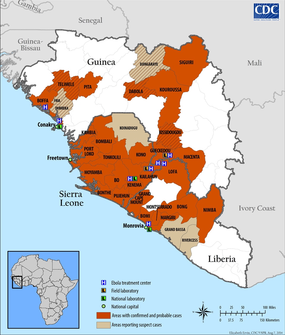


 Done -- The Anome (talk) 12:46, 24 August 2014 (UTC)
 Not done: The page's protection level and/or your user rights have changed since this request was placed. You should now be able to edit the page yourself. If you still seem to be unable to, please reopen the request with further details. -- ferret (talk) 19:38, 4 September 2014 (UTC)
 Cumulative totals of cases and deaths over time
 Not done: as you have not requested a specific change - and why only the US?
 I think it's good to have an svg image that we can easily update when new data is reported. Mikael Häggström (talk) 09:58, 7 September 2014 (UTC)
![[28]](http://2.bp.blogspot.com/-t7skIf1v8to/VA8lVQCRvLI/AAAAAAAAF6I/B1Zzi2bxWqE/s1600/Ebola%2B09.09%2B3.jpg)