
Wikipedia:Featured picture candidates/August-2008
| Featured picture tools |
|---|
Please cut and paste new entries to the bottom of this page, creating a new monthly archive (by closing date) when necessary.
Iowa and Nebraska lands[edit]

- Reason
- Period advertisement from 1872 for land sales in Iowa and Nebraska. Clear large file articulates loan terms and settlement inducements offered by a railroad that engaged in land speculation. Restored version of Image:Iowa and Nebraska lands.jpg.
- Articles this image appears in
- Burlington and Missouri River Railroad, History of Iowa, History of Nebraska
- Creator
- Burlington and Missouri River Railroad
- Support as nominator --DurovaCharge! 23:42, 25 July 2008 (UTC)
- Support. Superb.--ragesoss (talk) 01:57, 26 July 2008 (UTC)
- Support. Another good one. Dengero (talk) 02:22, 26 July 2008 (UTC)
- Support. A good quality scan and restoration of a historically informative image. NauticaShades 14:31, 26 July 2008 (UTC)
- Support —αἰτίας •discussion• 20:02, 27 July 2008 (UTC)
- Support - Like I said above, you deserve a monument. --Meldshal (§peak to me) 21:16, 27 July 2008 (UTC)
- Support as a valuable historical image. Doesn't seem to say when the offer expires... Fletcher (talk) 23:36, 27 July 2008 (UTC)
- Support Hurry up and take this down so we can buy all that land!!! :) Intothewoods29 (talk) 20:16, 28 July 2008 (UTC)
- Support Very nice scan of a historic and encyclopedic document. Cat-five - talk 08:33, 29 July 2008 (UTC)
- Support. High enc value. - Darwinek (talk) 19:06, 30 July 2008 (UTC)
Promoted Image:Iowa and Nebraska lands10.jpg MER-C 06:11, 1 August 2008 (UTC)
Vancouver, BC dusk panorama[edit]

- Reason
- A sharp, 9000 pixel wide panorama showing off the downtown buildings, bridges and stadium of Vancouver, BC at dusk against the mountain setting of the city with illuminated ski runs.
- Note this is to replace the earlier withdrawn nomination with a third and better version to reduce confusion, please re-vote.
- Articles this image appears in
- Vancouver, BC
- Creator
- Mfield, Matthew Field
- Support as nominator --Mfield (talk) 09:06, 25 July 2008 (UTC)
- Support. Absolutely stunning! Clegs (talk) 15:33, 25 July 2008 (UTC)
- Support. A beaut Trevor MacInnis (Contribs) 15:44, 25 July 2008 (UTC)
- Support. Boring composition, jpeg artifacts, blown areas....tsk tsk :D victorrocha (talk) 17:22, 25 July 2008 (UTC)
- Comment Is the link to your website necessary on the creator field ? I much see this as a form of "free" advertisement, and I believe it's not welcomed here. Blieusong (talk) 18:46, 25 July 2008 (UTC)
- It was unintentional - I had copied/pasted the creator info from the image page when i created the nom. Now what do you think of the image ;-) Mfield (talk) 04:29, 26 July 2008 (UTC)
- That's a clear support :) (I would have supported any version of it). I do like it a lot and sometimes wish I live in north America so I can try to shot similar night cityscapes. Blieusong (talk) 08:18, 26 July 2008 (UTC)
- You've taken a very impressive cityscape in Paris though. That sort of view would not be possible in almost any North American town! I'm quite jealous of you living in Paris to be honest! It is a far more photographic city than London is! Diliff | (Talk) (Contribs) 09:23, 26 July 2008 (UTC)
- Thanks for the compliment :). I agree that it must be difficult to duplicate on other cities, as the montparnasse tower (from which was taken the panorama) stands far above the surrounding buildings. I also think Paris is a wonderful city for photography and... not so far from London by eurostar :) Why not visiting us (again) some times ? Blieusong (talk) 12:35, 26 July 2008 (UTC)
- Sorry to have you remove the link by the way... I may be a little too paranoiac, but since Wikipedia is one of the most visited websites, some might be tempted to use it as an advertisement device, which is prohibited as far as I know. -- Blieusong (talk) 08:22, 26 July 2008 (UTC)
- For what it's worth, I don't think it's actually a problem. The GFDL is specifically designed to ensure that authors get credit for their work. Providing a website address for ease of contact seems a perfectly natural and permissible part of that, provided that it's a personal website of the author and relates to the work it is attached to. TSP (talk) 11:53, 26 July 2008 (UTC)
- You've taken a very impressive cityscape in Paris though. That sort of view would not be possible in almost any North American town! I'm quite jealous of you living in Paris to be honest! It is a far more photographic city than London is! Diliff | (Talk) (Contribs) 09:23, 26 July 2008 (UTC)
- That's a clear support :) (I would have supported any version of it). I do like it a lot and sometimes wish I live in north America so I can try to shot similar night cityscapes. Blieusong (talk) 08:18, 26 July 2008 (UTC)
- Support great. —αἰτίας •discussion• 20:13, 25 July 2008 (UTC)
- Support better than the ones here. --SpencerT♦C 20:37, 25 July 2008 (UTC)
- Support Outstanding Fg2 (talk) 03:46, 26 July 2008 (UTC)
- Support. Per my reasons in the previous nom. NauticaShades 14:28, 26 July 2008 (UTC)
- Support Nice work - per reasons last time (good to see you managed to get rid of the banding) --Fir0002 04:29, 27 July 2008 (UTC)
- Support - Quite the piece of work. Actually, stunning. Great job. --Meldshal (§peak to me) 21:17, 27 July 2008 (UTC)
- Weak Support because it would look better without those railings in the foreground. Picky, picky. Fletcher (talk) 23:43, 27 July 2008 (UTC)
- Support. Really great light and exposure. A pitty that you downsampled it so much :-( --Dschwen 00:11, 1 August 2008 (UTC)
Promoted Image:Vancouver dusk pano.jpg MER-C 06:11, 1 August 2008 (UTC)
I-35W Mississippi River Bridge collapse[edit]
.jpg)
_edit.jpg)
edit2.jpg)
- Reason
- Highly encyclopedic image showing a close-up of a modern disaster. This was chosen as one of the 12 most powerful photos of 2007 on ABC News online: [1]
- Articles this image appears in
- I-35W Mississippi River bridge
- Creator
- Kevin Rofidal, United States Coast Guard
- Support as nominator --howcheng {chat} 04:43, 25 July 2008 (UTC)
- Weak oppose. It's a unique and valuable image, but with due respect to the ABC News poll, neither this nor many of the other 11 photos have much going in terms of technical or aesthetic quality. I find most of the rest of the collapse-day images in the bridge article at least as compelling as this one.--ragesoss (talk) 02:06, 26 July 2008 (UTC)
- Neutral It gets the green light on encyclopedic terms, although like Ragesoss, I doubt it's technical quality even compared to the other ones. A side question, why are all the cars numbered? Dengero (talk) 02:25, 26 July 2008 (UTC)
- Support - Not the best quality, but more or less a encyclopaedic image. --Meldshal (§peak to me) 21:18, 27 July 2008 (UTC)
- Oppose because "more or less" encyclopedic doesn't quite cut it for me; I want to see a high quality image. Lighting in this image is rather drab, and while it does show the damage well, I think I'd rather see a wider perspective showing more distinguishing features of this bridge on this river. One could for example mistake this image for earthquake damage were it not captioned. Fletcher (talk) 23:48, 27 July 2008 (UTC)
- Comment Edit 1 uploaded. Papa Lima Whiskey (talk; todo) 14:04, 28 July 2008 (UTC)
- Comment Edit 2 uploaded. I don't think much more can be done for the picture. That being said, since it's in the bridge collapse article, and titled bridge collapse, I think the likelihood of it being mistaken for an earthquake is low. If is it mistaken for an an earthquake, that just underscores to me how bad the damage was. pschemp | talk 15:01, 28 July 2008 (UTC)
- Weak Oppose. A good picture with encyclopedic value, but not especially interesting in terms of technical or aesthetic quality. Kaldari (talk) 18:53, 28 July 2008 (UTC)
- Neutral Though encyclopedic, low technical quality prevents me from supporting. SpencerT♦C 20:03, 28 July 2008 (UTC)
- Oppose Busyness of the image and other issues aside as far as the best image on the subject I think this falls quite short, surely one of the collapsed bridge and the debris from that is readily available, more encyclopedic, and probably be of a good quality while more easily fulfilling encyclopedic obligation. Cat-five - talk 08:36, 29 July 2008 (UTC)
- Comment For composition, I might prefer Image:I-35W-bridge collapse-Minneapolis-20070801.jpg. Papa Lima Whiskey (talk; todo) 13:33, 29 July 2008 (UTC)
- Comment - I think for a disaster of this magnitude, there is a place for both detail shots showing the intimate horror and large general shots showing the overall view. Both what happened to the bridge on a large scale and the experiences of the people in the cars on the bridge are valid parts of the event. Saying we can only feature a picture that is an overview is limiting what can be powerful information. pschemp | talk 14:24, 29 July 2008 (UTC)
- Support I disagree with Papa lima whisky; I think this pic has much better composition (but that's just me) Intothewoods29 (talk) 16:32, 29 July 2008 (UTC)
- Oppose Has EV but not enough else. DurovaCharge! 10:03, 30 July 2008 (UTC)
Not promoted MER-C 06:12, 1 August 2008 (UTC)
Coca-Cola[edit]


- Reason
- A very good image which does a good job of showing 19th century advertising.
- Articles this image appears in
- Coca-Cola, Hilda Clark
- Creator
- The Coca-Cola Company
| Previous Votes before Restoration Work | |
|---|---|
* Support as nominator --Bewareofdog 21:32, 4 July 2008 (UTC)
Suspending pending cleanup... MER-C 06:41, 14 July 2008 (UTC) I presented this image to the Graphic Lab, and will post here when update is available. smooth0707 (talk) 17:07, 18 July 2008 (UTC)
| |
Shall we begin again, then? MER-C 04:04, 25 July 2008 (UTC)
- Support Edit 2 Although it is slightly unauthentic as edit 2 vs edit 1 removes the yellowing of the image (presumably due to age) Edit 1 is just for lack of a better word ugly due to the yellow aging tint. Great work removing the white spots btw. Cat-five - talk 04:30, 25 July 2008 (UTC)
- Thanks. I need to clarify to anyone that I have the cleaned up image with the border if anyone prefers it. I was leaving the nomination suspended to get some feedback, sorry for the extra work MER-C. User:victorrocha (talk) 05:49, 25 July 2008 (UTC)
- Support Edit 1 It looks great now. I'm not sure about edit 2, though; I'd think the LOC has their scanners pretty well calibrated, and none of us has any idea how the original looked, so correcting the white balance of a painting really is a shot in the dark, IMO. It's plausible the original painter chose a warm scheme on purpose. Thegreenj 17:17, 25 July 2008 (UTC)
- Support Edit 1 Looks more natural. Nice job on the restoration. smooth0707 (talk) 23:52, 25 July 2008 (UTC)
- Support Edit 1 --Fir0002 04:30, 27 July 2008 (UTC)
- Support Edit 1 Bewareofdog 07:20, 27 July 2008 (UTC)
- Support - I suppor the 1st edit, but this picture is intriguing. Clever, even. --Meldshal (§peak to me) 21:20, 27 July 2008 (UTC)
- Support Edit 1, but am pretty neutral between Edit 1 and 2. If Edit 1 is the more authentic we should go with that. Fletcher (talk) 23:52, 27 July 2008 (UTC)
- Support Edit 1, Oppose Edit 2. Warmer color-scheme seems natural enough. Without seeing the original messing with the white balance is inappropriate. Kaldari (talk) 18:56, 28 July 2008 (UTC)
- Support either one. Just a thought: could this go on advertising also, in the history section? It talks about advertising in the early 20th century. It could probably also go on some of the other marketing articles too... great job anyway! Intothewoods29 (talk) 16:22, 29 July 2008 (UTC)
Promoted Image:Cocacola-5cents-1900 edit1.jpg MER-C 06:12, 1 August 2008 (UTC)
Magnifying glass[edit]

- Reason
- This picture adds signifigantly to the article by showing the effect of a magnifying glass on a smaller object. This images orginates from the commons, and is already featured there.
- Articles this image appears in
- Magnifying glass
- Creator
- Heptagon (Commons user)
- Support as nominator --TomStar81 (Talk) 03:20, 24 July 2008 (UTC)
- Weak support Fascinating composition. Is it possible to get a better focus on the stamp? DurovaCharge! 03:46, 24 July 2008 (UTC)
- Comment. I don't think it's great as the lead image in magnifying glass, but would perhaps have higher EV in stamp collecting and/or philately. --jjron (talk) 08:59, 24 July 2008 (UTC)
- This could have great use at Postage stamps and postal history of Germany. SpencerT♦C 20:41, 25 July 2008 (UTC)
- Support as long as it goes on the stamp collecting or philately or postage stamp page(s), like jjron said. but it does give some value to magnifying glass by showing how one works Intothewoods29 (talk) 20:33, 24 July 2008 (UTC)
- Comment: Here is an image of the stamp in question. SpencerT♦C 20:43, 25 July 2008 (UTC)
- Oppose if I'd never seen a magnifying glass before, this image would be confusing. Nothing is seen at the same distance both without and with the magnifying glass. —Pengo 08:58, 26 July 2008 (UTC)
- How many people who have access to the internet have never seen a magnifying glass? Surely as many people who have never seen a stamp! Sabine's Sunbird talk 09:56, 27 July 2008 (UTC)
- If everyone's seen one, why does it need illustration? —Pengo 10:14, 27 July 2008 (UTC)
- Oppose. Unencyclopedic for Magnifying glass (the purported subject of the photograph, which is the magnifying glass and not the stamp, is out of focus). Spikebrennan (talk) 18:46, 27 July 2008 (UTC)
- Response. If you'll look at the reason for nomination, you'll see "This picture adds signifigantly to the article by showing the effect of a magnifying glass on a smaller object." It's not supposed to show the magnifying glass, it's supposed to show what a magnifying glass does. Clegs (talk) 18:43, 28 July 2008 (UTC)
- Reply to response. Yeah, but does it? The stamp viewed through the magnifying glass has been lifted up, so it's closer to the camera than the background stamps-- no wonder it looks bigger. The effect of the magnifying glass might be more effectively shown by depicting how it magnifies one of the stamps that's still in the sheet on the table. Spikebrennan (talk) 14:04, 29 July 2008 (UTC)
- Response. If you'll look at the reason for nomination, you'll see "This picture adds signifigantly to the article by showing the effect of a magnifying glass on a smaller object." It's not supposed to show the magnifying glass, it's supposed to show what a magnifying glass does. Clegs (talk) 18:43, 28 July 2008 (UTC)
- Oppose - Sorry, Tom, but is this really encyclopaedic? --Meldshal (§peak to me) 21:21, 27 July 2008 (UTC)
- Oppose because it's a clever image, but not a mag-nificant one. It seems to sit on the fence between being sort of encyclopedic for two different topics, but not very encyclopedic for either one. Agree with Spikebrennan's comment that the rim should be in focus for this image to be encyclopedic with respect to magnifying lens. --Fletcher (talk) 01:17, 28 July 2008 (UTC)
- Support. Very cool idea, and you pulled it off. Clegs (talk) 18:43, 28 July 2008 (UTC)
Not promoted MER-C 06:12, 1 August 2008 (UTC)
Vermont Air National Guard F-16s[edit]

- Reason
- It's a good image taken above the cloud layer below. This allows the sun to reflect off the planes in a way that shines back into the camera. The position of the planes also make the picture look good.
- Articles this image appears in
- 158th Fighter Wing
- Creator
- Senior Master Sgt. Robert Sabonis, uploaded by: ktr101
- Support as nominator --Kevin Rutherford (talk) 19:39, 28 July 2008 (UTC)
- Oppose Too noisy. SpencerT♦C 20:07, 28 July 2008 (UTC)
- Oppose. Noisy and not particularly interesting compared to some other FP planes. sorry. Intothewoods29 (talk) 22:42, 28 July 2008 (UTC)
- Oppose. It's been said. Papa Lima Whiskey (talk; todo) 23:36, 28 July 2008 (UTC)
Not promoted . --John254 02:40, 3 August 2008 (UTC)
Small White feeding on a thistle flowerhead[edit]


- Reason
- High quality image which combines enc value with some pretty nice aesthetics (IMO)
- Articles this image appears in
- Small White
- Creator
- Fir0002
- Support as nominator --Fir0002 04:23, 27 July 2008 (UTC)
- Oppose Sharpness is lacking Capital photographer (talk) 06:52, 27 July 2008 (UTC)
- Support Alt 1. A very attractive shot, and sharp enough where it counts.--ragesoss (talk) 19:53, 27 July 2008 (UTC)
- Oppose both Sorry, but DOF is too narrow. —αἰτίας •discussion• 20:01, 27 July 2008 (UTC)
- Weak support - Only because I like the edit, but I feel this will be one of your weakest candidates, Fir. --Meldshal (§peak to me) 21:13, 27 July 2008 (UTC)
- Oppose Beautiful creature, but yeah, not sharp enough. Fletcher (talk) 23:10, 27 July 2008 (UTC)
- Oppose. Cool pic, but it has some DOF issues. Clegs (talk) 16:07, 31 July 2008 (UTC)
Not promoted . --John254 02:42, 3 August 2008 (UTC)
Barrett M82[edit]


- Reason
- A training demonstration of the Barrett .50 photographed with the cartridge in the air exiting the chamber. A good demonstration of the weapon in operation and a high resolution file. As noted at peer review, none of the 105 images at Wikipedia:WikiProject Military history/Gallery depicts a female servicemember on active duty. It'd be good to remedy that shortcoming and this seems to fit the bill on technical and encyclopedic merit.
- Articles this image appears in
- Barrett M82, Hurlburt Field
- Creator
- A1C Jason Epley
- Support as nominator --DurovaCharge! 23:21, 27 July 2008 (UTC)
- Oppose Mildly uninteresting. The picture is just not compelling, and seeking something more compelling in the articles turns up nothing. --Blechnic (talk) 00:56, 28 July 2008 (UTC)
- Weak Oppose. Encyclopedically speaking, it's quite a nice image. However, the quality is lacking. The image seems to bright (or at leas the colors are washed out), very little is in focus, the background is distracting, and her back looks close to being blown. I checked with the eyedropper and there's nothing at 255-255-255, but it's getting close. NauticaShades 00:58, 28 July 2008 (UTC)
- Oppose for obscuring subject's face and too much smoke. By comparison this similar image is sharper, has a nicer background, and with a faster exposure it doesn't blur the cartridge ejecting. Fletcher (talk) 01:10, 28 July 2008 (UTC)
- Grrrr... This was the one that got the best overall responses at peer review. While I respect the responses, what's peer review for if the difference in feedback is this great? DurovaCharge! 01:19, 28 July 2008 (UTC)
- Support. I'm with this one. While the quality deteriorates at the largest sizes, I think it has enough at lower ones (although still well above the size minima). It also has sufficient "interest" and dynamic and evocative colours in my opinion, to gather my support. The background isn't to everyone's taste, but is a plus for me. Mostlyharmless (talk) 07:53, 28 July 2008 (UTC)
- Oppose Original. It's a good pic technically, but I find the background distracting, and the subject is not presented in a very interesting manner. Neutral Edit The edit dealt with most of my concerns, and the rest of my objections, while preventing a support, aren't big enough for me to oppose. Clegs (talk) 18:33, 28 July 2008 (UTC)
- Support. haha I like how it shows something happening (not just a still picture) and how you can see her reaction. I also like the background. But that's just me, and the quality is an issue for some people. Intothewoods29 (talk) 20:11, 28 July 2008 (UTC)
- Support edit 1 - I am partial to this photo, but recognized the problems others have seen in it. Here is a crop / and minor clone job that gets rid of most of the uneven lighting. I also did a selective levels adjust to bring out some detail in the dust cloud. de Bivort 22:41, 28 July 2008 (UTC)
- Unless we can verify that the lady really did have sunburn at the time, I'll oppose edit 1. Papa Lima Whiskey (talk; todo) 23:40, 28 July 2008 (UTC)
- Oppose No reason this should get fast tracked just because its a woman in the army. Almost nothing is in sharp focus due to the shutter speed and the smoke. Noodle snacks (talk) 12:27, 29 July 2008 (UTC)
- Oppose per Blechnic. Nothing particularly impressive is being demonstrated here. If a male was depicted in this picture, you wouldn't even consider nominating it. 67.174.4.2 (talk) 02:25, 30 July 2008 (UTC)
Not promoted . --John254 02:43, 3 August 2008 (UTC)
Morelia viridis[edit]


- Reason
- ...
- Articles this image appears in
none at the time of the nomination :-(Morelia viridisit's been reverted (it remains a much better image than the existing images so I left it on the talk page for someone with more involvement in the article to judge) Mfield (talk) 21:55, 2 August 2008 (UTC)- Creator
- Micha L. Rieser
- Support as nominator --Micha L. Rieser (talk) 19:49, 2 August 2008 (UTC)
- Object Since it is in no articles and thus cannot be judged as encyclopedic or non encyclopedic which unlike commons is the main thing here. Cat-five - talk 20:19, 2 August 2008 (UTC)
- Comment I just added it to Morelia viridis, as its surely a better image than the top one there was. Now I'll go and look at it further to vote. Mfield (talk) 20:56, 2 August 2008 (UTC) Followup - background far too noisy, have uploaded an edit since its a pretty subject and picture, but the blown highlights prevent me from supporting. Mfield (talk) 21:10, 2 August 2008 (UTC)
- Comment: the nominator appears to assume that "reason for nomination" and the inclusion in articles criterion are optional. They are mistaken. Not to sound too harsh (in truth I am mildly annoyed, but trying to AGF), you can't just shrug your shoulders when asked why you're nominating this - follow the procedure and WP:WIAFP please. This presents a face of a bad faith nomination, especially when the nominator is also the creator of the work - it almost sounds like you're saying "I don't care about the criteria or whether it's a good photo, I just want it to be featured because it's mine". I'm going to assume that's not the case, and you're just new here. Oppose on grounds of FPC politics. The photo is also quite noisy and has blown highlights, but that's a minor issue compared. —Vanderdecken∴ ∫ξφ 21:01, 2 August 2008 (UTC)
- Speedy Close image does not appear in any articles and still has no FP reason some hours after nom. Mfield (talk) 23:37, 2 August 2008 (UTC)
Not promoted MER-C 06:22, 3 August 2008 (UTC)
Aeshna cyanea moulting[edit]


- Reason
- Very high encylopedic value
- Articles this image appears in
- Southern Hawker
- Creator
- Bohringer
- Support as nominator --Muhammad(talk) 14:07, 27 July 2008 (UTC)
- Support. Very encylopedic, with good detail and good overall quality. Couldn't this be added to moulting? NauticaShades 14:14, 27 July 2008 (UTC)
- Comment Is there a particular reason why we're not presenting this as an animation? Papa Lima Whiskey (talk) 16:04, 27 July 2008 (UTC)
- IMO, a series like this works better than an animation because this way, a viewer can observe each image at ease, without any time constraints. Muhammad(talk) 16:37, 27 July 2008 (UTC)
- Cf. Image:Cicada molting animated-2.gif (FP). Papa Lima Whiskey (todo) 17:08, 27 July 2008 (UTC)
- Note that the frame changes significantly, so animation is likely impractical. Thegreenj 17:40, 27 July 2008 (UTC)
- It would just have to be a bit slower. I personally find the Cicada one a bit too fast anyway. And it's by no means perfectly suited for animation either - the lighting varies quite a bit between frames. And just to pre-empt a possible further question - I don't think a real time video of the event would be out of place at all, and I think it would be a better alternative. However, I don't see that as a reason to oppose this image now. Papa Lima Whiskey (talk; todo) 18:33, 27 July 2008 (UTC)
- Is someone skilled enough to put together an animation? I think the cicada has to be an animation because of the poor background, but this one doesn't have to be. I do wonder about its impact as an animation, though. --Blechnic (talk) 20:07, 27 July 2008 (UTC)
- It would just have to be a bit slower. I personally find the Cicada one a bit too fast anyway. And it's by no means perfectly suited for animation either - the lighting varies quite a bit between frames. And just to pre-empt a possible further question - I don't think a real time video of the event would be out of place at all, and I think it would be a better alternative. However, I don't see that as a reason to oppose this image now. Papa Lima Whiskey (talk; todo) 18:33, 27 July 2008 (UTC)
- Note that the frame changes significantly, so animation is likely impractical. Thegreenj 17:40, 27 July 2008 (UTC)
- Cf. Image:Cicada molting animated-2.gif (FP). Papa Lima Whiskey (todo) 17:08, 27 July 2008 (UTC)
- IMO, a series like this works better than an animation because this way, a viewer can observe each image at ease, without any time constraints. Muhammad(talk) 16:37, 27 July 2008 (UTC)
- Comment Muhammad, would you mind going back to the originals and arranging them as a 4×3 grid? Thegreenj 17:40, 27 July 2008 (UTC)
- Do you mean Image:Aeshna cyanea freshly slipped Q1.jpg? Papa Lima Whiskey (talk; todo) 18:26, 27 July 2008 (UTC)
- Oops! I thought Muhammad was the creator... But yeah, like that. Thegreenj 18:30, 27 July 2008 (UTC)
- Do you mean Image:Aeshna cyanea freshly slipped Q1.jpg? Papa Lima Whiskey (talk; todo) 18:26, 27 July 2008 (UTC)
- Support I'm in love. --Blechnic (talk) 19:24, 27 July 2008 (UTC)
- Support. Amazing! Such a dramatic transformation after it leaves its old skin.--ragesoss (talk) 19:45, 27 July 2008 (UTC)
- Support per the points mentioned by Nauticashades. Well done. —αἰτίας •discussion• 19:57, 27 July 2008 (UTC)
- Support - Not only encyclopaedic, but a quality image as well. Applause. --Meldshal (§peak to me) 21:12, 27 July 2008 (UTC)
- Support for proving life is beautiful. What gorgeous images; I'm not in favor of an animation, even were it possible here, because I much prefer viewing these frames at my own pace. Also oppose the grammar in the caption. Should be: "The exoskeleton limits growth, however, and is periodically shed in a process referred to as moulting." --Fletcher (talk) 23:05, 27 July 2008 (UTC)
- Support With preference for edit 1. Despite some frames which have poor sharpness (i think due to low light) the overal sequence is very enc. --Fir0002 00:05, 28 July 2008 (UTC)
- Support Brilliant. —Pengo 15:30, 28 July 2008 (UTC)
- Support. A lot more interesting than a lot of the bug pics that are nominated. Intothewoods29 (talk) 20:04, 28 July 2008 (UTC)
- Support I wanted to nominate it here too after having seen it on Commons' FPC. I think I would have supported any of them alone. Amazing. Blieusong (talk) 21:13, 28 July 2008 (UTC)
- Support Don't think I can say anything that hasn't been exclaimed above but I believe brilliant sums it up very well, very encyclopedic, very good shot(s). Cat-five - talk 08:30, 29 July 2008 (UTC)
- Support Edit 1 - Each photo is capable of being a Featured pic. Superbly done. And good job to fir on Sharping. --66.36.137.22 (talk) 20:38, 1 August 2008 (UTC)
- Comment Is there any video of the same process? --69.127.161.198 (talk) 03:01, 2 August 2008 (UTC)
Promoted Image:Aeshna cyanea freshly slipped L2.jpg MER-C 06:25, 3 August 2008 (UTC)
Anatomy Lesson of Dr. Nicolaes Tulp[edit]


- Reason
- Our featured picture collection deserves at least one Rembrandt. Offering one of his better known early works, which is famous enough to have its own article, in the best quality digital file I could locate. Also useful at History of medicine.
- Articles this image appears in
- Creator
- Rembrandt van Rijn
- Support as nominator --DurovaCharge! 23:37, 26 July 2008 (UTC)
- Comment. The figures around the dead man seem very pale. Maybe someone here has seen the original painting recently, and would be able to comment? Papa Lima Whiskey (talk) 01:57, 27 July 2008 (UTC)
- This image comes from the National Library of the Netherlands and originates from The Hague. Although I can't comment on the color balance, it was the most reliable source archive I could locate. DurovaCharge! 02:45, 27 July 2008 (UTC)
- Yes, it's certainly better quality than the alternate image here on Wikipedia. Support. -- Grandpafootsoldier (talk) 03:38, 27 July 2008 (UTC)
- This image comes from the National Library of the Netherlands and originates from The Hague. Although I can't comment on the color balance, it was the most reliable source archive I could locate. DurovaCharge! 02:45, 27 July 2008 (UTC)
- Support - Very nice painting, very helpful to wikipedia; --vineeth (talk) 07:27, 27 July 2008 (UTC)
- Support. A good quality digital version of a great painting (I love the facial expressions!). NauticaShades 14:11, 27 July 2008 (UTC)
- Support like Nautica, I like the xpressions. Muhammad(talk) 18:50, 27 July 2008 (UTC)
- Support —αἰτίας •discussion• 20:02, 27 July 2008 (UTC)
- Support - How many FP's can you get Durova? I think you deserve a monument. --Meldshal (§peak to me) 21:15, 27 July 2008 (UTC)
- Support and I also love their expressions. The guy in the background looks a little freaked out, like he's wondering, "hey, did you read the manual first!" Fletcher (talk) 23:24, 27 July 2008 (UTC)
- Support: added to Aris Kindt, the poor guy being dissected.... --Pete Tillman (talk) 03:30, 28 July 2008 (UTC)
- Support Fine image, great restoration. SpencerT♦C 19:52, 28 July 2008 (UTC)
- Support. Hey Pete, I'm no expert, but I think the guy's dead. :) Intothewoods29 (talk) 19:52, 28 July 2008 (UTC)
- No, he's just resting. Cheers, Pete Tillman (talk) 17:58, 3 August 2008 (UTC)
- Support Fine image! Masterpiece2000 (talk) 09:18, 29 July 2008 (UTC)
Promoted Image:The Anatomy Lesson.jpg MER-C 06:26, 3 August 2008 (UTC)
Harper's Ferry, 1862[edit]

- Reason
- An original Union Army manuscript map of the army positions for the Battle of Harper's Ferry, September 14-15, 1862. Restored version of Image:Attack on Harper's Ferry.jpg.
- Articles this image appears in
- Battle of Harpers Ferry, Robert Knox Sneden
- Creator
- Robert Knox Sneden
- Support as nominator --DurovaCharge! 18:31, 22 July 2008 (UTC)
- Comment. I think this image should be either more cropped or less. The map was pasted into a diary, and the same handwriting as the purple caption is present in the borders that were cropped out. Was Robert Knox Sneden the creator of the map, or did he just collect and annotate it? If the latter, it might be better to crop to the black lines. If the former (which it looks like from the hand), I think more the page should be kept, including the different top caption, the page number, and the cross-reference. There should also be a link to whatever is on page 1072, if at all possible.--ragesoss (talk) 19:05, 22 July 2008 (UTC)
- Sigh, I was a little concerned that someone might head in that direction, but expected I'd have time to create Robert Knox Sneden and didn't anticipate a comment so soon that went so far. Private Sneden organized his diary after the war. It is over 5000 pages long, more than 4500 of which are text. I have located digitizations for most of the illustrations but for none of text pages, and to the best of my knowledge the principal text has never been published. He was a mapmaker for the Union Army. There are several ways an image such as this one could be restored and my intention is to get as close as possible to the appearance of the document when it was newly created. My hope is that for a moment the viewer of this image can imagine himself or herself in the uniform of a Union colonel, holding the field map in hand, and comparing it to the campfires from the enemy army on the other hill. That is why I cropped its proportions very close to the original paper dimensions and discarded the later diary notes that added very little direct value to the image (just a page reference and a rephrasing of the caption). Your suggestions would be very appropriate if this FPC called Diary of an American Civil War soldier, but that image would appear at different articles and I would probably select a different page for that. DurovaCharge! 19:33, 22 July 2008 (UTC)
- The cross references makes it seem like page 1072 is another image, but if it's just text then that's that. A bit more context would be helpful on the description page. I think the bottom caption should be cropped or cloned out if you want it to be close to the original map, since it looks like that caption was added after the map was originally created (but maybe before it went into the diary). This is just my suggestion, but if you feel strongly about that I don't think it's a huge problem.--ragesoss (talk) 20:02, 22 July 2008 (UTC)
- Sigh, I was a little concerned that someone might head in that direction, but expected I'd have time to create Robert Knox Sneden and didn't anticipate a comment so soon that went so far. Private Sneden organized his diary after the war. It is over 5000 pages long, more than 4500 of which are text. I have located digitizations for most of the illustrations but for none of text pages, and to the best of my knowledge the principal text has never been published. He was a mapmaker for the Union Army. There are several ways an image such as this one could be restored and my intention is to get as close as possible to the appearance of the document when it was newly created. My hope is that for a moment the viewer of this image can imagine himself or herself in the uniform of a Union colonel, holding the field map in hand, and comparing it to the campfires from the enemy army on the other hill. That is why I cropped its proportions very close to the original paper dimensions and discarded the later diary notes that added very little direct value to the image (just a page reference and a rephrasing of the caption). Your suggestions would be very appropriate if this FPC called Diary of an American Civil War soldier, but that image would appear at different articles and I would probably select a different page for that. DurovaCharge! 19:33, 22 July 2008 (UTC)
- Support. We seem to have scared everyone off. When I look at it again, the map itself is just too good an image not to support, regardless of the context issues discussed above.--ragesoss (talk) 19:50, 27 July 2008 (UTC)--ragesoss (talk) 19:50, 27 July 2008 (UTC)
- Support - Very encyclopaedic, good job. --Meldshal (§peak to me) 21:23, 27 July 2008 (UTC)
- Support - Too good not to pass. =) Shoemaker's Holiday (talk) 15:50, 31 July 2008 (UTC)
- Support per ragesoss. Mostlyharmless (talk) 12:05, 1 August 2008 (UTC)
Promoted Image:Attack on Harper's Ferrypass5.jpg MER-C 06:28, 3 August 2008 (UTC)
American Tree Sparrow[edit]


- Reason
- The image is high quality, encyclopedic, and informative. It is already a Featured Picture on the German Wikipedia. And, well, it's cute.
- Articles this image appears in
- American Tree Sparrow, List of Kansas birds, List of New Jersey birds, List of Iowa birds
- Creator
- Mdf
- Support as nominator --NauticaShades 03:12, 22 July 2008 (UTC)
Support!vote updated I think the DOF and size are just about sufficient, otherwise it's perfect! Papa Lima Whiskey (talk) 03:22, 22 July 2008 (UTC)- Support nice, excellent lighting and very enc. Mfield (talk) 04:02, 22 July 2008 (UTC)
SupportVery strong oppose to either edit--ruined a lovely picture, one of my favorites of all the FPN lately. All the usual, but it's also cute as all. --Blechnic (talk) 05:50, 22 July 2008 (UTC)- Does the strike-through mean you've withdrawn your support from the original? NauticaShades 15:58, 24 July 2008 (UTC)
- I strongly support the original only, repeat: no support for edits. No, I love the original, it is gorgeous, and enlarged it includes lovely soft belly feathers of the bird. God alone (pick your deity) knows why anyone wants to ruin a gorgeous picture, though, and I don't want any mistakes made that include anyone thinking I support crapping up this fine image of an American tree sparrow. What a waste to readers who could come and get a lovely image to have it replaced with so something much lesser. --Blechnic (talk) 19:44, 24 July 2008 (UTC)
- Does the strike-through mean you've withdrawn your support from the original? NauticaShades 15:58, 24 July 2008 (UTC)
- Support excellent detail. — BRIAN0918 • 2008-07-22 13:12Z
- Support good choice. Intothewoods29 (talk) 17:11, 22 July 2008 (UTC)
- Support well done. —αἰτίας •discussion• 19:46, 22 July 2008 (UTC)
- Support Edit 1 Per above - surprised now one pointed out/fixed noise before me... --Fir0002 12:11, 23 July 2008 (UTC)
- Oh look I can be childish too - strong oppose original due to noise which completely ruins it! Come on guys you're being silly about the noise - it's failing criteria no.1 of WIAFP and you're happy to leave it in that rut?! --Fir0002 04:36, 27 July 2008 (UTC)
- If an otherwise encyclopedic and gorgeous image is noisy and correcting the noise appears to mean ruining the picture by taking away part of the detail, part of what makes it gorgeous, then I am not being childish to reject it. And consider that temper tantrum in bold italics the equivalent of WP:NPA. --Blechnic (talk) 05:50, 27 July 2008 (UTC)
- Take it easy buddy - if you have a problem with the NR removing detail then say so, but at least refrain from "crapping up this fine image" "What a waste to readers" "God alone (pick your deity) knows why anyone wants to ruin a gorgeous picture". I don't want to single you out but you are acting a little unrationally here to say the least. Btw just checking you realize I've revised my edit twice now to overcome concerns about feather detail and now the bird is essentially untouched (appart from chromatic noise reduction in the belly which doesn't lose detail) --Fir0002 12:43, 27 July 2008 (UTC)
- Taket is easy pal! Please, take it easy! Slow down! Catch your breath. At work we call Wikipedia's Featured Pictures our "What not to do," to reflect that fact that most of the images that have any scientific value could not be used in scientific articles anywhere but on Wikipedia because of the type of photoshopping (whatever your software) done on the images. The eager race to get their first and edit nature out of the images, change nature in the images, and promote the unnatural when perfectly good images are nominated is annoying, but the the results that leave usable scientific images as worthless are more than annoying, they detract from Wikipedia's value overall. So, take it easy on that editing software buddy. Relax the next time you see an image and consider first its scientific value by, for example, looking at the feathers as part of the bird first. Have I accounted for your mood well enough? And as accurately as you surely pinpointed mine? Did it enhance my post to ascertain your mood at the moment you read my post before launching forth? --Blechnic (talk) 19:13, 27 July 2008 (UTC)
- Oh, back to the images, now that we've dealt with each others' feelings, so important and transparent in Wikiworld. Edit 1 is okay. I don't see the need for it, but the bird looks the same blown up on my standard monitor, but not sure about viewed on my imaging system. Still, this last point does not matter to me for FP as the image is for a general audience. --Blechnic (talk) 19:19, 27 July 2008 (UTC)
- A few things: Human eyes see without digital color noise and therefor its removal (which as fir said leaves no artifacts) is more "natural". Secondly, photos here, I'm sure, have been used for scientific applications as much as is practical. I have a summer internship at the Harvard University Molecular and Cellular biology labs and a large part of what I am doing involves image capture and editing of mouse ES cells on Nikon Microscopes costing upwards of $200,000. I also set up a studio in a bio-safety level 3 underground facility for taking pictures (for publication) of animals. Without a doubt the editing I have done on the two dozen images of chimeric mice was more extensive than this. That is my (limited) experience with imaging in a scientific setting and I think the editing is necessary. Sorry, what's your experience? -Fcb981(talk:contribs) 03:18, 28 July 2008 (UTC)
- Well, that argument fails, because those algorithms do not remove noise in the same way the human eye does (fact number 1: the human brain compensates for natural noise inherent in the architecture of the human eye; fact number 2: the normal human brain is capable of compensating for digital noise, too). Anyway, my popcorn's run out, and I'm hoping not to have to go back to the microwave. Papa Lima Whiskey (talk; todo) 16:53, 28 July 2008 (UTC)
- Fact no. 3 wait another year or two and a DSLR will be able take the same photo (same lighting/settings) with zero noise - aka the same way you get with NR. Noise is a deficiency of a camera, one which manufacturers strive to minimize. Leaving noise like that in an image is a cardinal sin to a photographer. --Fir0002 22:39, 28 July 2008 (UTC)
- I don't know how your comment addresses anything I've said. Papa Lima Whiskey (talk; todo) 17:25, 29 July 2008 (UTC)
- It's quite simple - don't treat the noise in this image as an inherent part of this scene. The noise is not a natural part of it, it is there because the camera was unable to do a better job at capturing the image. Hence your "fact" 2 is wrong - the human eye is not going to magically edit out the noise in this image (obviously since we can see it) to create what it would see if it where the camera because the noise was not in the original scene but was generated by the camera. --Fir0002 10:35, 30 July 2008 (UTC)
- I don't know how your comment addresses anything I've said. Papa Lima Whiskey (talk; todo) 17:25, 29 July 2008 (UTC)
- Fact no. 3 wait another year or two and a DSLR will be able take the same photo (same lighting/settings) with zero noise - aka the same way you get with NR. Noise is a deficiency of a camera, one which manufacturers strive to minimize. Leaving noise like that in an image is a cardinal sin to a photographer. --Fir0002 22:39, 28 July 2008 (UTC)
- Well, that argument fails, because those algorithms do not remove noise in the same way the human eye does (fact number 1: the human brain compensates for natural noise inherent in the architecture of the human eye; fact number 2: the normal human brain is capable of compensating for digital noise, too). Anyway, my popcorn's run out, and I'm hoping not to have to go back to the microwave. Papa Lima Whiskey (talk; todo) 16:53, 28 July 2008 (UTC)
- A few things: Human eyes see without digital color noise and therefor its removal (which as fir said leaves no artifacts) is more "natural". Secondly, photos here, I'm sure, have been used for scientific applications as much as is practical. I have a summer internship at the Harvard University Molecular and Cellular biology labs and a large part of what I am doing involves image capture and editing of mouse ES cells on Nikon Microscopes costing upwards of $200,000. I also set up a studio in a bio-safety level 3 underground facility for taking pictures (for publication) of animals. Without a doubt the editing I have done on the two dozen images of chimeric mice was more extensive than this. That is my (limited) experience with imaging in a scientific setting and I think the editing is necessary. Sorry, what's your experience? -Fcb981(talk:contribs) 03:18, 28 July 2008 (UTC)
- Oh, back to the images, now that we've dealt with each others' feelings, so important and transparent in Wikiworld. Edit 1 is okay. I don't see the need for it, but the bird looks the same blown up on my standard monitor, but not sure about viewed on my imaging system. Still, this last point does not matter to me for FP as the image is for a general audience. --Blechnic (talk) 19:19, 27 July 2008 (UTC)
- Taket is easy pal! Please, take it easy! Slow down! Catch your breath. At work we call Wikipedia's Featured Pictures our "What not to do," to reflect that fact that most of the images that have any scientific value could not be used in scientific articles anywhere but on Wikipedia because of the type of photoshopping (whatever your software) done on the images. The eager race to get their first and edit nature out of the images, change nature in the images, and promote the unnatural when perfectly good images are nominated is annoying, but the the results that leave usable scientific images as worthless are more than annoying, they detract from Wikipedia's value overall. So, take it easy on that editing software buddy. Relax the next time you see an image and consider first its scientific value by, for example, looking at the feathers as part of the bird first. Have I accounted for your mood well enough? And as accurately as you surely pinpointed mine? Did it enhance my post to ascertain your mood at the moment you read my post before launching forth? --Blechnic (talk) 19:13, 27 July 2008 (UTC)
- Take it easy buddy - if you have a problem with the NR removing detail then say so, but at least refrain from "crapping up this fine image" "What a waste to readers" "God alone (pick your deity) knows why anyone wants to ruin a gorgeous picture". I don't want to single you out but you are acting a little unrationally here to say the least. Btw just checking you realize I've revised my edit twice now to overcome concerns about feather detail and now the bird is essentially untouched (appart from chromatic noise reduction in the belly which doesn't lose detail) --Fir0002 12:43, 27 July 2008 (UTC)
- If an otherwise encyclopedic and gorgeous image is noisy and correcting the noise appears to mean ruining the picture by taking away part of the detail, part of what makes it gorgeous, then I am not being childish to reject it. And consider that temper tantrum in bold italics the equivalent of WP:NPA. --Blechnic (talk) 05:50, 27 July 2008 (UTC)
- Oh look I can be childish too - strong oppose original due to noise which completely ruins it! Come on guys you're being silly about the noise - it's failing criteria no.1 of WIAFP and you're happy to leave it in that rut?! --Fir0002 04:36, 27 July 2008 (UTC)
- Support Edit 2 Very good photo. But I thought a better noise reduction was needed + a touch on the colors and contrast. --Arad (talk) 15:25, 23 July 2008 (UTC)
- Support Edit 2 Edit 1+Original not enough lighting in my opinion. TALKIN PIE EATER REVIEW ME 16:44, 23 July 2008 (UTC)
- oppose - this bird is fat. —Preceding unsigned comment added by Hairyholebutt (talk • contribs) 17:39, 23 July 2008
- Support original, oppose edits 1 and 2. I think the noise is acceptable; the edits are losing detail on the belly of the bird. Papa Lima Whiskey (talk) 18:04, 23 July 2008 (UTC)(UTC)
- Comment - The belly of the bird was 90% noise. I thought that too, that we are losing detail. However this is not true, we're loosing noise. There is actually barely any detail on the belly. I agree however that it's now soft. Which is another point. And is an acceptable one. --Arad (talk) 20:26, 23 July 2008 (UTC)
- Nah. To my eyes, the edits do create an unnatural edge between the belly and the rest of the feathers. I can't convince myself that that's what we should be aiming for, regardless what we believe about how much of the belly is noise. Papa Lima Whiskey (talk) 21:47, 23 July 2008 (UTC)
- I'd say good eye, Papa Lima Whiskey, but it's so obvious I can't understand why no one else sees it. The edits create a horrid "unnatural edge between the belly and the rest of the feathers," and lose all of the detail of the belly feathers of the original. It's awful. --Blechnic (talk) 04:13, 24 July 2008 (UTC)
- Support original Very sparrow-like. The edits look strange with the high contrast around the eyes and the glow in edit 2. Narayanese (talk) 06:45, 24 July 2008 (UTC)
- Comment I've redone my edit with more careful masking which should allay people's concerns - and frankly it would be plain stupid IMO to promote an image with easily fixable noise issues!! --Fir0002 09:43, 24 July 2008 (UTC)
- Better, but still blurring the edges of the bird. Papa Lima Whiskey (talk) 09:59, 24 July 2008 (UTC)
- Ok I've done another edit - hopefully the last --Fir0002 04:36, 27 July 2008 (UTC)
- It's still pinching the tuft of feathers on his right foot. Well, I've said that the noise seems a minor issue to me, so I'll stick with my !vote. Papa Lima Whiskey (talk; todo) 16:48, 28 July 2008 (UTC)
- I assume you mean the claw? The claw is slightly affected but it's so minor I can't believe you'd bring it up... Fixed anyway, but I assume at least you no longer oppose edit 1? --Fir0002 10:43, 30 July 2008 (UTC)
- Actually, foot is the more widely used term, and used throughout biology. Cf. Image:Birdmorphology.svg Papa Lima Whiskey (talk) 10:21, 10 August 2008 (UTC)
- I assume you mean the claw? The claw is slightly affected but it's so minor I can't believe you'd bring it up... Fixed anyway, but I assume at least you no longer oppose edit 1? --Fir0002 10:43, 30 July 2008 (UTC)
- It's still pinching the tuft of feathers on his right foot. Well, I've said that the noise seems a minor issue to me, so I'll stick with my !vote. Papa Lima Whiskey (talk; todo) 16:48, 28 July 2008 (UTC)
- Ok I've done another edit - hopefully the last --Fir0002 04:36, 27 July 2008 (UTC)
- Better, but still blurring the edges of the bird. Papa Lima Whiskey (talk) 09:59, 24 July 2008 (UTC)
- Support Original Oppose Edits I'd rather a bit of noise than zero noise and lost detail. Noodle snacks (talk) 11:17, 26 July 2008 (UTC)
- Support - I like the original much better. --Meldshal (§peak to me) 21:10, 27 July 2008 (UTC)
- Geez, what am I doing oppose all. Yes its an MDF, but sorry, an 1 Megapixel image?! You've got to be kiddding me. And I gotta give Fir this much credit, the noise and artifacting is pretty bad. All in all it is just an oversharpened bird shot. We've had way better. --Dschwen 03:26, 28 July 2008 (UTC)
- I'm glad you agree with the noise issue but I have to say it's frustrating to now see that your original vote seemed to be a knee-jerk one... --Fir0002 07:41, 28 July 2008 (UTC)
- Is this constructive? --Dschwen 12:11, 28 July 2008 (UTC)
- Well hopefully a gentle slap on the wrist now will encourage you to give edits a fair chance in the future... --Fir0002 22:41, 28 July 2008 (UTC)
- Wow! Talk about AGF. I'm really sorry that the edit bussiness is an obvious source of frustration for you here. If slapping me makes you feel better go ahead. But be aware it makes you look slightly condescending. After all I have quickly corrected my mistake... --Dschwen 22:54, 28 July 2008 (UTC)
- Well hopefully a gentle slap on the wrist now will encourage you to give edits a fair chance in the future... --Fir0002 22:41, 28 July 2008 (UTC)
- Is this constructive? --Dschwen 12:11, 28 July 2008 (UTC)
- I'm glad you agree with the noise issue but I have to say it's frustrating to now see that your original vote seemed to be a knee-jerk one... --Fir0002 07:41, 28 July 2008 (UTC)
- Weak Support edit 2 Though I do agree with Papa Lima Whiskey. SpencerT♦C 19:56, 28 July 2008 (UTC)
- Support Edit 1 and original, Oppose other To much background contrast in Edit 2 --Base64 (talk) 01:08, 31 July 2008 (UTC)
- UPDATE EDIT 2 - I remade the edit. Like Fir's Edit, the belly is untouched. However more background noise was removed and the contrast corrected. --Arad (talk) 16:27, 1 August 2008 (UTC)
- Suggestion - I think it's better to put this nomination on hold until we get a clear consensus. --Arad (talk) 17:04, 1 August 2008 (UTC)
No consensus Trainwreck, original too noisy. MER-C 06:49, 3 August 2008 (UTC)
BP Bridge[edit]

- Reason
- It is a great, high-resolution image of an aesthetically interesting bridge as seen from a rare angle.
- Articles this image appears in
- BP Pedestrian Bridge
- Creator
- Torsodog
- Support as nominator ----TorsodogTalk 22:25, 30 July 2008 (UTC)
- Oppose No wow, even technically not very good, overall nothing special. —αἰτίας •discussion• 22:47, 30 July 2008 (UTC)
- Oppose the bridge is really nice, and could possibly be a FP by itself, but there's just too much going on in the shot. plus part of the bridge is obscured by trees. Intothewoods29 (talk) 23:01, 30 July 2008 (UTC)
- Comment If you cropped about the top third or top fourth of the image, you'd improve composition a lot - this would also improve quality, as that part is out of focus. However, the tree cutting off part of the bridge is problematic - maybe try in winter or spring, when less foliage? Shoemaker's Holiday (talk) 15:59, 31 July 2008 (UTC)
- Oppose Very snapshotty. Clegs (talk) 16:03, 31 July 2008 (UTC)
Not promoted . --John254 03:32, 4 August 2008 (UTC)
TCD Campanile[edit]
.jpg)
- Reason
- Trinity College Dublin Campanile is one of the most prominent tourist attractions in Dublin and nominated picture illustrates that landmark magnificently fulfilling all the necessary technical criteria of FP (i.e. licence, size etc).
- Articles this image appears in
- Trinity College Dublin
- Creator
- Niaz
- Support as nominator --Niaz(Talk • Contribs) 21:11, 29 July 2008 (UTC)
- Oppose it fails to show either the complete campanile or the statue, plus the building is suffering from extreme perspective distortion which is undesirable in an encyclopedic architectural shot. Mfield (talk) 21:43, 29 July 2008 (UTC)
- Oppose It really doesn't contribute anything to the article; no where else in the article does it mention the campanile or Salmon, and the pic itself has been inserted into a section that has nothing to do with the picture. It is a nice pic of a building on campus, but that's about it. the perspective problems and the cropped building also detract from its EV, per Mfield's comment. sorry. Intothewoods29 (talk) 22:19, 29 July 2008 (UTC)
Not promoted MER-C 12:29, 6 August 2008 (UTC)
Sword dance[edit]


- Reason
- Another early twentieth century archival photo: a military sword dance in celebration of an Ottoman victory during World War I. Unfortunately no data available on exact date or location, but a fascinating cultural document with an attractive composition. Restored version of Image:Men dancing with swords.jpg.
- Articles this image appears in
- Sword dance
- Creator
- American Colony (Jerusalem)
- Support as nominator --DurovaCharge! 21:47, 28 July 2008 (UTC)
- Support A great image which meets the criteria. The encyclopedic value seems huge. Nick Dowling (talk) 11:21, 29 July 2008 (UTC)
- Weak Support. The angle is kind of akward, and the sword dance is blurry (but that's understandable; they're moving!), and that detracts from its EV, but it's the best illustration of a sword dance on the page, and the quality is good. What sells it are the expressions on the onlookers' faces. Intothewoods29 (talk) 16:02, 29 July 2008 (UTC)
- Support Shoemaker's Holiday (talk) 05:55, 30 July 2008 (UTC)
- Oppose for being overexposed, grainy, and not very sharp. We can forgive technical flaws of historical images if they are super-encyclopedic, but I think this is only moderately encyclopedic. Sword dancing does not appear to be an extinct practice, so I expect a good photographer with a modern camera could take an amazing picture. Fletcher (talk) 22:58, 30 July 2008 (UTC)
- Oppose. A valuable and interesting image, but the quality is not quite there in my view.--ragesoss (talk) 16:09, 31 July 2008 (UTC)
- Support Edit 1 - The quality is now decent and the image still has a very high value. --Arad (talk) 16:53, 1 August 2008 (UTC)
- Oppose It's too hard to see the actual dance that's going on here. This image of a Bedouin woman dancing with a sword is far more compelling visually and would be much more helpful to readers of the article. I'm starting to restore it, then I'll upload it. Calliopejen1 (talk) 20:00, 2 August 2008 (UTC)
- I've put my alternate image to the right. I think this would be a much better lead image, because you can actually see the person dancing with the sword. It's also a really interesting cultural document in its own right--this isn't the stereotypical image of a Middle Eastern woman. Calliopejen1 (talk) 22:12, 2 August 2008 (UTC)
-
- This one is faar more special with the WWI setting. Just my 2 cents --66.36.134.61 (talk) 04:36, 5 August 2008 (UTC)
- Oppose, but Support the new one! --Blechnic (talk) 06:43, 3 August 2008 (UTC)
- Oppose. Angle helps to get a good view of the crowd, but also helps to obscure the action of the dance. Clegs (talk) 15:03, 5 August 2008 (UTC)
Not promoted MER-C 12:28, 6 August 2008 (UTC)
Stave Hill, Rotherhithe, London - May 2008[edit]

- Reason
- A high quality panorama of Stave Hill in Rotherhithe, London, good encyclopedic value, not to mention great quality Image, taken by Diliff.
- Articles this image appears in
- Stave Hill
- Creator
- Diliff
- Support as nominator --Mifter (talk) 21:46, 28 July 2008 (UTC)
- Comment. Well, the technical quality is good, but I'm not sure its one of my most awe-inspiring photos. ;-) Certainly not one I would have voluntarily nominated, but thanks for the nod anyway Mifter! Diliff | (Talk) (Contribs) 21:50, 28 July 2008 (UTC)
- Reluctant, weak oppose The quality is really high, but it's boring... no wow at all. Intothewoods29 (talk) 22:40, 28 July 2008 (UTC)
- Oppose. In addition to what's been said about "wow", it's also low on EV. The article is a two-sentence stub without inline references. In addition, the "ecological park" doesn't seem to be fully illustrated by this picture, as I'd imagine there would be parts that aren't mown grass. I'm sure the viewing platform seemed a nice idea at the time, but we don't get a sense of whether it's popular. Looks pretty lonely (and yes, I know that having too many random strangers in a photo is one of the standard complaints here, but this particular composition is just *too* plain and might have benefited from some jolly crowds). Papa Lima Whiskey (talk; todo) 23:05, 28 July 2008 (UTC)
- Support. Hey, it's probably the best picture ever taken of Stave Hill. Why not? NauticaShades 23:05, 28 July 2008 (UTC)
- Oppose it's a good picture technically but as previously stated; not very impressive nor much encyclopedic value. --Krm500 (talk) 23:22, 28 July 2008 (UTC)
- Comment I quite like the composition. It's simple but elegant. Is it possible to get a taller view to give more perspective? --victorrocha (talk) 23:28, 28 July 2008 (UTC)
- Unfortunately not, the ground slopes away in all directions. This was about the only decent place to take the shot from. Diliff | (Talk) (Contribs) 06:32, 29 July 2008 (UTC)
- Guess climbing a tree is not an option. :D --victorrocha (talk) 08:31, 29 July 2008 (UTC)
- Not for a photo of this, it isn't.. The ends would not justify the means! Anyway, there are no trees where I took the shot from (the path connects to a road), and even if I did manage to climb those flimsy trees on the left and right sides, the symmetry would be lost. Diliff | (Talk) (Contribs) 10:12, 29 July 2008 (UTC)
- Guess climbing a tree is not an option. :D --victorrocha (talk) 08:31, 29 July 2008 (UTC)
- Unfortunately not, the ground slopes away in all directions. This was about the only decent place to take the shot from. Diliff | (Talk) (Contribs) 06:32, 29 July 2008 (UTC)
- Oppose. per Krm500 —Preceding unsigned comment added by Clegs (talk • contribs) 15:36, 30 July 2008 (UTC)
- Support - Something of a moral support. It's probably the best picture that could possibly be taken of this subject, but I agree the subject is fairly average-looking. I like the lightposts, though, and it's certainly encyclopaedic for the article it's in. Shoemaker's Holiday (talk) 15:55, 31 July 2008 (UTC)
- Support Maybe subject has little WOW, but the quality has a LOT! --Arad (talk) 19:50, 2 August 2008 (UTC)
- Weak support I really like the symmetry of the photograph and the perfect shape of the hill, but I'm not so sure about its encyclopedic value. A. Parrot (talk) 04:11, 4 August 2008 (UTC)
Not promoted MER-C 12:29, 6 August 2008 (UTC)
Normal 100 1930[edit]

- Reason
- Nice shot
- Articles this image appears in
- Stony Point railway station, Melbourne Stony Point railway line, Melbourne
- Creator
- Melbtrip
- Support as nominator --Megamelbourne (talk) 11:24, 6 August 2008 (UTC)
- Oppose, speedy close Way too small. Suggest nominators familiarize themselves with criteria before submitting... ;-) --Janke | Talk 12:08, 6 August 2008 (UTC)
Not promoted MER-C 12:33, 6 August 2008 (UTC)
Death Valley[edit]

- Reason
- A high-quality panorama. The people really give you a sense of scale.
- Articles this image appears in
- Death Valley
- Creator
- Phreakdigital
- Support as nominator --Shoemaker's Holiday (talk) 01:30, 2 August 2008 (UTC)
- Comment Gorgeous. Do you have information on which of Death Valley's sand dune fields this is? DurovaCharge! 05:38, 2 August 2008 (UTC)
- The photographer's last contribution was in 2007, so I'm afraid that we're probably not going to get more information now. =/ Shoemaker's Holiday (talk) 06:39, 2 August 2008 (UTC)
- Looks like the one near Stovepipe Wells, close to the road. I have a very similar shot that I took in 1993... --Janke | Talk 06:56, 2 August 2008 (UTC)
- Very possibly; I climbed the Stovepipe Wells dunes in 2000. And if I had to venture a guess I'd say the camera's facing west. But how different from the other Death Valley dune fields does this area really look? In an 80 mile long area lined with mountains on all sides, there's a chance of a similar sierra formation occurring somewhere else. Would it be fair to match this against reliably identified photos of Stovepipe Wells? DurovaCharge! 07:06, 2 August 2008 (UTC)
- Weak oppose If this is really Stovepipe Wells then it's relatively accessible and should be possible to photograph under better conditions. The haze itself is virtually unavoidable: partly a result of air pollution from the state's urban areas which rain almost never cleans out of this arid region, and partly a function of the conditions that create the dunes--prevailing winds carry fine particulates westward from the Sierras. (I don't have citations for any of this; quoting from memory from a trip to the park). The long and short of it is that these atmospheric conditions make sunsets and sunrises more colorful but wash out the midday sky. DurovaCharge! 08:13, 6 August 2008 (UTC)
- Very possibly; I climbed the Stovepipe Wells dunes in 2000. And if I had to venture a guess I'd say the camera's facing west. But how different from the other Death Valley dune fields does this area really look? In an 80 mile long area lined with mountains on all sides, there's a chance of a similar sierra formation occurring somewhere else. Would it be fair to match this against reliably identified photos of Stovepipe Wells? DurovaCharge! 07:06, 2 August 2008 (UTC)
- Looks like the one near Stovepipe Wells, close to the road. I have a very similar shot that I took in 1993... --Janke | Talk 06:56, 2 August 2008 (UTC)
- The photographer's last contribution was in 2007, so I'm afraid that we're probably not going to get more information now. =/ Shoemaker's Holiday (talk) 06:39, 2 August 2008 (UTC)
- Oppose Composition wise, there's too much sky and not enough dunes for the subject. Technically, there's some sky banding, the foreground bottom left is out of DOF and in general detail is smushy like too much jpeg noise reduction (i am looking at the bushes and ground, its not atmospheric like you can see on the dunes). I think this could/should be easily retaken in much higher IQ at a better time of day to make it FP.Mfield (talk) 21:26, 2 August 2008 (UTC)
- Support Very cool, and great quality. 216.183.234.7 (talk) 06:10, 5 August 2008 (UTC) Me again. Clegs (talk) 15:00, 5 August 2008 (UTC)
- Oppose per User:Mfield. Washed-out sky, hazy skyline. Not FP quality imo --Pete Tillman (talk) 02:10, 6 August 2008 (UTC)
- Oppose. bad stich. Undulating brightness in the sky can be reduced with a restich and applying a vignetting compensation beforehand. A reasonably new version of hugin should have no problems with that. I'd be happy to reconsider after this is fixed. --Dschwen 16:24, 6 August 2008 (UTC)
- The photographer has left Wikipedia. This is a "found" FPC, not one I was involved in. Shoemaker's Holiday (talk) 11:09, 7 August 2008 (UTC)
Not promoted . --John254 17:20, 8 August 2008 (UTC)
Reindeer sled[edit]

- Reason
- Photochrom print of a sled with reindeer. High resolution file with good composition. Restored version of Image:Archangel reindeer.jpg.
- Articles this image appears in
- Reindeer#Reindeer_husbandry
- Detroit Publishing Co.
- Support as nominator --DurovaCharge! 23:47, 1 August 2008 (UTC)
- Support. Illustrates well historic reindeer husbandry. Mostlyharmless (talk) 05:34, 3 August 2008 (UTC)
- Support per above. Intothewoods29 (talk) 18:41, 4 August 2008 (UTC)
- Support per above. Another shoo-in, imo. Durova, how many FP's do you have now? Good work, as always. Thanks, Pete Tillman (talk) 02:14, 6 August 2008 (UTC)
- Support. Papa Lima Whiskey (talk; todo) 10:15, 8 August 2008 (UTC)
Promoted Image:Archangel reindeer3.jpg --John254 13:48, 9 August 2008 (UTC)
Vernon and Irene Castle[edit]


- Reason
- One of the most important couples of twentieth century ballroom dancing: before there was Fred Astaire and Ginger Rogers, there was Vernon and Irene Castle. One measure of how well a couple dances is how close their bodies are. From the toe to the hip they practically touch. A large file with good photographic composition--it appears that the edges of the negative were painted, so I preserved that effect. Unrestored version at Image:Vernon and Irene Castle.jpg.
- Articles this image appears in
- Ballroom dance, Vernon and Irene Castle
- Creator
- Frances Benjamin Johnston
- Support as nominator --DurovaCharge! 01:02, 31 July 2008 (UTC)
- Comment The head poise of the gentleman is wrong. This flaw could be remedied by an appropriate caption. See Image:Ballroom dance exhibition.jpg or Image:2005 ballroom dance championships.JPG for what is the accepted modern standard. What's shown in the image *may* possibly have been acceptable historically (but I'm not aware of any hard evidence for that), but it misrepresents ballroom dancing today. In any case, it would require clarification imo. Papa Lima Whiskey (talk; todo) 09:15, 31 July 2008 (UTC)
- Support A marvelous photo--perhaps not the best quality, but just look at them dancing! A truly legendary couple in the history of partner dance. I would hesitate to say that anything Vernon Castle did was "wrong" or a "flaw". Different dancers have different styles, and if a master is dancing a certain way, then it is likely because it his his style rather than because it is a mistake. Different dances also have different traditional postures. The two photos you linked to are waltzes, whereas it is not entirely clear from this photo what sort of dance the Castles are doing. (Might it be a tango?) Calliopejen1 (talk) 05:56, 1 August 2008 (UTC)
- The Castles were best known for the Foxtrot. I'm not sure whether it's that or some other dance, but the foxtrot article links to a video clip of a recent competition and it appears that the male dancers do tilt their heads in a similar position at some moments. DurovaCharge! 04:01, 4 August 2008 (UTC)
- The physics of dance have been completely worked out. People in the business can tell you instantly, for example, whether a dancer has good footwork or not, and can tell you why, and, more importantly, agree with each other. The room for interpretation does not extend to technique, it is restricted to issues of timing and the size of each movement. If you're not using the physics properly, you will never achieve the look that modern judges are looking for. Foxtrot is a good guess for this picture; tango is less likely unless it is Argentine Tango, in which case, it would call into question the caption which identifies them as "ballroom dancers". Argentine Tango is not among the line-up of dances currently recognised as ballroom dances by bodies such as IDSF (see Ballroom dance for more information). In conclusion, "style" never trumps technique. If your technique is bad, your style can't be worth much. You probably need to entertain the possibility that this is not a picture of this couple actually dancing, but rather, being stationary waiting for the picture to complete. You will know this if you've ever tried to take pictures at an indoor ball, even with a modern camera. This, again, could be quite feasibly worked into the caption. Papa Lima Whiskey (talk; todo) 15:14, 8 August 2008 (UTC)
- Support original per Calliopejen. Strong oppose Edit 1 - I fail to see how less detail = better prints. Shoemaker's Holiday (talk) 13:13, 1 August 2008 (UTC)
- Support Edit 1 - I don't think we need an image that big. A down-sampled photo will do much better, both for viewing on computer and prints. --Arad (talk) 21:40, 1 August 2008 (UTC)
- Support Original per nom and Calliopejen Strong oppose Edit 1 pointless downsampling. Mfield (talk) 21:17, 2 August 2008 (UTC)
- Support Original - I totally agree with Papa Lima Whiskey that this is most likely a still posed shot. However, as an illustration of two people who were, almost a hundred years ago, ballroom dancers, in their article, I think it wouldn't matter if they were hanging from monkey bars, as the subject matter is the people, not dance technique. It's a little harder to make that argument in the history section of the Ballroom Dance article but the way it is being used there in no way implies that they are demonstrating anything specific. Instead it shows that these two people were historically important. I'd welcome a suggested better caption there from Papa Lima Whiskey. The current one certainly doesn't hold them up as examples of modern technique, and it dates them correctly and treats the photo as a portrait (it doesn't even say they are dancing) so a specific suggestion would be helpful. The only one I can think of, "Vernon and Irene Castle probably not dancing and possibly not showing modern day style in 1910" doesn't really seem to work. Not trying to be snarky here, just at a loss for what else could be said. pschemp | talk 16:52, 8 August 2008 (UTC)
- Comment All this discussion of whether their technique is "correct" strikes me as completely anachronistic. I don't know details of the history of dancesport, but the IDSF wasn't even founded until 1957 and according to Foxtrot that dance wasn't even invented until 1914. (And the Castles were the couple that popularized it!) Extreme standardization of social dance is a modern phenomenon. Calliopejen1 (talk) 18:09, 8 August 2008 (UTC)
- And I've not said anything that contradicts your most recent statements. But I'd like to avoid giving a misleading image of ballroom dancing, as might happen if we gave insufficient weight to the historic context. Papa Lima Whiskey (talk; todo) 18:32, 8 August 2008 (UTC)
- I think your concern is valid, but that in the context of their current use, the historic context is already sufficiently weighted. (Though admittedly, the history of Ballroom dance section is really quite poor to begin with.) I took a stab at that caption in the ballroom dance article, so it now reads, "Vernon and Irene Castle, early ballroom dance pioneers, c.1910-1918". Not sure what else to do. Are you worried about how it will appear in the FPC listing by itself? pschemp | talk 20:04, 8 August 2008 (UTC)
- And I've not said anything that contradicts your most recent statements. But I'd like to avoid giving a misleading image of ballroom dancing, as might happen if we gave insufficient weight to the historic context. Papa Lima Whiskey (talk; todo) 18:32, 8 August 2008 (UTC)
Promoted Image:Vernon and Irene Castle2.jpg Papa Lima Whiskey (talk) 10:03, 10 August 2008 (UTC)
Zizina labradus butterfly[edit]

- Reason
- High quality macro shot of this previously unillustrated tiny butterfly (specimen shown is about 1cm). Taken in an attractive setting perched on (or in) a rose. Compares well to other such macro FPs.
- Articles this image appears in
- Zizina labradus, List of butterflies of Tasmania
- Creator
- jjron
- Support as nominator --jjron (talk) 16:46, 2 August 2008 (UTC)
- Support It's a tad dark but the composition is superb. The colors of the flower stand out very well. The focus plane is well placed with only the outermost tip being out of focus. victorrocha (talk) 17:44, 2 August 2008 (UTC)
- Oppose But only because I think my photo has better definition and also slightly more interesting behaviour (feeding vs static). --Fir0002 00:03, 3 August 2008 (UTC)
- Interesting that you consider yours to have better definition when it's only about 2/3rds the size and mine clearly has considerably better detail on the wing scales, etc. I also notice that yours pre-dates mine as far as when it was photographed, but has only appeared on Wikipedia after I've created this nom. --jjron (talk) 12:46, 3 August 2008 (UTC)
- I meant definition in the fourth sense, in that my image has sharper details. Open the two in tabs at 100% and flick between them around the head and you'll see what I mean. Believe it or not I actually only just got a reply from the Australian museum with the ID of this butterfly last week and was planning to upload it in the near future. But yeah seeing this nom I figured it would be a good time to upload now to add to the discussion. --Fir0002 01:18, 4 August 2008 (UTC)
- As you are well aware DOF on macros like this can be quite narrow, so it depends where you are looking. Sharpness on the details around the body look pretty similar to me, as is. If I downsize mine to the size of yours, 'apparent' sharpness will become greater across more of the beast (at the loss of some of the wing detail which yours is already lacking). It also looks like you had the advantage of shooting in good sunlight allowing you to stop down more, which should have allowed you greater DOF. You're luckier than me re the IDing, and FWIW you wouldn't have had an article to upload it to. --jjron (talk) 14:27, 5 August 2008 (UTC)
- Yeah but I'm not so sure that DOF is to blame here as even the parts which are in focus aren't that sharp - what shutter speed where you shooting at? But actually no I didn't get much sunlight - the lighting is thanks to the MT-24EX! :) Fair enough on the article (and it's great you went to the effort to write it), but the article on "the blues" was in dire need of a photo... :P --Fir0002 05:37, 8 August 2008 (UTC)
- IMO if an image purporting to illustrate a particular species can't illustrate its own species' article in some way then it's usually lacking in EV. I actually looked at 'the blues' article as well, and decided against adding my photo given that Zizina are listed under Doubtful Polyommatinae. Nah, your flash may have come in handy, but I can see from the bg that you had more light than I did - I was in a semishaded spot during early twilight, and any bg beyond the flower would almost certainly have come out black. --jjron (talk) 11:14, 9 August 2008 (UTC)
- I'm not sure how reputable a source it is but this site gives a polyommatinae ID. I might check it on Monday - I think the Hargrave Andrews library at Monash has this book which that brisbane insects site cites. But I can tell you for sure that this was taken in semi-shade (shade caused by reasonably thin tree cover - from memory AE metered the scene to be -1 to -1.5 exposure. You can tell because if it was in sunlight the white flowers would have been blown white. But regardless it is of course possible that you had worse conditions. --Fir0002 01:19, 10 August 2008 (UTC)
- IMO if an image purporting to illustrate a particular species can't illustrate its own species' article in some way then it's usually lacking in EV. I actually looked at 'the blues' article as well, and decided against adding my photo given that Zizina are listed under Doubtful Polyommatinae. Nah, your flash may have come in handy, but I can see from the bg that you had more light than I did - I was in a semishaded spot during early twilight, and any bg beyond the flower would almost certainly have come out black. --jjron (talk) 11:14, 9 August 2008 (UTC)
- Yeah but I'm not so sure that DOF is to blame here as even the parts which are in focus aren't that sharp - what shutter speed where you shooting at? But actually no I didn't get much sunlight - the lighting is thanks to the MT-24EX! :) Fair enough on the article (and it's great you went to the effort to write it), but the article on "the blues" was in dire need of a photo... :P --Fir0002 05:37, 8 August 2008 (UTC)
- As you are well aware DOF on macros like this can be quite narrow, so it depends where you are looking. Sharpness on the details around the body look pretty similar to me, as is. If I downsize mine to the size of yours, 'apparent' sharpness will become greater across more of the beast (at the loss of some of the wing detail which yours is already lacking). It also looks like you had the advantage of shooting in good sunlight allowing you to stop down more, which should have allowed you greater DOF. You're luckier than me re the IDing, and FWIW you wouldn't have had an article to upload it to. --jjron (talk) 14:27, 5 August 2008 (UTC)
- I meant definition in the fourth sense, in that my image has sharper details. Open the two in tabs at 100% and flick between them around the head and you'll see what I mean. Believe it or not I actually only just got a reply from the Australian museum with the ID of this butterfly last week and was planning to upload it in the near future. But yeah seeing this nom I figured it would be a good time to upload now to add to the discussion. --Fir0002 01:18, 4 August 2008 (UTC)
- Interesting that you consider yours to have better definition when it's only about 2/3rds the size and mine clearly has considerably better detail on the wing scales, etc. I also notice that yours pre-dates mine as far as when it was photographed, but has only appeared on Wikipedia after I've created this nom. --jjron (talk) 12:46, 3 August 2008 (UTC)
- Jeezy Creezy. Those are both amazing photographs. What a dilemma! Kaldari (talk) 21:30, 6 August 2008 (UTC)
- Support. The other image currently isn't in any article, so I see no problem with promoting this excellent quality image. NauticaShades 02:03, 8 August 2008 (UTC)
- Support as Nautica. Muhammad(talk) 08:28, 8 August 2008 (UTC)
- Support. First come, first served. Papa Lima Whiskey (talk; todo) 08:27, 10 August 2008 (UTC)
Promoted Image:Zizina labradus-Butterfly-on-Rose SC,-EG-Vic,-23.2.2008.jpg --pschemp | talk 12:34, 10 August 2008 (UTC)
Snake eating a lizard near Ibor river, Cáceres (Extremadura, Spain)[edit]

- Reason
- it shows that this small snake can eat a prey with similar size. it's only focused the head of the snake and the postcranial part of the lizard because the rest doesn't contribute information about snake's diet. Scales of both animals can be seen in detail.
- Articles this image appears in
- snake
- Creator
- Mario Modesto Mata
- Support as nominator --Mario modesto (talk) 15:14, 4 August 2008 (UTC)
- Oppose. I really like the image, but the depth of field is much too shallow. NauticaShades 15:38, 4 August 2008 (UTC)
- Oppose - I don't like the fact that I can only see the front of the snake. If I could see like a diagonal view of the snake like 45 degree angle from the ground, it would be great. Pie is good (Apple is the best) 16:34, 4 August 2008 (UTC)
- Oppose Stopping down a step or two would have done so much for this picture; the halation would be greatly reduced, the DOF would be better, and the front bokeh would look much nicer (stopping down would get rid that highlighted edge in the OOF highlights). As is, the DOF is the real killer, although composition could be improved also by putting the snake's head farther to the right. You should also get an identification on the snake. Thegreenj 21:07, 4 August 2008 (UTC)
- Oppose I really can't tell who's eating who. Daniel Case (talk) 02:16, 8 August 2008 (UTC)
Not promoted . --John254 01:32, 11 August 2008 (UTC)
Still life[edit]

- Reason
- During the seventeenth century the Dutch Reformed Church forbade overtly religious subjects, so still life artists depicted moral lessons symbolically, often with a small object such as a skull or a pocket watch in an opulent scene to suggest that worldly pleasures come to an end. A high resolution file from a good source (the Dutch national library again), painted by one of the leading artists in the genre. This would be Wikipedia's first featured picture of a still life.
- Articles this image appears in
- Abraham van Beijeren
- Creator
- Abraham van Beijeren
- Support as nominator --DurovaCharge! 23:30, 3 August 2008 (UTC)
- Can someone explain the fading/banding that I've circled in the image? Is it a scanning or photographic error? NauticaShades 03:31, 4 August 2008 (UTC)
- Oppose They're terrible JPG artifacts. --Janke | Talk 12:30, 4 August 2008 (UTC)
- Withdraw nomination - Drat, you're right. After the Vermeer and the Rembrandt I thought this was a good archive to use again. Off to dig through more archives... DurovaCharge! 14:54, 4 August 2008 (UTC)
- Comment: There is a typo in the file name. It should only have two l's, not three. Rmhermen (talk) 15:43, 5 August 2008 (UTC)
Not promoted . --John254 01:33, 11 August 2008 (UTC)
F-15 71st Fighter Squadron[edit]

- Reason
- This high-res pic shows great details of the aircraft in flight.
- Articles this image appears in
- F-15 Eagle, 71st Fighter Squadron
- Creator
- U.S. Air Force photo/Staff Sgt. Samuel Rogers
- Support as nominator --Trevor MacInnis (Contribs) 16:05, 5 August 2008 (UTC)
- Comment. Could someone attempt a noise removal edit of this? It might help substantially. NauticaShades 15:54, 6 August 2008 (UTC)
- Oppose for being noisy —Preceding unsigned comment added by Intothewoods29 (talk • contribs) 18:29, 6 August 2008 (UTC)
- Oppose. Compression artifacts, and the subject is underexposed.--ragesoss (talk) 02:30, 10 August 2008 (UTC)
Not promoted . --John254 01:35, 11 August 2008 (UTC)
Red-bellied Woodpecker[edit]

- Reason
- Beautiful specimen, stunning image, high resolution, great detail.
- Articles this image appears in
- List of New Jersey birds, Red-bellied Woodpecker
- Creator
- Ken Thomas
- Support as nominator --ZeWrestler Talk 03:30, 6 August 2008 (UTC)
- Oppose. Noticeable compression artifacts, e.g., on the bill and the tree bark.--ragesoss (talk) 05:41, 6 August 2008 (UTC)
- Oppose. Distracting background/composition, and artifacts. NauticaShades 15:59, 6 August 2008 (UTC)
- Oppose per the points mentioned by Nauticashades. —αἰτίας •discussion• 19:53, 6 August 2008 (UTC)
- Oppose Very noticeable compression artifacts and a distracting background. – LATICS talk 03:37, 8 August 2008 (UTC)
- Weak oppose. Background is fine, compression artefacts are the problem. Papa Lima Whiskey (talk; todo) 20:42, 8 August 2008 (UTC)
- Oppose This is a really good image otherwise, but I think the compression artifacts all over the image really do mar it at full size. vlad§inger tlk 22:54, 8 August 2008 (UTC)
Not promoted . --John254 01:36, 11 August 2008 (UTC)
Regiment from Petrograd[edit]

- Reason
- World War I is of interest at FPC today so let's consider what would become the first FP of the Eastern Front. (Don't worry; we're not countering too much systemic bias--they weren't Bolsheviks). Restored file per upload notes.
- Articles this image appears in
- Women's Battalion
- Creator
- unknown
- Support as nominator --DurovaCharge! 09:40, 30 July 2008 (UTC)
I agree, it could do with a better, more explanatory caption. -- Grandpafootsoldier (talk) 18:08, 30 July 2008 (UTC)
- Okay, I'll draft something. :) It seemed like at least a couple of voters were actively hostile to the idea of having an FP on female active duty personnel. This find was serendipity while I was looking for potential FPC restorations on Russian history. DurovaCharge! 18:31, 30 July 2008 (UTC)
- Are you referring to this? All of the opposers in that nomination (myself included) voted on quality grounds. I didn't sense any hostility. NauticaShades 23:13, 30 July 2008 (UTC)
- Someone showed up on a single shot IP for the express purpose of accusing me of gender bias. DurovaCharge! 01:11, 31 July 2008 (UTC)
- Of course, that person doesn't get counted as a voter.... Fletcher (talk) 02:28, 31 July 2008 (UTC)
- Well I've updated the caption; hope it's acceptable now. DurovaCharge! 03:08, 31 July 2008 (UTC)
- So this is definitely the women's battalion? Fletcher (talk)`
- There are enough women in uniform that it seems likely. Still, the caption does not relate to what is happening in the image, and it's hard to grasp what is going on in the image that relates to the caption. Are they resting after? Doesn't look like it. Is this just a picture of the group known for this, and this image unrelated? --Blechnic (talk) 05:37, 31 July 2008 (UTC)
- Yes, this is a photograph taken in late February of the following year. Imagery of the Russian female World War I units isn't easy to locate in English language archives, and I haven't had much luck getting assistance from the Russian editors regarding this. As you might suppose from my username, I've had my eye out for this kind of thing for years. DurovaCharge! 05:51, 31 July 2008 (UTC)
- Oppose I think it's a great picture, but the image itself is not compelling, and the caption is entirely unrelated to what is happening in the image. --Blechnic (talk) 08:31, 1 August 2008 (UTC)
- Reading the discussion with Papa Lima Whiskey I see his issue (and from a comment he made on my talk page, and rethinking the image). I think it's an excellent image, but I don't think it shows anything compelling. If this is the first FP of the Eastern Front, it ought to be a battle scene or a refugee scene or the women in action or something. But I don't find anything compellingly encyclopedic about a group of soldiers drinking coffee and posing for photographs in between battles. Better caption for the image, though: what's going on, plus related the unit historically. --Blechnic (talk) 20:36, 1 August 2008 (UTC)
- Yes, this is a photograph taken in late February of the following year. Imagery of the Russian female World War I units isn't easy to locate in English language archives, and I haven't had much luck getting assistance from the Russian editors regarding this. As you might suppose from my username, I've had my eye out for this kind of thing for years. DurovaCharge! 05:51, 31 July 2008 (UTC)
- There are enough women in uniform that it seems likely. Still, the caption does not relate to what is happening in the image, and it's hard to grasp what is going on in the image that relates to the caption. Are they resting after? Doesn't look like it. Is this just a picture of the group known for this, and this image unrelated? --Blechnic (talk) 05:37, 31 July 2008 (UTC)
- So this is definitely the women's battalion? Fletcher (talk)`
- Well I've updated the caption; hope it's acceptable now. DurovaCharge! 03:08, 31 July 2008 (UTC)
- Of course, that person doesn't get counted as a voter.... Fletcher (talk) 02:28, 31 July 2008 (UTC)
- Someone showed up on a single shot IP for the express purpose of accusing me of gender bias. DurovaCharge! 01:11, 31 July 2008 (UTC)
- Are you referring to this? All of the opposers in that nomination (myself included) voted on quality grounds. I didn't sense any hostility. NauticaShades 23:13, 30 July 2008 (UTC)
- Comment Now, I'm sure I might be accused of all sorts of things, seeing that this seems to be the tone of these nominations recently, *but* in this picture, I can clearly identify everyone on the right of the picture as female. However, in the image nominated here, some individuals could plausibly be boys. A brief scan of our articles reveals that Polish boys did participate in warfare from 1918 (see Lwów Eaglets), which makes it plausible that boys might have participated on the Russian side when this picture was taken. In any case, the age of conscription was probably handled a little more loosely than it would today. Is there any way we can get clarification of the genders of the individuals in the picture? Papa Lima Whiskey (talk; todo) 16:06, 31 July 2008 (UTC)
- The Library of Congress identified this image. That's a reliable source. Their archivists are among the best in the world. If your question is based upon a scholarly source then a citation would be very interesting; as it is this speculation looks like original research. DurovaCharge! 18:27, 31 July 2008 (UTC)
- There are several people in the picture who are clearly women, and I'm happy that they're members of the particular regiment as your source indicates. The statement I'm looking for is that *all* of the people in the photograph are women, which I feel is not unambiguously clear from the photograph alone, and the terse image description doesn't corroborate that claim. Papa Lima Whiskey (talk; todo) 18:38, 31 July 2008 (UTC)
- PLW, the Library of Congress identified this as one of the Russian Army's all female units. It seems you are proposing that this would instead be a mixed unit of women and boys. If you want to suggest that the Russian military organized units that way during World War I, please present a reliable source for the claim. DurovaCharge! 19:10, 31 July 2008 (UTC)
- There are several people in the picture who are clearly women, and I'm happy that they're members of the particular regiment as your source indicates. The statement I'm looking for is that *all* of the people in the photograph are women, which I feel is not unambiguously clear from the photograph alone, and the terse image description doesn't corroborate that claim. Papa Lima Whiskey (talk; todo) 18:38, 31 July 2008 (UTC)
- The Library of Congress identified this image. That's a reliable source. Their archivists are among the best in the world. If your question is based upon a scholarly source then a citation would be very interesting; as it is this speculation looks like original research. DurovaCharge! 18:27, 31 July 2008 (UTC)
- Support, though suggest tweaking caption The caption describes what this group did, but not what they are doing in the picture, making it somewhat confusing. Stating what they are doing first would help. By the way, PLW, do you know how many women have managed to join the army by cutting their hair and pretending to be men throughout history, fooling everyone in whatever army it was for years and years? Given that, I hardly think "They look like they could be young men" trumps reliable sources that say they aren't. Shoemaker's Holiday (talk) 19:24, 31 July 2008 (UTC)
- Thanks, caption changed as requested. FWIW here's an article that explains female participation in the Russian military during WWI.[2] DurovaCharge! 19:28, 31 July 2008 (UTC)
- This article has the image but says they're in a training camp, not at rest between battles as the caption seems to imply. This would explain how fresh and healthy they look compared to other images on the same page, a number of which would be sure-fire FP to me at least.[3][4] It also explains the photographers, the relaxed look, and who the males might be. Both of these images that I link to are haunting, compelling and tell stories far beyond any words that could convey them. I also like the translation on this page, although I have not read the Russian (mine is limited to scientific articles), "Women's Battalion of Death." --Blechnic (talk) 20:53, 1 August 2008 (UTC)
- Thanks, caption changed as requested. FWIW here's an article that explains female participation in the Russian military during WWI.[2] DurovaCharge! 19:28, 31 July 2008 (UTC)
- Oppose I'm going to have to stick with saying this is incompletely sourced. I've made my concerns known, and it seems that it isn't possible to determine that all of the individuals in the picture are members of the regiment, and are female. I'm being offered handwavey arguments whose premise is that because women *can* disguise as boys, if a caption claims that something that looks like a boy is a woman, we have to believe that caption, even if the source doesn't make it clear (which could be done, for example, by identifying the individuals in the picture). That doesn't feel like responsible reporting to me. Durova, I also particularly object to the notion that asking for an unambiguous source constitutes original research. That comment casts a very ugly light on your attitude towards this work of reference. Papa Lima Whiskey (talk; todo) 19:55, 31 July 2008 (UTC)
- ...Um... I'm sorry, but... there is a major history journal, which Durova linked, that says it's the members of the battalion. [5] "Members of the First Petrograd Women's Battalion relaxing at their training camp at Levashovo." What part of "Women's Battalion" do you not understand, or are you simply launching attacks on Durova's character without bothering to read what she actually says and links you to? Shoemaker's Holiday (talk) 00:20, 1 August 2008 (UTC)
- ...Yes, to put it another way, from what I have read these units were not co-ed, hence the name Women's Battalion, so if there are some women present, most likely they are all women. Fletcher (talk) 00:53, 1 August 2008 (UTC)
- I thought that two reliable sources would be enough to settle this, especially since PLW has provided no source for the doubts he expresses. But if no one objects I'd be glad to contact the Russian wikiproject for additional verification that this is an all female unit. I wouldn't want to be accused of canvassing, so posting here first. If no one objects in 24 hours I'll follow up with the project. Respectfully, DurovaCharge! 01:36, 1 August 2008 (UTC)
- It looks like the regiment is sitting around, but being visited by the male soldier in the right foreground. I don't understand the point of this issue, though. Is this usually done on FP that one must verify all personnel in an image of a military unit are of that unit? I think that will eliminate all military unit pictures. --Blechnic (talk) 08:31, 1 August 2008 (UTC)
- Durova has commented (paraphrasing) that she believes this image has exceptional EV because it depicts female soldiers. If that is going to be implied by the caption, I'd rather have us make damn sure that it actually shows only female soldiers, or, if not, make it clear which individuals are male. Papa Lima Whiskey (talk; todo) 10:04, 1 August 2008 (UTC)
- Excuse me; I made no such comment. I did state that this image would have high EV as Wikipedia's first featured image of World War I's Eastern Front. Surely that's not in doubt. DurovaCharge! 10:40, 1 August 2008 (UTC)
- [6] [7] I don't think that arguing about the exact interpretation of your statements will do this nomination any favours. Papa Lima Whiskey (talk; todo) 18:28, 7 August 2008 (UTC)
- Excuse me; I made no such comment. I did state that this image would have high EV as Wikipedia's first featured image of World War I's Eastern Front. Surely that's not in doubt. DurovaCharge! 10:40, 1 August 2008 (UTC)
- Durova has commented (paraphrasing) that she believes this image has exceptional EV because it depicts female soldiers. If that is going to be implied by the caption, I'd rather have us make damn sure that it actually shows only female soldiers, or, if not, make it clear which individuals are male. Papa Lima Whiskey (talk; todo) 10:04, 1 August 2008 (UTC)
- Durova, the unit may be all-female, but the people in the picture may not -> there may be people in this picture who aren't members of the unit. Does that make it clear now? And btw, I still don't see how a request for clarification needs a reference, and stand by my comment that this attitude of yours is unbecoming @Durova. Also, please keep any discussion relating to this picture here. My talk page is not an appropriate place. With that, I'm off on vacation. I expect my oppose to be taken seriously except if we get a reference that presents evidence concerning this photograph specifically, to state unambiguously that there are no men or boys in it, or alternatively, if the captions on this nomination *and* articles (please) are changed to reflect the fact that not all individuals in the picture may be from that unit (something along the lines of, "a camp at which members of WB are present"). Papa Lima Whiskey (talk; todo) 10:04, 1 August 2008 (UTC)
- You attempt to reverse the burden of evidence and demand that I prove a negative, based upon original research for which you provide no scholarly support. I respectfully request that you review WP:NOR and refrain from proceeding this way in future candidacies. DurovaCharge! 10:46, 1 August 2008 (UTC)
- I'm going to have to agree with Durova on this one Papa, you made an argument which of course has been investigated and refuted and yet you still stick to your oppose and beyond that you are/were borderline attacking those who dare oppose you and on top of that even assuming good faith it seems that you are requesting that the caption state which soldiers and male and which are female which I think most people would see as being unreasonable. Cat-five - talk 22:01, 3 August 2008 (UTC)
- Not been refuted. Durova is not able to make a specific claim about *all* the figures in the picture. Based on the available information, all we know is that some of them certainly belong to the women's regiment. It may be the case that Blechnic has meanwhile found the answer, The men are the regular army soldiers at a training camp, training this woman's unit. [8] We seem to have two sets of conjecture here, neither of which can be fully verified. I find that extremely unsatisfactory in terms of verifiability and encyclopaedic value. Papa Lima Whiskey (talk; todo) 18:14, 7 August 2008 (UTC)
- I'm going to have to agree with Durova on this one Papa, you made an argument which of course has been investigated and refuted and yet you still stick to your oppose and beyond that you are/were borderline attacking those who dare oppose you and on top of that even assuming good faith it seems that you are requesting that the caption state which soldiers and male and which are female which I think most people would see as being unreasonable. Cat-five - talk 22:01, 3 August 2008 (UTC)
- You attempt to reverse the burden of evidence and demand that I prove a negative, based upon original research for which you provide no scholarly support. I respectfully request that you review WP:NOR and refrain from proceeding this way in future candidacies. DurovaCharge! 10:46, 1 August 2008 (UTC)
- It looks like the regiment is sitting around, but being visited by the male soldier in the right foreground. I don't understand the point of this issue, though. Is this usually done on FP that one must verify all personnel in an image of a military unit are of that unit? I think that will eliminate all military unit pictures. --Blechnic (talk) 08:31, 1 August 2008 (UTC)
- I thought that two reliable sources would be enough to settle this, especially since PLW has provided no source for the doubts he expresses. But if no one objects I'd be glad to contact the Russian wikiproject for additional verification that this is an all female unit. I wouldn't want to be accused of canvassing, so posting here first. If no one objects in 24 hours I'll follow up with the project. Respectfully, DurovaCharge! 01:36, 1 August 2008 (UTC)
- Weak Oppose for although it is an odd and interesting picture, it's not a very coherent composition, neither being a group portrait nor depicting any meaningful activity. A couple soldiers are caught with awkward expressions on their faces. I can accept the reliable source that claims they are indeed women (and I see from Durova's link that the women were intentionally de-feminized in their training), but that one leaning over in the lower right... well, I'm scratching my head about that one. Maybe it's just me, but the pic could be more likely to befuddle our readers than to enlighten. Fletcher (talk) 00:53, 1 August 2008 (UTC)
- support This is a high-quality picture. The primary concern raised, that there might be boys in the picture is based on original research borderling on speculation, while we have multiple reliable sources describing the batallion the people in the picture as female. That some of them look tomboyish shouldn't be surprising anyways given the military context. JoshuaZ (talk) 05:19, 1 August 2008 (UTC)
- Comment. Sorry Durova, can you clarify the licensing - it says "Restored version of source archival file (which, unfortunately, English Wikipedia hosting rules prevent uploading for easy comparison)." I don't understand how we're not allowed to host the original file, but we seemingly are allowed to host this edited version of it? --jjron (talk) 09:49, 1 August 2008 (UTC)
- Well, if you can find a way around the dilemma I'll gladly upload the unrestored version (and in the meantime I'll provide it via e-mail or Skyp upon request for candidacy review). I cannot upload this image to Commons because Russia recently changed its copyright law to be more like EU norms; this is pre-1923 PD in the United States but would only be PD in Russia if the photographer could be identified and verified to have died before 1938. English Wikipedia expects image files that it hosts to be used in article space. The original version for this image would not be used in article space. If a reference link to the source file would be sufficient justification for hosting then I'll go ahead. DurovaCharge! 10:54, 1 August 2008 (UTC)
- Hey, it was a legit question. I don't particularly care for all the copyright BS as I've expressed before, so have little interest in understanding all the different rules for all the different countries, and thus don't know offhand why you may or not have uploaded files here or at commons, upload one file and not its original, etc. I simply found the information provided on the image page confusing - it certainly doesn't explain what you've explained here. Then there's other files that can be displayed on relevant articles, but not anywhere else (such as userpages, FPC, etc). Shrug. --jjron (talk) 16:18, 2 August 2008 (UTC)
- Well, if you can find a way around the dilemma I'll gladly upload the unrestored version (and in the meantime I'll provide it via e-mail or Skyp upon request for candidacy review). I cannot upload this image to Commons because Russia recently changed its copyright law to be more like EU norms; this is pre-1923 PD in the United States but would only be PD in Russia if the photographer could be identified and verified to have died before 1938. English Wikipedia expects image files that it hosts to be used in article space. The original version for this image would not be used in article space. If a reference link to the source file would be sufficient justification for hosting then I'll go ahead. DurovaCharge! 10:54, 1 August 2008 (UTC)
- support per JoshuaZ Fryslan0109 (talk) 20:23, 1 August 2008 (UTC)
- Support - Agree with JoshuaZ (talk · contribs). Cirt (talk) 21:17, 1 August 2008 (UTC)
- Oppose Doesn't' grab me, and the quality isn't good enough to overcome it. 216.183.234.7 (talk) 06:08, 5 August 2008 (UTC) And that would be me, forgetting I wasn't logged on... again. Clegs (talk) 15:00, 5 August 2008 (UTC)
- Oppose - been agonizing over this, but what is going on is just too vague for me to support. I wish we had some more specific from a historian, because some of these people look an awuful lot like men. Are the women resting? Are they visiting the men? Dunno, can't tell and no one has the specifics :( pschemp | talk 13:55, 10 August 2008 (UTC)
Not promoted . --John254 01:45, 11 August 2008 (UTC)
Lunar transit of Earth[edit]
Original - The moon transiting the Earth, as viewed from NASA's EPOXI spacecraft on May 28-29, 2008
- Reason
- Extraordinary astronomy video- and remarkably, for an astronomy video, it's pretty self-explanatory. The globe in the lower left indicates what portion of the Earth is visible at any given moment. (There's a version of the image on NASA's website without the globe). Regarding the relatively low-resolution, NASA's website explains: "The movie is put together from just a small portion of the actual frame (no need to show alot of empty space!) and of course was taken from 31 million miles away." [9]
- Articles this image appears in
- EPOXI. (I just uploaded it there, other article suggestions welcome).
- Creator
- NASA (NASA asked me to use the following video credit line when they confirmed the PD status to me via email): "Video Credit: Donald J. Lindler, Sigma Space Corporation and NASA/JPL-Caltech/GSFC/UMD"
- Support as nominator --Spikebrennan (talk) 04:25, 3 August 2008 (UTC)
- Removed large animation (4 MB) from display. MER-C 06:32, 3 August 2008 (UTC)
- Oppose Simply too fuzzy for FP. Interesting, though. --Janke | Talk 17:06, 3 August 2008 (UTC)
- Support given that this was taken from 31 million miles away, I think I can forgive the amount of fuzziness. It's a very interesting, one of a kind image. -- Grandpafootsoldier (talk) 19:21, 3 August 2008 (UTC)
- Oppose This gigantic GIF would be happier in a more apropriate video format. — Preceding unsigned comment added by Uncle.bungle (talk • contribs) 21:42, 3 August 2008
- Support reminds me of the iconic view of the earth from the moon's surface. de Bivort 22:03, 3 August 2008 (UTC)
- Oppose per Janke. Papa Lima Whiskey (talk; todo) 09:55, 8 August 2008 (UTC)
Not promoted . --John254 01:50, 11 August 2008 (UTC)
Catapult Officer[edit]

- Reason
- This high-res picture demonstrates an interesting job, with great action.
- Articles this image appears in
- Modern US Navy carrier air operations#Catapult Officer
- Creator
- US Navy; http://www.navy.mil/view_single.asp?id=54407
- Support as nominator --Trevor MacInnis (Contribs) 22:08, 3 August 2008 (UTC)
- Support I thought that's what this was at first glance. It's a well-framed, interesting image of a small piece of the military in action. Good find for the encyclopedia, if you're the one who found it. I would puke before I take off in a plane like this. --Blechnic (talk) 22:30, 3 August 2008 (UTC)
- Support - wow. DurovaCharge! 23:31, 3 August 2008 (UTC)
Support This definitely has enough wow to get my vote. Amazing photo.– LATICS talk 00:01, 4 August 2008 (UTC)- Support. Great job. Malinaccier (talk) 00:30, 4 August 2008 (UTC)
- Support. WOW. And in a very real way, it does have great encyclopedic value, demonstrating the dynamic nature of a catapult officer's workplace. Mostlyharmless (talk) 02:30, 4 August 2008 (UTC)
- Support - just came across it on Commons. Awesome picture! →Christian.И 12:26, 4 August 2008 (UTC)
- Support. Very cool, very enc, and one of the best pics I've seen here in a while. 216.183.234.7 (talk) 06:13, 5 August 2008 (UTC) Ooops. That was me on a different comp than normal. Forgot I wasn't logged in :-D Clegs (talk) 14:59, 5 August 2008 (UTC)
- Oppose. I purely hate blurry, cartoony "action-line" photos like this. Obviously a matter of taste, and clearly I'm in the minority. But still.... --Pete Tillman (talk) 18:39, 5 August 2008 (UTC)
- Oppose - I would support this in a heart beat on the commons but I can not do so here. It doesn't do a great job of highlighting what a catapult officer does. In all seriousness, it's a guy in uniform obstructed by steam. In that regard, I could not support it for steam catapult either because again, all the requisite parts are blurred. If the plane had been stationary, it would be a different situation. --Uncle Bungle (talk) 23:31, 5 August 2008 (UTC)
- Oppose. Yeah, a commons FPC, but here, no! It offers little if any encyclopedic value. It is a partially occluded guy and a blurry mess. Just conveys emotion and wow, but no information. --Dschwen 18:02, 6 August 2008 (UTC)
- Oppose great image, and no doubt on commons it would FP but here no. Enc value missing per Dschwen. Mfield (talk) 19:42, 6 August 2008 (UTC)
- Oppose per above. Kaldari (talk) 21:23, 6 August 2008 (UTC)
- Comment.While disagreement about the FPC is of course legitimate, you would have to concede that the photo does convey considerable information. It isn't "a guy in uniform obscured by steam", but rather a catapult officer signalling a plane while another (likely a FA-18) launches at high speed in front of him. It shows the posture and demeanor of catapult officers while signalling planes on the deck of aircraft carriers, that they work among planes being launched at great speed among large amounts of steam (which adds, rather than detracts from the EV), and that their work is potentially dangerous. In my opinion this picture shows a huge amount of information, much of which would be very difficult to capture in a static shot. Mostlyharmless (talk) 23:18, 6 August 2008 (UTC)
- I hear what you are saying, my feeling was that this shot is a little too abstract to depict all those things well with no other context. It doesn't show enough of the plane or the ship to really gauge the scale of things and the distance or speed involved is my feeling. Without having seen other footage and images of this procedure i am left none the wiser as to what he is doing. I know it stands with the article and the other images on it so that's a little harsh and I do love the image - it certainly conveys speed and motion, just not necessarily in a way that is that descriptive. Mfield (talk) 23:23, 6 August 2008 (UTC)
- Support - Great composition, and I agree with Mostlyharmless that the photo does in fact represent well what is involved with the catapult officer's job. Bonus Onus (talk) 20:19, 10 August 2008 (UTC)
Not promoted . --John254 01:57, 11 August 2008 (UTC)
Peach Glow water-lily[edit]


- Reason
- This water-lily shot has pretty much everything one could want in flower portrait: sharp detail, good resolution, preservation of the subtle color variation between the concentric rows of petals, water droplets, and a backdrop of lily pads.
- Articles this image appears in
- Nymphaea, Brooklyn Botanic Garden
- Creator
- ragesoss
- Support as nominator --ragesoss (talk) 02:24, 3 August 2008 (UTC)
- Support Beautiful photograph. And oh, the location... Any chance of going back? A shot of the arboretum would be delightful. DurovaCharge! 04:01, 3 August 2008 (UTC)
- I have some other shots from my trip today that I'm processing, but it was a behind-the-scenes bonsai tour and we didn't have much time to explore the rest of the garden; I didn't get a chance to get nearly as many pictures of the (full-size) trees as I would have liked. What I did shoot is uploading to Flickr as I type, and whatever I can find a home for in articles will be on its way to Commons. I didn't get any wide-angle shot that would be representative of the arboretum, and it will probably be a while before I return to the BBG (although after this trip, I'm really looking forward to another).--ragesoss (talk) 04:17, 3 August 2008 (UTC)
- Support very nice and very well done. Cat-five - talk 21:53, 3 August 2008 (UTC)
- Support quite nice. —αἰτίας •discussion• 03:04, 4 August 2008 (UTC)
- Support. High quality and informative. NauticaShades 03:35, 4 August 2008 (UTC)
- Support great image. Acalamari 23:52, 4 August 2008 (UTC)
- Suppot either with preference for Edit 1. Nice shot --Fir0002 01:22, 10 August 2008 (UTC)
Promoted Image:Peach Glow water-lily at Brooklyn Botanic Garden.jpg --John254 02:04, 11 August 2008 (UTC)
Adm. Mike Mullen awards Silver Star to Army Capt. Ambrosia[edit]

- Reason
- It is of a good resolution, has great visuals, and is encyclopedic for both articles it appears in.
- Articles this image appears in
- Silver Star, Michael Mullen
- Creator
- U.S. Navy photo/MC1 Chad J. McNeeley
- Support as nominator --Hello32020 (talk) 21:51, 5 August 2008 (UTC)
- Oppose tilted, messy background. Also, is this really very enc? --Janke | Talk 10:47, 6 August 2008 (UTC)
- Support. It is a bit tilted, but I think it's encyclopedic (it shows a ceremony involving the Silver Star, and shows Michael Mullen performing one of his less-exciting duties). It's a good picture, IMO. Good choice. Intothewoods29 (talk) 17:49, 6 August 2008 (UTC)
- Oppose background and composition is not that great Thisglad (talk) 00:46, 7 August 2008 (UTC)
Not promoted . --John254 21:13, 12 August 2008 (UTC)
Old Trafford[edit]

- Reason
- This picture is of very high resolution. It also adds value to the article "Old Trafford". Furthermore, it is use widely as a template. Hence, I think it would be a splendid candidate.
- Articles this image appears in
- Full list here
- Creator
- Nic
- Support as nominator --HeLLboy2HeLL (talk) 13:02, 8 August 2008 (UTC)
- Oppose - not big enough to really show detail, and has lackluster composition along with serious vignetting. Horizontal lines aren't horizontal either. pschemp | talk 18:18, 8 August 2008 (UTC)
- Oppose Too small. smooth0707 (talk) 18:37, 8 August 2008 (UTC)
- Oppose I agree w/ pschemp vlad§inger tlk 22:47, 8 August 2008 (UTC)
- Oppose Too small and too dark. – LATICS talk 19:50, 9 August 2008 (UTC)
Not promoted . --John254 21:15, 12 August 2008 (UTC)
Water fountain near the art museum in Milwaukee, Wisconsin 6178.jpg[edit]

- Reason
- A stunning picture with very high technical quality and high encyclopedic value as well: I can't imagine a greater way of illustrating Fountain.
- Support as nominator —αἰτίας •discussion• 01:19, 6 August 2008 (UTC)
- Support as a really cool closeup showing jets of water in motion. I doubt it's the best possible way to illustrate a fountain, though. At 1/4000 of a second we are seeing a view that's not readily discernible to the human eye, and at such a close perspective, this isn't really what a fountain looks like to most people. But still, a useful image to show people. Fletcher (talk) 02:44, 6 August 2008 (UTC)
- Oppose Doesn't illustrate a fountain, and doesn't have (for me) any visual grab. Clegs (talk) 15:42, 6 August 2008 (UTC)
- Comment. As far as illustrations of fountains go, I really like this. NauticaShades 15:57, 6 August 2008 (UTC)
- I saw that fountain in real life last week. Absolutely stunning. —CyclonenimT@lk? 18:56, 6 August 2008 (UTC)
- Eh. Rococo's not for me. A very fine babe-magnet on nice days, though --Pete Tillman (talk) 19:24, 7 August 2008 (UTC)
- Weak support -- I like the photo, but don't find much encyclopedic value there. Maybe you can find another article it fits better in? --Pete Tillman (talk) 19:24, 7 August 2008 (UTC)
- Oppose per Clegs. Mfield (talk) 23:23, 7 August 2008 (UTC)
- Oppose This image is currently a FP candidate at Commons, and it seems likely that it will gain it for the aforementioned qualities. There is no particular need to prove encyclopedic value - its qualities have been recognized. vlad§inger tlk 22:58, 8 August 2008 (UTC)
Not promoted . --John254 01:26, 13 August 2008 (UTC)
Los Angeles from Getty panorama[edit]

- Reason
- a sharp high resolution near 180 degree panorama of Los Angeles on an exceptionally clear winters day clearly showing a large number of landmarks and illustrating the geography of the city.
- Articles this image appears in
- Getty Center, West Los Angeles, Los Angeles, California, Interstate 405 (California)
- Creator
- Mfield
- Support as nominator --Mfield (talk) 16:25, 7 August 2008 (UTC)
- Support fantastic timing: a rare moment where the 405 Freeway isn't bumper to bumper north of the 10. Seriously, a very large 180 degree panorama. Los Angeles being what it is, any image that gives a relatively clear view from downtown to both Brentwood and the peninsula is a good one. DurovaCharge! 17:47, 7 August 2008 (UTC)
- I know you didn't mean 360, but i added the angle - it's actually a couple of degrees short of 180. Mfield (talk) 18:00, 7 August 2008 (UTC)
- I can see where I used to live (Veteran Ave.) and work (UCLA physics building). Any reason you aren't sharing the full size version? --Dschwen 18:18, 7 August 2008 (UTC)
- One reason only - the lack of a non commercial license option. I upload less commerically useful imagery to Wiki at full reslution and if there was a way of doing CC with NC then I'd upload the original of this in a heartbeat. However this version is not exactly small at 10000 wide. Mfield (talk) 18:57, 7 August 2008 (UTC)
- Support. Contrasts nicely with my vaguely similar image taken a couple of years ago. By LA standards, you're right, that is exceptionally clear. Diliff | (Talk) (Contribs) 19:03, 7 August 2008 (UTC)
- Support well done. —αἰτίας •discussion• 20:47, 7 August 2008 (UTC)
- Support Great photo, I'm starting to love panoramas. :) – LATICS talk 03:35, 8 August 2008 (UTC)
- Support Wish I could get panoramas to turn out like that. vlad§inger tlk 22:51, 8 August 2008 (UTC)
- Oppose only for aesthetic reasons. I don't like composition on this one. I would have prefered a lower point of view, with less sky. Blieusong (talk) 10:44, 9 August 2008 (UTC)
- Support. To Blieusong- a lower perspective could easily block most of what is visible from this vantage. de Bivort 01:23, 10 August 2008 (UTC)
- Support per Durova and Debivort.--ragesoss (talk) 02:28, 10 August 2008 (UTC)
- Support. Agree with Blieusong that a lower angle would help, but still of featurable quality in my opinion. Mostlyharmless (talk) 11:22, 10 August 2008 (UTC)
- Support. Wonderful panorama. Respect to the photographer. - Darwinek (talk) 19:01, 10 August 2008 (UTC)
Promoted Image:Los angeles from getty panorama.jpg MER-C 12:02, 13 August 2008 (UTC)
- Support. When viewed full sized, the image is quite spectacular. Someone else could argue about composition, but there's more than one way to picture a city. Given that it's Los Angeles, there are so many ways to do this, there is something pleasant about the exquisite detail. I would support this and favor a wikipedia entry with links to city multiple panoramas of major cities or particularly beautiful smaller citys. A single would do for many. To be honest I would like a link to cityscapes in panoramic former with the content to links, ideally with enough description to facilitate choice. In terms of information, where it can be done, the general location of the photographer (as here or what works). Degrees within a few degrees, e.g. 110, 140, 150, 180. Whether, composite or panorama, camera and detail. In every case possible. I would include the name of the photographer and/or agency -- as part of the popup description. Getty is less valuable than the ties to an individual photographer given the spreading fraud of false claims for the work of others -- and the belief that the maker's art lives best when it's connected personally to the artists.This one could include Mfield's credit as well as Getty to everyone's advantage. Jmc9595 (talk) 01:00, 18 August 2008 (UTC)
- I am confused what you mean by Getty credit? This image is not and has never been the property of Getty. The reason that this image is in the Getty article is that the image was shot (by me) from the South facing balcony of the center. The image has no other connection to Getty, either the center or the picture agency. Mfield (talk) 01:36, 18 August 2008 (UTC)
- I'm also confused by why this was brought up in the FP nomination that has already passed and been archived. I suppose it was found via the image page. Not really the appropriate place to bring the issue up in any case, although as you say, there really is no issue and it is a case of crossed wires. Diliff | (Talk) (Contribs) 12:46, 18 August 2008 (UTC)
Bougainville Campaign underground surgery[edit]

- Reason
- Meets the criteria and is historical as well as dramatic.
- Articles this image appears in
- Bougainville Campaign, World War II casualties
- Creator
- "Miller", US Army, US National Archives File # 111-SC-187247WAR & CONFLICT BOOK #: 918
- Support as nominator --Cla68 (talk) 07:46, 6 August 2008 (UTC)
- Support - fits the criteria, and a very nice picture too. Thelb4 08:15, 6 August 2008 (UTC)
- Support Wow, wartime surgery...the medics aren't even wearing clothes...smooth0707 (talk) 12:44, 6 August 2008 (UTC)
- Oppose the lighting is horrible, and the subject is barely visible. Intothewoods29 (talk) 17:45, 6 August 2008 (UTC)
OpposeWeak OpposeIllustrates nothing about the article it's in, and any encyclopedic value about combat surgery at the time islimited by the lighting. Thegreenj 22:06, 6 August 2008 (UTC)
- I think its value to that article is to show the difficult conditions that the combatants were living under, including performing life-saving surgery in basically a hole in the ground by surgeons operating shirtless, I assume because of the heat or difficulties with keeping clothing sanitized. Cla68 (talk) 02:54, 7 August 2008 (UTC)
- But is that something unique to the Bougainville Campaign, or just an overall result of the combination of technology and resources anywhere in the fringes of WWII? This doesn't help me understand the Bougainville Campaign any better, but it is encyclopedic for World War II casualties, so I've changed to weak oppose. I can't support a photo whose subject is blown. Thegreenj 14:49, 7 August 2008 (UTC)
- Well, make that oppose unless the image is actually in World War II casualties, as it has been removed by User:Woogie10w without an edit summary... Thegreenj 14:51, 7 August 2008 (UTC)
- Comment I've added the image to World War II casualties where it replaces an image that had uncertain copyright status (due to a change in Russian law). It would be better in an article about wartime medicine, if that could be found. DurovaCharge! 02:42, 7 August 2008 (UTC)
- Oppose Blown highlight where it matters the most. --Janke | Talk 06:17, 7 August 2008 (UTC)
- Support Because I'm evidently too stupid to realise that primitive surgeries generally go hand-in-hand with professional photography. I mean, really, who wouldn't expect that? Shoemaker's Holiday (talk) 11:07, 7 August 2008 (UTC)
- Hmmmm Shows the conditions of wartime surgery, so definitely encyclopaedic. On the other hand, I'm wondering if it should be cropped. The bags of sand offer a better idea of what the trenches look like, but they give little information relative to the space consumed. So I'll be sitting on a barbless fence for a while. Papa Lima Whiskey (talk; todo) 14:57, 8 August 2008 (UTC)
- Just for the record, there are a whole bunch of articles where this could potentially fit: Medical Corps (United States Army), Military medicine, Field hospital, Combat medic, etc. I like the first two best as potential fits. -Hit bull, win steak(Moo!) 21:47, 12 August 2008 (UTC)
Not promoted MER-C 12:02, 13 August 2008 (UTC)
Mark Harmon[edit]


- Reason
- meets most of the FPC criteria.
- Articles this image appears in
- Mark Harmon
- Creator
- Jerry Avenaim
| Discussion prior to current higher resolution version | |
|---|---|
| |
- Strong support edit 1 with a request to take the nomination live. This is high quality portraiture. DurovaCharge! 05:56, 5 August 2008 (UTC)
- Nomination re-opened following upload of larger version as Edit 1. --jjron (talk) 14:34, 5 August 2008 (UTC)
- support - while total pixel dimensions could be larger, the face takes up a large fraction of the image, and is detailed. de Bivort 22:00, 5 August 2008 (UTC)
- Comment. While the composition and mood of the photo is great, has nobody noticed that the face is a bit overexposed? I've uploaded a slight edit which reduces the highlight luminosity on his face. Its subtle, but I think it makes the photo look a bit more balanced, while still contrasty. My preference is Support Edit 2 with weak support for the original (edit 1). Diliff | (Talk) (Contribs) 23:15, 5 August 2008 (UTC)
- Comment on Comment Edit 2 does seem like a more accurate exposure, but does anyone think it makes him more sullen looking, the creases and texture of his skin more prominent? I take it our job on FPC is not to flatter celebrities, but as far as portrait photography goes making the subject look good is a consideration. Curious to see how others react. Fletcher (talk) 02:27, 6 August 2008 (UTC)
- Another comment on the Comment I was going to say the same thing. But I refrained from going as far as an edit, albeit more from professional courtesy than a lack of desire to make the portrait more encylopedic and/or technically perfect. I do prefer it per Edit2 though with less of a high key effect on the face, that's just MHO. Mfield (talk) 03:55, 6 August 2008 (UTC)
- Support the image, undecided on which version. Fletcher (talk) 02:27, 6 August 2008 (UTC)
- Oppose' the original and edit 1. Neutral for edit 2. It's not that big, and for professional, commercial celebrity portraiture I feel that we shouldn't settle for the bare minimum; maybe somebody wants to make a poster based on the image. On the other hand, encouraging this kind of contribution is good, and we can also raise our standards later if free licensing of this type of image becomes common.--ragesoss (talk) 05:52, 6 August 2008 (UTC)
- With respect, this nomination was suspended for a week in order to request a larger file size. During that time any argument for a larger minimum might have been made, but wasn't. The photographer has complied with our published requirements and it really isn't fair to change the rules and generate a double standard after the photographer has fulfilled our request. Professional photographers have financial motivation not to upload larger files than necessary, due to the risk of downmarket exploitation of their work. The best way to encourage this type of contribution is to operate within our existing rules. Then, if we're fortunate enough to receive more of this type of material, at some point where the standards generally rise we may review the existing material on that basis. Let's not look fickle. DurovaCharge! 08:00, 6 August 2008 (UTC)
- Agree with Durova. This sort of commercial photography being released on GFDL or CC licenses is not common, and it's easy to understand why. Once an image is put on the internet - particularly a site like Wikipedia where people actively come looking for 'free' media - it is a genie that is very difficult to put back in the bottle. I'm not a full time photographer where my work is my livelihood, but I do make a bit of money on the side from it, and even I am a bit concerned with uploading my best work at the best resolution here, because it may impact my income from photography. It is very difficult to quantify, but I can certainly see why photographers are concerned. My estimation is that only about 20-30% of people who use images from Wikipedia elsewhere on the web actually conform to the license terms. Everyone else skips the fine print and assumes they can use it in whatever way they wish. Diliff | (Talk) (Contribs) 08:17, 6 August 2008 (UTC)
- Regarding Durova's comment about fairness... that's why I'm not opposing it. The main reason I commented at all was to note my preference for edit 2, while intending to remain agnostic about whether any version should be promoted. Diliff: I understand that general concern, but to put the minimum resolution version of this image in the same discussion as the kinds of things you upload... I think that does a disservice to the quality of your work, not to mention that even your scaled-down shots are usually much bigger than this. I think formal portraits should be held to a higher standard, since it's such a controlled situation. (By the way, how many of those 70%-80% who misuse Wikipedia licenses would have paid for rights under any circumstances? In my experience, the people/organizations who normally pay for image rights will do so even if you mark your uploads PD; I was recently paid for such a shot, which appeared in New Scientist. Obviously you would know better than me, but I would be surprised if adding your copyleft work to Wikipedia would have anything but a positive impact on your bottom line.)--ragesoss (talk) 19:43, 6 August 2008 (UTC)
- Perhaps you're right that many of those who use my images wouldn't pay for them if given an ultimatum, but is that really the point, anyway? Why should they be allowed to break the terms of the license? That's the thing - if someone contacted me to ask if I would waive the license terms, and their intended use was reasonably non-corporate (I don't have much sympathy for rich clients who want to nick someone's work for free but still profit from it in some way), I'd probably let them. But when somebody doesn't have the decency to ask or conform to the terms, then I'm going to be far less likely to compromise. As for holding portraits to a higher standard because they're relatively static subjects, maybe, but that doesn't make a portrait any less exploitable by those who don't respect the terms of the license, which is the whole point really. In any case, it is likely that the photographer is at best mildly flattered by the nomination but isn't prepared to compromise his commercial viability for the privilege. ;-) Diliff | (Talk) (Contribs) 22:27, 6 August 2008 (UTC)
- Regarding Durova's comment about fairness... that's why I'm not opposing it. The main reason I commented at all was to note my preference for edit 2, while intending to remain agnostic about whether any version should be promoted. Diliff: I understand that general concern, but to put the minimum resolution version of this image in the same discussion as the kinds of things you upload... I think that does a disservice to the quality of your work, not to mention that even your scaled-down shots are usually much bigger than this. I think formal portraits should be held to a higher standard, since it's such a controlled situation. (By the way, how many of those 70%-80% who misuse Wikipedia licenses would have paid for rights under any circumstances? In my experience, the people/organizations who normally pay for image rights will do so even if you mark your uploads PD; I was recently paid for such a shot, which appeared in New Scientist. Obviously you would know better than me, but I would be surprised if adding your copyleft work to Wikipedia would have anything but a positive impact on your bottom line.)--ragesoss (talk) 19:43, 6 August 2008 (UTC)
- Agree with Durova. This sort of commercial photography being released on GFDL or CC licenses is not common, and it's easy to understand why. Once an image is put on the internet - particularly a site like Wikipedia where people actively come looking for 'free' media - it is a genie that is very difficult to put back in the bottle. I'm not a full time photographer where my work is my livelihood, but I do make a bit of money on the side from it, and even I am a bit concerned with uploading my best work at the best resolution here, because it may impact my income from photography. It is very difficult to quantify, but I can certainly see why photographers are concerned. My estimation is that only about 20-30% of people who use images from Wikipedia elsewhere on the web actually conform to the license terms. Everyone else skips the fine print and assumes they can use it in whatever way they wish. Diliff | (Talk) (Contribs) 08:17, 6 August 2008 (UTC)
- With respect, this nomination was suspended for a week in order to request a larger file size. During that time any argument for a larger minimum might have been made, but wasn't. The photographer has complied with our published requirements and it really isn't fair to change the rules and generate a double standard after the photographer has fulfilled our request. Professional photographers have financial motivation not to upload larger files than necessary, due to the risk of downmarket exploitation of their work. The best way to encourage this type of contribution is to operate within our existing rules. Then, if we're fortunate enough to receive more of this type of material, at some point where the standards generally rise we may review the existing material on that basis. Let's not look fickle. DurovaCharge! 08:00, 6 August 2008 (UTC)
- Support Edit 2. Per all the reasons above. NauticaShades 15:37, 6 August 2008 (UTC)
- Support All edits, preference for edit 1. See reasons above, the photo is beautiful, and that I believe that modifying the photograph detracts from the original photographers intent. This is my personal opinion and throw my support to any edit that should achieve consensus. Bastique demandez 16:11, 6 August 2008 (UTC)
- I agree with you to an extent, but this isn't the photographer's personal exhibition, and anything that presents the subject in a more encyclopaedic and easily visible way should be the goal, IMO. Granted, the change is quite minute, and possibly does grate against the photographer's intentions, but my interpretation of those intentions is that he wanted to make it a bit arty with strong lighting, which is fine for many uses, but isn't ideal for an encyclopaedia. Thats not to say I'm not supporting it - I am, but I don't think it stands above scrutiny or modification just because it was taken by an established photographer. Just my two cents anyway. Diliff | (Talk) (Contribs) 17:24, 6 August 2008 (UTC)
- Support without particular preference (undecided on which is best yet). I've had a look through the Featured Pictures, and don't think that this falls below the standard established for living figures. Wikipedia is of course a project that anyone can contribute to, and I don't think we should discriminate on the basis of the identity of the uploader. Mostlyharmless (talk) 08:53, 7 August 2008 (UTC)
- Support Edit 2 - Not often we get posed, professional, celebrity photos. Photo is very well done and would be a great thing for the front page - Peripitus (Talk) 12:06, 7 August 2008 (UTC)
- Support edit 2 per Peripitus. You can see his features better in this one. Calliopejen1 (talk) 19:57, 7 August 2008 (UTC)
- Support Edit 2 It's the best-looking one of the three.Nightscream (talk) 01:15, 8 August 2008 (UTC)
- Support any hi-res version. One of my reservations about the image-use policy has been that it generally consigns us to whatever we're lucky enough to get from Flickr's two eligible streams for images of celebrities, particularly movie and TV stars, that readers wonder what's going on when everywhere else you can see pictures of these people that look like what we see on screen. Pictures like these change that. Promoting this and putting it on the Main Page at some point will encourage further high-quality free-image submissions. Daniel Case (talk) 02:23, 8 August 2008 (UTC)
- Question as this is a private portrait, and not a public image, we still need permission from the subject as the license is a commercial license or no? I mean the photographers copyright does not extend to licensing the image this way without the express permission of the subject? Mfield (talk) 03:49, 8 August 2008 (UTC) I am interested as I have a lot of images of notable subjects that were taken in the same manner. Mfield (talk)
- Oppose an ideal FP portrait is not black and white. Cacophony (talk) 05:48, 8 August 2008 (UTC)
- Support Not common to get high quality portraits of celebrities on Wikipedia, and IMO black and white is ideal, and I prefer it over colour photography for portraits. --Krm500 (talk) 09:43, 8 August 2008 (UTC)
- Support Quite a good portrait and very encyclopedic and quite rare to get a celebrity actual portrait shot released under such terms. I agree btw that black and white is definitely better than color for this type of shot. Cat-five - talk 09:17, 9 August 2008 (UTC)
- Support edit 2. Papa Lima Whiskey (talk) 09:47, 10 August 2008 (UTC)
Promoted Image:Mark Harmon 1 edit1.jpg MER-C 12:02, 13 August 2008 (UTC)
Australian Federal Labour Party, 1901[edit]


- Reason
- Group portrait of all the inaugural Australian Labor Party members of parliament in the year Australia gained independence. Includes future prime ministers Chris Watson, Andrew Fisher, and Billy Hughes, among other notable politicans from a formative period. (This photograph was taken before the Australian spelling change from labour to labor, so the title spelling is historical.) Restored version of Image:LabourGroup.jpg.
- Articles this image appears in
- Australian Labor Party, Andrew Fisher, Billy Hughes, Chris Watson, Frank Tudor, King O'Malley, Australian labour movement, William Spence, Gregor McGregor, Watson Ministry, William Higgs, Hugh Mahon, Lee Batchelor, Australian federal election, 1901, Fred Bamford
- Creator
- Barroni of Barroni & Co
- Support as conominator --DurovaCharge! 20:59, 3 August 2008 (UTC)
- Support as conominator Gnangarra 00:56, 4 August 2008 (UTC)
- Oppose Cut off arms. Age is no excuse for sloppy composition --Fir0002 01:20, 4 August 2008 (UTC)
- Seeing as it's not very likely we'll be able to manufacture a time machine and pop back 107 years to ask the portraitist for a better composition, would you grant leeway for encyclopedic value? Suppose the United States Declaration of Independence had a coffee stain... DurovaCharge! 02:05, 4 August 2008 (UTC)
- I know what you're saying but IMO it's just one of those images which was almost there but not quite FP level. Otherwise you get to the point where any historic photo can be promoted to FP regardless of it's photographic attributes --Fir0002 03:33, 5 August 2008 (UTC)
- Seeing as it's not very likely we'll be able to manufacture a time machine and pop back 107 years to ask the portraitist for a better composition, would you grant leeway for encyclopedic value? Suppose the United States Declaration of Independence had a coffee stain... DurovaCharge! 02:05, 4 August 2008 (UTC)
- Oppose Original, Weak Support for Edit 1. Bad composition and a poor scan. Why are there colored pixels in a black and white image? NauticaShades 03:24, 4 August 2008 (UTC)
- The original was a scan of a print that had yellowed with age. Sometimes histogram and color correction reveals staining. This was relatively mild and covered an area that would not be practical to address manually. If it would make a difference to your decision I could desaturate the image. DurovaCharge! 03:50, 4 August 2008 (UTC)
- I'm not talking about yellowing. I'm seeing green, red, and purple! I don't know if desaturation will help, but you should definitely try. NauticaShades 14:50, 4 August 2008 (UTC)
- The original was a scan of a print that had yellowed with age. Sometimes histogram and color correction reveals staining. This was relatively mild and covered an area that would not be practical to address manually. If it would make a difference to your decision I could desaturate the image. DurovaCharge! 03:50, 4 August 2008 (UTC)
Support. A good image with outstanding encyclopedic value.Mostlyharmless (talk) 04:05, 4 August 2008 (UTC)
- Oppose. Compression artifacts, per Thegreenj. Mostlyharmless (talk) 23:10, 11 August 2008 (UTC)
- Strong support A fantastic restoration of an image with incredible encyclopedic value. For non-Australian editors, the Australian Labor Party is Australia's oldest major political party and the only one to have had had elected members in parliament since the federation of Australia in 1901. Nick Dowling (talk) 10:40, 4 August 2008 (UTC)
- Support desaturated edit. Nautica is right about the upper right hand corner having minor colour issues. Shoemaker's Holiday (talk) 15:51, 4 August 2008 (UTC)
- Support because it has such high EV value (included on so many pages!) Intothewoods29 (talk) 18:30, 4 August 2008 (UTC)
- Support edit1. Great one. - Darwinek (talk) 10:43, 7 August 2008 (UTC)
- Oppose I really would like to support this one. Its EV is really high, and the restoration is great, but the scan quality is simply atrocious. The amount of visible jpeg artifacts makes this look like a puzzle, rather than a photograph. Thegreenj 18:49, 8 August 2008 (UTC)
- Oppose Bad scan quality led to bad artifacting. Clegs (talk) 06:21, 12 August 2008 (UTC)
Not promoted MER-C 12:02, 13 August 2008 (UTC)
Reflections of Earth fireworks[edit]

- Reason
- The image is visually striking and shows many of the elements of the fireworks show: fountains, the "Earth globe", and different types of fireworks.
- Articles this image appears in
- Epcot, Reflections of Earth
- Creator
- Benjamin Esham (bdesham)
- Support as nominator --bdesham ★ 23:00, 8 August 2008 (UTC)
- Oppose the composition is good but the image is unsharp and a lot of chromatic aberration Mfield (talk) 23:17, 8 August 2008 (UTC)
- Strong oppose The scene itself is quite beautiful, but the quality of the shot is terrible. 67.174.4.2 (talk) 03:10, 9 August 2008 (UTC)
- IPs do not have suffrage, even if the reasons are valid. If you wish to vote, please create an account. —Vanderdecken∴ ∫ξφ 10:39, 9 August 2008 (UTC)
- Strong Oppose - nice enough subject, but the photo is low quality - unsharp, posterized, and large amounts of blur and chromatic aberration. —Vanderdecken∴ ∫ξφ 10:39, 9 August 2008 (UTC)
- Oppose per Vanderdecken. Will a photo of fireworks ever become a FP? :( – LATICS talk 19:53, 9 August 2008 (UTC)
Not promoted . --John254 02:05, 14 August 2008 (UTC)
Fort Sumter surrender telegram[edit]

- Reason
- Telegram announcing surrender for the first battle of the American Civil War. Unrestored.
- Articles this image appears in
- Battle of Fort Sumter, Robert Anderson (major)
- Creator
- Robert Anderson
- Support as nominator --DurovaCharge! 08:36, 10 August 2008 (UTC)
- Oppose. It's an interesting and valuable document, but as an image it doesn't grab me much at all. In contrast to, e.g., the WWII instruments of surrender, this is almost completely a product of the mediating technology (pasted together at the receiving end in a standard way) rather than an intentional visual composition.--ragesoss (talk) 14:18, 10 August 2008 (UTC)
- Oppose - Per ragesoss. Also, adding on, only medium quality, not one of your best until improved, Durova. --Meldshal 00:04, 11 August 2008 (UTC)
- Oppose Per Ragesoss Clegs (talk) 00:55, 11 August 2008 (UTC)
Not promoted . --John254 02:04, 15 August 2008 (UTC)
Typhoid vaccination[edit]

- Reason
- An early color photograph of a typhoid vaccination, illustrating public health practices in the rural United States during the World War II era. Restored version of Image:Typhoid inoculation.jpg.
- Articles this image appears in
- Vaccination#History_of_vaccinations, Typhoid_fever#Treatment
- Creator
- John Vachon
- Support as nominator --DurovaCharge! 12:44, 8 August 2008 (UTC)
- Support The doctor is a little bit unsharp, but the resolution makes up for it. Papa Lima Whiskey (talk; todo) 14:49, 8 August 2008 (UTC)
- Support super EV Intothewoods29 (talk) 15:20, 8 August 2008 (UTC)
- Support - Shockingly reminiscent of a Norman Rockwell painting, perhaps one such as this [10]. Excellent EV. pschemp | talk 16:05, 8 August 2008 (UTC)
- Support I've always loved this photo. :) Calliopejen1 (talk) 17:57, 8 August 2008 (UTC)
- Support The girl's face is amusing. Ha. But a terrific photo and GREAT quality—19 MB?! – LATICS talk 19:51, 9 August 2008 (UTC)
- Support Has quality, composition, and interest. The Rockwell comparison seems apt too. Mostlyharmless (talk) 03:59, 10 August 2008 (UTC)
- Support. John Vachon rules! - Darwinek (talk) 18:59, 10 August 2008 (UTC)
Promoted Image:Typhoid inoculation2.jpg MER-C 04:07, 15 August 2008 (UTC)
Harriet Tubman[edit]

- Reason
- After months of searching I've finally located a high resolution portrait of Harriet Tubman at the Library of Congress rare book division. It's from the end of her life (she was 91 when this was taken), but look at the expression in her face and the way she grasps the arm of the chair. This is a distinctive portrait of an important historic figure. Restored version of Image:Harriet Tubman late in life.jpg.
- Articles this image appears in
- Harriet_Tubman#AME_Zion_Church.2C_illness.2C_and_death
- Creator
- unknown
- Support as nominator --DurovaCharge! 18:19, 7 August 2008 (UTC)
- The unrestored version is not displaying for me. I believe you mean [11]? smooth0707 (talk) 18:32, 7 August 2008 (UTC)
- Support Looks like a good photo. Nightscream (talk) 01:12, 8 August 2008 (UTC)
- Support - That is one determined woman. pschemp | talk 16:09, 8 August 2008 (UTC)
- Support - High quality image. Nice job digging the image up! Pie is good (Apple is the best) 21:44, 9 August 2008 (UTC)
- Oppose Sloppy composition - cut off at the bottom. Similar to the labour party shot, nice but not FP IMO --Fir0002 00:45, 10 August 2008 (UTC)
- Support. Yes, the composition is a little awkward, but there are several good ways it could be cropped for other contexts, and as Durova points out, it has a ton of character.--ragesoss (talk) 02:25, 10 August 2008 (UTC)
- Support. Unless the photographer can reshoot with better composition. Seriously, likely to be one of the best photos of this period of her life. Mostlyharmless (talk) 04:15, 10 August 2008 (UTC)
- Weak Support I agree with Fir, though it's not enough to make me oppose. SpencerT♦C 17:23, 14 August 2008 (UTC)
Promoted Image:Harriet Tubman late in life3.jpg MER-C 04:08, 15 August 2008 (UTC)
D-Day position map[edit]

- Reason
- Once in a while an archival find stands out from the rest. Here's the official (declassified) U.S. Twelfth Army position map from D-Day, showing the intelligence as it was available to headquarters at the end of the day. When WMF's new servers come online I hope to upload the full scale version (it's 109MB in .tif). Restoration of Image:D-Day 50 Pence Coin.jpg.
- Articles this image appears in
- Normandy Landings, D-Day
- Creator
- U.S. Twelfth Army Group
- Support as nominator --DurovaCharge! 02:38, 6 August 2008 (UTC)
- Comment. Could the fading of the map towards the bottom left be corrected? Also, why is it curved? Is that from the photography, warping of the page, or was the actual map printed like that? Can it be corrected without making things look even weirder? (And if that gets corrected, the left and right borders could probably be cropped; I assume they were left on to de-emphasize the curvature.)--ragesoss (talk) 06:01, 6 August 2008 (UTC)
- The shape of the map reflects the curvature of the earth. With regard to the slight fading at lower left, I've actually done a great deal of work at the pixel level in terms of reconstructing letters, redrawing longitude and latitude lines, etc. That was difficult to execute to perfection with a few of the smaller village names. Bear in mind that this version is downsampled due to the Commons upload limit, which should be remedied in the next couple of months, and I'll be uploading the full version as soon as possible. All of the place names are legible in the full version. DurovaCharge! 07:26, 6 August 2008 (UTC)
- Support. Interesting, encyclopedic, well-restored.--ragesoss (talk) 19:25, 6 August 2008 (UTC)
- Support per ragesoss. Mostlyharmless (talk) 04:38, 10 August 2008 (UTC)
- Support Mfield (talk) 17:26, 11 August 2008 (UTC)
- I like it very much, but I'm wondering if it would be more encyclopedically useful to just show a detail - crop it with a line to the west of the Cotentin peninsula and one just west of Le Havre, then cut across above Cherbourg and have the bottom somewhere around the Granville-Vire line? This gets all the "action", but means we don't confuse the viewer with a lot of empty space. (In terms of context, we can certainly make it clear it is simply an extract and not the map itself) Shimgray | talk | 18:12, 12 August 2008 (UTC) [adding: like this?
- Cropping might be worth doing at particular articles. The scale is located at the bottom of the map, though, so we'd lose significant data. Also, this is one of a series of maps showing daily troop positions as they were known to Allied headquarters at the time. So if anyone gets sufficiently ambitious it would be possible to restore and host an entire image set on the Normandy invasion. I think for the featured version it's best to display the entire document, as true to its original appearance as we can make it. DurovaCharge! 18:35, 12 August 2008 (UTC)
- A series? Ooooh, exciting. Somewhat irrelevantly, do you have a detailed map of the planned landing positions, out of interest? I'd be interested to have a look at it - I was trying to track one down for the British sectors a year or two ago (to confirm a detail in an article) but couldn't find one that was more detailed than brigade-level. Shimgray | talk | 19:04, 12 August 2008 (UTC)
- Well, the Library of Congress does have a large selection of historic maps. I doubt this collection would be the most accurate source available, since its particular value is that it was the best intelligence available to HQ at the time when command decisions were made. DurovaCharge! 19:56, 12 August 2008 (UTC)
- A series? Ooooh, exciting. Somewhat irrelevantly, do you have a detailed map of the planned landing positions, out of interest? I'd be interested to have a look at it - I was trying to track one down for the British sectors a year or two ago (to confirm a detail in an article) but couldn't find one that was more detailed than brigade-level. Shimgray | talk | 19:04, 12 August 2008 (UTC)
- Cropping might be worth doing at particular articles. The scale is located at the bottom of the map, though, so we'd lose significant data. Also, this is one of a series of maps showing daily troop positions as they were known to Allied headquarters at the time. So if anyone gets sufficiently ambitious it would be possible to restore and host an entire image set on the Normandy invasion. I think for the featured version it's best to display the entire document, as true to its original appearance as we can make it. DurovaCharge! 18:35, 12 August 2008 (UTC)
- Support Looks nice. SpencerT♦C 14:26, 13 August 2008 (UTC)
Promoted Image:D-Day5.jpg MER-C 04:07, 15 August 2008 (UTC)
Battle of Jerusalem, 1917[edit]


- Reason
- The British capture of Jerusalem in 1917 was one of most far-reaching events of World War I. Up until now Wikipedia has had no featured images of that war's Middle Eastern theater. Proposing this photograph of the British camp and artillery for encyclopedic value, and it's not a bad piece of photography. Restored version of Image:Capture of Jerusalem 1917.jpg.
- Articles this image appears in
- World War I, History of Jerusalem, Battle of Jerusalem (1917), Middle Eastern theatre of World War I
- Creator
- American Colony (Jerusalem)
- Support as nominator --DurovaCharge! 15:49, 5 August 2008 (UTC)
- Support -- nice historic photo, good encyc. value. Nice restoration, as always. Though I doubt that this is "one of most far-reaching events of World War I." Cheers, Pete Tillman (talk) 18:36, 5 August 2008 (UTC)
- Support for original version only, see below.--Pete Tillman (talk) 19:30, 7 August 2008 (UTC)
- Noted. Pity there's not a better version of Image:Allenby enters Jerusalem 1917.jpg available. Maybe you can find one? Cheers, Pete Tillman (talk) 02:41, 6 August 2008 (UTC)
- Support for its quality and EV. Good find, good restoration. Fletcher (talk) 02:33, 6 August 2008 (UTC)
- Support all three versions, though my personal fav is the original tone color on the second pass restoration I did on Durova's work. I mainly changed the cropping a bit and cleaned up the levels some more. JaakobouChalk Talk 12:42, 6 August 2008 (UTC)
- Oppose. I rather doubt that the picture displays actual artillery dispositions during the assault on Jerusalem, as it looks to be just an artillery park. It hardly encapsulates its name "Capture of Jerusalem". That's not to say that the capture of the city wasn't important, however this picture hardly illustrates that. It could be a collection of guns anywhere from Palestine to Mesopotamia. --Harlsbottom (talk | library | book reviews) 14:11, 6 August 2008 (UTC)
- Could you explain why they would space the guns this distant from each other, if the only purpose was to park them? DurovaCharge! 16:11, 6 August 2008 (UTC)
- Upon closer inspection I can see the boxes of shells and charges next to the 60-pounders, so it would appear to be a firing line. I stand by my point however that on the face of it it relates in no way to the capture of Jerusalem.--Harlsbottom (talk | library | book reviews) 17:58, 13 August 2008 (UTC)
- Could you explain why they would space the guns this distant from each other, if the only purpose was to park them? DurovaCharge! 16:11, 6 August 2008 (UTC)
- Oppose. The picture may have good EV
(although even that is in doubt), but the poor quality is inexcusable for the time period. NauticaShades 15:52, 6 August 2008 (UTC) - Support original only Further edits bring out grain in shadows. Quality is good, and unless there's some real evedence that this isn't what it says it is, I don't see any reason to doubt EV. Thegreenj 00:16, 7 August 2008 (UTC)
- Concur in preferring the original. Edit 2 ('Second cleanup original tone') is really bad in full res. Plus it has an odd, distracting sepia cast (on my monitor, anyway) --Pete Tillman (talk) 19:30, 7 August 2008 (UTC)
- In fairness to the uploader, that second edit retains the shade of the unrestored digital file. I desaturated during my restoration (the original nom.) because the source file was a scan from a print that had yellowed with age. The grain of the source photograph makes this hard to sharpen effectively. DurovaCharge! 19:51, 7 August 2008 (UTC)
- Support Aye. Shoemaker's Holiday (talk) 22:52, 7 August 2008 (UTC)
- Oppose Poor quality, uninteresting composition, total lack of wow. Clegs (talk) 06:24, 12 August 2008 (UTC)
- Oppose - this looks more like a camp, nothing relating to the actual battle, so EV is pretty low actually. diego_pmc (talk) 16:40, 13 August 2008 (UTC)
Alternative[edit]


These two, if cleaned up somehow, say something more than a picture of 60-pdr guns. Unfortunately these (from Google Books) are likely the best quality available offhand.--Harlsbottom (talk | library | book reviews) 17:58, 13 August 2008 (UTC)
No consensus MER-C 04:07, 15 August 2008 (UTC)
Four-spotted Chaser[edit]

- Reason
- Another of Richard Bartz' superb macro shots. There seems to be some delay with getting these nominated on the English WP (many of them are featured on Commons and the German Wikipedia, among others). I hope we can catch up a bit.
- Articles this image appears in
- Four-spotted Chaser
- Creator
- Richard Bartz
- Support as nominator --Papa Lima Whiskey (talk; todo) 00:55, 10 August 2008 (UTC)
Support. Nicely composed and very sharp.--ragesoss (talk) 02:19, 10 August 2008 (UTC)Support. Neutral. I'm impressed that the sharp focus goes almost to the wing tips. —Pengo 03:13, 10 August 2008 (UTC) (guess focus braking explains why "f/7.1" could get so much in focus) —Pengo 12:48, 11 August 2008 (UTC)- Support - Wow. Really nice picture. pschemp | talk 04:20, 10 August 2008 (UTC)
SupportGorgeous. DurovaCharge! 05:20, 10 August 2008 (UTC)- Changing to oppose per Fir0002. Sorry to disappoint; please try again. DurovaCharge! 20:15, 10 August 2008 (UTC)
- There is no guarantee that the creator is actually reading this nomination - just for general information. I notified him but he may have a reason for announcing his departure from the German WP. And I don't think anybody else has the originals. Papa Lima Whiskey (talk) 21:25, 10 August 2008 (UTC)
- Changing to oppose per Fir0002. Sorry to disappoint; please try again. DurovaCharge! 20:15, 10 August 2008 (UTC)
- Oppose As Pengo pointed out it is quite unusual to find a shot like this which has a DOF from wing tip to wing tip. And there's a very good reason for it in this picture - it's a (poorly done) focus bracket. Don't believe me? Well perhaps you could explain how the focus varies in and out along the stem of the (presumeably straight) plant stalk? I'd also be interested in the reason behind the out of focus areas on the wings. The doubling up of the cells in the wings is also highly unusual. But perhaps most disturbing of all is the leg appearing through a wing!! While I have no problems with focus bracketing as a technique (I do it myself), I do have a problem with poor examples such as this one, which produce a very unrealistic and therefore highly unenc photo! I'm also not keen on the fact that it wasn't disclosed on the image description page - very misleading to most people! --Fir0002 08:00, 10 August 2008 (UTC)
- Oh and from a purely aesthetic stand point I think there's too much dead space in this image - could do with a tighter crop (get rid of some of the RHS) --Fir0002 08:01, 10 August 2008 (UTC)
- I'm not the creator, so I can't "explain" anything to you. Richard Bartz may have decided not to be active on Wikipedias any more.[12] Papa Lima Whiskey (talk; todo) 08:24, 10 August 2008 (UTC)
- No I think Richard is still active [13]. But I agree, you don't have to explain anything I'm convinced - if you read this comment in context I'm addressing it to a hypothetical person who disagrees... --Fir0002 08:38, 10 August 2008 (UTC)
- You'll see that I said that he's no longer active on Wikipedias. If I meant he was no longer active on Commons, I would have said that. Papa Lima Whiskey (talk; todo) 09:02, 10 August 2008 (UTC)
- No I think Richard is still active [13]. But I agree, you don't have to explain anything I'm convinced - if you read this comment in context I'm addressing it to a hypothetical person who disagrees... --Fir0002 08:38, 10 August 2008 (UTC)
- I'm not the creator, so I can't "explain" anything to you. Richard Bartz may have decided not to be active on Wikipedias any more.[12] Papa Lima Whiskey (talk; todo) 08:24, 10 August 2008 (UTC)
- Oh and from a purely aesthetic stand point I think there's too much dead space in this image - could do with a tighter crop (get rid of some of the RHS) --Fir0002 08:01, 10 August 2008 (UTC)
- Neutral, it's a nice image, but I concur with Fir's technical points. A better stitch would get my support. --Janke | Talk 09:06, 10 August 2008 (UTC)
- Regretful oppose Focus brackets are best done in artificial, controlled conditions where the subject is not moving (which, for animals, means sedated, sleeping, or dead)--see here. Maybe even a poorly done focus bracket would be better than nothing, but the leg through the wing kills it for me.--HereToHelp (talk to me) 14:06, 10 August 2008 (UTC)
- Okay, just for clarification - where does it say what the condition of the animal was in the wolf spider series? I can't find any evidence that it was either of those things (sedated, sleeping, or dead). (Not to mention that it's a poor comparison as the spider doesn't have wings, but fair enough, I get your point.) Grateful if you (or Fir) could clarify. Papa Lima Whiskey (talk) 16:33, 10 August 2008 (UTC)
- The spider was initially cooled in a fridge to sedate him - although it didn't seem to last long and there were many failed brackets before I got this one. --Fir0002 11:32, 11 August 2008 (UTC)
- Okay, just for clarification - where does it say what the condition of the animal was in the wolf spider series? I can't find any evidence that it was either of those things (sedated, sleeping, or dead). (Not to mention that it's a poor comparison as the spider doesn't have wings, but fair enough, I get your point.) Grateful if you (or Fir) could clarify. Papa Lima Whiskey (talk) 16:33, 10 August 2008 (UTC)
- Oppose for the focus bracketing errors, shame - would support it if it was reworked. Mfield (talk) 18:15, 10 August 2008 (UTC)
- Support I've got no problems with this photo. High quality and enough EV to gain my support. – LATICS talk 21:03, 10 August 2008 (UTC)
- Oppose. A valued image, but not a featurable one. Mostlyharmless (talk) 22:53, 10 August 2008 (UTC)
- Oppose per Fir's comments. Wonder what we would have done otherwise :) Muhammad(talk) 12:57, 11 August 2008 (UTC)
Not promoted . --John254 00:24, 16 August 2008 (UTC)
PZ Myers[edit]

- Reason
- A very good picture of a notable publiciser of biology, whose blog, Pharyngula, was listed by Nature as the top-ranking blog written by a scientist. In addition to its general quality, it was provided by PZ Myers himself, and this is exactly the sort of thing that we want to encourage people to do.
- Articles this image appears in
- PZ Myers
- Creator
- Support as nominator --Shoemaker's Holiday (talk) 02:09, 13 August 2008 (UTC)
Weak oppose -- encyclopedic and meritorious, but just about zero zip. Not really FP material, imo. But a fine contribution. Cheers, Pete Tillman (talk) 03:24, 13 August 2008 (UTC)
- Oppose Distracting background for a portrait. --Janke | Talk 09:24, 13 August 2008 (UTC)
- Comment Following on from previous comments, it seems the better way to get this on the front page is to make an FA of it. It will be a smaller thumbnail, but it will still be on the front page. Papa Lima Whiskey (talk) 11:40, 13 August 2008 (UTC)
- Comment - This guy is my hero! But PLW is right. pschemp | talk 15:38, 13 August 2008 (UTC)
- Oppose. Poor lighting is the principal flaw that comes to mind. Spikebrennan (talk) 16:18, 13 August 2008 (UTC)
- Oppose EV is there but does not have the special wow effect. Muhammad(talk) 16:23, 13 August 2008 (UTC)
- Oppose per the above. Hastily done. The subject's passport is visible through his pocket and he wears a strap across his shoulder that's probably either luggage or a laptop. Background is not well chosen: the main advantage of shooting portraits outdoors on gray days is the wonderful effect that diffuse light can have on human skin. Going in close for a head and shoulders shot or using a narrow depth of field can get great results in that situation. This doesn't have that advantage because he's still in direct sunlight, with resultant harsh effects, yet the cropping and focus are such that it looks like a drab urban setting with a bridge growing out of his ears and a construction crane picking lice from his scalp. High EV and a sufficiently large file in good focus, but it's a snapshot. Sorry, can't support. DurovaCharge! 17:49, 13 August 2008 (UTC)
- Comment You could try and nominate it as a candidate for a Valued Image on Commons. I think it would have a good chance of making it there. -- Slaunger (talk) 22:21, 13 August 2008 (UTC)
Not promoted . --John254 01:13, 17 August 2008 (UTC)
The Painted Desert of Arizona[edit]

- Reason
- A wonderfully colorful air photo of the Painted Desert. By memory, this really is what the Painted Desert looks like, out the airliner window, on a clear day (likely after a rain). The speckles on the mesa-top are vegetation, probably dwarf junipers. Amazingly good quality, for shooting through a triple-pane plastic airliner window. This is the best air photo I've seen of the Painted Desert.
- Articles this image appears in
- Creator
- Doc Searls
- Support as nominator --Pete Tillman (talk) 05:13, 13 August 2008 (UTC)
- Oppose Poor contrast, white balance needs adjustment, not particularly sharp, blown highlights, also seems to be colour fringing (probably as a result of the window) Noodle snacks (talk) 08:29, 13 August 2008 (UTC)
- Oppose per Noodle snacks. Mostlyharmless (talk) 10:11, 13 August 2008 (UTC)
- Oppose - Mostly per Noodle snacks, focus is also lacking. --Meldshal42? 12:55, 13 August 2008 (UTC)
- Oppose Quite poor contrast. SpencerT♦C 14:23, 13 August 2008 (UTC)
- Oppose sorry. Intothewoods29 (talk) 22:10, 13 August 2008 (UTC)
Not promoted . --John254 01:14, 17 August 2008 (UTC)
Image:Hematospermia.jpg[edit]

- Reason
- Quality illustration of Hematospermia.
- Articles this image appears in
- Hematospermia, Semen
- Creator
- Jaakobou
- Support as nominator --JaakobouChalk Talk 23:32, 15 August 2008 (UTC)
- Oppose: Test tube and background totally irrelevant, microscopic image itself doesn't meet size guidelines. Joe D (talk) 03:11, 16 August 2008 (UTC)
- Oppose - poor quality, red blood cells have been shabbily cut out from another photo, enlarged and stuck on top of the image of the spermatozoa, leading to the scale being completely wrong (would someone like to find out the precise scale of sperm to red blood cells?) Not to mention the fact that the red blood cells not even being from the same photo as the sperm reduces the encyclopaedic value to zero. The test tube is almost completely irrelevant and again, low quality enlarged further than it should be. Not entertaining or visually compelling or pleasing. The licence is also dubious ("I created this work entirely by myself") - I doubt you actually took the microscope photos of the sperm or blood cells, and the test tube too. —Vanderdecken∴ ∫ξφ 11:48, 16 August 2008 (UTC)
- Reply: I created the image myself using a few references to get an idea of what the work should look like. The sperms are not "a picture", they are brushed in. If you're not sure, it's usually a good thing to ask. Venderdicken. JaakobouChalk Talk 18:32, 16 August 2008 (UTC)
- I find it entertaining that you respond to a little harsh criticism by reminding me to be civil, yet immediately resort to childish insults and violate WP:NPA. Way to go. In fact, shall we speedy close on the grounds of the nominator not being mature enough to withstand critical analysis of his work? —Vanderdecken∴ ∫ξφ 21:31, 16 August 2008 (UTC)
- No idea what your problem is (per "not being mature enough"). Requested clarification on your page. JaakobouChalk Talk 13:08, 17 August 2008 (UTC)
- I find it entertaining that you respond to a little harsh criticism by reminding me to be civil, yet immediately resort to childish insults and violate WP:NPA. Way to go. In fact, shall we speedy close on the grounds of the nominator not being mature enough to withstand critical analysis of his work? —Vanderdecken∴ ∫ξφ 21:31, 16 August 2008 (UTC)
- Reply: I created the image myself using a few references to get an idea of what the work should look like. The sperms are not "a picture", they are brushed in. If you're not sure, it's usually a good thing to ask. Venderdicken. JaakobouChalk Talk 18:32, 16 August 2008 (UTC)
- Oppose - static illustrations should be an SVG Thisglad (talk) 12:09, 16 August 2008 (UTC)
- Question: Is there already any image in this field? This is a free volunteer work you know. JaakobouChalk Talk 18:26, 16 August 2008 (UTC)
- All of the work on Wikipedia is free volunteer work. Some people spend thousands on camera equipment and release their pictures under commercial licenses here. This, by comparison was done almost entirely by computer at no cost. Plus a little more respect wouldn't hurt for the people here who are offering constructive criticism. Thisglad made a comment about making this picture an svg. Someone at the graphics lab is probably happy to help there. victorrocha (talk) 21:25, 16 August 2008 (UTC)
- Oppose - Ignoring its informational/encyclopedic significance, the quality of the image is just not that great. I wouldn't label this as a featured picture. -- mcshadypl TC 00:30, 17 August 2008 (UTC)
- Oppose and Nominate for Speedy Close because of the snowball principle. Clegs (talk) 01:48, 17 August 2008 (UTC)
Not promoted MER-C 07:32, 17 August 2008 (UTC)
Disney Concert Hall[edit]


- Reason
- This is the recent restoration of this image, free of dust specks now. High resolution, good tonal range. Featured on Commons and Spanish WP.
- Articles this image appears in
- Walt Disney Concert Hall, Frank Gehry
- Creator
- Carol M. Highsmith
Support as nominatorchanged vote below to support edit 2. --Papa Lima Whiskey (talk; todo) 09:40, 10 August 2008 (UTC)- Comment there are still a few dust specs that need removing just above the right hand side of the building, should be an easy fix. I'd support after those are also fixed. Noodle snacks (talk) 11:50, 10 August 2008 (UTC)
- It will take me a few hours until I can get to that. This computer has no grafx. Papa Lima Whiskey (talk) 12:15, 10 August 2008 (UTC)
- I won't have time. Sorry. Papa Lima Whiskey (talk) 19:17, 11 August 2008 (UTC)
- It will take me a few hours until I can get to that. This computer has no grafx. Papa Lima Whiskey (talk) 12:15, 10 August 2008 (UTC)
- Weak oppose building is clipped on left :( Mfield (talk) 15:25, 10 August 2008 (UTC)
- Comment Beautifully composed. The current version is a little overprocessed. Would it be possible to do a new denoising on the original photograph? DurovaCharge! 16:50, 10 August 2008 (UTC)
- I suspect your assessment of overprocessing would also include this version? I haven't done any work on this image, nor am I aware of a less processed version than the latter. It seems that you have more experience in obtaining such things. Papa Lima Whiskey (talk) 17:37, 10 August 2008 (UTC)
- Yes, I was comparing the nominated version to that unedited version. The latter is a little on the noisy side, and it looks to my eye that the edit is slightly more aggressive than ideal. Notice the poster boxes and glass doors--one looks a little in need of denoising, the other so smooth it resembles a render. DurovaCharge! 01:32, 11 August 2008 (UTC)
- If you want to have a go, feel free! Papa Lima Whiskey (talk) 19:16, 11 August 2008 (UTC)
- There are probably some other editors here who have more experience than I have with noise reduction on modern digital photography. I can do it, but it takes me a while to execute the right tweaks. If no one else steps forward in a couple of days, tug at my sleeve and I'll give it a try. DurovaCharge! 02:42, 12 August 2008 (UTC)
- If you want to have a go, feel free! Papa Lima Whiskey (talk) 19:16, 11 August 2008 (UTC)
- Yes, I was comparing the nominated version to that unedited version. The latter is a little on the noisy side, and it looks to my eye that the edit is slightly more aggressive than ideal. Notice the poster boxes and glass doors--one looks a little in need of denoising, the other so smooth it resembles a render. DurovaCharge! 01:32, 11 August 2008 (UTC)
- I suspect your assessment of overprocessing would also include this version? I haven't done any work on this image, nor am I aware of a less processed version than the latter. It seems that you have more experience in obtaining such things. Papa Lima Whiskey (talk) 17:37, 10 August 2008 (UTC)
- oppose - looks vignetted, looks tilted, and cut off at left de Bivort 18:37, 10 August 2008 (UTC)
- Oppose Poor crop and overprocessing. A bit too many compression artifacts. If you have an original, I might reconsider. – LATICS talk 21:00, 10 August 2008 (UTC)
- Check
threea few lines up. Papa Lima Whiskey (talk) 21:28, 10 August 2008 (UTC)
- Check
- support - Seems nice enough. Agree with Durova, though. --Meldshal 21:45, 10 August 2008 (UTC)
- Oppose Per LHS cropping issues and sky is over processed --Fir0002 11:30, 11 August 2008 (UTC)
- Support Pounds of wow! Much more important than any tiny technical flaws (although by all means fix any that can be fixed). Fg2 (talk) 12:40, 11 August 2008 (UTC)
- Comment Per Durova's comments above, here's a less aggressive NR edit (Edit2). If I missed anything let me know and i'll fix and upload over. I am still not supporting though per my original vote. Mfield (talk) 03:41, 12 August 2008 (UTC)
OpposeSupport edit 2Until the dust spots in the sky for both are cloned out.Looks good now. Noodle snacks (talk) 06:15, 12 August 2008 (UTC)
- Support edit 2. Looks good after brief review. Papa Lima Whiskey (talk) 12:43, 12 August 2008 (UTC)
Not promoted MER-C 07:32, 17 August 2008 (UTC)
Ramallah woman[edit]

- Reason
- A high quality ethnographic image that displays the traditional apparel of Ramallah. Photographic detail is so fine that it's possible to discern some of the individual stitches on this elaborately embroidered costume. Restored version of Image:Ramallah woman.jpg
- Articles this image appears in
- Ramallah, Palestinian costumes
- Creator
- American Colony (Jerusalem) photography dept.
- Support as nominator --DurovaCharge! 09:16, 9 August 2008 (UTC)
- Support per nom - ridiculously high rez with no glaring flaws. Two questions: 1, is the subject still alive and objects to her likeness displayed here and 2, are such outfits worn today when a color image could be taken? The answers are probably both no, but I just thought I should check.--HereToHelp (talk to me) 13:43, 9 August 2008 (UTC)
- The answer to both 1 and 2 is very unlikely. DurovaCharge! 17:42, 9 August 2008 (UTC)
- Thanks.--HereToHelp (talk to me) 15:36, 11 August 2008 (UTC)
- The answer to both 1 and 2 is very unlikely. DurovaCharge! 17:42, 9 August 2008 (UTC)
- Support. Yup, we need more ethnic stuff, and this is a good example. Papa Lima Whiskey (talk; todo) 20:54, 9 August 2008 (UTC)
- Support - You should get building on that monument Durova. :) --Meldshal [discuss] {contribs} 21:26, 9 August 2008 (UTC)
- Support. Fantastic detail.--ragesoss (talk) 02:16, 10 August 2008 (UTC)
- Support. Beautiful. Mostlyharmless (talk) 04:16, 10 August 2008 (UTC)
- Support. Great and valuable photograph. - Darwinek (talk) 18:58, 10 August 2008 (UTC)
- Support; since the word 'ridiculous' has already been used, I am forced to say this has a ludicrous amount of detail. --Golbez (talk) 23:14, 11 August 2008 (UTC)
- Support Very nice. smooth0707 (talk) 15:02, 12 August 2008 (UTC)
Promoted Image:Ramallah woman2.jpg MER-C 07:32, 17 August 2008 (UTC)
The Taming of the Shrew[edit]

- Reason
- The only high-resolution we have for one of Shakespeare's most famous works.
- Articles this image appears in
- The Taming of the Shrew
- Creator
- C. R. Leslie
- Support as nominator --Shoemaker's Holiday (talk) 01:15, 8 August 2008 (UTC)
- Conditional support if Shoemaker agrees to answer to Kate. DurovaCharge! 05:07, 8 August 2008 (UTC)
- They call me Katherina, that do talk of me. Shoemaker's Holiday (talk) 17:46, 8 August 2008 (UTC)
- Support. Kiss me, Shoemaker. —Vanderdecken∴ ∫ξφ 11:37, 8 August 2008 (UTC)
- Support. Sorry, no funny Shakespeare quote. :) Intothewoods29 (talk) 15:26, 8 August 2008 (UTC)
- Support What, Is the image more precious than the play, Because his pixels are more beautiful? Okay, corny, but the best I could do. SpencerT♦C 17:26, 14 August 2008 (UTC)
Promoted Image:Taming of the Shrew.jpg MER-C 07:32, 17 August 2008 (UTC)
The Cow Pock[edit]

- Reason
- I don't believe we have any of James Gillray's work as FP. Without wanting to understate Hogarth's importance, I think it's fair to say Gillray, the other major satiric artist from that period, captured a different side of 18th century life to Hogarth, and his unique view is very valuable.
- Articles this image appears in
- Edward Jenner, Vaccine, Cowpox, James Gillray, Vaccine controversy
- Creator
- James Gillray
- Support as nominator --Shoemaker's Holiday (talk) 00:22, 4 August 2008 (UTC)
- Support. Haha... funny, but gross at the same time Intothewoods29 (talk) 18:34, 4 August 2008 (UTC)
- Which is... pretty typical for Gillray =) Shoemaker's Holiday (talk) 18:57, 4 August 2008 (UTC)
- Support We're short on medical-related FPs. This image helps fill that gap, and does it with humor and historical value. DurovaCharge! 11:32, 7 August 2008 (UTC)
- Oppose I've never been a great fan of cartoons becoming FPs, this one seems to have especially low EV, and the artwork isn't all that good either. Clegs (talk) 15:12, 11 August 2008 (UTC)
- It's by the most important cartoonist of the 18th century, after Hogarth. What next? Let's reject Ruskin as poor art? Shoemaker's Holiday (talk) 05:47, 12 August 2008 (UTC)
- Support, a great image to display the public view of inoculations. This image takes me back to my GCSE history course- it was in my text book and I think it was in an exam. J Milburn (talk) 00:25, 14 August 2008 (UTC)
- Support. Quality reproduction, interesting and valuable image.--ragesoss (talk) 00:41, 17 August 2008 (UTC)
Promoted Image:The cow pock.jpg MER-C 07:33, 17 August 2008 (UTC)
Émilie du Châtelet[edit]
_-002.jpg)
- Reason
- Definite encyclopaedic value, portrait of a medieval notable, certainly a good image and an excellent portrait.
- Articles this image appears in
- Émilie du Châtelet, Passionate Minds.
- Creator
- Unknown artist
- Support as nominator --J.T Pearson (talk) 14:09, 18 August 2008 (UTC)
- Reluctant oppose Beautiful, but well below minimum size requirement. DurovaCharge! 16:38, 18 August 2008 (UTC)
- Oppose/Close Far below size threshold. smooth0707 (talk) 17:08, 18 August 2008 (UTC)
- Oppose and suggest Speedy Close. Snowball effect. Clegs (talk) 02:58, 19 August 2008 (UTC)
- Snowball effect? Muhammad(talk) 04:38, 19 August 2008 (UTC)
- See Wikipedia:Snowball clause. --jjron (talk) 08:25, 19 August 2008 (UTC)
- Snowball effect? Muhammad(talk) 04:38, 19 August 2008 (UTC)
Not promoted MER-C 10:32, 19 August 2008 (UTC)
Dead Sea Scrolls[edit]

- Reason
A rare professional photograph of one of the Dead Sea Scrolls. This is one of the best preserved scrolls. Compare to all other images on Commons. Top EV, borderline size--but basically impossible to do better.
- Article this image appears in
- Creator
- Unknown
- Support as nominator --DurovaCharge! 23:57, 13 August 2008 (UTC)
- I really don't think this has a chance. If the text was at a size large enough to be readable (by those who can read it), it would probably breeze through. — BRIAN0918 • 2008-08-14 01:01Z
- Oppose. Very high EV, but 983 × 463 for an item of this size is just to small. As Brian notes, the text is illegible. As Durova says, unlikely we'll get a better reproduction any time soon, which is terrible, but how things are unfortunately Mostlyharmless (talk) 03:29, 14 August 2008 (UTC)
- Oppose per Mostlyharmless. I was under the impression that high resolution photographs were made of the scrolls. --Uncle Bungle (talk) 11:05, 14 August 2008 (UTC)
- Oppose Again, the key factor is text legibility.--HereToHelp (talk to me) 14:34, 14 August 2008 (UTC)
- The text is practically illegible when you see the scrolls in real life. These are heavily faded and extremely brittle, and the letters themselves have changed substantially after two millenia. We're lucky these documents still exist at all. If you're going to oppose on size that's totally understandable, but (having actually seen these things) the legibility problem is beyond the photographer's control. DurovaCharge! 16:57, 14 August 2008 (UTC)
- I think it's clear there's substantially more detail than this resolution allows. The letters here are generally illegible not from degredation (although that might play a substantial part in a larger version), but from lack of detail. Thegreenj 23:39, 15 August 2008 (UTC)
- The text is practically illegible when you see the scrolls in real life. These are heavily faded and extremely brittle, and the letters themselves have changed substantially after two millenia. We're lucky these documents still exist at all. If you're going to oppose on size that's totally understandable, but (having actually seen these things) the legibility problem is beyond the photographer's control. DurovaCharge! 16:57, 14 August 2008 (UTC)
- Reluctant oppose for being too small. I wish it wasn't! Intothewoods29 (talk) 17:02, 14 August 2008 (UTC)
- Note: I hope you don't mind, Durova, that I fixed the nom a bit. (But changed no wording). SpencerT♦C 01:22, 15 August 2008 (UTC)
Not promoted MER-C 10:33, 19 August 2008 (UTC)
Polish Mi-24 Combat Helicopter[edit]

- Reason
- With the ongoing conflict in Georgia, I decided to look through the FPs for Russian military hardware. Finding little, I did a quick search and found this relatively high quality shot of a Polish "Hind" which might be of FP quality.
- Articles this image appears in
- Mil Mi-24, Polish Air Force, Polish Land Forces, History of the German Army Aviators Corps, 1994 Black Hawk shootdown incident, Soviet support for Iraq during the Iran-Iraq war
- Creator
- Cezary p (Polish Wikipedia)
- Support as nominator --Fryslan0109 (talk) 23:04, 12 August 2008 (UTC)
Support- I was initially afraid the background would distract, but the detail on the helo is so high as to negate that issue. --Golbez (talk) 23:15, 12 August 2008 (UTC)- Oppose both - suffering from very lossy jpeg compression. de Bivort 23:30, 12 August 2008 (UTC)
- Support Edit 1 - Selective jpeg artifact removal (There was no jpeg removal on the actual helicopter to prevent loss of detail). Selective sharpening of black lines on helicopter and a slight white balance adjustment to remove yellow tinge. --victorrocha (talk) 00:08, 13 August 2008 (UTC)
- Oppose I have to agree with de Bivort, the jpeg artifacts on the helicopter make me oppose. SpencerT♦C 01:13, 15 August 2008 (UTC)
- Oppose artifacted in front of the rocket pod. Clegs (talk) 15:15, 18 August 2008 (UTC)
Not promoted MER-C 10:33, 19 August 2008 (UTC)
St. Alexander's Church, Warsaw[edit]

- Reason
- Historic photochrom of a historic structure in Warsaw that was destroyed during Nazi occupation and never fully rebuilt. During World War II 85% of the buildings in Warsaw were demolished, rendering the city nearly uninhabitable (see Planned destruction of Warsaw). High resolution image of the church in its prewar condition. Restored version of Image:St Alexander's Church.jpg.
- Articles this image appears in
- St. Alexander's Church, Places of worship in Warsaw
- Creator
- Detroit Publishing Co.
- Support as nominator --DurovaCharge! 06:31, 12 August 2008 (UTC)
- Support. Very cool! Clegs (talk) 06:37, 12 August 2008 (UTC)
- Support. Nice. Bewareofdog 21:51, 12 August 2008 (UTC)
- Support. Wonderful detailed picture. - Darwinek (talk) 09:37, 13 August 2008 (UTC)
- Support Quite beautiful. SpencerT♦C 01:07, 15 August 2008 (UTC)
- Support. Very pretty, very good illustrative value. Mostlyharmless (talk) 07:30, 17 August 2008 (UTC)
- Strong Support. Just an amazing picture. --MakE shout! 04:53, 19 August 2008 (UTC)
Promoted Image:St Alexander's Church2.jpg MER-C 10:33, 19 August 2008 (UTC)
2008-08-01 Solar eclipse progression[edit]


- Reason
- Interesting, hi technical quality, informative
- Articles this image appears in
- Creator
- Kalan
- Support as nominator --diego_pmc (talk) 06:52, 11 August 2008 (UTC)
- Oppose because it isn't in any article. Furthermore, there is practically no details visible, just cicles, arcs and glare. Having at least two more images close to totality would have looked better.--Janke | Talk 07:15, 11 August 2008 (UTC)
- Weak Support - Great ev, nice quality. However, Janke is right, little detail. Details, details, details! --Meldshal 15:10, 11 August 2008 (UTC)
- Comment The main focus of the image is the eclipse itself, and not the sun or the moon which hides the sun. Detail is high enough for the this image's purpose (to illustrate the phases of the eclipse). That is why I believe extra detail (a bigger red glow?) does not help the image illustrate its subject any better. diego_pmc (talk) 16:38, 11 August 2008 (UTC)
- I was nice and added the alternate to Eclipse and Solar eclipse (hopefully in appropriate sections), but I Oppose this image per Janke's comments, plus it's confusing, has little EV (doesn't easily show what an eclipse is compared to other pics of eclipses, IMO) and not particularly interesting or wowing compared to a lot of the pics on the eclipse pages! But, I'm no expert on eclipses, so it could just be me. Next time you nominate a FPC, please make sure it's in an article. :) Intothewoods29 (talk) 19:45, 11 August 2008 (UTC)
- Comment
Assuming the pictures were taken at regular intervals,this would make a good animation with the background removed. Thegreenj 20:33, 11 August 2008 (UTC) - Question Why is the sun red? —Pengo 23:38, 11 August 2008 (UTC)
Not promoted MER-C 10:33, 19 August 2008 (UTC)
"Discovery of the Land"[edit]

- Reason
- Looking to fill another gap or two in our featured picture portfolio: so far we haven't promoted any Latin American artwork. These sailors practically leap off the screen at me. Hoping others feel the same. Restored version of Image:Discovery of the Land.jpg.
- Articles this image appears in
- Candido Portinari, Library of Congress Digital Library project
- Creator
- Candido Portinari
- Support as nominator --DurovaCharge! 10:22, 10 August 2008 (UTC)
- Comment Slightly confused by the PD tag here - how is this a work of the US federal government? Papa Lima Whiskey (talk) 10:47, 10 August 2008 (UTC)
- It's a U.S. government commission. DurovaCharge! 10:51, 10 August 2008 (UTC)
- Thank you. Papa Lima Whiskey (talk) 11:33, 10 August 2008 (UTC)
- It's a U.S. government commission. DurovaCharge! 10:51, 10 August 2008 (UTC)
- Support as nominated. Papa Lima Whiskey (talk) 11:34, 10 August 2008 (UTC)
- support - Very nice, although the shadows are a bit distracting. --Meldshal 14:42, 10 August 2008 (UTC)
- I agree, but then the painter wants it like that, so oh well.Pie is good (Apple is the best) 19:28, 18 August 2008 (UTC)
- Oppose It took me about two minutes of looking at it to finally figure out what the representation was of. I realize that's just a matter of personal preference, but to me, it looks more like random curvy lines on canvas than a meaningful work of art. Clegs (talk) 00:52, 11 August 2008 (UTC)
- Support. While mid-20th Century Latin American artwork generally isn't my thing, this seems like a high quality example of the work of Portinari. Mostlyharmless (talk) 05:16, 11 August 2008 (UTC)
- Conditional support as long as we can get some other latin american art in too, because this study is not the best of the best. Good idea though. Intothewoods29 (talk) 19:51, 11 August 2008 (UTC)
- Even if another image fitting your criteria were to be nominated now, its nomination would close after this one, so it would not be possible to consider your conditional !vote. Papa Lima Whiskey (talk) 20:12, 11 August 2008 (UTC)
- You are absolutely welcome to locate and nominate more Latin American potential FP material. I've been looking for quite some time. When I visited the National Library of Brazil's website I was unable to locate images of high enough resolution to nominate. Brazilian copyright law generally follows the life + 70 rule, so most works by this artist will not enter public domain until 2032 and free licensed Brazilian art from the 1940s is hard to come by, especially in high resolution files. The federal government of Brazil does place material into the public domain like the United States government does, so if you find Brazilian government PD material that'd be great (I haven't had such luck, but my searching is somewhat limited from dependence on cognates from Spanish). DurovaCharge! 02:34, 12 August 2008 (UTC)
- Even if another image fitting your criteria were to be nominated now, its nomination would close after this one, so it would not be possible to consider your conditional !vote. Papa Lima Whiskey (talk) 20:12, 11 August 2008 (UTC)
- Support High quality image of a hard-to-find genre. Pie is good (Apple is the best) 19:28, 18 August 2008 (UTC)
Promoted Image:Discovery_of_the_Land1.jpg MER-C 10:33, 19 August 2008 (UTC)
American Tree Sparrow 2: The Bird Strikes Back[edit]
- Reason
- I don't think the result of the previous nomination was satisfactory for any of the parties involved, so let's start again, shall we?
- Articles this image appears in
- American Tree Sparrow, List of Kansas birds, List of New Jersey birds, List of Iowa birds
- Creator
- Mdf
- Support as nominator --NauticaShades 15:43, 6 August 2008 (UTC)
- Oppose, as before. While I have the utmost respect for Mdf, this picture is just too small. --Dschwen 16:16, 6 August 2008 (UTC)
- Oppose Not up to par with other FP of birds. Not "the best work" of Wikipedia. --victorrocha 18:22, 6 August 2008 (UTC)
- Support Edit 1 and Edit 2 Great work, good enough. —αἰτίας •discussion• 19:52, 6 August 2008 (UTC)
- Support Edit 2 Great photo and EV. – LATICS talk 23:48, 6 August 2008 (UTC)
- Oppose agree with Dschwen. Mdf's bird photos are wonderful but this is at the bottom of the size limit and does not compare favourably with other bird FPs - Peripitus (Talk) 12:01, 7 August 2008 (UTC)
- If it passes the criteria as they are, why should it not pass? All FPs are not equal (nor should they be). There are always going to be images that are better than others, but we should stick to the standards set up by the WP:WIAFP until consensus decides to change them. NauticaShades 22:15, 7 August 2008 (UTC)
- Support either edit. Excellent picture, good color, high quality, and the bird itself is very large at full size. Clegs (talk) 15:41, 7 August 2008 (UTC)
- Support agree with Nautica. This picture meets the criteria. If it is better than or worse than other images is a different matter altogether. Muhammad(talk) 08:40, 8 August 2008 (UTC)
- Support any. This really should have closed as a promotion or been put in the more feedback pile the first time around, as the only question was which one was most preferred. I guess if I had to pick, I'd go with Edit 2.--ragesoss (talk) 22:02, 8 August 2008 (UTC)
- Support edit 2 - Excellent image, it seems like that its a bit brighter, and I like that. Pie is good (Apple is the best) 21:49, 9 August 2008 (UTC)
- Support edit 2--Avala (talk) 21:21, 15 August 2008 (UTC)
Promoted Image:Spizella-arborea-002 edit2.jpg MER-C 10:34, 19 August 2008 (UTC)
Mount Cleveland Erupts[edit]


- Reason
- A striking image of Mount Cleveland erupting in May 2006. This image has incredible detail, and the selection of FPs for geological objects are lacking.
- Articles this image appears in
- Volcano, Volcanic ash, Mount Cleveland (Alaska), Chuginadak Island
- Creator
- Jeffrey Williams
- Support as nominator ----Meldshal 15:02, 11 August 2008 (UTC)
- Weak support - striking, but shame about the small size. Can forgive the out-of-focus ash, of course. One striking aspect is how the clouds (fog?) seem to have been blown away from the eruption. --Golbez (talk) 23:10, 11 August 2008 (UTC)
- Support High EV. Within the size requirement; could be delisted and replaced if a higher resolution version becomes available. DurovaCharge! 01:52, 12 August 2008 (UTC)
- Comment I found it! I found it.... The high res image from NASA was downscaled quite a bit due to a very soft focus the original had. [14] Here's the image if anyone is willing to take a hand to it. Not sure you can extract much more detail than the candidate already has... BTW I like the 5th picture down... anyone know if it's already on commons? victorrocha (talk) 06:28, 12 August 2008 (UTC)
Support any, preference to Alt 2; OPPOSE Alt 3. Very cool pic. Would love it if we could find a larger resolution. We did! Go us! Edit-Alt 4 is just a crop of the original, as far as I can tell. At any rate, it is too small, and cuts off part of the ash cloud. Clegs (talk) 06:35, 12 August 2008 (UTC)
- Comment - I just uploaded the new version victorrocha mentioned:Image:Mount cleveland erupting2.jpg. --Meldshal 11:44, 12 August 2008 (UTC)
- Comment I added this picture to the article about the island Mt. Cleveland is on. Clegs (talk) 13:40, 12 August 2008 (UTC)
- I guess you could crop it, but I can't do it, i'll screw up the entire image. --Meldshal 14:24, 12 August 2008 (UTC)
- Comment Just using automatic white balance correction gives the dark blue background and leads to better contrast in the image imo. Papa Lima Whiskey (talk) 19:36, 12 August 2008 (UTC)
- Support Original It meets the minumum size requirement, though barely, and has a significant wow advantage over the alternatives. The contrast makes it. --Uncle Bungle (talk) 00:13, 13 August 2008 (UTC)
- Support Original per Uncle Bungle. Very dramatic photo. --Pete Tillman (talk) 03:29, 13 August 2008 (UTC)
- Support Original Intothewoods29 (talk) 04:27, 13 August 2008 (UTC)
- Support any --Mbz1 (talk) 21:08, 13 August 2008 (UTC)
- Support original. I don't know why I didn't think of nominating this when I uploaded it in the first place. howcheng {chat} 22:19, 13 August 2008 (UTC)
- Support original Nick Dowling (talk) 08:48, 14 August 2008 (UTC)
- Support original. Quite interesting that scientists didn't notice this. SpencerT♦C 00:52, 15 August 2008 (UTC)
Promoted Image:MtCleveland ISS013-E-24184.jpg --jjron (talk) 13:03, 19 August 2008 (UTC)
Sultan Pasha al-Atrash[edit]

- Reason
- A leading figure of Druze military and political life in the twentieth century. This photograph shows Sultan al-Atrash in the Arabian desert during the period of the Syrian Revolution of 1925-1927. Restored version of Image:Sultan Pasha Al-Atrash.jpg.
- Articles this image appears in
- Sultan al-Atrash
- Creator
- American Colony (Jerusalem) photo dept.
- Support as nominator --DurovaCharge! 10:10, 11 August 2008 (UTC)
- Support- Well done, but not a very notable subject. Oh well, excellent enough. --Meldshal 15:08, 11 August 2008 (UTC)
- Support He's notable enough to get a page for himself, so I support! :) Intothewoods29 (talk) 19:31, 11 August 2008 (UTC)
- Weak support because I'm slightly freaked out by his pale irises in this photograph. They seem darker in the other one in the article. I'll just assume that his irises were yellow, which seems to be a rare trait most often found in Middle Eastern people. Still, if I had confirmation of that, I'd be a happier chappy. Shoes... Papa Lima Whiskey (talk) 19:57, 11 August 2008 (UTC)
- What is the naural color of irises in black and white (monochrome... B&W is old fashionned...) ? Great question ! In color photography irises are indeed red ! If not, what's the purpose of "red eyes removal" ? In real life I don't no they are any color they want IMO. Ericd (talk) 00:31, 13 August 2008 (UTC)
- FWIW, red-eye has nothing to do with color photography; it happens with poor flash usage when light from the flash is reflected back into the camera with a red hue from behind the pupil (never the irises). A similar effect (with overly bright pupils) would occur in black-and-white photography. Thegreenj 20:09, 13 August 2008 (UTC)
- This doesn't have the shape or location of a flash reflection, nor is it likely that large flash equipment would have been hauled through the Arabian desert in 1926. It's probably sunlight. And have a look at the remainder of his irises: he may have had blue eyes. DurovaCharge! 21:26, 13 August 2008 (UTC)
- Yeah, it almost certainly doesn't have anything to do with flash, given the lack of reflection and the fact that it's limited to the iris, not the pupil. Thegreenj 22:35, 13 August 2008 (UTC)
- This doesn't have the shape or location of a flash reflection, nor is it likely that large flash equipment would have been hauled through the Arabian desert in 1926. It's probably sunlight. And have a look at the remainder of his irises: he may have had blue eyes. DurovaCharge! 21:26, 13 August 2008 (UTC)
- FWIW, red-eye has nothing to do with color photography; it happens with poor flash usage when light from the flash is reflected back into the camera with a red hue from behind the pupil (never the irises). A similar effect (with overly bright pupils) would occur in black-and-white photography. Thegreenj 20:09, 13 August 2008 (UTC)
- What is the naural color of irises in black and white (monochrome... B&W is old fashionned...) ? Great question ! In color photography irises are indeed red ! If not, what's the purpose of "red eyes removal" ? In real life I don't no they are any color they want IMO. Ericd (talk) 00:31, 13 August 2008 (UTC)
- Support Shoemaker's Holiday (talk) 03:58, 12 August 2008 (UTC)
- Support - this image meets all the FP criteria.--Avala (talk) 21:14, 15 August 2008 (UTC)
Promoted Image:Sultan Pasha Al-Atrash2.jpg --jjron (talk) 13:04, 19 August 2008 (UTC)
Shroud of Turin[edit]

- Reason
- Reasonable high resolution, one of the most important artefacts in human history, not to mention Christianity.
- Articles this image appears in
- Shroud of Turin
- Creator
- Many claims; file uploaded to Commons by Butko, apparently from an original upload to the Hebrew Wikipedia whose changelog is not preserved at Commons
- Support as nominator --diego_pmc (talk) 14:07, 10 August 2008 (UTC)
- Weak support - fascinating object, but resolution is rather low. --Meldshal 14:40, 10 August 2008 (UTC)
- Support Can be replaced with a higher resolution image if necessary; similar dimensions to some of our panoramas. High EV. DurovaCharge! 16:48, 10 August 2008 (UTC)
- Weak support, per Meldshal. Mostlyharmless (talk) 22:46, 10 August 2008 (UTC)
- Support for its huge EV. How did they scan this into a computer?! ;) Intothewoods29 (talk) 19:47, 11 August 2008 (UTC)
- Question is this a scan of the original or a replica? --Uncle Bungle (talk) 00:18, 13 August 2008 (UTC)
- The question remains: original or replica? --Uncle Bungle (talk) 21:01, 13 August 2008 (UTC)
- Oh, didn't understand at first, sorry. It most probably is a photo of the original, as for some reason an exact replica can't be made, especially one that would have the property of being clearer in negatives. At least that's what they said in a documentary. diego_pmc (talk) 21:05, 14 August 2008 (UTC)
- Thanks. I dont know much about it except that there is a replica on display to the public (thought I could be off there too) which is why I was asking. --Uncle Bungle (talk) 21:25, 15 August 2008 (UTC)
- Oppose. I don't feel comfortable supporting an image for which there is no source information. How can we be sure of the copyright status? I know what you're thinking: You can't copyright something 2000 years old. However, how do we know that the image hasn't been heavily modified or edited, thus creating a new copyright on the image? Kaldari (talk) 23:46, 18 August 2008 (UTC)
- We can compare it to other images...? diego_pmc (talk) 10:46, 19 August 2008 (UTC)
Promoted Image:Shroudofturin.jpg --jjron (talk) 13:04, 19 August 2008 (UTC)
Panorpa communis[edit]


- Reason
- Another accomplished image by Richard Bartz. No focus brackets in this one. :) The alternative is the more decorated image, being FP at Commons. That I put up another image as the primary nominee was a matter of minor personal preference - see what you think!
- Articles this image appears in
- Panorpa communis, Mecoptera
- Creator
- Richard Bartz
- Support as nominator --Papa Lima Whiskey (talk) 14:13, 10 August 2008 (UTC)
- Support - Very nice. Applause. --Meldshal 14:41, 10 August 2008 (UTC)
- Support with preference to original. Good macro shot. Muhammad(talk) 13:40, 12 August 2008 (UTC)
- Support either de Bivort 03:15, 14 August 2008 (UTC)
- Support either, prefer original. Narayanese (talk) 07:43, 16 August 2008 (UTC)
- Support either, great focus on the Panorpa communis. Pie is good (Apple is the best) 16:39, 18 August 2008 (UTC)
Promoted Image:Skorpionsfliege Panorpa communis male full.jpg --jjron (talk) 13:04, 19 August 2008 (UTC)
Napoleon's exile to Elba[edit]

- Reason
- A hand tinted British etching from 1814 in celebration of Napoleon Bonaparte's first exile to Elba at the close of the War of the Sixth Coalition. High resolution file with legible text. Restored version of Image:Napoleon's exile to Elba.jpg. The inscription reads as follows:
- A lesson to mortals regarding my fall:
- He grasps at a shadow, by grasping at all.
- My course it is finish'd my race it is run,
- My career it is ended just where it begun.
- The Empire of France no more it is mine.
- Because I can't keep it I freely resign.
- Articles this image appears in
- Elba#History, War of the Sixth Coalition#Abdication
- Creator
- J. Phillips (publisher)
- Support as nominator --DurovaCharge! 23:53, 2 August 2008 (UTC)
- Support. Captures all the detail I would want, interesting, valuable, and well-restored.--ragesoss (talk) 03:40, 3 August 2008 (UTC)
- Support silly Napoleon Intothewoods29 (talk) 18:38, 4 August 2008 (UTC)
WeakSupport - It's not the best work from that period, though it's pretty good, but the placement of "The greatest events in human life is turn'd to a puff" did make me laugh, and it's useful for presenting the "popular" view on events from a British perspective. Shoemaker's Holiday (talk) 17:54, 8 August 2008 (UTC) Changing to full support to help remove ambiguity in closing.- Weak Oppose Just doesn't grab me, and I don't think the EV is there to offset it. Clegs (talk) 18:24, 10 August 2008 (UTC)
Not promoted. --Meldshal 15:46, 11 August 2008 (UTC)
Overturned, returning to the slush pile for more input. I'll probably close this in a few days time. MER-C 10:45, 14 August 2008 (UTC)
- Support per Shoemaker's holiday. Mostlyharmless (talk) 07:32, 17 August 2008 (UTC)
- Well, it had 4 support votes (now 5) and only one weak oppose, so I'm not sure how it wasn't promoted... :? Intothewoods29 (talk) 00:36, 19 August 2008 (UTC)
Promoted Image:Napoleon's exile to Elba3.jpg --jjron (talk) 15:26, 20 August 2008 (UTC)
Box Turtle[edit]

- Reason
- High technical standard and resolution, informative, and encyclopedic.
- Articles this image appears in
- Box turtle, Terrapene carolina, Terrapene
- Creator
- Digon3
- Support as nominator ----Digon3 talk 16:59, 12 August 2008 (UTC)
- Comment Excellent shot of the animal. What is the argument for the clinical setting? Normally WP promotes images of wildlife against a natural background. I could keep an open mind here due to the quality of the shot. Please talk me into it. DurovaCharge! 18:48, 12 August 2008 (UTC)
- Wikipedia has other FP with a removed background [15][16] [17] [18] [19] [20] and others. You can see the original background here. I think it focuses attention on the subject and this way nothing is obstructed by the background (e.g. grass or mud, like [21]), which makes it more encyclopedic and easier to see. --Digon3 talk 19:18, 12 August 2008 (UTC)
- I agree this is definitely an improvement over the original. Support. Good examples. DurovaCharge! 20:07, 12 August 2008 (UTC)
- Support. duh :) Intothewoods29 (talk) 04:26, 13 August 2008 (UTC)
- Support. A great illustration. Mostlyharmless (talk) 10:18, 13 August 2008 (UTC)
- Support as Mostlyharmless. Muhammad(talk) 16:24, 13 August 2008 (UTC)
- Oppose because of shallow DOF. How come we demand full DOF for more difficult macro subjects, but not for a photo like this? --Janke | Talk 19:47, 13 August 2008 (UTC)
- Strong Oppose I just do not like (to say the least) animals photographed at a white background and not in their natural habitat. Sorry.--Mbz1 (talk) 21:03, 13 August 2008 (UTC)
- Oppose. I would definitely prefer a natural background as well. On a side note, if there is no background, why isn't the picture cropped more tightly? Kaldari (talk) 18:58, 14 August 2008 (UTC)
- Weak Oppose Just because the original is worse doesn't mean this should be a FP. No, instead I'd like to see this with a natural habitat background and/or more DoF (f/7.1 is a too shallow for this subject, f/11 would have been better.). (BTW, just because an animal can be found in a given man-made location doesn't mean we shouldn't prefer one in its native environment.) -- RM 21:58, 14 August 2008 (UTC)
- Support - I find this image a perfect example of what we should have as FP on animals. This is an image on Box Turtle and it is showing just that, Box Turtle without distracting elements.--Avala (talk) 21:06, 15 August 2008 (UTC)
- Support It being isolated is no problem for me, takes away from distractions. Good, sharp, high rez pic. Clegs (talk) 22:39, 15 August 2008 (UTC)
- Support - JaakobouChalk Talk 01:38, 16 August 2008 (UTC)
- Support Good angle --Base64 (talk) 16:25, 16 August 2008 (UTC)
- Support - FP has a place for both types of shots, ones with backgrounds and ones without, even of the same subject. There is no reason that these need to to be seen as competing aesthetics. pschemp | talk 14:51, 17 August 2008 (UTC)
Promoted Image:Florida Box Turtle Digon3.jpg --jjron (talk) 15:26, 20 August 2008 (UTC)
Tom Cobb[edit]

- Reason
- Perhaps the only major illustration for one of W. S. Gilbert's most successful straight plays. Tom Cobb, a hilarious little farce, wowed reviewers and the public alike, but, like many of Gilbert's non-Sullivan works, faded into obscurity in the early 20th century.
- Articles this image appears in
- Tom Cobb
- Creator
- D. H. Friston
- Support as nominator --Shoemaker's Holiday (talk) 03:51, 12 August 2008 (UTC)
- Weak support EV, but I don't think it's very "wow" worthy. Of course, that's not an FP requirement, is it? ;) Intothewoods29 (talk) 22:13, 13 August 2008 (UTC)
- Oppose No wow, and low EV. Clegs (talk) 00:28, 14 August 2008 (UTC)
Not promoted --jjron (talk) 15:22, 20 August 2008 (UTC)
Seals of the U.S. states 1876[edit]

.jpg)
- Reason
- Illustrates a historic concept in an interesting and dynamic manner, of a large size and high apparent quality (there are minor flaws, but these are with the original rather than its reproduction).
- Articles this image appears in
- Seals of the U.S. states
- Creator
- A.J. Connell Litho.
- Support as nominator --Mostlyharmless (talk) 10:08, 13 August 2008 (UTC)
- Oppose How did this version get featured on Commons? Would support the one with paper grain. Intrusive restoration: emblems at top appear to float in air and pixels not fully removed. I don't see the logic of this approach. DurovaCharge! 10:20, 13 August 2008 (UTC)
- I've added the unrestored version. I wasn't able to compare the two simultaneously, as the size of the files made my computer quite unhappy! But you're right, it is the better of the two. Mostlyharmless (talk) 11:12, 13 August 2008 (UTC)
*Strong Oppose*Support Unrestored - High EV ,but I still think there is some graininess there. --Meldshal 11:20, 13 August 2008 (UTC)
- You're welcome to prove me wrong but along with ragesoss below I can't see any graininess which isn't from the original print - which is certainly less than perfect (It seems fine for it's time for me, but that's outside my specialised knowledge, and I'll defer to others on that point). Mostlyharmless (talk) 05:55, 16 August 2008 (UTC)
- Oppose Low quality scan Clegs (talk) 00:25, 14 August 2008 (UTC)
- Support unrestored version, which is larger and retains paper grain, although I don't see what's so bad about the restored version. All the graininess I see looks to be from the original printing technology, not the scan.--ragesoss (talk) 19:06, 14 August 2008 (UTC)
- Support Unrestored - Firefox didn't like me opening such a huge image and it took a while to open but it's quite clear that the restoration had been overdone (high frequency detail all smeared out). I would also support an edit that simply whitened the background. --antilivedT | C | G 12:41, 16 August 2008 (UTC)
Promoted Image:Emblems of USA 1876 (original).jpg --jjron (talk) 08:37, 21 August 2008 (UTC)
Ursa Major[edit]

- Reason
- High resolution artist's conception of the Ursa Major constellation. Identification key provided on image hosting page. Restored version of Image:Ursa Major.jpg.
- Articles this image appears in
- Skygazing, Sidney Hall, Ursa Major, Gamma Ursae Majoris, Alpha Ursae Majoris, Beta Ursae Majoris, Eta Ursae Majoris, Delta Ursae Majoris
- Creator
- Sidney Hall
- Support as conominator --DurovaCharge! 20:57, 12 August 2008 (UTC)
- Support as conominator :-) Stwalkerster [ talk ] 21:17, 12 August 2008 (UTC)
- Support. Beautiful, fits the criteria, and encyclopedic value for Sydney Hall. —Preceding unsigned comment added by Mostlyharmless (talk • contribs) 10:17, 13 August 2008
- Support As above. Shoemaker's Holiday (talk) 01:05, 14 August 2008 (UTC)
- Support Question: Are the dips in the edges (where the tan meets the edge blackness) on the plate itself, or is the plate the curved tan, with the dips meeting the edge blackness? I hope I'm not being confusing, but when I see the image full and scroll across the top, the image dips down a tiny bit, and tilts upward, and on the left edge, it's close on the top, but steadily moves away. SpencerT♦C 01:11, 15 August 2008 (UTC)
- It's a combination of two factors. First, this comes from an era that didn't have the mathematical precision of our own in terms of graphic art production. It's normal for the border of eighteenth and nineteenth century etchings, etc. to be off by a small fraction of a degree. Second, since this is a book plate, a small amount of drying and warping occurs. Overall the original was in amazing condition for something that's over 180 years old. DurovaCharge! 02:28, 15 August 2008 (UTC)
Promoted Image:Ursa Major2.jpg --jjron (talk) 08:37, 21 August 2008 (UTC)
London bus and telephone box on Haymarket[edit]

- Reason
- High quality photo showing two symbolic icons of London - the red bus and the red telephone box.
- Articles this image appears in
- London, Buses in London, London Buses, motion blur
- Creator
- E01
- Support as nominator --118d (talk) 15:24, 17 August 2008 (UTC)
- Oppose Doesn't really illustrate a London bus at all, it's too motion blurred to see anything about the bus. It's a nice artistic effect, but not appropriate to illustrate the subject effectively. A somewhat better representation of a phone box, but higher quality photos of a phonebox would be easy to find. Also suffers from overdone digital noise removal, though the original image would obviously be very grainy, so unfortunately it won't really work either way. --Pharaoh Hound (talk) (The Game) 15:42, 17 August 2008 (UTC)
- Oppose - doesn't illustrate London Bus as we can't actually see a London bus, just a blur. Therefore EV is reduced and it fails criterion 5. Illustrates phone boxes though, and a little of London at night, and quite artistically pleasing. —Vanderdecken∴ ∫ξφ 16:43, 17 August 2008 (UTC)
- Oppose - I noticed this photo being added to London and reverted that edit because I felt the image to be overly stylistic rather than descriptive. Same argument fits here - it's not really a good descriptive photo of a London bus. Note, has been added to London Buses and Buses in London articles today as well, before this image was unused. Thanks/wangi (talk) 18:17, 17 August 2008 (UTC)
- Comment might get a better reception at Commons FPC where photographic style is more valued and specific encyclopedic use is less important. This might be useful at motion blur for variety, to replace one of the amusement park rides at that page. DurovaCharge! 19:18, 17 August 2008 (UTC)
- Support I've gone ahead and added to motion blur, where this is an excellent depiction of the concept. Mild suggestion to remove from other articles where it's less illustrative. DurovaCharge! 05:57, 19 August 2008 (UTC)
- Oppose - More artistic than encyclopedic, and the only thing thats actually useful on an encyclopedic level in that photo is the telephone box. The main subject (the bus) is much to blurred to be considered informative towards a London Bus. --MattWT 10:45, 18 August 2008 (UTC)
- Oppose per above. Clegs (talk) 15:27, 18 August 2008 (UTC)
- Oppose/Comment. Try closing this nom and removing it from the articles on buses (because there's no EV in those articles (there is some EV for London)). Then put the picture on Motion blur and Telephone booth, because it would actually help there, especially on motion blur (even though they already have images, this higher quality image would be better at illustrating the point IMO). After you do that, you can try to renominate this for FPC, and you might have a chance. Hope that helps. :) Intothewoods29 (talk) 01:39, 19 August 2008 (UTC)
Not promoted . --John254 02:18, 21 August 2008 (UTC)
Mar-A-Lago[edit]

- Reason
- When a home is the most lavish mansion in Palm Beach, Florida, that's saying something. Mar-A-Lago has 58 bedrooms, 33 bathrooms, and a dining table 29 feet long. Marjorie Merriweather Post donated it to the state of Florida in her will, but the upkeep was too expensive and the state sold it to Donald Trump. The main challenges with selecting a featured picture candidate for this structure are to locate a free image and choosing which element to highlight. A good full shot of the exterior is nearly impossible due to the size of the structure and nearby foliage, so I've chosen a single side entrance where the details can convey the opulence of the place. A United States National Historic Landmark. Restored version of Image:Mar-A-Lago.jpg.
- Articles this image appears in
- Mar-A-Lago, Marjorie Merriweather Post, Jack E. Boucher
- Creator
- Jack E. Boucher
- Support as nominator --DurovaCharge! 22:44, 14 August 2008 (UTC)
- Tentative oppose This is a great photo, but I'm not happy that it's in black and white. For an architectural shot, especially for a building with a reputation for opulence, color is important. Is the building inaccessible to the public now, or has it markedly changed in recent years? Why are we using a photo from 1967? Calliopejen1 (talk) 23:42, 14 August 2008 (UTC)
- All of the Historic American Buildings Survey photographs are in black and white. Until quite recently (as in the last 20 years), black and white was the preferred medium of most serious photographers because of its greater ability to capture texture and because the technology of film developing allowed the photographer to exercise greater creative control. As the article notes, Donald Trump has renovated the structure and converted it to commercial use, so a photograph of it now would not reflect the same character as when it was a strictly private residence. DurovaCharge! 00:57, 15 August 2008 (UTC)
- Comment. A great image, but doesn't the headliner image in the article better illustrate the subject? This door, apart from the caption, doesn't illustrate the article in a bold or striking manner, in my opinion. Mostlyharmless (talk) 00:23, 15 August 2008 (UTC)
- Support I think this illustrates it very well, and for a doorway picture, it has a lot of artistic merit. Shoemaker's Holiday (talk) 17:15, 15 August 2008 (UTC)
- Oppose. A picture of a doorway. Well done for such a shot, but it doesn't illustrate the whole building, just this doorway. Clegs (talk) 18:49, 15 August 2008 (UTC)
- Oppose per above. Also I don't think that this photo has historical significance just because the house was renovated in meantime.--Avala (talk) 20:41, 15 August 2008 (UTC)
Not promoted MER-C 10:26, 21 August 2008 (UTC)
Rhone Glacier[edit]


- Reason
- It all started with a beautiful day where I wanted to walk from canton of Uri to canton of Valais (Furka pass with Rhone glacier in between). As I was walking up the mountain more and more clouds came up. That's why I aborted the plan to go all the way up. I took the bus and went to the hotel in front of Rhone glacier almost on top of the pass. By the time I arrived in front of Rhone glacier there was just this thunderstorm passing. I've never seen such black clouds! No question I wanted to take a picture of this scene. But how to make a panoramic without a panoramic head? Because of the heavy snow falls in winter all the railings on the way to Rhone glacier are made out of wooden beams sticked on steel tubes. In winter you just remove the wooden part. So I put my camera on one of these rotating wooden beams where I expected the nodal point and rotated the camera around that steel tube. I think it's an exceptional image. --Ikiwaner (talk) 20:43, 14 August 2008 (UTC)
- Articles this image appears in
- Rhone Rhône Glacier
- Creator
- Ikiwaner
- Support as nominator --Ikiwaner (talk) 20:43, 14 August 2008 (UTC)
- Support It's a very nice image and it meets the requirements. -- RM 21:50, 14 August 2008 (UTC)
- Weak support Nice view of the glacier, but the noisy sky doesn't help. You also would want to use it in Rhône Glacier,
as its current use in Rhone is pretty weak.Previous comment struck: the Rhône Glacier is the source of the river. SpencerT♦C 01:30, 15 August 2008 (UTC) - Support But the caption could do with expanding a bit (particularly, what's the tunnel going under the glacier?). Time3000 (talk) 10:39, 15 August 2008 (UTC)
- Support - High EV. Could be edited to remove the noise in the sky. --Meldshal42? 12:52, 15 August 2008 (UTC)
- Strong support Shoemaker's Holiday (talk) 17:16, 15 August 2008 (UTC)
- Support edit. Well done. I'd echo the request for a caption tweak. Clegs (talk) 18:52, 15 August 2008 (UTC)
- Support original, Oppose edit. The original is just fine. Coincidentally I was at the upper reaches of the rhone river on the very same weekend when Ikiwaner took this picture. It is a beautiful shot that perfectly captures the gloomy atmosphere. The edit is IMO unnecessary and distorting and should not be performed by a person unfamiliar with the location in general and the conditions in particular. --Dschwen 16:07, 18 August 2008 (UTC)
- Weak Support original, Oppose edit. Perfect shot, doesn't need edit. Not sure of its encyclopedic importance though. --MakE shout! 04:48, 19 August 2008 (UTC)
- I'd like to note that its use in Rhône Glacier has pretty high importance. SpencerT♦C 11:48, 19 August 2008 (UTC)
Promoted Image:Rhonegletscher.jpg MER-C 10:26, 21 August 2008 (UTC)
Dali Atomicus[edit]
_09633u.jpg)
- Reason
- A very appropriate photograph of Dali.
- Articles this image appears in
- Salvador Dali, Philippe Halsman
- Creator
- Salvador Dali and Philippe Halsman
- Support as nominator --Shoemaker's Holiday (talk) 15:33, 14 August 2008 (UTC)
- Support. A classic, and well-captioned. Something approximating that caption should be added to the image description page.--ragesoss (talk) 18:30, 14 August 2008 (UTC)
- For the record, it's adapted from text in Salvador Dali and Philippe Halsman. Shoemaker's Holiday (talk) 21:30, 14 August 2008 (UTC)
- Support Wow, that's an amazing photo! And totally appropriate, I agree. Calliopejen1 (talk) 23:44, 14 August 2008 (UTC)
- Support per ragesoss. Mostlyharmless (talk) 00:24, 15 August 2008 (UTC)
- Support - A very interesting shot, good quality. --Meldshal42? 12:54, 15 August 2008 (UTC)
- Support.--Avala (talk) 20:43, 15 August 2008 (UTC)
- Strong support This has amazing "wow"-factor! -- mcshadypl TC 00:32, 17 August 2008 (UTC)
- Comment This photo is currently being considered for deletion at Commons:Deletion requests/Image:Salvador Dali A (Dali Atomicus) 09633u.jpg. Perhaps the nom should be suspended until the copyright status is resolved? --Pete Tillman (talk) 03:45, 17 August 2008 (UTC)
- Given that it's only one person claiming that, with everyone else pointing out that he's wrong, I think we can presume it's fine =) Shoemaker's Holiday (talk) 04:21, 17 August 2008 (UTC)
- WP could host the picture anyway, based on the Library of Congress data, so even if commons deletes it (which seems unlikely) it could be moved here. pschemp | talk 14:46, 17 August 2008 (UTC)
- Support, assuming it really is PD. Halsman & Dali rock!
- One does wonder how they were able to toss the cats 28 times. Welder's gloves? Stuffed animals? --Pete Tillman (talk) 19:47, 17 August 2008 (UTC)
- Comment Haiku
- Oh no now everyone is going to be coming up with dumb poems. Support Intothewoods29 (talk) 23:08, 20 August 2008 (UTC)
Promoted Image:Salvador Dali A (Dali Atomicus) 09633u.jpg MER-C 10:27, 21 August 2008 (UTC)
Common Grass Blue[edit]

- Reason
- High quality image of the butterfly in an interesting pose
- Articles this image appears in
- Polyommatinae and Zizina labradus
- Creator
- Fir0002
- Support as nominator --Fir0002 11:29, 11 August 2008 (UTC)
- Support Excellent quality and acceptable depth of field. Good shot! Clegs (talk) 15:00, 11 August 2008 (UTC)
- Support - Fir is back, baby! --Meldshal 15:07, 11 August 2008 (UTC)
- Weak support It's a beautiful picture. But I wonder about the EV, with a similar picture in Zizina labradus and the species listed as a dubious member of Polyommatinae. Narayanese (talk) 17:17, 11 August 2008 (UTC)
- According to Butterflies of Australia (written by Michael Braby of the CSIRO - Australia's leading scientific institute) it's definitely a member of Polyommatinae --Fir0002 23:04, 11 August 2008 (UTC)
- Oh, nice find. Narayanese (talk) 23:19, 11 August 2008 (UTC)
- According to Butterflies of Australia (written by Michael Braby of the CSIRO - Australia's leading scientific institute) it's definitely a member of Polyommatinae --Fir0002 23:04, 11 August 2008 (UTC)
- Support per Clegs. Well done. —αἰτίας •discussion• 00:48, 13 August 2008 (UTC)
Promoted Image:Common grass blue.jpg MER-C 10:27, 21 August 2008 (UTC)
Sunset across Machu Picchu[edit]

- Reason
- High quality image which is used in many important articles. It shows the large subject fully and it is therefore an informative and technically very well done photo. It was not digitally manipulated and is under free license.
- Articles this image appears in
- Machu Picchu, Civilization, South America, Wonders of the World, History of the world, History of architecture, Architecture of Peru, Peru
- Creator
- audrey_sel
- Support as nominator --Avala (talk) 21:00, 15 August 2008 (UTC)
- Oppose Too small, shadows obscure detail. Very pretty though. --Uncle Bungle (talk) 21:39, 15 August 2008 (UTC)
- The size is according to FP criteria so it't can't be a reason to oppose I think. Shadows are a normal thing during the sunset and the part which has the heavy shadow presence is the mountain and there isn't any lost detail there due to shadows.--Avala (talk) 21:55, 15 August 2008 (UTC)
- Machu Picchu is still standing, a higher resolution photograph with better lighting can easily be produced. --Uncle Bungle (talk) 22:18, 15 August 2008 (UTC)
- Well whether lighting is good or not is a subjective issue, this is s sunset photo so it's impossible not to have shadows and therefore there is no possibility for a new Sunset over Machu Picchu without shadows - only a bigger photo would be possible. And regarding the size, it fits the official size criteria so I am not sure but I think opposition on the ground it's too small is also too subjective. Still there is no rule which says "One FP per location", so it would be possible to have two or more FPs on Machu Picchu from various angles, times of the day, times of the year, size etc. but at this moment it's about this particular image.--Avala (talk) 23:17, 15 August 2008 (UTC)
- I did mention it is a very pretty picture, all sunsets are beautiful after all. The encyclopaedic value would be in showing the site, not in showing how cool it looks at sunset. Regarding the size, I'm well aware that it meets the minumum requirement thank you. The site is also cropped a little bit on the sides and it shows more sky and mountain than it does ruins. Awesome shot, very cool, but for something that can be re-produced, it's just not a featured picture. I'm obviously in the minority, but this is just how I feel. Sorry. --Uncle Bungle (talk) 03:36, 16 August 2008 (UTC)
- Well whether lighting is good or not is a subjective issue, this is s sunset photo so it's impossible not to have shadows and therefore there is no possibility for a new Sunset over Machu Picchu without shadows - only a bigger photo would be possible. And regarding the size, it fits the official size criteria so I am not sure but I think opposition on the ground it's too small is also too subjective. Still there is no rule which says "One FP per location", so it would be possible to have two or more FPs on Machu Picchu from various angles, times of the day, times of the year, size etc. but at this moment it's about this particular image.--Avala (talk) 23:17, 15 August 2008 (UTC)
- Machu Picchu is still standing, a higher resolution photograph with better lighting can easily be produced. --Uncle Bungle (talk) 22:18, 15 August 2008 (UTC)
- The size is according to FP criteria so it't can't be a reason to oppose I think. Shadows are a normal thing during the sunset and the part which has the heavy shadow presence is the mountain and there isn't any lost detail there due to shadows.--Avala (talk) 21:55, 15 August 2008 (UTC)
- Support unless unsupportable. It's over 1000 px on one side, so it's FP eligible, right? Ignore this vote if I'm wrong! <:) It's a good picture though! Intothewoods29 (talk) 21:41, 15 August 2008 (UTC)
- Support meets the size criteria, and the best on-wiki pic I've seen so far of this important location. DurovaCharge! 22:24, 15 August 2008 (UTC)
- Support Best pic of Macchu Picchu I've seen here. How was it taken with no people? That almost makes me worry it's not PD. Clegs (talk) 22:27, 15 August 2008 (UTC)
- I think that the new Peruvian laws have limited the number of visitors to the sight.--Avala (talk) 23:18, 15 August 2008 (UTC)
- As a matter of fact I see quite of few people at the image. They are hard to see because of a very, very low resolution, but they are there all right. I see a guy in a blue short around the middle of the picture and a big group of people at the upper left of the ruins. There are also some more.--Mbz1 (talk) 04:15, 16 August 2008 (UTC)
- I think that the new Peruvian laws have limited the number of visitors to the sight.--Avala (talk) 23:18, 15 August 2008 (UTC)
- Oppose per Uncle Bungle, for now. 1000px is a minimum, but that certainly doesn't mean size is no consideration as long as its over 1000. It's a very nice composition, but it doesn't have sufficient detail to merit FP status. I'm trying to contact the creator, who doesn't have a pro Flickr account but shoots with a 6 MP DSLR... she may have a higher resolution file she's willing to provide.--ragesoss (talk) 03:32, 16 August 2008 (UTC)
- Strong Oppose We already have FP for Machu Picchu Image:MachuPichuSacredValley fir000202 edit.jpg, which IMO provides much better details than the nominated image. There are also few other images, which I like much better. Image:Panorama du Macchu Picchu et des environs.jpg - 2.jpg;Image:Peru Machu Picchu Sunset.jpg.When I look at an image of Machu Picchu, I'd rather see more details in the structures and surroundings than nice color of the sky. --Mbz1 (talk) 04:01, 16 August 2008 (UTC)
- That FP is a panorama. How is that relevant to this vote anyway? having a featured panorama of Machu Picchu doesn't exclude other candidates and is hardly a reason for the strong opposition, it's hardly a reason to oppose at all. But OK it's your right, I would just like to see a bit more constructive voting.--Avala (talk) 09:51, 16 August 2008 (UTC)
- I do not understand what's wrong with comparing a high resolution panorama image with a very low resolution nominated image? The most important thing to me as to Wikipedia reader is to be able to see the details and I cannot see them at the nominated image. IMO my voting is very constructive, while your comment is not. --Mbz1 (talk) 12:22, 16 August 2008 (UTC)
- First of all every image is unique and there can be two FP of the same place. Secondly there are many FP which meet the minimum size criteria to the pixel like Image:Corncobs.jpg. All my comments are very constructive because they are based on "All objections should be accompanied by a specific rationale that, if addressed, would make you support the image." --Avala (talk) 12:59, 16 August 2008 (UTC).
- I agree that there can be two (or even more) FP of the same place, and I absolutely agree that every image is unique, which does not mean that every image should be FP. I do not agree that the nominated image poses FP quality.It is way too small to see the details incluping people that I would have liked to see for the scale of the ruins.--Mbz1 (talk) 15:02, 16 August 2008 (UTC)
- First of all every image is unique and there can be two FP of the same place. Secondly there are many FP which meet the minimum size criteria to the pixel like Image:Corncobs.jpg. All my comments are very constructive because they are based on "All objections should be accompanied by a specific rationale that, if addressed, would make you support the image." --Avala (talk) 12:59, 16 August 2008 (UTC).
- I do not understand what's wrong with comparing a high resolution panorama image with a very low resolution nominated image? The most important thing to me as to Wikipedia reader is to be able to see the details and I cannot see them at the nominated image. IMO my voting is very constructive, while your comment is not. --Mbz1 (talk) 12:22, 16 August 2008 (UTC)
- That FP is a panorama. How is that relevant to this vote anyway? having a featured panorama of Machu Picchu doesn't exclude other candidates and is hardly a reason for the strong opposition, it's hardly a reason to oppose at all. But OK it's your right, I would just like to see a bit more constructive voting.--Avala (talk) 09:51, 16 August 2008 (UTC)
- I prefer Image:MachuPicchu (pixinn.net).jpg--ragesoss (talk) 04:14, 16 August 2008 (UTC)
- Weak Oppose looks very impressive in the thumbnail. But the detail is definitely much smaller than a crop of the current panoramic FP. Would support if higher res is available. --Base64 (talk) 16:14, 16 August 2008 (UTC)
- Oppose. Too small, not enough detail. No wikilawyering about the 1000px limit please. This has to be decided on a case to case basis and size is not a yes/no criterion but contributes on a sliding scale. For this subject we have considerably better images already. This one is not one of the best. --Dschwen 15:36, 18 August 2008 (UTC)
Not promoted --jjron (talk) 08:38, 22 August 2008 (UTC)
Duck and Cover[edit]
- Reason
- "Duck and Cover" was named to the United States National Film Registry in 2004. A 1951 Civil Defense short. There's nothing quite like a singing cartoon of Bert the Turtle to convey the idea of nuclear war to children.
- Articles this image appears in
- Duck and Cover (film), Duck and Cover
- Creator
- Raymond J. Mauer and Anthony Rizzo
- Support as conominator --DurovaCharge! 05:38, 15 August 2008 (UTC)
- Support as conominator. This is a clearly historic piece.--Filll (talk | wpc) 18:08, 15 August 2008 (UTC)
- Support. Sigh.. I hope the cold war isn't starting again. de Bivort 18:52, 15 August 2008 (UTC)
- Support wow Durova, I'm all depressed now. Why can't we all just go back to the good ol' days of American history? Nice choice though. Intothewoods29 (talk) 20:18, 15 August 2008 (UTC)
- Support Durova this is probably the strongest video ever nominated here. But as a physics major I must wonder... How effective would it be to "duck and cover" when a bomb annihilates a building. Then again the yield of nuclear bombs in the 50's was hundreds of times smaller than the thermonuclear era. victorrocha (talk) 21:10, 15 August 2008 (UTC)
- I've seen vigorous debates over that. Apparently they based this upon the Hiroshima and Nagasaki survivor reports. Obviously all advice is useless in the immediate blast area. Beyond that, there could be a zone where covering one's eyes and skin would make a difference. The physics aren't quite my thing, but as a historic and cultural document this is fascinating. DurovaCharge! 21:26, 15 August 2008 (UTC)
- True, very good find from an unstable era. victorrocha (talk) 23:28, 15 August 2008 (UTC)
- I've seen vigorous debates over that. Apparently they based this upon the Hiroshima and Nagasaki survivor reports. Obviously all advice is useless in the immediate blast area. Beyond that, there could be a zone where covering one's eyes and skin would make a difference. The physics aren't quite my thing, but as a historic and cultural document this is fascinating. DurovaCharge! 21:26, 15 August 2008 (UTC)
- Support - classic film, good quality. JaakobouChalk Talk 01:26, 16 August 2008 (UTC)
- Oppose, the cultural importance of this is clear, but, I really don't think the quality is good enough. Not only is it small but, it's somewhat grainy. gren グレン 04:18, 16 August 2008 (UTC)
- Neutral Though I agree with the supports above, technical quality (Yes, I know its from the 1950's, but still) is too low to allow me to support. For example, in less that the first second into the video, the sound stops for a second. Next, there's black and white specks appearing all over the film. In another example, I find technical quality low in seeing the graininess of the words in 0:53 of the film. Then there's way too much light at 7:30 in the film. I could go on, but I think you can get the idea. SpencerT♦C 21:34, 16 August 2008 (UTC)
- black and white specks appearing all over the film, now that's a restoration challenge ;-)... --Dschwen 15:58, 18 August 2008 (UTC)
- I just uploaded a higher bitrate version over the old one. Upload limit is 20MB, the old version just used 15.4MB, this one uses 19.8MB. --Dschwen 16:49, 19 August 2008 (UTC)
- Ooh, thank you. :) DurovaCharge! 17:02, 19 August 2008 (UTC)
- 20MB just isn't big enough for a decent quality 10 minute video. I suppose this will be a bandwidth (and maybe storage) issues Wikimedia will have to decide. Yet, I still don't think we should be promoting these longer lower quality videos. Is there any discussion of it the limit will be upped or what will happen as video becomes more common especially with native Theora support entering entering the Firefox 3.1 trunk. gren グレン 05:06, 21 August 2008 (UTC)
- Yes, when the new servers go online the limit will rise. I've been talking to Brion about it. Trying to find out how much, but the change will come (relatively) soon. DurovaCharge! 06:03, 21 August 2008 (UTC)
- If the limit is increased please remind me to just upload an even bigger version over this one. --Dschwen 14:37, 22 August 2008 (UTC)
- Yes, when the new servers go online the limit will rise. I've been talking to Brion about it. Trying to find out how much, but the change will come (relatively) soon. DurovaCharge! 06:03, 21 August 2008 (UTC)
- 20MB just isn't big enough for a decent quality 10 minute video. I suppose this will be a bandwidth (and maybe storage) issues Wikimedia will have to decide. Yet, I still don't think we should be promoting these longer lower quality videos. Is there any discussion of it the limit will be upped or what will happen as video becomes more common especially with native Theora support entering entering the Firefox 3.1 trunk. gren グレン 05:06, 21 August 2008 (UTC)
- Ooh, thank you. :) DurovaCharge! 17:02, 19 August 2008 (UTC)
Promoted Image:DuckandC1951.ogg --jjron (talk) 08:41, 22 August 2008 (UTC)
Damage to the Pentagon in the September 11, 2001 terrorist attacks[edit]


- Reason
- The attack on the Pentagon is somewhat forgotten when talking about 9/11, but killed 125 people at the Pentagon, as well as everyone on the plane. As such, I'd like to find something to commemorate that part of the attacks. However, this issue is one where it's hard to be objective, so I here submit three images, each of which shows the damage in a unique way.
- Articles this image appears in
- September_11,_2001_attacks, etc.
- Creator
- U.S. government
- Support all three as nominator --Shoemaker's Holiday (talk) 17:01, 15 August 2008 (UTC)
- Support first - despite minor technical faults, massive enc and unreporducability make it a support, however I don't believe the other two are as enc. Why do we have no image of the impact point on the other side of the building (seen at the top of 1)? This looks like the 'exit hole' to me... from the documentaries I've seen, anyway. Wonderful file naming on the first one, that should be moved if possible. And I love the poster in the bottom left of 3: "QUIT HELL!!!". —Vanderdecken∴ ∫ξφ 17:51, 15 August 2008 (UTC)
- Oppose 2 and 3, Neutral on 1 - these are snapshot quality photos. There is nothing remarkable about them other than the subject matter. Kaldari (talk) 18:24, 15 August 2008 (UTC)
- Strong support 1 while not opposing 2 or three, because 1 shows more of the extent of the damage because it's an aerial view (I'm assuming). They all have huge EV; 1 just has more EV. :) Kalari, by Oppose 2 and 3, does that mean you support 1, or neutral on 1? FP noms with multiple images are sometimes lost because it's not clarified if an oppose to some means an oppose to all or some, etc. Intothewoods29 (talk) 20:13, 15 August 2008 (UTC)
- Support first.--Avala (talk) 20:34, 15 August 2008 (UTC)
- Support 1 and 2 - third one is too close. JaakobouChalk Talk 01:30, 16 August 2008 (UTC)
- Support 1. Best colour, composition, and illustrative value. Mostlyharmless (talk) 02:10, 16 August 2008 (UTC)
- Strong Support all.--Mbz1 (talk) 04:19, 16 August 2008 (UTC)
- Oppose all All three have tons of EV, but none of them are particularly great photos and they lack any 'wow' factor. The photos were all taken from awkward angles and don't show anything particularly dramatic - I'm sure that I've seen more striking photos of the Pentagon after the attack. Nick Dowling (talk) 06:41, 16 August 2008 (UTC)
- Oppose per Nick Dowling, and 2 and 3 are suffering from lens distortion Thisglad (talk) 12:04, 16 August 2008 (UTC)
- Oppose all per Nick, and 1 because of the angle and tight crop, 2 3 because of snapshot style. --Base64 (talk) 16:20, 16 August 2008 (UTC)
- Support first or third - overwhelming EV. Composition on 3rd isn't all that bad. Detail on all of them is good. de Bivort 18:11, 16 August 2008 (UTC)
- Oppose per Nick. --Uncle Bungle (talk) 19:18, 16 August 2008 (UTC)
- Weak support on 1, Oppose others I still get goosebumps when I see the pictures, but anyway, the first shows more extent of the overall damage to the Pentagon. SpencerT♦C 21:26, 16 August 2008 (UTC)
- Support 1, Neutral on others Very cool angle. Does an amazing job at showing the extent of the damage. Clegs (talk) 01:51, 17 August 2008 (UTC)
- Oppose on all for same reasons others have said. In addition, from my point of view the pictures just show a "random unidentified" building with some damage and light smoke (#2) coming from it. Had it not been stated what event and building it was depicting I would personally not have looked twice or bothered magnifying. Big emotional value if you were affected in some way, I'm sure, but not much for me, Even after I know what it is showing I can't get a good visual grasp of the actual damage caused and nothing else (not) visible sparks my interest. Laniala (talk) 07:14, 17 August 2008 (UTC)
- Oppose While the images may have emotional value and even encyclopaedic value, they are not particularly good images. They're of poor technical quality, and there is no wow. J.T Pearson (talk) 06:40, 18 August 2008 (UTC)
- Support 1 I think an overview shot illustrates the damage the best. Neutral for 2 and 3. Pie is good (Apple is the best) 16:35, 18 August 2008 (UTC)
Not promoted - no consensus (could consider renominating image 1 on its own). --jjron (talk) 08:38, 22 August 2008 (UTC)
Eastern Tiger Swallowtail[edit]

- Reason
- Very highly detailed wings for obvious encyclopedic value. Already a FP on Commons.
- Articles this image appears in
- Eastern tiger swallowtail
- Creator
- Ram-Man
- Support as nominator ---- RM 02:14, 14 August 2008 (UTC)
Support- Beautiful... everything you would look for in a featured picture!¡ 24.26.221.10 (talk) 04:04, 14 August 2008 (UTC)
- Weak support I find the flower distracting because of its brightness, and certain parts of the Swallowtail are hidden because of the black background (such as the antennae and slight shadows in the wings). Otherwise, it's a nice image. SpencerT♦C 01:26, 15 August 2008 (UTC)
- Weak Oppose The focus is off - it's on the wings when it should be on the most important part, the head (which is completely OOF). It's a shame that it wasn't focussed better as otherwise it's a very nice image. Hence the weak vote. --Fir0002 06:32, 15 August 2008 (UTC)
- This image is obviously about the wings, not the head. -- RM 11:28, 15 August 2008 (UTC)
- This image is about the entire subject, not a specific part. At least, that is what I got from the caption and article of choice. — BRIAN0918 • 2008-08-15 14:09Z
- Obviously by definition the subject is whatever is in the picture. The primary focus of the image is clearly the wing detail. Everything other than the wing is important in its own way, but they are only a secondary focus. No image can focus on every important detail, nor should it try to. That would be quite an unreasonable standard. -- RM 21:33, 15 August 2008 (UTC)
- In that case your composition is poor - the immediate impression it gives is that it is attempting to illustrate a Swallowtail in its entirety. If you want to illustrate wing detail then you'd need to stick to something like this or even go with something along the lines of this which gives both wing detail and the head in sharp focus. --Fir0002 06:13, 17 August 2008 (UTC)
- Obviously by definition the subject is whatever is in the picture. The primary focus of the image is clearly the wing detail. Everything other than the wing is important in its own way, but they are only a secondary focus. No image can focus on every important detail, nor should it try to. That would be quite an unreasonable standard. -- RM 21:33, 15 August 2008 (UTC)
- This image is about the entire subject, not a specific part. At least, that is what I got from the caption and article of choice. — BRIAN0918 • 2008-08-15 14:09Z
- This image is obviously about the wings, not the head. -- RM 11:28, 15 August 2008 (UTC)
- Oppose Excellent quality, but unfortunate background. Clegs (talk) 18:54, 15 August 2008 (UTC)
- Oppose - it is a nice photo but not good enough to be featured especially because of the distracting background.--Avala (talk) 20:45, 15 August 2008 (UTC)
- The strong direct lighting made the background dark, but it also made the butterfly wings "pop". The butterfly would look flat in dull lighting, as in this image. The scales on the butterfly act like mirrors of a sort. The light highlights the important encyclopedic element here: the wing detail. -- RM 14:45, 16 August 2008 (UTC)
- Oppose Too little of the body is visibly (especially the feeding tube is lacking), I prefer some of the gallery pictures in the article. Also, I doubt that's the wild-type colour of the flower, insects tend to have difficulties locating red flowers. Narayanese (talk) 06:36, 16 August 2008 (UTC)
- Difficulty finding red flowers? Certainly not! It is the most popular nectar flower in my flower garden after my milkweeds. As for the flower saturation, Tithonia rotundifolia is one of the most highly saturated flowers I've ever seen (in both its red and orange forms). Here is another example. It boggles my mind why people do not like the red flower. There is nothing wrong with it and the color is accurate! I also do not understand the obsession with the head. This is a unique image in that it clearly shows the fine details of the wings. The choice of aperture maximized the sharpness at the expense of DoF. But its certainly encyclopedic because of its main purpose. Who cares about the feeding tube if the other image does a far more effective job of showing the head and the feeding? Each image has a different purpose. -- RM 14:31, 16 August 2008 (UTC)
- Question - Is this a live butterfly or a preserved one? I don't know if it's the lighting or what, but the wings look like it's made out of cloth/plastic to me... --antilivedT | C | G 12:37, 16 August 2008 (UTC)
- See the example image in my comment above (it is the same butterfly). This is exactly my point though, most people never see this kind of detail in a butterfly, which is why it is special. Here is another example of a Monarch butterfly wing in extreme detail. Notice that you can't see the head! Instead the focus of voting is on something that is totally unimportant in the image. Baffling stuff. -- RM 14:31, 16 August 2008 (UTC)
- Support This picture has encyclopedic value and is also a very good macro shot. Muhammad(talk) 15:24, 16 August 2008 (UTC)
- Weak Support I do see the OOF head, but I personally do not find the background distracting. --Base64 (talk) 16:18, 16 August 2008 (UTC)
- Support. High EV, high-resolution and clear example of subject. ~AH1(TCU) 22:18, 19 August 2008 (UTC)
- Support per RM's arguments. The status of the head is being overemphasized here and I don't see the background as being distracting, but offering a distinct barrier between wings and background. I guess another background color could be more appreciated, but that's not to say this one shouldn't be. It's what is offered, not what could be offered. Wadester16 (talk) 05:28, 21 August 2008 (UTC)
Not promoted - no consensus. --jjron (talk) 08:37, 22 August 2008 (UTC)
Swamp Milkweed Flowers[edit]

- Reason
- High quality closeup detail shot, beautiful composition, high encyclopedic value.
- Articles this image appears in
- Monarch (butterfly), Asclepias incarnata, and Asclepias
- Creator
- Ram-Man
- Support as nominator ---- RM 01:14, 14 August 2008 (UTC)
Weak Support-- It is such a lovely picture but the ONLY two things that detract from it is the fly and that some of the petals are focused on while others are fuzzed up with the background a touch. I still think that it is a deserving picture though. --24.26.221.10 (talk) 04:07, 14 August 2008 (UTC)- Comment Sorry, what's the size of this flower? Shoemaker's Holiday (talk) 12:08, 14 August 2008 (UTC)
- Each flowers would fit in a 6mm cube. They are quite small. With a sensor size of 23.7x15.5mm, this is close to a 1:1 magnification (a flower should take up 38% of the image height, however the flowers are leaning, so it is difficult to judge the magnification of the closest flowers). -- RM 16:42, 14 August 2008 (UTC)
- Oppose due to technical weakness: DOF is much too narrow, nearly nowhere in focus. —αἰτίας •discussion• 16:12, 14 August 2008 (UTC)
- If you are going to cite a technical weakness, here is the technical explanation: this was shot at f/13 on a 6MP 1.5x sensor. If I had used a smaller aperture, diffraction would have decreased the overall resolution to below the 6MP threshold. I intentionally chose this to prevent image softening. At this magnification, the DoF is very shallow regardless of the aperture. Even if I had shot at f/16 or f/22, the DoF would still be shallow. It could be increased by maybe 5mm at f/22, but resolution would be severely degraded to about 2MP. There is more than enough DoF for encyclopedic value. You can see all of the flower parts in maximal sharpness and you can see the shape of the bloom. -- RM 16:50, 14 August 2008 (UTC)
- Support Excellent pic, I don't think DOF is an issue here. Clegs (talk) 18:57, 15 August 2008 (UTC)
- Support Agree with Clegs: a fine encyclopedic shot. Depth of field is sufficient for identification. DurovaCharge! 09:41, 17 August 2008 (UTC)
- Support DOF is enough for enc shot--Base64 (talk) 15:32, 21 August 2008 (UTC)
Promoted Image:Swamp Milkweed Asclepias incarnata Flowers Closeup 2800px.jpg --jjron (talk) 08:42, 22 August 2008 (UTC)
Guadalupe Mountains[edit]


- Reason
- This photo of the Guadalupe Mountains was taken just before sunset and the lighting is such that it appears to be a painting. The Guadalupe Mountain range includes the highest summit in Texas, Guadalupe Peak (8,749 ft or 2,667 m), and the "signature peak" of West Texas, El Capitan.
- Articles this image appears in
- Guadalupe Mountains
- Creator
- Leaflet
- Support as nominator --Leaflet (talk) 02:16, 20 August 2008 (UTC)
- Weak Oppose It's a nice photo, but it's grainy and the background is very light/dull. Contrast seems to need some work. Can you edit it some to give it some more... pizzazz?? Wadester16 (talk) 05:11, 20 August 2008 (UTC)
- Oppose. Not a bad photograph, but El Capitan is a very frequently photographed subject, and there are many examples that are much better than this. As a result, this can't ever exemplify Wikipedia's "best work" (the criteria for FPC). The trees in the foreground obscuring the subject also don't help either, and these can't be cropped out unfortunately. Mostlyharmless (talk) 07:05, 20 August 2008 (UTC)
- Oppose The telephone pole in the middle kills it. Clegs (talk) 14:50, 20 August 2008 (UTC)
- Oppose — The telephone pole is distracting and the mountains themselves look dull. Maybe a panorama would be better. — JuWiki (Talk <> Resources) 17:46, 20 August 2008 (UTC)
- Reluctant oppose! That's exactly what mountains look like in the western US deserts, but the pole is too distracting. sorry!
- Oppose - dull colors and the supposedly main subject is distracted by the bush and sticks in front.--Avala (talk) 12:50, 21 August 2008 (UTC)
- Question is it going too far to airbrush out the pole? --Uncle Bungle (talk) 23:48, 21 August 2008 (UTC)
- Comment This photo still has no chance of promotion but here is a version sans telephone pole and offending sagebrush (see Edit 1). I still think this photo looks a bit like an oil painting. Leaflet (talk) 05:17, 22 August 2008 (UTC)
- Oppose The image is a snapshot. Also, I find the brush in the lower left corner distracting (in edit 1). SpencerT♦C 11:55, 22 August 2008 (UTC)
Not promoted --Leaflet (talk) 14:25, 22 August 2008 (UTC)
Nude protest[edit]
- Reason
I think the image is artistic and utilizing nudity as a mean of protest- Articles this image appears in
- Public nudity, Nudity and protest, Nudity
- Creator
- Jaume Ventura
- Support as nominator --Otolemur crassicaudatus (talk) 13:13, 22 August 2008 (UTC)
- Oppose Among other issues, its too small. smooth0707 (talk) 13:43, 22 August 2008 (UTC)
- Oppose Given the large amount of high resolution nude images on the internet (okay, so they're not in protest...) it needs to be above 1000px.--HereToHelp (talk to me) 13:53, 22 August 2008 (UTC)
- Oppose. Too small. Mostlyharmless (talk) 14:19, 22 August 2008 (UTC)
- Speedy Close per other voters and they come back. Muhammad(talk) 16:59, 22 August 2008 (UTC)
- Why speedy close, though? And what do you mean "and they come back"? Diliff | (Talk) (Contribs) 17:56, 22 August 2008 (UTC)
- Speedy close and delete file I've deactivated the image. Copyright violation.[22] DurovaCharge! 18:05, 22 August 2008 (UTC)
- Hosted on Commons; I've deleted. DurovaCharge! 18:06, 22 August 2008 (UTC)
- Are you sure it is a violation? The Flickr user who released the image on a CC-BY-CA licence is the same photographer as on the website you cite. Diliff | (Talk) (Contribs) 19:12, 22 August 2008 (UTC)
- Are you sure the Flickr user is the same person? The image appears on the home page of the photographer's own website with a notice placing it under full copyright. If someone would like to contact him and file an OTRS ticket I'll be glad to undelete. DurovaCharge! 19:23, 22 August 2008 (UTC)
- Well no, I'm not positive it is the same person, but can anyone be 100% sure about the identity of someone on the internet? As I said, the Flickr user does appear to be the same photographer, as the Flickr page actually links to the personal site and mentions the photographer by name... This doesn't mean that someone out there didn't just create the user to impersonate the actual photographer, of course, but given the number of contributions to Flickr by the user, it would have to be a pretty elaborate ruse. And likewise, who is to say that someone didn't create the personal site to impersonate the Flickr user? Really, there is no proof either way, but in this case I'd say the simplest explanation is the correct one: he just licensed the image differently on Flickr, either deliberately or accidentally. This is common and certainly not a problem legally. But why shoot first and ask questions later? There was no need to delete it on sight without any attempt at verification. Diliff | (Talk) (Contribs) 23:39, 22 August 2008 (UTC)
- Are you sure the Flickr user is the same person? The image appears on the home page of the photographer's own website with a notice placing it under full copyright. If someone would like to contact him and file an OTRS ticket I'll be glad to undelete. DurovaCharge! 19:23, 22 August 2008 (UTC)
Withdrawing nom per the concern raised regarding size of the image. Otolemur crassicaudatus (talk) 17:57, 22 August 2008 (UTC)
- I was going to suggest you could suspend it and contact the photographer to ask if he would be willing to provide a higher res image, which is what often happens. Diliff | (Talk) (Contribs) 18:00, 22 August 2008 (UTC)
Not promoted --Ten Pound Hammer and his otters • (Broken clamshells • Otter chirps • HELP) 18:53, 22 August 2008 (UTC)
Sand Wasp (Bembix rostrata)[edit]

- Reason
- A very clear and high quality depiction of a sand wasp in its habitat, showing the distinctive features of the species
- Articles this image appears in
- Bembix, Sand Wasp
- Creator
- Joaquim Alves Gaspar
- Support as nominator --Alvesgaspar (talk) 23:16, 16 August 2008 (UTC)
- Support Slight issues with depth of focus at far left, but not enough to affect identification or EV. DurovaCharge! 09:03, 17 August 2008 (UTC)
- Info - I made a mistake in the species ID, it is Bembix oculata, not a B. rostrata. It is fixed now -- Alvesgaspar (talk) 16:04, 17 August 2008 (UTC)
- Support High rez macro, DOF is very good. Clegs (talk) 15:23, 18 August 2008 (UTC)
- Support. Clear example of subject being shown, very high-resolution. ~AH1(TCU) 22:13, 19 August 2008 (UTC)
- Support Nice work. SpencerT♦C 00:49, 20 August 2008 (UTC)
Promoted Image:Wasp July 2008-1.jpg --jjron (talk) 11:26, 23 August 2008 (UTC)
Arctic eclipse[edit]

.gif)
- Reason
- View of a total solar eclipse on earth as seen from NASA's Terra satellite. Covers the Arctic Ocean, northern Norway, and northwest Russia. The affected area was dark for two minutes during the eclipse. Satellite path was nearly perpendicular to the eclipse. Spectacular view of the umbra and penumbra from a unique perspective.
- Articles this image appears in
- Terra (satellite), Solar eclipse of August 1, 2008
- Creator
- NASA
- Support as nominator --DurovaCharge! 18:13, 16 August 2008 (UTC)
- Question: Which way is north? Rmhermen (talk) 18:49, 16 August 2008 (UTC)
- Support I love the shown difference between the umbra and penumbra. SpencerT♦C 21:38, 16 August 2008 (UTC)'
- Support Waaaay cool! Clegs (talk) 01:33, 17 August 2008 (UTC)
- Note when adding additional images, it's best to add them directly below the code for the original image to avoid creating whitespace in the middle of the nomination. See this diff and the effect it has. Raven4x4x (talk) 02:16, 17 August 2008 (UTC)
- Support, nice find. The little GIF anim confuses me a bit though. The relative sizes of umbra and penumbra in the gif and in the sat image seem to be different. --Dschwen 15:40, 18 August 2008 (UTC)
- The penumbra looks different in an animated representation v. an actual photo of the eclipse because small percentages of obstruction don't cast an obvious shadow. DurovaCharge! 21:05, 18 August 2008 (UTC)
- So, essentially all we are seeing here is penumbra, right? --Dschwen 21:51, 18 August 2008 (UTC)
- What makes you suppose that? DurovaCharge! 21:55, 18 August 2008 (UTC)
- What I'm wondering is, where is the umbra on the picture. I don't really get a sense of scale here. From the gif it looks like the umbra is just a tiny spot. But on the satellite image the black area is huge. Is the umbra somewhere in the blackness? --Dschwen 22:18, 18 August 2008 (UTC)
- What makes you suppose that? DurovaCharge! 21:55, 18 August 2008 (UTC)
- So, essentially all we are seeing here is penumbra, right? --Dschwen 21:51, 18 August 2008 (UTC)
- The penumbra looks different in an animated representation v. an actual photo of the eclipse because small percentages of obstruction don't cast an obvious shadow. DurovaCharge! 21:05, 18 August 2008 (UTC)
Promoted Image:Arctic eclipse.jpg --jjron (talk) 11:26, 23 August 2008 (UTC)
"Blind monks examining an elephant"[edit]

- Reason
- This is a high-quality scan of an ukiyo-e depicting one of the central ideas of Anekantavada Jainism. It illustrates three articles and could easily illustrate a third.
- Articles this image appears in
- Blind Men and an Elephant, Anekantavada, (not now but could easily illustrate) ukiyo-e
- Creator
- Hanabusa Itchō
- Support as nominator --Fryslan0109 (talk) 22:34, 15 August 2008 (UTC)
- Support, although I wouldn't mind seeing a restored version with correction for fade and yellowing.--ragesoss (talk) 00:20, 17 August 2008 (UTC)
- Weak Support I completely agree with Ragesoss. It's a nice scan, but it could be a tad better. SpencerT♦C 00:50, 17 August 2008 (UTC)
- Support There's white ink used on the elephant and elsewhere. You can't use white ink on white paper, hence the paper is obviously supposed to be tinted =) Shoemaker's Holiday (talk) 01:01, 17 August 2008 (UTC)
- Conditional support the use at Polyclonal B cell response looks like OR: please supply a citation for the allegory or remove. DurovaCharge! 09:06, 17 August 2008 (UTC)
- Comment I removed it form the article (it seems rather out-of-place anyway). Fryslan0109 (talk) 17:14, 17 August 2008 (UTC)
- I can't see how you can consider proving an allegory to explain something to be research. Narayanese (talk) 18:12, 17 August 2008 (UTC)
- Oppose The illustration itself is not particularly visually appealing (elephant is bizarrely contorted, etc). It also doesn't really make sense to illustrate a South Asian concept with an ukiyo-e woodblock. Calliopejen1 (talk) 20:32, 17 August 2008 (UTC)
- Comment The bizarre appearance of the elephant might represent a stylistic element inherent in the creator of the work or with ukiyo-e printing (elephants are obviously not native to Japan, so perhaps it is difficult for the artist to accurately depict them). As for the medium depicting a South Asian subject, the print represents a concept common to many Dharmic religions, including Buddhism which became quite prominent in Japan. Fryslan0109 (talk) 05:05, 18 August 2008 (UTC)
- That's largely my point - the artist appears to have no idea what elephants look like. It doesn't make sense to illustrate this concept with something that looks more like the dog from Neverending Story than an elephant. I think a random Wikipedian (User:LadyofHats?) could do a better job of illustrating the allegory than this ukiyo-e. Calliopejen1 (talk) 13:01, 18 August 2008 (UTC)
- Here are several better examples:
- That's largely my point - the artist appears to have no idea what elephants look like. It doesn't make sense to illustrate this concept with something that looks more like the dog from Neverending Story than an elephant. I think a random Wikipedian (User:LadyofHats?) could do a better job of illustrating the allegory than this ukiyo-e. Calliopejen1 (talk) 13:01, 18 August 2008 (UTC)
- Comment The bizarre appearance of the elephant might represent a stylistic element inherent in the creator of the work or with ukiyo-e printing (elephants are obviously not native to Japan, so perhaps it is difficult for the artist to accurately depict them). As for the medium depicting a South Asian subject, the print represents a concept common to many Dharmic religions, including Buddhism which became quite prominent in Japan. Fryslan0109 (talk) 05:05, 18 August 2008 (UTC)


- Other non-free images that are better illustrations are available here, here, here, and here. I just think that this artwork is not so significant in and of itself that we should be settling for a deformed elephant for our main illustration of the concept. Calliopejen1 (talk) 13:54, 18 August 2008 (UTC)
- Oppose At least until this gets a color balance to deal with yellowing. Still not grabbed by it, and the anatomical innacuracies are also a hang-up. Clegs (talk) 15:21, 18 August 2008 (UTC)
Promoted Image:Blind monks examining an elephant.jpg --jjron (talk) 11:26, 23 August 2008 (UTC)
Bug Nebula[edit]

- Reason
- Another excellent image by the Hubble. This is the relatively new Bug Nebula, formed from a dying star.
- Articles this image appears in
- NGC 6302/Bug Nebula
- Creator
- Hubble Telescope
- Support as nominator ----LordSunday 01:11, 21 August 2008 (UTC)
- Oppose. Interesting phenomenon, but it is obviously right at the edge of that camera's capabilities and the image quality is not so great (actually).--ragesoss (talk) 01:56, 21 August 2008 (UTC)
- Oppose gorgeous, but unsufficient resolution. Better to feature a different nebula, or a better image of this one (if such can be had). DurovaCharge! 04:49, 21 August 2008 (UTC)
- Oppose I agree that it is an amazing photo, but again, the resolution is poor, even at small sizes. Wadester16 (talk) 05:30, 21 August 2008 (UTC)
- Oppose Quite interesting, but technical quality prevents me from supporting. SpencerT♦C 11:53, 22 August 2008 (UTC)
- withdraw In my haste to nominate this pic, I overlooked the reach of the camera, which appears to barely have even gotten an image of this subject. I withdraw. Thanks, --LordSunday 17:02, 23 August 2008 (UTC)
Not promoted - withdrawn. --jjron (talk) 18:54, 23 August 2008 (UTC)
Venus Animation[edit]
- Reason
- Venus animation that effectively demonstrates Venus' unique clockwise motion and terrain features.
- Articles this image appears in
- Venus, Magellan probe
- Creator
- Rendered by User:Stotan, original image courtesy of NASA.
- Support as nominator --Tobyw87 (talk) 05:26, 3 August 2008 (UTC)
- Removed large animation (9 MB) from display. Why not use OGG? MER-C 06:32, 3 August 2008 (UTC)
- The destructions for doing so are here, though you may want the newer version. MER-C 07:20, 3 August 2008 (UTC)
- Thank you for that link. However, I converted the video and it became an .ogv file and not an .ogg. Wikicommons only allows .ogg files to be uploaded... Any advice would be much appreciated on how to convert the ogv file. As per Janke the avi that I am trying to convert is much larger and has greater resolution. (and its 4MB)--Tobyw87 (talk) 20:25, 3 August 2008 (UTC)
- The destructions for doing so are here, though you may want the newer version. MER-C 07:20, 3 August 2008 (UTC)
- Oppose Loss of detail. I much prefer to study the large, detailed still picture from which this animation is compiled. --Janke | Talk 17:10, 3 August 2008 (UTC)
- Comment. The seam is evident in the animation. Kaldari (talk) 19:19, 3 August 2008 (UTC)
- Support I do agree with the technical comments, but I like opening up Wikipedia and seeing these animations on the main page, especially something with a unique hook as the DYKers call them, like the retrograde rotation about its axis. I think fun science always has high encyclopedic value for something as small as a FP. --Blechnic (talk) 20:28, 3 August 2008 (UTC)
*Oppose This gigantic GIF file would be much happier in an apropriate video format. --Uncle Bungle (talk) 21:21, 3 August 2008 (UTC)
- Support great animation, a rare high res video on Wikipedia
- Comment Thank you for the OGG. I installed VLC 0.8.6i and the plugin for MSIE 7 to view it. It appears to be in 8 bit colour? Probably not, but thats what the ActiveX player made it look like. I will download the OGG and play it with the full on player. --Uncle Bungle (talk) 21:21, 6 August 2008 (UTC)
No concensus. --Meldshal 15:55, 11 August 2008 (UTC)
Not promoted --jjron (talk) 03:48, 24 August 2008 (UTC)
Along the River During the Qingming Festival, Song Dynasty original[edit]

- Reason
- This is a fairly high quality image of the 12th century original 'Along the River During the Qingming Festival' by Zhang Zeduan. There are several pictures of sections of the original painting and even a featured picture[23] of the 18th century Qing Dynasty (Which looks very different) copy but there are no other images of the full Song Dynasty original on wikipedia except for this. I know that the quality is not perfect but it is fairly decent considering it is about 900 years old and it is quite large and it is a very rare picture of the Song Dynasty original so I am hoping people take this into consideration
- Articles this image appears in
- Zhang Zeduan, Qingming Festival, Along the River During the Qingming Festival
- Creator
- wikiuser
- Support as nominator --Daniel Chiswick (talk) 01:56, 3 August 2008 (UTC)
- Support in spite of the lossy compression this is spectacular enough that I'll make an exception. Good find! (Any chance of stitching those seams?) DurovaCharge! 02:06, 3 August 2008 (UTC)
- This seems already featured... MER-C 02:34, 3 August 2008 (UTC)
- No, this picture is not already featured. The picture that you are talking about in an 18th century Qing Dynasty replica and it is very different from the 12th century Song Dynasty original that I uploaded. Daniel Chiswick (talk) 02:46, 3 August 2008 (UTC)
- Weak support. I'm conflicted, because it's an amazing composition (more interesting in a lot of ways than the Qing Dynasty reinterpretation) and there is much more detail than in a typical FP, but the reproduction falls way, way short of the level of detail in the actualy painting. It's unsatisfying because, as good as it is, most viewers will wish it was better.--ragesoss (talk) 03:36, 3 August 2008 (UTC)
- Support. It's an absolute masterpiece; certainly one of the most important historical visual mediums to come out of China, let alone a brilliant piece of medieval art.--Pericles of AthensTalk 05:07, 3 August 2008 (UTC)
- Support I'm mesmerized. It does have encyclopedic value on top of that, but I just adore it. How will this look on the main page, though? I didn't even see the thumbnail the first time around, it's not compelling to click on. --Blechnic (talk) 20:31, 3 August 2008 (UTC)
- Support very nice and encyclopedic to boot. Cat-five - talk 21:56, 3 August 2008 (UTC)
- Comment is it just me or is the thumbnailing system choking on this image, I wonder if it's because it's such a large image. Cat-five - talk 21:56, 3 August 2008 (UTC)
- Weak Support While it's certainly a masterpiece, one might wish for a bit more resolution, and at only 7 megabytes for this resolution, you could probably get it to 800, 1000 px tall before Commons got upset at you. However, I accept that the ideal is not always what's possible =) That said, can we get some of those details from that site it's taken from, as a compensation prize? Shoemaker's Holiday (talk) 22:56, 3 August 2008 (UTC)
- Comment Well I did make a copy that is 1000 px tall, but I am worried about it's quality. Daniel Chiswick (talk) 23:57, 3 August 2008 (UTC)
- Suspend nomination If you upload it, I'm sure the image restorers here can help out and fix some of the quality issues =) Shoemaker's Holiday (talk) 18:39, 4 August 2008 (UTC)
Strong Oppose now. I thought the original looked great, but the color changes you've made have burned out the image. Please upload such changes under a different name so that they can be compared side-by-side and voted on separately.Support original. — BRIAN0918 • 2008-08-04 20:43Z- Yep, agree with Brian. I didn't realise a new version had been uploaded over the top of the old one. I did think it looked too different (not in a good way) and didn't quite know why. Diliff | (Talk) (Contribs) 20:46, 4 August 2008 (UTC)
- If you just want to revert to the original version, I can do that for you (doing it now). — BRIAN0918 • 2008-08-04 23:10Z
- Comment No, I want to delete the image (I have already marked it for deletion) and delist the nomination. After it is deleted and delisted I want to re-upload and renominate the original. I want to start fresh with the votes because some people voted for the new version and the old version so the support for the image is sort of messed up. Also I don't want somebody else taking credit for my upload, which is one of the reasons why I want to start all over. Daniel Chiswick (talk) 23:17, 4 August 2008 (UTC)
- Oppose 608 pixels for a vertical resolution is quite low, considering the large size of the original painting, and it is a low quality scan Thisglad (talk) 08:34, 6 August 2008 (UTC)
- Reluctant oppose sally. Better resolution is absolutely essential for this image. M.K. (talk) 13:20, 7 August 2008 (UTC)
Promoted. --Meldshal 15:57, 11 August 2008 (UTC)
Promoted Image:Alongtheriver QingMing.jpg --jjron (talk) 04:08, 24 August 2008 (UTC)
USS Key West at periscope depth.[edit]

- Reason
- This image provides a relatively rare look at a submerged submarine from an aerial source. This is only possible in certain portions of the world and in certain weather conditions. The image is especially helpful in the Los Angeles class submarine article, as it provides a good look at certain features of the class.
- Articles this image appears in
- Los Angeles class submarine
- USS Key West (SSN-722) (added 8/5/08)
- RIMPAC (added 8/5/08)
- Creator
- Image was uploaded to commons by Protonk (talk), but I am not the image creator. The image was created by a military member and forwarded to us (I was stationed on the Key West at the time) via ComSubPac (our bosses). The image was reduced in size in photoshop so it could be emailed (note the meta-data).
- Support as nominator --Protonk (talk) 17:51, 2 August 2008 (UTC)
- Oppose too small, unsharp also not too keen on the angle/framing. As far as the size goes, the full size version could easily have been emailed in jpeg format, most email limits around 10MB - that translates to a sizeable jpeg - around 15MP at 80% quality. Mfield (talk) 18:09, 2 August 2008 (UTC)
- Comment It also appears that images of this sort are not as rare as I thought here is an old one that failed FPC. Protonk (talk) 18:12, 2 August 2008 (UTC)
- Oppose That's a nice photo, but I don't think that it meets the FP criteria. Submarines can be spotted from aircraft when they're operating at a shallow depth pretty much anywhere where the water is clear (which is why they generally stay bellow periscope depth) so this is isn't all that rare. Nick Dowling (talk) 03:10, 3 August 2008 (UTC)
- Support -- nicer image than the failed candidate, good encyc. value. Not a common photo (speaking as a former Naval officer in SUBPAC). Maybe ask the photographer for the original? Cheers, Pete Tillman (talk) 18:47, 5 August 2008 (UTC)
- Added photo to USS Key West (SSN-722) & RIMPAC, Pete Tillman (talk) 18:59, 5 August 2008 (UTC)
- Oppose. The periscope is out of focus, and the image does not provide sufficient encylopedic value. Mostlyharmless (talk) 07:52, 10 August 2008 (UTC)
Not promoted. --Meldshal 13:31, 10 August 2008 (UTC)
Not promoted --jjron (talk) 03:49, 24 August 2008 (UTC)
LAFD (Los Angeles Fire Dept) ladder truck[edit]

- Reason
- come on, it's a lovely sharp high resolution stitched panorama, but not of a landscape - of a fire truck
- Articles this image appears in
- Fire apparatus, Los Angeles Fire Department
- Creator
- Mfield
- Support as nominator --Mfield (talk) 01:46, 31 July 2008 (UTC)
- Weak Support I wanted to oppose for a very distracting background, but this truck is just too pretty, and I'm sure it's very difficult to get a good angle of a big engine like this in such good lighting. If you had set fire to one of the houses in the background it could have improved its encyclopedic value, though. ;-) Fletcher (talk) 02:41, 31 July 2008 (UTC)
- Follow up Question: is there some particular reason for stitching this image, instead of just using a wide angle lens? Fletcher (talk) 03:43, 31 July 2008 (UTC)
- Well, I don't have a camera body that will capture a 5500 wide image with any lens. Mfield (talk) 04:51, 31 July 2008 (UTC)
- Which focal did you use ? Angle doesn't look this wide. But I'd say increasing resolution is also a reason for stitching. Blieusong (talk) 21:00, 31 July 2008 (UTC)
- Well, I don't have a camera body that will capture a 5500 wide image with any lens. Mfield (talk) 04:51, 31 July 2008 (UTC)
- Follow up Question: is there some particular reason for stitching this image, instead of just using a wide angle lens? Fletcher (talk) 03:43, 31 July 2008 (UTC)
- Neutral, for now. Once the stich error is fixed, I think I'll support. If I may add one suggestion, cropping some of the top might help the background not distract so much. Clegs (talk) 16:01, 31 July 2008 (UTC)
| Discussion about first version with stitch error (since replaced) | |
|---|---|
| |
- Comment I restitched and replaced the original so please continue. Mfield (talk) 22:42, 31 July 2008 (UTC)
- Oppose I like the subject, but unfortunately the background is just too distracting. -- Grandpafootsoldier (talk) 01:37, 1 August 2008 (UTC)
- Well, its a typical LA street and they are pretty distracting and messy looking. You aren't really going to find a LA fire truck in an undistracting environment sadly, or be able to fit a truck of this size in and get enough distance from the background to be able to throw it out of focus. Plus I think the size of the houses really gives a sense of scale to the size of these ladder trucks Mfield (talk) 01:48, 1 August 2008 (UTC)
Weaksupport per Fletcher. Mostlyharmless (talk) 06:22, 1 August 2008 (UTC)- Oppose - No WOW factor at all. Not to mention that the quality isn't great either (Specially since it's stitched). Seriously not FP. Quality picture, maybe. --Arad (talk) 20:42, 1 August 2008 (UTC)
Maybe you'd rather I created a raytraced version and uploaded that instead. But I'll humor you for a second -what's your issue with the quality being 'not great'- its sharp from corner to corner, well exposed, has low distortion and zero noise or CA? Maybe point me to a more detailed photo of a fire engine. Mfield (talk) 20:53, 1 August 2008 (UTC)
- Support What the heck, I love fire trucks, and, to plagiarize Fletcher, "this truck is just too pretty" to say no to. I agree that your setting fire to one of the houses would have helped the image for FP candidacy, but I also suggest that you might not have had access to promote it until after your trial and conviction for arson. The houses are very typically Los Angeles neighborhood houses, by the way, so, in my opinion, you've framed the fire truck very well. --Blechnic (talk) 21:05, 1 August 2008 (UTC)
- Support. I disagree with Arad that theres no wow, although that term will always be subjective. Often, for me, the wow is in the detail and the quality of the composition. It might be a straightforward and simple image, but in our busy, messy world, simple compositions are actually quite difficult to shoot! For example, I often have to wait half an hour or an hour for the right combination of lighting, absence of cars/people/other distractions (unless I want them in the shot to help the illustration) etc. Diliff | (Talk) (Contribs) 10:40, 4 August 2008 (UTC)
- I can no more agree with this, and hope that one realises that a straightforward composition doesn't mean there's no work/attempts/thoughts behind. I also often wait "half hours" before being satisfied with conditions, and go for the shot. Sometimes, I also wait for the good weather (typically clear sky sunsets, after rains) before deciding to jump on the RER (french underground system) to Paris. Blieusong (talk) 22:29, 4 August 2008 (UTC)
- Support By the way :) Blieusong (talk) 22:34, 4 August 2008 (UTC)
- Oppose per grandpa and Arad. Intothewoods29 (talk) 00:19, 7 August 2008 (UTC)
- Support.--ragesoss (talk) 02:41, 10 August 2008 (UTC)
This article was promoted by --Meldshal 13:51, 10 August 2008 (UTC).
Promoted Image:Lafd_ladder_truck.jpg --jjron (talk) 04:09, 24 August 2008 (UTC)
German train wreck, World War I[edit]

.jpg)
.jpg&action=edit§ion=T-1)
![[3]](http://www.historycooperative.org/journals/ahr/109.1/images/stockdale_fig02b.jpg)
![[4]](http://www.historycooperative.org/journals/ahr/109.1/images/stockdale_fig03b.jpg)
![[10]](http://www.curtispublishing.com/images/Rockwell/Doc%20Melhorn%20and%20the%20Pearly%20Gates%20112438.jpg)
![[11]](https://en.wikipedia.org/wiki/Image:Harriet_tubman.jpg)
![[13]](https://commons.wikimedia.org/w/index.php?title=Commons:Featured_picture_candidates/Image:CathedraleEtVieuxPontBeziers.jpg&oldid=13322278)
![[15]](https://en.wikipedia.org/wiki/Image:P1010027.jpg)
![[16]](https://en.wikipedia.org/wiki/Image:Eastern_banjo_frog_white_bg.jpg)
![[17]](https://en.wikipedia.org/wiki/Image:Huntsman_spider.jpg)
![[18]](https://en.wikipedia.org/wiki/Image:Sceliodes_cordalis.jpg)
![[19]](https://en.wikipedia.org/wiki/Image:Assassin_bug_aug08_02.jpg)
![[20]](https://en.wikipedia.org/wiki/Image:Macropodus_opercularis_-_side_%28aka%29_edit.jpg)
![[21]](https://en.wikipedia.org/wiki/Image:Eastern_Long-neck-Turtle-with-algae%2C-Vic%2C-3.1.2008.jpg)
_09633u.jpg)
.jpg)
![[23]](https://en.wikipedia.org/wiki/Image:Along_the_River_7-119-3.jpg)
- Reason
- A good use of panorama format: wreckage of a German ammunition train (probably shot in France where the photography firm was active) from World War I. Restored version of Image:Wrecked ammunition train.jpg.
- Articles this image appears in
- Western Front (World War I), Technology during World War I
- Creator
- Schutz Group Photographers (Washington, D.C.)
- Support as nominator --DurovaCharge! 02:28, 30 July 2008 (UTC)
- Support Very interesting and unique image. There's not much media like this from the first World War victorrocha (talk) 05:26, 29 July 2008 (UTC)
- support - Very encyclopaedic, not as high quality as I'm used to from you, but still awesome enough. --Meldshal (§peak to me) 12:46, 30 July 2008 (UTC)
- Support. very striking, despite the sandstorm in the background :) Intothewoods29 (talk) 15:41, 30 July 2008 (UTC)
- Weak Support. Not the best quality considering the time period, but impressive nevertheless. NauticaShades 23:14, 30 July 2008 (UTC)
- Tentative Support It does look like a desert environment; we're sure this is the Western Front? Fletcher (talk) 02:50, 31 July 2008 (UTC)
- There wasn't much left standing in parts of France and Belgiuim during this period, but the bibliographic data doesn't specify. As I noted, this particular firm was active along the Western Front. I can't go farther than to speculate (informally, outside of article and caption space) that there's a likelihood this photograph came from the same region. DurovaCharge! 03:06, 31 July 2008 (UTC)
- A German ammunition train wouldn't be that likely to be in a desert environment in WWI... especially not with a US film crew around. This was quite probably a misty day somewhere in a well-shelled region of France; perhaps an old quarry or mine? There's denuded trees by the railway line (the distant flatcars). Shimgray | talk | 12:03, 4 August 2008 (UTC)
- Support Interesting picture. There appears to be a signal box in the rear right of the picture or at the very least a pitched roof house, neither of which are likely to be found in a desert environ I think. --Harlsbottom (talk | library | book reviews) 03:00, 2 August 2008 (UTC)
- Weak Oppose I am going to go against the flow on this one, I just don't think its that informative or interesting. It lacks any human element to make it compelling. It reminds me of a partially buried whale carcass/ribcage on a deserted beach sure, but as for enc value, I don't think it contains enough information. Mfield (talk) 21:33, 2 August 2008 (UTC)
The image was promoted. --Meldshal 13:11, 10 August 2008 (UTC)
Promoted Image:Wrecked ammunition train3.jpg --jjron (talk) 04:10, 24 August 2008 (UTC)
German instrument of surrender, World War II[edit]

- Reason
- Since the Japanese surrender document is up here's the German one too. I promise to switch back to photographs for a while if this gets boring. Restored version of Image:German instrument of surrender.jpg.
- Articles this image appears in
- Victory in Europe Day, End of World War II in Europe, German Instrument of Surrender
- Creator
- Office of War Information
- Support as nominator --DurovaCharge! 00:03, 30 July 2008 (UTC)
- Comment. Can the names of the signatories be included on the image description page? NauticaShades 00:17, 30 July 2008 (UTC)
- Strong Support "Consensus Image". A great restoration of an extremely significant historical document. NauticaShades 00:33, 30 July 2008 (UTC)
- Support nominated restoration. Great encyclopedic value, and has a sheer wow factor for me. Mostlyharmless (talk) 03:01, 30 July 2008 (UTC)
- I wonder what the point of this so called restoration is. You messed with the whitebalance. What is that based on? You removed a staple hole. So why didn't you remove the punch holes as well? Why didn't you make up a nice color for the signatures? Sorry, but I don't see the encyclopedic value of such a fantasy image. --Dschwen 12:31, 30 July 2008 (UTC)
- Restoration began with removal of hundreds of dirt specks. For that I started working 7 pixels wide at 300% resolution, then moved in to 500% and 3-5 pixel selections for the extreme margins of the document and in places where the damage interacted with the text. That also means removing smudges and stains while maintaining a realistic paper grain. After hours of labor on those operations it becomes feasible to "mess with the white balance", which actually means reading the histogram and correcting for fade, then undoing yellowing via individual adjustments to the red/cyan and yellow/blue balance for the image's highlights, midtones, and shadows. If all of these operations are done well it becomes possible to replicate something close to the appearance when the document was new. The result is certainly much easier to read. The goal is Kansas, not Oz (see the Nebraska and Iowa restoration below). Operations performed during restoration are stated on the image page along with a link to the original, which is uploaded under separate filename. The occasional reader who prefers an unrestored document may access it. If you would like to learn restoration, Dschwen, I would be glad to coach you. Yet that comment goes over with an unpleasant edge of sarcasm. DurovaCharge! 14:33, 30 July 2008 (UTC)
- Ok, I agree, removing scanning artifacts and dirt is acceptable and maybe even useful and that is an aspect of your work I definitely appreciate (I'm sorry if the negative tone of my hasty comment sounded like I didn't). But my main point from below still stands. The whitebalance modification is pure guesswork (do you know for a fact what kind of paper was used, how was it bleached, what was the original hue?), and it (even if we assume you guessed correctly) only returns some aspects of the document closer to its original state. This is not useful in my opinion. I may create the impression to the casual reader that the document actually looked like this during one point in time, while as a matter of fact it never did. I'd rather have an accurate representation of how it looks now, than a wrong impresson of how it might have looked. Why is it even important to make it look like it was just signed? You mention legibility, but that strikes me as a weak argument, as the unmodified version seems just as legible to me. --Dschwen 15:05, 30 July 2008 (UTC)
- Restoration began with removal of hundreds of dirt specks. For that I started working 7 pixels wide at 300% resolution, then moved in to 500% and 3-5 pixel selections for the extreme margins of the document and in places where the damage interacted with the text. That also means removing smudges and stains while maintaining a realistic paper grain. After hours of labor on those operations it becomes feasible to "mess with the white balance", which actually means reading the histogram and correcting for fade, then undoing yellowing via individual adjustments to the red/cyan and yellow/blue balance for the image's highlights, midtones, and shadows. If all of these operations are done well it becomes possible to replicate something close to the appearance when the document was new. The result is certainly much easier to read. The goal is Kansas, not Oz (see the Nebraska and Iowa restoration below). Operations performed during restoration are stated on the image page along with a link to the original, which is uploaded under separate filename. The occasional reader who prefers an unrestored document may access it. If you would like to learn restoration, Dschwen, I would be glad to coach you. Yet that comment goes over with an unpleasant edge of sarcasm. DurovaCharge! 14:33, 30 July 2008 (UTC)


(outdent) Actually I'm creating a Wikibooks module on image restoration so a discussion like this one is very useful. Here's an interim version of the restoration on this image. In theory it makes sense to correct for dirt, stains, and fade only. The result, unfortunately, is that those corrections make yellow aging all the more apparent. Now we don't know with the same precision what shade the original paper was, but this is obviously incorrect. The archivist didn't note the paper type (they seldom do) so the next best solution is to examine the grain. Here it's characteristic of a typical wood pulp business paper. I adjusted accordingly, using layers and masks to partially compensate for the uneven brightness. A scan of this quality imposes limits on how effective that can really be (I often work from 50-200mb originals). So this restoration can't achieve the transformation from Image:Fultondesign.jpg to Image:Fultondesign7.jpg because the scanner settings on the surrender document generated slightly pixelated text. The result does bring the viewer substantially closer to the appearance when this document was new and increases legibility. As long as the alterations are notated and the original version is made available, I think that's an ethical approach. The editors who worry me are the ones who upload their alterations over the same filename as source files, and who induce .jpg degradation, and who make dubious changes without explaining what or why (my "favorite" was one who eliminated part but not all of an outdoor power line). If you'd like to draft a guideline for that, I'll get on board in an instant. Best regards, DurovaCharge! 18:22, 30 July 2008 (UTC)
- I think i would rather support the original. The restoration doesn't seem to add anything, or fix any problems. the document is definately important and featurable, but the restoration isn't necessary. Chris_huhtalk 12:46, 30 July 2008 (UTC)
- Comment I am confused at some of these sarcastic comments. The point of a restoration is to try to make the original more legible and convey the information better; to make the content more accessible. Durova has done exactly that, over and over in her image restorations. To try to approximate the original image, without losing valuable content (as much as possible), is the goal of these restorations, something that Durova does admirably. And this is another example of that. Whether the punch holes should be there or not is a matter of judgement. Whether the staple holes should be there or not is a matter of judgement. The presence of dirt will distort the "white balance" of course. Removing dirt is absolutely uncontroversial in this sort of situation, because dirt adds no useful information. Adjusting the levels should also be uncontroversial because it reduces the fading, and makes the document more legible. Adjusting the colorbalance, which reduces the yellowing of aged documents, is also totally appropriate because yellowing can reduce readability, and is just an artifact of the aging of non-deacidified paper. I wonder; is there some substantial difference between this document and the lightbulb patent restoration that was recently submitted?--Filll (talk | wpc) 15:23, 30 July 2008 (UTC)
- Probably not, but i haven't reviewed that image. The lack of interesting original Photography reduced my motivation to visit this page as frequently as I used to. Anyhow, please note that the removal of dirt and the whitbalance are two different issues. --Dschwen 15:34, 30 July 2008 (UTC)
- Support the image for its EV and hopefully the consensus choice of original or restoration. I'm tentatively favoring Durova's interim restoration, as it strikes a balance between cleaning up the image and remaining authentic to it. While I understand the desire to show what it (probably) looked like when it was signed, fundamentally the scan captures what the document looks like now and thus changing it to what it might have looked like is an act of imagination. Suppose we have a recent photo of a person who was famous 20 years ago; we might adjust the levels, white balance, sharpness, or other elements of the photo, to compensate for the camera's imperfect ability to capture what he looks like. But if you use photoshop to remove wrinkles and change his hair color, to show how he looked when he was famous, I think that's treading on more dangerous ground, as it misleads the viewer into thinking it's a photographic depiction, when in fact it's more of an artistic rendering. I don't think Durova's restoration is as offensive as that, but still, perhaps it's better to err on the side of authenticity. Fletcher (talk) 22:50, 30 July 2008 (UTC)
- Comment. But "authentic" when? When it was made - it almost certainly wasn't printed on yellow paper, or authentic now, in a deteriorated condition. Going as far as to call the restoration an artistic rendering, and comparing it to photoshopping out wrinkles ignores the fact that we know what the kind of paper this item was printed on looks like when it is in good condition, and thus we can be quite sure this approximates the original not exactly, but pretty well. The comparison above would be better more accurate if it was correcting for deterioration caused by aging of the print over time. Mostlyharmless (talk) 23:33, 30 July 2008 (UTC)
- No, that's not comparable: you're talking about restoring an old print of an old subject, while I'm talking about modifying a new image of an old subject to make the subject look new. In the former, you're just correcting the flaws of the medium (the print), which is fine, just like correcting the flaws of a camera or scanner is fine. In the latter, you're changing the appearance of the actual subject to match how you think it originally appeared years before the image was even taken. It's rather beside the point if your manipulation is plausible, because people are sensitive about an image being manipulated by a human, regardless of how good the manipulation is (cf. Arad's aborted FPC of Murano glassware that was actually a computer rendering). There's no fine line between good clean-up and excessive manipulation, and some people will see things differently, which is an argument for stating very clearly in the caption that the image has been manipulated.
- Comment. But "authentic" when? When it was made - it almost certainly wasn't printed on yellow paper, or authentic now, in a deteriorated condition. Going as far as to call the restoration an artistic rendering, and comparing it to photoshopping out wrinkles ignores the fact that we know what the kind of paper this item was printed on looks like when it is in good condition, and thus we can be quite sure this approximates the original not exactly, but pretty well. The comparison above would be better more accurate if it was correcting for deterioration caused by aging of the print over time. Mostlyharmless (talk) 23:33, 30 July 2008 (UTC)
- Here's a different angle: ask yourself if the original document itself is important, or if the ideas represented on the document are more important. In this case, the physical piece of paper is of great historical value. Contrast that with another recent FPC, Edison's patent of the light bulb. The actual patent document was intended to secure Edison's intellectual property, and, not being Edison, I couldn't care less about it. It's Edison's design of the light bulb, likely one of the most far-reaching inventions of all time, that is really interesting. So to me it seems like an image restorer should use a lighter touch on documents that are intrinsically significant, and a heavier touch when the document itself is not so interesting, just the ideas represented on it. Personally, I kind of like to see that the surrender document is yellowed and a little beat up; it makes me think if I ever gainied access to the archive where it's stored, the paper would actually look like that in my hands. Fletcher (talk) 02:13, 31 July 2008 (UTC)
- That looks like a very subjective distinction, Fletcher. It would be easy to argue that the idea of unconditional surrender is represented here (rendering the document itself a formality), while an editor might envision himself or herself as a patent clerk or a potential investor having a meeting with Mr. Edison. My approach is to make both options available. Experience has shown that most people prefer restorations when the restoration is executed well. DurovaCharge! 07:00, 31 July 2008 (UTC)
- Here's a different angle: ask yourself if the original document itself is important, or if the ideas represented on the document are more important. In this case, the physical piece of paper is of great historical value. Contrast that with another recent FPC, Edison's patent of the light bulb. The actual patent document was intended to secure Edison's intellectual property, and, not being Edison, I couldn't care less about it. It's Edison's design of the light bulb, likely one of the most far-reaching inventions of all time, that is really interesting. So to me it seems like an image restorer should use a lighter touch on documents that are intrinsically significant, and a heavier touch when the document itself is not so interesting, just the ideas represented on it. Personally, I kind of like to see that the surrender document is yellowed and a little beat up; it makes me think if I ever gainied access to the archive where it's stored, the paper would actually look like that in my hands. Fletcher (talk) 02:13, 31 July 2008 (UTC)
Support Unrestored and Partial Restoration only Although I definitely prefer seeing photographs on the front page, I think this document has value. While the restored version is certainly cleaner, it is difficult to support a document that we can't prove is honest to the original. Considering how I can read the original just fine, and this is an encylcopedia, I prefer the versions with limited modifications. smooth0707 (talk) 00:49, 31 July 2008 (UTC)
- Comment. I present the Commons:category:documents. Users can judge for themselves whether this restoration is faithful, when compared to documents of a similar age that have not suffered significantly from sunlight and other aging processes. Mostlyharmless (talk) 05:30, 31 July 2008 (UTC)
- Support unrestored version I prefer the feel of the original, and since it can be read and understood just as easily i support this one over the restored version. Chris_huhtalk 08:18, 31 July 2008 (UTC)
- Support the full restoration. It is my view that for a document such as this, the improved legibility increases encyclopedic value. Spikebrennan (talk) 13:25, 31 July 2008 (UTC)
- Support original or full restoration, prefer restoration.--ragesoss (talk) 16:06, 31 July 2008 (UTC)
- "Support original' The exact shade of the document is not what makes it encyclopedic, so I don't worry about that aspect tooo much. de Bivort 04:43, 1 August 2008 (UTC)
- Support original per Chris_huh Fryslan0109 (talk) 20:27, 1 August 2008 (UTC)
- Strong Support An excellent, well-restored, encyclopedic image. Definitely FP material. —Preceding unsigned comment added by Elephantissimo (talk • contribs) 17:25, 3 August 2008 (UTC)
- Strong support Restored - the shade might not be the most important aspect of the image, but why not tend towards perfectness? diego_pmc (talk) 12:45, 4 August 2008 (UTC)
- Support any but partially restored, IMO, its too yellowish. Great encyclopedic image. Pie is good (Apple is the best) 21:59, 9 August 2008 (UTC)
Promoted Image:German instrument of surrender1a.jpg. --Meldshal 21:22, 10 August 2008 (UTC)
Promoted Image:German instrument of surrender2.jpg - close call on which one; as I read it the originally nominated restored version just gets the nod. --jjron (talk) 07:41, 24 August 2008 (UTC)
Japanese instrument of surrender, World War II[edit]

- Reason
- A major historic document in a large legible file. Restored version of Image:Instrument of surrender Japan.jpg.
- Articles this image appears in
- Occupation of Japan, Japanese Instrument of Surrender, Surrender of Japan
- Creator
- United States War Department
- Support as nominator --DurovaCharge! 18:01, 29 July 2008 (UTC)
- Very Strong Support. The first time I've come out of the Wikiwoodwork to support something for ages, because this is an incredibly historically significant document and the image is of amazing quality. —Vanderdecken∴ ∫ξφ 19:24, 29 July 2008 (UTC)
- Comment. Can the names of the signatories be included on the image description page? If you can't get them all, that's fine. NauticaShades 00:21, 30 July 2008 (UTC)
- Strong Support. For the same reasons as here. NauticaShades 02:31, 30 July 2008 (UTC)
- Support. Exceptional encyclopedic value and high quality. Mostlyharmless (talk) 04:44, 30 July 2008 (UTC)
- High quality restoration was the reason (not clearly) stated above. Mostlyharmless (talk) 07:10, 31 July 2008 (UTC)
- Personally i prefer the original, it just feels much more real. I don't see anything wrong with a few scratch marks on the paper. Chris_huhtalk 12:48, 30 July 2008 (UTC)
- This is the same nonsense as the german surrender above. What is the point of this restoration. You selectively removed some signs of aging, creating a fantasy image of how the document never looked like. It is sad irony taht due to the nomination procedure this image gets labled original. Sorry, for being so harsh, but I just don't get it into my head why this receives super duper very mega strong support. --Dschwen 14:32, 30 July 2008 (UTC)
- Please see my comments above. DurovaCharge! 14:37, 30 July 2008 (UTC)
- Just to clarify, I think that the two above voters who supported strongly (Vanderdecken and I) did so because of historical value, and not because of the restoration. NauticaShades 23:24, 30 July 2008 (UTC)
- What's odd is that photographic restorations from World War II don't generate complaints, and neither do text restorations from the nineteenth century. I wonder why the difference. DurovaCharge! 23:26, 30 July 2008 (UTC)
- I don't have too much of an opinion on this debate, but I think Dschwen opposes the only color balance tweaking in the images, something which usually isn't done as much in a photograph restoration. NauticaShades 23:59, 30 July 2008 (UTC)
- Blink. Where you you get that idea, Nauticashades? Photographic restoration involves a variety of archaic formats, some of which experience serious yellowing. DurovaCharge! 06:54, 31 July 2008 (UTC)
- I don't have too much of an opinion on this debate, but I think Dschwen opposes the only color balance tweaking in the images, something which usually isn't done as much in a photograph restoration. NauticaShades 23:59, 30 July 2008 (UTC)
- What's odd is that photographic restorations from World War II don't generate complaints, and neither do text restorations from the nineteenth century. I wonder why the difference. DurovaCharge! 23:26, 30 July 2008 (UTC)
- Just to clarify, I think that the two above voters who supported strongly (Vanderdecken and I) did so because of historical value, and not because of the restoration. NauticaShades 23:24, 30 July 2008 (UTC)
- Please see my comments above. DurovaCharge! 14:37, 30 July 2008 (UTC)
The image was promoted by --Meldshal 21:50, 10 August 2008 (UTC).
Promoted Image:Instrument of surrender Japan2.jpg --jjron (talk) 07:32, 24 August 2008 (UTC)
Light bulb patent[edit]


- Reason
- A reproduction of Thomas Edison's original patent for the light bulb. Restored version of Image:Light bulb Edison.jpg.
- Articles this image appears in
- Thomas Edison, Incandescent light bulb
- Creator
- Thomas Edison
- Support as nominator --DurovaCharge! 09:42, 29 July 2008 (UTC)
- Support - very fine quality (love the paper texture) and wonderful EV - Peripitus (Talk) 09:51, 29 July 2008 (UTC)
- Support because of top enc. --Janke | Talk 11:58, 29 July 2008 (UTC)
- Support with marginal preference for Edit 1 for its quality and EV. Not the most wowing image, but it's great to see the patent diagram for such an important invention. What do people think of all the white space? Crop or leave it alone? Fletcher (talk) 13:21, 29 July 2008 (UTC)
- Personally, I'd crop it a bit, say 50% of linear border measure. --Janke | Talk 13:47, 29 July 2008 (UTC)
- Support, but why is the paper white on the right, then light grey on the left? Can it be made to be one colour? SpencerT♦C 13:52, 29 July 2008 (UTC)
- Uneven aging. I uploaded a version overnight that should have corrected that. In case that didn't show in the thumbnail I'm forcing the system to create a new thumbnail. In case I've been staring at this too long and lost perspective, please let me know if that element still needs work. Thanks, DurovaCharge! 15:14, 29 July 2008 (UTC)
- Support whether it gets cropped or not. good ev Intothewoods29 (talk) 16:28, 29 July 2008 (UTC)
ConditionalSupport Edit 1. I would support a crop, but as it is the white space just removes detail from the thumbnail. NauticaShades 00:34, 30 July 2008 (UTC)- All right, I did it myself. NauticaShades 15:31, 4 August 2008 (UTC)
- I prefer to retain the aspect ratio of the original, personally. It's the historian's perspective that views this as a document and takes care to restore the original paper grain. People who have engineering or programming backgrounds see this image and ask for vector graphics, which makes perfect sense in a totally different way. We'll see what the other FPC voters think. DurovaCharge! 15:51, 4 August 2008 (UTC)
- All right, I did it myself. NauticaShades 15:31, 4 August 2008 (UTC)
- Support Quality image. Masterpiece2000 (talk) 02:55, 30 July 2008 (UTC)
- Support With mild preference for original. Quality and EV per Fletcher. Mostlyharmless (talk) 23:11, 4 August 2008 (UTC)
- Weak Support original; Oppose edit. I like it better with the first aspect ratio, and a little white space doesn't hurt the enc. Clegs (talk) 15:08, 5 August 2008 (UTC)
- Support either with preference for cropped, it seems to display the patent better. Pie is good (Apple is the best) 22:02, 9 August 2008 (UTC)
- Support original, weak oppose edit 1 - I just think it looks better as it was originally, not cropped - more official, less... artwork. The crop also emphasises the unbalance left and right, bringing out an aesthetic flaw not really noticeable in the original. Shoemaker's Holiday (talk) 05:12, 10 August 2008 (UTC)
Note to Closer: Could you leave this open a little longer to give people time to respond to Edit 1? NauticaShades 15:31, 4 August 2008 (UTC)
- Comment: Well, no one seems to oppose the original, so I guess that one passed! :) Intothewoods29 (talk) 17:59, 6 August 2008 (UTC)
- As someone who has not been involved with the course of this nomination, I would second the view here expressed by Intothewoods29, and would be prepared to close it if there are no strongly dissenting voices. It seems that Nautica has also conceded to Durova's preference in a comment from 8 August, above. Papa Lima Whiskey (talk) 17:45, 10 August 2008 (UTC)
The original image was promoted by --Meldshal 00:09, 11 August 2008 (UTC).
Promoted Image:Light bulb Edison 2.jpg --jjron (talk) 08:08, 24 August 2008 (UTC)
Nagoya Castle[edit]
.jpg)
.jpg)
.jpg)
- Reason
- High quality image of Japanese architecture.
- Articles this image appears in
- Japanese architecture (in a gallery), Japanese castle, Nagoya, Nagoya-juku, Nagoya Castle, Oda clan
- Creator
- Base64
- Support as nominator --Bewareofdog 21:34, 27 July 2008 (UTC)
- Weak Support as an encyclopedic image of a beautiful structure, although it lacks the wow factor of some other images being nominated. I might have preferred a different angle, setting the smaller annex off more in the background --it's less attractive with the big blank wall and the windows closed off. Fletcher (talk) 22:53, 27 July 2008 (UTC)
- Conditional oppose The lighting makes the colours look a bit dull, which lowers the wow factor a lot. Perhaps it can be edited to artificially improve the lighting? Shoemaker's Holiday (talk) 00:36, 28 July 2008 (UTC)
- Weak Support. I agree with my fellow voters that the "wow" factor is lacking and that another angle might have been better, but I have to say that the photo is very good quality and quite encyclopedic. It's not the most impressive image out there, but it definitely conveys a lot of information about the castle. NauticaShades 01:02, 28 July 2008 (UTC)
Support Wow was the first thing I thought when I saw this. Very beautiful! Clegs (talk) 18:37, 28 July 2008 (UTC)
- Support. Great picture. Great wow value, much more interesting than a bunch of pictures of butterflies (references today's pic of the day). Intothewoods29 (talk) 19:49, 28 July 2008 (UTC)
- Weak support/Comment Great picture, but its placement in the Japanese architecture article seems somewhat haphazard, like it was just randomly inserted to add clout to this nomination. Fryslan0109 (talk) 20:39, 28 July 2008 (UTC)
- Weak oppose similar to Shoemaker, although I'd prefer reshooting under better lighting conditions. DurovaCharge! 01:32, 29 July 2008 (UTC)
- Support Could look a little better however I'd disagre about why it looks dim, the lightning isn't great but the cloud cover itself makes the whole image look darker however lighting aside it's a nice shot. Cat-five - talk 08:28, 29 July 2008 (UTC)
- Support I've looked at nearly all the Japanese castle photos on Wikipedia, but I think this one shows the structure and decoration more clearly than any others. The "dim" lighting doesn't bother me, as direct sunlight tends to cause glare on those white walls and make things slightly blurry. A. Parrot (talk) 23:50, 29 July 2008 (UTC)
- Support
editall Adjusted the curves, and avoiding blown highlights on the another hand. --Base64 (talk) 14:54, 31 July 2008 (UTC) - Still oppose edit Sorry, just looks washed out now. Needs a bit more saturation. Shoemaker's Holiday (talk) 15:52, 31 July 2008 (UTC)
- Comment Just to note, this picture could easily find its way into the article on the Japanese castle. I also want to reiterate that its place on the Japanese architecture article is somewhat haphazard and should be revised so it fits in with the overall scheme of the article. Fryslan0109 (talk) 20:30, 1 August 2008 (UTC)
- UPDATE - The Orignal it now more satuared and sharper. The trees are not dull anymore. --Arad (talk) 18:19, 2 August 2008 (UTC)
- Support Original, Oppose Edit - I really appreciate the effort put into the edit. But I think the Shadow/Highlight function was a little bit overused, and there was no need for it in the first place. Great photo otherwise. --Arad (talk) 18:19, 2 August 2008 (UTC)
- Comment: Well that makes it 9 supports/weak supports and only 1 conditional oppose and 1 weak oppose for the original! I'll see if I can move the image in the architecture and add it to Japanese castle, unless someone beats me to it! :) Intothewoods29 (talk) 18:07, 6 August 2008 (UTC)
- Comment (again)! I put it in Japanese castle, moved it in Japanese architecture, and listed all of the articles it appears in at the top of this FP nomination! Sorry if I messed up! <:) Intothewoods29 (talk) 18:23, 6 August 2008 (UTC)
- Support Fg2 (talk) 03:14, 7 August 2008 (UTC)
- Weak Support have to agree with Nautica, about WOW factor. M.K. (talk) 13:27, 7 August 2008 (UTC)
- Comment Just to let you know, it seems someone has replaced the pic in the Nagoya Castle article. Fryslan0109 (talk) 00:31, 8 August 2008 (UTC)
- Support original, oppose edit 1 per Arad. Papa Lima Whiskey (talk; todo) 10:01, 8 August 2008 (UTC)
- Support edit 2 - The original seems to lack a bit of contrast to me. Noodle snacks (talk) 00:11, 9 August 2008 (UTC)
- Support any but edit 1, IMO, it seems like the editor for that one made it look like a drawing/painting. Pie is good (Apple is the best) 22:04, 9 August 2008 (UTC)
- Support, prefer edit 2.--ragesoss (talk) 02:37, 10 August 2008 (UTC)
Promoted edit 2. --Meldshal 22:03, 10 August 2008 (UTC)
-
- My mistake, I'll move it now Noodle snacks (talk) 04:05, 11 August 2008 (UTC)
Promoted Image:Nagoya Castle(Edit2).jpg - this is another mess; I don't feel that Edit 2 clearly has a majority, though 2 preferenced it and no one opposed it after it went up. However given that Arad overwrote the Original with an Edit anyway during the nomination, we're actually dealing with 3 edits. Thus I'm leaving it with the official Edit 2, but it should really have been put up for more user input when it was first 'closed'. --jjron (talk) 08:21, 24 August 2008 (UTC)
Stellar quake[edit]

- Reason
- High quality, fascinating image of one of the many wonders of our poorly understood universe.
- Articles this image appears in
- Quake (natural phenomenon), Neutron star
- Creator
- NASA
- Support as nominator ----Meldshal 22:22, 10 August 2008 (UTC)
- Question. Is this an actual photo, or an artist's concept? Clegs (talk) 00:50, 11 August 2008 (UTC)
- It is an actual photo, I believe. --Meldshal 01:02, 11 August 2008 (UTC)
- May I ask what you mean by jpegy? And the image is not fake, it is still taken by satellite. There are plenty of other featured pictures taken by satellite. --Meldshal 01:54, 11 August 2008 (UTC)
- Comment - this was NOT taken by a satellite. If you note, all the satellites were blinded at the time of the event, therefore they couldn't have taken a picture. THis is an artist's rendering. All NASA images will state which instrument was used, and in this case none was because it is a drawing. Here's a real image of a neutron star for comparison [24] note that on the side, it says what insturments were used. pschemp | talk 01:58, 11 August 2008 (UTC)
- Speedy Close On Snowball Act grounds. The information concerning the picture is also inaccurate. The nominator should have done research to find accurate info and possibly a larger picture. You can find a bigger picture here as well as a note saying "an artist's conception" [25]. Artist drawings rarely pass. victorrocha | talk 04:00, 11 August 2008 (UTC)
- close, please. --Meldshal 12:00, 11 August 2008 (UTC)
Lake Effect Snow[edit]
- Reason
- Very clearly demonstrates this fairly unique phenomenon. The other image in the article has an outline of the lakes, but this makes it very obvious that wind + open water == snow.
- Articles this image appears in
- Lake effect snow
- Creator
- NASA, SeaWiFS
- Support as nominator --Uncle Bungle (talk) 21:43, 23 August 2008 (UTC)
- Comment. I believe this image is not in the public domain. Is it not the same as the image deleted at Commons:Commons:Deletion requests/Image:LakeEffect-Superior-Michigan-EO.jpg? Chick Bowen 22:00, 23 August 2008 (UTC)
- Well there is no link in the deletion page, but you were involved then, and if SeaWiFS is not public domain I apologize. Please speedy delist here and delete commons. --Uncle Bungle (talk) 22:22, 23 August 2008 (UTC)
- I wasn't sure I remembered, but it's coming back to me now. The note here says "All SeaWiFS images and data presented on this website are for research and educational use only," which runs up against WP:NONCOM. I'll tag it at Commons. It's a great image, though--actually it was featured before--sorry. Chick Bowen 00:23, 24 August 2008 (UTC)
- Well there is no link in the deletion page, but you were involved then, and if SeaWiFS is not public domain I apologize. Please speedy delist here and delete commons. --Uncle Bungle (talk) 22:22, 23 August 2008 (UTC)
Copyright violation MER-C 06:18, 24 August 2008 (UTC)
Lincoln funeral in New York City[edit]

- Reason
- One of the few surviving sketches of the funeral procession outside of Washington D.C., plus shows the mass crowd wishing to bid farewell the man who wanted to preserve the Union.
- Articles this image appears in
- Abraham Lincoln assassination
- Creator
- Harper's Weekly, May 13, 1865, p. 296-297, uploaded by Zscout370
- Support as nominator --User:Zscout370 (Return Fire) 20:46, 18 August 2008 (UTC)
- Oppose Too small of a scan. A woodcut really needs to have all the lines distinct in order to be reproduced accurately. Otherwise, an excellent find, though, and certainly useful - but, well... =) Shoemaker's Holiday (talk) 23:33, 18 August 2008 (UTC)
- This is the only other scan of the photograph (according to the small text). User:Zscout370 (Return Fire) 23:45, 18 August 2008 (UTC)
- Reluctant oppose Barely makes the minimum size requirement, and needs cropping. DurovaCharge! 23:57, 18 August 2008 (UTC)
- Comment You can buy the original image here for US$195.00. Bewareofdog 00:08, 19 August 2008 (UTC)
- A fine price for public domain... DurovaCharge! 06:11, 19 August 2008 (UTC)
- Shoot, Wikimedia has been talking about buying works for us to use on our projects. That might be something we should kick over to Bastique. User:Zscout370 (Return Fire) 06:31, 19 August 2008 (UTC)
- For that cost, I can get 6 months of an illustrated newspaper from 1871, setting out the history of the PAris commune and all other world events with dozens of huge, detailed engravings of similar quality. One image isn't worth it =) Shoemaker's Holiday (talk) 13:48, 19 August 2008 (UTC)
- Shoot, Wikimedia has been talking about buying works for us to use on our projects. That might be something we should kick over to Bastique. User:Zscout370 (Return Fire) 06:31, 19 August 2008 (UTC)
- A fine price for public domain... DurovaCharge! 06:11, 19 August 2008 (UTC)
- Oppose, low quality scan. gren グレン 04:58, 21 August 2008 (UTC)
- Oppose. The quality of the present scan is insufficient for promotion. NauticaShades 13:15, 23 August 2008 (UTC)
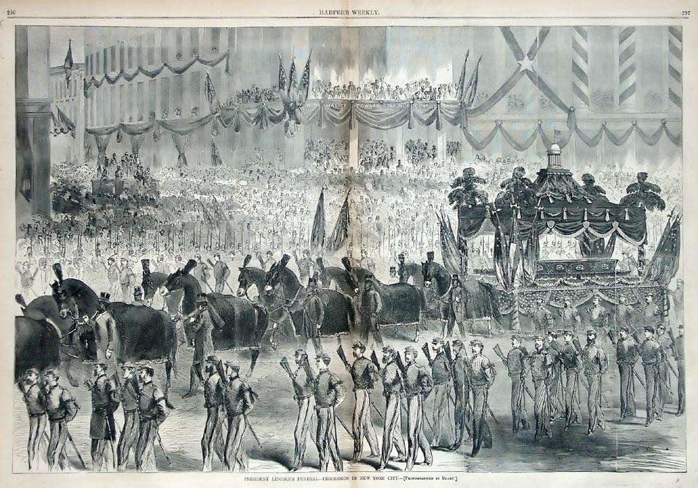
Not promoted MER-C 06:18, 24 August 2008 (UTC)
Lascar, Aguas Calientes and Acamarachi Volcanoes[edit]

- Reason
- This is an excellent panorama of the three volcanoes mentioned above, along with the lovely Laguna Lejia (Lejia Lagoon).
- Articles this image appears in
- Lascar Volcano, Aguas Calientes (volcano)
- Creator
- RudiR (german wikipedia)
- Support as nominator ----Meldshal42? 13:10, 18 August 2008 (UTC)
- Support Definite yes to this image. J.T Pearson (talk) 14:17, 18 August 2008 (UTC)
- Weak Oppose 600 pix hight is pretty short, even for a panorama. If you can find a bigger version, I'll change to support in a heartbeat. Clegs (talk) 15:29, 18 August 2008 (UTC)
- Weak oppose. Looks like a great shot, but the size is disappointingly small. --Dschwen 15:38, 18 August 2008 (UTC)
- Alright, Clegs, I'll try to contact the uploader, and see if he can converse with the photographer. It'll be tough, i assure you. I don't think the phototgrapher speaks english. --Meldshal42? 21:00, 18 August 2008 (UTC)
- Weak Support because it's slightly cut off on the right and size. nice pic tho. Intothewoods29 (talk) 02:22, 19 August 2008 (UTC)
- Oppose It's pretty, but the detail is lacking, The main subject of this shot only takes up 0.1 megapixels or so and the overall resolution is low. The right side is also cut off. Would probably support a substantially bigger version Noodle snacks (talk) 06:12, 21 August 2008 (UTC)
- Neutral It's nice, but Noodle snacks sums up my concerns. SpencerT♦C 15:02, 23 August 2008 (UTC)
Not promoted MER-C 06:24, 24 August 2008 (UTC)
Haile Selassie[edit]


- Reason
- High-quality formal portrait of an important figure in African history and in the Rastafari movement. I did a really long restoration job to get rid of all the scratches, blotches, etc. Comments/suggestions on the restoration are welcome.
- Articles this image appears in
- Haile Selassie I of Ethiopia, Ethiopia, Emperor of Ethiopia, List of people who have been considered deities, Rastafari movement, African military systems (1800-1900), List of people who have spoken to both Houses of the United Kingdom Parliament, Rastafarian vocabulary, Mansions of Rastafari
- Creator
- American Colony (Jerusalem) Photo Dept.
- Support as nominator --Calliopejen1 (talk) 23:18, 17 August 2008 (UTC)
- Support. Slightly out of focus, but the encyclopedic value is very high. Mostlyharmless (talk) 00:25, 18 August 2008 (UTC)
- Support per User:Mostlyharmless. It's nice to see a photo of the youthful H.S. -- you mostly see mature or old-age images. Thanks, Pete Tillman (talk) 03:16, 18 August 2008 (UTC)
- Comment Can we get any more information on where this was taken? or other information... gren グレン 05:43, 18 August 2008 (UTC)
- I don't think so... The "guide card" (don't know what that is) said "Balfour visit" (Arthur Balfour, perhaps?). Calliopejen1 (talk) 12:55, 18 August 2008 (UTC)
- Support per nominator.--Avala (talk) 10:17, 18 August 2008 (UTC)
- Support Great encyclopedic value, good focus, and a great restoration. Pie is good (Apple is the best) 16:28, 18 August 2008 (UTC)
- Support Lovely find: high EV, good restoration, counters systemic bias. Congrats! DurovaCharge! 16:41, 18 August 2008 (UTC)
- Support Very nice. smooth0707 (talk) 17:08, 18 August 2008 (UTC)
- Support very very nice, especially compared to the unrestored. Intothewoods29 (talk) 01:33, 19 August 2008 (UTC)
- Support An excellent image which meets the criteria. Nick Dowling (talk) 11:09, 19 August 2008 (UTC)
- Support. Ultimate FP stuff. - Darwinek (talk) 19:42, 19 August 2008 (UTC)
- Support This is a great addition, with high EV, and overall good quality. Wadester16 (talk) 05:08, 20 August 2008 (UTC)
- Support. Encyclopedic and relatively good quality. Not very sharp, though. NauticaShades 13:11, 23 August 2008 (UTC)
Promoted Image:Selassie restored.jpg MER-C 06:21, 24 August 2008 (UTC)
B-36 tracked gear[edit]


- Reason
- High-quality image of a strange and unique piece of equipment. I cropped out the one major flaw in the original (a line on the right side of the photo).
- Articles this image appears in
- Convair B-36, Undercarriage, Continuous track
- Creator
- United States Air Force
| Discussion before suspension | |
|---|---|
Suspended for cleanup. MER-C 04:07, 15 August 2008 (UTC) Touch-up done (Graphic Lab) --Slashme (talk) 11:12, 15 August 2008 (UTC) | |
Restarting nomination. Please note that the cleaned up version was uploaded on top of the original. MER-C 07:36, 17 August 2008 (UTC)
- Support Nice cleanup. High EV. --Uncle Bungle (talk) 19:54, 17 August 2008 (UTC)
- Support for cleaned-up version; see my earlier remarks.--Pete Tillman (talk) 03:20, 18 August 2008 (UTC)
- Oppose per my statement last time--Extremely boring aesthetically, and low EV, because we can't really tell scale or how it works. Clegs (talk) 15:24, 18 August 2008 (UTC)
- Aesthetics didn't stop other boring images from being promoted. The image provides a great deal of information about how this experiment fifty years ago worked. Shock absorbers and brake fluid lines are clearly visable. The damage to the turf gives a real sense of the mass of the aircraft. Finally, the article has enough good images of the aircraft that the reader could reasonably infer the scale of the gear even without the benifit of someone holding a coloured meter stick. --Uncle Bungle (talk) 17:42, 18 August 2008 (UTC)
- I would say the other one actually is interesting aesthetically, but I was taking a sabbatical while that one was promoted, so I didn't vote there. Not being the most mechanically oriented person in the world, I can guess what might be the shock absorbers and brake lines, but it's nothing more than a guess, so it is still difficult to see how this works. As far as scale, IMO an FP's EV should be stand-alone, not dependent on inferences from one of the articles it's in. I can't tell if these are four inches wide, or a foot wide. Basically, to sum up, if this were a labelled SVG, I'd support as a no-brainer. But as it is now, it's just too blah, and I can't find enough EV in it to make up for that. Clegs (talk) 03:05, 19 August 2008 (UTC)
- I saw you didn't vote on that one, don't worry, thats not my point anyway. I was just citing an example of a boring image which had been promoted :). --Uncle Bungle (talk) 21:30, 21 August 2008 (UTC)
- I would say the other one actually is interesting aesthetically, but I was taking a sabbatical while that one was promoted, so I didn't vote there. Not being the most mechanically oriented person in the world, I can guess what might be the shock absorbers and brake lines, but it's nothing more than a guess, so it is still difficult to see how this works. As far as scale, IMO an FP's EV should be stand-alone, not dependent on inferences from one of the articles it's in. I can't tell if these are four inches wide, or a foot wide. Basically, to sum up, if this were a labelled SVG, I'd support as a no-brainer. But as it is now, it's just too blah, and I can't find enough EV in it to make up for that. Clegs (talk) 03:05, 19 August 2008 (UTC)
- Aesthetics didn't stop other boring images from being promoted. The image provides a great deal of information about how this experiment fifty years ago worked. Shock absorbers and brake fluid lines are clearly visable. The damage to the turf gives a real sense of the mass of the aircraft. Finally, the article has enough good images of the aircraft that the reader could reasonably infer the scale of the gear even without the benifit of someone holding a coloured meter stick. --Uncle Bungle (talk) 17:42, 18 August 2008 (UTC)
- Support. A strong image with high encyclopedic value. Mostlyharmless (talk) 23:09, 18 August 2008 (UTC)
- Support again Intothewoods29 (talk) 01:44, 19 August 2008 (UTC)
- Support I never realized that this experiment had been done, and a caterpillar track on an aircraft's landing gear is such an unexpected sight that it really should be featured, IMHO. As for the scale, I think the texture of the grass, as well as the size of the hydraulic connectors and the undercarriage, give me a good enough idea. --Slashme (talk) 10:21, 19 August 2008 (UTC)
- Support Much better now. SpencerT♦C 14:59, 23 August 2008 (UTC)
Promoted Image:B-36 tracked gear edit.jpg MER-C 06:21, 24 August 2008 (UTC)
Fieldfare[edit]

- Reason
- This photo was taken in a good condition, and the position of the bird is very suitable for taking a nice picture. It seems that bird was ready to build its nest.
- Articles this image appears in
- Fieldfare
- Creator
- Yuqi Qiao User:Yuqi632
- Support as nominator --Intern1984 (talk) 08:23, 19 August 2008 (UTC)
- Oppose. Unsharp, noisy on the background, chromatic aberration and not unnoticeable JPG compression. Not bad compositionally though, and a good view of the subject - just not the best Wikipedia has to offer. Was submitted for PPR yesterday, nobody has commented on that yet (on closer inspection, it was never actually transcluded on the page). Curiously, submitting this to FPC yesterday was the user's first edit for a year and a half. —Vanderdecken∴ ∫ξφ 09:27, 19 August 2008 (UTC)
- Oppose per the quality issues raised above. Clegs (talk) 21:50, 19 August 2008 (UTC)
- Oppose for reasons above,
plus the nomination name is not capitalizedand the caption is so sparse! Intothewoods29 (talk) 21:52, 19 August 2008 (UTC)
- Wait a minute ... you're complaining that the title of the nomination isn't capitalized? That may be the most ridiculous thing I've ever read on FPC. de Bivort 23:46, 19 August 2008 (UTC)
- haha I have the right to be ridiculous! sorry... I guess that someone like me with grammer OCD is bothered by stuff like that *nervous coughing* Intothewoods29 (talk) 03:32, 20 August 2008 (UTC)
- At least you don't have speling OCD. I here that's incurable. Fletcher (talk) 04:20, 20 August 2008 (UTC)
- Of course we could just capitalise it... (done BTW - OK, technically the pagename is still not capitalised, but good enough). --jjron (talk) 06:33, 20 August 2008 (UTC)
- Phew. Thanks. Now I can finally get to sleep. Intothewoods29 (talk) 18:07, 20 August 2008 (UTC)
- Of course we could just capitalise it... (done BTW - OK, technically the pagename is still not capitalised, but good enough). --jjron (talk) 06:33, 20 August 2008 (UTC)
- At least you don't have speling OCD. I here that's incurable. Fletcher (talk) 04:20, 20 August 2008 (UTC)
- Oppose. Blown highlights, noisy, and many other quality problems. NauticaShades 13:20, 23 August 2008 (UTC)
- Comment I like the subject, but the background is noisy and it really doesn't look natural. —Preceding unsigned comment added by ZooFari (talk • contribs) 23:38, 23 August 2008 (UTC)
Not promoted . --John254 00:50, 25 August 2008 (UTC)
Canary Wharf Panorama[edit]

- Reason
- I beleive that the image could be considered stunning or beautiful, as well as adding meaning to the Canary Wharf page. Canary Wharf could certainly be considered the new financial centre of London, taking the place of the tradition city. Thus I beleive that images of it truly represent modern Britain.
- Articles this image appears in
- Canary Wharf
- Creator
- Seb Tyler (The european union)
- Support as nominator --The european union (talk) 12:29, 20 August 2008 (UTC)
- Oppose Unsharp. Clegs (talk) 14:42, 20 August 2008 (UTC)
- Comment. Looks to have a slight clockwise tilt - that's easily enough fixed, but the softness is probably not, and noise is also quite significant. A downsize would help it look a bit crisper and hide some of the noise, but wouldn't really get it up to usual FP standards. Perhaps try Picture peer review first till you get more used to the process. --jjron (talk) 16:15, 20 August 2008 (UTC)
- Oppose — While it is stitched together nicely, the skyline is blurry and somewhat grainy. — JuWiki (Talk <> Resources) 17:42, 20 August 2008 (UTC)
- Oppose a good thumbnail that doesn't quite hold up at full resolution. DurovaCharge! 20:22, 20 August 2008 (UTC)
- Comment Date of creation should be rewritten if nothing else. I assume the date means August 11, 2008, but not everyone in the world writes the date with the day first, so to Americans, it looks like a date that hasn't yet happened. Can we make it into August 11, 2008? —Preceding unsigned comment added by Wadester16 (talk • contribs) 22:01, 20 August 2008 (UTC)
- The date is not particularly relevant to the caption, so I've removed it. Thegreenj 00:09, 21 August 2008 (UTC)
- My mistake for not signing. Wadester16 (talk) 04:58, 21 August 2008 (UTC)
- The date is not particularly relevant to the caption, so I've removed it. Thegreenj 00:09, 21 August 2008 (UTC)
- Oppose. Fairly poor image and stitching quality. I admit that I'm quite biased as I actually live in Rotherhithe, only 5 minutes walk from where this was shot from, and I could quite easily replicate this shot (admittedly not from the Hilton hotel - I don't particularly think the shot is worth paying for a room with a view ;-) ) with higher quality. Diliff | (Talk) (Contribs) 23:37, 20 August 2008 (UTC)
- Oppose, it's a really nice shot but for this type of thing it has to be almost perfect like some of our other night panoramas. gren グレン 04:53, 21 August 2008 (UTC)
- Oppose - if the photo is supposed to depict Canary Wharf why is the main subject - dark water?--Avala (talk) 12:48, 21 August 2008 (UTC)
- Oppose. Very, very noisy, which hurts the detail significantly. NauticaShades 13:38, 23 August 2008 (UTC)
Not promoted . --John254 00:51, 25 August 2008 (UTC)
PHICUS PLANT[edit]

- Reason
- THIS COULD BE USED AS COMPUTER SCREEN BACKGROUND
- Articles this image appears in
- kicglobal
- Creator
- SANDEEP
- Support as nominator --Sandeep (talk) 13:50, 24 August 2008 (UTC)
- Comment. I don't understand the subterfuge on the creator/nominator, i.e., Kicglobal/Sandeep, see here. Potential sockpuppetry? Also not in an article and invalid reason. --jjron (talk) 00:23, 25 August 2008 (UTC)
- Speedy Close per Jjron's comments. Nomination makes no sense. Fletcher (talk) 01:32, 25 August 2008 (UTC)
Not promoted MER-C 12:16, 25 August 2008 (UTC)
Andrew Carnegie[edit]

- Reason
- The best picture of Carnegie on the project, by far. This image was taken in 1913, but it is top quality of images from that time period. It also features an extremely encyclopediuc subject, the great Andrew Carnegie.
- Articles this image appears in
- Andrew Carnegie, 1902, Carnegie Mellon University, Homestead Strike, Carnegie Council for Ethics in International Affairs, Historical timeline of events in Hamilton, Ontario, List of Sinfonians, Wealthy historical figures 2007, Wealthy historical figures 2006, History of private equity and venture capital, Early history of private equity
- Creator
- Marceau of New York
- Support as nominator ----LordSunday 14:07, 21 August 2008 (UTC)
- Support per nom. (Note: the LoC version at http://memory.loc.gov/service/pnp/cph/3c00000/3c01000/3c01700/3c01767v.jpg has a different crop and includes a copyright symbol and the company's logo.) --KFP (talk | contribs) 16:51, 21 August 2008 (UTC)
- Conditional oppose Executed with enough skill to remove the copyright notice, but no attempt at restoration of numerous obvious scratches, etc. Some of these defects interact with the subject's face, which is a problem. Also the uploader chose a significantly lower resolution than necessary. The original is a 12MB .tif. I've done a rough approximation of the crop, converted to .jpg, and uploaded for comparison. See Image:Carnegie.jpg, which has nearly six times the amount of data in the nominated image. This is a competent portrait, but not among the best of its type for the period or even innovative: good formal portrait photography of this setting and style goes all the way back to the daguerrotype era, 70 years before this example was taken. If anything, this is a throwback. Enough EV to pass FPC if the original image is restored with sufficient care. Suggest suspending the nomination. DurovaCharge! 17:24, 21 August 2008 (UTC)
- Question Is his worth 2.98 billion dollars or 298.3 billion as the article suggests? Muhammad(talk) 17:41, 21 August 2008 (UTC)
- 298.3 billion is correct, I believe. SpencerT♦C 00:28, 22 August 2008 (UTC)
- It's not a typo, but it's based on rather generous calculation (by Forbes) of the value of U.S. Steel at its height. Another way to figure it is this--he gave away everything he had, and the gifts amounted to about $380 million from 1901 onward, which would be about $9 billion now I think. Chick Bowen 00:40, 24 August 2008 (UTC)
- 298.3 billion is correct, I believe. SpencerT♦C 00:28, 22 August 2008 (UTC)
- I completely agree with Durova. I also think enc. is lowered, that because Carnegie's left shoulder is blended into the shadows. SpencerT♦C 00:28, 22 August 2008 (UTC)
- Oppose Until flaws (white spots and scratches) are fixed. Clegs (talk) 14:44, 24 August 2008 (UTC)
- withdraw - I think i'll leave this to durova to fix. --LordSunday 18:21, 24 August 2008 (UTC)
Image:New Town, Edinburgh, Panorama.jpg[edit]

- Reason
- A beatiful Panorama
- Articles this image appears in
- St Andrew's and St George's Church
- Creator
- Turbo Golf
Support as nominator--Turbo Golf (talk) 11:14, 24 August 2008 (UTC)
- Indef-blocked user. MER-C 13:15, 25 August 2008 (UTC)
- Oppose No wow, flat lighting, too much sky. Tried to fixe the messed-up nom, not yet OK... --Janke | Talk 11:57, 24 August 2008 (UTC)
- Oppose unsharp, using a tripod would help prevent this Thisglad (talk) 12:07, 24 August 2008 (UTC)
- Oppose. Thisglad, using a tripod would not fix the lack of sharpness. The issue is not with motion blur but with the camera's low quality optics/sensor. The only way to make the image sharper would be to take it with a better camera, really. Diliff | (Talk) (Contribs) 12:53, 24 August 2008 (UTC)
- Oppose Unsharp/low quality. Clegs (talk) 14:29, 24 August 2008 (UTC)
- Oppose - for reasons of extremely low quality as stated above, although I would oppose based on the creator's (and nominator) conduct alone. —Vanderdecken∴ ∫ξφ 18:19, 24 August 2008 (UTC)
- Oppose Contrast panorama/sky it too low, this is not a high quality composition. Arnoutf (talk) 20:41, 24 August 2008 (UTC)
Not promoted MER-C 13:15, 25 August 2008 (UTC)
- Is this a bad photo? 89.242.19.188 (talk) 10:11, 6 September 2008 (UTC)
The Brooklyn Bridge at Night[edit]


- Reason
- Found this on Commons. Of high resolution. Slightly trimmed version of original. Believe this to be the best photo we have on the subject.
- Articles this image appears in
- Brooklyn Bridge
- Creator
- National Park Service
- Support as nominator --smooth0707 (talk) 19:28, 20 August 2008 (UTC)
- Question when was the photograph taken? The image hosting page only states that it's post-1968. Can we get more precise than that? DurovaCharge! 20:17, 20 August 2008 (UTC)
- It is a color transparency taken in 1982. smooth0707 (talk) 20:52, 20 August 2008 (UTC)
- Oppose. Does appear to be the best image in the article but still a bit below par in my opinion. It suffers from reciprocity failure (leaning towards green) which is common with long exposures on film, and is a bit soft. If it was a historically important image then perhaps I might be more lenient, but it is essentially a generic image of the bridge at night and given that a better, up to date image could easily be taken, I don't really see the importance of featuring this one. Diliff | (Talk) (Contribs) 21:37, 20 August 2008 (UTC)
- Durova, not sure that Edit 2 actually improved it at all. Looks like you've adjusted the black point slightly, but the colour is almost identical. If anything, it is slightly warmer/green. To get it looking more natural, I think the bridge supports need to look more neutral and grey'ish. You can also tell the colour balance isn't right in it because the sky still has a green bias if you look at the RGB colour values. I'll upload Edit 3 to show you what I mean. Also, why have you uploaded it as a PNG file? As I explained in a previous nomination, PNG files are fairly unsuitable for photos, as it is a lossless format and results in larger file sizes than necessary when dealing with images with lots of tonal variation. Diliff | (Talk) (Contribs) 23:07, 20 August 2008 (UTC)
- What's odd is that the uploaded version looks significantly different from the appearance on my home system. After double checking the upload and the screen in Photoshop on my home system I was going to look at the color profile and give it another pass, but another version has gone up anyway. Support edit 3: it's the first major suspension bridge in the world and it's engineered so well that it's still an object of admiration among civil engineers and the general public. Also one of the best known New York City landmarks. If a better color photo of this bridge becomes available under free licence we can delist and replace. Until then, let's go with this version. DurovaCharge! 02:52, 21 August 2008 (UTC)
- Durova, not sure that Edit 2 actually improved it at all. Looks like you've adjusted the black point slightly, but the colour is almost identical. If anything, it is slightly warmer/green. To get it looking more natural, I think the bridge supports need to look more neutral and grey'ish. You can also tell the colour balance isn't right in it because the sky still has a green bias if you look at the RGB colour values. I'll upload Edit 3 to show you what I mean. Also, why have you uploaded it as a PNG file? As I explained in a previous nomination, PNG files are fairly unsuitable for photos, as it is a lossless format and results in larger file sizes than necessary when dealing with images with lots of tonal variation. Diliff | (Talk) (Contribs) 23:07, 20 August 2008 (UTC)
- Oppose. It's a nice picture, but the colors make the subject harder to see. A daylight photo would have been better, considering that encyclopedic value is the primary concern. Dylan (talk) 22:59, 20 August 2008 (UTC)
- Weak oppose for edit 3, oppose rest. Edit 3 is by far the best, but, like Dylan said, there's not a whole lot of EV going on here. More artistic than encyclopedic. Intothewoods29 (talk) 23:12, 20 August 2008 (UTC)
- Weak Oppose Edit 3, Oppose others. Edit 3 is a great improvement, but as others have pointed out, the EV is low. NauticaShades 16:03, 25 August 2008 (UTC)
Not promoted MER-C 09:45, 26 August 2008 (UTC)
Apollo 13 load on deck[edit]


- Reason
- The image meets the criteria for resolution, even as a historic photograph (1970). I'm not familiar with the technical issues that FPC usually gets into, but from my novice viewpoint, it seems like a very clear, well-constructed, informative photograph. Its impressiveness is amplified by the fact that it is a color photograph in 1970, for which I would have expected much lower quality.
- Its encyclopedia value is strong: it is the only exterior photograph of the Command Module in the article, so it uniquely illustrates a major component of the topic (for instance, lots of people around to illustrate relative size, etc. to allow the reader to visualize it). Apollo 13 endured a major spaceflight malfunction that put the lives of the astronauts in jeopardy, and so the fact that they managed to return is remarkable; and this is an image of the vessel in which they survived. It that sense, the gravity of the event being illustrated is all the greater.
- This image was seconded at Picture Peer Review (Wikipedia:Picture peer review/Apollo 13 load on deck), and the image being nominated is Edit 1, which crops out the blurred foreground at the bottom.
- Articles this image appears in
- Apollo 13
- Space accidents and incidents (I just added it there myself)
- Creator
- NASA photograph, public domain
- Support as nominator --Dylan (talk) 17:28, 20 August 2008 (UTC)
- Support. Very interesting, especially with all the visible damage to the module.--ragesoss (talk) 18:17, 20 August 2008 (UTC)
- Conditional support Top enc, but needs a better caption. Also, AFAIK, the "damage" has nothing to do with the Apollo 13 explosion, all capsules look like this when they are hoisted aboard (it's the heat from re-entry). If this capsule had been damaged, the crew wouldn't have had a chance... This should be reflected in the caption, in order to avoid misunderstandings like above. --Janke | Talk 18:27, 20 August 2008 (UTC)
- I agree, this particular vehicle was not where the explosion took place. That is clear in context in Apollo 13, so I don't think the caption needs anything there; I've changed the caption in Space accidents and incidents to avoid suggesting that the command module was where the explosion was. Dylan (talk) 18:49, 20 August 2008 (UTC)
- Support edit 1 high ev. DurovaCharge! 19:15, 20 August 2008 (UTC)
- Support Support edit 1 with new caption. Great quality photo for the era. Wadester16 (talk) 21:54, 20 August 2008 (UTC)
- Support edit one. Intothewoods29 (talk) 22:58, 20 August 2008 (UTC)
- Support Edit 1 for its quality and historical value. Oppose bell bottoms Fletcher (talk) 00:58, 21 August 2008 (UTC)
- Support. A good photo with good EV. Mostlyharmless (talk) 10:48, 22 August 2008 (UTC)
- Support Per above.--HereToHelp (talk to me) 21:12, 22 August 2008 (UTC)
- Support. Good quality and EV. A lot of "wow", as well. NauticaShades 13:41, 23 August 2008 (UTC)
Promoted Image:Apollo13-load on deck crop1.jpg MER-C 09:53, 26 August 2008 (UTC)
Panoramic View of Bridgetown, Barbados[edit]

- Reason
- Large panorama which displays many aspects of the downtown area, especially Chamberlain Bridge. In the background can be seen the Parliament buildings, in addition to the Department of Treasury of Barbados. Gives a good overview of the downtown area. I've tried to incorporate it into other articles, but placement in all cases would end up odd and uncomfortable. I believe it could fit in at least a few others, but not without some major reworking (see Barbados; Parishes of Barbados; Saint Michael, Barbados; Economy of Barbados because the scene on the reverse of the paper currency is this view, though no scans of paper currency are currently posted on WP; and on the same note, Barbadian dollar.
- Articles this image appears in
- Bridgetown
- Creator
- wadester16
- Support as nominator --Wadester16 (talk) 04:54, 20 August 2008 (UTC)
- Oppose. Serious quality issues, but I don't remember the name for this specific type. Can anybody tell me what it's called? Clegs (talk) 14:45, 20 August 2008 (UTC)
- Depends what you are referring to. Without downplaying a pretty decent image, it's certainly very lacking in sharpness at fullsize, there's a bit of artifacting (though I've seen a lot worse), there's some overexposed sky around the middle, and there's at least one significant stitching error (look to the right of that tall white building a bit over a third of the way across the image). --jjron (talk) 15:21, 20 August 2008 (UTC)
- Oppose. Looks very fuzzy and uncrisp at full size. Dylan (talk) 18:02, 20 August 2008 (UTC)
- Comment - As a group we cannot complain simultaneously about 1) an image being unsharp or noisy at full resolution, and 2) downsampling images. To be consistent we need to evaluate images based on how much information they contain relative to how much information their subjects demand - not their apparent sharpness. So, please bear in mind, when evaluating this image, that it is 1800 pixels high. It could be downsampled by nearly 50% and still meet the minimum pixel count on its smallest dimension. de Bivort 18:43, 20 August 2008 (UTC)
- Yeah, I thought there was a bit of paradox there. Wadester16 (talk) 05:39, 21 August 2008 (UTC)
- A valid point, and part of the reason I don't complain about downsampling (within reason of course) - I might be in the minority, but for mine, people who support images 'because it's big' are not looking at things the right way. I'd rather it be smaller and more pleasant and easy to access and view. Having said which, downsample this by 50% and I expect it would still be quite soft. --jjron (talk) 08:31, 21 August 2008 (UTC)
- The problem with that, though, is that you can downsample any pic you want on your own time, but I can't upres anything and get the original. Of course what you said is true to a limited extent (like in pictures that wouldn't loose detail in a downsample), or else the photos here would never be cropped or saved as jpegs either. It's when you're loosing a lot of detail for a little convinience that there's a problem. Thegreenj 03:27, 24 August 2008 (UTC)
- A lot of users are still on limited connections, so it's not necessarily just 'a little convenience' - a 10 or 20MB image download (the only thing beyond the image page) is frankly totally unusable for them. I find it more often that people want it big to satisfy their own concerns and fears that there might be a bit of lost quality or something similar, not for the greater detail that is sometimes contained in a bigger version. And there's also the issue of the image creators that (quite rightly) don't necessarily want to 'give away' their images at huge resolutions to anyone and everyone, as that's effectively what you're doing when you put them on Wiki, regardless of what licensing you officially give them. --jjron (talk) 08:48, 26 August 2008 (UTC)
- The problem with that, though, is that you can downsample any pic you want on your own time, but I can't upres anything and get the original. Of course what you said is true to a limited extent (like in pictures that wouldn't loose detail in a downsample), or else the photos here would never be cropped or saved as jpegs either. It's when you're loosing a lot of detail for a little convinience that there's a problem. Thegreenj 03:27, 24 August 2008 (UTC)
- A valid point, and part of the reason I don't complain about downsampling (within reason of course) - I might be in the minority, but for mine, people who support images 'because it's big' are not looking at things the right way. I'd rather it be smaller and more pleasant and easy to access and view. Having said which, downsample this by 50% and I expect it would still be quite soft. --jjron (talk) 08:31, 21 August 2008 (UTC)
- Yeah, I thought there was a bit of paradox there. Wadester16 (talk) 05:39, 21 August 2008 (UTC)
Not promoted MER-C 09:46, 26 August 2008 (UTC)
H.M.S. Pinafore[edit]

- Reason
- Easily the best illustration we have for H.M.S. Pinafore, the current WikiProject Gilbert and Sullivan featured article drive. There are no other featured images of H.M.S. Pinafore. Improved & restored. The somewhat less restored image is an FP on commons, where they hate engravings, so I figure it has a good chance here. =)
- Articles this image appears in
- H.M.S. Pinafore
- Creator
- A.S. Seer's
- Support as nominator --Shoemaker's Holiday (talk) 21:09, 19 August 2008 (UTC)
- Question aren't images preferred not to be in png? Would there be any way of converting this to jpeg? Clegs (talk) 21:42, 19 August 2008 (UTC)
- Why on earth would we want to change from a lossless medium to a lossy one? Anyway, JPG only really works for photographs. I find for engravings it messes things up. Shoemaker's Holiday (talk) 22:33, 19 August 2008 (UTC)
- It's a matter of convinience. When you go to jpeg, you normally trade a marginal amount of detail for a significantly smaller file size, and low-compression jpeg artifacts are practically invisible in textures, which is why the format lends itself to photographs. For pictures like this, which are detailed, but not really textured, jpeg artifacts are more easily visible and the difference in file sizes is smaller, so PNG is better. But for something like this, which is well textured, jpeg might be an alternative to a 7MB download. Thegreenj 21:12, 21 August 2008 (UTC)
- I think PNG should be fine for this type of image. Kaldari (talk) 23:32, 19 August 2008 (UTC)
- Why on earth would we want to change from a lossless medium to a lossy one? Anyway, JPG only really works for photographs. I find for engravings it messes things up. Shoemaker's Holiday (talk) 22:33, 19 August 2008 (UTC)
- Support Intothewoods29 (talk) 23:05, 20 August 2008 (UTC)
- Support. Per my reasons in the previous nomination. NauticaShades 13:30, 23 August 2008 (UTC)
- Support A fine restoration. A discussion over formats really ought to be segregated from consideration of whether this should be featured. DurovaCharge! 02:43, 26 August 2008 (UTC)
Promoted Image:HMSPinafore2.png MER-C 09:53, 26 August 2008 (UTC)
Benito Mussolini[edit]
- Reason
- My first FPC nom ever, but I think this meets the criteria. Although it's a bit grainy, it adds a lot of value to the article in question.
- Articles this image appears in
- Benito Mussolini
- Creator
- Universal City Studios, uploaded by Movieevery
- Support as nominator --Maxim (☎) 18:20, 19 August 2008 (UTC)
- Comment A "fitting" end indeed, but I don't know how glorious. Do others interpret this as the actual execution of Mussolini, or a representative example of similar executions? The wording in the video seemed ambiguous to me. "Just as these pictures show the trial previously of other key fascists and collaborators... and in this manner he died." I think I would support if it shows his actual execution, but I think it's of considerably less historical value if it's just a news report about the execution. Fletcher (talk) 21:05, 19 August 2008 (UTC)
- Oppose per the last point raised by Fletcher. Clegs (talk) 21:47, 19 August 2008 (UTC)
- Conditional support if suitably captioned. This is wartime propaganda as well as a report about an execution and it's essential to distinguish both functions. This is highly encyclopedic. For our purposes as an encyclopedia, the appropriate way to present this is as an example of how the wartime American public was informed about the execution. DurovaCharge! 22:06, 19 August 2008 (UTC)
- Would something like "An example of American propaganda during the Second World War, it summarizes Benito Mussolini's death. At the end, part of Mussolini's execution by firing squad is shown, as well as his dismembered leg hanging off a wall." be better? Maxim (☎) 02:05, 20 August 2008 (UTC)
- Calling it propaganda would need sourcing... and, while it may be... it's very typical of war news footage I've seen during the time... and I even mean wars that didn't prominently involve the U.S. (e.g. Suez crisis). It might be more a sign of the times. But, we need a good caption... gren グレン 03:57, 20 August 2008 (UTC)
- How about calling it an American newsreel and giving the date? That's not OR, and any intelligent reader is going to infer that a wartime document from a warring nation isn't going to be a neutral document. We have a WWI FPC and nobody stepped up during FPC to object This is non-neutral; it's asking young men to risk their lives because of a trumpet? Well, it's a recruitment poster. 'Nuff said. DurovaCharge! 17:03, 20 August 2008 (UTC)
- Oppose for lack of interest in fact checking. On further review I think I was being very charitable in my earlier comment. For one, I think the narrator goes out of his way to note we are seeing only stock footage of trials and executions, and not Mussolini's actual execution or his dismembered leg. Second, there is historical controversy surrounding execution, but many accounts have Walter Audisio executing Mussolini and his gf Clara Petacci privately, not in front of a firing squad, though a group of his compatriots were later executed that way. Third, there are recognizable photos of Mussolini strung up on a girder after his execution, which you might expect to see in the film, but don't. Fourth, I don't see evidence he was dismembered. There appear to be many accounts that his corpse was beaten and mutilated after he was strung up, so you'd think someone would mention he was also cut into pieces, but I don't see this, suggesting that perhaps he was not cut into pieces, and that perhaps that leg belonged to someone else. Yes, it may draw in eyeballs to say this was Mussolini, but if it ain't him, it ain't him. Fletcher (talk) 21:03, 20 August 2008 (UTC)
- Oppose The news reel is misleading and doesn’t even come close to factually portraying what happened. Mussolini and his mistress were spirited out of a nondescript house by a handful of partisans at night and summarily executed at night in front of a stone wall. The video depicts a more formal looking firing squad that has the appearance of being an official governmental act. Both their bodies, along with those of some others were strung up at a gas station and were beaten by the crowd. Mussolini did not loose his leg—as the video depicts—though his skull was so shattered into utter rubble, the coroner had to *mush* it into shape to obtain a recognizable appearance of Mussolini for pictures. Greg L (talk) 03:43, 23 August 2008 (UTC)
Not promoted MER-C 09:46, 26 August 2008 (UTC)
Graphic design[edit]

- Reason
- I think this is a very good example of graphic design, by the prolific Lady of Hats. By showing an early stage in the process, it lets people get an idea of how graphic designers prepare various variations on a theme for their customers to select from.
- Articles this image appears in
- Graphic design
- Creator
- User:LadyofHats
- Support as nominator --Shoemaker's Holiday (talk) 13:42, 19 August 2008 (UTC)
- Comment Looks nice, but is it too incestuous to promote a design done for the Commons? Fletcher (talk) 14:57, 19 August 2008 (UTC)
- That's for the voters to decide. I just thought it might be nice to have something different, and it is encyclopedic, if rather convenient =) Shoemaker's Holiday (talk) 15:40, 19 August 2008 (UTC)
- Weak support To some extent Fletcher is right, but the image does meet all the criteria. Muhammad(talk) 15:14, 19 August 2008 (UTC)
- Weak support I suppose it's likely difficult to obtain an image like this that would not be fair use (hence ruled out here), so free content projects such as Wikimedia should be valid sources to draw from. Caption needs a copyedit ("various variations"?) Fletcher (talk) 19:15, 19 August 2008 (UTC)
- weak oppose the incestuousness (e.g. Wikipe-tan) doesn't concern me much - but I'm not sure of the EV. How does this illustrate graphic design? I do lots of graphic design and never take the process of making different design variants all the way to this high level of completion. I think the featured image set at Bezier curve is much more illustrative of graphic design. de Bivort 19:39, 19 August 2008 (UTC)
- Support I was on the fence for a while about this. It's a nice image, and I suppose that its placement in the article gives it EV. It would be better if there was a place in the article talking about how graphic designers make different copies. Intothewoods29 (talk) 21:48, 19 August 2008 (UTC)
- Oppose per deBivort. Clegs (talk) 21:48, 19 August 2008 (UTC)
- Oppose unless the caption is changed to explain what this has to with graphic design, because I don't see it. The Euro symbol construction diagram (which is already featured mind you) does a much better job of illustrating the subject, IMHO. --Uncle Bungle (talk) 21:07, 20 August 2008 (UTC)
- Oppose, existing FP does a better job, low EV, self-referential. — BRIAN0918 • 2008-08-21 16:05Z
- Oppose, graphic design is not just logo design, which I suppose that would be. I don't think it's showing the process well, certainly not better than the euro sign diagram, and as a logo it is of lesser quality than the euro symbol: it is too detailed for the purpose, a logo requires among other things simplicity, clarity and a good concept, it's not an illustration. Also, the image isn't used anywhere else. Todor→Bozhinov 11:16, 24 August 2008 (UTC)
Not promoted MER-C 09:47, 26 August 2008 (UTC)
FA-18 aerial refueling[edit]
- Reason
- NASA video of a FA-18A Hornet refueling operation.
- Articles this image appears in
- Aerial refueling, F/A-18 Hornet
- Creator
- NASA
- Support as nominator --DurovaCharge! 23:21, 18 August 2008 (UTC)
- Question: Am I missing something, or does it not show the actual refueling? all I saw was the tube stretching out, hitting the windshield, and being pulled back in. but maybe I missed it. Intothewoods29 (talk) 21:49, 19 August 2008 (UTC)
- There's a fuel intake mechanism mounted near the windshield. You can see it best when the drogue basket disconnects. DurovaCharge! 21:55, 19 August 2008 (UTC)
- Okay I didn't see that. Thanks. Support because it fulfils all of the requirements for FP. Intothewoods29 (talk) 03:35, 20 August 2008 (UTC)
- Well, it doesn't show the refueling afaik... it shows how it's done but just like everything else in the video its cut short (and that's not to say a 20+ minute video of everything in full is any more encyclopedic... it's not) gren グレン 04:03, 20 August 2008 (UTC)
- There's a fuel intake mechanism mounted near the windshield. You can see it best when the drogue basket disconnects. DurovaCharge! 21:55, 19 August 2008 (UTC)
- Support Good EV. Clegs (talk) 14:53, 20 August 2008 (UTC)
- Support. The quality is acceptable and the EV is good. I had no idea this was even done. NauticaShades 13:18, 23 August 2008 (UTC)
- Support per Nauticashades. Mostlyharmless (talk) 00:36, 25 August 2008 (UTC)
Promoted Image:FA-18 Automated Aerial Refueling.ogg MER-C 09:48, 26 August 2008 (UTC)
Pittsburgh[edit]

- Reason
- I grew up in Pittsburgh, and have never seen it look better than it does in this picture.
- Articles this image appears in
- Pittsburgh, Pennsylvania
- Creator
- Dr. Cash
- Support as nominator --Shoemaker's Holiday (talk) 22:25, 21 August 2008 (UTC)
- The caption needs some
- Heh. Sorry. Fixed Shoemaker's Holiday (talk) 22:35, 21 August 2008 (UTC)
- Comment. Looks nice, but I find it disappointingly small. The author seems to be a small-picture-uploader who hasn't discoverd / is avoiding commons. --Dschwen 23:47, 21 August 2008 (UTC)
- I agree with Dschwen. Also I suppose this pic could be added to the gallery in Duquesne Incline. SpencerT♦C 00:23, 22 August 2008 (UTC)
- Support within our size requirements and beautifully shot. DurovaCharge! 01:38, 22 August 2008 (UTC)
- Weak oppose I find the funicular distracting, it looks too big when compared to the downtown core. Image tilted slightly to the right. The water doesn't look right either - is it artifacts or does the river natuarlly look like that? Higher resolution would be better. --Uncle Bungle (talk) 02:39, 22 August 2008 (UTC)
- The rivers are colored correctly. I don't think I've ever seen them blue. Years of dumping crap into them will do that. Dr. Cash (talk) 13:48, 26 August 2008 (UTC)
- What is your opinion on the overall colour balance issue, rather than just the river? Is this edit inaccurate? If the photo was taken around one hour from sunset, then I would expect it to look reasonably neutral (maybe ever-so-slightly more warm than the edit, but cooler than the original) as the blue light scattering effect doesn't usually kick in until a bit closer to sunset. As for the colour of the river, I would imagine that it depends on the weather - if there is a blue sky, the river will reflect more blue. Diliff | (Talk) (Contribs) 14:43, 26 August 2008 (UTC)
- Oppose per water artifacts mentioned by UB, and the color balance is off, unless the photo was taken around dusk or dawn, which seems unlikely, given the angle of the shadows. Might change to weak oppose if this were fixed. de Bivort 04:29, 22 August 2008 (UTC)
- Actually, this shot is taken from the west looking east. That's pretty much how you'd expect things to look at sunset.
- Oppose. Yeah, colour balance is way off on this one and image quality is a bit poor for a DSLR shot. Nice composition, but I've seen much nicer shots at dusk. This one just looks a bit flat. Diliff | (Talk) (Contribs) 12:39, 22 August 2008 (UTC)
- Note: I've fixed the incline and the colour. --Slashme (talk) 12:47, 22 August 2008 (UTC)
- You REALLY shouldn't upload edits over the picture. For one thing, this shot is taken from just west of Pittsburgh, looking east, so it could very well have been taken at Sunset, with the sun behind the photographer.
- Uploading a significant edit over a previous filename is not a good idea, particularly while a featured picture candidacy is underway. In future, please upload under a new filename with a summary of the changes in the edit notes and a link back to the original image. DurovaCharge! 21:10, 22 August 2008 (UTC)
- You REALLY shouldn't upload edits over the picture. For one thing, this shot is taken from just west of Pittsburgh, looking east, so it could very well have been taken at Sunset, with the sun behind the photographer.
- Oppose. Small and noisy. NauticaShades 13:57, 23 August 2008 (UTC)
- Support. Looks good, quality is acceptable. Clegs (talk) 14:43, 24 August 2008 (UTC)
- Weak oppose. The EXIF timestamp reported at Commons is "15:38, 19 May 2008", although the time zone could be in error. Sunset was 20:34 EDT. The color balance looks too warm to me. It also looks to me like there's a slight clockwise tilt. This is an accessible and popular place to photograph the Pittsburgh skyline, so the photo should be of the very highest quality, and preferably at a higher resolution. -- Coneslayer (talk) 14:22, 27 August 2008 (UTC)
- Oppose Colour balance and the compression artifacts are a bit of an annoyance. Latics (talk) 08:22, 28 August 2008 (UTC)
Not promoted --jjron (talk) 10:14, 28 August 2008 (UTC)
Stunt pyrotechnics[edit]

- Reason
- Spectacular image of stunt pyrotechnics by Belgian Wikimedian Luc Viatour is getting rave reviews on Commons FPC. IMO a possible picture of the year. Highly encyclopedic illustration for the articles where it appears.
- Articles this image appears in
- Pyrotechnics, Stunt
- Creator
- Luc Viatour
- Support as conominator --DurovaCharge! 19:34, 20 August 2008 (UTC)
- Support as conominator--Luc Viatour (talk) 19:59, 20 August 2008 (UTC)
- Support me: WOAH! Intothewoods29 (talk) 22:52, 20 August 2008 (UTC)
- Support, of course -- Alvesgaspar (talk) 22:54, 20 August 2008 (UTC)
- Support Ooooo, fire! Wadester16 (talk) 05:35, 21 August 2008 (UTC)
- Support. Somebody get me a fire extinguisher! Mostlyharmless (talk) 11:08, 21 August 2008 (UTC)
Oppose No wow factorSupport--HereToHelp (talk to me) 11:44, 21 August 2008 (UTC)- Support - Aah, I'm on fire! --LordSunday 13:21, 21 August 2008 (UTC)
- Support Woohoo ! Blieusong (talk) 17:41, 22 August 2008 (UTC)
- Support It got me to stop scrolling down the page. Greg L (talk) 03:32, 23 August 2008 (UTC)
- Support. Blown highlights. ;) NauticaShades 13:53, 23 August 2008 (UTC)
- Support. Fuego! SpencerT♦C 22:13, 27 August 2008 (UTC)
- Support Quality is less than great, but I believe that the EV and wow factor makes up for it sufficiently. Latics (talk) 08:24, 28 August 2008 (UTC)
Promoted Image:Stunt Pyrotechnics Luc Viatour.jpg --jjron (talk) 10:16, 28 August 2008 (UTC)
Oswego lighthouse, 1900[edit]

- Reason
- High resolution restored file of recreational fishing along the Oswego, New York shoreline c. 1900. Includes a historic lighthouse that was dismantled in 1929.[26] The structure on the hillside is Fort Ontario. Similar unrestored file at Image:Oswego NY Fort Ontario LOC det 4a07737.jpg.
- Articles this image appears in
- Oswego, New York, Fort Ontario, Oswego Harbor West Pierhead Light
- Creator
- Detroit Publishing Co.
- Support as conominator --DurovaCharge! 23:00, 19 August 2008 (UTC)
- Support as 2nd conominator - Mitch32(UP) 23:02, 19 August 2008 (UTC)
- Support per nominators. Wadester16 (talk) 04:33, 20 August 2008 (UTC)
- Support Nice black and white photo. Tells a story about life in Oswego, New York in 1900. Leaflet (talk) 15:13, 20 August 2008 (UTC)
- Support Nice photo! Ecoleetage (talk) 03:37, 22 August 2008 (UTC)
- Support Nice 1900 photo. --Funper (talk) 10:13, 23 August 2008 (UTC)
- Support Well done. SpencerT♦C 22:12, 27 August 2008 (UTC)
Promoted Image:Lighthouse in Oswego2.jpg --jjron (talk) 10:16, 28 August 2008 (UTC)
Morning fog in East Frisia[edit]

- Reason
- Flat landscapes can be a challenge to shoot in a visually engaging manner, and this example of early morning in the very flat German coastal district of East Frisia is a particularly good example. Newly featured on the German Wikipedia.
- Articles this image appears in
- East Frisia, North German lowlands#Scenery, grounds and origin, North European Plain#Germany
- Creator
- Support as nominator --DurovaCharge! 09:35, 17 August 2008 (UTC)
- Strong Oppose I would give it a Supreme Support on Commons, but this is Wikipedia, and the main purpose of FPs on WP is for them to be highly encyclopedic. This image is only extremely well done, but has no real EV, that's why i think it would be a lot better as a FP at Commons. diego_pmc (talk) 08:10, 18 August 2008 (UTC)
- How does it fail EV at the article where it appears? It replaced a similar landscape of inferior quality, and both are accurate depictions of the countryside in coastal northern Germany. DurovaCharge! 09:02, 18 August 2008 (UTC)
- The image first of all is artistically fascinating. It isn't EV because the article it's in is about a region - a region which cannot be clearly seen due to the fog. The image would rather have higher EV in Fog article, even so I think this is more FP on Commons than on Wikipedia. diego_pmc (talk) 11:42, 18 August 2008 (UTC)
- How does it fail EV at the article where it appears? It replaced a similar landscape of inferior quality, and both are accurate depictions of the countryside in coastal northern Germany. DurovaCharge! 09:02, 18 August 2008 (UTC)
- Support Very beautiful, and does a good job of illustrating what East Frisia looks like. Clegs (talk) 15:26, 18 August 2008 (UTC)
- Support High quality image describes excellently how East Frisia looks like. Pie is good (Apple is the best) 16:30, 18 August 2008 (UTC)
- Support As above. Shoemaker's Holiday (talk) 00:25, 19 August 2008 (UTC)
- Comment. That grass is a mess. I can't work out what exactly is wrong with it (artifacting?), so neutral for now. Mostlyharmless (talk) 00:41, 19 August 2008 (UTC)
- Support. Having never been to East Frisia, I'm assuming this has a lot of EV from prior comments. nice picture too. Intothewoods29 (talk) 01:45, 19 August 2008 (UTC)
- Oppose per Diego PMC: beautiful picture, but not particularly educational. --Slashme (talk) 10:26, 19 August 2008 (UTC)
- Info. First of all: Thanks for nominating this picture. I think, that there is a usage for this pic. In the German article about East-Frisia it is placed in the climate part. At the moment this part is missing in the English article. This might be changed by s.o. Greetings Matthias Süßen (talk) 10:46, 19 August 2008 (UTC)
- Support. Stunning image, clear, good example of morning fog. ~AH1(TCU) 22:10, 19 August 2008 (UTC)
- Support. I think the way it's used in these articles demonstrates sufficient encyclopedic value, and it's a great composition.--ragesoss (talk) 14:47, 27 August 2008 (UTC)
Promoted Image:Nebelostfriesland.jpg --jjron (talk) 10:15, 28 August 2008 (UTC)
Death Valley National Park Aerial View[edit]

- Reason
- Very high quality, encyclopaedic and creative
- Articles this image appears in
- Death Valley National Park, Death Valley
- Creator
- Landsat 7 satellite
- Support as nominator ----Meldshal 12:55, 10 August 2008 (UTC)
- Comment It needs a colour key/legend. Papa Lima Whiskey (talk) 14:47, 10 August 2008 (UTC)
- I just discovered that the image has already been uploaded. The one that i uploaded has a better description and all that, but should I change this nom to that image or the one I uploaded? --Meldshal 14:59, 10 August 2008 (UTC)
- If the image files really are completely the same, I'd nominate the one that was first uploaded, change the description to include the information that is unique to your uploaded version, and then nominate the more recent one for deletion as a duplicate. If they're not the same, follow the same steps, but list your new upload as an alternative on the old image's page. Also make sure that all articles have the same version of the image. Makes things easier later on. Thanks. Papa Lima Whiskey (talk) 15:05, 10 August 2008 (UTC)
- Thanks, and fixed. --Meldshal 15:11, 10 August 2008 (UTC)
- Can you tell us what the intense red things are? Papa Lima Whiskey (talk) 21:21, 10 August 2008 (UTC)
- I believe that is what the "rust-colored" things are indicated in the key created by howcheng. --Meldshal 21:37, 10 August 2008 (UTC)
- It might be useful to say which channels are on each gun, along with a link to an explanation of what colours are caused by high and low values in each gun (should be a 2x2x2 matrix aka table). That way, we can figure out what the intense red things are as well (or the intense green etc.). Thanks. Papa Lima Whiskey (talk) 19:12, 11 August 2008 (UTC)
- I believe that is what the "rust-colored" things are indicated in the key created by howcheng. --Meldshal 21:37, 10 August 2008 (UTC)
- Can you tell us what the intense red things are? Papa Lima Whiskey (talk) 21:21, 10 August 2008 (UTC)
- Thanks, and fixed. --Meldshal 15:11, 10 August 2008 (UTC)
- If the image files really are completely the same, I'd nominate the one that was first uploaded, change the description to include the information that is unique to your uploaded version, and then nominate the more recent one for deletion as a duplicate. If they're not the same, follow the same steps, but list your new upload as an alternative on the old image's page. Also make sure that all articles have the same version of the image. Makes things easier later on. Thanks. Papa Lima Whiskey (talk) 15:05, 10 August 2008 (UTC)
- I just discovered that the image has already been uploaded. The one that i uploaded has a better description and all that, but should I change this nom to that image or the one I uploaded? --Meldshal 14:59, 10 August 2008 (UTC)
- Weak support. It doesn't seem that we can reconstruct exactly which wavelengths were used to compile this image, or, for that matter, which guns they go on. The cursory description in terms of resulting colours is somewhat informative, but it would be much less valuable on GIS-related articles, so I'd like to place an embargo on placing it on such articles until the full information becomes available. Papa Lima Whiskey (talk) 15:27, 12 August 2008 (UTC)
- Weak support. Excellent resolution, but hard for a non-expert to read. Ideal solution would be to add an unprocessed photograph with the same orientation and crop to the image hosting page. DurovaCharge! 17:04, 12 August 2008 (UTC)
- Support John254 03:36, 13 August 2008 (UTC)
- Weak oppose -- this is a very confusing image, even with the legend -- and I used to use these things pretty regularly for work (they were confusing then, too).
- Comment: the articles used need the legend, too. Even then, I'm not sure how much EV is really added. Maybe do an article on false-color imaging? --Pete Tillman (talk) 03:42, 13 August 2008 (UTC)
- As I said above, that would be a bad idea because this image lacks information about the allocation of wavelengths to display colours. False-color already has two images, a real colour and a false colour one, and the false colour seems to be an NRG (suggested, but not explicitly stated by [27]). Nominated image may or may not have the same channel assignment. Papa Lima Whiskey (talk) 07:32, 13 August 2008 (UTC)
- Oppose --Uncle Bungle (talk) 21:40, 21 August 2008 (UTC)
- Oppose --Base64 (talk) 07:08, 28 August 2008 (UTC)
Not promoted --jjron (talk) 10:14, 28 August 2008 (UTC)
CH-47 Chinook helicopter[edit]

- Reason
- A good photograph of a difficult and dangerous exercise that displays the capabilities of two military craft.
- Articles this image appears in
- CH-47 Chinook, Virginia Capes, Rigid-hulled inflatable boat
- Creator
- MC3 Robyn Gerstenslager
- Support as nominator --DurovaCharge! 23:59, 21 August 2008 (UTC)
- Weak, Weak support It's noisy, and the picture's cut off, detracting from it's enc. in CH-47 Chinook. Also, it's use in Virginia Capes is pretty weak. Otherwise, for the picture's use in Rigid-hulled inflatable boat, I think it's pretty decent, so it's a weak support in that regard. SpencerT♦C 00:20, 22 August 2008 (UTC)
- A propos of nothing, I wish I could find an upload-quality version of the Chinook stunt pictured here: [28] Spikebrennan (talk) 14:16, 22 August 2008 (UTC)
- Oppose. Composition, cut-off subject, raft is in the shadows, hard to see what's going on. --Dschwen 14:35, 22 August 2008 (UTC)
- Support. Very cool! Clegs (talk) 14:41, 24 August 2008 (UTC)
- Oppose – parts of rotor blades and the tail top are cut off – Ilse@ 20:53, 24 August 2008 (UTC)
- Weak support - Dramatic, striking, good focus on the body of the helicopter - but Ilse and Dschwen bring up good points. Cirt (talk) 19:02, 28 August 2008 (UTC)
Not promoted - no consensus. --jjron (talk) 08:16, 29 August 2008 (UTC)
Cone Nebula[edit]
_Star-Forming_Pillar_of_Gas_and_Dust.jpg)
- Reason
- Another excellent and highly encyclopedic Hubble image. This one depicts the Cone Nebula, a truly interesting thing in our universe. Calm down, it's not a monster, it's just a dust and gas particle nebula. No, this disastrous looking thing is not coming at you, it is just providing an excellent view of the fascinating Cone Nebula.
- Articles this image appears in
- Cone Nebula
- Creator
- Hubble Telescope
- Support as nominator ----LordSunday 00:49, 21 August 2008 (UTC)
- Conditional Support Obviously the caption has to be changed. In addition, the summary text basically constitutes an article to itself. Otherwise, it's beautiful, with good resolution - looks like a painting. I would say the sharpness is not perfect, but then again nebulae are not sharp to begin with, and the full resolution size is very large, so cutting it down in size could solve the issue. Wadester16 (talk) 05:34, 21 August 2008 (UTC)
- That is not the caption used in the article. smooth0707 (talk) 17:27, 21 August 2008 (UTC)
- I am just using the caption for the nomination, plenty of other noms use this, i have never gotten this before. --LordSunday 23:39, 21 August 2008 (UTC)
- Yeah, the caption doesn't have to be what's used in the article, but it is meant to provide context on the picture for FPC users. I'd say the second half of what's here does that quite well, the first half is just 'advertising' - suggest if you want to use 'advertising', put the it in the "reason". Having said which, I don't see any of this as a reason to object. --jjron (talk) 02:23, 22 August 2008 (UTC)
- Support Wow! Great photo! Ecoleetage (talk) 03:36, 22 August 2008 (UTC)
- Support Good pic, caption needs to be standardized. Clegs (talk) 14:46, 24 August 2008 (UTC)
- Oppose Very grainy (oversharpened?) in full size. --Janke | Talk 16:23, 26 August 2008 (UTC)
- Support Huge wow, quality compares favorably to our other images of nebulae. (It's located 2,600 light-years away... think we will just have to accept a bit of graininess.) Calliopejen1 (talk) 18:12, 28 August 2008 (UTC)
- For reference: current FPs are here, here, and here. Calliopejen1 (talk) 18:15, 28 August 2008 (UTC)
- Support. Agree with Calliopejen1 (talk · contribs). Cirt (talk) 19:00, 28 August 2008 (UTC)
Promoted Image:Cone Nebula (NGC 2264) Star-Forming Pillar of Gas and Dust.jpg --jjron (talk) 08:27, 29 August 2008 (UTC)
Sarah Bernhardt[edit]

- Reason
- One of the most famous actors of the nineteenth century in one of her most important roles. High resolution photomechanical print (postcard). Restored version of Image:Bernhardt Hamlet.jpg.
- Articles this image appears in
- Hamlet#19th century, Sarah Bernhardt
- Creator
- Lafayette Photo, London
- Support as nominator --DurovaCharge! 19:12, 20 August 2008 (UTC)
- Comment = IMO the caption at the bottom should be cropped out, leaving just the picture, because we already have a caption. But that could just be me. Also, the background is a bit grainy. Do you know if that's digital or if that was how the scenery was painted? Intothewoods29 (talk) 22:55, 20 August 2008 (UTC)
- Support...even though the negative space is on the wrong side. I don't think the caption needs to be cropped, but it we do crop the caption, we should crop the right side as well.--ragesoss (talk) 01:50, 21 August 2008 (UTC)
- Support. A strong image with very high EV. Mostlyharmless (talk) 05:17, 23 August 2008 (UTC)
- Support. Very major actress, still remembered today. Shoemaker's Holiday (talk) 13:56, 25 August 2008 (UTC)
'Support. Clear and sharp. Cirt (talk) 18:59, 28 August 2008 (UTC)
Promoted Image:Bernhardt Hamlet2.jpg --jjron (talk) 08:28, 29 August 2008 (UTC)
Beethoven Piano Sonata No. 28 manuscript sketch[edit]

- Reason
- To quote from Wikipedia's biography, Ludwig van Beethoven was a crucial figure in the transitional period between the Classical and Romantic eras in Western classical music, and remains one of the most respected and influential composers of all time. This document holds particular encyclopedic value: a manuscript sketch in Beethoven's own handwriting for the final movement of Piano Sonata No. 28--the first of his late period sonatas when he began composing in the Romantic style. Restored version of Image:Beethoven sketch op. 101.jpg and Image:Beethoven sketch op 101a.jpg (combined file of a two page manuscript). Completed version of the music available for listening at Wikipedia:Featured sound candidates/Beethoven Piano Sonata No. 28 (part 3 of 3 files).
- Articles this image appears in
- Musicology, Sonata, Piano sonata, Beethoven's musical style and innovations, Life and work of Ludwig van Beethoven, Piano Sonata No. 28 (Beethoven), Art music, Romantic music
- Creator
- Ludwig van Beethoven
- Support as conominator --DurovaCharge! 19:04, 22 August 2008 (UTC)
- Support as conominator Shoemaker's Holiday (talk) 19:38, 22 August 2008 (UTC)
- Support. my first thought was yes, because of the super EV. my second thought was no because it's a bit sloppy IMO. But I think the EV hugely outweighs the sloppiness of it, most of which comes from the age of the documents. so yeah. nice choice. Intothewoods29 (talk) 20:08, 22 August 2008 (UTC)
- The sloppiness is to be expected from this type of manuscript - what we're seeing here is a composer jotting down his thoughts quickly. =) Shoemaker's Holiday (talk) 20:59, 22 August 2008 (UTC)
- Support Looks like a very interesting an encyclopedic image. I am no expert on classical music, but I'm confident that the composer's own manuscript will be of great interest to those studying the composer and his works. Great find! -Pete (talk) 21:39, 22 August 2008 (UTC)
- Support. A good quality scan and restoration of a historically important manuscript. NauticaShades 14:00, 23 August 2008 (UTC)
- Neutral Extremely high EV, but it still looks pretty shabby. It looks like the crease in the middle was raised off the scanner bed. I guess that can't be helped without risking damage to the document. Still, I think it would look better if only one sheet were in the image, then the difference between the fading would not be so stark and distracting. It is really faded, with a lot of shadows, creases, etc. --Uncle Bungle (talk) 21:19, 23 August 2008 (UTC)
- Oppose. I don't see the need of combining those two (different coloured) sheets. Would support a single well-restored copy though. Lycaon (talk) 09:55, 24 August 2008 (UTC)
- The Library of Congress listed it as a two page manuscript; it's the composer's working notes for the movement. DurovaCharge! 22:03, 24 August 2008 (UTC)
- Could they be made the same shade?: Presumably, they were that way when the maestro was writing on them. NauticaShades 16:05, 25 August 2008 (UTC)
- If the scans were higher resolution than this, they might be tweaked that much. DurovaCharge! 16:13, 25 August 2008 (UTC)
- It would actually be pretty easy to adjust the shades like that, even at the document's present resolution. However, I'm not sure it would be appropriate to do so. There are many possible explanations for this "flaw"; one explanation (which is pretty likely) is that the storage of the documents has left one page more exposed to light than the other, causing more fading. Since we don't know the cause, I think it would be inappropriate to further tamper with the document.
- I'd be more inclined to split it into two documents, and display one right above the other. Just because they are conceptually one document, I don't think means we're obliged to display them one-above-the-other within a single computer file. -Pete (talk) 18:05, 25 August 2008 (UTC)
- Could they be made the same shade?: Presumably, they were that way when the maestro was writing on them. NauticaShades 16:05, 25 August 2008 (UTC)
- The Library of Congress listed it as a two page manuscript; it's the composer's working notes for the movement. DurovaCharge! 22:03, 24 August 2008 (UTC)
- Support I LOVE Beethoven! Clegs (talk) 14:40, 24 August 2008 (UTC)
- Support. Agree with everything said by Peteforsyth (talk · contribs). Cirt (talk) 19:03, 28 August 2008 (UTC)
- He does make very good points. Unfortunately the scan resolution prevents this from going as far as either of you would like. In order to get an end result like this, this file would need about ten times its present data. What I was able to do in the other instance was recreate an even paper tone, but in order to do that it was necessary to get down to 800% resolution in some places and retrace the outline of individual pen strokes. That wouldn't work here because the image just doesn't hold up at that level, so I can take out the larger stains and dirt but there's no way to work the full magic--unless you can talk the LoC archivists into doing another scan? :) DurovaCharge! 21:19, 28 August 2008 (UTC)
Promoted Image:Beethoven opus 101 manuscript.jpg --jjron (talk) 08:27, 29 August 2008 (UTC)
Human male body[edit]

- Reason
- Large and detailed image of the human body
- Articles this image appears in
- Human body (so far - just uploaded it)
- Creator
- Mikael Häggström
- Support as nominator (and model) Mikael Häggström (talk) 19:19, 24 August 2008 (UTC)
- Weak Support - it's a very good picture overall, and we're unlikely to get another like it - but around the feet, it looks like it's been cut out from its background and left pixelated edges, particularly the subject's right big toe; and the upper hips. I commend you for your bravery though. For one thing, it's not often we get a penis in addition to the face of its owner on WP, but a free-licensed full body shot is very encyclopaedic, high quality and useful to the encyclopedia in many ways. —Vanderdecken∴ ∫ξφ 20:16, 24 August 2008 (UTC)
- comment. Yes, the background has been cut away from hips and down. It can be done better, though. Perhaps the nomination could be postponed until it's done better
(could do it in the weekend or so).Mikael Häggström (talk) 04:51, 25 August 2008 (UTC)
- comment. Yes, the background has been cut away from hips and down. It can be done better, though. Perhaps the nomination could be postponed until it's done better
- Oppose Tan lines. --Uncle Bungle (talk) 21:04, 24 August 2008 (UTC)
- Comment Posing without underpants was ok because it was for the sake of science. Sunbathing so wasn't, because it didn't feel like it was for science. If it makes it more suitable, however, it may be justified to do so for any further pictures. Any new version, however, may take long time (classes just started today), much longer than a week, as a stated earlier, so let's decide what to do with this one first. Mikael Häggström (talk) 14:52, 25 August 2008 (UTC)
- Oppose - Very poor photographic quality -- Alvesgaspar (talk) 21:48, 24 August 2008 (UTC)
- Do you mean the tan lines or the inaccurate cut from the background? Or maybe something else? The overall resolution seems good to me. Mikael Häggström (talk) 14:52, 25 August 2008 (UTC)
- I mean all of those and also poor detail, general unsharpness and unsufficient resolution. For an easy shot like this there is little excuse for not showing photographic excelence -- Alvesgaspar (talk) 18:47, 26 August 2008 (UTC)
- Do you mean the tan lines or the inaccurate cut from the background? Or maybe something else? The overall resolution seems good to me. Mikael Häggström (talk) 14:52, 25 August 2008 (UTC)
- Oppose per Uncle.bungle. Not a bad shot; might make a viable candidate at the Commons Valued Image program. And with regard to Vanderdecken's comment, as a Commons admin it's nearly as rare that we get the subject's face in addition to his privates. DurovaCharge! 22:00, 24 August 2008 (UTC)
- Comment I'm sorry, um, can we just check the subject's age? Because if he's under 18 - and arguably, under 21, I don't think we can accept this. Shoemaker's Holiday (talk) 23:19, 24 August 2008 (UTC)
- Comment The model is 22, so that won't be a problem. Old enough to know the consequences - young enough to have it to blame. Mikael Häggström (talk) 04:51, 25 August 2008 (UTC)
- Comment if we are going for medical diagram-style enc, I would like to see a scale bar and body hair. de Bivort 08:50, 25 August 2008 (UTC)
- Comment & oppose Ineligible, not in any article. The one with labels was moved to a gallery... --Janke | Talk 18:38, 25 August 2008 (UTC)
- I support a nomination at Valued Images, but I think the age of the model should be mentioned in any caption for reference. NauticaShades 01:15, 26 August 2008 (UTC)
- Comment, should probably be higher resolution... but, more pressingly, this is poorly cut out around the feet. gren グレン 09:17, 26 August 2008 (UTC)
- Oppose per Grenavitar. Clegs (talk) 14:38, 26 August 2008 (UTC)
- Comment, thanks for all comments. I made a list on its description page of what should be included in any updated versions. Mikael Häggström (talk) 05:12, 27 August 2008 (UTC)
- Oppose Poor quality and removal of background, ie around the feet. Latics (talk) 08:18, 28 August 2008 (UTC)
- Oppose. Gotta agree with Grenavitar (talk · contribs) here. Cirt (talk) 20:08, 28 August 2008 (UTC)
Not promoted . --John254 00:01, 30 August 2008 (UTC)
NGC 5457[edit]

- Reason
- My third nomination for Hubble images, I think that this one will be most successful. This is obviously another excellent Hubble image. Listed at several users "favorite images pages", this image has become one the most excellent images around. After all, it has high quality, exceeds the size guidelines by a lot, and has a very nice wow factor. This had a nomination back in 2006, but I think that this excellent image should be given another chance.
- Articles this image appears in
- Galaxy formation and evolution, Hubble sequence, Spiral galaxy, Pinwheel Galaxy, Astrophysics Data System, List of Messier objects, Messier 102, M101 Group, List of spiral galaxies
- Creator
- Hubble Telescope
- Support as nominator ----LordSunday 16:51, 23 August 2008 (UTC)
- Previous nomination as suggested by nominator. --jjron (talk) 18:47, 23 August 2008 (UTC)
- Oppose because of the unsharp sections. --Janke | Talk 19:38, 23 August 2008 (UTC)
- Oppose. Sadly, I have to agree with Janke here. It's a great image, and I would support it if the low-res regions were limited to the periphery, but the thin band of low-res cutting diagonally through the top right quadrant is quite distracting.--ragesoss (talk) 05:20, 24 August 2008 (UTC)
- Support. I looked for the low rez, and couldn't find it, so it must not be that bad. Awesome pic! Clegs (talk) 14:34, 24 August 2008 (UTC)
- It's not enough to go to the image page, you must watch it full size - then you'll note the fuzzy, diagonal bands... --Janke | Talk 18:26, 25 August 2008 (UTC)
- Oppose because of the diagonal bands. --Base64 (talk) 09:18, 26 August 2008 (UTC)
- Neutral. Image is quite striking but Ragesoss (talk · contribs) brings up some good points. Cirt (talk) 19:57, 28 August 2008 (UTC)
Not promoted . --John254 00:02, 30 August 2008 (UTC)
Green Praying Mantis Grooming[edit]

- Reason
- I think it is educational and useful. Good quality, high resolution, and natural colors.
- Articles this image appears in
- Mantis
- Creator
- ZooFari
- Support as nominator --ZooFari 23:20, 23 August 2008 (UTC)
- Opppose. There are blown highlights on the subject, and it is not very sharp.--ragesoss (talk) 04:23, 24 August 2008 (UTC)
- Oppose. Blown highlights. Clegs (talk) 14:32, 24 August 2008 (UTC)
- Oppose. Some blurring issues do it for me, also would be nice to get the full body. Cirt (talk) 19:58, 28 August 2008 (UTC)
Not promoted . --John254 00:02, 30 August 2008 (UTC)
Grass snake head[edit]

- Reason
- Good looking image with detail of animal's head
- Articles this image appears in
- Grass Snake
- Creator
- biocruiser
- Support as nominator --CharlesC (talk) 18:06, 24 August 2008 (UTC)
- Weak Oppose Many parts of the animal's head appear to be blurry with the background. In other words, the main subject not entirely in focus .--ZooFari 19:15, 24 August 2008 (UTC)
- Weak oppose The head itself is small (I'd guess ≤ 300 px), and there's a lot of filler background. Although it's symmetrical, I'd like to see both sides (composition).--HereToHelp (talk to me) 20:52, 24 August 2008 (UTC)
- Weak oppose. Little EV because it only shows the head. There are two more pics of grass snake heads on the page. Intothewoods29 (talk) 16:24, 25 August 2008 (UTC)
- Oppose Bad composition-- most of the pic is dead space. Clegs (talk) 14:40, 26 August 2008 (UTC)
- Oppose. - Per Clegs (talk · contribs). Cirt (talk) 20:04, 28 August 2008 (UTC)
Not promoted . --John254 00:03, 30 August 2008 (UTC)
Left Right[edit]
- Reason
- Something different, quite amazing.
- Articles this image appears in
- Transport in Sweden Right- and left-hand traffic
- Creator
- the creator of the image, where possible using the format Matanya
- Support as nominator -- AJUK Talk!! 23:17, 29 August 2008 (UTC)
- Oppose. Well below the size minimum. Would support a larger version. Mostlyharmless (talk) 02:25, 30 August 2008 (UTC)
- Oppose and speedy close Much too small, also a likely copyvio. Calliopejen1 (talk) 02:29, 30 August 2008 (UTC)
- Comment the file was already nominated for deletion on Commons. The source page posted a copyright notice and the uploader's other contributions had been deleted as copyvio. Speedy close, please. DurovaCharge! 06:55, 30 August 2008 (UTC)
Deleted MER-C 08:26, 30 August 2008 (UTC)
Mount St. helens Crater[edit]
- Reason
- An excellent image of the highly encyclopedic topic of the illustrious Mount St. Helens. The subject is the lava dome building activity, there is also an animation at the source, but I feel that this still is better. Quite attractive to the human eye, black and white due to being taken by a rather primieval satellite.
- Articles this image appears in
- Mount St. Helens, 2004 and later volcanic activity of Mount St. Helens
- Creator
- IKONOS satellite
- Support as nominator ----LordSunday 17:18, 20 August 2008 (UTC)
- Oppose. Between the small size, black+white, and limited visual context, I don't think this is interesting enough to be an FP.--ragesoss (talk) 18:20, 20 August 2008 (UTC)
- Support black and white photography is is better at depicting texture, and the EV here is dome growth. The image is within the size requirement (25% over minimum actually). DurovaCharge! 20:20, 20 August 2008 (UTC)
CommentOppose I don't understand this at all. Is it visible light or a thermal image? Why is the background all black? At first glance I was expecting it to link to Mount Saint Helens (some other planet or moon). --Uncle Bungle (talk) 21:01, 20 August 2008 (UTC)- Visible light, I'd say. The crater has a glacier in it. DurovaCharge! 22:14, 20 August 2008 (UTC)
- So the background was intentionally removed or it is the blackness of space? --Uncle Bungle (talk) 02:32, 21 August 2008 (UTC)
- Visible light, I'd say. The crater has a glacier in it. DurovaCharge! 22:14, 20 August 2008 (UTC)
- Comment How does a satellite take a photo of the mountain from the side? Wadester16 (talk) 21:58, 20 August 2008 (UTC)
- Support. we've been getting some really unique pics on FPC lately. Intothewoods29 (talk) 23:00, 20 August 2008 (UTC)
- Comment needs a better caption... and mention of the satellites (to make clear it's not a doctored aerial) and do we know if the background was edited or that is how the satellite takes it raw? gren グレン 04:50, 21 August 2008 (UTC)
- Support - Very nice! ~~ ĈőмρǖтέŗĠύʎ890100 (t ↔ Ĕ ↔ ώ) Review me! 23:09, 21 August 2008 (UTC)
- conditional Support per Gren, will review when the caption is fixed. --Pete Tillman (talk) 00:08, 25 August 2008 (UTC)
- Oppose. When I look through the extremely image rich Mount St. Helens article, the only thing that really catches my eye about this is to wonder why it's in there. In an image cull I suspect this will be one of the first to go. Personally I don't like the B&W, don't like the composition, and find it of only limited EV. --jjron (talk) 09:43, 27 August 2008 (UTC)
No consensus MER-C 08:31, 30 August 2008 (UTC)
Hitler in Paris, 1940[edit]


- Reason
- Image of Hitler with the architect of the Reich, Speer in occupied Paris has high EV. Iconic photo of World War II.
- Articles this image appears in
- Adolf Hitler, Battle of France, Trocadéro
- Creator
- Created by Presse Illustrationen Hoffman (Heinrich Hoffman) Uploaded by SF007
- Support as nominator --TheWB (talk) 21:58, 13 August 2008 (UTC)
- Comment - Can't we clean this up a bit? Shoemaker's Holiday (talk) 14:42, 14 August 2008 (UTC)
- Yeah, I agree. I suggest a withdrawl for cleanup. SpencerT♦C 01:17, 15 August 2008 (UTC)
- Question -I noted a tab on the file page and it says not to upload the file to commons since it was taken out of the US. I'm guessing... Upload the restored version to wikipedia? On another note, the Eiffel Tower could be darkened. Anyone preferred a darkened version? victorrocha (talk) 02:16, 15 August 2008 (UTC)
- Comment I realize this is suspended for cleanup, and although restoration is a worthwhile undertaking for its own sake I see obstacles to FP candidacy that no restoration could solve. Composition is unbalanced and cuts off one figure at the shoulder, which is a problem that will get worse with needed clockwise rotation and cropping. Focus is soft, lighting is unimpressive, resolution is not great, main subject takes up a small portion of the image. It's a snapshot. If this were the only free image of Hitler available then of course its EV would override the shortcomings, but we already have a featured photograph of Hitler with Mussolini. If we need a second FP of Hitler, the Hitler biography already has three other photos that depict more of the man and his career. Wouldn't it be more appropriate to show a head and shoulders portrait, or a Nazi rally, or an SS parade, than a photographically inferior image that makes Hitler look like a tourist? DurovaCharge! 10:25, 17 August 2008 (UTC)
Suspended for cleanup. MER-C 04:07, 15 August 2008 (UTC)
- Moved to additional input for discussion on Edit 1. NauticaShades 01:30, 26 August 2008 (UTC)
- Makes more sense to reopen the nom rather than just seek 'additional input'. Would have done it earlier if I'd realised the edit had gone up. --jjron (talk) 09:25, 27 August 2008 (UTC)
- Oppose Too much empty space...and whatever Durova just said about pigs. smooth0707 (talk) 14:18, 27 August 2008 (UTC)
- Oppose per Durova, but nice job with the cleanup.--ragesoss (talk) 14:30, 27 August 2008 (UTC)
- Support because of the high EV and good restoration. --151.124.247.200 (talk) 16:11, 27 August 2008 (UTC)
- Comment As much as I hate to admit I agree completely with Durova. This does make Hitler look like a tourist and unless he was going to shoot the photographer for wasting his time, the sloppy composition could have been made better. As for the rotation it needs 0.38 CW rotation but the object of the framing was to get the Eiffel tower vertical. victorrocha (talk) 17:59, 27 August 2008 (UTC)
- The architect of the reich in front of the Eiffel Tower carries some significant EV, and I don't expect Hiter devoted a lot of time for snapshots with someone outside his inner circle. --Uncle Bungle (talk) 21:26, 27 August 2008 (UTC) (forgot to login)
- Oppose per mostly the above. The image just has too much empty space and is terribly faded. Latics (talk) 08:14, 28 August 2008 (UTC)
- Oppose EV does not make up for terrible composition and fading, especially considering we have much better photos of Hitler. Calliopejen1 (talk) 09:50, 28 August 2008 (UTC)
- Oppose. Composition mainly. The picture isn't sure if it's of Hitler or of the Eiffel Tower, and as a result captures neither particularly spectacularly. It isn't a bad photo by any means, but it isn't a great one either, and the EV isn't high enough to make up for that. Mostlyharmless (talk) 11:34, 28 August 2008 (UTC)
- Oppose. Per Smooth0707 (talk · contribs). Cirt (talk) 20:27, 28 August 2008 (UTC)
- Comment/Suggestion. Since the one guys' shoulder is cropped out, you could always try cropping out some of the white space above the tower, and cropping off some of the other guy's shoulder (the one on the right, so at least it'll be symmetrical), since the focus is Hitler, and the space on the right distracts from him. I think this has slim chance of being an FP, but the cropping could improve the picture.But you might want to get the opinion of some editors who actually have taken good pictures. Intothewoods29 (talk) 02:52, 29 August 2008 (UTC)
Not promoted . --John254 00:15, 30 August 2008 (UTC)
Red squirrel[edit]

- Reason
- This is beautiful picture by a red squirrel. It's where I just have to say "Wow!" it's an amazing picture at a close hold.
- Articles this image appears in
- Red Squirrel, and Cumbria Way
- Creator
- Original image by: Ray eye, crop by Fabien1309.
- Support as nominator --Kanonkas : Talk 13:29, 25 August 2008 (UTC)
- Support Cute! Looks sharp and high-quality. Shoemaker's Holiday (talk) 14:05, 25 August 2008 (UTC)
- Support DOF looks a little shallow to get the tail and back side, but the subject is likely not an enthusiastic model so it's a great capture. Fletcher (talk) 14:11, 25 August 2008 (UTC)
- Weak oppose. Quality is not great. I don't quite see the enc value of this image. Little of the subject is in focus and the setting doesn't thrill me either. --Dschwen 14:27, 25 August 2008 (UTC)
- Oppose. Shallow depth-of-field, and the poor quality (not sure if it's due to noise or compression) is visible even at 1000px, the bare mininum. NauticaShades 01:20, 26 August 2008 (UTC)
- Oppose per NauticaShades. Mostlyharmless (talk) 03:25, 26 August 2008 (UTC)
- Comment Surely its quality must be good enough to be an FP and #3 in the POTY? I'm not saying its has much EV, but I think that you are focusing too much on the quality of this image. We already know ti has good quality, now what about EV? --Lord₪Sunday 16:52, 26 August 2008 (UTC)
- No, we do not know that it has good quality. POTY is not about quality, POTY attracts lots of users who have little photographic experience and judge based on wow and cuteness. --Dschwen 17:17, 26 August 2008 (UTC)
- Support - good quality and composition.--Avala (talk) 21:21, 26 August 2008 (UTC)
- Support - I just stumbled upon the picture when I was reading about the red squirrel and would have nominated it myself for the reasons above if it hadn't already been nominated. --ZeWrestler Talk 01:36, 27 August 2008 (UTC)
- Oppose - grainy and out of focus. Poor photo quality by FPC standards. de Bivort 02:09, 27 August 2008 (UTC)
- Oppose per Debivort. Also, the surroundings are less than ideal for nature or animal shots. Latics (talk) 08:15, 28 August 2008 (UTC)
- Comment Though I can't bring myself support (quality is not so great), the comments about the surroundings are puzzling to me. Many squirrels live in parks and other urban environments. (Could it be true that most squirrels do these days?) A built environment is now the habitat of many many squirrels, and it makes little sense to hide this fact in our images. Calliopejen1 (talk) 09:54, 28 August 2008 (UTC)
- Weak support a touch-up would be nice, but a caption on the mainpage about the red squirrel (plus a terribly cute pic) is a good thing in my mind. Xavexgoem (talk) 14:01, 28 August 2008 (UTC)
- Support. Yup, certainly. Also per Shoemaker's Holiday (talk · contribs). Cirt (talk) 20:17, 28 August 2008 (UTC)
- Oppose not much ev--Base64 (talk) 02:58, 29 August 2008 (UTC)
Not promoted MER-C 06:37, 31 August 2008 (UTC)
John Trumbell's Declaration of Independence[edit]
,_by_John_Trumbull.jpg)
- Reason
- This well-known painting has obvious EV, is at high resolution, and is a recognizable image to many Americans. It is also the image found on the reverse of the American two dollar bill. I'm surprised this has not yet become a featured picture.
- Articles this image appears in
- At least 29 encyclopedic articles. Please see filepage for complete list.
- Creator
- Misogi, Geni, Panoptik
- Support as nominator --Wadester16 (talk) 04:52, 25 August 2008 (UTC)
- Comment It would be nice if we could digitally remove some of those reflections, though they aren't horrible. Shoemaker's Holiday (talk) 04:56, 25 August 2008 (UTC)
- Support Excellent quality scan. Surprised this isn't an FP already. Clegs (talk) 14:36, 26 August 2008 (UTC)
- Support: Historical image with encyclopedic value that is good quality. Dendodge|TalkContribs 17:05, 26 August 2008 (UTC)
- Support per Dendodge --Uncle Bungle (talk) 21:27, 27 August 2008 (UTC) (forgot to login)
- Question: I know there is a key somewhere about the people appearing in the painting. Is there one on Wikipedia? SpencerT♦C 22:16, 27 August 2008 (UTC)
- Support. Agree with Clegs (talk · contribs). Cirt (talk) 20:16, 28 August 2008 (UTC)
- Support well-known good quality picture. M.K. (talk) 22:33, 28 August 2008 (UTC)
- Support Good image, historical significance. - PKM (talk) 18:07, 30 August 2008 (UTC)
- Regretfull Support I was looking for a big version of this for a long time so I could nom it FP status, but I got sidetracked at home, and now the big version is an FPC candidate. Oh well, thats life I guess. At any rate, well done, definately an FP photo. TomStar81 (Talk) 00:01, 31 August 2008 (UTC)
Promoted Image:Declaration of Independence (1819), by John Trumbull.jpg MER-C 06:37, 31 August 2008 (UTC)
Sheep club[edit]

- Reason
- Demonstrates the connection between sheep husbandry and international use of sheep products by encouraging children to raise sheep in order to equip the soldiers of an overseas war. Also a good example of period public service posters. Restored version of Image:Sheep club.jpg.
- Articles this image appears in
- Sheep husbandry#Sheep production worldwide
- Creator
- Breuker & Kessler, Co.
- Support as conominator --DurovaCharge! 16:14, 24 August 2008 (UTC)
- Support as conominator -- Seddσn talk Editor Review 22:52, 24 August 2008 (UTC)
- Support as a surprisingly good quality image for WW I era. The subject matter is a little bland to me but the artwork is weird and interesting. The artist seems to have gone a little overboard making their cheeks rosy. Restoration seems to make it a lot more vivid than the faded original. Note: I fixed the noms' link to the original image, which linked to the restoration instead of the original. Fletcher (talk) 01:55, 25 August 2008 (UTC)
- Support for high quality and high EV. Intothewoods29 (talk) 16:27, 25 August 2008 (UTC)
- Support. Plenty of EV, and a great restoration. NauticaShades 01:33, 26 August 2008 (UTC)
- Support: Per all the above. Dendodge|TalkContribs 17:07, 26 August 2008 (UTC)
- Support Another excellent image. Nick Dowling (talk) 10:51, 27 August 2008 (UTC)
- Support - has strangely encyclopedic value, plus I love the palette. Very interesting... Xavexgoem (talk) 14:03, 28 August 2008 (UTC)
- Support. Per Nauticashades (talk · contribs). Cirt (talk) 20:09, 28 August 2008 (UTC)
- Support. I'm off to join the local Sheep Club. Mostlyharmless (talk) 10:48, 29 August 2008 (UTC)
- Support Quite nice. I think I'll join Mostlyharmless while I'm there. SpencerT♦C 14:09, 30 August 2008 (UTC)
Promoted Image:Sheep club2.jpg MER-C 06:37, 31 August 2008 (UTC)
Green Frog[edit]

- Reason
- Sharp and clear. Useful pose makes to show the species and gender. The background is natural and non-distracting.
- Articles this image appears in
- Rana clamitans and a few lists of frogs.
- Creator
- Ram-Man
- Support as nominator ---- RM 15:26, 24 August 2008 (UTC)
- Support Very nice—high quality and a natural environment. Thegreenj 15:46, 24 August 2008 (UTC)
- Oppose Very good picture, but the contrast between the object (frog) and background is not very large, making the picture a bit hard to get a "wow" from first looks. Arnoutf (talk) 20:40, 24 August 2008 (UTC)
- Camouflage. -- RM 20:59, 24 August 2008 (UTC)
- Support per Thegreenj. Narayanese (talk) 21:26, 24 August 2008 (UTC)
- Support. High quality and enough "wow" for me - derived from the camouflaging (while still distinct enough against the background). Mostlyharmless (talk) 03:27, 26 August 2008 (UTC)
- Support. Definitely agree with Mostlyharmless (talk · contribs). Cirt (talk) 20:03, 28 August 2008 (UTC)
Promoted Image:Green Frog Rana clamitans Facing Left 3008px.jpg MER-C 06:37, 31 August 2008 (UTC)