
Wikipedia:Featured picture candidates/March-2010
| Featured picture tools |
|---|
Please cut and paste new entries to the bottom of this page, creating a new monthly archive (by closing date) when necessary.
Eurocopter[edit]

- Reason
- Good, sharp, high quality image and a good angle. A possible criticism is the motionblurred rotors: unfortunately I didn't have time to prepare for the shot, I heard it coming, turned around and just had time to take a snap.
- Articles in which this image appears
- Eurocopter AS350, Eurocopter
- Creator
- Benjamint 13:34, 19 February 2010 (UTC)
- Support as nominator --Benjamint 13:34, 19 February 2010 (UTC)
- Comment Is the guy in the helicopter taking your picture? --Muhammad(talk) 15:18, 19 February 2010 (UTC)
- I was standing part-way up the summit with pretty impressive views (for Australia) behind me so I assume he was photographing that --Benjamint 00:17, 20 February 2010 (UTC)
- Any chance of geocoding? I was up there and passed through swifts creek maybe two weeks ago, so curious. Noodle snacks (talk) 00:38, 20 February 2010 (UTC)
- Support The motion blur on the blades is acceptable IMO --Muhammad(talk) 00:42, 20 February 2010 (UTC)
- Support I think the blur is actually desirable - it wouldn't look realistic with stationary blades. Noodle snacks (talk) 03:19, 20 February 2010 (UTC)
- Support per nom, motion blur looks natural. Fletcher (talk) 14:01, 20 February 2010 (UTC)
- Support agree with Fletcher et al re motion of blades. Gazhiley (talk) 13:32, 24 February 2010 (UTC)
- Weak support It's a pity the horizon cuts right through the helicopter, but still an excellent photo. I don't think the blurred blades are a problem at all. Calliopejen1 (talk) 18:53, 26 February 2010 (UTC)
- Support per nom.--Sabri76'message 08:41, 27 February 2010 (UTC)
Promoted File:Eurocopter AS350B.jpg —Maedin\talk 07:35, 1 March 2010 (UTC)
Black soldier fly[edit]


- Reason
- Good quality, lighting and EV. Replaced a previous, inferior quality image of mine which had been in the article for over a year.
- Articles in which this image appears
- Black soldier fly, Brachycera
- Creator
- Muhammad Mahdi Karim
- Support as nominator --Muhammad(talk) 01:51, 20 February 2010 (UTC)
- Why is this one superior to your previous image? Prima facie, I see a little distracting blurred object in the foreground that the other doesn't have. In this one the insect has something at the end (like if it was lighted as a cigar) which might be normal but the other doesn't have. franklin 21:09, 20 February 2010 (UTC)
- The poor guy also needs a shower, it is covered in sand. The thing about a cigar is that the end of the abdomen looks like burned. I am almost sure it is not burned but changing its exoskeleton or something like that. But that makes the previous picture of yours a more generic individual. franklin 23:44, 20 February 2010 (UTC)
- But again, why is it you consider this one superior to the other? franklin 23:44, 20 February 2010 (UTC)
- I've got another picture which also shows it covered in sand so I'd say that's pretty normal for them. Personally, I prefer the lighting of this one. If you like that more, I could add it as an alternative. --Muhammad(talk) 00:34, 21 February 2010 (UTC)
- I was asking so much to see if I could identify what you were seeing in the other not as good as this one, and it makes me happy to know that I guessed right. The things about the sand and the strange abdomen might or might not be an issue, that depends on knowing more about that species, which I don't. The blurred spot on the sand is what I find more problematic. Usually blurs help to draw attention to the subject but in this case the blurred spot in the bottom is gathering attention itself. I guess because it is surrounded by a band of sharp elements. I tried a little (and quickly) blurring the rest of the sand (or most of it) and I think it solves this. It has to be blurred quite a bit since that spot is already very blurred. I don't know if that counts as excessive manipulation, but if not I think it would be good to do it. You can also add the other image but if I were you I would ponder whether it is the wining card because otherwise, since both images are good, it can happen that they will compete for the votes and that maybe is not strategically desirable. franklin 05:21, 21 February 2010 (UTC)
- Comment Hmmm... can we somehow get this without the red channel blow-out? Papa Lima Whiskey (talk) 23:56, 20 February 2010 (UTC)
- Support I'd rather have blown highlights in the largely out of focus foreground and background than clipped blacks on the insect. The blown areas do not look objectionable. If it is an easy fix I'd fix it. Noodle snacks (talk) 08:43, 21 February 2010 (UTC)
- Support. I think this one is slightly superior to the older image. Sharpness is a little better. Both have noticable dust spots though, Muhammad! Could you try to clone them out? Ðiliff «» (Talk) 10:53, 21 February 2010 (UTC)
- Edit 1 Uploaded. I applied a blur to part of the foreground, cloned out part of the sand blocking the leg and cloned on part of the leg from another picture I had of the shoot --Muhammad(talk) 16:30, 21 February 2010 (UTC)
- Comment: I find the blurry sand in the forground a little distracting... J Milburn (talk) 17:00, 21 February 2010 (UTC)
- I know but it's unavoidable. The subject is at such a position that you can not exclude at least some of the foreground, and at such high magnification, DOF is waay too shallow. Usually for insects perched on leaves, there is no "ground" in the foreground, hence a non-distracting compo --Muhammad(talk) 18:05, 21 February 2010 (UTC)
- Support Edit 1-per nominator. franklin 22:18, 21 February 2010 (UTC)
- Support (Edit 1) agree with above --Sabri76'message 08:39, 27 February 2010 (UTC)
Promoted File:Hermetia illucens Black soldier fly edit1.jpg —Maedin\talk 07:35, 1 March 2010 (UTC)
White-faced Heron - breeding plumage[edit]

- Reason
- Shows whole bird well. The wind lifting up the long breeding plumes illustrates them well, the rose coloured fore-neck feathers also clearly illustrated.
- Articles in which this image appears
- White-faced Heron, Egretta
- Creator
- Benjamint 13:42, 20 February 2010 (UTC)
- Support as nominator --Benjamint 13:42, 20 February 2010 (UTC)
- Weak Support. Nice photo and composition, but only just scrapes through the with minimum resolution. Ðiliff «» (Talk) 10:48, 21 February 2010 (UTC)
- It was a bit low, fixed. Benjamint 01:28, 22 February 2010 (UTC)
- Support, nice. J Milburn (talk) 16:58, 21 February 2010 (UTC)
- Support. Good composition, shows plumage nicely. -- Avenue (talk) 21:21, 21 February 2010 (UTC)
- Support. Nice composition. Elekhh (talk) 07:33, 22 February 2010 (UTC)
- Support, agree with above --Sabri76'message 08:45, 27 February 2010 (UTC)
Promoted File:White-faced-Heron444.jpg —Maedin\talk 07:35, 1 March 2010 (UTC)
Australian Raven[edit]

- Reason
- I think the image meets the criteria
- Articles in which this image appears
- Australian Raven
- Creator
- Noodle snacks
- Support as nominator --Noodle snacks (talk) 10:28, 21 February 2010 (UTC)
- Support. One of your best bird shots actually, I think. Interesting pose, good detail, aesthetic background and good exposure of the blacks (bit of fill flash I assume?). Ðiliff «» (Talk) 10:42, 21 February 2010 (UTC)
- EXIF says flash not fired --Muhammad(talk) 16:54, 21 February 2010 (UTC)
- I've a feeling the flash wasn't quite seated properly - pretty sure I used fill. Noodle snacks (talk) 09:23, 24 February 2010 (UTC)
- EXIF says flash not fired --Muhammad(talk) 16:54, 21 February 2010 (UTC)
- Support. Creepy looking thing. J Milburn (talk) 12:15, 21 February 2010 (UTC)
- Support per Diliff. The composition is awesome. --Muhammad(talk) 16:53, 21 February 2010 (UTC)
- Question, leaning oppose. What is happening with the feathers of the neck/face? For contrast look at that non-FP quality shot of what the bird looks like normally. The feathers look damaged or dirty (maybe just really wet), and there are lots of feathers missing under the bill and in a small patch at about 7oclock from the eye. The lack of feathers on the throat, and the damaged ones around the neck removes one of the diagnostic clues to separate this species from the Little and Forest Ravens, reducing the EV. The EV could be restored if an explanation for this oddity is explained, as the photo quality is great and the pose is dynamic, but I don't think it is a representative shot f the species. Sabine's Sunbird talk 21:53, 21 February 2010 (UTC)
- The bird had recently had a bath, perhaps I should add this to the caption. Noodle snacks (talk) 22:29, 21 February 2010 (UTC)
- That would explain the state of the feathers, but not the missing feathers. I will hold off on opposing, but I still feel this is not a sufficiently good representation of the species, which is a shame. It's the bird's fault, Noodle, not yours! Sabine's Sunbird talk 00:33, 22 February 2010 (UTC)
- I wonder if it is part way between juvenile and adult. Birds in Backyards says that "Young birds resemble the adults, but have dark eyes, shorter throat hackles and often the presence of a pink, fleshy gape". This species is sometimes called a crow". here is an image of a juvenile. The bird was also gaping most of the time in a pose similar to this. Noodle snacks (talk) 03:01, 22 February 2010 (UTC)
- I'll need to check HBW or maybe HANZAB in the library tomorrow. There seems to be a lot of brown on the bird, which would support the suggestion it is young, but as you note the eye is clearly that of an adult. Sabine's Sunbird talk 03:14, 22 February 2010 (UTC)
- Okay, the HBW states that the species has extensive bare areas of grey skin on chin. Clearly this is unusually visible on this photo because the face is wet. (The HBW also confirms this is adult - older juvenile birds have hazel eyes). Thus the state of the birds head is entirely due to it being wet. Sabine's Sunbird talk 04:41, 22 February 2010 (UTC)
- Probably a silly question, but could you tell me what HBW and HANZAB stand for? Noodle snacks (talk) 05:58, 22 February 2010 (UTC)
- Stab in the dark: Handbook of Birds and Wildlife and Handbook of Australian and New Zealand something Birds? Ðiliff «» (Talk) 07:54, 22 February 2010 (UTC)
- Sorry, Handbook of the Birds of the World and Handbook of Australian, New Zealand and Antarctic Birds. If neither of them don't know it, it probably isn't known. Sabine's Sunbird talk 09:18, 22 February 2010 (UTC)
- Stab in the dark: Handbook of Birds and Wildlife and Handbook of Australian and New Zealand something Birds? Ðiliff «» (Talk) 07:54, 22 February 2010 (UTC)
- Probably a silly question, but could you tell me what HBW and HANZAB stand for? Noodle snacks (talk) 05:58, 22 February 2010 (UTC)
- I wonder if it is part way between juvenile and adult. Birds in Backyards says that "Young birds resemble the adults, but have dark eyes, shorter throat hackles and often the presence of a pink, fleshy gape". This species is sometimes called a crow". here is an image of a juvenile. The bird was also gaping most of the time in a pose similar to this. Noodle snacks (talk) 03:01, 22 February 2010 (UTC)
- That would explain the state of the feathers, but not the missing feathers. I will hold off on opposing, but I still feel this is not a sufficiently good representation of the species, which is a shame. It's the bird's fault, Noodle, not yours! Sabine's Sunbird talk 00:33, 22 February 2010 (UTC)
- The bird had recently had a bath, perhaps I should add this to the caption. Noodle snacks (talk) 22:29, 21 February 2010 (UTC)
- Support: I'm so taken with those pine needles. They're gorgeous. Great composition and quality. Shame about the wet feathers, but don't ravens usually look a little rough around the edges? :) Maedin\talk 07:45, 26 February 2010 (UTC)
Promoted File:Corvus coronoides.jpg --Makeemlighter (talk) 11:07, 1 March 2010 (UTC)
Jack Kerouac[edit]


- Reason
- I believe that this on par with the other featured black and white photographic portraits that we have.
- Articles in which this image appears
- Jack Kerouac
- Creator
- Tom Palumbo
- Support as nominator --Sir Richardson (talk) 02:46, 27 February 2010 (UTC)
- Oppose Mainly it's too small. Sometimes we make exceptions for historical images, but for 60's, we would expect larger. Most if not all of our B&W FPs are larger; we have a larger portrait of Edgar Allen Poe taken more than 100 years before this shot. On the plus side, it's the only image we have of Kerouac in the article which is kind of surprising. Also I think you've overdone it with the contrast boost - we've lost some shadow detail and it changed the appearance of his hair and shirt, even if it does make the skin more dramatic. The edit also caused or brought out jpeg artifacts in the background. Fletcher (talk) 04:41, 27 February 2010 (UTC)
- Comment I wrote up a long email to send to the address listed on his website to request a large resolution, but unfortunately address was invalid. I share Fletcher's concerns. Jujutacular T · C 05:01, 27 February 2010 (UTC)
- Oppose as above. Possible an excellent valued picture candidate. J Milburn (talk) 16:41, 27 February 2010 (UTC)
- Comment Can we close this? You can re-nominate when the larger resolution becomes available. Papa Lima Whiskey (talk) 18:05, 27 February 2010 (UTC)
Not promoted --Makeemlighter (talk) 11:14, 1 March 2010 (UTC)
- Per WP:SNOW. Makeemlighter (talk) 11:14, 1 March 2010 (UTC)
Wikipedia:Featured picture candidates/Pyogenic granuloma on a finger-1.jpg
Hubbard Grandstand, Bowdoin College, Brunswick, ME[edit]

- Reason
- It is a beautiful image of a college football grandstand, depicting a bygone era.
- Articles in which this image appears
- Bowdoin College, Whittier Field
- Creator
- Hugh Manatee
- Support as nominator --Ute in DC (talk) 04:54, 26 February 2010 (UTC)
- Oppose Thanks for your nomination, but this photo is very compressed and has bad JPEG artifacting throughout. Calliopejen1 (talk) 18:57, 26 February 2010 (UTC)
Not promoted --Makeemlighter (talk) 11:15, 1 March 2010 (UTC)
- Per WP:SNOW. Makeemlighter (talk) 11:15, 1 March 2010 (UTC)
Regent Parrot[edit]


- Reason
- Good image of a juvenile (similar to female) Regent Parrot.
- Articles in which this image appears
- Regent Parrot
- Creator
- Noodle snacks
- Support as nominator --Noodle snacks (talk) 10:30, 21 February 2010 (UTC)
- Support Edit 1. Seems a touch overexposed (beak and breast) but otherwise another quality photo. Ðiliff «» (Talk) 10:46, 21 February 2010 (UTC)
- I would second that. Can it be re-developed with more balanced values? Papa Lima Whiskey (talk) 11:43, 21 February 2010 (UTC)
- Support. Looks ok to me. J Milburn (talk) 16:57, 21 February 2010 (UTC)
- Support Ditto J Milburn. Great shot! upstateNYer 19:25, 21 February 2010 (UTC)
- Support Edit 1. Lovely. Sabine's Sunbird talk 22:01, 21 February 2010 (UTC)
- Support Edit 1 -- Benjamint 01:32, 22 February 2010 (UTC)
- Support Edit 1 - very very nice. Elekhh (talk) 07:28, 22 February 2010 (UTC)
- Weak oppose I think this should be redone properly, from raw. Papa Lima Whiskey (talk) 17:26, 23 February 2010 (UTC)
- What is your objection (in reality, not in theory) to edit 1? It could be reprocessed from RAW, but I think the benefit would be minimal. There isn't any blown highlights, just slight overexposure. And the overexposure is mainly in areas of detail, so any benefit of working with a colour space larger than 8 bit is largely lost in situations like that - you simply wouldn't notice any introduced posterisation. So is it really worth insisting on reprocessing it from RAW in this case? Ðiliff «» (Talk) 22:02, 23 February 2010 (UTC)
- Support edit 1.--Mbz1 (talk) 03:03, 25 February 2010 (UTC)
Promoted File:Polytelis anthopeplus 2 edit1.jpg --Makeemlighter (talk) 13:43, 1 March 2010 (UTC)
File:Bangkok Night Wikimedia Commons.jpg[edit]

- Reason
- Another great cityscape photo from Benh. High quality, aesthetic and of great value to the Bangkok article.
- Articles in which this image appears
- Bangkok and Tiger Cub Economies
- Creator
- Commons:User:Benh
- Support as nominator --Ðiliff «» (Talk) 10:39, 21 February 2010 (UTC)
- Support Nice EV, interesting to view --Muhammad(talk) 03:04, 22 February 2010 (UTC)
- Support per above. Elekhh (talk) 07:26, 22 February 2010 (UTC)
- Support, very good quality for a night image of this breadth... and a great view of the city. gren グレン 02:20, 23 February 2010 (UTC)
- Support beautiful photo, makes me nostalgic for when I lived there. Calliopejen1 (talk) 05:32, 23 February 2010 (UTC)
- Weak Support Very good quality but as per prev night shots up for nom there are several well lit areas that appear to be detail-less due to over-exposure... Im not too technical so not sure if that's exactly the right reason but I know what I'm trying to say! Most noticable on the centre tall building with the well lit white top - I cannot view much detail on the top of that building due to what I think are blown highlights... Other than a few little examples of this the picture as a whole is very good but I can't give full support as IMO I think this harms the picture... Gazhiley (talk) 13:23, 24 February 2010 (UTC)
- Support wow! --Alchemist-hp (talk) 22:23, 24 February 2010 (UTC)
- Support--Mbz1 (talk) 23:04, 25 February 2010 (UTC)
Promoted File:Bangkok Night Wikimedia Commons.jpg --Makeemlighter (talk) 20:18, 1 March 2010 (UTC)
Crested Pigeon[edit]

- Articles in which this image appears
- Crested Pigeon
- Creator
- Benjamint 01:46, 22 February 2010 (UTC)
- Support as nominator --Benjamint 01:46, 22 February 2010 (UTC)
- Comment sorry for asking for a crop again: I think the right margin is too wide. I find the grass somewhat distracting as it is very sharp on the bottom, and overall much more vivid than the subject,
while not providing much information about the bird's habitat. I think an image with this type of background would be better. Elekhh (talk) 07:24, 22 February 2010 (UTC)
- I've provided a slight crop. To the background however I have to disagree: it tells us nothing about the natural habitat but of it's new adopted habitat, gardens and lawns etc. since the species has expanded it's distribution this is a very typical setting to find one in. Just as I have never seen a city pigeon in anything resembling natural habitat, I have also never seen these pigeons outside of expanses of lush, mown grass such as parks and golf-courses. IMO the IQ and the EV of the pigeon itself is more than mitigating, also NB the iridescence on the wing feathers, I spent quite a while angling myself in order to catch that glint which many photos lack. Benjamint 09:29, 22 February 2010 (UTC)
- Support. I largely agree with Benjamint, as long as it is not grossly unrepresentative of the natural environment (desert, arctic etc), it's hard to say it's unnatural, especially when it comes to pigeons who tend to be happy almost anywhere they can find something to nibble on. A good photo of the bird without any major distracting elements is the primary goal, and a good understanding of the habitat from the photo is merely a nice addition IMO. Ðiliff «» (Talk) 13:35, 22 February 2010 (UTC)
- Support I saw plenty of these on the mainland, almost always on grass like this. Noodle snacks (talk) 02:14, 23 February 2010 (UTC)
- Support--Mbz1 (talk) 23:02, 25 February 2010 (UTC)
- Support: Okay for me. EV and quality are there. Maedin\talk 07:26, 1 March 2010 (UTC)
Promoted File:Pigeon-Crested.jpg --Makeemlighter (talk) 20:39, 1 March 2010 (UTC)
Keep Calm and Carry On 2[edit]

- Reason
- I have recreated this nomination with a new version of the file that appeared very late in the game in the last nomination.
Very emotive and powerful poster, which says a lot. I have it on the cover of a book next to me, on my wall at home, and I have seen the it (and bastardisations) on clothing and the like- in Britain, it is comparable to the likes of the famous Che Guevara photo in terms of its iconic status. This svg is a perfect reproduction, and, as an svg, can appear at any size necessary. There can be no better illustration for the article on the poster itself, and is a decent addition to the other articles on which it is used. I think it could probably be used in other articles as well. Has that "wow" factor that we're not allowed to talk about, and meets all the criteria, as far as I can see. Yes, it's simple, but it's certainly a highly valuable addition to the encyclopedia.
- Articles in which this image appears
- Keep Calm and Carry On, motivational poster, Ministry of Information (United Kingdom)
- Creator
- UK Government (design), Mononomic (svg)
- Support as nominator --J Milburn (talk) 17:11, 21 February 2010 (UTC)
- Support-per nominator. franklin 22:29, 21 February 2010 (UTC)
- Support per previous nom. Assume this one is an improvement. :-) I wasn't that phased by the minor typesetting issues to begin with though. Ðiliff «» (Talk) 13:29, 22 February 2010 (UTC)
- Support as image recreator. I've traced it by hand, and the alignment and type shape should all be fixed now. Would be a great addition to the FP group. Mononomic (talk) 00:18, 23 February 2010 (UTC)
- Support As per my prev support on orig nom Gazhiley (talk) 13:09, 24 February 2010 (UTC)
- Support per last time. Noodle snacks (talk) 07:12, 25 February 2010 (UTC)
- Comment EV for Ministry of Information (United Kingdom) seems low given that the ministry made no use of the poster. Nick-D (talk) 23:37, 26 February 2010 (UTC)
Promoted File:Keep Calm and Carry On Poster.svg —Maedin\talk 07:24, 2 March 2010 (UTC)
Plectroctena sp ants[edit]

- Reason
- Something you don't see everyday. I have only seen these large ants a couple of times, usually after a rainfall. A hard to take picture IMO and I got scrapped skin by lying on the ground to take the picture. Good quality, lighting and EV. Also, did quite well at commons
- Articles in which this image appears
- Ponerinae, Ant, Apocrita
- Creator
- Muhammad Mahdi Karim
- Support as nominator --Muhammad(talk) 11:06, 22 February 2010 (UTC)
- Support- Very funny, the little one is helping the one that is losing biting the other's ankle. All of this was happening next to Wikipedia:Featured picture candidates/File:Hermetia illucens Black soldier fly.jpg which was probably watching the fight. franklin 13:27, 22 February 2010 (UTC)
- Comment: What is the little one? That a baby? Or just a passing small ant? J Milburn (talk) 12:49, 23 February 2010 (UTC)
- Support Per nominator. Noodle snacks (talk) 02:08, 25 February 2010 (UTC)
- Support, valuable, eye-catching and interesting image. The fact the little one is there does actually bother me a bit, as it could cause some confusion, but I am happy to support. J Milburn (talk) 10:45, 25 February 2010 (UTC)
- Support Per nom. The ground/background is fortunate in that it provides a scale refernce to the image. Elekhh (talk) 21:10, 28 February 2010 (UTC)
Promoted File:Plectroctena sp ants.jpg —Maedin\talk 07:24, 2 March 2010 (UTC)
European Robin at RHS Garden Harlow Carr, England[edit]

- Reason
- good image
- Articles in which this image appears
- European Robin
- Creator
- Photography by Paul Tomlin and cropped by Snowmanradio
- Support as nominator --Snowman (talk) 12:30, 23 February 2010 (UTC)
- Oppose Back-focussed such that the eye and wing are not sharp. A pity. Noodle snacks (talk) 02:07, 25 February 2010 (UTC)
- Weak oppose; not quite there. Composition is lovely, but as Noodle snacks says, the focus isn't quite right. For such a common bird, I would want to see something of a higher quality. J Milburn (talk) 10:48, 25 February 2010 (UTC)
Not promoted --Makeemlighter (talk) 19:42, 2 March 2010 (UTC)
Leiocephalus carinatus[edit]
-
 Original - Leiocephalus carinatus (shown clinging to a palm tree near West Palm Beach, Florida) is a lizard native to the Bahama Islands, the Cayman Islands and Cuba, and was released intentionally in Palm Beach, Florida in the 1940s.
 -
 Edit 2 by Muhammad.


- Reason
- Next part of the lizard series. FP on Commons.
- Articles in which this image appears
- Leiocephalus carinatus, Curly-tailed lizards
- Creator
- Ianaré Sévi
Support as nominator --Papa Lima Whiskey (talk) 00:19, 20 February 2010 (UTC)updated below- Comment Isn't the colour a bit too warm? --Muhammad(talk) 00:45, 20 February 2010 (UTC)
- Try edit 1? Papa Lima Whiskey (talk) 12:58, 20 February 2010 (UTC)
- Edit2? --Muhammad(talk) 15:10, 20 February 2010 (UTC)
- I did try taking it that far, but was unhappy that the fg became monochromatic. Well, let's not complicate things. Your edit can be the alt since I actually still quite like the original. Papa Lima Whiskey (talk) 19:26, 20 February 2010 (UTC)
- Edit2? --Muhammad(talk) 15:10, 20 February 2010 (UTC)
- Try edit 1? Papa Lima Whiskey (talk) 12:58, 20 February 2010 (UTC)
- Support Edit2-Although I would have left the background without the reduction of temperature, only applying the transformation to the lizard and tree. franklin 13:58, 25 February 2010 (UTC)
- Support edit2: Excellent lizard shot, pleasing composition. Plus I love the creamy bokeh, :) Maedin\talk 07:43, 26 February 2010 (UTC)
- Support (Edit 2) agree with above --Sabri76'message 08:40, 27 February 2010 (UTC)
- Support any but ultimately with preference for edit 1. Papa Lima Whiskey (talk) 20:47, 1 March 2010 (UTC)
Promoted File:Leiocephalus carinatus armouri tree cool.jpg --Makeemlighter (talk) 02:52, 3 March 2010 (UTC)
Glasshouse and fountain at lalbagh[edit]

- Reason
- Good quality, EV, colours. Very few good Indian pictures, this helps fill the gap
- Articles in which this image appears
- Lal Bagh, Bangalore, Tourist attractions in Bangalore
- Creator
- Muhammad Mahdi Karim
- Support as nominator --Muhammad(talk) 16:33, 22 February 2010 (UTC)
- Support Sharp, well composed, pretty good Ev. Fletcher (talk) 23:57, 22 February 2010 (UTC)
- Support Good work. People in the photo are good for size reference, but not noticeable enough to ruin the composition. Jujutacular T · C 04:19, 23 February 2010 (UTC)
- SupportBeautifulWai Hong (talk) 11:23, 23 February 2010 (UTC)
- Support per Fletcher Gazhiley (talk) 13:06, 24 February 2010 (UTC)
Promoted File:Glasshouse and fountain at lalbagh.jpg —Maedin\talk 07:26, 3 March 2010 (UTC)
Pythagoras theorem[edit]

- Reason
- This visual proof is much easier to understand for the layperson than the algebraic ones. It is also useful for explaining the concept of a mathematical proof.
- Articles in which this image appears
- Pythagorean theorem, Mathematical Proof
- Creator
- Alvesgaspar
- Support as nominator --Noodle snacks (talk) 02:35, 23 February 2010 (UTC)
- Support Wow, never thought of it that way. How cool. Don't know how many times I've used that and never even considered this sort of proof. upstateNYer 02:39, 23 February 2010 (UTC)
- Query: the "creator" field above seems to contradict the file history, which credits Alvesgaspar. Which is correct?-- Avenue (talk) 03:16, 23 February 2010 (UTC)
- Alvesgaspar, just habit. Noodle snacks (talk) 03:43, 23 February 2010 (UTC)
- Oppose. Good EV, but the jerkiness of the movements puts me off. -- Avenue (talk) 03:16, 23 February 2010 (UTC)
- There is a trade off with animated gif. Less jerky motion means more frames and a consequent large file size. Noodle snacks (talk) 03:43, 23 February 2010 (UTC)
- Yes, and I can accept that the current version might have got the balance right when it was created back in 2007. However a sub-400K animated gif doesn't seem that big to me nowadays; I imagine we could make it a lot smoother without causing problems. But perhaps I'm wrong. Can anyone point me to a relevant guideline? -- Avenue (talk) 04:14, 23 February 2010 (UTC)
- I'm not sure there is a guideline beyond what has been accepted in the past since animated gifs are not that common. Mediawiki can't resize them to smaller resolutions, so the article thumbnail is the same size as the image itself. This means that at current size it would take about a minute to load on a dialup connection. I really think commons should introduce flash support, but that is another matter. Noodle snacks (talk) 10:15, 23 February 2010 (UTC)
- Support for in-place SVG animation would be even better, IMO. Back to this nom: earlier this month the 23MB File:Mandelbrot sequence new.gif was promoted. Even bulking up the proof diagram by a factor of ten wouldn't get us into the same ballpark, so I don't see size as a good reason to accept a jerky animation here. -- Avenue (talk) 12:25, 23 February 2010 (UTC)
- I'm not sure there is a guideline beyond what has been accepted in the past since animated gifs are not that common. Mediawiki can't resize them to smaller resolutions, so the article thumbnail is the same size as the image itself. This means that at current size it would take about a minute to load on a dialup connection. I really think commons should introduce flash support, but that is another matter. Noodle snacks (talk) 10:15, 23 February 2010 (UTC)
- Yes, and I can accept that the current version might have got the balance right when it was created back in 2007. However a sub-400K animated gif doesn't seem that big to me nowadays; I imagine we could make it a lot smoother without causing problems. But perhaps I'm wrong. Can anyone point me to a relevant guideline? -- Avenue (talk) 04:14, 23 February 2010 (UTC)
- There is a trade off with animated gif. Less jerky motion means more frames and a consequent large file size. Noodle snacks (talk) 03:43, 23 February 2010 (UTC)
- Support. Yes, it's jerky and could be more visually impressive (at a file size cost), but it's very valuable to both articles IMO and it's unrealistic to expect the same standards as still images when it comes to animations. Wish it came with a pause button though. It would benefit from being a bit slower. Ðiliff «» (Talk) 11:19, 23 February 2010 (UTC)
- Support. Good quality and ev, and personally, the jerkiness doesn't worry me, and slows it down for me just a bit. SpencerT♦Nominate! 03:16, 26 February 2010 (UTC)
- Comment the jerkyness needs to be sorted out. I'm not convinced that animation really helps, with these animations to truly convince myself I need to check that the distances match, especially in the last stage that the width of the two squares are really a and b, you need to check with the triangles above. This is actually easier with static images, compare an alternative proof shown right. With the static pictures I can check the required measurements.

An alternative proof which is arguably simpler and more compelling
.svg)
- There is also a question of sourcing. To whom should this visual proof be credited? For a featured picture I would really expect good referencing. --Salix (talk): 20:35, 26 February 2010 (UTC)
- There are ample references asserting that the theorem being proved in the animation is correct. The exact proof doesn't need a reference (it's a proof!). Noodle snacks (talk) 23:31, 26 February 2010 (UTC)
- To be picky FPC #6:Is accurate. It is supported by facts in the article or references cited on the image page and the article gives the proof without reference, its even not clear in the article which of the two rearrangements the text is referring to. Anyway Cut the Knot does give references to the proof,
- This and the next 3 proofs came from R. B. Nelsen, Proofs Without Words, MAA, 1993.
- The first two pieces may be combined into one. The result appear in a 1830 book Sanpo Shinsyo - New Mathematics - by Chiba Tanehide (1775-1849), [H. Fukagawa, A. Rothman, Sacred Mathematics: Japanese Temple Geometry, Princeton University Press, 2008, p. 83].--Salix (talk): 00:15, 27 February 2010 (UTC)
- To be picky FPC #6:Is accurate. It is supported by facts in the article or references cited on the image page and the article gives the proof without reference, its even not clear in the article which of the two rearrangements the text is referring to. Anyway Cut the Knot does give references to the proof,
- There are ample references asserting that the theorem being proved in the animation is correct. The exact proof doesn't need a reference (it's a proof!). Noodle snacks (talk) 23:31, 26 February 2010 (UTC)
- Support -- Wow, what can I say? Thanks for the nomination, Noodle snacks. Yes, I believe that a much smoother animation is possible. But this was made the hard way, frame by frame with CorelDraw. Anyway I believe that the fundamental concept of the "proof" is transmitted. To whom should this particular proof be credited? I have no idea. -- Alvesgaspar (talk) 00:04, 28 February 2010 (UTC)
- Comment:In general, dissection proofs such as these are visually appealing, but they often gloss over significant assumptions and should not be used as a substitute for more formal reasoning. In fact there are several dissection "proofs" that lead to obviously false results (See [1]). This type of proof does have a place though, especially to introduce the theorem to people who don't want to take an entire course in Euclidean geometry. On the file size vs. Jerkiness issue, I don't think file size can be dismissed simply because dial-up connections are going the way of the dinosaur. Now people access Wikipedia through cell phones and even as those connections get higher bandwidth there may be other technologies that come along where large file sizes cause problems.--RDBury (talk) 18:55, 2 March 2010 (UTC)
- Missing square puzzle is an example of one that we have an article on. They usually work by having triangles with slightly different side length ratios. They usually rely on squares for counting area and the like too. In this case a single triangle is mirrored a number of times, so that problem is not going to happen. There is plenty of discussion about in the article section on the rigour of this type proof too I might add. Noodle snacks (talk) 22:12, 2 March 2010 (UTC) Noodle snacks (talk) 22:08, 2 March 2010 (UTC)
Promoted File:Pythagoras-2a.gif —Maedin\talk 18:09, 3 March 2010 (UTC)
Green Flash (optical phenomenon)[edit]

- Reason
- Great EV, very good quality, interesting image of rarely seen phenomena
- Articles in which this image appears
- green flash
- Creator
- Mbz1
- Support as nominator --Mbz1 (talk) 22:54, 22 February 2010 (UTC)
- Support per nom. It might be useful to add the time period that the images were taken over to the caption. Noodle snacks (talk) 02:13, 23 February 2010 (UTC)
- Support per nom. Lovely sequence, shows the process very clearly. I agree that mentioning the sequence's duration on the description page would improve the EV. -- Avenue (talk) 03:09, 23 February 2010 (UTC)
- Support I would also like a the time period to be included on the image (but I wouldn't require it for support). Also, green flash could use an image-trim. It's pretty heavy at the moment. Jujutacular T · C 04:16, 23 February 2010 (UTC)
- Support per nom. franklin 14:40, 23 February 2010 (UTC)
- Support per nom --Muhammad(talk) 02:13, 26 February 2010 (UTC)
- Support per nom --George Chernilevsky talk 11:07, 26 February 2010 (UTC)
- Comment have you tried making this into an animation? It could be interesting to see that way. Calliopejen1 (talk) 23:11, 26 February 2010 (UTC)
- Yes, it would have been very interesting, but I do not know how to do it. I am willing to email you the originals, if you could do it. Of course it will take quite a few emails to send them all I am afraid :( because IMO, if we are to to make an animation, it will be better to include more images. Maybe an animation could be done from the image from the nominated image? I do have a bigger composite of the same sunset:
 .--Mbz1 (talk) 23:20, 26 February 2010 (UTC)
Promoted File:Development of Green Flash.jpg —Maedin\talk 18:08, 3 March 2010 (UTC)
Kalapana, Hawaii[edit]

- Reason
- Good EV and quality, a rare everchanging lanscape
- Articles in which this image appears
- Kalapana, Hawai'i
- Creator
- Mbz1
- Support as nominator --Mbz1 (talk) 03:14, 24 February 2010 (UTC)
- Comment: Very nice. Might there be a dust speck in the darker cloud just left of the pole, and another between the two vog plumes? -- Avenue (talk) 10:24, 24 February 2010 (UTC)
- Edit conflict, same as Avenue. If I hadn't read the caption I would have assumed that the plane was also a dust spot. Benjamint 10:31, 24 February 2010 (UTC)
- I do not see a spot to the left, could somebody please add a note? Thank you. To the right from the pole there is a plane and a helicopter--Mbz1 (talk) 11:30, 24 February 2010 (UTC)
- I've added a note for each speck. Would it be worth adding notes for the plane and helicopter? -- Avenue (talk) 11:44, 24 February 2010 (UTC)
- I've added notes for the plane and helicopter. I am not sure about dust spots. IMO they are too black for dust spots. It might be just another helicopter or a bird there. If you still wish me to remove those two, I will.Thanks.--Mbz1 (talk) 14:38, 24 February 2010 (UTC)
- I think you're in the best position to judge, so I'll leave it up to you. -- Avenue (talk) 15:18, 24 February 2010 (UTC)
- Then I'd rather not, the image is up for supporting :)--Mbz1 (talk) 15:25, 24 February 2010 (UTC)
- Did you have to darken the sky a lot? (or lighten the land) I was just thinking it looks kind of odd the way the yellow sign suddenly gets darker at the same height as the horizon ... almost looks as if it wasn't excluded from the mask (I'm sorry I'm just being annoying now) Benjamint 18:24, 24 February 2010 (UTC)
- Thank you for your question, Benjamint. You do not have to be sorry. Your question is a legitimate one, and honestly I am very glad that such a good photographer as you are showing interest in my image. Now about the question itself. The answer is: I do not remember, but maybe you are right. The original image was lost, when I crashed my hard drive some time ago. It was very upsetting because I lost some absolutely unique images that I took from helicopter. Very few were uploaded to Commons before the crash (Mauna Loa, which is nominated above is one of them), but most images, taken on that expensive helicopter ride, were lost. The image in question is of course not the one that was taken from a helicopter, yet IMO it is kind of unique on its own. I tried to address the problem in my new edit, I also removed the dust spots in question. Thanks.--Mbz1 (talk) 19:11, 24 February 2010 (UTC)
- Did you have to darken the sky a lot? (or lighten the land) I was just thinking it looks kind of odd the way the yellow sign suddenly gets darker at the same height as the horizon ... almost looks as if it wasn't excluded from the mask (I'm sorry I'm just being annoying now) Benjamint 18:24, 24 February 2010 (UTC)
- Then I'd rather not, the image is up for supporting :)--Mbz1 (talk) 15:25, 24 February 2010 (UTC)
- I think you're in the best position to judge, so I'll leave it up to you. -- Avenue (talk) 15:18, 24 February 2010 (UTC)
- I've added notes for the plane and helicopter. I am not sure about dust spots. IMO they are too black for dust spots. It might be just another helicopter or a bird there. If you still wish me to remove those two, I will.Thanks.--Mbz1 (talk) 14:38, 24 February 2010 (UTC)
- I've added a note for each speck. Would it be worth adding notes for the plane and helicopter? -- Avenue (talk) 11:44, 24 February 2010 (UTC)
- Support Lovely photo, with excellent justaposition of the various elements - tells much of the story in a single image. The plane and especially the helicopter are useful for giving a sense of the scale. -- Avenue (talk) 00:19, 25 February 2010 (UTC)
- Comment: The image currently seems to be in an image gallery in the specified article. SpencerT♦Nominate! 03:12, 26 February 2010 (UTC)
- Well, you are kind of right. Of course I would not like to replace the top image with an active lava flow, but the quality of the top image do not allow to nominate it for FP. On the other hand Kalapana is such a fascinating place that IMO one of the images should be featured. The article is small, and I am not sure how to format it to include the image in the body. Any suggestions? Thanks.--Mbz1 (talk) 03:23, 26 February 2010 (UTC)
Not promoted --Makeemlighter (talk) 01:25, 4 March 2010 (UTC)
Recreational fishing[edit]

- Reason
- High EV, good quality
- Articles in which this image appears
- Recreational fishing, Lake Merced
- Creator
- mbz1
- Comment Some of you might say that because the image shows very little of the lake it has low EV. Let me please prove to you that this image contains almost complete information about the lake:
- The image was taken on a foggy morning. Early morning fog are very usual occurrence at the Lake.
- The fishing pier that is depicted at the image shows that active recreational fishing at the lake is encouraged.
- The fisherman is an Asian American. Asian Americans are the most common fishermen at the lake.
- The image depicts few birds and kayaks . They are a very usual sight at the lake in any weather.
- Cane that is seen at the image is growing up all over the lake.
- Of course the presence of the fisherman with few Fishing rods is a good indicator that fish is common at the lake, but to tell you the truth I've never seen a fisherman catching a fish :) I did see how Double-crested Cormorant did
 .
.

- Support as nominator --Mbz1 (talk) 15:23, 25 February 2010 (UTC)
- Weak Oppose. I have to admit, I'm still not convinced of the EV of this image. It might typically be foggy, but the dark side of the moon is typically very dark too, but that doesn't mean we should feature a photo of a black rectangle. ;-) And Asian Americans might be the most common fishermen at this lake, but it's not evident that he is actually Asian, and if you have to explain this sort of thing in an image caption then it's not really telling us as much as you imply that it is. It's an aesthetic and interesting image, but just doesn't tell us as much about the lake as a FP could or should IMO. Having said that, the EV is better in recreational fishing, although I think that a photo could show fishing better without a silhouette. Ðiliff «» (Talk) 16:56, 25 February 2010 (UTC)
- Thank you for taking the time to review the image and comment on it. I only cannot understand why the vote was only "weak oppose" :) I am not sure I agree with your statement about that it is not evident that the man is an Asian American. Before I uploaded the image to Wikipedia I submitted it to a stock photo site. It was rejected. Guess why, they wanted to have a model release :)
To tell you the truth that image reminded me a story about a student, who was taking geography exam. The question was Sakhalin. The student was not ready for the exam, but in the last moment she remembered a song about Sakhalin. She started to recite the song : "What, could I tell you about Sakhalin? The weather on the island is great." Professor said: So, what could you tell me about Sakhalin? The student responded: It is an island. Then she continued with the song: "The surf makes my clothing salty, and I live, where the Sun rises." Once again professor stopped her, and asked:So where Sakhalin is located? The student responded: It is located at far East. Then she continued with the song: "It takes some time for the mail to reach our harbor" Professor asked: Please name an industry in Sakhalin. The student responded: They have a harbor there. She continued with the song: "Sometimes I come to the rocky cliffs at Strait of La Pérouse. Professor said: You even know the name of the strait! You deserve an "A", good job! Sorry for the long story, but I did use it to prove that my image has EV. :)
In any case I'd like to thank you one more time for commenting on the image. I am always trilled, when you do, and I mean it. --Mbz1 (talk) 17:34, 25 February 2010 (UTC)
- Oppose- almost all the elements of the picture are either blurred or dark which I see unjustified since "normal" images can be produced (e.g. the one in the infobox of Lake Merced). (Not part of the oppose argument: The Asian person could also be native American/Sudamerican since they also can have this shape of the face) franklin 05:50, 26 February 2010 (UTC)
- They are not blurred, they are foggy :) This particular image could not have been any brighter because the sun would have been overexposed then. It is a mood image, which shows the mood of an early morning at the lake. IMO infobox image is kind of boring. Anyway thanks for your review, Franklin. I understand and have absolutely no problems with your and Diliff oppose reasons, while still believing that the image is of a good quality and EV. --Mbz1 (talk) 14:53, 26 February 2010 (UTC)
- Comment - Thanks for the nomination. It is refreshing to see a different approach at FPC. I agree the image does provide a lot of information about the lake. I think what is missing is an element which would make it clearly unique to this lake, as probably there are many lakes which are foggy and good for fishing. The design of the balustrade unfortunately doesn't appear to be unique either. However, I think it might have sufficient EV for recreational fishing, as it illustrates a typical fishing scene on a foggy morning. I also think you were a bit shy to place your image towards the bottom of the article, so I moved it up a bit :) Elekhh (talk) 00:08, 27 February 2010 (UTC)
- Thank you for your comment. I am glad you understood the image! I've changed the subject as you suggested, and I hope that maybe now Diliff will reconsider his weak oppose to weak support because he also said that fishing is a better subject for this nomination :)--Mbz1 (talk) 00:20, 27 February 2010 (UTC)
- Support While the EV for Lake Merced is low, it's pretty good EV for recreational fishing. Because it's recreation, the mood or emotional aspect is more relevant than it might otherwise be (why do we do what we do?). And the picture captures a very relaxed, peaceful atmosphere. It's surely not the most educational picture possible, but then, not all human experience takes place under "encyclopedic" lighting conditions. Fletcher (talk) 06:01, 27 February 2010 (UTC)
- Well, if the image is now about recreational fishing it is even more uncalled the mist, the darkness, the blown-up sun (not for being that way but for being that way in a dark picture, distracting from the fisherman). For Lake Merced I could assume being misty is tipical (although misty doesn't imply that everything has to be dark) but for fishing... I believe that it is dark because the sun is there inside the frame and is there for two reasons, either it is a mistake (hopefully it isn't) or it is there on purpose. But then the picture is more about the interaction sun-fisherman-mist. That's why Mbz1 calls it a mood image. But a mood image compromises the EV. One can't see what the fisherman wears, what he brought: is he really wearing gloves? Do we need to bring gloves? Is that a cloth over the fence or just a newspaper? I don't know. How many questions can remain unanswered for the choice of everything being dark. franklin 06:41, 27 February 2010 (UTC)
- Franklin, you reminded me a story about one elderly woman. She got a strong pain in her lower back. The pain was so strong, she could not go to a hospital, and asked a doctor to come to her house. The doctor was very young, it probably was her very first house call. The doctor examined the elderly woman, and asked: "Aren't you in labor by any chance?" The woman responded: "Oh, no, dear, I would have never allowed myself to go to labor by a chance." I remembered the story because you said you hoped I've got the sun into my image by mistake. I would have never allowed myself to get the sun into my image by mistake, I assure you. The image is not about fisherman, the image is about fishing, and the atmosphere of fishing. It is not important what fisherman wears, what he brought and so on. It is the atmosphere that made the scene somehow special to me. The fog that made the shapes of trees, birds and kayaks softer, the sun, the sun glitter in the lake, the birds... Having said this, I do realize that everybody has a different taste, and I thank you for taking time to comment on the image.--Mbz1 (talk) 16:27, 27 February 2010 (UTC)
- Notice that I said "hopefully it isn't": hopefully it is not by mistake. And then I continued assuming the other possibility. franklin 16:52, 27 February 2010 (UTC)
- Franklin, please do not get upset with my story and me. I just thought it was funny that's it. It also reminded me that when I nominated this image of mine File:Foggy sunset with Brown Pelicans.jpg on Commons, one user said that he wished the sun were not the sun, but a lens flare :)--Mbz1 (talk) 17:10, 27 February 2010 (UTC)
- I don't think we should feature many images like this, but I don't rule them out. Like I said, the mood actually contributes to EV; it explains why (some) people likely enjoy fishing. Note that we have separate articles for fishing techniques and fishing tackle, among many others, where more technical images are appropriate. This image is a good illustration of the recreational aspect. And contre-jour is an established photographic technique so I don't think it makes sense to complain it's too dark. The question is, is the technique effective, and I think it works well here, placing emphasis on the man and fishing rod. The missing information is not all that important: what he's wearing would depend on the weather and location; what is draped over the rail seems trivial. Oddly, besides a drawing, the article has no other images of someone actually fishing. Fletcher (talk) 15:21, 27 February 2010 (UTC)
- Maybe the image is useful in the contre-jour article. (By the way, thank you, I didn't know that term) Another thing is that contre-jour doesn't imply that things should be dark-dark [2], filling flash could be used. In this one it wasn't, at least not the one in the camera. In general not all techniques are suited for encyclopedic use in subjects outside of the technique it self. It is true that the article needs more suited images and this one seems better than the ones that were there. I expected to see Hemingway there but he is not even mentioned. franklin 16:03, 27 February 2010 (UTC)
- Oppose EV is compromised due to the lightning. Noodle snacks (talk) 09:46, 27 February 2010 (UTC)
- Support per previous comments. It well illustrates hard to capture attributes of recreational fishing such as calm or solitude. I also find it does a good job in "making the viewer want to know more" per FP criteria. Elekhh (talk) 20:08, 27 February 2010 (UTC)
- Oppose The image contains the silhouette of a fisher with a rod in a murky brown fog, apparently fishing from a pier among weeds in a lake. It may have merits in some technical areas, or viewed from a certain aesthetic. But it doesn't have merits as an image representative of recreational fishing. The opinion above says this "well illustrates hard to capture attributes of recreational fishing such as calm or solitude". I think viewers are more like to react to it as somewhat suffocating and depressive. There are many aspects to recreational fishing, and this picture captures practically none of them. It might be a good image for an article on depression, with a caption something like "The twilight of hope". I am concerned that if this picture becomes a featured picture, then that status might be used to force its use onto key fishing articles as the lead picture. There have already been attempts to push this picture as the lead image on angling and recreational fishing. In both cases, it is quite inappropriate. --Epipelagic (talk) 23:43, 27 February 2010 (UTC)
- I added image to angling and to Recreational fishing at the same time. You removed it from angling, but let it be in Recreational fishing. Did I revert you on angling, did I ask you to reconsider? No, I did not. Should I have asked you before adding image to angling? No, I should not. You do not own the article. Where do you see "pushing" in those two edits?
- Elekhh liked my image better than the one in the article now, and put it to be the lead image. You reverted the user's edit, Elekhh never reverted you. Where do you see "pushing" in this edit?
- Elekhh went to the talk page of the article to discuss the changes. Discussing changes at an article talk page is not considered to be "pushing". Articles talk page are made for that very purpose.
- Conclusion. You reverted my edit and Elekhh in two different articles. Neither me nor Elekhh ever reverted your edit. That's why I do consider your language inappropriate. I do not really care about you opposing the nomination, but please do not say that somebody was attempting to push the image. Nobody did. BTW you constant talking about that the image is good to illustrate depression is not very appropriate either, and could make one depressed. --Mbz1 (talk) 01:41, 28 February 2010 (UTC)
- I don't see any edit warring, only some proposals for improvement, and an open discussion regarding the merits of the image. Let's keep focused. Elekhh (talk) 01:32, 28 February 2010 (UTC)
(edit conflict)(edit conflict):::::So you were talking to me? Here's the history of one article. How many times I edited it? Two times, first, when I added the image, second few minutes later, when I changed the caption. Any "pushing" so far? Here's the history of other article. How many time you see my name here? Two times, first, when I added the image, second few minutes later, when I changed the caption. Any "pushing" so far? What have I done wrong in your opinion? I guess after talking to you I will consider go fishing myself just to relax and get rid of depression you know.--Mbz1 (talk) 01:58, 28 February 2010 (UTC)
- I do find your language very inappropriate. We don't shy away from harsh criticism here, but it should be constructive. Thus, you don't say, "this image sucks," you say it is unsharp, overexposed, etc. While the mood of an image is inherently subjective, you could say you find it more gloomy than relaxing without going on and on about how badly you feel about it. Tying it to depression, a mental illness which has nothing to do with this image, is over the line IMO and makes it seem like you are just trying to demoralize the photographer. Further, saying someone is trying to "push" an image makes it sound like there is some sort of sinister manipulation going on, rather than good faith edits to the encyclopedia. I was amused to see in the edit history that it was you who removed the image from Angling and moved it from the lead in Recreational fishing. Consider if it might be just as accurate to say one editor with ownership issues over certain fishing articles is pushing to remove the contributions of others. Fletcher (talk) 01:56, 28 February 2010 (UTC)
- Goodness... This thread seems... very disorganised. --Epipelagic (talk) 02:11, 28 February 2010 (UTC)
- If have in any way been uncivil, I apologise. But again Mbz1, instead of just making accusations, you need to explain how I have been uncivil. There is now a pile on of supporters from this page attempting to to instigate this image as the lead image on recreational fishing. And why are you trying to stigmatise depression Fletcher, calling it a "mental illness"? --Epipelagic (talk) 02:51, 28 February 2010 (UTC)
- I did not ask you to apologize, I asked you to respond my questions that you never did. So one more time:
I have never reverted any of your edits, just the opposite you reverted me and Elekhh, and then you said: " There have already been attempts to push this picture as the lead image on angling and recreational fishing. In both cases, it is quite inappropriate." Please in plain English explain to me, where do you see pushing? What I have done wrong?
Please stop talking about the discussion going on at the article talk page. It is an appropriate place for such discussions, to call it "pile on" and.or "pushing" is inappropriate.--Mbz1 (talk) 03:07, 28 February 2010 (UTC)- No thanks, that's enough. I've said what I think about the picture. I don't want to keep trying to respond to these shifting quicksands. Mbz1 says the attempts to make the picture the lead image in fishing articles is not happening. Others can draw their their own conclusions. --Epipelagic (talk) 03:43, 28 February 2010 (UTC)
- Regarding the "pile on" of supporters at the talk page, have you forgotten that you linked from here to the talk page? I had been unaware of any discussion there and simply found it courtesy of your link. And I in no way stigmatized depression, nor am I sure why calling something a mental illness stigmatizes it, unless you presuppose mental illness is shameful in which case you are guilty of stigmatizing, not me! For the record I was referring to clinical depression which is the sense that you seemed to be using the word when you said the image should be captioned "the twilight of hope". Fletcher (talk) 05:17, 28 February 2010 (UTC)
- No thanks, that's enough. I've said what I think about the picture. I don't want to keep trying to respond to these shifting quicksands. Mbz1 says the attempts to make the picture the lead image in fishing articles is not happening. Others can draw their their own conclusions. --Epipelagic (talk) 03:43, 28 February 2010 (UTC)
- I did not ask you to apologize, I asked you to respond my questions that you never did. So one more time:
- If have in any way been uncivil, I apologise. But again Mbz1, instead of just making accusations, you need to explain how I have been uncivil. There is now a pile on of supporters from this page attempting to to instigate this image as the lead image on recreational fishing. And why are you trying to stigmatise depression Fletcher, calling it a "mental illness"? --Epipelagic (talk) 02:51, 28 February 2010 (UTC)
- Support - I can't see what all the fuss is about. It is a beautiful picture that provides a certain very real atmosphere - "a typical fishing scene on a foggy morning," as someone above termed it. It actually shows a person fishing as opposed to a girl simply holding a fish. I admit it is a very cute little girl but there is more artistic merit in the Mbz1 picture. As for the comment above that the fog in this picture is a "murky brown": I would just wonder if perhaps your monitor needs adjustment, as I see a cool silver fog myself! Stellarkid (talk) 05:50, 28 February 2010 (UTC)
- Perhaps it's my monitor. I see a dreary pollution smog rather than a cool silvery fog! --Epipelagic (talk) 08:20, 28 February 2010 (UTC)
- Email canvassing for support, are we Mbz1? --Epipelagic (talk) 08:36, 28 February 2010 (UTC)
- Oppose. EV is low in both articles, not a wonderfully composed picture - it is dominated by the sun shining through the fog, and the dark shadows, rather than the ostensible subjects of the image. Mostlyharmless (talk) 08:26, 28 February 2010 (UTC)
- I'm also opposed to users trying to force an image into the lead of an article against editors wishes. This is above everything an encyclopedia, and encyclopedic value comes first. Mostlyharmless (talk) 08:26, 28 February 2010 (UTC)
- And looking at the histories of those articles, I see that this was not done - I withdraw and apologise. Mostlyharmless (talk) 08:33, 28 February 2010 (UTC)
- Weak support Been thinking about this for some time now, and while I agree it may not be ideal for illustrating the lake IMO the image is suitable for recreational fishing and is the sort of image I remember seeing in story books I used to read. --Muhammad(talk) 16:24, 28 February 2010 (UTC)
Not promoted --Makeemlighter (talk) 01:25, 4 March 2010 (UTC)
God Speed[edit]

- Reason
- I don't think there is any denying that this is an image of high quality and striking composure, the image helps to capture a very victorian view of medieval chivalry, and does so at the same time as being aesthetically pleasing. At 1,702 × 2,382 pixels should be more than sufficient from a technical point of view. And I believe that it adds encyclopedic quality to Edmund Leighton by displaying not only Leighton's perception of the medieval community, but also by providing an example of his work. (Image is in the public domain).
- Articles in which this image appears
- Edmund Leighton, Sir Gawain and the Green Knight#Themes, courtly love, castle
- Creator
- Edmund Leighton, and uploaded by Grendelkhan.
- Support as nominator --SpitfireTally-ho! 14:18, 24 February 2010 (UTC)
- Comment: I'm actually not wild about the EV in the artist's article, but I have added three other articles to the list above in which it is used- two FAs and one in which it is used in the lede. I would personally love to see more fine art FPs, and this seems like a good candidate. However, without knowing the original size of the painting, I'm not sure I can easily judge this reproduction. Also, the source link is dead. J Milburn (talk) 10:39, 25 February 2010 (UTC)
- Reply ah, sorry about the source link,
fixed now. Kind regards, SpitfireTally-ho! 18:39, 25 February 2010 (UTC) - Actually, not fixed because I can't access commons, the correct source, however, is: http://www.artrenewal.org/pages/artwork.php?artworkid=5210 SpitfireTally-ho! 21:10, 26 February 2010 (UTC)
- Reply ah, sorry about the source link,
- Support - Good digital reproduction and good use in articles. Also, I've fixed the source links. Diego_pmc Talk 17:37, 2 March 2010 (UTC)
- Support I'm a tad leery about enc., but it has high quality. SpencerT♦Nominate! 23:15, 3 March 2010 (UTC)
Not promoted --Makeemlighter (talk) 01:28, 4 March 2010 (UTC)
Penrose Tiling[edit]
.svg)
- Reason
- Penrose tiling would not be easy to understand without images. The rotational symmetry and aperiodic structure are quite clear in this example. It is also an SVG.
- Articles in which this image appears
- Penrose tiling, Rhombille tiling, Mathematics and art
- Creator
- Inductiveload
- Support as nominator --Noodle snacks (talk) 10:29, 23 February 2010 (UTC)
- Support. Not the most exciting of things to my eye, but a great FPC. J Milburn (talk) 10:49, 25 February 2010 (UTC)
- Weak support. I can't honestly say that seeing the image makes me feel "FP," but the quality is good and the EV is strong. SpencerT♦Nominate! 03:14, 26 February 2010 (UTC)
- comment some minor visual defects in the image. SOme of the lines down the centre are thicker than the other edges. Also wondering if a different colour scheme might draw out the contrast between the two tiles a bit more. --Salix (talk): 23:00, 26 February 2010 (UTC)
- Is the thicker lines just because of the rendering? I can't see it. I could create an edit with changed colours, any personal favourites? We need to stick to a scheme that works for the colour blind. Noodle snacks (talk) 08:30, 27 February 2010 (UTC)
- Comment: A slightly more colorful image of the Penrose tiling was used on the Jan. 1977 cover of Scientific American, and a variation of it was used 30 years later. That image is a bit more eye-catching but the additional colors add extraneous information that I think would detract from its encyclopedic value. The fact that there are only two colors may lessen the immediate visual impact, but one of the points of interest here is that only two types of tiles are needed and the point would be lost if there were more colors. This is more like a Bach Cello Suite than a Tchaikovsky Piano Concerto but I'd think there would be room for both here.--RDBury (talk) 07:37, 28 February 2010 (UTC)
- I don't think Salix was talking about adding additional colours, just changing the two here to something with greater contrast. Noodle snacks (talk) 09:48, 28 February 2010 (UTC)
- Support: Valuable, good format, clear. Maedin\talk 12:46, 3 March 2010 (UTC)
Not promoted --Makeemlighter (talk) 01:28, 4 March 2010 (UTC)
Chestnut Teal Duckling[edit]

- Articles in which this image appears
- Australian Wood Duck
- Creator
- Benjamint 12:04, 22 February 2010 (UTC)
- Support as nominator --Benjamint 12:04, 22 February 2010 (UTC)
- Support per nominator.--Mbz1 (talk) 03:02, 25 February 2010 (UTC)
- Comment: The article seems a little over-illustrated, and there is not a single mention of the ducklings. Quality-wise, this image is there, but in the current article, it is adding little. Perhaps contact Casliber (talk · contribs)? He's someone who would be very able to write a decent article on an Australian bird. J Milburn (talk) 10:44, 25 February 2010 (UTC)
- I have to completely disagree; in no way does one each of male, female and duckling constitute overillustrated. IMO that's perfect, and even if it had 20 images, if this were the only one of a duckling then it would still be important. If the article doesn't currently mention the ducklings then that means the image is even more important. Benjamint 21:05, 25 February 2010 (UTC)
- I agree that where a species' appearance is variable a well illustrated article will have representations of all the different ways it can look. Having a male, female and chick is not over illustrated, for this species it could probably have a male in ellipse plumage and a juvenile bird too. It would be great if the article was longer, and with as many featured images as this has it may well be worked on soon (but bear with us, there are lots of birds that could have better articles!). Sabine's Sunbird talk 01:49, 26 February 2010 (UTC)
- Support. Always nice to have a juvenile image to compliment the adults. It's a stub, but it isn't gallery-like. Mostlyharmless (talk) 08:35, 28 February 2010 (UTC)
- Support. I expanded the article a bit, and I think the image now fits in much better. Elekhh (talk) 21:02, 28 February 2010 (UTC)
- Support: Great work, Elekhh, thank you. Fits well in the article. Good EV and quality. Maedin\talk 07:28, 1 March 2010 (UTC)
- Support. Nice image. -- Avenue (talk) 13:08, 2 March 2010 (UTC)
Promoted File:Australian Wood Duck duckling.jpg --Makeemlighter (talk) 20:48, 4 March 2010 (UTC)
Join, or Die[edit]


- Reason
- The historical value of the cartoon in the context of the American Revolution is immense. The picture's printing quality is only due to the technology available at the time. The uploaded version is of a high quality. It meets all criteria as far as I can see.
- Articles in which this image appears
- Join, or Die, Benjamin Franklin, American Revolution
- Creator
- Benjamin Franklin
- Support as nominator --Sir Richardson (talk) 22:43, 25 February 2010 (UTC)
- Comment We can do better. It looks like this is a restoration of the original: [8] (which has much higher resolution). I'll take a shot at producing a better restoration. Jujutacular T · C 00:25, 26 February 2010 (UTC)
- Wasn't really happy with the result of my work: File:Franklin join or die2.jpg. Jujutacular T · C 06:34, 26 February 2010 (UTC)
- Comment Your version is more accurate to the original print. Sir Richardson (talk) 15:19, 26 February 2010 (UTC)
- Alright then, I'll post it: Alt. Jujutacular T · C 18:06, 26 February 2010 (UTC)
- One interesting thing did come up through restoration. You'll notice on the library of congress information page about the print it lists the state letters: "S.C., N.C., V., M., R., N.J., N.Y., [and] N.E.". At first I thought - what does the 'R' stand for? Rhode Island? On closer inspection however, there is a brown smudge on that letter, forming it into an 'R'. It was originally a 'P', which I assume stands for Pennsylvania. Jujutacular T · C 18:18, 26 February 2010 (UTC)
- Comment: The image could be added to Albany Plan, the union to which the picture is suggesting. SpencerT♦Nominate! 23:28, 1 March 2010 (UTC)
- Oppose. Sorry, I'm not really seeing it. J Milburn (talk) 18:58, 3 March 2010 (UTC)
Not promoted --Makeemlighter (talk) 21:01, 4 March 2010 (UTC)
- No quorum. Makeemlighter (talk) 21:01, 4 March 2010 (UTC)
Subiaco Abbey and Academy[edit]

- Reason
- This image is of extremely high quality and the subject matter is stunning. It exemplifies the subject and is of interest around the world.
- Articles in which this image appears
- Subiaco Abbey and Academy, Frank Stanford, Ordre de Saint-Benoît, Liste d'abbayes bénédictines, Abbaye de Subiaco (Arkansas)
- Creator
- Image furnished by Subiaco Abbey
- Support as nominator --Jarhed (talk) 08:02, 28 February 2010 (UTC)
- Oppose The crop at the top is too tight, and some other quality issues as well.--Mbz1 (talk) 15:19, 28 February 2010 (UTC)
- Oppose Not sure if same issues Mbz1 refers to, but blurred in foreground, distracting dark patch lower-right (thought initially it was shadow but seems too thick to be shadow - poss lens obscured?) Plus distortion on angle of building - it seems to be all leaning to centre... Gazhiley (talk) 11:34, 3 March 2010 (UTC)
- Oppose; even on the thumb, the distortion is obvious. It all looks a bit Alice in Wonderland. J Milburn (talk) 18:18, 3 March 2010 (UTC)
- Oppose per above. Noodle snacks (talk) 09:37, 4 March 2010 (UTC)
Not promoted --Makeemlighter (talk) 04:10, 5 March 2010 (UTC)
- Per WP:SNOW. Makeemlighter (talk) 04:10, 5 March 2010 (UTC)
Mauna Loa[edit]

- Reason
- Huge EV, very good quality. a very rare view from the air
- Articles in which this image appears
- Mauna Loa
- Creator
- Mbz1
- Comment Please correct my English in the caption
- Support as nominator --Mbz1 (talk) 04:35, 24 February 2010 (UTC)
- Support per nom. Wonderful colours. I have edited the caption here and on the description page. Can you add any information about the location? A geocode would be ideal, but even just the general area would be useful (the northeast rift zone, say). -- Avenue (talk) 07:47, 24 February 2010 (UTC)
- Support I was going to oppose due to huge shadows making details hard to view, but that's not shadows... I never thought lava went THAT dark so good EV as I've learnt something today... Gazhiley (talk) 11:33, 24 February 2010 (UTC)
- Support per nom. Very nice image. I would crop a bit from the bottom for better format and proportions. Elekhh (talk) 20:13, 24 February 2010 (UTC)
- Support per Nominator. Rare photo --George Chernilevsky talk 09:50, 25 February 2010 (UTC)
- Support Per nom. Noodle snacks (talk) 09:46, 27 February 2010 (UTC)
Promoted File:Mauna Loa from the air.jpg —Maedin\talk 19:23, 5 March 2010 (UTC)
Slender Ringtail[edit]

- Reason
- Articles in which this image appears
- Slender Ringtail, Austrolestes
- Creator
- Noodle snacks
- Support as nominator --Noodle snacks (talk) 05:53, 26 February 2010 (UTC)
- Support, very nice. J Milburn (talk) 01:35, 27 February 2010 (UTC)
- Support Really like the sharpness and detail across most of the damselfly.Fletcher (talk) 05:26, 27 February 2010 (UTC)
- Support per above --Muhammad(talk)
- Support sharp and good composition. --Elekhh (talk) 23:43, 3 March 2010 (UTC)
Promoted File:Austrolestes analis.jpg —Maedin\talk 21:18, 6 March 2010 (UTC)
Eclectus Parrot[edit]

- Reason
- Sharp and nice lighting.
- Articles in which this image appears
- Eclectus Parrot, Psittaculini, Eclectus
- Creator
- Noodle snacks
- Support as nominator --Noodle snacks (talk) 06:12, 26 February 2010 (UTC)
- Support per Nominator --George Chernilevsky talk 11:09, 26 February 2010 (UTC)
Support- good quality image. Can you confirm the subspecies? Elekhh (talk) 23:33, 26 February 2010 (UTC)
- It is a side view and only the tips of its feet are seen. Snowman (talk) 15:33, 27 February 2010 (UTC)
- Weak Support. Accept Snowman's point that the pose is not ideal, as the characteristic plumage which differentiates the subspecies is on the abdomen. Still I find it a high quality image with very nice composition. With the recent abundance of bird images on FPC it seems that the expectations are gettting higher :). Elekhh (talk) 05:03, 5 March 2010 (UTC)
- It is a side view and only the tips of its feet are seen. Snowman (talk) 15:33, 27 February 2010 (UTC)
- Oppose Only a minute portion of the red and blue is shown, and it would be much better if more of the blue and red is seen in a more frontal picture. It is not a very good angle and so the bird looks almost entirely green. It would be better to show a view where more of the front is visible and more of the blue and red can be seen. I do not think this view of a parrot is a very good image to put in infoboxes. It is not well composed - only a small portion of its feet can be seen and its colours can not be seen well except for green. To me this has much less EV, because its colours are obscured. Even if the subspecies was known, the EV would not be elevated because its colours are not shown well. Snowman (talk) 15:16, 27 February 2010 (UTC)
- Comment: Maybe a silly question, but why's it so puffy and fluffy? I did some Googling, and I didn't see any other parrots like this one- see this, this and this, for instance. J Milburn (talk) 18:57, 3 March 2010 (UTC)
- I'd say it was trying to keep warm, except the weather on that day was mid 30s, so I'm not sure. Noodle snacks (talk) 09:55, 4 March 2010 (UTC)
- I have a female version of this bird at my home. They fluff up like this from time to time, but often for only a short bit of time. To me, it appears something similar to stretching, or a "chill", but I am not an expert by any means. Did you get to hear this bird? These birds are extremely loud! --Chrismiceli (talk) 12:29, 4 March 2010 (UTC)
- I'd say it was trying to keep warm, except the weather on that day was mid 30s, so I'm not sure. Noodle snacks (talk) 09:55, 4 March 2010 (UTC)
- Weak oppose per Snowman. Lovely photo, but I agree about the problems with its EV in those articles. It is a good illustration of the "fluffing" behaviour, and I would reconsider if it found a home in an article covering this. -- Avenue (talk) 10:27, 5 March 2010 (UTC)
- I am in complete agreement with Avenue. This a lovely shot, and very well illustrates this fluffing, whatever it is. If we can get an an article somewhere on that, I would support. I will ask around... J Milburn (talk) 18:13, 5 March 2010 (UTC)
- Here's a book reference: [9] Calliopejen1 (talk) 18:37, 5 March 2010 (UTC)
- Weak oppose because of fluffiness. Calliopejen1 (talk) 20:18, 5 March 2010 (UTC)
- Comment many birds in captivity in Australia are apparently hybrids between polychloros and solomonensis, as Sydney's Taronga Park Zoo had many of these in a large aviary many years ago. The Australian subspecies macgillivrayi is way way up the top of Cape York and hard to get to. Some more recent birds are actually of this subspecies. I have not read enough about the subspecies to be able to check which one it is. Another way would be to contact Melbourne Zoo. If I have time I can try and ring them today. Casliber (talk · contribs) 20:37, 5 March 2010 (UTC)
Not promoted —Maedin\talk 21:18, 6 March 2010 (UTC)
Aedes aegypti[edit]

- Reason
- Good quality, EV(clearly identifiable due to prominent white markings), resolution(for such a tiny subject). Few mosquito FPs.
- Articles in which this image appears
- Aedes aegypti, Mosquito
- Creator
- Muhammad Mahdi Karim
- Support as nominator --Muhammad(talk) 01:19, 27 February 2010 (UTC)
- Support Excellent photo, EV is clear. Jujutacular T · C 06:30, 27 February 2010 (UTC)
- Support per Jujutacular. upstateNYer 01:30, 28 February 2010 (UTC)
- Support Good EV.--Mbz1 (talk) 00:44, 1 March 2010 (UTC)
- Support very good image. --Elekhh (talk) 23:41, 3 March 2010 (UTC)
- Support per above. Noodle snacks (talk) 09:56, 4 March 2010 (UTC)
Promoted File:Aedes aegypti.jpg —Maedin\talk 21:18, 6 March 2010 (UTC)
Trachylepis striata[edit]


- Reason
- Well identified, quality and EV.
- Articles in which this image appears
- Trachylepis, Trachylepis striata
- Creator
- Muhammad Mahdi Karim
- Support as nominator --Muhammad(talk) 12:59, 27 February 2010 (UTC)
- Comment Isn't there a slight rose tint? Papa Lima Whiskey (talk) 17:58, 27 February 2010 (UTC)
- Sorry, I don't see it. Edit? --Muhammad(talk) 18:19, 27 February 2010 (UTC)
- Added. Don't have much time. Papa Lima Whiskey (talk) 20:32, 1 March 2010 (UTC)
- Sorry, I don't see it. Edit? --Muhammad(talk) 18:19, 27 February 2010 (UTC)
- Comment Isn't there a slight rose tint? Papa Lima Whiskey (talk) 17:58, 27 February 2010 (UTC)
- Support per nominator.--Mbz1 (talk) 15:23, 28 February 2010 (UTC)
- Support. Very nice composition. J Milburn (talk) 18:32, 3 March 2010 (UTC)
- Support nice. --Alchemist-hp (talk) 02:06, 5 March 2010 (UTC)
- Support "quick edit". Papa Lima Whiskey (talk) 16:24, 5 March 2010 (UTC)
- Comment Note to closer, I don't see much of a difference so either one is fine by me --Muhammad(talk) 13:33, 6 March 2010 (UTC)
Promoted File:Trachylepis striata edit.jpg —Maedin\talk 21:18, 6 March 2010 (UTC)
Noisy miner[edit]


- Articles in which this image appears
- Noisy Miner
- Creator
- Benjamint 04:42, 27 February 2010 (UTC)
- Support as nominator --Benjamint 04:42, 27 February 2010 (UTC)
- Comment The lighting gives the feathers a weird look. [10] --Muhammad(talk) 08:06, 27 February 2010 (UTC)
- Support alt. I can confirm that this is indeed what they look like - a good image. Just be thankful there isn't a featured sound nomination for this animal! Mostlyharmless (talk) 08:39, 28 February 2010 (UTC)
- Support original is my preferred composition but either one for me if consensus goes the other way--Childzy ¤ Talk 16:28, 2 March 2010 (UTC)
- Support either. Weird looking thing. Whichever is promoted should be used as the lead image. J Milburn (talk) 18:11, 5 March 2010 (UTC)
- Weak oppose original Agree with Muhammad on the strange lighting and colours. Was this taken with flash? Oppose alt per same reason, and less successful composition. Elekhh (talk) 00:50, 7 March 2010 (UTC)
Not promoted —Maedin\talk 07:34, 8 March 2010 (UTC)
Rufous-collared Sparrow in Buenos Aires, Argentina[edit]

- Reason
- good image
- Articles in which this image appears
- Rufous-collared Sparrow
- Creator
- dfaulder
- Support as nominator --Snowman (talk) 15:04, 27 February 2010 (UTC)
- Support The beak is slightly out of focus and the image is a bit noisy but resolution makes up for shortcomings. Sharp and well composed. --Muhammad(talk) 17:52, 27 February 2010 (UTC)
- Support But its a pity the bird didn't look at the photographer. Noodle snacks (talk) 10:52, 28 February 2010 (UTC)
- Weak oppose. Sorry. Seems to be a fairly common bird, and I'm not wild about the angle this has been taken from- this shot is a much better angle. Again, it's a little out of focus, but is a high resolution. I think a better image than this one will be forthcoming. J Milburn (talk) 18:28, 3 March 2010 (UTC)
Not promoted —Maedin\talk 07:34, 8 March 2010 (UTC)
Naajaat[edit]


- Reason
- This rarely visited place can only be visited via helicopter from Upernavik or by private boat. The weather was exceptionally good on this day with really good visibility, calm wind, clear sky and sun. The individual photos are from a compact camera and not excellent, nor was my original stitch from 2007. However, Noodle snacks was been so kind to give it another try with stitching it, and I think we has managed to get the best possible out of it, and I now dare to nominate it. My English is not great. Thus, reviewers are encouraged to tweak the caption is needed. --Slaunger (talk) 20:05, 27 February 2010 (UTC)
- Articles in which this image appears
- Naajaat
- Creator
- Photos by Slaunger, stitch by Noodle snacks
- Support as nominator, prefer edit --Slaunger (talk) 10:41, 4 March 2010 (UTC)
- Weak Support Edit 1. Very nice scene, but it's a shame that the ice is so badly overexposed. The stitching looks fine. Ðiliff «» (Talk) 00:47, 28 February 2010 (UTC)
- Weak Support per Diliff. We don't get many pictures from that part of the world. Noodle snacks (talk) 10:50, 28 February 2010 (UTC)
- Information I agree with the concern about overexposed areas. It would have to be something that should be mitigated due to others aspects of the photo (rarity). However, I have nominated it at Commons as well and here, Herby has been so kind to work on an edit which has repaired a lot of the overexposure, especially on the Greenland ice sheet: File:Naajaat panorama 2007-08-09 2 cropped USM downsampled edit.jpg. I guess it would be relevant to put up as an alternative edit here? I am not that familiar with the circuitry here though. How would I do that? --Slaunger (talk) 11:58, 28 February 2010 (UTC)
- Weak oppose both. The scene is great, the ice is overexposed. --Mbz1 (talk) 15:22, 28 February 2010 (UTC)
- Support Good EV. A little bit of lost details of ice does not bother me --Muhammad(talk) 16:39, 2 March 2010 (UTC)
- Weak Support IQ not the best, but the scene is spectacular. Fletcher (talk) 03:15, 3 March 2010 (UTC)
- Support per Muhammad & Fletcher Gazhiley (talk) 11:48, 3 March 2010 (UTC)
- Support edit, I am not overly bothered about the ice either. Very nice shot. J Milburn (talk) 18:25, 3 March 2010 (UTC)
- Support edit The "overexposed" ice is a very small part of the image (which is very good). I think it was less than 5%. --Herby talk thyme 11:23, 4 March 2010 (UTC)
Promoted File:Naajaat panorama 2007-08-09 2 cropped USM downsampled edit.jpg —Maedin\talk 07:35, 8 March 2010 (UTC)
Assassin Bug[edit]

- Reason
- No species article yet, but really helps explain the statement "They use the long rostrum to inject a lethal saliva that liquefies the insides of the prey, which are then sucked out" in Reduviidae. Also useful in Rostrum (anatomy) for similar reasons.
- Articles in which this image appears
- Reduviidae, Rostrum (anatomy)
- Creator
- Noodle snacks
- Support as nominator --Noodle snacks (talk) 05:46, 26 February 2010 (UTC)
- Sugestion: In the Rostrum article I would use a cropped version of this image instead. One that leaves out most of the insect and focus on the thing, and then in the article for the insect use the whole image such as it is. If that is done, would that invalidate claiming for this image (as it is) the use in the rostrum article? franklin 06:12, 26 February 2010 (UTC)
OpposeDOF seems shallow, cluttered composition and I don't particularly like the lighting. --Muhammad(talk) 13:38, 26 February 2010 (UTC)- Support couldn't disagree with Muhammad more about the composition, which I like quite a bit. (It's kind of nice to see the bug that got away in the corner.) This has to be one of the coolest insect images I've ever seen, and illustrates very well what a rostrum does and how these animals feed. Calliopejen1 (talk) 18:56, 26 February 2010 (UTC)
- Support: I'm with Calliopejen, I think this is good. Maedin\talk 12:48, 3 March 2010 (UTC)
- Support, I'm with Calliopejen1 completely. Also, there's instant-EV when the article on the species is written (someone could easily rustle up a one-paragraph stub in a few minutes). J Milburn (talk) 18:51, 3 March 2010 (UTC)
- Support, meets all criteria. I don't find the composition too cluttered given the difference in colour between the bug and its habitat. --Elekhh (talk) 00:43, 7 March 2010 (UTC)
- Support - Of course! Obvious EV and very good quality. -- Alvesgaspar (talk) 02:24, 7 March 2010 (UTC)
Promoted File:Gminatus australis with Beetle.jpg --Papa Lima Whiskey (talk) 15:53, 8 March 2010 (UTC)
New Tree Stump[edit]

- Reason
- good quality image, adds to the two articles due to its clarity and it being freshly cut. Also reasonably interesting composition
- Articles in which this image appears
- Dendrochronology, Tree stump
- Creator
- Childzy ¤ Talk 16:23, 2 March 2010 (UTC)
- Support as nominator --Childzy ¤ Talk 16:23, 2 March 2010 (UTC)
- Comment: I am not an expert but I think the picture's EV for dendrochronology is fairly limited. Firstly, I doubt that dendrochronologists would be interested in studying such a young tree. Secondly, even if they were interested, they probably wouldn't cut the entire tree down, since using a drill to extract a sample (as illustrated in the article) is probably a much easier method and means that samples don't need to be studied in situ. The section of the article that this picture is in talks about 'taking samples' from a variety of sites and discusses the applications of dendrochronology to historical/archaeological research... making this picture of a single, young, fully-felled tree particularly inappropriate. NotFromUtrecht (talk) 21:36, 2 March 2010 (UTC)
- Oppose The EV in dendrochronology could have been improved by polishing the stump so that the rings were visible more clearly. More generally I feel that the angle to the stump is too acute, the image is underexposed and the sharpness is borderline. Noodle snacks (talk) 09:46, 3 March 2010 (UTC)
- Oppose as per Noodle snacks- additionally, I'm not really seeing why the image has to be so dark. J Milburn (talk) 18:12, 3 March 2010 (UTC)
- Oppose per Noodlesnacks and J Milburn. Papa Lima Whiskey (talk) 16:47, 5 March 2010 (UTC)
Not promoted --Makeemlighter (talk) 05:16, 9 March 2010 (UTC)
Greensburg High School tornado damage[edit]

- Reason
- High quality & resolution, high EV for tornado damage
- Articles in which this image appears
- Tornado, May 2007 tornado outbreak
- Creator
- Greg Henshall of the Federal Emergency Management Agency
- Support as nominator --Ks0stm (T•C•G) 06:33, 2 March 2010 (UTC)
- Weak Oppose Lacks clarity ie seems out of focus to me... Most of the surrounding rubble and greenery seems to be slightly blurred and the brickwork of the building itself seem almost plastic in appearance due to blurriness... Only weak oppose though due to high EV and the fact that this photo cannot be re-taken unless time travel is conquered! Gazhiley (talk) 10:23, 3 March 2010 (UTC)
- I fixed some typos in your comment...I looked at the picture full size again, and I'm not seeing the blurriness except some on the left-most areas of the picture. Are you sure the rest of the blurriness you see isn't the windswept greenery and grass/dirt/who-knows-what blown onto the bricks by the tornado? I'm just not seeing it except for to the left of the building. Ks0stm (T•C•G) 15:53, 8 March 2010 (UTC)
- Weak support; not technically perfect, but certainly gets across the feel. J Milburn (talk) 18:13, 3 March 2010 (UTC)
Not promoted --Makeemlighter (talk) 05:16, 9 March 2010 (UTC)
Flying Plover[edit]


- Reason
- flying shots so mitigates the slightly lower IQ than usual (IMO), shows the wing spurs and facial mask well which are both destinguishing features of these birds.
- Articles in which this image appears
- Masked Lapwing
- Creator
- Benjamint 13:49, 1 March 2010 (UTC)
- Support as nominator, and this is the crap being swooped out of me ... I left quickly after taking these ;-) --Benjamint 13:49, 1 March 2010 (UTC)
- Support - They are both good, i'd go with the first. I think the image quality is negligibly different from what we would expect. Good shot! --Childzy ¤ Talk 16:25, 2 March 2010 (UTC)
- Oppose Its pretty soft. I'm not sure if it's motion blur or just plain out of focus. Your bravery is to be commended however. Noodle snacks (talk) 09:35, 4 March 2010 (UTC)
- Support An interesting bird in flight, I could overlook some quality problems for that one.--Mbz1 (talk) 02:45, 6 March 2010 (UTC)
- Support first photo. Not sharp, but high EV for threat response. Some leeway for a fast flight shot is reasonable IMO. The second photo doesn't have the same wow for me. -- Avenue (talk) 09:33, 6 March 2010 (UTC)
- Oppose per Noodle --Muhammad(talk) 16:20, 6 March 2010 (UTC)
- Oppose per above, though I like the picture a lot. -- Alvesgaspar (talk) 01:40, 7 March 2010 (UTC)
Not promoted --Makeemlighter (talk) 05:16, 9 March 2010 (UTC)
Eilean Donan castle[edit]

- Reason
- Quality picture (FP on Commons), good illustration of the subject and its environment.
- Articles in which this image appears
- Eilean Donan, List of islands of Scotland
- Creator
- Eusebius
- Support as nominator --Eusebius (talk) 11:30, 28 February 2010 (UTC)
- Comment Very nice, but IMO should have been panorama because of the unfortunate crop on the left.--Mbz1 (talk) 15:17, 28 February 2010 (UTC)
- I prefer the original version for being less artefacted, which gets 1/4 of a full support from me. 98% jpeg quality should keep most people happy in spite of the slight blur - it's also possible that a better edit will be made from the original. If you're unsure what I'm referring to, you should take a close look at what the sharpening has done to the appearance of the plants at the foot of the castle, which now look uncomfortably like renaissance general purpose shrubbery. Papa Lima Whiskey (talk) 01:50, 2 March 2010 (UTC)
- Oppose I think the sharpening etc is fine. Looking at other photos I think the image would be improved with more to the left (per mbz essentially). Noodle snacks (talk) 09:53, 4 March 2010 (UTC)
Not promoted --Makeemlighter (talk) 05:16, 9 March 2010 (UTC)
Mt Anne from High Shelf Camp[edit]


- Reason
- It wasn't really my intention when taking the photo, but this actually turns out to be an excellent illustration for this habitat. It replaced File:Huon river tasmania in summer.JPG in the flora section of the Tasmania article. Prominent endemic species include Richea pandanifolia, Richea scoparia and Athrotaxis selaginoides. It is annotated a bit here.
- Articles in which this image appears
- Tasmania, Heath (habitat), Plant community
- Creator
- Noodle snacks
- Support as nominator --Noodle snacks (talk) 23:31, 27 February 2010 (UTC)
- Comment. Nice, but is it tone mapped? The tonal range looks a bit peculiar and inconsistent. Ðiliff «» (Talk) 00:51, 28 February 2010 (UTC)
- Not in the HDR sense no. There is a graduated blend between two exposures, but its very minor, the unprocessed RAW looks quite similar. Noodle snacks (talk) 01:23, 28 February 2010 (UTC)
- Hmm ok, colour balance definitely seems a bit off to me. Too pink. Look at the soil in the foreground - it looks distinctly pink. Likewise the vegetation and rocks. Obviously I wasn't there, but I've uploaded an image that I think is more realistic looking. What do you think? Ðiliff «» (Talk) 18:12, 28 February 2010 (UTC)
- I think the edit is a little too green looking at the shadows on mt anne in particular. Seems to be closer to neutral though. I'll try and get around to uploading a slightly greener one over the original unless you want to do it. Noodle snacks (talk) 06:30, 1 March 2010 (UTC)
- Fair enough. You can do it, given you were there. I'm sure there was some pink glow in the clouds from the sunset, but the scene just seemed to be too pink-tinted (due to incorrect colour balance, not just tinting, I mean), as the bushes and soil which should have been in shadow appeared just as pink as the more exposed areas, although I suppose it is possible that the sky directly overhead was also pink, and reflecting into the shadows. Ðiliff «» (Talk) 14:26, 1 March 2010 (UTC)
- I think the edit is a little too green looking at the shadows on mt anne in particular. Seems to be closer to neutral though. I'll try and get around to uploading a slightly greener one over the original unless you want to do it. Noodle snacks (talk) 06:30, 1 March 2010 (UTC)
- Hmm ok, colour balance definitely seems a bit off to me. Too pink. Look at the soil in the foreground - it looks distinctly pink. Likewise the vegetation and rocks. Obviously I wasn't there, but I've uploaded an image that I think is more realistic looking. What do you think? Ðiliff «» (Talk) 18:12, 28 February 2010 (UTC)
- Not in the HDR sense no. There is a graduated blend between two exposures, but its very minor, the unprocessed RAW looks quite similar. Noodle snacks (talk) 01:23, 28 February 2010 (UTC)
- Support Nice image that captures context and species detail simultaneously. Melburnian (talk) 12:01, 28 February 2010 (UTC)
- Support--Mbz1 (talk) 15:20, 28 February 2010 (UTC)
- Support, prefer original. The dolerite columns across the tarn are nicely lit. Some indication of scale in the description would be nice; are they really over 100m high, as the route descriptions here suggest? The pinkness of the ground doesn't surprise me given the colour in the clouds to the right. -- Avenue (talk) 00:35, 1 March 2010 (UTC)
- The scale is accurate on that page, though the bottom of the east face isn't quite visible. Noodle snacks (talk) 06:30, 1 March 2010 (UTC)
- Support either, preference to original per above and I also find it more visualy appealing. Benjamint 14:01, 1 March 2010 (UTC)
- Support either pref to alt as more realistic colouring and IMO therefore better EV, however orig is also good enough... Gazhiley (talk) 12:07, 3 March 2010 (UTC)
- Support with preference to the edit. --Muhammad(talk) 13:59, 5 March 2010 (UTC)
Promoted File:Mt Anne from High Shelf Camp.jpg --Makeemlighter (talk) 05:27, 9 March 2010 (UTC)
The break of Mavericks waves[edit]


- Reason
- Amazing shot, high quality and EV, huge "Wow"
- Articles in which this image appears
- Surfing; Mavericks (location) Big wave surfing
- Creator
- Shalom Jacobovitz
- Comment The nominated image is great! Yet I put mine low quality image as the lead image for Mavericks (location). I did it because IMO my image that was made out of 4 images is more encyclopedic. It shows the break of a wave from the beginning to the end. May I please ask you while commenting on the nominated image to state your opinion about the lead. I am more than willing to replace my image with the nominated one, if you believe it will be a better lead for the article. Could you please also comment, if the title of the nomination should be changed to "Big waves surfing" ? Thanks.--Mbz1 (talk) 15:10, 28 February 2010 (UTC)
- Comment The alternative was done by request of Wikimedia Commons reviewers. I personally prefer the original much more. It is more encyclopedic IMO.
- Support as nominator --Mbz1 (talk) 15:06, 28 February 2010 (UTC)
- Support prefer original. Great EV for big wave surfing --Muhammad(talk) 16:17, 28 February 2010 (UTC)
- Support original version. The out-of-focus area in lower left seems to be a closer wave, which is understandable. The edit in the alt version is clean, but makes the wave appear to get steeper again near the photographer for no apparent reason. -- Avenue (talk) 20:32, 28 February 2010 (UTC)
- Comment How do we know that this high-res version is CC-licensed? The one freely licensed on flickr is a lower resolution. Calliopejen1 (talk) 21:55, 28 February 2010 (UTC)
- The high resolution image was emailed to me as an attachment by the photographer himself. He changed the license on Flickr because I asked him to. I emailed the links to the image and to the articles image appears in to the photographer. So Shalom is fully aware of what's going on. --Mbz1 (talk) 22:23, 28 February 2010 (UTC)
- Support either version, prefers edit. The blurred area in the original is distracting for me. I find the clone less distracting albeit it may not be a very accurate representation of the waves in this very small area. The nominator has done a good job in negotiating licensing terms with the creator. Photographing the Mavericks in this manner cannot be done from the coast. You need to be in a boat close by (as in this case, which is risky from a personal safety point of view) or hovering in a helicopter over the waves. It is rare that photos from these sources are freely licensed, so I find it is a quite unique contribution and great action shot (although the technical qualities of the photo could have been better). --Slaunger (talk) 10:16, 1 March 2010 (UTC)
- Support either, as per others --Childzy ¤ Talk 16:26, 2 March 2010 (UTC)
- Support either, with preference to the edited one. Obvious EV and beauty. -- Alvesgaspar (talk) 02:16, 7 March 2010 (UTC)
Promoted File:2010 mavericks competition.jpg --Makeemlighter (talk) 22:53, 9 March 2010 (UTC)
Surfing rainbow[edit]

- Reason
- Good quality, high EV, adds value to the article it appears in
- Articles in which this image appears
- Rainbow
- Creator
- Mbz1
- Support as nominator --Mbz1 (talk) 00:57, 8 March 2010 (UTC)
- Oppose- A nice picture of a mediocre rainbow. Not the subject of the picture. It is the surfer instead. Abisharan (talk) 02:20, 8 March 2010 (UTC)
:Almost first edit of a bran new, and rather strange user! Well, welcome to wikipedia.--Mbz1 (talk) 02:26, 8 March 2010 (UTC)
- Comment, you recently replaced an older image of yours with this which was subsequently reverted (and called vandalism for some reason...). I'd recommend letting its usage in Rainbow stabilize before it goes up for an FPC. gren グレン 17:30, 8 March 2010 (UTC)
- Thanks. Who thought I would have a problem with replacing of my own image?--Mbz1 (talk) 17:36, 8 March 2010 (UTC)
- Withdraw untill it is stable in the article.--Mbz1 (talk) 18:15, 8 March 2010 (UTC)
- Comment don't know if it will reach consensus on the article, but personally I think the surfer distracts from the rainbow, and your other spray bow picture you replaced seemed to have a stronger rainbow than this one. Fletcher (talk) 02:31, 9 March 2010 (UTC)
- That's right the rainbow was brighter in the other image. IMO the surfer improves the composition, but basically I decided to let go on that nomination, as well as on the article itself, and let them do as they wish. I was upset my change was called "vandalism" so unfairly, and if you add to that the absolutely ungrounded accusations in canvassing down below, you may figure out what my day was like :( Anyway...--Mbz1 (talk) 02:37, 9 March 2010 (UTC)
- and I was called "strange" who knows why. I guess people like to use adjectives and labels for emphasis. Abisharan (talk) 06:03, 9 March 2010 (UTC)
- More likely she saw it as unusual that someone with no contribution history would immediately find his or her way to FPC. Are you an established user who had to start a new account for some reason? Fletcher (talk) 13:00, 9 March 2010 (UTC)
- why would that matter in any way? It is the picture the main business here. The most attractive part of the main page is the picture of the day... the rest is just following links, and this was the one on top when I commented. No need for conspiracy theories and it makes no difference that I am not a new user. Abisharan (talk) 13:48, 9 March 2010 (UTC)
- Hi Abisharan, you are right,there is no need for conspiracy theories. I am sorry I came up with one. Please do accept my apology. --Mbz1 (talk) 17:17, 9 March 2010 (UTC)
- No offense was intended and I don't assume bad faith - but you shouldn't be surprised it's a red flag to start a new account and jump right into a forum where voting goes on. Fletcher (talk) 01:36, 10 March 2010 (UTC)
- why is it a red flag? what could it imply? If at least there were a second oppose vote but there isn't. I don't take it as an offense, it would be really hard to offend me in the web environment but I do think it should be taken as a lesson, to take a vote with cold blood and as impersonal as it should be. In the end, it is supposed to be something about the picture, in this case. 128.100.68.3 (talk) 13:54, 10 March 2010 (UTC)
- why would that matter in any way? It is the picture the main business here. The most attractive part of the main page is the picture of the day... the rest is just following links, and this was the one on top when I commented. No need for conspiracy theories and it makes no difference that I am not a new user. Abisharan (talk) 13:48, 9 March 2010 (UTC)
- More likely she saw it as unusual that someone with no contribution history would immediately find his or her way to FPC. Are you an established user who had to start a new account for some reason? Fletcher (talk) 13:00, 9 March 2010 (UTC)
- and I was called "strange" who knows why. I guess people like to use adjectives and labels for emphasis. Abisharan (talk) 06:03, 9 March 2010 (UTC)
Not promoted --J Milburn (talk) 00:11, 11 March 2010 (UTC)
Desargues theorem[edit]


- Reason
- Its easier to make sense of than "In a projective space, two triangles are in perspective axially if and only if they are in perspective centrally".
- Articles in which this image appears
- Desargues' theorem, Perspective (geometry)
- Creator
- DynaBlast
- Support as nominator --Noodle snacks (talk) 00:16, 2 March 2010 (UTC)
Support. Not much to say here, but I didn't understand before I looked at the image, and did understand afterwards. The image quality is good. J Milburn (talk) 18:15, 3 March 2010 (UTC)- Support The lead at Desargues' theorem would be extremely difficult to understand without this image. Very valuable. Jujutacular T · C 18:21, 3 March 2010 (UTC)
- Oppose original. The lines Aa and Bb are shown as meeting somewhat to the right of the point labeled the center of perspectivity, and below the line Cc. This flaw is visible even at the nominal size, and is more obvious in the larger renditions linked on the file description page. I agree the diagram has high EV, and the flaw is small enough that it shouldn't hinder understanding, but I think a diagram should be free of visible defects to become an FP. -- Avenue (talk) 10:09, 5 March 2010 (UTC)
- I'm really not seeing that. To me the lines all go through the exact same point. Perhaps it's confusing because the lines are dashed? Jujutacular T · C 17:14, 5 March 2010 (UTC)
- No, he's right, and I'm surprised I didn't spot it. Look at the dashed lines- they cross (on dashes) around 4mm to the right and 2mm below the center of the dot representing the center of perspectivity (at least, it does on my screen, sorry for the not-so-technical explanation). This should really be fixed. As such, oppose until this is fixed or an explanation is forthcoming. J Milburn (talk) 18:07, 5 March 2010 (UTC)
- I see it now. I've made an alternate to account for this. Let me know if I need to make any alterations to it. I Support ALT Jujutacular T · C 23:05, 5 March 2010 (UTC)
- I'd prefer the default size of the alt to be a little bigger. J Milburn (talk) 00:13, 6 March 2010 (UTC)
- Done. Now defaults at 578×430. Jujutacular T · C 00:38, 6 March 2010 (UTC)
- Thanks for fixing this. Is there any chance of making the lines a bit thicker (like the original)? It lets you see the diagram at article size clearly. Noodle snacks (talk) 05:52, 6 March 2010 (UTC)
- Lines are a bit thicker now. Jujutacular T · C 13:30, 6 March 2010 (UTC)
- On reflection, I have another concern. It seems like the axis of perspectivity is parallel to the line Cc, but I don't believe this is a requirement for perspective triangles, and showing them as parallel could mislead readers into believing this is a necessary condition. I don't believe showing them as parallel makes the diagram significantly easier to follow, either, so I would prefer for those lines not to be parallel. -- Avenue (talk) 06:38, 6 March 2010 (UTC)
- This occurred to me too, but I personally do feel that it makes the diagram easier to follow. I certainly see where you are coming from, but I remember when I did this kind of thing at school, making one of the lines completely horizontal, if possible, did make the issue a little simpler. J Milburn (talk) 09:11, 6 March 2010 (UTC)
- One of the lines being horizontal is okay. What he's saying is making two of the lines horizontal implies a relationship where there needn't be one. I've made an adjustment for this, thank you again Avenue. Jujutacular T · C 15:17, 6 March 2010 (UTC)
- Support Good now IMO.--Mbz1 (talk) 23:47, 5 March 2010 (UTC)
- Support ALT. Not only have the technical fixes been made, but I think the ALT is a little prettier. J Milburn (talk) 18:31, 6 March 2010 (UTC)
- Support ALT. This version addresses my concerns. High EV, makes the article much easier to follow. -- Avenue (talk) 23:37, 7 March 2010 (UTC)
Promoted File:Desargues theorem alt.svg --Makeemlighter (talk) 05:29, 11 March 2010 (UTC)
Plover Chick[edit]

- Articles in which this image appears
- Masked Lapwing
- Creator
- Benjamint 06:42, 1 March 2010 (UTC)
- Support as nominator --Benjamint 06:42, 1 March 2010 (UTC)
- Support Not a hard photo to take, apart of course from getting the crap swooped out of you. Noodle snacks (talk) 11:22, 1 March 2010 (UTC)
- Comment Is it a new trend to not provide a reason? --Elekhh (talk) 23:46, 3 March 2010 (UTC)
- Comment - how did the link document lack of reasoning? if u support u obviously think it meets the requirements, comments go on top of that --Childzy ¤ Talk 10:44, 4 March 2010 (UTC)
- Elekh is talking about the template not being filled in completely, and in this case, the "Reason" field being removed entirely. I have to admit that I've often found it difficult to say more than "meets the criteria". Perhaps the rationale is that if you haven't considered the criteria by that point, you might at least stumble and go back to check them. We seem to get the occasional ineligible image nominated in spite of this. Maybe there should be a size criterion banner at the top of the FPC page. Papa Lima Whiskey (talk) 20:40, 4 March 2010 (UTC)
- Comment - how did the link document lack of reasoning? if u support u obviously think it meets the requirements, comments go on top of that --Childzy ¤ Talk 10:44, 4 March 2010 (UTC)
- Support - good, interesting high EV photo meets the requirements --Childzy ¤ Talk 10:44, 4 March 2010 (UTC)
- Weak suppose I much prefer the previous effort - the higher resolution allows to see the down feathers clearly, whereas in this image, they're anything but clear. Papa Lima Whiskey (talk) 20:40, 4 March 2010 (UTC)
- Suppose? I'm guessing this means you're neutral... Makeemlighter (talk) 01:07, 10 March 2010 (UTC)
- Correct. Papa Lima Whiskey (talk) 17:40, 10 March 2010 (UTC)
- Suppose? I'm guessing this means you're neutral... Makeemlighter (talk) 01:07, 10 March 2010 (UTC)
- SupportVery cute.--Mbz1 (talk) 03:10, 6 March 2010 (UTC)
Not promoted --Makeemlighter (talk) 05:28, 11 March 2010 (UTC)
- Ten days and only 4 supports. Makeemlighter (talk) 05:28, 11 March 2010 (UTC)
Tarawera rift crater[edit]

- Reason
- Helps show not only the size of Tarawera's 1886 eruption, but also the type of rock produced. The scoria comes in a beautiful range of colours, both in the fissure walls and on the crater floor. Revegetation is proceeding slowly due to the subalpine climate and unstable ground.
- Articles in which this image appears
- Mount Tarawera, Taupo Volcanic Zone
- Creator
- Avenue
- Support as nominator --Avenue (talk) 15:16, 22 February 2010 (UTC)
- Support per nominator.--Mbz1 (talk) 23:08, 22 February 2010 (UTC)
- Support I wonder if you might have been better up on one of the ridges, but then you'd loose foreground information about the rock type. Noodle snacks (talk) 03:47, 23 February 2010 (UTC)
- Support Rare view of craterWai Hong (talk) 08:32, 2 March 2010 (UTC)
- Support - Peripitus (Talk) 05:16, 3 March 2010 (UTC)
- Oppose: I'm sorry, I think the quality is too poor. It's not sharp overall, and particularly blurry on the right side. Maedin\talk 18:35, 3 March 2010 (UTC)
- Oppose per Maedin. Makeemlighter (talk) 20:59, 4 March 2010 (UTC)
Promoted File:Inside the Tarawera rift.jpg --Papa Lima Whiskey (talk) 20:01, 11 March 2010 (UTC)
Platinum[edit]

- Reason
- I don't think that too many people have such a thing floating around the house.
- Articles in which this image appears
- Platinum, Native metal, Sakha (Yakutia) Republic
- Creator
- Alchemist-hp
- Support as nominator --Noodle snacks (talk) 09:42, 3 March 2010 (UTC)
Oppose. Looks to me like most of the overexposed areas at the centre of the specimen have been crudely painted over with a grey brush. NotFromUtrecht (talk) 16:24, 3 March 2010 (UTC)- "grey areas are fixed (false layer)". Platinum is a high glossy metal. I think it is Ok if we see a small "overexposed" areas. --Alchemist-hp (talk) 22:23, 3 March 2010 (UTC)
- Support -- looks much better now. Detail is excellent, EV is very high, small amount of overexposure not a huge problem. NotFromUtrecht (talk) 22:43, 3 March 2010 (UTC)
- Neutral as creator (otherwise alternatively Support) --Alchemist-hp (talk) 22:23, 3 March 2010 (UTC)
- Support. Shine's fine. The upper front corner seems a little unsharp, but the high EV and excellent detail elsewhere outweigh that for me. -- Avenue (talk) 03:04, 4 March 2010 (UTC)
- Support Nice quality and rare object --George Chernilevsky talk 07:18, 5 March 2010 (UTC)
- Support --Herby talk thyme 15:53, 5 March 2010 (UTC)
- Support--Mbz1 (talk) 02:42, 6 March 2010 (UTC)
- Support I'd prefer the background to be whiter but this good as well --Muhammad(talk) 14:56, 6 March 2010 (UTC)
- Edit 1 Uploaded Made background white. --Muhammad(talk) 16:24, 6 March 2010 (UTC)
- Oppose - Maybe a VP, but not a FP. I don't see anything exceptional in this image except the value of the object. -- Alvesgaspar (talk) 02:13, 7 March 2010 (UTC)
- A VP is only possible on commons, not on en:wikipedia, de:Wikipedia, pl:Wikipedia, .... The value of an object is one of the FP criteria also the high resolution, the DOF and the rare object. Of course your opinion is though accepted. --Alchemist-hp (talk) 08:15, 7 March 2010 (UTC)
- But there is already a VPC page on Wikipedia! -- Alvesgaspar (talk) 19:25, 7 March 2010 (UTC)
- Ups, thank you. I did not know it. --Alchemist-hp (talk) 19:29, 7 March 2010 (UTC)
- Request: Would voters comment on edit 1, please? Maedin\talk 10:02, 10 March 2010 (UTC)
- Edit 1 increased the overexposure in many areas of the nugget itself, ultimately leading to a loss of detail. I realise that the nature of the subject means that some overexposure is inevitable, but nonetheless I prefer the first version. NotFromUtrecht (talk) 10:20, 10 March 2010 (UTC)
- It looks different to me when you compare both images at 100%: see the comparison I uploaded. As discussed above, the overexposure isn't itself problem: but when more areas become overexposed, and more white bits join together to form contiguous areas, then detail is lost. I wouldn't oppose Edit 1, but I prefer the original since fine detail on the platinum itself is more important to me than the shade of the background. NotFromUtrecht (talk) 16:04, 10 March 2010 (UTC)
- It was additional my new edit over the edit from Muhammad. I made it also somewhat brighter. But the main: we are voting here for the original image! NOT for others. --Alchemist-hp (talk) 18:23, 10 March 2010 (UTC)
- Didn't notice that, so my apologies for the confusion. I still prefer the original to both versions of Edit 1: I've already stated the reasons why I dislike Edit 1 in its current form, and Muhammad's first version has problems with the detail along the top edge of the platinum. NotFromUtrecht (talk) 19:00, 10 March 2010 (UTC)
- Prefer original. And how about we take this opportunity to declare "uploading over the top" as a bad idea (tm)? Papa Lima Whiskey (talk) 21:48, 10 March 2010 (UTC)
- info only the original is here a featured picture candidate. All the edits are legal, but not a FP candidate. :-) --Alchemist-hp (talk) 21:58, 10 March 2010 (UTC)
- Can you stop jabbering on about things that are completely against the established practice at FPC? Thank you. Papa Lima Whiskey (talk) 22:40, 10 March 2010 (UTC)
Promoted File:Platinum-nugget.jpg —Maedin\talk 12:26, 12 March 2010 (UTC)
Burnley[edit]

- Reason
- a large, detailed and very wide pano showing the town of burnley as well as a host of features in the surrounding geography. Suggested to try here from Peer Review
- Articles in which this image appears
- Burnley
- Creator
- Childzy ¤ Talk 18:44, 3 March 2010 (UTC)
- Support as nominator --Childzy ¤ Talk 18:44, 3 March 2010 (UTC)
- Support -- high res, good EV, nice detail. NotFromUtrecht (talk) 14:21, 4 March 2010 (UTC)
- Support That picture looks raght gud n all quality laik... Proof if needed that life ain't no longer grim oop in that ther north... Gazhiley (talk) 14:38, 4 March 2010 (UTC)
- Support. Nice to see something local :) J Milburn (talk) 15:13, 4 March 2010 (UTC)
- Support. I like this pano too. --Alchemist-hp (talk) 02:02, 5 March 2010 (UTC)
- Support Yep - --Herby talk thyme 15:53, 5 March 2010 (UTC)
- Support--Mbz1 (talk) 23:48, 5 March 2010 (UTC)
- Oppose Something should be urgently done about the blue haze in the background. This is not supposed to illustrate the weather conditions, but the town, so there's no excuse. Papa Lima Whiskey (talk) 21:17, 6 March 2010 (UTC)
- But surely if the blue haze is in the background then it is not a problem? I don't see much of a haze over the town itself. The large hills in the background are quite far away, so I don't see the blue haze as being particularly unnatural or undesireable. NotFromUtrecht (talk) 19:29, 10 March 2010 (UTC)
- Oppose -- Big is not necessarily beautiful or valuable. Sorry, but I can't see a specific reason for promoting this picture other than the size and detail. -- Alvesgaspar (talk) 02:08, 7 March 2010 (UTC)
- I think the level of detail in this is exactly the reason to nominate it... Each to their own tho... Gazhiley (talk) 00:42, 9 March 2010 (UTC)
- It's a great illustration of Burnley? Is that not reason enough to nominate? Yeah, Burnley perhaps isn't the most exciting of places to many eyes, but this seems like a solid panorama to me. Shows the environment, the kind of housing, gives a feel for the modern town. If I was to criticise, I would say it doesn't speak much about the history of the city, but that's not what it set out to do. J Milburn (talk) 18:38, 10 March 2010 (UTC)
- To compare, take a look at today's POTD. It's a view of what I take to be a fairly typical settlement for the area, but looking at it tells me so much- I've never been anywhere like that, I'm transported into a different world. Wikipedia is a worldwide project, and, equally, many people will have never been anywhere like Burnley, and what they imagine it to look like may be completely wrong. J Milburn (talk) 01:27, 11 March 2010 (UTC)
- It's a great illustration of Burnley? Is that not reason enough to nominate? Yeah, Burnley perhaps isn't the most exciting of places to many eyes, but this seems like a solid panorama to me. Shows the environment, the kind of housing, gives a feel for the modern town. If I was to criticise, I would say it doesn't speak much about the history of the city, but that's not what it set out to do. J Milburn (talk) 18:38, 10 March 2010 (UTC)
- I think the level of detail in this is exactly the reason to nominate it... Each to their own tho... Gazhiley (talk) 00:42, 9 March 2010 (UTC)
- Support: Great panoramic picture. -- BigDom 09:14, 7 March 2010 (UTC)
Promoted File:Burnley Pano.jpg —Maedin\talk 12:26, 12 March 2010 (UTC)
Feeding Behavior of Carpilius convexus[edit]

- Reason
- High resolution, high EV, high quality, underwater image taken in the wild
- Articles in which this image appears
- Crab
- Creator
- Mbz1
- Support as nominator --Mbz1 (talk) 07:54, 5 March 2010 (UTC)
- Support. While it's at an early stage of the attack, it is quite clear what's going on. I'm happy with the quality, although if anyone can put in an improved edit, I might support that, too. Papa Lima Whiskey (talk) 14:13, 5 March 2010 (UTC)
- Support, interesting one. The article is a little lacking, but this is still a high quality shot documenting important behaviour of a crab. J Milburn (talk) 16:33, 5 March 2010 (UTC)
- Support, good image --Herby talk thyme 17:39, 5 March 2010 (UTC)
- Support - I always found amusing the euphemism comsuming for what we commonly call eating or devouring. Good EV, though! -- Alvesgaspar (talk) 02:00, 7 March 2010 (UTC)
- Support. Excellent illustration of behaviour. --Avenue (talk) 23:45, 7 March 2010 (UTC)
Promoted File:Carpilius convexus is consuming Heterocentrotus trigonarius in Hawaii.jpg —Maedin\talk 12:27, 12 March 2010 (UTC)
Phelsuma dubia[edit]


- Reason
- Reptilian FPs are few and lizards seem to be doing well so here's another one. The only picture in its article. Previous image in article was of lower quality and probably misidentified( or juvenile)
- Articles in which this image appears
- Dull day gecko, Reptile (Under camouflage in defense)
- Creator
- Muhammad Mahdi Karim
- Support as nominator --Muhammad(talk) 09:12, 5 March 2010 (UTC)
- Weak Support Blurring on tail and distracting background (white bits) - I thought I was viewing some form of optical illusion picture until I read the details as I just didn't see the animal... Still support though as once you know what ur looking for it is a good picture of an animal I had never seen so good ev... Gazhiley (talk) 09:38, 5 March 2010 (UTC)
- Support. Composition is interesting and eye catching. It's the sort of composition that you tend to see in wildlife photography competitions. Shame you didn't get it more straight-on, so that everything was in focus. Ðiliff «» (Talk) 10:14, 5 March 2010 (UTC)
- Oppose I think this is slightly but significantly below our standards, and if it were from any photographer that isn't an FPC regular, we almost certainly wouldn't promote it. Papa Lima Whiskey (talk) 12:21, 5 March 2010 (UTC)
- Nice of you to AGF. :-P Ðiliff «» (Talk) 13:12, 5 March 2010 (UTC)
- AGF? Gazhiley (talk) 13:24, 5 March 2010 (UTC)
 took three minutes to find. FPC unknown photographer, been lingering for two and a half years without getting nominated. Papa Lima Whiskey (talk) 13:46, 5 March 2010 (UTC)
- It's a very different image, of a different species, in a different part of the world. And I wouldn't actually say it's a better image anyway. So what point were you trying to make exactly? Ðiliff «» (Talk) 14:13, 5 March 2010 (UTC)
- I'm not sure you should have been starting this discussion at all. Certainly by this point, Muhammad's nomination is suffering from the long discussion, if anything. But then you'd hate to just let it be, wouldn't you? Papa Lima Whiskey (talk) 14:57, 5 March 2010 (UTC)
- Funny, I thought you started this discussion when you didn't AGF about the intentions of the voters. And yes, I'd hate to let it be if there was an unresolved issue. But you're more than happy to disappear and dig your head into the sand when you're actually asked to explain yourself, aren't you? Ðiliff «» (Talk) 15:11, 5 March 2010 (UTC)
- I'm not sure you should have been starting this discussion at all. Certainly by this point, Muhammad's nomination is suffering from the long discussion, if anything. But then you'd hate to just let it be, wouldn't you? Papa Lima Whiskey (talk) 14:57, 5 March 2010 (UTC)
- It's a very different image, of a different species, in a different part of the world. And I wouldn't actually say it's a better image anyway. So what point were you trying to make exactly? Ðiliff «» (Talk) 14:13, 5 March 2010 (UTC)
- Nice of you to AGF. :-P Ðiliff «» (Talk) 13:12, 5 March 2010 (UTC)
- I agree the lizard is difficult to see at first but I think it's more camouflage in the setting than the background --Muhammad(talk) 17:04, 5 March 2010 (UTC)
- Try defocussing your eyes and looking at the thumbnail- you see a series of white triangles. They look like the focus of the picture. This feels much more BBC than Wikipedia- I suppose that's a compliment, but I'm not certain it's something we should be featuring. However, I realise how inconsistent that sounds, so consider my oppose withdrawn. I am neutral. J Milburn (talk) 18:01, 5 March 2010 (UTC)
Not promoted —Maedin\talk 12:29, 12 March 2010 (UTC)
Golden Gate Bridge and San Francisco skyline[edit]


- Reason
- High EV and quality. We have few FP on San Francisco and Golden Gate Bridge, but if I am not mistaking it is the first FP nominated image, which shows San Francisco and his two famous bridges in connection to each others
- Articles in which this image appears
- San Francisco Bay
- Creator
- Mbz1
- Support as nominator --Mbz1 (talk) 20:25, 5 March 2010 (UTC)
- Support per nom --Muhammad(talk) 10:20, 6 March 2010 (UTC)
- Support beautiful fog photo. --Alchemist-hp (talk) 12:57, 6 March 2010 (UTC)
- Oppose -- Yes, a beautiful picture. But where is SF bay? I only see the Golden Gate bridge clearly. -- Alvesgaspar (talk) 01:37, 7 March 2010 (UTC)
- Come on now, Alves, the bay is under the fog :)--Mbz1 (talk) 01:39, 7 March 2010 (UTC)
- Come on, Mila, you know well what I mean... -- Alvesgaspar (talk) 01:45, 7 March 2010 (UTC)
- To tell you the truth, no I do not. There are 2 Bridges at the image Golden Gate Bridge and part of San Francisco – Oakland Bay Bridge, there is Fort Mason that is seen clearly, and located at the Bay. There is a shoreline. Of course it is not the whole Bay, but to say you see no Bay...
- Anyway I added alternative, Here you could see Golden Gate Bridge;San Francisco – Oakland Bay Bridge ;Alcatraz Island (partially covered by fog) and Treasure Island They all are at the Bay.--Mbz1 (talk) 01:58, 7 March 2010 (UTC)
- What argument would you make to the effect that the EV is improved with the fog? Noodle snacks (talk) 02:18, 7 March 2010 (UTC)
- None, absolutely none, but let's say I have an absolutely the same image, without the fog. What extra could be seen at the image? Only the water of the Bay. The fog makes the the image more atmospheric, but neither adds nor subtracts EV.--Mbz1 (talk) 02:24, 7 March 2010 (UTC)
- This is SF we are talking about. Surely it would lack EV if there was no fog! (I once sailed under the bridge in fog so thick you could barely see the bridge from the water). The image shows SF Bay as it often is. In a pretty way. Sabine's Sunbird talk 04:53, 7 March 2010 (UTC)
- None, absolutely none, but let's say I have an absolutely the same image, without the fog. What extra could be seen at the image? Only the water of the Bay. The fog makes the the image more atmospheric, but neither adds nor subtracts EV.--Mbz1 (talk) 02:24, 7 March 2010 (UTC)
- What argument would you make to the effect that the EV is improved with the fog? Noodle snacks (talk) 02:18, 7 March 2010 (UTC)
- Support per my above comment (even if it reminds me of the Onion story "San Francisco Photographer Shits Out Another Bridge Photo :P ! Sabine's Sunbird talk 04:51, 7 March 2010 (UTC)
- Oppose I think the fog is hiding the things that would give this image EV. The bridge itself is partly concealed, and even more so in the Alt. Just as we feel entitled to use false colour images where appropriate (electron microscopy, satellite IR imagery), we're equally entitled to have the SF bay free of fog, or nocturnal animals in plain daylight. I'm afraid that fog looks pretty much the same everywhere, and ahem. Papa Lima Whiskey (talk) 16:14, 7 March 2010 (UTC)
- Do you mean more the same than File:Hong Kong Skyline Restitch - Dec 2007.jpg and File:Hong Kong Night Skyline.jpg? And besides the nominated image is a night shot of the fog, which has some EV on its own. It shows how street lights look in the fog, and how the fog changes the visibility. --Mbz1 (talk) 16:25, 7 March 2010 (UTC)
- Support. Fog adds to the EV, per Sabine's Sunbird, and to the image itself. -- Avenue (talk) 17:42, 7 March 2010 (UTC)
- Support original. Beautiful. upstateNYer 01:30, 8 March 2010 (UTC)
- Oppose Whilst regular fog appears to be an integral component of the harbour File:San francisco in fog with rays.jpg is doing a better job of illustrating the fog frankly. I really think that Golden Gate Bridge article really just needs a more standard (boring?) picture of the bridge without the fog etc. I wouldn't mind a bit more space below the bridge too. Noodle snacks (talk) 03:53, 8 March 2010 (UTC)
- Info The image is not in Golden Gate Bridge article.--Mbz1 (talk) 03:59, 8 March 2010 (UTC)
- Support 1st picture...seeing the city background gives it more perspective of location and overview. The image need not include the entire bridge in my opinion.--MONGO 12:21, 8 March 2010 (UTC)
- I'm just going to give voice to my concern that MONGO may have arrived here by way of canvassing, seeing that he's not a regular contributor, this is the only current nomination that he's decided to comment on, and he's a friend of Mbz1 [12]. Papa Lima Whiskey (talk) 17:55, 8 March 2010 (UTC)
- Honestly I myself was surprised over Mongo vote, but I wonder, if you have ever heard about WP:AGF? What a stupid assumption to bring barnstar from 2007 and to talk about canvasing! I am more than disappointed in your comment and you.--Mbz1 (talk) 18:10, 8 March 2010 (UTC)
- It is unusual for me to cast an opinion regarding images, but did land on this page after tracking Mbz1's edit history. I actually looked pretty closely at the images after downloading them and looking at them off site. I've never been to San Fran but have seen many pics of the GGB and these appear in my humble opinion to be first rate.--MONGO 03:01, 9 March 2010 (UTC)
- Honestly I myself was surprised over Mongo vote, but I wonder, if you have ever heard about WP:AGF? What a stupid assumption to bring barnstar from 2007 and to talk about canvasing! I am more than disappointed in your comment and you.--Mbz1 (talk) 18:10, 8 March 2010 (UTC)
- Support - Very cool picture. I aspire to the skills needed to create it. BTW - Both MONGO and Mbz1 are my friends in collaboration on WP but don't hold that against Mbz1.--Mike Cline (talk) 19:06, 8 March 2010 (UTC)
- And let me guess, you also just happened to pass? Papa Lima Whiskey (talk) 21:41, 8 March 2010 (UTC)
- Hey, Papa Lima Whiskey, have you ever heard about so called "watch list"? It is a good idea to have one, you know. If you do not how it works, please, ping me and I will explain it to you. So, here is the sequence of events. Mike has Mongo's talk page on his watch list. I left a message at Mongo's talk page here. Mike checked his watch list. Mike saw the message. Mike voted for the image. Is that clear? WP:AGF--Mbz1 (talk) 21:49, 8 March 2010 (UTC)
- Mbz1 - That's the second time you've had to stand up for me. Not necessary but humbling. You're explanation to PLW could have been shortened to this phrase: Collaboration is not WP:Canvassing.--Mike Cline (talk) 21:55, 8 March 2010 (UTC)
- Hey, Papa Lima Whiskey, have you ever heard about so called "watch list"? It is a good idea to have one, you know. If you do not how it works, please, ping me and I will explain it to you. So, here is the sequence of events. Mike has Mongo's talk page on his watch list. I left a message at Mongo's talk page here. Mike checked his watch list. Mike saw the message. Mike voted for the image. Is that clear? WP:AGF--Mbz1 (talk) 21:49, 8 March 2010 (UTC)
- And let me guess, you also just happened to pass? Papa Lima Whiskey (talk) 21:41, 8 March 2010 (UTC)
- Oppose Lacks EV: neither a good depiction of the bridge nor of the bay. Makeemlighter (talk) 05:25, 9 March 2010 (UTC)
- Support per Avenue. --Herby talk thyme 18:53, 9 March 2010 (UTC)
- Oppose I'm not sure why there's so much fog discussion - even without the fog this should not pass... The background is completely blurred leaving little or no visable features of the buildings behind the bridge... Which considering this FP nom is about the Bay itself to have a blurred image isn't good... The bridge itself is out of focus to the extent you cannot see clearly the wires - just a feint blurred line... There is over exposed lights to the left of the bridge on the hill and above and slightly left-of-centre of the bridge itself... The foreground is too dark to see any detail on the hill... I appreciate fog will have some effect, especially around the bridge itself, but no excuse for a blurred fuzzy picture... Gazhiley (talk) 13:11, 12 March 2010 (UTC)
- Yeah, right it is one " blurred fuzzy picture". One should remember that the fog was all over the place. The whole bridge was in the fog, only the density of the fog was not so high above the bridge as it was below.--Mbz1 (talk) 17:28, 12 March 2010 (UTC)
Not promoted —Maedin\talk 20:44, 12 March 2010 (UTC)
Pine Grosbeak[edit]


- Reason
- A charismatic fat little bird at the start of winter. Image meets our criteria.
- Articles in which this image appears
- Pine Grosbeak, Grosbeak, List of birds of Oregon, Birds of Glacier National Park (U.S.)
- Creator
- 72426950scott (but since transferred to commons via bot)
- Support as nominator --Papa Lima Whiskey (talk) 00:35, 3 March 2010 (UTC)
- Support Background is a bit distracting but it meets the criteria. Noodle snacks (talk) 09:48, 3 March 2010 (UTC)
- Support per nom. Background has a nice colour scheme, only disturbing part is the red triangular branch above his head. Could that be softened by reducing localy the saturation? Elekhh (talk) 23:36, 3 March 2010 (UTC)
- See edit 1. I can bring back the full fg colours if there is consensus to do so. Papa Lima Whiskey (talk) 00:31, 5 March 2010 (UTC)
- Support any Ver pleasnt colors.--Mbz1 (talk) 02:44, 6 March 2010 (UTC)
- Support: Nice. Prefer Edit 1. Maedin\talk 09:36, 10 March 2010 (UTC)
Promoted File:Pine grosbeak17g.jpg --Makeemlighter (talk) 02:03, 13 March 2010 (UTC)
Durvillaea antarctica[edit]
_with_cross-section_showing_honeycomb_structure_IMG_102_1239.JPG)
- Reason
- Good EV: shows a unique feature of this species, its internal honeycomb-like structure.
- Articles in which this image appears
- Durvillaea antarctica
- Creator
- Avenue
Support as nominator--Avenue (talk) 01:23, 9 March 2010 (UTC)- Support Interesting. I have seen kelp so many times, but it never got to my mind to make a cross-section :)--Mbz1 (talk) 04:30, 9 March 2010 (UTC)
- Oppose Messy composition. For example, the part in the foreground it is true shows the structure viewed from outside but it was not necessary to put it covering some of the one with the cross-section. Abisharan (talk) 05:50, 9 March 2010 (UTC)

- Weak support. Weak because of the composition, as mentioned above, but this is a high quality shot of an interesting subject, and it certainly adds to the article. J Milburn (talk) 18:11, 10 March 2010 (UTC)
- Weak support - Quality not the best, but adds plenty of value to its respective article and helps to demonstrate a feature difficult to imagine otherwise. –Juliancolton | Talk 14:22, 12 March 2010 (UTC)
- Oppose This is a nice image, but the composition is not good. I know that this particular specimen was curved, but this is an extremely common species in certain areas, according to the article (the article even shows a bundle of dried seaweed being sold in a market). It should be easy to get an uncluttered piece of seaweed to take a better photo. Calliopejen1 (talk) 22:34, 12 March 2010 (UTC)
- Withdraw. I agree with the criticisms, and will work on producing something better. My thanks to everyone who reviewed it. -- Avenue (talk) 03:52, 13 March 2010 (UTC)
Not promoted —Maedin\talk 22:35, 13 March 2010 (UTC)
White-headed dwarf gecko[edit]

- Reason
- Good quality and EV. As I mentioned during the nomination of a similar lizard, losing the tails among members of this genus is quite common. Probably my last lizard nomination for now.
- Articles in which this image appears
- White-headed dwarf gecko, Lygodactylus, Reptile
- Creator
- Muhammad Mahdi Karim
- Support as nominator --Muhammad(talk) 12:09, 6 March 2010 (UTC)
- Support, though I think it would be worth mentioning in the caption that the gecko has lost its tail. J Milburn (talk) 18:37, 6 March 2010 (UTC)
- Oppose - A tail is missing -- Alvesgaspar (talk) 01:35, 7 March 2010 (UTC)
- Support because the tail is missing. Muhammad, you might want to add info about missing tail to the caption. Say something like the missing tails will grow back.
- Comment. I think we've already covered the issue of whether flaws/imperfections are acceptable. If I recall correctly, we generally agreed that the specimen should be as pristine as possible, except where the flaws had EV. I think as long as the caption (in the article(s)) mentions that losing tails is common in geckos, the image doesn't lose EV. However, if it was a random genetic flaw, it wouldn't have much EV as it wouldn't describe the species accurately. Ðiliff «» (Talk) 10:55, 7 March 2010 (UTC)
- Having said that, and having thought about it a bit more, it does make sense to me that the EV of a missing tail would be higher in a 'higher order' article. IMO, there's not as much value to having a photo showing the missing tail in a species article because it implies that this species specifically exhibits tail-dropping, whereas the truth is that many different types of gecko do this. Whereas, if this image were to be used in the gecko article as an illustration of tail-dropping, it would have higher EV. Just my two cents. Ðiliff «» (Talk) 11:01, 7 March 2010 (UTC)
- I don't know about other geckos, but the Lygodactylus has a high number of tail-dropping. This image appears in the Lygodactylus article but that is more of a stub than an article so... Updated the captions in the articles. --Muhammad(talk) 11:22, 7 March 2010 (UTC)
- I'm not an expert either, but it's definitely something that can be done by a wide variety of lizards as per this: "Geckos, skinks, legless lizards and some dragons have the ability to lose their tail quickly if it is grasped by a predator, then grow a new tail.". Ðiliff «» (Talk) 11:53, 7 March 2010 (UTC)
- I don't know about other geckos, but the Lygodactylus has a high number of tail-dropping. This image appears in the Lygodactylus article but that is more of a stub than an article so... Updated the captions in the articles. --Muhammad(talk) 11:22, 7 March 2010 (UTC)
- Having said that, and having thought about it a bit more, it does make sense to me that the EV of a missing tail would be higher in a 'higher order' article. IMO, there's not as much value to having a photo showing the missing tail in a species article because it implies that this species specifically exhibits tail-dropping, whereas the truth is that many different types of gecko do this. Whereas, if this image were to be used in the gecko article as an illustration of tail-dropping, it would have higher EV. Just my two cents. Ðiliff «» (Talk) 11:01, 7 March 2010 (UTC)
- Support The background is somewhat psychedelic, but the colours seem okay, and the resolution on subject *just* meets the criteria. Papa Lima Whiskey (talk) 17:39, 10 March 2010 (UTC)
- BTW, given that the section you created, at least in terms of images, is somewhat specific to lizards, I'd recommend sticking it in lizard. You already put another image in autotomy so we may be exhausting the EV in that category now. Papa Lima Whiskey (talk) 17:52, 10 March 2010 (UTC)
- Support -- interesting subject, nice detail, good EV. The crop could be a bit tighter, and the composition could be improved at the same time, but I realise that this is simply a matter of preference. NotFromUtrecht (talk) 19:05, 10 March 2010 (UTC)
- Support if the tail missing is biologically relevant as it seems to be I don't see how it detracts from the EV and it's otherwise a good shot of the gecko. Cat-five - talk 00:40, 13 March 2010 (UTC)
Promoted File:White-headed dwarf gecko.jpg —Maedin\talk 22:41, 13 March 2010 (UTC)
Aneilema aequinoctiale[edit]


- Reason
- Good quality, EV
- Articles in which this image appears
- Aneilema aequinoctiale, Aneilema, Commelinaceae
- Creator
- Muhammad Mahdi Karim
- Support as nominator --Muhammad(talk) 11:15, 6 March 2010 (UTC)
- Comment -- A beautiful picture, yes. But its EV is questionable as both articles are stubs and the image was forced into them. IMO this is against the spirit of FPC, where only the images with exceptional EV value for the articles they actually illustrate should be promoted. Welcome to Commons FPC... -- Alvesgaspar (talk) 01:55, 7 March 2010 (UTC)
- Nobody forced the image anywhere. One article had no picture of the flower and the other had this very low resolution, and bad quality picture. Since when is replacing such an image with a superior one as this called forcing? --Muhammad(talk) 04:25, 7 March 2010 (UTC)
- Sometimes it's a good idea to put the existing image into a <gallery> environment at the bottom of the article, to allow other editors to decide what to do with it (not everybody wants to have to check the edit history to see if there are older images to be found). Alternatively, make sure the previous image is properly categorised at commons, and use {{commonscat}}. Papa Lima Whiskey (talk) 14:41, 7 March 2010 (UTC)
- Nobody forced the image anywhere. One article had no picture of the flower and the other had this very low resolution, and bad quality picture. Since when is replacing such an image with a superior one as this called forcing? --Muhammad(talk) 04:25, 7 March 2010 (UTC)
- Support Per Muhammad. Nobody denies it is a very good image of a very beutiful flower, and IMO it adds EV to the articles it appers in--Mbz1 (talk) 20:13, 7 March 2010 (UTC)
- Support per nom. It seems like its a bit underexposed. Noodle snacks (talk) 01:16, 8 March 2010 (UTC)
- Weak support. Not wild about the image, but it seems ok. I realise this isn't a very helpful comment, so feel free to ignore it. J Milburn (talk) 18:34, 10 March 2010 (UTC)
- Oppose. Looks like some motion blur, as there's a general lack of sharpness. Also not a big fan of the composition. Good, but just doesn't quite stand out enough as a flower FP for me. Ðiliff «» (Talk) 19:41, 12 March 2010 (UTC)
- Weak oppose: I think the composition is lacking, enough to merit a weak oppose. Two quite distinctive features of the plant (which will be unfamiliar to the majority of readers) are the cincinnus arrangement of the inflorescences and the single pair of petals on the flowers. I don't think this photograph captures these elements well enough. See here for a comparison. Having said that, I've created the article on the species and the image should be on the main page for DYK soon. Maedin\talk 21:44, 13 March 2010 (UTC)
Not promoted --Makeemlighter (talk) 04:51, 14 March 2010 (UTC)
Sand wasp feeding on a fly[edit]

- Reason
- High EV and relative rarity. I believe that the educational value mitigates the less-than-optimal quality. It all happened in front of my eyes during some four or five seconds and I had very little time to point and shoot.
- Articles in which this image appears
- Wasp
- Creator
- Alvesgaspar (talk)
- Support as nominator --Alvesgaspar (talk) 01:15, 7 March 2010 (UTC)
- Oppose Unsharp and low DOF. The sucking part is hardly distinguishable in the high res. I know this is rare and may a hard to capture but if something like File:Hoverflies mating midair.jpg and File:Pegesimallus sp robberfly.jpg is possible, then surely this too can be captured with better quality. --Muhammad(talk) 04:30, 7 March 2010 (UTC)
- Question and Info a macro photo with f/6.3? No, DOF will be allways to low. I think it is better to use f/20 or f/22 and perhaps using a flash. --Alchemist-hp (talk) 10:46, 7 March 2010 (UTC)
- It's a battle between sharpness and DOF. f/20 will make the image unsharp. What we have discovered (at FPC) is that f/11-f/13 usually gives the best of both. --Muhammad(talk) 11:16, 7 March 2010 (UTC)
- Comment - I'm well aware of the challenge posed by macro photography and of the technical details, thanks :-). In the present case there were two aditional problems: the need for a high shutter speed (due to intense motion) and the very few time available for thinking, making adjustments and shoot. IMO this was much more difficult that Fir's catch of the mating flies, because this is a common occurrence (for us to see, I mean) and he had the opportunity of making several shots. -- Alvesgaspar (talk) 11:44, 7 March 2010 (UTC)
- It's a battle between sharpness and DOF. f/20 will make the image unsharp. What we have discovered (at FPC) is that f/11-f/13 usually gives the best of both. --Muhammad(talk) 11:16, 7 March 2010 (UTC)
- Weak support The wasp itself is sharp enough IMO, the fly not so much, but EV is in the wasp and it behavior.--Mbz1 (talk) 20:09, 7 March 2010 (UTC)
- Oppose. The focus in on the behaviour, so I would want the mouth thing to be sharper than it is. Currently, the picture focuses on the thorax and the near leg, which is not really the important part here. I don't think this is quite there. J Milburn (talk) 18:31, 10 March 2010 (UTC)
Not promoted --Makeemlighter (talk) 04:54, 14 March 2010 (UTC)
Phelsuma laticauda[edit]

- Reason
- High resolution, sharpness; full body shown; natural habitat.
- Articles in which this image appears
- Phelsuma laticauda, Phelsuma
- Creator
- Thierry Caro
- Support as nominator --Papa Lima Whiskey (talk) 15:28, 5 March 2010 (UTC)
- Comment: On the same article, we also have File:Combat-de-phelsumes-sur-un-bananier.JPG- a high quality shot showing interesting behaviour, already featured on Commons. While the behavior is not explicitly discussed in the article, I feel that may also make a good FPC. J Milburn (talk) 17:50, 5 March 2010 (UTC)
- Indeed, although the nominated image gives you much higher resolution on the individual. I wish we had more developed articles on intersexual selection or male combat, but we only have aggression and territory (animal), the latter with File:Elephant seals fighting.jpg as an FP. Papa Lima Whiskey (talk) 18:50, 5 March 2010 (UTC)
- Support The gecko is sharp and well illustrated. IF only the image were a bit cleaner --Muhammad(talk) 03:15, 9 March 2010 (UTC)
- Support. As I said above, I'm not wild about the composition, but the technical quality and EV are high. J Milburn (talk) 18:35, 10 March 2010 (UTC)
- SupportRyan shell (talk) 02:12, 11 March 2010 (UTC)
- Support: Agreement with nominator; quality full-body illustration of the species. Maedin\talk 17:27, 12 March 2010 (UTC)
Promoted File:Phelsuma-laticauda-Saint-Denis.JPG --Makeemlighter (talk) 04:56, 14 March 2010 (UTC)
Magnetic Field is a Pseudovector[edit]

- Reason
- It is an excellent demonstration for how a pseudovector behaves differently from a vector under improper rotation. This example would be clear for anyone with a basic (year 12) understanding of magnetism. The direction of the B field is dependant on the direction the current flows through the loop. Rotating a loop about 180 degrees does not change the B field direction. Mirroring the loop on the same axis causes the current to flow in the opposite direction, inverting the B field produced.
- Articles in which this image appears
- Magnetic field, Pseudovector
- Creator
- Sbyrnes321
- Support as nominator --Noodle snacks (talk) 02:38, 7 March 2010 (UTC)
- Comment. Perhaps this is picky, but the field lines closest to the mirror seem like they wouldn't quite meet up inside the loop. The mirror is also closer to one side than the other. -- Avenue (talk) 23:52, 7 March 2010 (UTC)
- Fixed both. Noodle snacks (talk) 01:14, 8 March 2010 (UTC)
- I think something's messed up. The arrows in the right side are reversed. This should follow the right hand rule and point down, no? upstateNYer 01:29, 8 March 2010 (UTC)
- Thats correct (and rather the point of the diagram). I forgot to move the arrows when re-mirroring it. Fixed now. Noodle snacks (talk) 01:47, 8 March 2010 (UTC)
- Except now I see that mediawiki can't render it properly :(. Noodle snacks (talk) 01:48, 8 March 2010 (UTC)
- Stroke-Path fixed that. Turns out that inkscape has bugs (the black arrow heads) and the renderer has bugs too. It makes things difficult. Noodle snacks (talk) 01:56, 8 March 2010 (UTC)
- Except now I see that mediawiki can't render it properly :(. Noodle snacks (talk) 01:48, 8 March 2010 (UTC)
- Thats correct (and rather the point of the diagram). I forgot to move the arrows when re-mirroring it. Fixed now. Noodle snacks (talk) 01:47, 8 March 2010 (UTC)
- I think something's messed up. The arrows in the right side are reversed. This should follow the right hand rule and point down, no? upstateNYer 01:29, 8 March 2010 (UTC)
- Fixed both. Noodle snacks (talk) 01:14, 8 March 2010 (UTC)
- Support. Simple and effective. I can't see any real flaws now, although the mirror line seems a bit heavy-handed to me. The EV is especially good in magnetic field, IMO. --Avenue (talk) 08:36, 8 March 2010 (UTC)
- Support Useful in understanding the articles. Technically sound now :) Jujutacular T · C 22:50, 8 March 2010 (UTC)
- Support. If this is as accurate and useful as people say it is (I really don't feel qualified to judge; I've tried to read the article twice, it's just not happening- always hated magnetism...) I am happy to support it. I wouldn't like to see this not promoted because people like me don't understand what's going on. J Milburn (talk) 14:23, 12 March 2010 (UTC)
Not promoted --Makeemlighter (talk) 23:15, 14 March 2010 (UTC)
- No quorum. Probably worth re-nominating at some point. Makeemlighter (talk) 23:15, 14 March 2010 (UTC)
Small White[edit]

- Reason
- Nice image of this butterfly.
- Articles in which this image appears
- Whites (butterfly), Small White
- Creator
- Noodle snacks
- Support as nominator --Noodle snacks (talk) 02:54, 7 March 2010 (UTC)
- Support per nominator.--Mbz1 (talk) 20:11, 7 March 2010 (UTC)
- Support Lovely shot, good EV. Fletcher (talk) 02:21, 9 March 2010 (UTC)
- Support per above --Muhammad(talk) 02:34, 9 March 2010 (UTC)
- Support, this is a particularly lovely shot. I personally suspect EV would be higher showing the top of the wing, but I love the shot, so I'm more than happy to support. J Milburn (talk) 18:26, 10 March 2010 (UTC)
- Support per Fletcher. NotFromUtrecht (talk) 19:06, 10 March 2010 (UTC)
- Support - very nice shot. Any idea what flower it is perched on? - I.M.S. (talk) 03:30, 11 March 2010 (UTC)
- I'm not sure sorry. Noodle snacks (talk) 23:19, 12 March 2010 (UTC)
Promoted File:Pieris sp 3.jpg --Makeemlighter (talk) 23:18, 14 March 2010 (UTC)
Cavalry at Balaklava[edit]

- Reason
- It has a high educational value in 6th (Inniskilling) Dragoons, 5th Dragoon Guards and is a high quality/resolution restoration.
- Articles in which this image appears
- 6th (Inniskilling) Dragoons, 5th Dragoon Guards
- Creator
- William Simpson, restored by NativeForeigner
- Support as nominator --NativeForeigner Talk/Contribs 02:52, 8 March 2010 (UTC)
- Support Excellent work again, good job. High EV. Jujutacular T · C 22:47, 8 March 2010 (UTC)
- Weak support Can we try to also get material from some other artists? At my count, this would be the third FP from Simpson. Papa Lima Whiskey (talk) 17:43, 10 March 2010 (UTC)
- Support. I'm with PLW concerning the artist, but I do think there is value for the article on the 6th Dragoons especially. Just a note- William Simpson is a dab page; you want William Simpson (artist). J Milburn (talk) 18:21, 10 March 2010 (UTC)
- Comment I'm restoring another crimean war lithograph by another artist, along with a picture of a renault tank in a ditch. I'm also actively looking for any material regarding korea to restore, if anyone has any ideas. NativeForeigner Talk/Contribs 00:00, 11 March 2010 (UTC)
- Support. As long as each image has separate ev we can feature them all. Think of this as the Crimean parallel to Muhammad's quest at documenting the world's fly species. :) Durova412 04:22, 12 March 2010 (UTC)
- I don't think it's a precise paralell, although I certainly appreciate what you are saying. J Milburn (talk) 14:17, 12 March 2010 (UTC)
- We also have at least five FPs of Gustave Doré engravings. Between Simpson and Doré and Muhammad we're getting excellent coverage of the Crimean War and historic literature and houseflies: it's equally good for the site to illustrate all these subjects in depth. Durova412 17:45, 12 March 2010 (UTC)
- I don't think it's a precise paralell, although I certainly appreciate what you are saying. J Milburn (talk) 14:17, 12 March 2010 (UTC)
- Support--Mbz1 (talk) 06:19, 14 March 2010 (UTC)
Promoted File:Cavalryatbalaklava2.jpg —Maedin\talk 07:42, 15 March 2010 (UTC)
Mythology: Battle at Lanka, Ramayana[edit]

- Reason
- First nomination had unanimous support, but did not reach quorum.
- Articles in which this image appears
- Ramayana, Sahibdin
- Creator
- Sahibdin, uploaded by Abhishekjoshi (earlier version) and TheMandarin (current high res version)
- Support as nominator --Papa Lima Whiskey (talk) 16:18, 8 March 2010 (UTC)
- Support. We really need more artwork going through FPC, and this seems like an excellent candidate. J Milburn (talk) 17:26, 8 March 2010 (UTC)
- Support agree with the arguments. Abisharan (talk) 05:55, 9 March 2010 (UTC)
- Support good enc.; per nom. SpencerT♦Nominate! 03:35, 12 March 2010 (UTC)
- Support Good EV, high quality. --Avenue (talk) 13:08, 14 March 2010 (UTC)
Promoted File:Battle at Lanka, Ramayana, Udaipur, 1649-53.jpg —Maedin\talk 20:58, 15 March 2010 (UTC)
Wattled Jacana at Cleveland Metroparks Zoo, Ohio, USA[edit]

- Reason
- good image
- Articles in which this image appears
- Wattled Jacana
- Creator
- Ozan Kilic
- Support as nominator --Snowman (talk) 11:13, 9 March 2010 (UTC)
- Support. Decent composition, very large, sharp enough. J Milburn (talk) 12:03, 9 March 2010 (UTC)
- Weak oppose The upper parts of the legs seem very fuzzy, as are parts of the feet (DOF problem I imagine), and feet are of extreme interest in this family. Also, I find the EV really hampered by the dull background. These are birds of bright sunny marshes, not dark zoos. Given how common these types of birds are and how approachable in the wild they are, and the open environment they live in it is not a huge ask for a photo of a wild bird with some contextualising habitat. To be clear, being in the wild is not essential for a FP, but the captive background should not be so jarring. Sabine's Sunbird talk 21:02, 9 March 2010 (UTC)
- The caption and image description say that this bird is in a zoo. The focus is on the leg nearest the camera, which is better than it being on the leg farthest from the camera. Snowman (talk) 15:23, 11 March 2010 (UTC)
- I'm aware of the first point, but it still detracts from the image. Even if that were not an issue the legs still are. Neither leg is in good focus, even if the closer one is better, and the feet are not well focused on either. Sabine's Sunbird talk 18:14, 11 March 2010 (UTC)
Not promoted --Makeemlighter (talk) 09:36, 16 March 2010 (UTC)
Eurymela distincta[edit]

- Reason
- It would appear to be pointing at something.
- Articles in which this image appears
- Leafhopper
- Creator
- Noodle snacks
- Support as nominator --Noodle snacks (talk) 11:02, 9 March 2010 (UTC)
- Comment: Is this a stuidio shot? What's going on with the background? J Milburn (talk) 12:04, 9 March 2010 (UTC)
- Comment. The leafhopper article is already spammed with photographs. Why not create an article for the species or genus (or wait until someone else does)? I have lots of leafhopper photos that I could dump into leafhopper as well, but I would feel like I was not really contributing anything to the encyclopedia. Kaldari (talk) 22:16, 9 March 2010 (UTC)
- Comment -- there's quite a few dustspots in the background which could be fixed. NotFromUtrecht (talk) 09:00, 10 March 2010 (UTC)
- Oppose as per above - plenty of high-res images in article, no additional EV demonstrated. Papa Lima Whiskey (talk) 20:11, 10 March 2010 (UTC)
Not promoted --Makeemlighter (talk) 09:36, 16 March 2010 (UTC)
Big & Small[edit]


- Reason
- A rather charismatic picture showing the two main characters from an award-winning television programme aimed at preschool children. Not the kind of shot we see very often at all as a free image. I appreciate that this is at the lower end of our size requirements, but I do not feel that it detracts from the encyclopedic value.
- Articles in which this image appears
- Big & Small, Kindle Entertainment
- Creator
- Christos Kalohoridis/Kindle Entertainment
- Support as nominator --J Milburn (talk) 16:58, 8 March 2010 (UTC)
- Comment, I think we could use to know more about this image. Is it a screencap from the show? If so, was this in a year when they show was not playing in 1080i. I ask because I would like to support this since it's important to get freely licensed commercial material but, if this is a publicity shot then this is probably not high enough resolution to warrant support. gren グレン 17:24, 8 March 2010 (UTC)
- Support I think in terms of a typical scene, this is about as good as can be. It took me a while to get used to the fact that Small looks more yellow in photographs, and more orange in the series - cf. (sorry, 4MB image). I agree that the resolution is borderline, but can't imagine what additional EV would be gained with a bigger image. Papa Lima Whiskey (talk) 17:44, 8 March 2010 (UTC)
- Support Good to have such a picture. Agree with PLW about the resolution --Muhammad(talk) 01:27, 11 March 2010 (UTC)
Support:No problem with the size, agree with PLW. This type of image rarely comes our way and the quality is good. Although they've cooked the spaghetti a little al dente, ;-) Maedin\talk 09:06, 14 March 2010 (UTC)
- Support--Mbz1 (talk) 04:16, 15 March 2010 (UTC)
- The tablecloth - which appears to be a fairly standard red-and-white checked tablecloth, is, in fact, red and yellow in this image, and there's a yellow cast over everything. I've uploaded an edit; Support edit. I'd appreciate a little time being allowed to allow the edit to be considered. Also seems nearer to images in the BBC site Shoemaker's Holiday talk 23:29, 15 March 2010 (UTC)
- Just to note, I've made some very minor additional tweaks to the edit. Basically, when you edit a JPEG, the main figures are usually fine, but the areas with very little detail were super-compressed by the JPEG algorithm, and this can show a lot more clearly when you tweak the levels. Luckily, since there's very little detail in those areas, it's pretty easy to fix. Shoemaker's Holiday talk 03:22, 16 March 2010 (UTC)
- Support Edit 1 Jujutacular T · C 17:48, 16 March 2010 (UTC)
- Support edit. --Avenue (talk) 20:17, 16 March 2010 (UTC)
Promoted File:Big&Small edit 1.jpg --Makeemlighter (talk) 22:51, 16 March 2010 (UTC)
Vexi Salmi[edit]

- Reason
- Engaging, high-quality, high-resolution portrait of a very popular man in Finland. Thanks to Jafeluv for helping me with the Finnish to expand Salmi's article from an unreferenced stub.
- Articles in which this image appears
- Vexi Salmi
- Creator
- Teemu Rajala
- Commons nomination statement: This portrait was nominated at Commons last year and the Finnish nominator, Samulili, had this to say: "I find it hard to explain the greatness of this image but I will try my best... This man, Vexi Salmi, is one of the most popular, if not the most popular, lyricist in Finnish music. His lyrics have spoken to millions of Finns through platinum selling artists such as Irwin Goodman, Jari Sillanpää, Katri Helena etc. He does not write music for the younger generation but rather to the baby boomers of his age, the rural generation urbanized in the 70s, dancing their waltz and Finnish tango. His lyrics are not only of love but also of social phenomena and critical double entendre. In this picture he is shown against the rural background (forest) leaning against a pine. His habitus and expression tell of a personality who amicably casts his critical gaze on the things he sees happening around him (cf.). More than that, and what makes the image even better, is that you could label the image "the Finnish middle-aged man", so archetypal he looks in his gray suit. I have never been able to judge the technical quality of any image professionally (althought this looks very good) but the greatness of this image lies not in its technical achievements but the cultural connotations is captures." (link)
- Support as nominator —Maedin\talk 07:28, 9 March 2010 (UTC)
- Support. Absolutely agree with the original nominator (except maybe their definition of "middle age"). Salmi is an icon in Finland, despite being strictly a behind-the-scenes man and not a performer. It's a high quality photo, already featured in Commons, and captures the man and his background very effectively. Jafeluv (talk) 08:05, 9 March 2010 (UTC)
- Support. Good composition and high resolution. Snowman (talk) 11:22, 9 March 2010 (UTC)
- Support, very nice. J Milburn (talk) 12:00, 9 March 2010 (UTC)
- Support per Commons FPC. –Juliancolton | Talk 22:01, 9 March 2010 (UTC)
- Support--Mbz1 (talk) 00:03, 10 March 2010 (UTC)
- Support. High quality portrait. Ðiliff «» (Talk) 12:04, 10 March 2010 (UTC)
- Pile on support per above --Muhammad(talk) 01:26, 11 March 2010 (UTC)
- Support –Ppntori (talk) 14:56, 11 March 2010 (UTC)
- Support I have issues with the phrasing of the image description, it would read better saying something along the lines of "[[Vexi Salmi of Finland" in my opinion, but the image is superbly done. Cat-five - talk 00:36, 13 March 2010 (UTC)
- Support. High quality portrait. - Darwinek (talk) 23:12, 13 March 2010 (UTC)
- Support per above. Very nice. -- Avenue (talk) 22:02, 15 March 2010 (UTC)
Promoted File:Vexi Salmi.jpg Jujutacular T · C 23:19, 16 March 2010 (UTC)
Hubble Breakdown[edit]


- Reason
- This I thought was an interesting breakdown on the internal design of the Hubble Telescope, with finely drwan sections and nice labels for the material. As an svg file it can be resized easily and it definitely adds to the article by showing the equipment that goes into the telescope that makes it such a wonderful astronomer tool. As such, I submit this for FP consideration.
- Articles in which this image appears
- Hubble Space Telescope
- Creator
- AndrewBuck
- Support as nominator --TomStar81 (Talk) 01:00, 10 March 2010 (UTC)
- Oppose. It's definitely an interesting diagram but I don't think it has the visual flair necessary (would benefit from colour/shading), and at least in Firefox, the line thickness is slightly too large IMO. Ðiliff «» (Talk) 07:44, 10 March 2010 (UTC)
- Comment: For a start, you would need to remove all the random capitals. So far as I am aware, at leas the majority labels are not proper nouns. J Milburn (talk) 18:08, 10 March 2010 (UTC)
- Alt added: Most capitals replaced with lower-case, also hyphenated low- and high-gain, fixed one typo, and added : where it seemed headings were being used (e.g. in the repeated "Optical telescope assembly"). Maedin\talk 09:27, 11 March 2010 (UTC)
- Another comment: Why green? And is the far left piece meant to look so ugly? As in, off-balance? J Milburn (talk) 18:13, 12 March 2010 (UTC)
- I created the picture by tracing over an existing picture by the same name (it was tagged with "covert to SVG). The version I posted is an exact (or as close as I could make it anyway) representation of what was in the original, so anything that looks funny was either drawn by the original artist. The lines are green because it makes it easy to see what has been traced and what hasn't, I just never got around to changing them to another color. -AndrewBuck (talk) 21:55, 12 March 2010 (UTC)
- Comment: Aperture is misspelled near the top right. -- Coneslayer (talk) 18:16, 16 March 2010 (UTC)
Not promoted --Makeemlighter (talk) 03:22, 17 March 2010 (UTC)
- No quorum. Makeemlighter (talk) 03:22, 17 March 2010 (UTC)
You Ronald Lewis is 📖 Yawh universe 10>grow ing look closer
Blue Streaked Lory[edit]

- Articles in which this image appears
- Blue-streaked Lory
- Creator
- Benjamint 01:25, 11 March 2010 (UTC)
- Support as nominator --Benjamint 01:25, 11 March 2010 (UTC)
- Comment: Yet another very heavily illustrated article. This is the highest quality image currently in the article, but it does not show the variety of colours as well as some of the others do. This is perhaps not the best angle for this species. I do think I'd like to support, but these short articles layered with pictures annoy me a little. J Milburn (talk) 18:16, 12 March 2010 (UTC)
- I removed two of the images from the gallery, these pages also annoy me. Thanks for cutting down the other articles aswell. ;-) Benjamint 01:11, 13 March 2010 (UTC)
- People are welcome to add more text to an article for balance, which would be more constructive than criticising other peoples work. The WP:Birds project on en wiki have agreed on the WP talk page we can not write text for all 14,000 (approx) articles in an instant and that it will be inevitable that some articles will have a gallery of images, and they accept that this will be the case for some time to come. Please to not cut down galleries on short stubs or discuss this on the WP birds page or the article talk page. The WP Birds project tend to cut down galleries when articles are well developed. I would say that the vast majorities of galleries on WP bird pages are useful. Please see WP:IG . Snowman (talk) 14:14, 13 March 2010 (UTC)
- Oppose. Does not show the colours on the side of the bird, so this image does not have much EV. The documentation for this image was poor, so I have added to location at the Jurong Bird Park, according to the authors caption on the species page. In future please add the zoo or location to the image description. Please note that there is usually a category for a zoo. Please add the date to the photograph details. Snowman (talk) 14:14, 13 March 2010 (UTC)
Not promoted --Makeemlighter (talk) 02:40, 18 March 2010 (UTC)
Coot Chick[edit]

- Reason
- Good IQ. Also shows the partially webbed feet that no other image on the page currently does.
- Articles
- Eurasian Coot
- Creator
- Benjamint 01:00, 11 March 2010 (UTC)
- Support as nominator --Benjamint 01:00, 11 March 2010 (UTC)
- Comment I may be seeing this wrongly, but apart from the 400px or so of focus on head everything else is OOF --Muhammad(talk) 01:29, 11 March 2010 (UTC)
- Support, lovely. Despite seeing coots an awful lot, I've never actually seen a chick this young. Article is brutally over-illustrated, but this image certainly has a place there. I'm gonna go and cut it down. J Milburn (talk) 01:33, 11 March 2010 (UTC)
- Support--Mbz1 (talk) 06:18, 14 March 2010 (UTC)
- Support Shoemaker's Holiday talk 00:02, 16 March 2010 (UTC)
- Oppose mediocre quality. --Dschwen 01:31, 17 March 2010 (UTC)
Not promoted --Makeemlighter (talk) 02:39, 18 March 2010 (UTC)
Grand Central Terminal video[edit]
(High-res version on Internet Archive)
- Reason
- I think this is a first-of-its-kind video for its subject type and manner of composition; it is a sophisticated multi-shot video architectural tour produced and edited by Gabrielm199, who is one of the Wikimedia New York City interns, for our Lights Camera Wiki initiative. Unfortunately Commons has a 100 MB limit, but until that is increased a high-res version is available on the Internet Archive under the same license.
- Articles in which this image appears
- Grand Central Terminal
- Creator
- Gabrielm199
- Support as nominator --Pharos (talk) 15:12, 11 March 2010 (UTC)
- Note -- I just changed the video's thumbnail in the Grand Central article, using the thumb-time parameter. The new thumbnail is much more interesting. The underlying video is the same. I raise this point here, because reviewers may fail to spot the video in the GSS article, because the thumbnails are currently different. It's currently in Grand_Central_Terminal#Grand_Central_North. NotFromUtrecht (talk) 20:40, 11 March 2010 (UTC)
- Support Great EV and seems like acceptable quality given the file size limits. Fletcher (talk) 12:52, 12 March 2010 (UTC)
- Comment I haven't watched the whole thing yet, but a couple comments - the panning of essentially flat elements is not that helpful. It makes me wish I just had a photo, because the video aspect isn't actually improving my understanding over a photo. Also, I think narration would be very helpful. Especially when new elements come on screen, I sometimes have little to no idea of how it fits into the overall building. (I see there is a guideline against this in the project page, but I think this is misguided - if internationalization is a concern, commentary can simply be removed and replaced by another language.) Calliopejen1 (talk) 13:54, 12 March 2010 (UTC)
- Oppose I expected this to be a narrated overview of a number of the architectural aspects of the terminal. However, it seems it is just a couple sweeping scenes of small features chosen by (assumedly) the author. Something with narration, actually describing what is seen, possibly with some history, would be really nice. Right now the choices are seemingly random and no explanation is given for any of them. upstateNYer 18:53, 12 March 2010 (UTC)
- What sort of narration - do you mean repeating information that is covered in the article, or do you think a videographer should have to do additional research beyond what a still photographer would have to do? Fletcher (talk) 23:45, 12 March 2010 (UTC)
- It seems odd to make narration a requirement when this has not been required of videos or any other media before, and when a serious case has been made for this guideline on internationalization grounds. BTW, the choice of areas filmed was designed to follow those aspects of the architecture that are actually covered in the Grand Central Terminal article (see Wikipedia:Videos#Tour-type videos).--Pharos (talk) 02:45, 16 March 2010 (UTC)
- What sort of narration - do you mean repeating information that is covered in the article, or do you think a videographer should have to do additional research beyond what a still photographer would have to do? Fletcher (talk) 23:45, 12 March 2010 (UTC)
- Oppose Pretty clear case where a still photograph or two can do a better job. Noodle snacks (talk) 09:42, 15 March 2010 (UTC)
- Oppose I like this, but I don't think it adds any more to the article than a few photos could. Mahahahaneapneap (talk) 21:44, 17 March 2010 (UTC)
Not promoted --Makeemlighter (talk) 15:14, 18 March 2010 (UTC)
Black-capped Lory[edit]

- Reason
- High IQ and also captures the the fun-loving and playful feel of lorikeets. (yes, I know: anthropomorphism ;-))
- Articles in which this image appears
- Black-capped Lory, Lorius
- Creator
- Benjamint 02:04, 11 March 2010 (UTC)
- Support as nominator --Benjamint 02:04, 11 March 2010 (UTC)
- Support, good shot with interesting (but still encyclopaedic) pose.Bbut it would be nice to note where the photo was taken - I am assuming a zoo but which? Sabine's Sunbird talk 03:09, 11 March 2010 (UTC)
- Jurong Bird Park. Benjamint 22:09, 11 March 2010 (UTC)
- Comment: This merely appears in a gallery in the species article; are we certain it's the best picture for the genus article? J Milburn (talk) 18:19, 12 March 2010 (UTC)
- Moved out of gallery. Benjamint 01:05, 13 March 2010 (UTC)
- Support IMO EV is fine. The full bird is shown, and it is also a behavior image. They often hang upside down.--Mbz1 (talk) 21:29, 13 March 2010 (UTC)
- Support per nom. Durova412 15:27, 17 March 2010 (UTC)
Not promoted --Makeemlighter (talk) 15:12, 18 March 2010 (UTC)
- No quorum. Likely worth re-nominating. Makeemlighter (talk) 15:12, 18 March 2010 (UTC)
Green Naped Lorikeet[edit]

- Articles in which this image appears
- Rainbow Lorikeet
- Creator
- Benjamint 07:28, 11 March 2010 (UTC)
- Support as nominator --Benjamint 07:28, 11 March 2010 (UTC)
- Comment I prefer the composition of this image but what about the current FP? --Muhammad(talk) 08:12, 11 March 2010 (UTC)
- Different subspecies. Notice the plumage difference in the chest. Sabine's Sunbird talk 08:30, 11 March 2010 (UTC)
- Comment: I have, again, cut down the number of images in this article. I think there is probably a place for a featured image of each subspecies, but illustrating less-than-one-line entries on a list? I'm not so sure. J Milburn (talk) 12:36, 11 March 2010 (UTC)
- Comment Since these each have a distinct distribution, I don't see why they shouldn't also each have their own article - we've done this for the tigers, for instance. It would make a much stronger case for additional EV, which is currently lacking. Papa Lima Whiskey (talk) 17:32, 12 March 2010 (UTC)
- We already have 10,000 species to be getting on with before we start trying to split out subspecies. And that is assuming we have any information on this specific subspecies beyond its distribution and appearance; information on New Guinea birds is sadly lacking due to a lack of study. For the moment it is preferable to keep subspecies in the main article and split them out as and when the parent article becomes too large ad unwieldy. The EV is still high; like alternate plumages of females or seasonal plumages this shows the variation in the species. Sabine's Sunbird talk 20:04, 12 March 2010 (UTC)
- per Sabine's Sunbird, this image is not lacking EV in any way -- Benjamint 01:13, 13 March 2010 (UTC)
- Actually, I've just noticed this is the nominate race, making its inclusion arguably vital for the article. Sabine's Sunbird talk 02:55, 13 March 2010 (UTC)
- (If the "nominate race" is the equivilent of the type species, then yes, absolutely, and this one should be in the infobox. Otherwise, however...) If this image is considered to have EV, then the same argument could be applied to any picture of a subspecies, meaning that, in an "ideal world", there would be at least 12 images in this article with a prosesize of just over 5000b- further, 11 of these 12 images would belong in the same section. As such, I'm not willing to accept that an image of the subspecies automatically has great amounts of EV for this article, just because it shows a subspecies. This particular image is illustrating all of "Green-naped Lorikeet, T. h. haematodus - southern Maluku, West Papua islands and western New Guinea." That sort of thing is the length I would expect a caption to be. If we had more on each subspecies (say, at the very least, a table like we would in a good article on a genus with only 12 members) then I would be inclined to agree with that argument. Otherwise, it is rather unsustainable. (Note that, in an ideal world, I would support FPs for all subspecies- however, at the moment, our article structure does not support it. J Milburn (talk) 09:32, 13 March 2010 (UTC)
- I have seen a tree of life policy somewhere guiding that species pages are constructed by starting with the higher taxa and then the lower taxa. When a species page is "full" then subspecies pages can be split off. Sometimes a subspecies is well known and may have its own page, but this is for only a tiny minority of taxa at the current stage of the wiki. I might be wrong, but I guess that if someone wrote a decent article with many references (not just a Stub or Start class) on this particular subspecies of lorikeet, then it would not be merged or deleted Snowman (talk) 15:48, 13 March 2010 (UTC)
- Note that, in an ideal world, I would support FPs for all subspecies- - Note that, in an ideal world, we'd have FP quality images of all subspecies. We don't even come close. In this world we have two images of birds with different plumages that illustrate some of the variation in the species, which is sufficiently valuable to merit inclusion. I disagree that we need to have galleries for every single iteration of what the bird can look like, but my rants against galleries in the pasts have been to no avail. Sabine's Sunbird talk 19:31, 13 March 2010 (UTC)
- As far as I am aware the consensus on WP:Birds is in favour of galleries; see Wikipedia_talk:WikiProject_Birds/archive_29#Gallery_Cleanup_usage in the archived discussions. Snowman (talk) 20:10, 13 March 2010 (UTC)
- I was not making any comment about what the consensus was, I was commenting on my own opinion. Sabine's Sunbird talk 20:32, 13 March 2010 (UTC)
- Support per all my comments above. Sabine's Sunbird talk 20:04, 12 March 2010 (UTC)
- Support per Sabine --Muhammad(talk) 08:02, 13 March 2010 (UTC)
- Support. Good photograph, but I think there are grounds for failing it because its poor documentation lets it down. Please improve the image documentation by adding the location and date to the image description. Please note that there are categories for a lot of zoos on commons. Snowman (talk) 15:38, 13 March 2010 (UTC)
- Comment I am sure that you are eager to show your own photographs, but please do not cut down galleries without good reasons. I have restored the gallery, which contains three of the subspecies in specially prepared square images. It seems to me that galleries are generally useful on bird pages. See WP:IG. Snowman (talk) 15:48, 13 March 2010 (UTC)
- Your comment makes little sense; J Milburn doesn't have any photos on the page that he is "eager to show". If you believe it was me then you haven't read all of the above text thoroughly. Often a good idea to do so before commenting. Also, lack of date is a complete non-issue at FPC (unless it adds ev, e.g., illustrates seasonal plumage?), especially when the subject is a bird in captivity. I have nevertheless appended this and the location information to the page. Benjamint 00:56, 14 March 2010 (UTC)
- Comment This has all prompted me to expand, clean up, reorganise the article on Rainbow Lorikeets. The picture here is now the taxobox image, as the nominate race I think it makes sense. The existing FP is in the description section where it illustrates some of the plumage differences in the species. Sabine's Sunbird talk 20:32, 13 March 2010 (UTC)
- Support based on this fact (though not the flawed reasoning above...) and the technical quality of the image. J Milburn (talk) 21:15, 13 March 2010 (UTC)
- Flawed reasoning? 0_o I suspect that I haven't explained myself properly here. When I expand articles, I look for images to go with each of the sections. With luck I can find a picture of a bird eating for the diet section, a picture with some pretty background for the habitat section, a nest for the breeding section, etc. For the description and taxonomy sections, images that exemplify differences within that species are good, be they between sexes, or seasons, age or races. They add value in these sections in showing these differences. No one is suggesting that every difference can or should be illustrated, any more than you'd expect a picture in the feeding section for every type of food being eaten. But you wouldn't suggest that an image of a bird feeding doesn't add value because you can't add lots of pictures of the bird feeding on different things. Sabine's Sunbird talk 21:53, 13 March 2010 (UTC)
- Support based on this fact (though not the flawed reasoning above...) and the technical quality of the image. J Milburn (talk) 21:15, 13 March 2010 (UTC)
- Support--Mbz1 (talk) 06:17, 14 March 2010 (UTC)
- Support. Good photo, and EV is now clear. --Avenue (talk) 11:38, 16 March 2010 (UTC)
Promoted File:Trichoglossus haematodus -Jurong Bird Park, Singapore -Dec2009.jpg --Makeemlighter (talk) 02:30, 19 March 2010 (UTC)
Vishnu on Garuda as 'Avatar prequel'[edit]

- Reason
- Unique, ancient original painting of the blue-skinned Hindu god Vishnu riding the gigantic bird Garuda. This is a very traditional image in Hinduism, which a reporter from San Francisco Examiner recently dubbed "Avatar the prequel" It is slightly substandard per the recommended resolution, but I am not aware of any higher resolution version of it.
- Articles in which this image appears
- Vishnu, Garuda, Themes in Avatar
- Creator
- Published by User:Redtigerxyz. The original creator of the image is unknown.
- Support as nominator --Cinosaur (talk) 16:11, 14 March 2010 (UTC)
- Comment Ineligible due to small size. Papa Lima Whiskey (talk) 01:47, 15 March 2010 (UTC) You may find eligible images with a similar theme at commons:Category:Paintings_from_India. Papa Lima Whiskey (talk) 01:57, 15 March 2010 (UTC)
- Oppose. I was actually getting rather excited then- I'd love to support some images of Hindu deities, but this one is just much too small. The original will have been far larger. J Milburn (talk) 13:33, 15 March 2010 (UTC)
Not promoted --Makeemlighter (talk) 18:49, 21 March 2010 (UTC)
Transit of Mercury[edit]
.
- Reason
- Great EV, very good quality image of a rare event
- Articles in which this image appears
- Transit of Mercury;Limb darkening; Discovery and exploration of the Solar System
- Creator
- Mbz1
- Support as nominator --Mbz1 (talk) 21:21, 13 March 2010 (UTC)
- Support. High EV in the first two articles. Rare and beautiful. -- Avenue (talk) 22:09, 13 March 2010 (UTC)
- Support. There is something a little bit awesome about this. J Milburn (talk) 23:18, 13 March 2010 (UTC)
- Support But no promises I won't make a better one in 2016 ;-) Jujutacular T · C 17:38, 14 March 2010 (UTC)
- Support Good EV. A very nice shot considering it was not taken by NASA equipment. --Muhammad(talk) 05:58, 16 March 2010 (UTC)
- Support Good EV. Beautiful. Elekhh (talk) 05:42, 17 March 2010 (UTC)
- Support per nom. Durova412 23:13, 17 March 2010 (UTC)
- Would have been better with an H-alpha filter. And I'm a bit suspicious about the granulation, as there is underlying posterisation in the picture. Makes me wonder what kind of postprocessing went into the image (not that postprocessing astronomy images is in any way unusual, but please document it!!). --Dschwen 16:19, 18 March 2010 (UTC)
- Okay, let's first talk about the granulation. Please see:It seems that largest currents of gas and heat generate myriad smaller ones and these manifest themselves as the granulation we can see in white light and H-Alpha. So I assumed it was granulation, but I do agree with you that it might be not, so I removed the mention about granulation from the caption.
- About H-Alpha filters. Maybe better maybe not. For example here are few images taken with H-Alpha [13];[14]. Are there any more encyclopedic than mine? Here's the image that was taken by my friend, a very nice person, and one of the best solar photographers. He used Calcium-K filter that reveals the bright magnetic froth around sunspots and between solar granules: [15]. It is great image of the sun and the sun features, but Mercury looks pretty much the same as it is at mine (much worst :( image).
- About postprocessing:Not so much really. Here's the practically original image that was BTW selected from few dozens images to be published at NASA site. When I uploaded this one here, the editors complained that the color of sun does not look natural, so I adjusted the colors. Of course in reality the sun is white.--Mbz1 (talk) 17:25, 18 March 2010 (UTC)
- Wikipedia has an H Alpha image of the sun: de:Datei:Son-1.jpg. Papa Lima Whiskey (talk) 22:36, 18 March 2010 (UTC)
- Yes, I know. Wikipedia even has some SOHO images. Even I uploaded few images of solar prominences like this one for example that was taken with H-Alpgha: File:Solar prominence 1.jpg. I do have a small solar scope with h-alpha filter, and I enjoy watching prominences and solar flares with it, but I cannot get really good images with it because I could only use so-called afocal method of photography. With my other scope I am using prime focus. Of course the nominated image is not the best image of the sun on Wikipedia, but it is the best image of Mercury transit on Wikipedia, and the scope of the nomination is transit of Mercury.--Mbz1 (talk) 23:11, 18 March 2010 (UTC)
- Wikipedia has an H Alpha image of the sun: de:Datei:Son-1.jpg. Papa Lima Whiskey (talk) 22:36, 18 March 2010 (UTC)
Promoted File:Mercury transit 2.jpg --Makeemlighter (talk) 18:50, 21 March 2010 (UTC)
File:Young muslim woman in the Thar desert near Jaisalmer, India.jpg[edit]

- Reason
- It's a high quality, high resolution portrait of a young muslim girl from the Thar Desert region in India, near the border with Pakistan. It's currently only in the Thar Desert article, but it may have EV in Islam in India as that article seems to focus more on the history and notable Indian Muslims and does not have any photos of Muslims in traditional/local dress. Ðiliff «» (Talk) 15:21, 14 March 2010 (UTC)
- Articles in which this image appears
- Thar Desert
- Creator
- User:Paulrudd
- Support as nominator --Ðiliff «» (Talk) 15:21, 14 March 2010 (UTC)
- Support Used well in the article, good quality. Jujutacular T · C 17:28, 14 March 2010 (UTC)
- Support--Mbz1 (talk) 18:19, 15 March 2010 (UTC)
- Comment Don't get me wrong, this is a beautiful shot, the framing is great, and the colors are outstanding, but what does it tell us from an encyclopedic standpoint? upstateNYer 19:25, 15 March 2010 (UTC)
- To me, this image demonstrates clothing, jewelry, and general appearance (skin color, facial structure, etc.) of someone from this region. Jujutacular T · C 20:53, 15 March 2010 (UTC)
- Yeah, but I don't think there is any real urgency to show that. If those things were discussed in the article... A picture of me wouldn't necessarily be a useful addition to the article on the village in which I live, and, equally, this picture is not automatically a valuable addition to the desert article. J Milburn (talk) 23:04, 15 March 2010 (UTC)
- I agree that a single person isn't necessarily representative, especially since the human genome project has shown that within-population diversity is generally greater than between-population diversity. In essence, there is a good chance that a native white person from, say, London, could be a likeness in all but skin colour of the lady in this picture. On the other hand, we do have a tradition at FPC of featuring "local people", especially where in traditional dress. Papa Lima Whiskey (talk) 00:22, 16 March 2010 (UTC)
- A village isn't really an equivalent to a distinct geographical region though. As PLW mentions, this image may not show a woman of a genetically distinct group, but it would be fair to say that she isn't dressed as a typical Londoner would. I agree that the EV could be improved if we could elaborate on the ethnicity of the region, but as long as it isn't shown to be grossly unrepresentative of local dress/customs (unlikely), I still see it as having good EV. I don't see how it differs from any other ethnic portrait that we've featured. To me, the one thing stopping us from having an equivalent 'American' or 'British' ethnic portrait is the greater diversity/individuality in western countries, which is perhaps only superficial anyway, in the same sense that it's human nature to find it more difficult to differentiate unfamiliar races/animals. That and our inherent bias towards the more interesting and uncommon ethnic groups. To someone from the Thar Desert, a portrait of a modern western teenager/young adult might be just as fascinating. Ðiliff «» (Talk) 09:42, 16 March 2010 (UTC)
- The mainstream in the "West" has become globalised (say, jeans and T-shirt), but where there is diversity, it is still under the same normative pressures as elsewhere - I could see us featuring a typical goth, emo, indie, furry, or a group of cosplayers if the photographic quality is right. Added to that, we have a whole slew of festivals and occasions with more or less specific dress codes: halloween, wedding, funeral (picture could be posed imo), St. Patrick's Day, carneval in Rio/Venice/Rhineland/etc., Mardi Gras, Burns Night, Beltane, Burning Man, Vienna Opera Ball, etc. Then we have policemen/women, fire fighters and probably another half dozen of commonly encountered uniformed professions. Plenty of reasons for FPs; in spite of that, I would consider representing geographic diversity a priority. Papa Lima Whiskey (talk) 15:58, 16 March 2010 (UTC)
- Comment on EV: I've examined about a dozen photographs of women from the region, and can state the following things: Purple is a popular, but not exclusive, colour choice for the head dress; rich decoration of the ear and neck is typical; when the nose was decorated (all except one old woman - the oldest in my set), it was always on the LHS; actual nose chains were more often seen in older women. Where a religion was given or apparent, women with nose chains were Hindu, not Muslim. In two cases the same women were shown in two or three completely different dresses ("different" here means that not a single piece of clothing or decoration that was visible was shared between two photographs). These dresses varied in the amount of decoration/festiveness, and I would guess they were for occasions of different degrees of formality. Nose chains were more often associated with festive dress and decoration, and the dress shown here almost certainly would not be her most festive. What caught my eye was the half-necklace with the decorated ends - particularly the bundles of green wool with white solid pieces that may be replacements for ivory; I found something similar in only one other picture - it might be a rare variant or very local (although half-necklaces were more common). Not sure that my piece of original research particularly moves anybody; what it does show is that someone just needs to pull the EV out of this - I'm fairly convinced that it's there, and there's probably a book or thesis that describes it (probable category: cultural anthropology). Papa Lima Whiskey (talk) 00:22, 16 March 2010 (UTC)
- Oppose The unconventional composition is not suited for a photo whose EV is mostly in showing her dress. Her necklace is cut off, and it's impossible to see what she's wearing - top plus skirt? sari? salwar kameez? etc. Calliopejen1 (talk) 13:28, 17 March 2010 (UTC)
- Oppose as per Calliopejen1. --TheMandarin (talk) 04:07, 18 March 2010 (UTC)
- Support. Fantastic shot both in terms of composition (does not get in the way of the image being encyclopaedically useful, adds relevant background) as well as technical aspects (good fg/bg separation, nice colors, perfect sharpness). You cannot expect to know every possible dress from one picture, the EV you should take from this photo is the general style an appearance. And last but not least it is a pretty eye-catcher. --Dschwen 16:01, 18 March 2010 (UTC)
- It's not about seeing "every possible dress" - this shows nearly nothing of her clothing and appearance. Yes, she's wearing a dupatta over her head, like nearly every woman in India. (I guess it is interesting that she is not wearing a niqab, like many Muslim Indian women.) There is a wide range of clothing by region, and this photo gives little to no insight into what she's wearing. Her earrings are too dark to make out well. One necklace is seen. The other necklace is somewhat of a puzzle and appears to be very interesting--I wish we could see more. This image simply does a bad job of illustrating typical dress and appearance, which is what it is in the article to do. Calliopejen1 (talk) 00:13, 19 March 2010 (UTC)
- Support per nom and Dschwen. Really nice shot. NotFromUtrecht (talk) 16:17, 18 March 2010 (UTC)
Not promoted --Makeemlighter (talk) 04:06, 22 March 2010 (UTC)
- No consensus on EV. Makeemlighter (talk) 04:06, 22 March 2010 (UTC)
- Weak support Encyclopedic and unique, but as Calliopejen1 indicated-it's impossible to see what she's wearing and it's relevant.--Gilisa (talk) 10:05, 24 March 2010 (UTC)
Paper Kite (Idea leuconoe)[edit]


- Reason
- Nice quality and focus
- Articles in which this image appears
- Idea leuconoe
- Creator
- Pro2
- Support as nominator --Rehratep (talk) 07:18, 11 March 2010 (UTC)
Oppose. At this time, the image is used only in a gallery, and so it's encyclopedic value is not clear. I admit the image quality is excellent, but we are not going to be able to promote the image now. Perhaps if the article was a good bit longer, this could be one of two infobox pictures. I am not certain that it would work as the only image used inline, though it certainly seems to be the best image in the article, in technical terms.J Milburn (talk) 12:23, 11 March 2010 (UTC)- After consideration, I've gone ahead and switched the photos- both have a place in the article, but, as a high quality, compelling shot, this one has earnt its place in the infobox. It seems a shame to refuse a quality image FP status on what is, in many ways, a technicality. As such, due to the high technical quality, compelling composition and high EV, I am happy to support this image. J Milburn (talk) 11:06, 14 March 2010 (UTC)
- Support--Mbz1 (talk) 04:15, 15 March 2010 (UTC)
- Support either: Very good shot and sits well in the infobox. I'm sure the article can be expanded, will try to add some content if I find the time. Maedin\talk 07:36, 15 March 2010 (UTC)
- Edit 1 Uploaded
- Support Edit 1 small but ok --Muhammad(talk) 10:58, 15 March 2010 (UTC)
- Support either, prefer edit 1. --Avenue (talk) 01:08, 17 March 2010 (UTC)
- Support either, prefer original. Leaf edges are visually distracting on the crop. Durova412 15:57, 17 March 2010 (UTC)
Comment on preference for original or edit 1, please. Makeemlighter (talk) 02:20, 19 March 2010 (UTC)
- Support either, prefer edit 1. I think I see what Durova is talking about, but I don't find the leaf edges distracting, and the edit provides better focus on the butterfly. Jujutacular T · C 08:06, 20 March 2010 (UTC)
Promoted File:Idea leuconoe Weiße Baumnymphe crop.jpg --Makeemlighter (talk) 04:08, 22 March 2010 (UTC)
Langjökull moulin[edit]

- Reason
- Look into the abyss, but don't fall in, :) Although we have a couple of other images of moulins, I don't think they convey "depth" as well as this one does. You can see water entering near the top of the photograph, but it's not enough to obstruct views of the walls of ice either side. As far as crevasses go, this is a super cool one. The quality and resolution are also decent.
- Articles in which this image appears
- Langjökull, though could feasibly go in moulin (geology) if the article is expanded a little.
- Creator
- Ville Miettinen
- Support as nominator —Maedin\talk 08:15, 15 March 2010 (UTC)
- Comment: I'm not really getting any sense of scale here- I'm not particularly certain what I'm looking at. Also, there are some dab links in the caption. J Milburn (talk) 13:30, 15 March 2010 (UTC)
- Oppose. Completely unclear what is shown at what orientation and what scale. Is it illegal to vote oppose now on FPC?! --Dschwen 01:41, 17 March 2010 (UTC)
- Weak oppose Sorry I don't get the depth. I think the other image in the moulin gives a better sense of what's going on --Muhammad(talk) 12:57, 17 March 2010 (UTC)
- Oppose Blurred... I know the subject matter will be tricky to get a perfect picture of, but the level of detail in this is akin to a snapshot picture, and there is very little clarity even in the lighter parts... Gazhiley (talk) 12:24, 18 March 2010 (UTC)
- Support Yes, the quality could have been better, but what a subject!--Mbz1 (talk) 08:46, 19 March 2010 (UTC)
- Support per nom. Broccoli (talk) 22:52, 21 March 2010 (UTC)
- Weak oppose. I do get a good feeling of depth, but the lack of scale cues detracts too much from its EV for me. -- Avenue (talk) 06:51, 22 March 2010 (UTC)
Not promoted --Makeemlighter (talk) 22:42, 22 March 2010 (UTC)
Orthetrum trinacria[edit]


- Reason
- Good quality, DOF and EV.
- Articles in which this image appears
- Orthetrum trinacria
- Creator
- Muhammad Mahdi Karim, edited by Jjron
- Support as nominator --Muhammad(talk) 04:02, 16 March 2010 (UTC)
- Support, looks good to me. J Milburn (talk) 11:36, 16 March 2010 (UTC)
- Tight crop and not outstanding among dragonfly pictures. --Dschwen 01:39, 17 March 2010 (UTC)
- DOF is outstanding --Muhammad(talk) 12:55, 17 March 2010 (UTC)
- Not much DOF needed from this angle. --Dschwen 13:17, 17 March 2010 (UTC)
- Outstanding angle then :) I think this is one of the most properly focused dragonfly picture we have. --Muhammad(talk) 14:10, 17 March 2010 (UTC)
- Downscaled and sharpend != most properly focused --Dschwen 15:34, 17 March 2010 (UTC) P.S.: have I still not been nasty enough to provoke some sympathy-supports?
- Care to show any examples of the "outstanding dragonfly pictures" you are referring to? --Muhammad(talk) 16:40, 17 March 2010 (UTC)
- Please read carefully what I wrote: not outstanding among dragonfly pictures. That does not directly imply that there are "outstanding dragonfly pictures", just that yours is not standing out amongst the ones we do have. But well, here you go: excellent focus, much higher resolution, good focus, certainly nor worse than your picture, similarly good quality (screw the wing tips, no detail is lost there), good focus and detail, much nicer composition, superior composition, more challenging depth and yet sufficiently focussed, and with this i rest my case. Some of the stuff that gets happy-clappy support here lately is very disappointing. Looking at the FP collection it seems that a downsampling-mafia is running the show. :-( --Dschwen 17:08, 17 March 2010 (UTC)
- Apart from the fact that many of the images you linked to are neither actual dragonflies nor FPs on the English wikipedia, how many pictures of this specie can you find? Criteria at commons are different and the resolution requirement here is 1000px which this meets quite easily. I hope you have not forgotten the criteria on your time away from FPC. --Muhammad(talk) 17:33, 17 March 2010 (UTC)
- How on earth does it matter that those pics are FP on commons rather than here?! The only thing that tells me is that en.fpc is running on selfnominations from a pretty small crowd. And we were discussing technical merits. You are now saying that the technical criteria here are lower than on commons? And that makes my example invalid why exactly?! And now a mediocre picture of one in a zillion dragonfly species is an automatic FP, because it is the only one? --Dschwen 17:38, 17 March 2010 (UTC)
- Commons criteria are different and that is why I linked the criteria page so you could read and remind yourself before airing your comments. Dragonflies and damselflies have different behaviours, don't tell me you don't know the difference. Why don't you just oppose and let the nomination continue so we can know what others think as well? --Muhammad(talk) 17:57, 17 March 2010 (UTC)
- Before airing my comments? I find it rather impolite of you to try and silence my criticism. Nobody is keeping other people from voting and nobody is putting this nomination on halt. Your comment does not make much sense. As per the criteria: I simply do not think that the image is among wikipedias best work. Simple as that. You can try and Wiki-lawyer your way out of it by defining a sufficiently narrow subject scope. Be my guest. I'm done with this. --Dschwen 19:08, 17 March 2010 (UTC)
- Commons criteria are different and that is why I linked the criteria page so you could read and remind yourself before airing your comments. Dragonflies and damselflies have different behaviours, don't tell me you don't know the difference. Why don't you just oppose and let the nomination continue so we can know what others think as well? --Muhammad(talk) 17:57, 17 March 2010 (UTC)
- How on earth does it matter that those pics are FP on commons rather than here?! The only thing that tells me is that en.fpc is running on selfnominations from a pretty small crowd. And we were discussing technical merits. You are now saying that the technical criteria here are lower than on commons? And that makes my example invalid why exactly?! And now a mediocre picture of one in a zillion dragonfly species is an automatic FP, because it is the only one? --Dschwen 17:38, 17 March 2010 (UTC)
- Apart from the fact that many of the images you linked to are neither actual dragonflies nor FPs on the English wikipedia, how many pictures of this specie can you find? Criteria at commons are different and the resolution requirement here is 1000px which this meets quite easily. I hope you have not forgotten the criteria on your time away from FPC. --Muhammad(talk) 17:33, 17 March 2010 (UTC)
- Please read carefully what I wrote: not outstanding among dragonfly pictures. That does not directly imply that there are "outstanding dragonfly pictures", just that yours is not standing out amongst the ones we do have. But well, here you go: excellent focus, much higher resolution, good focus, certainly nor worse than your picture, similarly good quality (screw the wing tips, no detail is lost there), good focus and detail, much nicer composition, superior composition, more challenging depth and yet sufficiently focussed, and with this i rest my case. Some of the stuff that gets happy-clappy support here lately is very disappointing. Looking at the FP collection it seems that a downsampling-mafia is running the show. :-( --Dschwen 17:08, 17 March 2010 (UTC)
- Care to show any examples of the "outstanding dragonfly pictures" you are referring to? --Muhammad(talk) 16:40, 17 March 2010 (UTC)
- Downscaled and sharpend != most properly focused --Dschwen 15:34, 17 March 2010 (UTC) P.S.: have I still not been nasty enough to provoke some sympathy-supports?
- Outstanding angle then :) I think this is one of the most properly focused dragonfly picture we have. --Muhammad(talk) 14:10, 17 March 2010 (UTC)
- Not much DOF needed from this angle. --Dschwen 13:17, 17 March 2010 (UTC)
- DOF is outstanding --Muhammad(talk) 12:55, 17 March 2010 (UTC)
- Comment The difficulty seemed to be contrast against a busy background. Tried an edit to improve the contrast. This is curves only, no alteration to saturation (although it seems more saturated). Muhammad, is the result sufficiently accurate? Durova412 19:30, 17 March 2010 (UTC)
- Oppose - I much agree with Dschwen. That one doesn't stand so much (if at all) out of other similar pics. Composition is centered and straightforward. Background is distracting (but maybe one could argue it tells a lot about the environment). I'm surprised DOF is raised as reason to promote this, as the angle makes most part of the bug falling into focal plane. - Blieusong (talk) 21:04, 17 March 2010 (UTC)
Not promoted --Makeemlighter (talk) 04:51, 23 March 2010 (UTC)
Sunflowers by Vincent van Gogh[edit]
Original - A 1887 series of paintings in France, by Dutch post-impressionist artist Vincent van Gogh.
- Reason
- I believe these should be featured for the same reason The Starry Night is. The paintings are culturally iconic images, and are among the most recognizable in the history of art.
- Articles in which this image appears
- List of works by Vincent van Gogh, Western painting, History of painting, Still life, Vincent van Gogh's Décoration for the Yellow House, Vincent van Gogh's display at Les XX, 1890, Collection of the National Gallery, London
- Creator
- Vincent van Gogh
-
 First
First -
 Second
 -
 Third
Third -
 Final
Final


.jpg)
![[2]](http://nomadphotography.com.au/blog/wp-content/uploads/2009/10/C7D/oob/C7Di9.jpg)
.svg)
.svg&action=edit§ion=T-1)
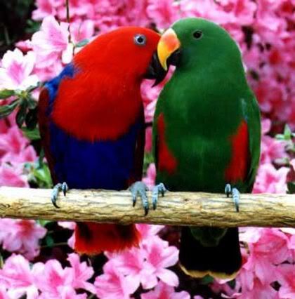
_(2195772708).jpg)
![[13]](http://spaceweather.com/eclipses/08nov06d/Ashraf1.jpg)
![[14]](http://spaceweather.com/eclipses/08nov06d/Jones1.jpg)
![[15]](http://spaceweather.com/eclipses/08nov06e/Alvarez1.jpg)
- Support as nominator --Sir Richardson (talk) 17:16, 15 March 2010 (UTC)
- Comment: I thought it odd that the flower on the right was cut off; I figured that van Gogh was surely a better framer than that. After a quick google, it seems we're missing a right hand edge, some of the top, and some from the left: [16], [17]. Maedin\talk 17:33, 15 March 2010 (UTC)
- Agree.--Mbz1 (talk) 18:17, 15 March 2010 (UTC)
- Different painting, he made several... —Preceding unsigned comment added by 88.194.249.90 (talk • contribs) 22:11, 15 March 2010
- Yes, it is now a different painting, Sir Richardson changed it 2 hours ago and neglected to mention this. Maedin\talk 22:13, 15 March 2010 (UTC)
- Barking up the wrong tree, check history... ;-) —Preceding unsigned comment added by 88.194.249.90 (talk) 22:16, 15 March 2010 (UTC)
- Yes, it is now a different painting, Sir Richardson changed it 2 hours ago and neglected to mention this. Maedin\talk 22:13, 15 March 2010 (UTC)
- Different painting, he made several... —Preceding unsigned comment added by 88.194.249.90 (talk • contribs) 22:11, 15 March 2010
- Comment I think for such an important set of works, it would be legitimate to feature both of them, as long as they're not more cropped than what you would see in the respective (real life) galleries (and meeting our other criteria). Papa Lima Whiskey (talk) 15:39, 16 March 2010 (UTC)
- Sorry, I should have mentioned more sooner. All four sunflower paintings could possibly be featured as a set of pictures, per those of the United States Constitution. Sir Richardson (talk) 16:25, 16 March 2010 (UTC)
- Then I'm in favour of !voting on the set. Papa Lima Whiskey (talk) 19:45, 16 March 2010 (UTC)
- Sorry, I should have mentioned more sooner. All four sunflower paintings could possibly be featured as a set of pictures, per those of the United States Constitution. Sir Richardson (talk) 16:25, 16 March 2010 (UTC)
- Update Nomination is now reworded and is a set of all four sunflower paintings. Sir Richardson (talk) 17:18, 17 March 2010 (UTC)
- Support 3rd only Now I see what the problem is - three of them are of small size. I might have been willing to forgive that one of them is 48 pixels short, but since there are two that are significantly under the bar, I can really only support the one. While I'm at it, number 1 has fairly unsightly reflections - diffuse lighting or equivalent might be better if possible. Papa Lima Whiskey (talk) 14:29, 18 March 2010 (UTC)
Not promoted --Makeemlighter (talk) 04:51, 23 March 2010 (UTC)
Petard[edit]

- Reason
- A petard was an explosive device that used gunpowder to force open gates and doors. Period illustration shows a petard being lit at top, with component parts at bottom. Restored version of File:Petardsketch.jpg.
- Articles in which this image appears
- Petard
- Creator
- anonymous
- Support as nominator --Durova412 20:37, 16 March 2010 (UTC)
- Support GerardM (talk) 05:52, 17 March 2010 (UTC)
- Oppose I can see the components, I can see the men, but the detail is too poor/small/dark to see how they all fit together... especially the first two components - can't see how they are used at all... There also seems to be a plank of wood horizontally which the "bucket" part is fixed, yet this is not included in the components... Sorry, historic and all that, but not very good ev... Gazhiley (talk) 12:07, 17 March 2010 (UTC)
- The second component is a gunpowder horn. The first appears to be a cross section of the metal support frame for the exploding canister. Durova412 15:54, 18 March 2010 (UTC)
- I'd think it is a crossection of the canister itself. The two eyes where the suspension is attached are visible. Image annotation can be used on commons to enhance the image. --Dschwen 16:24, 18 March 2010 (UTC)
- The second component is a gunpowder horn. The first appears to be a cross section of the metal support frame for the exploding canister. Durova412 15:54, 18 March 2010 (UTC)
- Oppose per Gazhiley. Papa Lima Whiskey (talk) 13:15, 18 March 2010 (UTC)
- Oppose, when I saw the thumb and description I really wanted to support because it is such a neat and original find. But Gazhiley has a point. --Dschwen 15:45, 18 March 2010 (UTC)
Not promoted --Makeemlighter (talk) 04:50, 23 March 2010 (UTC)
Meliponula ferruginea.jpg[edit]

- Reason
- Good quality and EV. A picture of the same species was nominated some time ago but barely failed. This one's much better
- Articles in which this image appears
- Stingless bee, Meliponula
- Creator
- Muhammad Mahdi Karim
- Support as nominator --Muhammad(talk) 17:02, 16 March 2010 (UTC)
- Weak support Focus is a little short. Durova412 22:31, 16 March 2010 (UTC)
- Oppose. DOF is pretty low and even the parts that are in focus do not show a whole lot of detail. --Dschwen 15:55, 18 March 2010 (UTC)
- Oppose per Dschwen. The Utahraptor (talk) 01:26, 22 March 2010 (UTC)
Not promoted --Makeemlighter (talk) 04:50, 23 March 2010 (UTC)
San Gorgonio Pass Wind Farm[edit]

- Reason
- Quality and colour seems good enough, and it seems to meet the FI criteria.
- Articles in which this image appears
- San Gorgonio Pass Wind Farm
- Creator
- Farwestern (Commons: Farwestern)
- Oppose Very wavy, also don't see the need for a 360 degree stitch. Some elevation on one of the hills would be better. Noodle snacks (talk) 06:52, 21 March 2010 (UTC)
- Oppose Not a great "fan" of this - too bright and wavery as per noodle... Gazhiley (talk) 23:35, 21 March 2010 (UTC)
- Oppose per Gazhiley --Herby talk thyme 16:18, 22 March 2010 (UTC)
- Withdrawal of nomination: Above points seems reasonable. Thanks for your time. Rehman(+) 01:05, 23 March 2010 (UTC)
Not promoted --Makeemlighter (talk) 04:51, 23 March 2010 (UTC)
- Withdrawn by nominator. Makeemlighter (talk) 04:51, 23 March 2010 (UTC)
Juvenile Pongo pygmaeus[edit]
.jpg)
- Reason
- Okay, yes, it is on the small side, but it does meet the criteria. Sharp and clear, well-framed, good quality. Shows the "laughing" behaviour.
- Articles in which this image appears
- Bornean Orangutan, Orangutan, Laughter in animals, Laughing
- Creator
- Malene Thyssen
- Support as nominator —Maedin\talk 17:34, 16 March 2010 (UTC)
- oppose for the given size this is neither sharp nor clear (and 0.88MP is ridiculously small). --Dschwen 01:34, 17 March 2010 (UTC)
- Do you mean 0.93 MP? I think "ridiculous" is a strong word, considering that it does meet the criteria and the standard upload by Benjamint is only 1.7. As for the rest, I think there's some slight movement blur on the face where he was caught mid-expression, but I found it acceptable. Maedin\talk 09:51, 17 March 2010 (UTC)
- I actually mean 0.88, sorry but I'm still thinking in 10242 rather than the marketing-cosmetics-units ;-). Anyhow there are plenty of compression artifacts in the fur and the end result is not clear at all. This is low quality. But I guess some funny-monkey-supports (pardon, ape!) are inevitable. I suggest next time we put the monkey in a tuxedo -> instant FP. --Dschwen 13:22, 17 March 2010 (UTC)
- I'm not really sure why you're being so sarcastic, Dschwen, :) Apart from you implying that I somehow nominated this because I prefer apes in tuxedos and doing tricks, I don't entirely disagree with your comments. I've asked Malene for a bigger image, with less compression. We'll see what she says; if nothing comes of it, *shrug*. Maedin\talk 13:44, 17 March 2010 (UTC)
- Mine and Fir's standard is very close to double this size.... (Are they compression artifacts btw? I assumed they were a few strokes of strong selective sharpening (The end result is the same of course)) Benjamint 13:31, 17 March 2010 (UTC)
- Yes, but considering that Dschwen thinks this is "ridiculously small", your 0.8MP increase on that says "only slightly less ridiculous" to me. In any case, this was uploaded at that resolution in 2004 (which was fairly standard back then). Maedin\talk 13:44, 17 March 2010 (UTC)
- Anyone seen Spaceballs? Reminds of ludicrous speed :-). Well, I'm certainly not wowed by Benjamintt's size (and still "blame" Fir for setting such a bad example) but using him as a justification for uploading at just half the size of him does not strike me as a logical argument. --Dschwen 15:49, 18 March 2010 (UTC)
- Maybe you didn't mean it like that, but just for the record: the uploader is Malene Thyssen. Papa Lima Whiskey (talk) 00:19, 20 March 2010 (UTC)
- Support, solely because of the hilarious expression on this ape's face! -- Ϫ 05:18, 17 March 2010 (UTC)
- Oppose per Dschwen aswell as cloning artifacts in bg --Benjamint 06:32, 17 March 2010 (UTC)
- Oppose per Dschwen's first comment -- looks quirky when viewed as a thumbnail, but very disappointing when viewed at full size. NotFromUtrecht (talk) 15:47, 18 March 2010 (UTC)
- Support, This picture shows a lot of character. The expression alone outweighs the "quality" issues. It brought a smile to my face, something a lot of FPs can not do. Tim1337 (talk) 18:35, 18 March 2010 (UTC)
- And this is precisely what my tuxedo remark referred to: anthropomorphisation of animals. It is absolutely unencyclopaedic to interpret character into this. --Dschwen 18:56, 18 March 2010 (UTC)
- Support per nom.--Mbz1 (talk) 08:44, 19 March 2010 (UTC)
- Oppose -- it's not "sharp and clear" at all, which says a lot considering how small the image is. Diego_pmc Talk 17:54, 19 March 2010 (UTC)
- Comment I'm beginning to wonder if the complaints about sharpness are actually about resolution. The focus plane seems to be to be in the right place, and DOF is good. Nothing unsharp about his wrinkles, for instance. Resolution actually also seems fine to me by Wikipedia's WIAFP standards. Papa Lima Whiskey (talk) 00:19, 20 March 2010 (UTC)
- Weak support Resolution is not great but meets the criteria. --Muhammad(talk) 00:15, 21 March 2010 (UTC)
Not promoted --Makeemlighter (talk) 04:01, 24 March 2010 (UTC)
Impala mutualim with birds[edit]


- Reason
- Good quality and very good EV for many articles. Shows the impala in a natural environment and illustrates the relationship between the two species.
- Articles in which this image appears
- Impala, Mutualism (biology), Red-billed Oxpecker
- Creator
- Muhammad Mahdi Karim
- Support as nominator --Muhammad(talk) 17:07, 16 March 2010 (UTC)
- Comment The framing is too tight at the top. Papa Lima Whiskey (talk) 19:58, 16 March 2010 (UTC)
- Edit added. Papa Lima Whiskey (talk) 20:36, 16 March 2010 (UTC)
- Comment The stalk of grass running through the face of the oxpecker on the back is a crying shame. And, wearing my bird-nerd hat, its inclusion in mutualism is debatable. Oxpeckers are part mutual and part parasitic. The extent to which this is so is a source of ongoing debate and research. Sabine's Sunbird talk 05:06, 17 March 2010 (UTC)
- In the beginning the oxpeckers are mutalistic and then they end up being parasitic. Would it be better if I included that in the caption? Grass through the oxpecker is indeed unfortunate but sometimes it is impossible to see such minor things through the wiewfinder. But it illustrates the implala and the environment quite well, IMO --Muhammad(talk) 12:49, 17 March 2010 (UTC)
- The clone job on the edit needs a little more work; many duplicated features --Benjamint 06:25, 17 March 2010 (UTC)
- Support per nominator.--Mbz1 (talk) 17:27, 17 March 2010 (UTC)
Reluctant oppose. Cloning problems at far right. Durova412 19:16, 17 March 2010 (UTC)OpposeSupport Alt1. The cloning is an absolute no no for me, the "original" has a bit of an unbalanced composition and I would like the subject to show more detail (i.e. give me more pixels). --Dschwen 15:53, 18 March 2010 (UTC)- Alt 1 Uploaded. Much higher resolution (I need more RAM) and wider crop from another image in the batch. --Muhammad(talk) 17:53, 18 March 2010 (UTC)
- Thanks. The Alt1-version has the added benefit of the blade of grass not being in the bird's face. --Dschwen 19:01, 18 March 2010 (UTC)
- You and me both, Muhammad. Makeemlighter (talk) 02:27, 19 March 2010 (UTC)
- Usually with high res images, PS is very slow and a bit of impatience and it crashes. It's a sad situation --Muhammad(talk) 14:19, 19 March 2010 (UTC)
- Alt 1 Uploaded. Much higher resolution (I need more RAM) and wider crop from another image in the batch. --Muhammad(talk) 17:53, 18 March 2010 (UTC)
- Support either, prefer edit 1. Nice EV and an interesting subject. Ðiliff «» (Talk) 22:22, 18 March 2010 (UTC)
Promoted File:Impala mutualim with birds wide.jpg --Makeemlighter (talk) 04:03, 24 March 2010 (UTC)
Borneo wildfires[edit]

- Reason
- NASA's usual standard of satellite imagery; plus, I think the EV is higher than "usual" due to the well-illustrated widespread and deliberate slashing-and-burning. This island is the habitat of the Bornean orangutan, see image of juvenile nominated below.
- Articles in which this image appears
- Borneo peat swamp forests, Borneo, Peat swamp forest
- Creator
- NASA, or, more specifically, Jacques Descloitres, MODIS Land Rapid Response Team
- Support as nominator —Maedin\talk 18:22, 16 March 2010 (UTC)
- Support High quality image of course. I'm glad the red boxes were added by NASA, eliminating any potential original research that may have been done by us. Good EV. Jujutacular T · C 22:37, 16 March 2010 (UTC)
- This makes an interesting read. I wonder which version of the fire detection algo was used in the picture (it was taken 2002). The original algorithm does not seem perfect, and it should not be idolized. In fact it is pretty obvious that a couple of fires were missed. False positives are harder to tell though. As far as I can see the algorithm works completely independent of the occurence of smoke, and I would not call it OR to infer that if there is smoke in a forrest there is a fire. --Dschwen 21:37, 18 March 2010 (UTC)
- Comment Very high EV, but a pitty that two peninsulas are slightly croped and is not north aligned. --Elekhh (talk) 05:30, 17 March 2010 (UTC)
- Took me a while to see the lack of north alignment. Indeed, north seems to be a few degrees to the left. I'd be more concerned if the primary encyclopedic value of this image was geographic. Jujutacular T · C 06:59, 17 March 2010 (UTC)
- just out of curiosity how can you tell this isn't north alligned? Gazhiley (talk) 12:09, 17 March 2010 (UTC)
- Compare with any map of Borneo, for instance: File:Borneo Topography.png. Look closely at a specific small detail of the coastline, some place that it would be easy to see orientation. You'll see that this image is rotated slightly counter-clockwise. I also double-checked with google earth. Jujutacular T · C 17:49, 17 March 2010 (UTC)
- Given the satellites' paths [18], the raw images won't be north-aligned. North-aligning them without hugely increasing the resolution would cause some detail to be lost. Papa Lima Whiskey (talk) 10:10, 18 March 2010 (UTC)
- Wow fair play good spotting there... Even with this and another image side by side it took me a while to spot that! Gazhiley (talk) 12:02, 18 March 2010 (UTC)
- Compare with any map of Borneo, for instance: File:Borneo Topography.png. Look closely at a specific small detail of the coastline, some place that it would be easy to see orientation. You'll see that this image is rotated slightly counter-clockwise. I also double-checked with google earth. Jujutacular T · C 17:49, 17 March 2010 (UTC)
![[18]](http://tirolatlas.uibk.ac.at/topics/sat/terra/images/orbitmap1.global.2007075.jpg)
- Support per nom. Durova412 15:29, 17 March 2010 (UTC)
- Support Of course.--Mbz1 (talk) 17:48, 17 March 2010 (UTC)
- Support although I wish the red squares from the fire product weren't permanently burnt into the image. Redeemingly, there are a few fires the algorithm didn't catch. Papa Lima Whiskey (talk) 10:10, 18 March 2010 (UTC)
- Support btw - forgot to do this when i first started commenting... sentiments as per PLW though... Gazhiley (talk) 12:12, 18 March 2010 (UTC)
- Support High quality and EV. -- Avenue (talk) 10:31, 20 March 2010 (UTC)
- Support per nom. Broccoli (talk) 22:54, 21 March 2010 (UTC)
- Support per nom. --Herby talk thyme 16:21, 22 March 2010 (UTC)
Promoted File:Borneo fires and smoke, 2002.jpg --Makeemlighter (talk) 04:12, 24 March 2010 (UTC)
VLS cells aboard USS Santa Fe (SSN-763)[edit]
_VLS_doors_open.jpg)
- Reason
- These days submarines are known not only for their torpedoes, but also for their missile magazines, a fact often forgotten since these boats are typically associated with torpedo attacks. Here, though, we have a unique view of the vertical launch cells that subs make use of to fire missiles during exercises or during actual military operations. As an added bonus, the cells are forward of the sail of the submarine, a unique feature since missile subs (SSBN/SSGN) have these doors behind the sail. On the whole, this is a photograph that should inspire a closer look, and I am therefore adding it here.
- Articles in which this image appears
- Los Angeles class submarine
- Creator
- OS2 JOHN BOUVIA
- Support as nominator --TomStar81 (Talk) 06:15, 22 March 2010 (UTC)
- Oppose. There's not much positive to say about the photo. The composition is fairly ordinary, the image is quite out of focus/soft, there's lots of film grain, and the subject seems a bit underexposed. I suppose it's an interesting photo for sub-spotters, but it just doesn't stand out as a FP. Ðiliff «» (Talk) 11:11, 22 March 2010 (UTC)
- Support. Factsontheground (talk) 14:34, 22 March 2010 (UTC)
- Oppose Bleak colours, boring composition, cut-off --Muhammad(talk) 16:16, 22 March 2010 (UTC)
- Oppose per Diliff and Muhammad. --Dschwen 16:26, 22 March 2010 (UTC)
- Oppose per Diliff and Muhammad too. --Alchemist-hp (talk) 18:56, 22 March 2010 (UTC)
- Comment This might work better as a valued picture than a featured picture - it's a very useful image, but not of particularly high technical standards. Nick-D (talk) 07:38, 23 March 2010 (UTC)
- That suggestion has actually been made to me before, but I like to think that any picture that can be valued can also be featured, so I do not make use of the VP system. If you would like to add this image for consideration at VPC then do feel free to do so, I won't stop you, its just a preference for FPs over VP that keeps me from using the system. TomStar81 (Talk) 20:15, 23 March 2010 (UTC)
- Oppose per Diliff and Muhammad--Mbz1 (talk) 00:56, 24 March 2010 (UTC)
Not promoted --Makeemlighter (talk) 04:21, 24 March 2010 (UTC)
- Per WP:SNOW. Makeemlighter (talk) 04:21, 24 March 2010 (UTC)
Blue and Yellow Macaw[edit]

- Articles in which this image appears
- Blue-and-yellow Macaw, Neotropical parrot
- Creator
- Benjamint 13:15, 17 March 2010 (UTC)
- Support as nominator --Benjamint 13:15, 17 March 2010 (UTC)
- Can you please elaborate on the postprocessing? Thanks. --Dschwen 13:18, 17 March 2010 (UTC)
- RAW conversion and postprocessing done by Fir, I'll see him this evening so I can ask but it was nothing more than usual, it was a nice image to begin with. Benjamint 21:29, 17 March 2010 (UTC)
- Hm, well, send him my regards ;-). It just looks like a nuclear-parrot to me, or maybe a blacklight-disco-parrot. Then again parrots are not very common in the american midwest, so what do I know... --Dschwen 15:43, 18 March 2010 (UTC)
- Comment -- the 2:5 aspect ratio pushes all the infobox content right down to the bottom of both the articles it's used in. It doesn't create a nicely composed photograph. The background is interesting and not particularly distracting, so I don't see why the narrow crop is needed. I'd prefer something in the region of 2:3 or even 3:4. NotFromUtrecht (talk) 16:25, 18 March 2010 (UTC)
- Oppose -- for the reasons above, since no alt version has been forthcoming. Also, it does look a bit over-processed. NotFromUtrecht (talk) 08:00, 24 March 2010 (UTC)
- Weak Support Beautiful composition, but the background is a bit distracting. Nothing too serious, though. The Utahraptor (talk) 01:18, 22 March 2010 (UTC)
- Support It is nice! Little wow. Feathers are cute! --Tadijataking 00:52, 24 March 2010 (UTC)
- Support--Mbz1 (talk) 00:58, 24 March 2010 (UTC)
- Oppose looks fake, overprocessed/oversaturated. --Dschwen 02:47, 24 March 2010 (UTC)
Not promoted --Makeemlighter (talk) 04:33, 25 March 2010 (UTC)
- Only 3.5 of 5 required supports. Makeemlighter (talk) 04:33, 25 March 2010 (UTC)
Raw Garnet[edit]

- Reason
- It's a beautiful picture, and illustrates the physical properties of mercury.
- Articles in which this image appears
- Garnet
- Creator
- US Federal Government
- Support as nominator --'FLaRN'(talk) 05:02, 21 March 2010 (UTC)
- Oppose The particular specimen is very dusty and the image quality isn't great. Noodle snacks (talk) 06:54, 21 March 2010 (UTC)
- Oppose per Noodle Snacks. Fletcher (talk) 14:59, 21 March 2010 (UTC)
- Oppose per Noodle Snacks too. --Alchemist-hp (talk) 20:02, 21 March 2010 (UTC)
Not promoted --Makeemlighter (talk) 04:39, 25 March 2010 (UTC)
- Per WP:SNOW. Makeemlighter (talk) 04:39, 25 March 2010 (UTC)
- I don't know where this came from. I do remember making this nomination, but I have no memory of nominating this picture. My reason for supporting as the nominator very similar to the other one. 'FLaRN'(talk) 03:49, 17 July 2011 (UTC)
Pouring liquid mercury[edit]

- Reason
- It just looks cool, and illustrates the physical properties of mercury.
- Articles in which this image appears
- Mercury (element)
- Creator
- Bionerd
- Support as nominator --'FLaRN'(talk) 04:40, 21 March 2010 (UTC)
- Weak Support Actually works pretty well in my opinion. The blown highlights from the flash lighting are unfortunate. Noodle snacks (talk) 06:55, 21 March 2010 (UTC)
- Oppose Very cool (and dangerous?), but technical quality and composition should be improved. Besides the highlights, it's not quite sharp enough IMO. But mainly, the composition is crooked and has too much clutter in it (including fingers!). Bonus points if you could somehow include Robert Patrick in the picture. ;-) Fletcher (talk) 15:10, 21 March 2010 (UTC)
- Oppose cool photo but tilted and bad composition. --Alchemist-hp (talk) 20:00, 21 March 2010 (UTC)
- Oppose. Looks a bit snapshotty and has unappealing flash lighting. --Dschwen 16:28, 22 March 2010 (UTC)
Not promoted --Makeemlighter (talk) 04:39, 25 March 2010 (UTC)
- Per WP:SNOW. Makeemlighter (talk) 04:39, 25 March 2010 (UTC)
Bison grazing on Antelope Island[edit]

- Reason
- Four bison are grazing together, and the background is good.
- Articles in which this image appears
- Antelope Island
- Creator
- The Utahraptor
- Support as nominator --The Utahraptor (talk) 21:46, 22 March 2010 (UTC)
- Oppose The sky is very noisy, the composition is not good, no wow.--Mbz1 (talk) 04:50, 23 March 2010 (UTC)
- Oppose You've taken better pictures than this, and there are at least six in the article that are superior. Once you resolve your focus issues (referring to some of your other pictures) and maybe upgrade to a slightly better camera (there are reviews of photo quality by camera model in magazines and on the web), you'll most likely to be able to produce photographs that will receive recognition here. Papa Lima Whiskey (talk) 14:31, 23 March 2010 (UTC)
- Oppose as per Mbz1. plus either Horizon is tilted badly or this is such a tight crop/zoom that the hill this is on is out of picture... Either way looks really awkward... Gazhiley (talk) 11:47, 24 March 2010 (UTC)
- This wasn't taken on a hill. The grass is just tall. The Utahraptor (talk) 13:25, 24 March 2010 (UTC)
- If not on a hill, then the horizon is definately tilted... The buffelo on the right is just as clear as the ones to the left, so grass is same length, yet it appears higher up in the picture... and there is a smooth steady increase in hight l-r of horizon, which would not be the case if the grass was just longer unless the person planting the grass planted one row of seeds per week so that it grew at different lengths... Nature is too random to grow grass in a straight slope like that... Gazhiley (talk) 15:13, 24 March 2010 (UTC)
- Oppose I've seen your photos. You've taken photos much better than this one. You can definitely do better than this. BlackCowboy9 (talk) 14:04, 24 March 2010 (UTC)
Not promoted --Makeemlighter (talk) 04:38, 25 March 2010 (UTC)
- Per WP:SNOW. Makeemlighter (talk) 04:38, 25 March 2010 (UTC)
Glaciers and Icebergs in high Arctic[edit]


- Reason
- A rare aerial view of the very remote region of High Arctic. The only image of the kind on Wikipedia, huge EV, good quality.
- Articles in which this image appears
- Glacier; Iceberg;Cape York (Greenland)
- Creator
- Mbz1
- Support as nominator --Mbz1 (talk) 05:11, 23 March 2010 (UTC)
Oppose terrible CAoh wait, my mistake. :) Support as per Commons FPC on this image. –Juliancolton | Talk 13:32, 23 March 2010 (UTC)- Oppose Noise and motion blur. Papa Lima Whiskey (talk) 14:50, 23 March 2010 (UTC)
- Comment: Just asking, where exactly you see motion blur?--Gilisa (talk) 06:28, 24 March 2010 (UTC)
- That image is extremely rare, and was taken in a very harsh environment. Arctic is melting. Few years from now that image will become historic.--Mbz1 (talk) 15:26, 23 March 2010 (UTC)
- I like the image but can you tell me why we should promote this when we already have a very similar FP? --Muhammad(talk) 15:45, 23 March 2010 (UTC)
- It is not really similar. The image you pointing out to was taken from a ship. The nominated image was taken from a helicopter. Not only it provides a wider view of the area, but it also shows the parts of icebergs that are under the water. Many people do not realize that typically only one-tenth of the volume of an iceberg is above water. That's why the icebergs are so dangerous for navigation. It seems small and harmless above the water line, but most of the danger is hidden below.--Mbz1 (talk) 15:54, 23 March 2010 (UTC)
- I like the image but can you tell me why we should promote this when we already have a very similar FP? --Muhammad(talk) 15:45, 23 March 2010 (UTC)
- Looks overprocessed. --Dschwen 16:10, 23 March 2010 (UTC)
- Right. Added the edit. Now you sure could see the part below the water much better :)--Mbz1 (talk) 18:43, 23 March 2010 (UTC)
- Dschwen, you can find out more by looking at what I think is the actual original: File:Icebergs cape york 1.JPG. Papa Lima Whiskey (talk) 23:39, 23 March 2010 (UTC)
- Uh huh. Attempted recovery of overexposed icebergs makes them look posterized and grainy. Quite a shame,but I guess the sight must have been to stunning to think of setting the exposure compensation. We don't have many users flying to the arctic (Slaunger?) so I won't oppose, but rather abstain. --Dschwen 02:53, 24 March 2010 (UTC)
- I know Slaunger took some rather nice images of icebergs, but I do not recall aerial view. Do you? --Mbz1 (talk) 02:56, 24 March 2010 (UTC)
- Uh no, that was just the only one coming to my mind who had been there (so he probably flew to the arctic, but didn't fly around there ;-) ). --Dschwen 03:00, 24 March 2010 (UTC)
- Then, if we have agreed that my image is the only one image of the icebergs taken from the air, you might reconsider your "abstain" and support the image :)--Mbz1 (talk) 03:05, 24 March 2010 (UTC)
- Well, there are many things we only have one image of. That's not a sufficient criterium for FP status. --Dschwen 03:34, 24 March 2010 (UTC)
- Then, if we have agreed that my image is the only one image of the icebergs taken from the air, you might reconsider your "abstain" and support the image :)--Mbz1 (talk) 03:05, 24 March 2010 (UTC)
- Uh no, that was just the only one coming to my mind who had been there (so he probably flew to the arctic, but didn't fly around there ;-) ). --Dschwen 03:00, 24 March 2010 (UTC)
- I know Slaunger took some rather nice images of icebergs, but I do not recall aerial view. Do you? --Mbz1 (talk) 02:56, 24 March 2010 (UTC)
- Uh huh. Attempted recovery of overexposed icebergs makes them look posterized and grainy. Quite a shame,but I guess the sight must have been to stunning to think of setting the exposure compensation. We don't have many users flying to the arctic (Slaunger?) so I won't oppose, but rather abstain. --Dschwen 02:53, 24 March 2010 (UTC)
- Support either, prefer edit 1 (although I wish it was cropped a little less tightly on the sides). The oblique aerial view gives a very different perspective to the other FP. --Avenue (talk) 00:30, 24 March 2010 (UTC)
- Oppose per Papa Lime Whiskey. Factsontheground (talk) 04:10, 24 March 2010 (UTC)
- support - It's a featured picture on Wikimedia Commons and is considered one of the finest images on commons - don't see why that wouldn't be the case here. Momma's Little Helper (talk) 04:53, 24 March 2010 (UTC)
- Comment - I see more than enough difference between this and the one from the ship. I prefer option 1 as well but I am not an expert with photos.Cptnono (talk) 05:30, 24 March 2010 (UTC)
- support per Avenue I think. Worthwhile image & perfection in such a setting would be hard to achieve while enjoying the view :) --Herby talk thyme 08:51, 24 March 2010 (UTC)
- Support Great photo after all, noteable subject and more important-present aerial view. I didn't find signficant noise levels or blur in it.--Gilisa (talk) 10:01, 24 March 2010 (UTC)
- Oppose Most of the picture is blurred, and you can only see top part of icebergs - what appears to be the below-water part is merely a reflection... Study the shapes carefully and they are mirror images of the above-water ice shapes... High EV yes, and unique yes, but neither are enough to automatically grant FP status, as per Dschwen... Gazhiley (talk) 11:08, 24 March 2010 (UTC)
- Comment Gazhiley-I realy think I miss something here, what do you find to be blurred? Also, on the contarary regarding what you refered as icebergs reflection. It first look as a reflection, but if you study it carefuly you will find that it isn't.--Gilisa (talk) 11:35, 24 March 2010 (UTC)
- The entire left side of the picture especially the "land" but also the individual icebergs are incredibly blurred when viewed at full res... A case in point for the reflection is the iceberg in the bottom right of the picture... The shape viewed on the water is a mirror image... Gazhiley (talk) 11:51, 24 March 2010 (UTC)
- I see both reflections (brownish-grey) and submerged parts (light blue) for the nearer icebergs. The difference is perhaps clearest for the iceberg a little left of centre at the bottom of edit 1 - see the large blue projection to the left of it. In the middle distance and beyond, only reflections are visible. --Avenue (talk) 11:57, 24 March 2010 (UTC)
- Ok apologies where apologies due - there are one or two where you can see something below the water - certainly not 9 times the size ABOVE the water though, which one would expect when being told that they are 1/10th above and this pic shows it below... So not very EV there... But either way that blue tint is only viewable on a small handful, so I still say that this doesn't show the below the surface enough to support, and the afore-mentioned blur on the entire left side of the pic is still a problem for me... Gazhiley (talk) 12:15, 24 March 2010 (UTC)
- It is not about the size, it is about the volume, and I am not sure the volume and the size are corresponding in the icebergs.--Mbz1 (talk) 14:28, 24 March 2010 (UTC)
- Ok now you've lost me... I understood (I may be wrong) that 9/10ths of an iceberg was underwater... Certainly my comemorative Titanic wallposter I obsessed over when I was younger (and obsessed is exactly the right description here) had a "mock up" of the iceberg that the ship hit... It showed that statistic and the iceberg they pictured used size as their way of describing the 9/10ths bit... Ie if an iceberg was 10metres above water, there would be 90metres below water... But I and whoever made that poster may have been wrong... Or maybe I'm misunderstanding what you are saying? Either way, the quality of the picture is too low for me... Gazhiley (talk) 14:36, 24 March 2010 (UTC)
- Honestly I am not a big specialist in icebergs, but as I explained earlier IMO volume and size do not always correspond in other words the density below the water could be greater than the density above the water--Mbz1 (talk) 15:28, 24 March 2010 (UTC)
- Nope, that is
nonsenseobviously wrong. What does size even mean? Density should be roughly the same, making it 9/10 of the volume being submeged. You just cannot see all of the iceberg below the water line as the visibility in the water is not sufficient. --Dschwen 15:51, 24 March 2010 (UTC) P.S.: and actually Gazhiley is right. At least for the icebergs not in the immediate foreground we are definitely seeing reflections. Sorry, that means you kind of over-sold the picture a bit ;-) --Dschwen 15:54, 24 March 2010 (UTC)- I said I was not specialist, but thanks for the explanation and for "nonsense" :)--Mbz1 (talk) 15:59, 24 March 2010 (UTC)
- Yeah, sorry , rephrased ;-). Made my toenails roll up, as it should have for anyone with a bit of a physics background. --Dschwen 16:17, 24 March 2010 (UTC)
- I think the "overselling" mainly comes down to one word, "the", as in "the part of the icebergs ...". Maybe this was due to non-fluent English? I assumed it was when I first read it, and I'm a bit stunned that people seem to have taken it literally.--Avenue (talk) 16:38, 24 March 2010 (UTC)
- I said I was not specialist, but thanks for the explanation and for "nonsense" :)--Mbz1 (talk) 15:59, 24 March 2010 (UTC)
- Nope, that is
- Honestly I am not a big specialist in icebergs, but as I explained earlier IMO volume and size do not always correspond in other words the density below the water could be greater than the density above the water--Mbz1 (talk) 15:28, 24 March 2010 (UTC)
- Ok now you've lost me... I understood (I may be wrong) that 9/10ths of an iceberg was underwater... Certainly my comemorative Titanic wallposter I obsessed over when I was younger (and obsessed is exactly the right description here) had a "mock up" of the iceberg that the ship hit... It showed that statistic and the iceberg they pictured used size as their way of describing the 9/10ths bit... Ie if an iceberg was 10metres above water, there would be 90metres below water... But I and whoever made that poster may have been wrong... Or maybe I'm misunderstanding what you are saying? Either way, the quality of the picture is too low for me... Gazhiley (talk) 14:36, 24 March 2010 (UTC)
- It is not about the size, it is about the volume, and I am not sure the volume and the size are corresponding in the icebergs.--Mbz1 (talk) 14:28, 24 March 2010 (UTC)
- Ok apologies where apologies due - there are one or two where you can see something below the water - certainly not 9 times the size ABOVE the water though, which one would expect when being told that they are 1/10th above and this pic shows it below... So not very EV there... But either way that blue tint is only viewable on a small handful, so I still say that this doesn't show the below the surface enough to support, and the afore-mentioned blur on the entire left side of the pic is still a problem for me... Gazhiley (talk) 12:15, 24 March 2010 (UTC)
- I see both reflections (brownish-grey) and submerged parts (light blue) for the nearer icebergs. The difference is perhaps clearest for the iceberg a little left of centre at the bottom of edit 1 - see the large blue projection to the left of it. In the middle distance and beyond, only reflections are visible. --Avenue (talk) 11:57, 24 March 2010 (UTC)
- The entire left side of the picture especially the "land" but also the individual icebergs are incredibly blurred when viewed at full res... A case in point for the reflection is the iceberg in the bottom right of the picture... The shape viewed on the water is a mirror image... Gazhiley (talk) 11:51, 24 March 2010 (UTC)
- Oppose as per Gazhiley. BlackCowboy9 (talk) 14:04, 24 March 2010 (UTC)
- Support the original image. Beautiful image, notable subject. Broccoli (talk) 15:53, 24 March 2010 (UTC)
Not promoted —Maedin\talk 08:13, 25 March 2010 (UTC)
Royal Coat of Arms of the Kingdom of Greece[edit]

- Reason
- High quality vector image
- Articles in which this image appears
- Coat of arms of the Kingdom of Greece, Template:Greek Royal Family
- Creator
- Sodacan
- Support as nominator --Sodacan (talk) 17:45, 17 March 2010 (UTC)
Oppose: There seem to be numerous differences between this and the coat of arms shown in the cited source,[19] which I can't see good reasons for. Most glaringly, the supporters seem to have transformed from curiously garbed but genial, garlanded, grey-haired gentlemen into scowling troglodytes. The faces in this version seem closer to the source. Sorry, I'm sure a lot of work has gone into the nominated image, but it doesn't seem accurate to me. -- Avenue (talk) 22:14, 17 March 2010 (UTC)
- A coat of arms of the same blason does not always appear exactly the same, E.g. [20], [21], and [22]: all essentially the same image, representing the same institution, but with great artistic differences. The troglodytes are supposed to be Hercules wearing the skin of the Nemean lion (reading the caption could have helped with that one). BTW the other version's supporters are identical basic template as this version, but with a new beard and hair, I would know I drew most of that version as well. Sodacan (talk) 22:34, 17 March 2010 (UTC)
- I know that there can be artistic differences, but I'd think we'd want to follow the official version reasonably closely. Of the three UK examples you show, the two from official sources seem very similar to me. Having said that, after looking around I see the Greek government has not been as consistent as I would have expected, e.g. the coat of arms on this document is very different from the 1864-1936 version in the Royal House of Greece source, and much more so than your version. So I have struck my opposition above for now. I still have reservations about the changes, especially to the supporters and the crown. For instance, the Royal House of Greece source shows a simple Greek cross on top of the crown, but yours is more ornate, similar to a cross crosslet, which I gather has evangelical connotations. Was this simply an artistic choice, or did you intend the change to carry some meaning? -- Avenue (talk) 00:53, 18 March 2010 (UTC)
- Well, my personal opinion is that I have been as accurate, as I can be as a heraldic artist. Heraldry does not specify the look on faces or the flowing folds of a curiously floating mantle. It does however specify colours (tinctures) and symbols (charges), of which I believed, is almost if not entirely accurate, representative and encyclopaedic. What I have done was to take artistic licenses where it does not matter. If I was copying the Coca-Cola logo, where absolute conformity is key, then I of course would not make any deliberate differences. The issue of the crown is definitely worthy of discussion, and this has been done at length at my talk page at Wiki Commons, but the issue, for me anyway, has been settled. I will reiterate and say that I have made the coat of arms as accurate heraldically as I can, If I wanted a copy then I would have uploaded it under fair use, and although I have taken artistic licenses, they are definitely not akin to an artistic choice or an intension to graphically espouse a POV! I would not dare upload an artwork that I have painstakingly created unto Wikipedia, if I knew that it was inaccurate and is of no benefit whatsoever. Believe me before I create any of my artwork I do a lot of research, finding as many images as I can on the internet and books, it takes weeks if not months, to source them all here would be quite insane, and believe me none of them are exactly the same (well, they're not really meant to be). Sodacan (talk) 01:43, 18 March 2010 (UTC)
- Thanks for the link to your earlier discussions. I haven't gone through it all yet, but it has already set my mind at rest about the cross. I didn't mean to suggest you were trying to espouse a POV in your work; I just wanted to make sure one had not slipped in accidentally. My question was probably poorly worded - I'm sorry. -- Avenue (talk) 02:40, 18 March 2010 (UTC)
- Well, my personal opinion is that I have been as accurate, as I can be as a heraldic artist. Heraldry does not specify the look on faces or the flowing folds of a curiously floating mantle. It does however specify colours (tinctures) and symbols (charges), of which I believed, is almost if not entirely accurate, representative and encyclopaedic. What I have done was to take artistic licenses where it does not matter. If I was copying the Coca-Cola logo, where absolute conformity is key, then I of course would not make any deliberate differences. The issue of the crown is definitely worthy of discussion, and this has been done at length at my talk page at Wiki Commons, but the issue, for me anyway, has been settled. I will reiterate and say that I have made the coat of arms as accurate heraldically as I can, If I wanted a copy then I would have uploaded it under fair use, and although I have taken artistic licenses, they are definitely not akin to an artistic choice or an intension to graphically espouse a POV! I would not dare upload an artwork that I have painstakingly created unto Wikipedia, if I knew that it was inaccurate and is of no benefit whatsoever. Believe me before I create any of my artwork I do a lot of research, finding as many images as I can on the internet and books, it takes weeks if not months, to source them all here would be quite insane, and believe me none of them are exactly the same (well, they're not really meant to be). Sodacan (talk) 01:43, 18 March 2010 (UTC)
- I know that there can be artistic differences, but I'd think we'd want to follow the official version reasonably closely. Of the three UK examples you show, the two from official sources seem very similar to me. Having said that, after looking around I see the Greek government has not been as consistent as I would have expected, e.g. the coat of arms on this document is very different from the 1864-1936 version in the Royal House of Greece source, and much more so than your version. So I have struck my opposition above for now. I still have reservations about the changes, especially to the supporters and the crown. For instance, the Royal House of Greece source shows a simple Greek cross on top of the crown, but yours is more ornate, similar to a cross crosslet, which I gather has evangelical connotations. Was this simply an artistic choice, or did you intend the change to carry some meaning? -- Avenue (talk) 00:53, 18 March 2010 (UTC)
![[20]](https://en.wikipedia.org/wiki/File:Ukpassport-cover.jpg)
![[21]](https://en.wikipedia.org/wiki/File:Her_Majesty%27s_Government_Coat_of_Arms.svg)
![[22]](https://commons.wikimedia.org/wiki/File:Timbre_UK_2-6_1939.jpg)
- Comment: Regardless of the issue above, the licensing is questionable. This image does not belong to you- I'm assuming that you're assuming it public domain, but, if so, some evidence and a public domain template would be nice. J Milburn (talk) 23:01, 17 March 2010 (UTC)
- Just added an anonymous author tag, Greek copy write laws are in conformity with the EU: 70 years after the work has been available to the public and the author's identity is unknown, then it is considered within the public domain. This version of the coat of arms was created in 1936, one year after the return of King George II from exile and the restoration of the monarchy. Sodacan (talk) 23:11, 17 March 2010 (UTC)
- Comment: [I'm retired from editing Wikipedia, but I'll make this exception] 1) Regarding the last comment about "the devices within the shield": these devices is the shield of the coat of arms of the Kingdom of Denmark, as it was when King George I of Greece (Prince Vilhelm (William) of Denmark) was installed as King of Greece. That insignia was designed in 1819, and approved by royal decree by King Frederick VI of Denmark in 1819 or 1820, so no copyright issue there. 2) The crown: the crown Sodacan uses is the same drawing which he uses for his illustrations of various coats of arms of Denmark. He has stated on his talk page, why he believes that the Greek royals would have used a drawing they already knew, i.e. the Danish equivalent. The actual drawing used in Denmark is a heraldic construct based on the crown of King Christian V of Denmark (Compare the physical crown of Denmark with the top image of this 18th century copy of an official painting of the various heraldic crowns). The way Sodacan portrays the crown corresponds rather closely to the way it has been rendered in official Danish images since 1819, cf: current official drawings of the Danish arms and crown and the current official drawing of the insignia of the Danish monarch. 3) The supporters in the Greek arms are indeed meant to represent Hercules, identified by the skin of the Nemean Lion, that he wears as clothing. The inspiration for this element is the "vildmænd" (wild men / savages) from the Danish arms. 4) Avenue, you wish that heraldic drawings on Wikipedia should follow the original official drawings very closely. I hold the same position, however, consensus on this project has rejected this position. In a normal paper encyclopedia, using the official drawing is not a problem, as such illustrations would fall under a fair use-clause or similar law. However, Wikipedia's requirements for "free-for-all downstream use" makes this impossible for heraldic illustrations from almost the entire EU, as EU copyright law treats heraldic drawings like all other drawings; i.e. all drawings are proteced by copyright until 70 years have passed following the artist's death. A "work for hire" clause applies in the US, but not in the EU. This is the reason why a ton of heraldic illustrations have previously been deleted on Wikipedia, precisely because they were found to resemble the official drawings too closely, which meant that they were deemed to be copyright violations. Since the fair-use option has been rejected repeatedly for this particular material, the only option left is to design a new heraldic illustration based on the official's written description, so the end-result is a new illustration where copyright belongs only to the Wikipedian that drew it. This is what Sodacan is doing here. Another example is Lokal Profil who is doing the same for the Swedish material, as it is covered by the same legal situation as the Greek material. It would have been ideal to use an official Greek drawing as illustration, however, it is extremely unlikely that any such drawing should exist which would live up to Wikipedia's definition of a free work, as the artist behind such a drawing must have died no later than 1939, in order to stay clear of the 70 year p.m.a. rule. This is just unlikely, as this insignia was designed in 1936. Unless Wikipedia changes its rules for this kind of material, we have to go with user-generated renderings of heraldic illustrations for those juristictions where laws don't explicitly render official insignia to be PD. This problem exists for more than 3/4 of all countries in the EU, including Greece. Valentinian T / C 08:12, 18 March 2010 (UTC)
- Thanks for your long post. I'm sorry you've had to come out of retirement to remedy my cluelessness. The consensus makes sense now that you've explained it, and I have clearly been judging Sodacan's work by the wrong criteria. I'll strike the rest of of my original comment, and come back to this tomorrow. --Avenue (talk) 10:54, 18 March 2010 (UTC)
- No problem. You know, knowledge is something given to us by other people, in order that we may pass it on to other people. :) Btw, just wanting to settle two issues in my post as I'd hate to be the cause of confusion: 1) when I wrote that the Danish royal crown is a heraldic construct, in fact, I don't believe that it gained this status deliberately. The reason why the "real deal" isn't simply depicted, seems to be that the official drawing from 1819 is imperfect in its depiction of the crown - likely because physical access to the crown was extremely limited at the time - but almost all subsequent drawings of the Danish arms are to some measure based on the official 1819 drawing with the imperfect crown. So one might say, that Sodacan's crown imitates something that was created by accident in 1819 [still no copyright problems, though]. 2) A few EU countries in fact legally place renderings of all official coats of arms as copyright-exempt, but to my knowledge, this only applies in Germany, Finland, Estonia, Latvia, Lithuania, Poland and Romania. For these few jurisdictions, one can use any official heraldic drawing on Wikipedia without problems, but this is alas not the case for all other jurisdictions in the EU. Valentinian T / C 22:23, 18 March 2010 (UTC)
- Support after reading the discussions and looking at the image I must say this is quite an amazing piece of work! Thank you. --Dschwen 15:40, 18 March 2010 (UTC)
- Support--Mbz1 (talk) 11:55, 19 March 2010 (UTC)
- Support, high quality, appealing rendition. --Avenue (talk) 20:41, 19 March 2010 (UTC)
- Support - good rendition, also surprisingly detailed. Connormah (talk | contribs) 22:05, 19 March 2010 (UTC)
Promoted File:Royal Coat of Arms of Greece.svg --Makeemlighter (talk) 21:40, 25 March 2010 (UTC)
Kathakali Performer[edit]

- Support as nominator --JovianEye (talk) 00:33, 21 March 2010 (UTC)
- Oppose Image is cut-off. SpencerT♦Nominate! 03:20, 21 March 2010 (UTC)
- Oppose Not that sharp either, even given the small size of the image. Sometimes portraits work well with the subject slightly cut off, but I think the headdress isn't something you want to lose. Fletcher (talk) 15:14, 21 March 2010 (UTC)
- Oppose per tight crop... maybe suggest speedy close? Gazhiley (talk) 22:37, 25 March 2010 (UTC)
- Withdrawn --JovianEye (talk) 22:43, 25 March 2010 (UTC)
Not promoted --Makeemlighter (talk) 23:18, 25 March 2010 (UTC)
- Withdrawn by nominator. Makeemlighter (talk) 23:18, 25 March 2010 (UTC)
Pyrocumulus clouds in Yellowstone National Park[edit]


- Reason
- High EV, great quality and not a bird ;)
- Articles in which this image appears
- Pyrocumulus cloud; Yellowstone National Park
- Creator
- Mbz1
- Comment As usually any help with the caption will be appreciated.
- Support as nominator --Mbz1 (talk) 17:42, 17 March 2010 (UTC)
- Comment: Given the caption a quick clean. J Milburn (talk) 18:26, 17 March 2010 (UTC)
- Comment: There seems to be too much orange in this picture. I accept that the cloud should have an orange tint, but the whole picture seems to. Is it meant to be like that? J Milburn (talk) 19:11, 17 March 2010 (UTC)
- Thank you for helping me with caption. I addressed the color issues in the edit.--Mbz1 (talk) 20:53, 17 March 2010 (UTC)
- Comment Sorry to jump on the "comment" bandwagon but I recognise this picture - in fact I'm sure I voted on it before... Is there a prev now for this? Just out of curiosity... Because I'm sure it failed before but seems to be the same pic nom'd again... Gazhiley (talk) 09:16, 18 March 2010 (UTC)
- Comment Yes: previous nom. Papa Lima Whiskey (talk) 10:55, 18 March 2010 (UTC)
- Support Edit 1 I supported this before, although only a weak support... As Mbz1 has pointed out those issues have been taken out so now full support... Gazhiley (talk) 11:55, 18 March 2010 (UTC)
- Comment. You say 'High EV', Mbz1, but you don't explain how it has high encyclopedic value or in what context. Care to elaborate? Mostlyharmless (talk) 03:47, 19 March 2010 (UTC)
- Well, the image is used in two important articles: Pyrocumulus cloud and Yellowstone National Park. It adds EV to both of them. In Pyrocumulus cloud it depicts not just one, but few clouds, and is the highest resolution image of the phenomenon. In Yellowstone National Park it is used in the section that describes wild fires that are common in Yellow stone. I hope I answered your question. Please ask more, if you have some.--Mbz1 (talk) 04:00, 19 March 2010 (UTC)
- Support it has EV for at least the clouds article. --Muhammad(talk) 15:55, 19 March 2010 (UTC)
- Support Nice image. Has good EV in the pyrocumulus article, where it is the only photo showing multiple clouds forming. --Avenue (talk) 17:21, 20 March 2010 (UTC)
- Oppose What appears to be an aggressive highlight reduction makes the sky look dramatic but unrealistic. Noodle snacks (talk) 06:53, 21 March 2010 (UTC)
- Support per all the comments listed above, and also because I it successfully in he.wiki. A very good picture indeed. Broccoli (talk) 22:44, 21 March 2010 (UTC)
- Oppose per Noodle snacks. The Utahraptor (talk) 01:15, 22 March 2010 (UTC)
- There's massive wildfire is going on. The sky looks dramatic. Please see here File:Pyrocumulus Cloud Station Fire 08312009 Aerial View.jpg--Mbz1 (talk) 13:37, 22 March 2010 (UTC)
- Oppose per Noodle snacks. Factsontheground (talk) 13:40, 22 March 2010 (UTC)
- Note: Factsontheground and Mbz1 have been engaged in bitter editing disputes for weeks, and are still actively in conflict. This is Factsontheground's first edit at FPC. --Avenue (talk) 14:54, 22 March 2010 (UTC)
- Yes that's right. Just a minute before factsontheground opposed the nomination the user left that message at my talk page. Still I see some positive developments here. After I complained about wikihounding, the user voted on few more FP nominations :) I hope the user will become a regular here, and it surely will be the time spent better compare to what the user is doing now :)--Mbz1 (talk) 15:14, 22 March 2010 (UTC)
- Support Interesting, rare and nice quality --George Chernilevsky talk 15:26, 22 March 2010 (UTC)
- Support To me this has a genuinely high EV and I agree with George --Herby talk thyme 16:15, 22 March 2010 (UTC)
- Oppose per Noodle snacks, mostly. Two versions here plus two versions in the previous nom, all of them fairly different, make me wonder what this scene really looked like. I'm just not convinced that either one here is accurate. Makeemlighter (talk) 05:02, 23 March 2010 (UTC)
- Oppose: What Makeemlighter said, mostly. EV may be there, but it will also still be in the article, so I see no need to let EV thrust aside technical and post-processing concerns. Maedin\talk 07:51, 25 March 2010 (UTC)
Not promoted Consensus is, again, not clear for promotion at this point. --upstateNYer 04:16, 26 March 2010 (UTC)
Tavurvur[edit]

- Reason
- The reason is . . . I've decided to be random. I know we don't go in for pretty colours and dramatic scenes quite as much as those Commoners, but this was a smashing success there last year, and is also featured on de and tr. Quality isn't the greatest, but it's a decent resolution (uh-oh, I've said that before!) and I like the colour orange.
- Articles in which this image appears
- Tavurvur, Rabaul caldera, Stratovolcano, List of shield volcanoes
- Creator
- Taro Taylor
- Support as nominator —Maedin\talk 13:19, 26 March 2010 (UTC)
- Comment My main concern is the EV. Can we actually see the volcano itself, or is it just the ash from the eruption (undeniably pretty though it is!)? It seems to be obscured by another volcano in the foreground, or is this erupting from the side of the existing volcano cone? Hard to tell. Ðiliff «» (Talk) 13:51, 26 March 2010 (UTC)
- Support Very beautiful picture. --Extra999 (Contact me + contribs) 13:57, 26 March 2010 (UTC)
- Support per nominator. The Utahraptor (talk) 14:23, 26 March 2010 (UTC)
- Weak Oppose too dark to see enough clarity of details (as per Diliff's concerns) as no idea from this where the ask/smoke is coming from... Shame though, because it is a lovely picture, very few other flaws... Gazhiley (talk) 14:35, 26 March 2010 (UTC)
- Comment: Fair points. Clearly I was overawed by orange, :) Maedin\talk 14:45, 26 March 2010 (UTC)
- Potentially a bit hasty. :-) Having read the articles in more detail, it does still illustrate Rabaul caldera, although not that well due to the dark exposure. Ðiliff «» (Talk) 14:55, 26 March 2010 (UTC)
Not promoted —Maedin\talk 14:45, 26 March 2010 (UTC)
Bangalore Town Hall[edit]


- Reason
- Good quality, EV, resolution and view. The building is situated such that there is traffic from 3 sides and the only time to get a clear view is a few seconds between the traffic light change. Had to dispose many images to get a clear view. FWIW, many Bangalore residents were surprised to see how nice the town hall looked in the picture.
- Articles in which this image appears
- Bangalore Town Hall, Bangalore
- Creator
- Muhammad Mahdi Karim
- Support as nominator --Muhammad(talk) 18:18, 18 March 2010 (UTC)
- I'm pretty sure it is leaning a bit to the left. --Dschwen 21:07, 18 March 2010 (UTC)
- Could you please put up an edit? I am not very sure of what to do. --Muhammad(talk) 23:16, 18 March 2010 (UTC)
- Perspective correction to begin with. Set vertical guides in you stitching software. I won't spend time on editing this unless I have the original material, it would be a waste of time. --Dschwen 13:40, 19 March 2010 (UTC)
- Could you please put up an edit? I am not very sure of what to do. --Muhammad(talk) 23:16, 18 March 2010 (UTC)
- Comment --- Seems like there is a stitching/blending error in the patch of sky which is enclose by the green sign on top of the building. Towards the right a vertical line on the building continues into the sky. The coordinates are: 1520,277 to 1520,320. A similar vertical line can be found starting at 275,545. The change of the stonework's colour on the far right of the building (again, along the vertical axis) is also a bit odd. There is also a slight change of colour running horizontally to the left of the big gold "1935" sign. Sorry to be so pedantic, but several minor problems can add up. NotFromUtrecht (talk) 21:45, 18 March 2010 (UTC)
- Furthermore --- on looking at the 260px thumbnail, it seems like there is a halo running round most of the left side and top of the building. NotFromUtrecht (talk) 21:47, 18 March 2010 (UTC)
- Exposure blending to make the sky look more dramatic? --Dschwen 21:52, 18 March 2010 (UTC)
- Also looks like a vertical line of odd color change below the power cable on the left side. It's part of the halo but looks unnatural. Makeemlighter (talk) 02:25, 19 March 2010 (UTC)
- I think that's the vertical line at 275,545 that I referred to above. NotFromUtrecht (talk) 12:17, 19 March 2010 (UTC)
Oppose. Sorry, I totally forgot to give you feedback on this image previously. As NotFromUtrecht mentioned, there are a few minor problems that add up to a bigger problem. :-) If you wanted, I could try to reprocess/restitch it for you, and see if I could improve it? Up to you. Just email me if you do. Ðiliff «» (Talk) 08:06, 19 March 2010 (UTC)- Support Good EV!--Mbz1 (talk) 08:43, 19 March 2010 (UTC)
- Oppose Sorry to oppose again on a picture of you. First, size is ridiculously small given the fact this is a multi pictures stitch, and that you own a 10 mpix camera. Second, this picture looks like having been taken en passant and has nothing (in my eyes) that makes me "wow, this is something I would have love to catch myself" or "wow how did he do that" (contrary to many of your superb macro shots). Third, the minor stitch error already mentionned. Fourth, I would at least apply minor perspective correction ; since the picture has small FOV, this wouldn't make the picture look unatural. Maybe high EV, but then, should you feature all pics that has EV ? There would be many candidates for sure. - Blieusong (talk) 12:30, 19 March 2010 (UTC)
- Come now, size is more than 4mp which is very large. The fact that my cam has up to 10mp should mean nothing. About the "wow", like I mentioned, I showed the image to some locals and they were surprised to see the clear view and the angle from which the picture was taken. One local went as far as setting it as his laptop wallpaper. --Muhammad(talk) 16:11, 20 March 2010 (UTC)
- Sorry but I Keep opposing for the two first reasons I mentioned (and although David Iliff did good job with the restitching). I'm not gonna say more about the no wow issue. No wow is no wow... About size issue : 4mp may be enough, but certainly not very large. Maybe this was large in 2002 (I remember I bought a camera with such resolution by then)... And you could have save yourself some extra work and take this in a single shot, you'd still have kept room for further downscaling. Some might say that extra resolution wouldn't add to EV. - Blieusong (talk) 19:40, 20 March 2010 (UTC)
- The criteria requires a minimum size of 1000px, which is sufficient to view an image on screen, or print at standard article size. This image has much higher resolution thant that, and provides all information it can about the building. Higher resolution would make the people recognisable, but would not add EV. Elekhh (talk) 20:11, 20 March 2010 (UTC)
- Sorry but I Keep opposing for the two first reasons I mentioned (and although David Iliff did good job with the restitching). I'm not gonna say more about the no wow issue. No wow is no wow... About size issue : 4mp may be enough, but certainly not very large. Maybe this was large in 2002 (I remember I bought a camera with such resolution by then)... And you could have save yourself some extra work and take this in a single shot, you'd still have kept room for further downscaling. Some might say that extra resolution wouldn't add to EV. - Blieusong (talk) 19:40, 20 March 2010 (UTC)
- Come now, size is more than 4mp which is very large. The fact that my cam has up to 10mp should mean nothing. About the "wow", like I mentioned, I showed the image to some locals and they were surprised to see the clear view and the angle from which the picture was taken. One local went as far as setting it as his laptop wallpaper. --Muhammad(talk) 16:11, 20 March 2010 (UTC)
Withdraw for now.Thanks for all the comments. I sincerely wish all nominations received such constructive feedback. --Muhammad(talk) 14:38, 19 March 2010 (UTC)- Will you consider withdrawing your withdrawal? :-) I've just uploaded Edit 1 which I think resolves all of the issues mentioned above: stitching errors in the sky and on far right of the building, as well as a dull sky colour, perspective correction (verticals now vertical). Some of the people's positions have changed (and the woman on the left removed completely) due to using different stitching overlaps, and I thought it benefited from slightly more space on either side and in the sky. Hope you don't mind. Ðiliff «» (Talk) 21:49, 19 March 2010 (UTC)
- Weak Oppose per Ben. I agree that enc value should be paramount here, but there are zillions of encyclopaedically good pictures here. Enc value is more of an absolutely necessary rather than a sufficient criterium for me. In information theory the information content of a piece of data is essentially meassured by how "surprising" it is (rather than predictable and therefore compressible). This image is not surprising it shows a town hall, big deal. I bet there are literally hundreds of those left over from colonial times in india. I do not learn anything special from this. --Dschwen 13:54, 20 March 2010 (UTC)
- Correct me if I am wrong but if you look at it that way then for a learned person hardly anything will be surprising. I for one, do not find anything surprising in File:CH cow 2.jpg, File:HH Polizeihauptmeister MZ.jpg or File:Takbir of prayer.jpg. They are all, no doubt, beautiful pictures which strongly illustrate articles. Aesthetic they may be but not surprising. Yet that did not stop us from featuring them due to their strong EV. I am not sure of the exact number but I doubt there are hundreds of these halls, my count gives me around 5 major ones. Nonetheless, I personally found the town hall (not the image) quite interesting having never seen such things in Tanzania. --Muhammad(talk) 16:11, 20 March 2010 (UTC)
- Feel free to nominate them for delisting. --Dschwen 16:55, 20 March 2010 (UTC)
- You miss my point. If those images were nominated today they would still be good candidates despite not being "surprising" --Muhammad(talk) 17:38, 20 March 2010 (UTC)
- No, you miss my point. The endresult looks like a better snapshot it has no special appeal. It should at least be something special in the EV department. And in my opinion it isn't. It certailny is a good image, but I absolutely do not think it is among Wikipedia's best work (or even your best work). --Dschwen 20:34, 20 March 2010 (UTC)
- Agree with Muhammad here, hardly can a neoclassical building "surprise". --Elekhh (talk) 18:41, 20 March 2010 (UTC)
- You miss my point. If those images were nominated today they would still be good candidates despite not being "surprising" --Muhammad(talk) 17:38, 20 March 2010 (UTC)
- Feel free to nominate them for delisting. --Dschwen 16:55, 20 March 2010 (UTC)
- Correct me if I am wrong but if you look at it that way then for a learned person hardly anything will be surprising. I for one, do not find anything surprising in File:CH cow 2.jpg, File:HH Polizeihauptmeister MZ.jpg or File:Takbir of prayer.jpg. They are all, no doubt, beautiful pictures which strongly illustrate articles. Aesthetic they may be but not surprising. Yet that did not stop us from featuring them due to their strong EV. I am not sure of the exact number but I doubt there are hundreds of these halls, my count gives me around 5 major ones. Nonetheless, I personally found the town hall (not the image) quite interesting having never seen such things in Tanzania. --Muhammad(talk) 16:11, 20 March 2010 (UTC)
- Support Edit 1 I find the lighting optimal for the subject, and the presence of people around the building provides human scale and a valuable example of utilisation. Good work Diliff in fixing all the small technical errors. The composition is also better now with less road surface visible. High EV. --Elekhh (talk) 18:41, 20 March 2010 (UTC)
- Support Edit 1 per Elekhh --Herby talk thyme 16:20, 22 March 2010 (UTC)
- Support Edit 1 --- edit resolves all my original criticisms. Picture has excellent EV and decent resolution; interesting subject. (By the way, EV could be further improved by translating the non-English text in the photograph.) NotFromUtrecht (talk) 13:53, 23 March 2010 (UTC)
- I will ask a local to help me with that --Muhammad(talk) 15:08, 23 March 2010 (UTC)
- It says Puttanna Chetty and on the next line Bruhat Bengaluru Mahanagara Palike. --Muhammad(talk) 12:41, 24 March 2010 (UTC)
- I will ask a local to help me with that --Muhammad(talk) 15:08, 23 March 2010 (UTC)
- Support per nom and diliff. Noodle snacks (talk) 08:54, 27 March 2010 (UTC)
- Comment why did you remove the woman? Calliopejen1 (talk) 17:04, 27 March 2010 (UTC)
Promoted File:Sir Puttanna Chetty Town Hall Bangalore Edit1.jpg —Maedin\talk 18:53, 27 March 2010 (UTC)
Village in India[edit]

- Reason
- It is of a good quality and should be nominated as it also has some useful meaning behind it.
- Articles in which this image appears
- Village
- Creator
- Extra999
- Support as nominator ----Extra999 (talk) 00:58, 2 October 2009 (UTC) 15:27, 4 February 2010 (UTC)
- Oppose Blur, cut-off tree, rope? --Muhammad(talk) 13:34, 26 March 2010 (UTC)
- Comment Rope does not matter. --Extra999 (Contact me + contribs) 13:53, 26 March 2010 (UTC)
- Suggest Speedy Close as per my above comments and as per Mohammad... Gazhiley (talk) 14:39, 26 March 2010 (UTC)
- Where exactly is the village on this picture? --Dschwen 17:00, 26 March 2010 (UTC)
- Comment <Geographic location of village removed> --Extra999 (Contact me + contribs) 03:04, 27 March 2010 (UTC)
- I should have seen this coming :-). I wasn't asking where on the world the village is located, but where in the picture it is visible. --Dschwen 03:08, 27 March 2010 (UTC)
- For that houses are on the other side and farms are visible. I know, I still can't understand your language. --Extra999 (Contact me + contribs) 09:03, 27 March 2010 (UTC)
- I should have seen this coming :-). I wasn't asking where on the world the village is located, but where in the picture it is visible. --Dschwen 03:08, 27 March 2010 (UTC)
- Oppose, suggest Speedy Close. Per arguments above. Ðiliff «» (Talk) 09:11, 27 March 2010 (UTC)
- Comment: I have removed the image from the article village because it is not illustrating a village nor an aspect of village life. Maedin\talk 18:41, 27 March 2010 (UTC)
Not promoted --Makeemlighter (talk) 06:41, 28 March 2010 (UTC)
- Per WP:SNOW. Makeemlighter (talk) 06:41, 28 March 2010 (UTC)
Kohala[edit]


- Reason
- High EV, good quality.
- Articles in which this image appears
- Kohala, Hawaii
- Creator
- Mbz1
- Comment As always help with the caption will be appreciated :)
- Support as nominator --Mbz1 (talk) 09:36, 19 March 2010 (UTC)
- Oppose --- The only part that is relatively sharp is the very centre of the picture; the rest is very blurred, particularly towards the top, where there is also haze/blur and noise. The composition and content are not particularly striking. NotFromUtrecht (talk) 12:05, 19 March 2010 (UTC)
- Well, the image was taken from a helicopter. Still the image has a good EV, and is a rare image of Kohala from above. IMO the image still nicely shows the hotels, the lava flows,the reefs, the palms, the village and even a golf course, in other words everything that Kohala is about. I added down-sampled edit, still fells into the size requirement--Mbz1 (talk) 13:34, 19 March 2010 (UTC)
- Edit 2 Uploaded. Selective levels adjustment to reduce haze. --Muhammad(talk) 16:40, 19 March 2010 (UTC)
- Support, prefer edit2 Some minor motion blur but I can look past that for the amazing scene and the good EV. I have added Edit2 but if you want to remove it feel free --Muhammad(talk) 16:40, 19 March 2010 (UTC)
- Thank you, Muhammad. Your version does look much better! I'll take QI template off and add your name as an editor of the image. --Mbz1 (talk) 17:21, 19 March 2010 (UTC)
- Weak support for edit 2. Strong EV outweighs the unsharpness IMO. It's an appealing image, but the composition isn't ideal, hence only weak support. I find myself wanting a wider view including more of the sea. (I've revised the caption.) -- Avenue (talk) 13:48, 20 March 2010 (UTC)
- Comment: Could we identify the major buildings better? 75.41.110.200 (talk) 17:38, 20 March 2010 (UTC)
- Support for edit2. IMO the view is very impressive, and combining with the articles linked from the description it is good enough. Broccoli (talk) 22:48, 21 March 2010 (UTC)
- Support very good. --George Chernilevsky talk 15:30, 22 March 2010 (UTC)
- Support Despite blur. ⇌ Jake Wartenberg 04:06, 28 March 2010 (UTC)
Promoted File:Kohala coast at the Big Island of Hawaii from the air levels.jpg Papa Lima Whiskey (talk) 13:00, 28 March 2010 (UTC)
Allosaurus skull[edit]

- Reason
- An absolutely fantastic original sketch of a well-known dinosaur used well in an FA. Little small maybe but easily meets the requirements. Fully sourced. How often do you see original artwork being released to the project? Especially at this quality. For the curious, the user's other artwork can be found here
- Articles in which this image appears
- Allosaurus
- Creator
- Steveoc 86
- Support as nominator --upstateNYer 03:33, 20 March 2010 (UTC)
- Support Looks to be well-documented from a reliable source, noting where the drawing is speculative (texture). Good quality, definitely adds to the accompanying article. Good idea to encourage quality work in a novel contribution to the project. Jujutacular T · C 08:17, 20 March 2010 (UTC)
- Support per nom. Durova412 15:19, 20 March 2010 (UTC)
- Support per nom. --Avenue (talk) 17:40, 20 March 2010 (UTC)
- Support per nom. --Humanfeather 05:19, 2 March 2010 (UTC)
- Support I'd call the drawing original research, but it is well referenced enough to not really have to worry. Noodle snacks (talk) 06:53, 21 March 2010 (UTC)
- Thank you User:UpstateNYer for nominating my picture and for those supporting it. Regarding the problem of original research and speculation: This is a problem that applies to all fleshed out reconstructions of prehistoric animals. It's very rare that you get extensive skin impressions and other soft tissue anatomy for a whole animal. I have tried to include references for the pictures beacause of this. Steveoc 86 (talk) 12:37, 21 March 2010 (UTC)
- And I think you've done a fine job of doing that. upstateNYer 14:21, 21 March 2010 (UTC)
- Question Superb drawing, but is the angle of gape supported by the research? The Allosaurus article says: "In the lower jaws, the bones of the front and back halves loosely articulated, permitting the jaws to bow outward and increasing the animal's gape", but is the specifically depicted angle supported by sources? Spikebrennan (talk) 18:52, 22 March 2010 (UTC)
- Thanks. The drawing and gape angle are based on Figure 6 in this research paper [25] Figure 2 also shows the 'gape'. (It's a PDF, so requires somthing like Adobe Reader). The passage you're refering to is disscusing the ability of the jaws to widen, somthing that would be noticable in front view as opposed to side view. Steveoc 86 (talk) 19:32, 22 March 2010 (UTC)
- Question Superb drawing, but is the angle of gape supported by the research? The Allosaurus article says: "In the lower jaws, the bones of the front and back halves loosely articulated, permitting the jaws to bow outward and increasing the animal's gape", but is the specifically depicted angle supported by sources? Spikebrennan (talk) 18:52, 22 March 2010 (UTC)
- And I think you've done a fine job of doing that. upstateNYer 14:21, 21 March 2010 (UTC)
- Thank you User:UpstateNYer for nominating my picture and for those supporting it. Regarding the problem of original research and speculation: This is a problem that applies to all fleshed out reconstructions of prehistoric animals. It's very rare that you get extensive skin impressions and other soft tissue anatomy for a whole animal. I have tried to include references for the pictures beacause of this. Steveoc 86 (talk) 12:37, 21 March 2010 (UTC)
- Support per nom. Factsontheground (talk) 14:35, 22 March 2010 (UTC)
- A general comment regarding the caption: I think it would be important that the phase, as hypothesized by Robert Bakker, where included. Other reasurchers/evidence could come along in the future and cast doubt on this interpretation. It's important that this isn't portrayed as a universal fact, few things are in palaeontology. Steveoc 86 (talk) 18:59, 27 March 2010 (UTC)
Promoted File:Allosaurus Jaws Steveoc86.jpg --Makeemlighter (talk) 02:46, 29 March 2010 (UTC)
Helicatenoid[edit]

- Reason
- This is striking visually as well as being a good illustration of the transformation given in the text.
- Articles in which this image appears
- Catenoid, Theorema Egregium
- Creator
- Wickerprints
- Support as nominator --RDBury (talk) 06:33, 20 March 2010 (UTC)
- Comment is it possible to make it pause at the end points? Noodle snacks (talk) 08:06, 20 March 2010 (UTC)
- I agree, that would make this much easier to make sense of. Jujutacular T · C 08:09, 20 March 2010 (UTC)
- Support per nom, although the suggested pause would be nice. Durova412 21:00, 20 March 2010 (UTC)
- The caption shouldn't say that the dimensions of the squares remains the same, because this is not actually true. Abisharan (talk) 23:41, 20 March 2010 (UTC)
- I removed it - none of the articles have it in the caption. I think it was a (not quite right) attempt to explain isometry. Noodle snacks (talk) 02:38, 21 March 2010 (UTC)
- Support I put the pause in. It'd be nice if the value of θ was given too, but that'd be difficult to add in later. Noodle snacks (talk) 07:10, 21 March 2010 (UTC)
- Pauses would help explain what the image is supposed to demonstrate, though I think they would detract from the the elegance of the animation. Either way, I'm not seeing them. If they are inserted then one would be at the point where the "boundaries" join up (catenoid) and the other would be where they form horizontal lines (helicoid).--RDBury (talk) 20:49, 21 March 2010 (UTC)
- Really three cases - helicoids come in left and right handed varieties. Noodle snacks (talk) 05:47, 22 March 2010 (UTC)
- Isn't it the same looked from above or below? Abisharan (talk) 14:51, 22 March 2010 (UTC)
- Its true, but that doesn't make them the same. I guess it really depends on how you define your equivalence class :) Noodle snacks (talk) 08:59, 23 March 2010 (UTC)
- Isn't it the same looked from above or below? Abisharan (talk) 14:51, 22 March 2010 (UTC)
- Really three cases - helicoids come in left and right handed varieties. Noodle snacks (talk) 05:47, 22 March 2010 (UTC)
- Pauses would help explain what the image is supposed to demonstrate, though I think they would detract from the the elegance of the animation. Either way, I'm not seeing them. If they are inserted then one would be at the point where the "boundaries" join up (catenoid) and the other would be where they form horizontal lines (helicoid).--RDBury (talk) 20:49, 21 March 2010 (UTC)
- Support, as long as the pauses stay. @RDBury, try clearing your cache to see the pauses, they are quite apparent. I also don't think they detract from the 'elegance' of the animation. They merely add value to it, as it clearly shows what the two shapes that are being transformed. Jujutacular T · C 21:00, 21 March 2010 (UTC)
- Support per nom. Factsontheground (talk) 14:36, 22 March 2010 (UTC)
- Support per nom. --Herby talk thyme 16:19, 22 March 2010 (UTC)
- I'm not voting, but have two remarks:
- 1. Where is the new caption that does NOT have the "dimensions remain the same"? This caption on the right has it. Also, I think math texts should avoid using "dimensions" in this sense: each little square has dimension 2, so, of course, all dimensions remain the same...
- Calm down - brain fade. It was never in the articles anyway. Noodle snacks (talk) 07:51, 26 March 2010 (UTC)
- 2. The pauses should be longer. Before I read the comments here, I had thought it was some error in the animation, or in my browser, "I should empty my cache", or something. --GaborPete (talk) 03:22, 26 March 2010 (UTC)
- Why do you feel the pauses should be longer? To me, the pauses give just enough time to see the shape, but don't sit long enough for me to lose interest. Jujutacular T · C 19:38, 26 March 2010 (UTC)
Promoted File:Helicatenoid.gif --Makeemlighter (talk) 21:38, 29 March 2010 (UTC)
Standardville General Store[edit]

- Reason
- It is a very good image of the general store in Standardville, Utah.
- Articles in which this image appears
- Standardville, Utah
- Creator
- The Utahraptor
- Support as nominator --The Utahraptor (talk) 00:49, 22 March 2010 (UTC)
- Oppose The composition isn't very compelling, and it's not very sharp. Jujutacular T · C 02:22, 22 March 2010 (UTC)
- Could you be a little more specific? That is, how is it not compelling? The Utahraptor (talk) 02:29, 22 March 2010 (UTC)
- The tree blocking the view is quite distracting. Jujutacular T · C 02:57, 22 March 2010 (UTC)
- Weak support Yes, it would have been better, if the tree were not on the way, but still it is a natural landscape.--Mbz1 (talk) 15:19, 22 March 2010 (UTC)
- Oppose per Jujutacular. Encyclopedic, but could be reshot from a better angle under better lighting conditions. Durova412 19:18, 23 March 2010 (UTC)
- Weak support As mentioned before, the photo is nice and encyclopedic but it's not leveld. Taking another shot from different angel may make it featured.--Gilisa (talk) 09:57, 24 March 2010 (UTC)
- Oppose: Unappealing composition and angle; I think this could have been better captured, perhaps from a higher position, showing more of the surrounding landscape, or at least not from a low vantage point that "looks up" at a one-story building. Maedin\talk 08:07, 25 March 2010 (UTC)
- This wasn't looking up. This was taken on relatively flat terrain. And I say relatively because it was taken in the mountains. The Utahraptor (talk) 12:23, 25 March 2010 (UTC)
- It's only very slight, I know, but for me it helps to make the composition uncomfortable. You can see that you were standing on a very gentle slope away from the building; I'd expect an average-height man at the same level as the building to get a different result. It's not the reason I'm opposing, though, I was just mentioning it as a minor side thing (because I'm verbose, perhaps); the tree, awkward angles, and tilt are the main points for me. Maedin\talk 12:39, 25 March 2010 (UTC)
- Comment Taken at a better angle, this photo would be much better. Plus, as stated earlier, there's the issue with the tree on the right hand side. BlackCowboy9 (talk) 12:26, 25 March 2010 (UTC)
- Oppose Per tree... Surely a couple of steps to the
rightleft and that would be out of the way... Oh and btw BlackCowboy9 - surely what you've written is an oppose?! Comment is for providing fact or asking questions... that sounds like an oppose to me... Gazhiley (talk) 22:34, 25 March 2010 (UTC)
- Oppose What's interesting and encyclopedic is that the town is a ghost town. A single dilapidated building doesn't really capture that, as you could find such buildings in many places (just go to Detroit). You've added a number of good pictures to the article but they don't stand out as FPs. If it's possible, I think a wide view, or panorama, showing many buildings, giving you a sense that there was a community in these ruins, would have more potential. But it's not always possible to get such an angle. Fletcher (talk) 23:13, 25 March 2010 (UTC)
- So you can find completely deserted buildings in Detroit completely surrounded not by a city, but by nature? I don't think so. The Utahraptor (talk) 23:16, 25 March 2010 (UTC)
Not promoted --Makeemlighter (talk) 21:48, 29 March 2010 (UTC)
Churchill, Roosevelt and Stalin[edit]
_(B%26W).jpg)
- Reason
- A high resoultion image with an obviously significant historical value.
- Articles in which this image appears
- Yalta Conference
- Creator
- US Signal Corps
- Support as nominator --Sir Richardson (talk) 17:19, 20 March 2010 (UTC)
Reluctant oppose. Tremendous encyclopedic value, but substantial technical shortcomings. Durova412 20:59, 20 March 2010 (UTC)Opposeper Durova. Jujutacular T · C 01:25, 21 March 2010 (UTC) (Support new picture below)- Oppose I'm moderately sure that I've seen better pictures of the trio. Noodle snacks (talk) 06:50, 21 March 2010 (UTC)
- Comment Hey, what about this one which actually is high resolution, unlike this nom. Has a few scratches but doesn't look that bad. There is a similar color photo at Yalta Conference but it's even smaller than the nom. Fletcher (talk) 15:24, 21 March 2010 (UTC)
- I would definitely support that one, it's iconic. But it might need a separate nomination. Different conference, different year. Jujutacular T · C 18:21, 21 March 2010 (UTC)
- Nomination reworded with new picture. Sir Richardson (talk) 19:32, 22 March 2010 (UTC)
- Support new picture. I'd even say make this image the lead at Yalta Conference. Jujutacular T · C 22:13, 22 March 2010 (UTC)
- Whoa What happened here?? Makeemlighter (talk) 22:46, 22 March 2010 (UTC)
- Sir Richardson changed out the picture. Perhaps this would be better closed, and restarted with the new image. Jujutacular T · C 23:00, 22 March 2010 (UTC)
- Yeah, I see that now. I agree. This should be closed and a new nomination created. At the very least, the comments from earlier should be struck. Makeemlighter (talk) 04:48, 23 March 2010 (UTC)
- Comment: the new image was nominated previously here. --Avenue (talk) 23:20, 22 March 2010 (UTC)
- Support It is one-of-a-kind image that deserves to get FP status IMO.--Mbz1 (talk) 16:08, 24 March 2010 (UTC)
- Strong support per Mbz1. Ultra-rare photo --George Chernilevsky talk 05:59, 25 March 2010 (UTC)
- Oppose Resolution is nice, but Jalta-confer.jpg is in color, with much smaller resolution. I'd like an FP of this iconic shot but this isn't it. HereToHelp (talk to me) 19:45, 27 March 2010 (UTC)
- Did they HAVE colour photography back then, and, if so, was it in fact used for this image, or is the colour version just a hand-tinting for a magazine or the like? Shoemaker's Holiday talk 12:29, 29 March 2010 (UTC)
Promoted File:Yalta Conference (Churchill, Roosevelt, Stalin) (B&W).jpg —Maedin\talk 20:25, 30 March 2010 (UTC)
Snake's Head Fritillary[edit]

- Reason
- High quality and large size photograph, illustrating both the plant and its swampy habitat (= high EV). Already featured at Commons (see the nomination page there). This is the second nomination after the first one got 100% support but not enough votes. So, please, vote.
- Articles in which this image appears
- Fritillaria meleagris
- Creator
- Yerpo
- Support as nominator --— Yerpo Eh? 14:20, 21 March 2010 (UTC)
- Oppose Lighting seems somewhat harsh and uneven on the flower; and while it's good the stem is included, it's too blurry. The quality of the bokeh is also not that good, to the point of being distracting in some places. Fletcher (talk) 14:56, 21 March 2010 (UTC)
- Support It is pleasant, and nice. I like very much focus the flower itself. --Tadijataking 00:46, 24 March 2010 (UTC)
- Weak support per nominator.--Mbz1 (talk) 16:06, 24 March 2010 (UTC)
- Support nice --George Chernilevsky talk 05:57, 25 March 2010 (UTC)
- Support. This is a nearly perfect example of what we're looking for. Papa Lima Whiskey (talk) 19:56, 25 March 2010 (UTC)
- Support: Appreciate Fletcher's comments, but don't agree that the observed weaknesses detract from the appeal of the photograph. Swampy habitat is a plus, too. Maedin\talk 16:26, 29 March 2010 (UTC)
Promoted File:Fritillaria meleagris LJ barje2.jpg --Jujutacular T · C 20:32, 30 March 2010 (UTC)
Stellaria media[edit]

- Reason
- These flowers are somewhat difficult to photograph due to their extremely small size (approx. 5 mm) and bright white petals. I caught this pair on an overcast day with no wind and thus was able to get some decent shots.
- Articles in which this image appears
- Stellaria media
- Creator
- Kaldari
- Support as nominator --Kaldari (talk) 03:22, 29 March 2010 (UTC)
- Oppose Good composition but unsharp and overexposed. For an 18mp camera, the image should be much sharper IMO --Muhammad(talk) 08:27, 29 March 2010 (UTC)
- Megapixels have nothing to do with it. If I opened up the aperture to reduce the diffraction softening, the depth of field wouldn't be adequate. I could have a 1000 Megapixel camera and it would give the exact same results. At this degree of magnification you're fighting against the limitations of light, not the limitations of your camera (as you probably know from your own macro work). There are some blown highlights on the petals, but that's difficult to avoid with a white flower. If I have some time, I'll try reworking it from the RAW files and dial down the exposure. I'll probably have add some fill light though to keep the shadows from getting too dark. Kaldari (talk) 16:35, 29 March 2010 (UTC)
- This and this are about the same size as each flower. The resolution on the subject is much greater and the pictures are much sharper. You mentioned that there was no wind. Would a natural light stack be possible? --Muhammad(talk) 01:03, 30 March 2010 (UTC)
- Those are very impressive. I'll try a natural light stack next time (which should let me use more images). What kind of lens are you using? Kaldari (talk) 19:30, 30 March 2010 (UTC)
- Both the pictures, Fir's and mine, were taken with the Sigma 150mm. --21:44, 30 March 2010 (UTC)
- Is yours stacked or single frame? Kaldari (talk) 22:12, 30 March 2010 (UTC)
- Both the pictures, Fir's and mine, were taken with the Sigma 150mm. --21:44, 30 March 2010 (UTC)
- Those are very impressive. I'll try a natural light stack next time (which should let me use more images). What kind of lens are you using? Kaldari (talk) 19:30, 30 March 2010 (UTC)
- This and this are about the same size as each flower. The resolution on the subject is much greater and the pictures are much sharper. You mentioned that there was no wind. Would a natural light stack be possible? --Muhammad(talk) 01:03, 30 March 2010 (UTC)
- Megapixels have nothing to do with it. If I opened up the aperture to reduce the diffraction softening, the depth of field wouldn't be adequate. I could have a 1000 Megapixel camera and it would give the exact same results. At this degree of magnification you're fighting against the limitations of light, not the limitations of your camera (as you probably know from your own macro work). There are some blown highlights on the petals, but that's difficult to avoid with a white flower. If I have some time, I'll try reworking it from the RAW files and dial down the exposure. I'll probably have add some fill light though to keep the shadows from getting too dark. Kaldari (talk) 16:35, 29 March 2010 (UTC)
- Weak support If do not take 18 mp camera into consideration, seems sharp enough.--Mbz1 (talk) 16:21, 29 March 2010 (UTC)
- Weak support for me too. --Alchemist-hp (talk) 08:24, 30 March 2010 (UTC)
- Oppose Not a bad shot by any means but I think a FP requires more detail and care with the highlights. Fletcher (talk) 22:40, 30 March 2010 (UTC)
- Oppose Over-exposed. Let me know when the new version is available. Papa Lima Whiskey (talk) 23:12, 30 March 2010 (UTC)
- Withdraw. Unfortunately, I can't open the RAW files until Adobe updates their Photoshop RAW plug-in to support the Canon 550D. So no exposure correction for now. Kaldari (talk) 23:24, 30 March 2010 (UTC)
Not promoted --Makeemlighter (talk) 03:28, 31 March 2010 (UTC)
- Withdrawn by nominator. Makeemlighter (talk) 03:28, 31 March 2010 (UTC)
American Bird Grasshopper[edit]

- Reason
- Large, well framed and clear image of an entire adult American Grasshopper. Highly encyclopedic, and very good quality (if very slightly grainy in full view).
- Articles in which this image appears
- Schistocerca
- Creator
- Tomfriedel
- Support as nominator --Anxietycello (talk) 18:26, 21 March 2010 (UTC)
- Comment. I've run noise reduction over the background (excluding the grasshopper itself to preserve detail) so it shouldn't be too grainy anymore. Ðiliff «» (Talk) 19:02, 21 March 2010 (UTC)
- You might want to add that it is laying eggs to the caption too. Noodle snacks (talk) 22:14, 21 March 2010 (UTC)
- I did wonder if it was doing that, but it kinda looks like it's sitting on tarmac... Could it lay eggs into that? Anxietycello (talk) 12:38, 23 March 2010 (UTC)
- You might want to add that it is laying eggs to the caption too. Noodle snacks (talk) 22:14, 21 March 2010 (UTC)
- Support per nom. Broccoli (talk) 22:53, 21 March 2010 (UTC)
- Support per nom. Durova412 01:03, 22 March 2010 (UTC)
- Question: could we clarify the species? In Schistocerca it's captioned as a desert locust, but it doesn't look like one. Chick Bowen 16:26, 22 March 2010 (UTC)
- Sorry, that was my fault. I swapped the pictures while forgetting to swap the captions. Anxietycello (talk) 12:38, 23 March 2010 (UTC)
- Support Very unique photo that give rare view on its subject. Colors as well as contrast and luminance are all great, image quality is very good. The horizontal line is balanced and the photo itself is beautiful. The background is blured on purpose to create a good contrast which emphasize the foreground. The grasshopper look still as the photo was taken from distance and with very short time of exposure I guess (or that it stuffed?) --Gilisa (talk) 09:44, 24 March 2010 (UTC)
- Support--Mbz1 (talk) 16:05, 24 March 2010 (UTC)
Promoted File:American Bird Grasshopper.jpg--Shoemaker's Holiday talk 06:29, 31 March 2010 (UTC)
Askari Independence monument in Moshi Tanzania[edit]

- Reason
- good quality and EV.
- Articles in which this image appears
- Askari, Moshi
- Creator
- Muhammad Mahdi Karim
- Support as nominator --Muhammad(talk) 18:03, 30 March 2010 (UTC)
- I'm a bit puzzled about the EV. What does the 'water for life' sign have to do with the monument? Is it an advertisement, or does it relate to the monument in some way? Ðiliff «» (Talk) 18:19, 30 March 2010 (UTC)
- The sign has nothing to do with the monument. It's an advertisement for the governmental agency, MUWSA. I have no idea why though.--Muhammad(talk) 18:27, 30 March 2010 (UTC)
- FYI, it appears that site for the government agency is 'dirty'. Firefox blocks it with "This web page at www.muwsa.or.tz has been reported as an attack page and has been blocked based on your security preferences.". When I ignore the warning and visit it anyway, AVG blocks an exploit on the page called "Exploit Script Injection-359"... Ðiliff «» (Talk) 19:36, 30 March 2010 (UTC)
- I get a similar Firefox warning. Maybe you should remove the link? Fletcher (talk) 22:09, 30 March 2010 (UTC)
- The sign has nothing to do with the monument. It's an advertisement for the governmental agency, MUWSA. I have no idea why though.--Muhammad(talk) 18:27, 30 March 2010 (UTC)
- Not too thrilled by the upward angle on the statue. --Dschwen 19:26, 30 March 2010 (UTC)
- You are allowed to oppose if there's something you don't like Dschwen... Your response sounds like you don't like it anyways...Gazhiley (talk) 22:13, 30 March 2010 (UTC)
- And am I allowed to comment on a picture without putting a support/oppose label in front of it? --Dschwen 22:50, 30 March 2010 (UTC)
- Oppose For me the advertisement kills it, very distracting. Also not keen on how the base is cut off. Fletcher (talk) 22:09, 30 March 2010 (UTC)
- Oppose Main draw of photograph is the advertising and thus I immediately thought this picture was to do with that... plus as per Fletcher base cut off... Poss Speedy close? Gazhiley (talk) 22:12, 30 March 2010 (UTC)
- Oppose. Agree with Gazhiley- I look at the advert first. J Milburn (talk) 22:36, 30 March 2010 (UTC)
- Oppose -- don't like the composition, don't see the relevance of the advert. NotFromUtrecht (talk) 09:33, 31 March 2010 (UTC)
- Oppose. Sorry, I agree with above. The composition and subject doesn't have a lot of wow, and EV is a bit low in the articles. Ðiliff «» (Talk) 11:20, 31 March 2010 (UTC)
- I have not received these many opposes for a very long time ;-). Withdraw --Muhammad(talk) 13:01, 31 March 2010 (UTC)
Not promoted --Jujutacular T · C 17:07, 31 March 2010 (UTC)
- Withdrawn by nominator. Jujutacular T · C 17:07, 31 March 2010 (UTC)
- ^ Stephen A. Fulling; Michael N. Sinyakov; Sergei V. Tischchenko (2000). Linearity and the mathematics of several variables. World Scientific. p. 343. ISBN 9810241968.
- ^ Gereben, Janos (February 15, 2009). "Avatar, the prequel, at the Asian Art Museum". San Francisco Examiner. Retrieved February 17, 2010.