version 1version 2version 3version 4version 5version 6
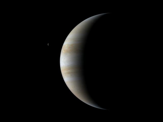
Image needed of a gas giant, ~1.14 Jupiter radius, 2.63-2.9 Jupiter mass, contains water clouds in upper atmosphere, orbiting sun-like star at ~2.233 AU. Include 47 Ursae Majoris c in backround. Fusion7 17:03, 12 May 2007 (UTC)[reply]
Alright ladies and gentlemen - here's the first image up for review. What are your thoughts? Debivort 18:43, 12 May 2007 (UTC)[reply]
haha looking at my drawing, I think I must have sub-consciously understood "upper atmosphere" to mean "polar atmosphere" and hence drew the special clouds up near the pole let me know if that should be fixed, or if it is within the parameters. Debivort 18:43, 12 May 2007 (UTC)[reply]
Nice image - it's very pretty and the viewing angle is a good choice. Here are some criticisms: (1) The rings are speculative, and since only 1 out of 4 gas giants in our solar system has spectacular rings like those, the odds are against them... (2) The rings are also too close to the planet aren't they? Compare a picture of Saturn and see. (3) You mentioned the 'upper atmosphere' misunderstanding, and might want to read up on Jupiter to see whereabouts the water clouds tend to appear on that planet. (4) Where is the light coming from that illuminates the 'dark side' of the planet? Cop 633 19:45, 12 May 2007 (UTC)[reply]
1)rings are a separate layer in photoshop, so very easy to remove. 2) Looking at google images of jupiter's rings, it's main ring seems comparably close to the way this one is drawn, but again - maybe we're ditching the rings. 3) I need to defer to an expert on that. I can always extend the clouds over the whole planet if there is reason to think they wouldn't be localized to the pole. 4) starlight, reflections off the rings... Saturn's dark side receives a good bit of light from the rings. But ditching the rings, I'll darken it up a bit. Debivort 19:54, 12 May 2007 (UTC)[reply]
Nice. The only other issue is that the stars are not visible unless you view the image full size. I think that version two will be ready to put up on the article. Fusion7 20:58, 12 May 2007 (UTC)[reply]
Version 2. No rings, more clouds throughout, stars brighter, but I had to add in some regional variation in star brightness so that 47 Ursae Majoris c can be distinguished among the stars.
Much nicer. How do you feel about putting a lens flare around the sun? I find they help to create the feeling of intense brightness. Just a thought. Cop 633 23:00, 12 May 2007 (UTC)[reply]
I played around with this a bit, but all my photoshop lens flares have a red cast that make the star look like a red dwarf. Could still do it though.Debivort 23:19, 12 May 2007 (UTC)[reply]
Looks good Debivort. I agree with the above comment that it would be nice to see the background stars in the smaller versions of the picture but I think the exosolar planets box, which is presumably where this image will be used in the article, uses a larger preview size anyway so it might not even be a problem. If you do put in a lens flare I would suggest a small one. A quick calculation with the numbers found in the wikipedia articles shows that the star should be about half the radius of the sun as seen from earth (which I think looks about right in your picture), but should only be about 30% as bright. So any lens flare would not be nearly as bad I would think. This might help in reducing the red-dwarf effect you mentioned (I'm not sure how much you tried to add in; or even if photoshop lets you vary this). Looking forward to seeing the final version. --AndrewBuck 01:39, 13 May 2007 (UTC)[reply]
I figured out how to get a yellow lens flare - make a dummy black channel with screen transparency and do a hue shift on the flare. ta daa - I lightened up the back side of the planet just a bit too - it just looked too inky in v2. Debivort 01:59, 13 May 2007 (UTC)[reply]
I love the lens flare! I'm still iffy about the light on the 'dark side' though; it's just not realistic (see here for example). Maybe one way to take the edge off the 'inkiness' is to make the transition from dark side to lit side a bit more gradual, as it is in the example photo. But I really like this picture, it's looking great. Cop 633 14:07, 13 May 2007 (UTC)[reply]
The other thing that might be a possibility would be altering the axial tilt of the planet. Right now you are showing it as being summer in the southern hemisphere. If this could be reversed so the northern hemisphere was in summer, the north pole where your ice clouds are would then be visible without having to light up the dark side. This may be an impossibility at this point though so maybe it can't be done. Another possibility, although we haven't detected any moons thus far I think the likelihood is probably high given the mass of the planet. These might reflect a bit of light from the star down on the planet, but not very much. The Earth lights up the moon fairly well even where the sun doesn't hit directly but I don't know if Jupiter's experiences similar effects. Also implying the existence of moons might be considered original research so that could be an issue. Final thought, it might be possible to have the image in the article completely dark on the one side but on the image page have the lit up image as a thumbnailed down in the image description with a caption saying this is just to show the surface of the planet more clearly, etc. This way anyone who clicks into the image wanting more detail gets that and/or the lit up version as well. --AndrewBuck 15:09, 13 May 2007 (UTC)[reply]
If we do include moons, we may not want them to show much detail. Since we have no idea what sort of moons this planet has, if any, it may be safest to have the moons not stand out, or just have the moons be barren spheres of rock. However, I think this image is nearing completion. Fusion7 16:09, 13 May 2007 (UTC)[reply]
Version 4 - the graded shadow helps alot. Debivort 18:29, 13 May 2007 (UTC)[reply]
I really like version 4. Cop 633 01:17, 15 May 2007 (UTC)[reply]
Nice. I think the lens flare around the planet is distracting though. There's a way to make the kind of flare that comes from brightness without having the extraneous halos that come from a lens. Sagittarian Milky Way 02:22, 15 May 2007 (UTC)[reply]
Shouldn't the terminator (the curve between the light and dark sides of the planet) be perpendicular to the line between the center of the planet and the star? (Anyone can observe, for instance, that the "horns" of the crescent Moon always point directly away from the Sun when they're in the sky at the same time.) Glycerinester 04:09, 15 May 2007 (UTC)[reply]
I guess the outer edge of all phases of illumination have to have a tangent that points to the light source, but that would be independent of the phase. Debivort 05:56, 15 May 2007 (UTC)[reply]
In case it wasn't clear, this is kinda what I meant:
Or something like that. Hard to get it right with just the eyeballs.
Not trying to tell you how to paint of course. Glycerinester 12:31, 15 May 2007 (UTC)[reply]
Some astronomer should correct me if I am wrong, but I think that alignment would only happen if you are in the obrital plane? Debivort 19:38, 15 May 2007 (UTC)[reply]
Obviously not. The part lit by the sun has to be facing it, that's all. Nothing esoteric or alignmentey about it. Sagittarian Milky Way 22:08, 15 May 2007 (UTC)[reply]
And the crescent might have to be a little narrower. I don't know what the field of view of the image is supposed to be but unless it's huge then the planet shouldn't be having so much of it's lit side showing. If you need a guide then you can assume the eye sees about 45 degrees of its surroundings at once. So if the mean of the diagonals and sides is 45º, from the planet to star might be about 25 degrees (just a guess, you can measure it accurately in Photoshop), then go and find a picture of what Venus the Moon like looks like at [25 or other] degrees elongation from the Sun, so you know what shape crescent to use (Venus being the only available cloudy planet). Sagittarian Milky Way 04:42, 15 May 2007 (UTC)[reply]
I think at some point allowances should be made for the sake of illustration. This isn't supposed to replicate a photo, that said. I take your point and here is a new version, with an isolated lens flare. For more egregious examples of extraneous illumination on planets, check out the two down below. Debivort 05:56, 15 May 2007 (UTC)[reply]
Okay, even I feel sorry for losing so much of the beautiful clouds. I suppose if it's accurate, the crescent would be almost as thin as [[1]] (actual Celestia screenshot), which is good for nothing but hiding planet details (though that might be useful in some cases..). V 5 does need to be rotated more counterclockwise though, so that it faces it's sun. — Preceding unsigned comment added by Sagittarian Milky Way (talk • contribs) 22:08, 15 May 2007 (UTC)[reply]
For my part, sometimes I miss the rings. If we give in to "show only known facts," all these images might start looking the same pretty quickly. One known fact is that one quarter of all actually imaged gas giants in the Solar System have spectacular rings. Does that mean the percentage of artists' impressions at WP with rings should be zero?
Another thing that might start looking the same is small crescent planets next to pointlike stars in images that are almost entirely black. This might seem like a consequence of "show the star or it's all speculation," but there are a couple of loopholes.
Angle of view of early versions of Debivort's painting? Widening the profile of the lit side seems to be a reasonable concession to aesthetics and utility. You can just do it, or justify it to photorealists by simulating wide-angle, fisheye or panoramic photography from vantage points close to the planet. It's not too much trouble for a photographer with the right toys to take a photo of two objects that form a right angle with the camera, or even wider.
Waving your magic wand and making the background stars brighter is a common practice in artists' impressions of all types. (This could conceivably be justified in terms of nonlinear brightness corrections to the image, or in terms of some fancy double exposure technique.) If you can distinguish other stars around the local primary, a juxtaposition that no camera or human eyeball could manage, why not brighten the night side of the planet? It's the same principle.
That took a lot longer to write than I expected. Glycerinester 05:58, 16 May 2007 (UTC)[reply]
Wow these are all very good, well explained thoughts, but... rather than generate a new version of this graphic, why don't we keep it as is (which I believe satisfies all the rigorous criterion) - and in the next illustration we can explore some of the illustrative frameworks you've outlined. In particular, the wide angle rationale could be pretty convincing if we made a wide aspect ratio image. Debivort 06:14, 16 May 2007 (UTC)[reply]
So when will it be ready? Fusion7 15:10, 19 May 2007 (UTC)[reply]
V6 is up - as far as I am concerned it is ready to go. Debivort 15:22, 19 May 2007 (UTC)[reply]
Should I add it to the article? Fusion7 16:30, 21 May 2007 (UTC)[reply]
version 1version 4version 2version 5version 3version 6
Diagram needed of star system, showing the orbits of Gliese 581 b, Gliese 581 c and Gliese 581 d. I'm not looking for something artistic, just a simple diagram of the orbits. Thanks.Pharos 19:32, 12 May 2007 (UTC)[reply]
I created this using Celestia. Rubble pile 14:32, 13 May 2007 (UTC)[reply]
Everything looks good but the way the star rendered makes it look as if "b" is right at the surface of the star (at least in the small version, the full size looks much better). I think the star itself looks to be about the right size in relation to the orbits but the effect around it makes it looks much bigger at first glance. --AndrewBuck 15:31, 13 May 2007 (UTC)[reply]
While this is more of a cosmetic issue, perhaps you should enlarge the dots representing the planets. It isn't nessciary, but it would make it more appealing without sacrificing scientific accuracy. Fusion7 16:11, 13 May 2007 (UTC)[reply]
Here is version 2. I actually got rid of the dots representing the planets, since they are distracting, and the orbit is all that matters. Unfortunately I can't get rid of the 'planet B being burnt by the sun effect' which seems to be a limitation of Celestia. Maybe someone more artistic can find a solution. Rubble pile 01:16, 15 May 2007 (UTC)[reply]
Here's one without planet burned into the sun effect. Sagittarian Milky Way 06:50, 15 May 2007 (UTC)[reply]
Looks very good. The only final suggestion I have would be to crop the sides a bit to reduce the file size for bandwidth reasons, but I'm not sure if this would even make the file smaller due to compression. --AndrewBuck 17:36, 15 May 2007 (UTC)[reply]
No offense meant, but I think version 2 (by me) is better than version 3. Version 3 is too big and yet its labels are too small to see. But I agree that the 'burnt by the sun' effect has gone in version 3. It would be nice to produce a happy medium. Rubble pile 21:22, 17 May 2007 (UTC)[reply]
Yah, I knew that but I'm busy now and don't have time to change it.Sagittarian Milky Way 22:47, 17 May 2007 (UTC)[reply]
This doesn't appear to be as bad as I thought at first glance either. The star looks like it is very sun-like only a bit older. As for the planet the Wikipedia article says although its mass is less than Jupiter due to its high tempurature it should be quite large. This does almost look like a side by side comparison though and even given the immense size of the planet the star should probably be a lot bigger, or qualified with "not to scale". --AndrewBuck 17:49, 13 May 2007 (UTC)[reply]
From an artistic perspective, it looks like roughly half the planet is lit up, which gives the impression it is orthogonal to the viewing angle - but if that were true, it would be resting on the star. Debivort 17:56, 13 May 2007 (UTC)[reply]
Maybe it's just hot? 51 Pegasi B is 1800 degrees (F) Then only the red sunward lip would be interpreted as sunlit. The star should be much brighter and whiter sure (51 Peg is a solar twin), but artistically it's an expressive painting. Sagittarian Milky Way 07:11, 15 May 2007 (UTC)[reply]
Surely there are lots of stars out there to illustrate that are actually red. (Aren't there? Is it a myth, and they're all really yellow or peach-colored?) This one would need a disclaimer, like "artist's impression of 51Pegb through a red filter." Glycerinester 00:29, 17 May 2007 (UTC)[reply]
Yes, for example incandescent light bulbs aren't even as hot as red dwarf stars yet they still look yellow. Stars generally are so bright that the color doesn't matter much. It's the surface brightness. You'd have to get far enough from the star that it becomes a point and the number of photons decreases enough so it doesn't cause 'clipping' in any of the three types of retinal cones. Then you'd be able to see the 'true' colors [2] As you get farther, at about magnitude +2 the stars become too dim to see color in and once again look white. The painting is art not science. Sagittarian Milky Way 21:10, 17 May 2007 (UTC)[reply]
I find that many artist's impressions of red stars fail to capture the fact that these things are still incredibly bright and hot even though they're less bright than our sun. I would like a more vivid impression of the way this planet is being blasted to a crisp, rather than just warmly toasted.Rubble pile 21:26, 17 May 2007 (UTC)[reply]
So should I remove it? Fusion7 17:42, 27 May 2007 (UTC)[reply]
Here's an alternative for you considerations. Debivort 19:43, 28 May 2007 (UTC)[reply]
Ya I think that image may work. Lets see what the rest of the members have to say before I post it, though. Fusion7 00:40, 30 May 2007 (UTC)[reply]
V2. Hehe, I just have to say that making a planet appear dark blue, when it is being fried by a close yellow star, and possibly radiating its own orange light is quite a challenge. Debivort 17:39, 30 May 2007 (UTC)[reply]
In reality, the star's color is nearly identical to the sun, and due to the 4th power law of blackbody radiation and much lower lumens per watt, the self-glowing contribution to the color of the dayside is miniscule. So only the planet's true color matters. Sagittarian Milky Way 19:27, 30 May 2007 (UTC)[reply]
Well, the orange glow in this image is pretty insignificant, so I think this image is pretty close to a dark blue planet being hit by a ton of light. Thoughts, or do you think the color should be revised? Debivort 23:01, 30 May 2007 (UTC)[reply]
A bit too purple? Another thing, I wonder if these planets would really be so banded. What would the weather system be like? How turbulent would it be? We should have a Sudarsky classification system for bandedness and turbulence as well as for color and albedo.
A bit too purple eh? I'm starting to think we're making adjustments that are tiny compared to our actual confidence in the appearence, but I guess it's not too much effort to make a new version. As for banding, we would be speculating about it either way, so it seems to me we shouldn't worry. Debivort 03:40, 31 May 2007 (UTC)[reply]
Artist's impression of the outer planet Gliese 876 b.
Using the stars radius and b's orbital radius Gliese 876 should have an angular radius of .461 degrees compared to .266 degrees for the sun seen from Earth. However Gliese 876 has only a .0124 solar luminosity. So the star should be big, possibly bigger than it is now, but fairly dim. Brightness falls with the square of the distance so the planet being 4.8 times closer gains a factor of ~23 increase in apparent brightness relative to the Earth's orbit. Multiplying the luminosity by this factor of 23 yeilds about 28 percent as bright as the sun seen from Earth (note: this is a very crude calculation done by myself, and I'm not 100% sure it accounts for all that it needs to). As for the moons in the picture they coincide with the discussion above as being rather featureless, so on the whole I don't think it's too bad of a picture. I think they would have to be pretty close to the planet to make the planet look so big but they could just be small moons too. --AndrewBuck 17:49, 13 May 2007 (UTC)[reply]
The absolute luminosity of the star will affect the star's behavior, and the planets' climates, and all that, but it's not all that relevant to pictures of its planets. What matters in a picture is the brightness and reflectivity of the different objects in it, relative to each other.
Imagine photographing a basketball in a black room illuminated by a single table lamp with no shade. You can overexpose the lightbulb in the image and take a good photo of the basketball, or show detail on the bulb but the basketball will be too dim. Doesn't matter how bright the bulb is. Glycerinester 13:39, 15 May 2007 (UTC)[reply]
I agree with what you're saying I hadn't thought about the relative nature between the planet lighting and the star. However, I wasn't trying to compute the absolute luminosity of the star, rather the apparent luminosity, observed at the distance of the planet. It should be noted I am neither studying astronomy nor am I artistically trained at all, I was just trying to provide comparative estimates for others to use. I'm not sure how to take what you have said about the relative brightness of the two into account so I guess my previous comment about the image itself is possibly incorrect but I think the calculation on the solar flux received at the planet is on the right track. This number (the 28%) should presumably then set the factor by which the star is overexposed (at least as much as the sun is overexposed relative to the earth) but I'm not sure. Also this is as you mentioned neglecting the planet's albedo, however this is just another term to be multiplied into the above calculation. What to use for the albedo of these planets is another matter entirely, and as for that I have no idea. --AndrewBuck 17:57, 15 May 2007 (UTC)[reply]
If a star is 28% as bright as the Sun at a given planet's orbit, then it also illuminates the planet 28% as brightly as the Sun would. The whole scene is dimmer, by a uniform amount. The photographer changes f-stops or film speeds or whatever and the picture comes out looking exactly the same.
(Of course, the whole scene is uniformly affected by the star's color too.)
Try focusing on the apparent size of the star. When the scene illumination is coming from a larger area of the sky, it's less concentrated and should look less overexposed. A star that looks bigger than the Sun should look less bright, compared to the rest of the scene. It still won't "look dim," because it'll always be the brightest thing in the picture.
In this case the star in the picture should look 73% wider and thus (.266/.461)2 = one-third as bright as the Sun does from Earth, compared to the illuminated features of the planets. I don't know how big the star would have to be in the sky for a camera to take a good picture of the surface of the star and the surface of the planet at the same time. Maybe really big. Glycerinester 00:00, 17 May 2007 (UTC)[reply]
What do you mean? Do you mean illumination, like with 47 Ursae Majoris b, where the side of the planet you can see would be almost completely dark unless the light source was tens of degrees wide; or do you mean relative size, for the planet to show any detail the star would have to be huge since it's physically much smaller than the star? The second one wouldn't be a problem since you can just be close to the planet and far from the star. Sagittarian Milky Way 08:20, 23 May 2007 (UTC)[reply]
Um, what do I mean by what, specifically? Glycerinester 12:47, 23 May 2007 (UTC)[reply]
"I don't know how big the star would have to be in the sky for a camera to take a good picture of the surface of the star and the surface of the planet at the same time. Maybe really big."Sagittarian Milky Way 17:18, 23 May 2007 (UTC)[reply]
OK, by "good picture" I meant technically correct exposure vs. overexposure. We assume our imaginary photographer will do whatever's necessary to get the exposure he wants of the planet he's trying to photograph. The question is, how does that affect the exposure of the star. I'm not saying overexposing the star is "bad," just when does it happen and when does it not.
Image needed of a gas giant .36 Jupiter mass, .725 Jupiter radius, contains hydrogen and and helium in atmosphere. Orbits a yellow subgiant with a semi-major axis of 0.042 AU, an inclination of 85.3°. Do not include any other planets in the image. Fusion7 18:33, 28 May 2007 (UTC)[reply]
I did a hot jupiter earlier today (see 58 Pegasi b below). I'll work on this one too. Debivort 03:07, 29 May 2007 (UTC)[reply]
For your consideration. Debivort 08:49, 29 May 2007 (UTC)[reply]
For a planet with a semi-major axis of only .042 AU, (and the blazing sun depicted in the image) the planet looks rather.....dim. Fusion7 00:56, 30 May 2007 (UTC)[reply]
Clarification please - do you think the side illuminated is too dim or that the rest of the planet which is emiting it's own photons is too dim, or both? Debivort 02:15, 30 May 2007 (UTC)[reply]
As for me, I'd definately say the part of the planet being illuminated by starlight is too dim. It should be blazing white. Sagittarian Milky Way 03:32, 30 May 2007 (UTC)[reply]
I dunno if this qualifies as blazing (I had made it before I saw your comment), but it is certainly brighter, so here's a new version. Debivort 03:48, 30 May 2007 (UTC)[reply]
Although 2300 K is plenty bright by itself, in contrast to 6150 K it should still be dim (remember sunspots)? Sagittarian Milky Way 08:35, 4 June 2007 (UTC)[reply]
Can you explain your thinking more fully? The illuminated part of the planet wouldn't be 6150K, and compared to the star, the planet here is relatively dim, so I'm not sure what you are objecting to in the image. Debivort 18:03, 10 June 2007 (UTC)[reply]
Sunspot. The human eye has greater dynamical range than a camera, but still..
Blackbodies have great differences in brightness with temperature. Going down the scale, objects become exponentially less radiant (Stefan-Boltzmann law), almost all output they do have is infrared, and even the light that's visible tends to the red side of the spectrum where the eye is less sensitive.
Multiplying radiance by luminous efficiency:[5] the planet night's side is 1000 times dimmer than HD's photosphere. That's within the contrast range the eye can experience (10000:1) but not by much, (on a logarithmic scale).
So I thought the v2 star and dayside looked good but the nightside needs to be toned down probably to a little below v1 level. This would be the view through supersunglasses deep enough to allow seeing the scene in the first place without burning your eyes off :) Sagittarian Milky Way 06:31, 14 June 2007 (UTC)[reply]
Then again, you shouldn't see all those stars either.. Maybe there should be a consensus on whether it's acceptable to draw nonvisible stars or not? Some people don't even believe in the moon landings anymore due to ages of seeing impossible stars in astronomy pictures.. Sagittarian Milky Way 06:52, 14 June 2007 (UTC)[reply]
Well, the star is saturated out, so the proportionality of their respective brightnesses will break down, no? It's easy to fix, I'm just thinking aloud, via wiki. Debivort 07:11, 14 June 2007 (UTC)[reply]
For the sake of showing the night side, I assumed that the star is just bright enough to saturate itself. Sagittarian Milky Way 16:56, 14 June 2007 (UTC)[reply]
Here is a version I hope you will like. v3. Debivort 04:17, 20 June 2007 (UTC)[reply]
Why no stars? Because of the intensity dynamic range? I'd be fine with that version, but there is a huge chunk of empty space on the right and bottom. Debivort 18:40, 23 June 2007 (UTC)[reply]
No stars cause it's so out of range it's just ridiculous. This is only slightly worse than looking at the sun through a telescope..
If you still have the originals of v1 and v3 I could redo it again without the whitespace and maybe the quality would be a little better since it only has to be compressed once. Otherwise I'll use the versions on the page. Sagittarian Milky Way 01:45, 25 June 2007 (UTC)[reply]
I'd say go ahead and just crop your most recent version. With the stars gone, there's hardly any fine details that could be lost to compression artifacts. Debivort 04:34, 25 June 2007 (UTC)[reply]
Image needed of super earth >7.7 Earth mass, 1.96 Earth radius, orbiting a red dwarf. Due to a theorized greenhouse effect, the planet may be able to support life. Fusion7 22:28, 29 June 2007 (UTC)[reply]
At what point does a super earth become a mini uranus? Sagittarian Milky Way 04:45, 1 July 2007 (UTC)[reply]
I think its safe to assume that the planet is terrestrial. Fusion7 16:54, 7 July 2007 (UTC)[reply]


.jpg)


![[1]](https://en.wikipedia.org/wiki/Image:Gliese_581_c_Celestia.png)


 , and the planet itself glows at
  , though perhaps not uniformly.
