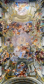
Oppose Interior is too dark. Awkward angle. Where's the staircase? Étienne Dolet (talk) 17:44, 27 October 2016 (UTC)[reply]
Comment: Hello Étienne Dolet, the beauty is not the steps, but the architecture of other..colums, like is alternate etc.Thanks --LivioAndronico(talk) 21:28, 27 October 2016 (UTC)[reply]
Oppose Columns in foreground are discordant; window is a little too blown even considering long exposure. Daniel Case (talk) 03:24, 31 October 2016 (UTC)[reply]
Oppose - The angle is too wide (notice the perspective distortion on the left) Margalob (talk) 00:16, 6 November 2016 (UTC)[reply]
Support – Jobas (talk) 12:00, 1 November 2016 (UTC)[reply]
Oppose, regretfully; nice composition and symmetry but the detail is too soft and there is CA near the edges. Daniel Case (talk) 20:35, 1 November 2016 (UTC)[reply]
Promoted File:San Lorenzo (Turin) - Dome interior.jpg --ArmbrustTheHomunculus 21:27, 6 November 2016 (UTC)[reply]
Support as nominator – Nikhil (talk) 03:00, 29 October 2016 (UTC)[reply]
Comment: The current use in the articles and the description on the file page is confusing. An oil field as a geologic feature. What is pictured here appears to be an oil platform. The operator's website refers to the structure as Mittelplate Drilling and Production Island. It seems that the name Mittelplate is used inclusively to refer to the field, well and structure. The articles should make the proper distinctions of which is which. Also, an explanation of why the surrounding area appears black (it's a mudflat) would be nice. --Paul_012 (talk) 08:51, 29 October 2016 (UTC)[reply]
Mittelplate is an area of the Schleswig-Holstein Wadden Sea National Park in the German Wadden Sea, an intertidal zone. It lies north of the Elbe estuary and west of Schleswig-Holstein. The oil platform, built on a submerged sand bar, is named after the area in which it is situated. (Mittelplate means "middle plate" or "middle section.") It does indeed appear to be largely mudflats, at least at this site. Sca (talk) 15:55, 30 October 2016 (UTC)[reply]
Support Almost looks like a model. I'd suggest some cleanup of this; removal of white spots in several areas, and the cluster of black spots at top left. lNeverCry 06:27, 31 October 2016 (UTC)[reply]
Support – Jobas (talk) 12:03, 1 November 2016 (UTC)[reply]
Support Nice angle and compact composition, although the angle of the sun behind the photographer makes it look as if it were a flash photo. Daniel Case (talk) 20:37, 1 November 2016 (UTC)[reply]
Promoted File:11-09-fotofluege-cux-allg-25a.jpg --ArmbrustTheHomunculus 04:20, 8 November 2016 (UTC)[reply]
Voting period is over. Please don't add any new votes. Voting period ends on 9 Nov 2016 at 19:57:11 (UTC)
Reason
High quality, high EV
Original
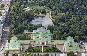
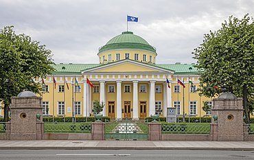
Tauride Palace in Saint Petersburg, Russia was designed by Ivan Starov for Prince Grigory Potemkin and constructed from 1783 to 1789. It later housed the first Imperial State Duma (1906–1917) and the post-revolution provisional government. Two views offered: aerial of the entire palace and grounds, and street level of the main entrance.
Support – Jobas (talk) 12:07, 1 November 2016 (UTC)[reply]
Support, well-composed although I wish they could have been sharper near the edges. Daniel Case (talk) 20:43, 1 November 2016 (UTC)[reply]
Support. Very nice. Just wondering how you got the aerial shot? Helicopter tour or something along those lines? It might explain the sharpness issues in the corners if shot through a window. Nicely composed though. The two images complement each other nicely. Ðiliff «» (Talk) 10:03, 2 November 2016 (UTC)[reply]
Hi Diliff- I’ve done a few helicopter shoots and this one was fairly challenging as regulations did not allow for flying over land (only over the rivers and canals) within SPB central district, no hovering was permitted and a fairly fast rate of forward motion was required. I was able to shoot through a sliding window, though it was a tight fit at times due to the angle of the lens. It felt very rushed so I am very lucky (IMO) to have gotten some of the images I did.--Godot13 (talk) 01:16, 3 November 2016 (UTC)[reply]
Promoted File:RUS-2016-Aerial-SPB-Tauride Palace (crop).jpg --ArmbrustTheHomunculus 21:17, 9 November 2016 (UTC)[reply] Promoted File:RUS-2016-SPB-Tauride Palace.jpg --ArmbrustTheHomunculus 21:17, 9 November 2016 (UTC)[reply]
A significant work by a notable female sculptor of her also-notable husband. Given angles and such, cutting off the gravestone is probably an acceptable way of getting good backgrounds.
Comment: Interesting nom. The image page could probably do with an explanation of why the statue is PD or a FOP template. Josh Milburn (talk) 18:34, 31 October 2016 (UTC)[reply]
@J Milburn: Well, the sculptor died in 1904, and the UK has full Freedom of Panorama, so... definitely is fine. Adam Cuerden(talk) 23:24, 31 October 2016 (UTC)[reply]
Josh is saying that it needs to be noted on the file page. — Chris Woodrich (talk) 04:00, 1 November 2016 (UTC)[reply]
@Crisco 1492 and J Milburn: Which it is. Scroll to the very bottom of the licensing section. You can't make it too prominent or people will ignore Kim Traynor's CC-by license because, for example, Media Vieweronly goes by the firs t license it sees, I believe, and will actively encourage people to ignore copyright. That thing has some serious bugs. Adam Cuerden(talk) 05:07, 1 November 2016 (UTC)[reply]
I wonder why the PD-100 template isn't being used under a sub-header for the statue. — Chris Woodrich (talk) 10:42, 1 November 2016 (UTC)[reply]
My view is that files shouldn't have both a PD and a CC license; they are surely mutually exclusive. I'd just include a note on {{information}} if the statue's PD and/or include a FOP template. I agree, though, that there's an inconsistency/lack of clarity when it comes to how we treat these images. Josh Milburn (talk) 13:07, 1 November 2016 (UTC)[reply]
Oppose The bottom inscription below his name is clipped, leaving it illegible. Brandmeistertalk 16:03, 1 November 2016 (UTC)[reply]
Oppose And that's not the only thing clipped ... look at the shadows on the bust. The lack of metadata on this one does not help me judge whether this was something unavoidable or not. Daniel Case (talk) 20:45, 1 November 2016 (UTC)[reply]
Would probably considered this as an artwork (if successfull), as the image isn't used in the depicted person's article. ArmbrustTheHomunculus 20:28, 10 November 2016 (UTC)[reply]
Found this in the tank article, it caught my eye. It apparently caught someone else's eye too, because it listed as a valued pictured over at the commons, so I thought I'd let it loose here and see if its got what it takes to obtain an FPC star here.
Commons user MathKnight and flicker user Zachi Evenor
Support as nominator – TomStar81 (Talk) 16:34, 31 October 2016 (UTC)[reply]
Support both This amends my !vote to include the alt. TomStar81 (Talk) 18:59, 1 November 2016 (UTC)[reply]
Oppose QI (quality image) over at Commons and possibly a reasonable candidate for valued image there, but I think that's the limit for this image. If the lighting were better, if the tank were in motion or firing, you might have an FP. As is, the light is pretty dull and there's nothing special enough for FP IMO. lNeverCry 05:47, 1 November 2016 (UTC)[reply]
Oppose – Per Never. Low contrast, static. Better choice would be something like at right. Sca (talk) 18:48, 1 November 2016 (UTC) ⇒[reply]
Support – Jobas (talk) 08:44, 4 November 2016 (UTC)[reply]
Comment Worth adding some more sky to the top, so the pole isn't right at the top in thumbnail view? — Chris Woodrich (talk) 13:32, 4 November 2016 (UTC)[reply]
I could try ... it was a consequence of correcting the perspective as I was asked to do during the Commons FPC nom, and at the time I hadn't learned quite how to rescale images afterwards. I'll see. Daniel Case (talk) 20:43, 5 November 2016 (UTC)[reply]
Oppose - We already have a picture just like this that is already featured and found in the exact same page. Do we need two? Mattximus (talk) 00:17, 5 November 2016 (UTC)[reply]
Support. Having an existing FP doesn't mean we should simply decline. If necessary we delist the old one (though I'm not advocating that). -- King of♥♦♣ ♠ 01:53, 5 November 2016 (UTC)[reply]
Well I suppose we could delist the second one if you think the first one is better. But there is no reason to have 2 featured pictures of the same thing, this is not normal for featured picture and has been grounds for opposition in the past. How many picture of stairs going in a circle do we need? Mattximus (talk) 13:26, 5 November 2016 (UTC)[reply]
Mattximus: I oppose delisting. These are simple two different staircases, i can understand delisting one of two shots of same stuff. How many pictures: my is from above, you can have from bottom too (and FP picture is from bottom), its different, and you can have wooden staircase also... many, but different. Or, if you go like this, what will be feutered pic for tomorrow, following one per "each" category. Wiki Commons is more reliable on this. I had case with this shot here, almost failed because of "rules". In Commons, rules are rules, but our thinking prevail first. So, no delisting, normal voting of different stuff. --PetarM (talk) 06:55, 6 November 2016 (UTC)[reply]
I guess then I would oppose on EV grounds. A second picture of a staircase shot from a visually similar angle does not add any new encyclopedic value to the article on stairs. It is a nice photograph though! Mattximus (talk) 13:42, 6 November 2016 (UTC)[reply]
Oppose as above. This isn't Commons, and we should keep it that way. Josh Milburn (talk) 16:03, 6 November 2016 (UTC)[reply]
Support – Jobas (talk) 11:16, 5 November 2016 (UTC)[reply]
Support as not only is it a fine digitization, it needs to be found. Daniel Case (talk) 20:45, 5 November 2016 (UTC)[reply]
Support. This digitization is not quite up to the standard of some others we have promoted, but, given that the painting has been missing since 1990, it is more than acceptable. A great candidate. Josh Milburn (talk) 16:55, 6 November 2016 (UTC)[reply]
Support - per Josh.--Godot13 (talk) 20:49, 6 November 2016 (UTC)[reply]
Oppose – Strange angle, obscuring most of the grandiose porphyry sarcophagus. Usually pictured more or less as at right below. Sca (talk) 01:28, 7 November 2016 (UTC)[reply]
Support per nom. Yann (talk) 21:50, 10 November 2016 (UTC)[reply]
Promoted File:The Immaculate Conception, by Giovanni Battista Tiepolo, from Prado in Google Earth.jpgBammesk (talk) 03:57, 17 November 2016 (UTC)[reply]
Oppose See the eyes, its not sharp, and seen sharpening artefatcs. Would expect more from Hasselblad. --PetarM (talk) 08:37, 10 November 2016 (UTC) True, it might be texture. --PetarM (talk) 09:07, 11 November 2016 (UTC)[reply]
At 5 MB I don't expect artifacts, it's either brushstroke/canvas texture or I'm hallucinating. Brandmeistertalk 09:37, 10 November 2016 (UTC)[reply]
Support per nom. Yann (talk) 21:47, 10 November 2016 (UTC)[reply]
Support great picture of a little-known historical figure. MurielMary (talk) 02:02, 12 November 2016 (UTC)[reply]
Support – Jobas (talk) 12:54, 14 November 2016 (UTC)[reply]
Promoted File:Amalia de Llano y Dotres, condesa de Vilches (Federico de Madrazo).jpg --ArmbrustTheHomunculus 05:40, 18 November 2016 (UTC)[reply]
Support as nominator – Yann (talk) 21:54, 10 November 2016 (UTC)[reply]
Support however query caption - shouldn't it read "tigress", not "female tiger"? Otherwise it's like calling a lioness a "female lion" when there's actually a correct name for that animal. MurielMary (talk) 02:03, 12 November 2016 (UTC)[reply]
Support --PetarM (talk) 18:54, 12 November 2016 (UTC)[reply]
Support And @MurielMary:: Not necessary to change "female tiger" to "tigress". Either way is OK. Most basic animal names include both sexes; e.g., "tiger" includes male and female tigers. What's more, there's no separate word for the male of most species, including tigers. So "female tiger" is fine, IMHO. (Others may disagree.) --Thnidu (talk) 16:05, 13 November 2016 (UTC)[reply]
If the animal in the image was a male, would the caption read "male tiger"? No? Then clearly in common usage "tiger" = "male animal" and the female should be referred to by its name of "tigress". Otherwise, we are assuming that male = normal/standard/default and everything else must be tagged to clarify what it is. MurielMary (talk) 01:17, 20 November 2016 (UTC)[reply]
Also, following your logic @Thnidu:, if "tiger" = "male and female animals" then the caption should actually read "Maya, a tiger". MurielMary (talk) 01:19, 20 November 2016 (UTC)[reply]
@MurielMary:(Not a vote, just continuing a discussion.) Not necessarily. We can use "deer" for an adult animal of that type of either sex, but we also have the option of saying "doe" or "stag" as appropriate. As I said above, "Not necessary to change female tiger to tigress. Either way is OK."
Dog words are similar to "tiger/tigress". From Quora: In the breeder's world, a male dog is simply called a "dog." (Females are called "bitches.") In the breed ring you have classes for "dogs" and classes for "bitches." Only males show as dogs, and only females show as bitches.
Support – Jobas (talk) 13:02, 14 November 2016 (UTC)[reply]
Oppose, oversaturated sky. Daniel Case (talk) 06:07, 18 November 2016 (UTC)[reply]
I have to agree with Daniel, there seems to be a consistent issue with sky tint/saturation in your images using the medium format camera. I remember seeing a similar issue last year with the images in Cambridge (or was it Oxford?). I suppose it must be a quirk of the camera/RAW format/profile. It just doesn't look right. I have no doubt it was a deep blue sky but the way it bleeds into the clouds screams oversaturation to me. Otherwise, a nice photo though. Ðiliff«»(Talk) 11:54, 18 November 2016 (UTC)[reply]
Promoted File:ISR-2015-Jerusalem-Temple Mount-Fountain of Qayt Bay.jpg --ArmbrustTheHomunculus 08:21, 21 November 2016 (UTC)[reply]
Support as nominator – MurielMary (talk) 02:32, 12 November 2016 (UTC)[reply]
Oppose Per small size. lNeverCry 08:11, 12 November 2016 (UTC)[reply]
Oppose, in good faith, but the size (1,167×850 px) is significantly below requirements, per WP:WIAFP, "still images should be a minimum of 1500 pixels in width and height". Brandmeistertalk 14:53, 12 November 2016 (UTC)[reply]
Oppose True, and original is more than 1 meter. --PetarM (talk) 18:55, 12 November 2016 (UTC)[reply]
Oppose - Far too low resolution to be featured. Mattximus (talk) 20:36, 12 November 2016 (UTC)[reply]
Thanks for the feedback. I will look into the criteria regarding resolutions, as I hadn't paid attention to that! Also, newbie question - who writes the paragraph caption that appears on the main page? The nominator? Thanks. MurielMary (talk) 07:58, 13 November 2016 (UTC)[reply]
Oppose Per Other – Jobas (talk) 13:05, 15 November 2016 (UTC)[reply]
Voting period is over. Please don't add any new votes. Voting period ends on 22 Nov 2016 at 17:03:51 (UTC)
Original – Peter Tatchell, taken on the balcony of his flat in London
Reason
Peter Tatchell is a British human rights campaigner who is particularly well known for his LGBT activism. The photo was taken by me on the balcony of his London flat. The bold red background complements well the black shirt. For an article that spans 50 years of campaigning, it is good to have a high-quality up-to-date photo.
Promoted File:Rifling of a cannon (M75; 90mm; y.1891; Austro-Hungarian; exposed in Ljubljana, Slovenia).jpg --ArmbrustTheHomunculus 20:56, 22 November 2016 (UTC)[reply]
Voting period is over. Please don't add any new votes. Voting period ends on 23 Nov 2016 at 08:14:53 (UTC)
Original – Flower Still Life, painted in 1669 by Dutch artist Maria van Oosterwijck; the bouquet depicted features two tulips - tulips had been introduced to the Netherlands around 1600 and were prized for their beauty and, as in these blooms, their unusual patterns.
Reason
meets the resolution criteria, comes from a comprehensive, well sourced WP article on the artist (article rated C-class)
Voting period is over. Please don't add any new votes. Voting period ends on 23 Nov 2016 at 19:07:43 (UTC)
Original – Structures on ALH84001 meteorite from Mars resembling bacteria. In 1996 this specific scanning electron microscope image started a debate about the possibility of actual extraterrestrial life on Mars.
Voting period is over. Please don't add any new votes. Voting period ends on 24 Nov 2016 at 08:07:10 (UTC)
Original – Self-portrait of Marie-Gabrielle Capet (1761–1818), a French Neoclassical painter. She came from a modest background and her previous background and artistic training is unknown, but in 1781 she became the pupil of the French painter Adelaide Labille-Guiard in Paris. She excelled as a portrait painter, and her works include oil paintings, watercolours and miniatures.
Reason
Another gem from the Google Art Project. Marie-Gabrielle Capet. A lesser known neoclassical female painter. A student of Adélaïde Labille-Guiard. She's seen it all folks. The Ancien Régime. The French Revolution. And of course, Napoleon. And she still managed to be a quite an admirable personality and painter throughout all the turmoil.
Support stunning image of a little known painter. However the caption should say who painted the work, shouldn't it? MurielMary (talk) 08:19, 14 November 2016 (UTC)[reply]
Comment Done. I added the fact that it's a self-portrait to the caption. Étienne Dolet (talk) 08:29, 14 November 2016 (UTC)[reply]
Support – Jobas (talk) 13:33, 15 November 2016 (UTC)[reply]
Support as nominator – MurielMary (talk) 08:16, 14 November 2016 (UTC)[reply]
Support - Good find. I remember seeing this painting for the first time a couple of weeks ago. Was quite impressed. My favorite tidbit is the reflection of her on the metallic lid of the vase. Pretty cool stuff. Étienne Dolet (talk) 08:25, 14 November 2016 (UTC)[reply]
Support Is there any way that the whole set of her still lifes-which I think are equally as good in quality-can be submitted as a whole,or would they have be nominated individually? Lemon martini (talk) 15:56, 14 November 2016 (UTC)[reply]
Support Still "still" life. --PetarM (talk) 17:59, 14 November 2016 (UTC)[reply]
Support – Jobas (talk) 13:38, 15 November 2016 (UTC)[reply]
Oppose – the original painting [2] doesn't seem to have so much color and contrast. Bammesk (talk) 02:43, 16 November 2016 (UTC)[reply]
Comment: What Bammesk say is mostly true, for all oil on canvass etc. We have rarely original. Problem is, do we wanna a bit more corrected and better for our eyes or original. If original, nobody will be interested. So they put saturation and other stuff. Than, since we are Wikipedia, visitor might be shocked when he move to museum - we should present as it is. So, who know what it look like if he wasnt there, all shots on Google will be different. --PetarM (talk) 06:49, 16 November 2016 (UTC)[reply]
Voting period is over. Please don't add any new votes. Voting period ends on 24 Nov 2016 at 08:18:56 (UTC)
Original – Painting by Adélaïde Labille-Guiard of Stéphanie Félicité du Crest de Saint-Aubin, Comtesse de Genlis (25 January 1746 – 31 December 1830), known as Madame de Genlis, who was a French writer, harpist and educator.
Reason
Another extraordinary woman during the French Revolutionary period and Napoleonic Era. Her full name was Stéphanie Félicité du Crest de Saint-Aubin, Comtesse de Genlis. Try saying that 5 times.
Voting period is over. Please don't add any new votes. Voting period ends on 24 Nov 2016 at 10:45:26 (UTC)
Original – Odds and Ends (1939) is a painting by Canadian artist Emily Carr (1871 - 1945). The painting reflects Carr's concern for the environmental impact of industrialisation, particularly logging, on the land of British Columbia.
Reason
meets resolution criteria; striking image which represents the artist's body of work concerned with environmentalism and the issue of deforestation.
Support as nominator – MurielMary (talk) 10:45, 14 November 2016 (UTC)[reply]
Support – Captivating painting by a lesser-known artist. Reminds me of some Čiurlionis works, though it's less abstract. Sca (talk) 16:18, 14 November 2016 (UTC)[reply]
Comment: A great candidate, but I'd perhaps like to see a little more documentation on the Commons page? Josh Milburn (talk) 17:15, 14 November 2016 (UTC)[reply]
Support – Jobas (talk) 13:49, 15 November 2016 (UTC)[reply]
Oppose – sorry, I don't see sufficient encyclopedic value criteria 5. Each article listed above already has a FP portrait of her [3], [4], and there seems to be no discussion of this painting. Bammesk (talk) 03:12, 22 November 2016 (UTC)[reply]
Oppose – per Bammesk. No discussion of the painting in the article (No EV), and already 2 FPs... Mattximus (talk) 01:00, 25 November 2016 (UTC)[reply]
Voting period is over. Please don't add any new votes. Voting period ends on 25 Nov 2016 at 06:46:20 (UTC)
Original – A painting of Jean-Jacques Rousseau by Allan Ramsay (1766). Rousseau is wearing an Armenian-style robe, one of his favorite pieces of clothing he wore
Oppose – resolution of the image is 14 pixels per inch, given the painting is 749 cm tall [5]. The dimensions in the file description [6] seem to be wrong.Bammesk (talk) 04:32, 16 November 2016 (UTC)[reply]
correction: 136 pixels per inch, per more reliable source [7]. Bammesk (talk) 05:07, 16 November 2016 (UTC)[reply]
Support – Jobas (talk) 18:31, 23 November 2016 (UTC)[reply]
Voting period is over. Please don't add any new votes. Voting period ends on 25 Nov 2016 at 06:33:08 (UTC)
Original – Portrait of Farncoise Marguerite de Sévigné, Countess of Grignan (1646-1705) by Alexander Roslin
Reason
The renowned Madame de Sévigné was her mother and they always wrote to one another. Françoise-Marguerite de Sévigné married a big-shot count and moved to the provinces. From thereon, her mother began with her perhaps the most famous series of correspondence in literary history. Oh yeah, and the quality is good.
Support Great colours and striking image. MurielMary (talk) 10:46, 15 November 2016 (UTC)[reply]
Support – Jobas (talk) 13:54, 15 November 2016 (UTC)[reply]
Oppose – colors are warmer on the original [8].Bammesk (talk) 02:35, 16 November 2016 (UTC) . . . addressed below.[reply]
Comment - @Bammesk: should we update that original version then? The quality seems good on that one. In fact, looks a little better I think. Étienne Dolet (talk) 05:19, 16 November 2016 (UTC)[reply]
I think yes. Bammesk (talk) 05:22, 16 November 2016 (UTC)[reply]
@Bammesk: I replaced it. Turns out that version was already uploaded. Étienne Dolet (talk) 05:37, 16 November 2016 (UTC)[reply]
It looks good, thanks. Bammesk (talk) 02:39, 17 November 2016 (UTC)[reply]
Voting period is over. Please don't add any new votes. Voting period ends on 25 Nov 2016 at 12:05:53 (UTC)
Original – A procession of Buddhists bearing a long cloth to wrap around the stupa (in the far back) during Hae Pha Khuen That Festival at Wat Phra Maha That Woramahawihan, Nakhon Si Thammarat Province, southern Thailand.
Reason
Illustrates the subject (the festival procession) in an eye-catching and compelling way. Ninth place winner of WLM 2015.
Support as nominator – Paul_012 (talk) 12:05, 15 November 2016 (UTC)[reply]
Weak support – I like the EV and composition, but not sharp at full size and there is some chromatic aberration [9]. I wish it wasn't so. Bammesk (talk) 04:49, 16 November 2016 (UTC)[reply]
Was this scene choreographed by Alfred Hitchcock? Sca (talk) 22:10, 16 November 2016 (UTC)[reply]
People's faces have no detail, ... I love the composition though. Bammesk (talk) 02:51, 17 November 2016 (UTC)[reply]
Oppose EV is there but the image quality is not up to the FP standards. It is not sharp and there are chromatic aberrations in the pic. Nikhil (talk) 02:38, 17 November 2016 (UTC)[reply]
Oppose -- Unfortunately very unsharp on the bottom, and the saturation seems abnormally pumped up. --Janke | Talk 07:19, 17 November 2016 (UTC)[reply]
Support the original version – Jobas (talk) 16:38, 18 November 2016 (UTC)[reply]
Oppose colours look very strange, maybe over saturated? Either way there is blurriness at the top and bottom. Mattximus (talk) 03:24, 19 November 2016 (UTC)[reply]
Comment: Thanx for nomination Étienne but maybe is better this: Original – Andrea Pozzo's painted ceiling in the Church of St. Ignazio in Rome--LivioAndronico(talk) 13:39, 20 November 2016 (UTC)[reply]
Thanks Livioandronico2013. @Mattximus:, @Jobas:, @Janke: I replaced the previous image with the original version now. Let me know what you guys think and if you're willing to support now. Étienne Dolet (talk) 17:49, 20 November 2016 (UTC)[reply]
Voting period is over. Please don't add any new votes. Voting period ends on 28 Nov 2016 at 01:16:42 (UTC)
Original – "Joseph Ambrose, an 86-year-old World War I veteran, attends the dedication day parade for the Vietnam Veterans Memorial in 1982. He is holding the flag that covered the casket of his son, who was killed in the Korean War."
Reason
High EV as the lead image for the article Veterans Day; historical value
Support – Jobas (talk) 16:34, 18 November 2016 (UTC)[reply]
Love this picture... but it's got a lot of grain. Worth reducing a little? — Chris Woodrich (talk) 02:57, 19 November 2016 (UTC)[reply]
I'd personally say the grain's authentic, and attempts to fix it have a high chance of just making it look fake. But if someone can prove me wrong with a good fix.... (Support for now, anyway) Adam Cuerden(talk) 12:49, 19 November 2016 (UTC)[reply]
Support Thinking it over, I agree with Adam. — Chris Woodrich (talk) 03:50, 20 November 2016 (UTC)[reply]
Oppose Bad quailty and crop. --PetarM (talk) 17:53, 20 November 2016 (UTC)[reply]
Support – It is quite grainy, but the poignant expression and composition counterbalance that. (Plus the tattered old uniform – that he can still get into!) Sca (talk) 16:35, 21 November 2016 (UTC)[reply]
Support - Per Sca and Adam. A 1982 photo with encyclopedic (and emotional) value.--Godot13 (talk) 06:38, 27 November 2016 (UTC)[reply]
Promoted File:World War I veteran Joseph Ambrose, 86, at the dedication day parade for the Vietnam Veterans Memorial in 1982.jpg --ArmbrustTheHomunculus 01:17, 28 November 2016 (UTC)[reply]
Voting period is over. Please don't add any new votes. Voting period ends on 6 Dec 2016 at 22:40:52 (UTC)
Original – A U.S. Marine Corps Sikorsky CH-53D Sea Stallion helicopter hovers above the ground near a Soviet ZU-23 anti-aircraft weapon prior to picking it up during "Operation Urgent Fury", the U.S. invasion of Grenada in October 1983.
Reason
That time when the United States invaded an island the size of Martha's Vineyard.
Oppose. Bad crop, part of the helicopter blades and gun are chopped off. Sorry. —Bruce1eetalk 07:10, 27 November 2016 (UTC)[reply]
Oppose – tight crop per Bruce1ee (also the peaceful setting doesn't suggest a military operation is in progress, other images in that article better project a military conflict). Bammesk (talk) 16:06, 27 November 2016 (UTC)[reply]
Voting period is over. Please don't add any new votes. Voting period ends on 6 Dec 2016 at 21:44:49 (UTC)
Original – A portrait of Proudhon done by his good friend Gustave Courbet. Pierre-Joseph Proudhon was a French politician and the founder of mutualist philosophy. He was the first person to declare himself an anarchist and is widely regarded as one of the ideology's most influential theorists.
Support – Jobas (talk) 14:51, 21 November 2016 (UTC)[reply]
Support --PetarM (talk) 15:11, 21 November 2016 (UTC)[reply]
Oppose - Excellent level of detail but composition is not FP: the pendentives are cropped. Also a more meaningful reasoning for the nomination, and a more insightful image caption would help. --ELEKHHT 22:52, 24 November 2016 (UTC)[reply]
Oppose - All 4 corners are cut off... Mattximus (talk) 00:59, 25 November 2016 (UTC)[reply]
Oppose – excessive manipulation, criteria 8. The image was shot on a sunny midday, but manipulated to look like an evening shot the manipulation makes the image look like an evening shot (shadow on buildings). Also, given the other images, I am not sure this image adds significant EV. Bammesk (talk) 01:36, 22 November 2016 (UTC)[reply]
Comment:Bammesk: This is shot around 1h before sunset over there, since you forgot its winter, sun is comming from south where hills are, on a cloudy day which give better colors since clouds werent strong. Which shot this one or could you show similar ? If you check Island and see trees, its obviously sunset is about to come. In 1h-1,5 h there is sunset. So would you like to reconsider your statement ?! Or i put original here as well ? Situtation where i was standing was already in shadow, with some lake also which can be seen on picture. And i even planned to be there at sunset. --PetarM (talk) 08:40, 22 November 2016 (UTC)[reply]
Kamera of Bled Lake, and original file. Criteria 8... putting false statement is something like lying to all here. Be careful Bammersk. --PetarM (talk) 09:18, 22 November 2016 (UTC)[reply]
I stand by what I wrote, but the language could have been better. That's probably why you said "false statement". I have clarified the language. I think the original file looks better. Bammesk (talk) 02:51, 23 November 2016 (UTC) . . . since you warned me about lying, which I think is absurd, here are some details: 1- the angle of shadows is 30 degrees, hence midday (BTW the image timestamp is 1:40pm, which is false), 2- the sun is casting a shadow, hence sunny, 3- the image is manipulated (in other words [10], adjusted in software), 4- the deep blue color of the sky and foreground makes the image look like an evening shot, my opinion, sort of similar to this image, 5- the combination of the 30 degree shadows and the deep blue colors makes the image look unnatural enough, in my opinion, to call the adjustment excessive.[reply]
Oppose the main feature of the lake, the church, is almost indiscernible in the far distance. As per Sca's comment above, the image is mainly foreground of the sea. MurielMary (talk) 21:57, 22 November 2016 (UTC)[reply]
Oppose – per above. Too much foreground. Mostly just water. Mattximus (talk) 00:08, 23 November 2016 (UTC)[reply]
Comment. It is a picture of a lake. It is not suprising that there is a lot of water. What do you expect? I think it is a lovely composition. The only criticism I would make is that it's not very clear that the church is on an island rather than a peninsula jutting into the lake. Even so, it is a good picture. I don't know about any manipulation. The lighting looks natural enough to me. 86.185.218.189 (talk) 20:28, 23 November 2016 (UTC)[reply]
Oppose Poor composition. The focus is on generic water, not the lake, its specific features and its setting. --ELEKHHT 22:48, 24 November 2016 (UTC)[reply]
While everyone is entitled to their own opinion, TBH, anyone who thinks this is a poor composition really should not be casting votes here. 86.185.218.120 (talk) 03:43, 29 November 2016 (UTC)[reply]
Can't argue with that one... lNeverCry 08:07, 29 November 2016 (UTC)[reply]
Huh? Sca (talk) 16:10, 30 November 2016 (UTC)[reply]

_-_Borromini%27s_staircase.jpg)
 Comment: Hello Étienne Dolet, the beauty is not the steps, but the architecture of other..colums, like is alternate etc.Thanks --LivioAndronico (talk) 21:28, 27 October 2016 (UTC)
_-_Dome_interior.jpg)

.jpg)


.jpg)


.jpg)
.jpg&action=edit§ion=T-1)


.jpg)
.jpg)


![[1]](https://commons.wikimedia.org/wiki/File:Peter_Tatchell_-_Red_Wall_-_Uncropped_-_2016-10-15.jpg)
.jpg)
.jpg&action=edit§ion=T-1)
.jpg)


_Odds_and_Ends.jpg)

![[3]](https://en.wikipedia.org/wiki/File:Alexander_Roslin_-_The_Lady_with_the_Veil_%28the_Artist's_Wife%29_-_Google_Art_Project.jpg)
![[4]](https://en.wikipedia.org/wiki/File:Alexander_Roslin_Konstnaren_och_hans_hustru_Marie_S.jpg)
_-_Google_Art_Project.jpg)
![[6]](https://commons.wikimedia.org/wiki/File:Allan_Ramsay_-_Jean-Jacques_Rousseau_%281712_-_1778%29_-_Google_Art_Project.jpg)


_-_Cappella_Paolina.jpg)
.jpg)
.jpg&action=edit§ion=T-1)
.jpg)