
Pie chart: Difference between revisions
No edit summary |
|||
| Line 95: | Line 95: | ||
{{Commons category|Pie charts}} |
{{Commons category|Pie charts}} |
||
* [[Pro-rata]] |
* [[Pro-rata]] |
||
* [http://bimeanalytics.com/blog/which-chart/ Which Chart Should I Use and When? A Guide to Dashboard Charts] |
|||
==References== |
==References== |
||
Revision as of 13:56, 23 December 2010

A pie chart (or a circle graph) is a circular chart divided into sectors, illustrating proportion. In a pie chart, the arc length of each sector (and consequently its central angle and area), is proportional to the quantity it represents. When angles are measured with 1 turn as unit then a number of percent is identified with the same number of centiturns. Together, the sectors create a full disk. It is named for its resemblance to a pie which has been sliced. The earliest known pie chart is generally credited to William Playfair's Statistical Breviary of 1801.[1][2]
The pie chart is perhaps the most ubiquitous statistical chart in the business world and the mass media.[3] However, it has been criticized,[4] and some recommend avoiding it,[5][6][7][8] pointing out in particular that it is difficult to compare different sections of a given pie chart, or to compare data across different pie charts. Pie charts can be an effective way of displaying information in some cases, in particular if the intent is to compare the size of a slice with the whole pie, rather than comparing the slices among them.[1] Pie charts work particularly well when the slices represent 25 to 50% of the data,[9] but in general, other plots such as the bar chart or the dot plot, or non-graphical methods such as tables, may be more adapted for representing certain information.It also shows the frequency within certain groups of information.
Example


The following example chart is based on preliminary results of the election for the European Parliament in 2004. The table lists the number of seats allocated to each party group, along with the derived percentage of the total that they each make up. The values in the last column, the derived central angle of each sector, is found by multiplying the percentage by 360°.
| Group | Seats | Percent (%) | Central angle (°) |
|---|---|---|---|
| EUL | 39 | 5.3 | 19.2 |
| PES | 200 | 27.3 | 98.4 |
| EFA | 42 | 5.7 | 20.7 |
| EDD | 15 | 2.0 | 7.4 |
| ELDR | 67 | 9.2 | 33.0 |
| EPP | 276 | 37.7 | 135.7 |
| UEN | 27 | 3.7 | 13.3 |
| Other | 66 | 9.0 | 32.5 |
| Total | 732 | 99.9* | 360.2* |
*Because of rounding, these totals do not add up to 100 and 360.
The size of each central angle is proportional to the size of the corresponding quantity, here the number of seats. Since the sum of the central angles has to be 360°, the central angle for a quantity that is a fraction Q of the total is 360Q degrees. In the example, the central angle for the largest group (European People's Party (EPP)) is 135.7° because 0.377 times 360, rounded to one decimal place(s), equals 135.7.
Use, effectiveness and visual perception

Pie charts are common in business and journalism, perhaps because they are perceived as being less "geeky" than other types of graph. However statisticians generally regard pie charts as a poor method of displaying information, and they are uncommon in scientific literature. One reason is that it is more difficult for comparisons to be made between the size of items in a chart when area is used instead of length and when different items are shown as different shapes. Stevens' power law states that visual area is perceived with a power of 0.7, compared to a power of 1.0 for length. This suggests that length is a better scale to use, since perceived differences would be linearly related to actual differences.
Further, in research performed at AT&T Bell Laboratories, it was shown that comparison by angle was less accurate than comparison by length. This can be illustrated with the diagram to the right, showing three pie charts, and, below each of them, the corresponding bar chart representing the same data. Most subjects have difficulty ordering the slices in the pie chart by size; when the bar chart is used the comparison is much easier.[10]. Similarly, comparisons between data sets are easier using the bar chart. However, if the goal is to compare a given category (a slice of the pie) with the total (the whole pie) in a single chart and the multiple is close to 25 or 50 percent, then a pie chart can often be more effective than a bar graph.
Variants and similar charts

Polar area diagram
The polar area diagram is similar to a usual pie chart, except sectors are equal angles and differ rather in how far each sector extends from the center of the circle. The polar area diagram is used to plot cyclic phenomena (e.g., count of deaths by month). For example, if the count of deaths in each month for a year are to be plotted then there will be 12 sectors (one per month) all with the same angle of 30 degrees each. The radius of each sector would be proportional to the square root of the death count for the month, so the area of a sector represents the number of deaths in a month. If the death count in each month is subdivided by cause of death, it is possible to make multiple comparisons on one diagram, as is clearly seen in the form of polar area diagram famously developed by Florence Nightingale.
The first known use of polar area diagrams was by André-Michel Guerry, which he called courbes circulaires, in an 1829 paper showing seasonal and daily variation in wind direction over the year and births and deaths by hour of the day.[11] Léon Lalanne later used a polar diagram to show the frequency of wind directions around compass points in 1843. The wind rose is still used by meteorologists. Nightingale published her rose diagram in 1858. The name "coxcomb" is sometimes used erroneously. This was the name Nightingale used to refer to a book containing the diagrams rather than the diagrams themselves.[12] It has been suggested [by whom?] that most of Nightingale's early reputation was built on her ability to give clear and concise presentations of data.
Spie chart
A useful variant of the polar area chart is the spie chart designed by Feitelson [13] which permits the comparison of a set of data at two different states. For the first state, for example time 1, the spie chart is a normal pie chart. For the second state, the radii of the slices vary according to the change in the values of each variable. The R Graph Gallery provides an example.[14]
Multi-level pie chart
.png)
Multi-level pie chart, also known as a radial tree chart is used to visualize hierarchical data, depicted by concentric circles.[15] The circle in the centre represents the root node, with the hierarchy moving outward from the center. A segment of the inner circle bears a hierarchical relationship to those segments of the outer circle which lie within the angular sweep of the parent segment.[16]
Exploded pie chart
A chart with one or more sectors separated from the rest of the disk is known as an exploded pie chart. This effect is used to either highlight a sector, or to highlight smaller segments of the chart with small proportions.
3-D pie chart
A perspective (3D) pie chart is used to give the chart a 3D look. Often used for aesthetic reasons, the third dimension does not improve the reading of the data; on the contrary, these plots are difficult to interpret because of the distorted effect of perspective associated with the third dimension. The use of superfluous dimensions not used to display the data of interest is discouraged for charts in general, not only for pie charts.[7][17]
Doughnut chart
A doughnut chart (also spelled donut) is functionally identical to a pie chart, with the exception of a blank center and the ability to support multiple statistics as one.
History
The earliest known pie chart is generally credited to William Playfair's Statistical Breviary of 1801, in which two such graphs are used.[1][2] This invention was not widely used at first;[1] the French engineer Charles Joseph Minard was one of the first to use it in 1858, in particular in maps where he needs to add information in a third dimension.[18]
-
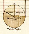 One of William Playfair's pie charts in his Statistical Breviary, depicting the proportions of the Turkish Empire located in Asia, Europe and Africa before 1789.
 -


Notes
- ^ a b c d Spence (2005)
- ^ a b Tufte, p. 44
- ^ Cleveland, p. 262
- ^ Wilkinson, p. 23.
- ^ Tufte, p. 178.
- ^ van Belle, p. 160–162.
- ^ a b Stephen Few. "Save the Pies for Dessert", August 2007, Retrieved 2010-02-02
- ^ Steve Fenton"Pie Charts Are Bad"
- ^ Good and Hardin, p. 117–118.
- ^ Cleveland, p. 86–87
- ^ Friendly, p. 509
- ^ "Florence Nightingale's Statistical Diagrams". Retrieved 2010-11-22.
{{cite web}}: Unknown parameter|creator=ignored (help) - ^ "Feitelson, Dror (2003) Comparing Partitions With Spie Charts" (PDF). 2003. Retrieved 2010-08-31.
- ^ "R Graph Gallery: Spie chart". Retrieved 2010-08-31.
- ^ Clark Jeff. (2006). Neoformix. "Multi-level Pie Charts"
- ^ Webber Richard, Herbert Ric, Jiangbc Wel. "Space-filling Techniques in Visualizing Output from Computer Based Economic Models"
- ^ Good and Hardin, chapter 8.
- ^ Palsky, p. 144–145
See also
References
- Cleveland, William S. (1985). The Elements of Graphing Data. Pacific Grove, CA: Wadsworth & Advanced Book Program. ISBN 0-534-03730-5.
- Friendly, Michael. The Golden Age of Statistical Graphics, Statistical Science, Volume 23, Number 4 (2008), 502-535 [1]
- Good, Phillip I. and Hardin, James W. Common Errors in Statistics (and How to Avoid Them). Wiley. 2003. ISBN 0-471-46068-0.
- Guerry, A.-M. (1829). Tableau des variations météorologique comparées aux phénomènes physiologiques, d'aprés les observations faites à l'obervatoire royal, et les recherches statistique les plus récentes. Annales d'Hygiène Publique et de Médecine Légale , 1 :228-.
- Harris, Robert L. (1999). Information Graphics: A comprehensive Illustrated Reference. Oxford University Press. ISBN 0-19-513532-6.
- Palsky Gilles. Des chiffres et des cartes: la cartographie quantitative au XIXè siècle. Paris: Comité des travaux historiques et scientifiques, 1996. ISBN 2-7355-0336-4.
- Playfair, William, Commercial and Political Atlas and Statistical Breviary, Cambridge University Press (2005) ISBN 0-521-85554-3.
- Spence, Ian. No Humble Pie: The Origins and Usage of a statistical Chart. Journal of Educational and Behavioral Statistics. Winter 2005, 30 (4), 353–368.
- Tufte, Edward. The Visual Display of Quantitative Information. Graphics Press, 2001. ISBN 0961392142.
- van Belle, Gerald. Statistical Rules of Thumb. Wiley, 2002. ISBN 0471402273.
- Wilkinson, Leland. The Grammar of Graphics, 2nd edition. Springer, 2005. ISBN 0-387-24544-8.
- Clark Jeff. (2006). ‘’Neoformix’’. Multi-level Pie Charts [2]
- Webber Richard, Herbert Ric, Jiangbc Wel. Space-filling Techniques in Visualizing Output from Computer Based Economic Models [3]
- Stasko John. SunBurst [www.cc.gatech.edu/gvu/ii/sunburst/]
- Woodbury, Henry. Nightingales Rose