Thematic map


A thematic map is a type of map that portrays the geographic pattern of a particular subject matter (theme) in a geographic area. This usually involves the use of map symbols to visualize selected properties of geographic features that are not naturally visible, such as temperature, language, or population.[1] In this, they contrast with general reference maps, which focus on the location (more than the properties) of a diverse set of physical features, such as rivers, roads, and buildings.[2][3] Alternative names have been suggested for this class, such as special-subject or special-purpose maps, statistical maps, or distribution maps, but these have generally fallen out of common usage.[4][5] Thematic mapping is closely allied with the field of Geovisualization.
Several types of thematic maps have been invented, starting in the 18th and 19th centuries, as large amounts of statistical data began to be collected and published, such as national censuses. These types, such as choropleth maps, isarithmic maps, and chorochromatic maps, use very different strategies for representing the location and attributes of geographic phenomena, such that each is preferable for different forms of phenomena and different forms of available data. A wide variety of phenomena and data can thus be visualized using thematic maps, including those from the natural world (e.g., climate, soils) and the human world (e.g., demographics, public health)
History
[edit]
According to Arthur Robinson, thematic maps were largely an Industrial Age innovation, with some Enlightenment-era roots; almost all of the modern graphical techniques were invented between 1700 and 1850.[6]: 26 Prior to this, the most important cartographic development was the production of accurate general base maps. Their accuracy improved slowly, and even in the mid-17th century, they were usually of poor quality; but they were good enough to display basic information, allowing the production of the first thematic maps.
One of the earliest thematic maps was one entitled Designatio orbis christiani (1607) by Jodocus Hondius, showing the dispersion of major religions using map symbols, in the French edition of his Atlas Minor (1607).[7] This was soon followed by a thematic globe (in the form of a six-gore map) showing the same subject, using Hondius' symbols, by Franciscus Haraeus, entitled Novus typus orbis ipsus globus, ex Analemmate Ptolomaei diductus (1614)[8]
An early contributor to thematic mapping in England was the English astronomer Edmond Halley (1656–1742), who introduced the Enlightenment conception of the thematic map as a tool for scientific thinking.[6]: 42 His first significant cartographic contribution was a star chart of the constellations of the Southern Hemisphere, made during his stay on St. Helena and published in 1686. In that same year he also published his first terrestrial map in an article about trade winds, and this map is called the first meteorological chart.[9] In 1701 he published the "New and Correct Chart Shewing the Variations of the Compass", see first image, the first chart to show lines of equal magnetic variation and possibly the first isarithmic map. Early chorochromatic (nominal area-class) maps also appeared in the late 18th century as scientific instruments for exploring geographic phenomena such as geology and language.[6]: 52
The early to middle 19th century could be considered, as Robinson called it, a "golden age" of thematic mapping, when many of the current techniques were invented or further developed.[10] For example, the earliest known choropleth map was created in 1826 by Charles Dupin. Based on this work Louis-Léger Vauthier (1815–1901) developed the population contour map, a map that shows the population density of Paris in 1874 by isolines.[11]
One of the most influential early works of thematic cartography was a small booklet of five maps produced in 1837 by Henry Drury Harness as part of a government report on the potential for construction of railroads in Ireland.[10][12] Included were early chorochromatic and flow maps, and possibly the first proportional point symbol and dasymetric maps.

Another example of early thematic mapping comes from London physician John Snow. Though disease had been mapped thematically, Snow's cholera map in 1854 is the best-known example of using thematic maps for analysis. Essentially, his technique and methodology anticipated the principles of a geographic information system (GIS). Starting with an accurate base map of a London neighborhood which included streets and water pump locations, Snow mapped out the incidence of cholera deaths. The emerging pattern centered around one particular pump in Broad Street. At Snow's request, the handle of the pump was removed, and new cholera cases ceased almost at once. Further investigation of the area revealed that the Broad Street pump was near a cesspit under the home of the outbreak's first cholera victim.
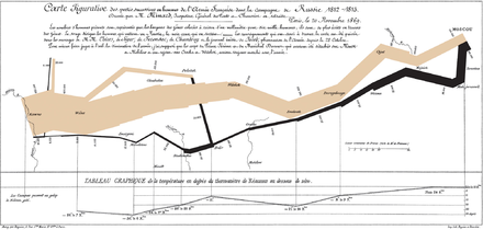
Charles Joseph Minard has been hailed as perhaps the first master of thematic mapping and information visualization.[13] In the 1850s and 1860s, he integrated thematic maps (especially flow maps) with statistical charts to create visual narratives, most notably his 1869 map of Napoleon's 1812 invasion of Europe.[14]
By the early 20th century, established methods were in place for manually drafting a variety of thematic maps, but they were still produced in far fewer numbers than general reference maps, and occupied a relatively small portion of cartographic education.[15] Their popularity vastly increased in the second half of the century, due to several influences: first, the Quantitative revolution in geography and the rise of cartography as an academic discipline, both of which increased the role of thematic maps as tools for scientific analysis and communication; second, technology that facilitates map design and production, especially the personal computer, the geographic information system (GIS), graphics software, and the Internet; and third, the widespread availability of large volumes of data, notably the first digital releases of national censuses in the 1990s.[16]: 8
Purposes
[edit]The most common purpose of a thematic map is to portray the geographic distribution of one or more phenomena. Sometimes this distribution is already familiar to the cartographer, who wants to communicate it to an audience, while at other times the map is created to discover previously unknown patterns (as a form of Geovisualization).[17] Thematic maps accomplish these two goals by leveraging the natural ability of the human visual perception system to recognize patterns in a complex visual field, which is necessary for common tasks such as object recognition.[18][19] A thematic map usually focuses on visualizing the distribution of values of a single property or type of feature (a univariate map), occasionally including two (bivariate) or more (multivariate) properties or feature types that are hypothesized to be statistically correlated or otherwise closely related.[20]
By focusing on a single subject matter, the thematic map is typically intended to be used for a narrower range of tasks than a reference map. These tasks tend to fall into three types:[16]: 2
- Provide specific information about particular locations. For example, "what is the Hispanic proportion of Chicago?"
- Provide general information about spatial patterns. For example, "where is maize grown?"
- Compare patterns on two or more maps. For example, "how did the vote change between the 2008 and 2012 U.S. presidential elections?"
Mapping methods
[edit]Cartographers use many methods to create thematic maps. These are often referred to as different types of thematic maps, but it is more proper to call them types of thematic map layers or thematic mapping techniques, as they can be combined with each other (forming a bivariate or multivariate map) and with one or more reference map layers in a single map. For example, a cartogram technique could be used to distort the sizes of countries proportional to one variable, with the countries being filled with colors representing a second variable using the choropleth technique.

Choropleth
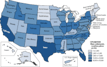
[edit]A choropleth map shows statistical data aggregated over predefined regions, such as countries or states, by coloring or shading these regions. For example, countries with higher rates of infant mortality might appear darker on a choropleth map.[21][22] The summary variable being mapped may be nominal or quantitative, but usually represents a geographic field. Visual variables filling each region are used to represent each aggregate summary value: hue is commonly used for qualitative variables, such as predominant land use, while lightness is most common for quantitative differences, such as population density. Choropleth maps are the most popular form of thematic map due to their intuitive nature, widespread availability of such aggregate statistical data, and GIS data for common regions.[23][24] The loss of information inherent in aggregate information can result in interpretation issues such as the Ecological fallacy and the Modifiable areal unit problem.[25][26][27] Choropleth maps, in almost all cases, must employ normalized or rate data (such as people per square mile, or disease cases per 100,000) to avoid creating a misleading map.[28][29] This step is often ignored, leading to potentially misleading maps.[24]

Proportional point symbol
[edit]The proportional symbol technique uses point symbols of different sizes (height, length, area, or volume) to represent quantitative statistical values associated with different areas or locations within the map. For example, a disc may be shown at the location of each city in a map, with the area of the disc being proportional to the population of the city.[30] This type of map is useful for visualization when raw data cannot be dealt with as a ratio or proportion. Although circles are the most typical symbol because they are more compact due to their low perimeter to area ratio, studies show that it is easier for the reader to estimate the size of the symbol if it is a square or a bar.[31] Proportional symbol maps are commonly used for variables representing total counts or amounts.

Cartogram
[edit]A cartogram is a map that intentionally distorts geographic space based on a given variable, usually by scaling features so their size is proportional to their value of the variable.[33] For example, the countries of the world could be scaled proportional to their population. The features being distorted may be lines (such as making the length of subway lines proportional to travel time), but most commonly it is regions that are scaled. The distorted shapes are sometimes used as a basis for additional thematic mapping techniques, such as the choropleth, and can be used to display absolute data not appropriate for choropleth maps.[16]: 355 [33]

Isarithmic or isoline
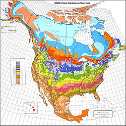
[edit]Isarithmic maps, also known as contour maps or isoline maps, depict continuous quantitative fields (sometimes conceptualized as "statistical surfaces" by cartographers), such as precipitation or elevation by partitioning space into regions, each containing a consistent range of values of the field. The boundary of each region, an isoline, thus represents the set of locations of constant value. For example, on a topographic map, each contour line indicates an area at the listed elevation.

Chorochromatic or area-class
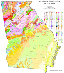
[edit]A chorochromatic or area-class map represents a categorical or nominal variable distributed over space (also known as a discrete field), by using different area symbols (usually color hue) to represent regions of homogeneous value. Common examples include maps of surface geology, soil, vegetation, land use, city zoning, and climate type.[34]

Dot
[edit]A dot distribution map places small point symbols over a given space to indicate the distribution of a given phenomenon. The location of each dot may represent the actual location of a single instance, as in the map made by Dr. Snow during the 1854 Broad Street cholera outbreak, where each dot represented one death due to cholera. Alternatively, aggregate statistical data (the same used in choropleth maps) may be mapped by randomly placing dots within each aggregation region (e.g., country, state, county) to show the general density of instances; this latter form is usually called a dot density map.
Flow
[edit]
Flow maps are maps that use line symbols to portray movement or relationship between two or more places, such as air travel, monetary aid, or economic trade. The lines may be schematic straight lines or curves, or may represent the actual travel route. Some flow maps simply show the presence of connections, while others use visual variables such as size (width) or color to represent the properties of each connection.
Dasymetric
[edit]A dasymetric map is an alternative to a choropleth map. As with a choropleth map, data are collected by enumeration units. But instead of mapping the data so that the region appears uniform, ancillary information is used to estimate a more detailed distribution of the phenomenon within each enumeration unit. For example, land cover data (forest, water, grassland, urbanization) may be used to refine the distribution of county-level population density.[16]: 271
Reference layers
[edit]While the thematic information is the core of a thematic map, other geographic features may also be included as reference information. The primary purpose of reference information is to establish the location of the thematic information in a context understood by the map readers (i.e., to answer questions such as "where is this red region in the real world?"). Common reference layers include government administrative boundaries, roads, cities, a latitude/longitude graticule, or even terrain. These layers play a secondary role in the use of the map, so they are usually included sparingly, and symbolized to be low in the visual hierarchy, but not so faded that they cannot be used.[5]: 64
See also
[edit]References
[edit]- ^ Bartz Petchenik, Barbara (April 1979). "From Place to Space: The Psychological Achievement of Thematic Mapping". Cartography and Geographic Information Science. 6 (1): 5–12. doi:10.1559/152304079784022763.
- ^ Thrower, Norman J.W. (2008). Maps and Civilization: Cartography in Culture and Society (3rd ed.). University of Chicago Press. p. 95. ISBN 9780226799759.
- ^ "Fundamentals of Mapping". icsm.gov.au. Retrieved 2015-05-03.
- ^ Dent, Borden D.; Torguson, Jeffrey S.; Hodler, Thomas W. (2009). Cartography: Thematic Map Design. McGraw-Hill. p. 7. ISBN 978-0-07-294382-5.
- ^ a b Keates, John S. (1973). Cartographic design and production. Longman. p. 59.
- ^ a b c Robinson, Arthur H. (1982). Early Thematic Mapping in the History of Cartography. University of Chicago Press.
- ^ Van der Dussen, Jan and Kevin Wilson (1995). The History of the Idea of Europe. Routledge. p. 28.
- ^ "Novus typus orbis ipsus globus, ex Analemmate Ptolomaei diductus 1614". Retrieved 25 February 2013.
- ^ Thrower, Norman J.W. (2008). Maps and Civilization: Cartography in Culture and Society (3rd ed.). University of Chicago Press. p. 97. ISBN 9780226799759.
- ^ a b Robinson, Arthur H. (Dec 1955). "The 1837 Maps of Henry Drury Harness". The Geographical Journal. 121 (4): 440–450. doi:10.2307/1791753. JSTOR 1791753.
- ^ Michael Friendly (2008). "Milestones in the history of thematic cartography, statistical graphics, and data visualization".
- ^ Griffith, Richard John; Harness, Henry Drury (1838). Atlas to Accompany 2nd Report of the Railway Commissioners. Ireland.
- ^ Tufte, Edward (2006). Beautiful Evidence. Graphics Press. Bibcode:2006beev.book.....T.
- ^ Minard, Charles Joseph. "Carte figurative des pertes successives en hommes de l'Armée Française dans la campagne de Russie 1812–1813".
- ^ Raisz, Erwin (1948). General Cartography. McGraw-Hill. p. 245.
- ^ a b c d Slocum, Terry A.; McMaster, Robert B.; Kessler, Fritz C.; Howard, Hugh H. (2009). Thematic Cartography and Visualization (3rd ed.). Pearson/Prentice Hall.
- ^ MacEachren, Alan M. (1995). How Maps Work: Representation, Visualization, and Design. Guilford Press. p. 355. ISBN 0-89862-589-0.
- ^ Tufte, Edward R. (1983). The visual display of quantitative information. Graphics Press.
- ^ MacEachren, Alan M.; Ganter, John H. (Summer 1990). "A Pattern Identification Approach to Cartographic Visualization". Cartographica. 27 (2): 64–81. doi:10.3138/M226-1337-2387-3007.
- ^ Nelson, J. (2020). Multivariate Mapping. The Geographic Information Science & Technology Body of Knowledge (1st Quarter 2020 Edition), John P. Wilson (ed.). DOI: 10.22224/gistbok/2020.1.5
- ^ Dent, Borden D.; Torguson, Jeffrey S.; Hodler, Thomas W. (2009). Cartography: Thematic Map Design (6th ed.). McGraw-Hill.
- ^ Tobler, Waldo (1973). "Choropleth Maps Without Class Intervals?". Geographical Analysis. 5 (3): 262–265. doi:10.1111/j.1538-4632.1973.tb01012.x.
- ^ Brewer, Cynthia. A.; Pickle, L. (2002). "Evaluation of methods for classifying epidemiological data on choropleth maps in series". Annals of the Association of American Geographers. 92 (4): 662–681. doi:10.1111/1467-8306.00310.
- ^ a b Adams, Aaron M.; Chen, Xiang; Li, Weidong; Chuanrong, Zhang (27 July 2023). "Normalizing the pandemic: exploring the cartographic issues in state government COVID-19 dashboards". Journal of Maps. 19 (5): 1–9. doi:10.1080/17445647.2023.2235385.
- ^ Piantados, Steven; Byar, David P.; Green, Sylvan B. (1988). "The Ecological Fallacy". American Journal of Epidemiology. 127 (5). Retrieved 27 December 2022.
- ^ Openshaw, Stan (1983). The Modifiable Areal Unit Problem (PDF). ISBN 0-86094-134-5.
- ^ Chen, Xiang; Ye, Xinyue; Widener, Michael J.; Delmelle, Eric; Kwan, Mei-Po; Shannon, Jerry; Racine, Racine F.; Adams, Aaron; Liang, Lu; Peng, Jia (27 December 2022). "A systematic review of the modifiable areal unit problem (MAUP) in community food environmental research". Urban Informatics. 1. doi:10.1007/s44212-022-00021-1. S2CID 255206315.
- ^ Monmonier, Mark (2018). How to Lie With Maps. University of Chicago Press. ISBN 978-0226435923.
- ^ Adams, Aaron; Chen, Xiang; Li, Weidong; Zhang, Chuanrong (2020). "The disguised pandemic: the importance of data normalization in COVID-19 web mapping". Public Health. 183: 36–37. doi:10.1016/j.puhe.2020.04.034. PMC 7203028. PMID 32416476.
- ^ Using Proportional Symbols [1] ESRI ArcGIS Resources. Accessed 19 Dec 2018
- ^ Crawford, P. (1973). "The Perception of Graduated Squares as Cartographic Symbols". Cartographic Journal. 10 (2): 85–88. doi:10.1179/caj.1973.10.2.85.
- ^ Paull, John & Hennig, Benjamin (2016) Atlas of Organics: Four Maps of the World of Organic Agriculture Journal of Organics. 3(1): 25–32.
- ^ a b Zhang, T. (2020). "Integrating geographic information system technique with Google Trends data to analyse COVID-19 severity and public interest". Public Health. 189: 3–4. doi:10.1016/j.puhe.2020.09.005. PMC 7494314. PMID 33074108.
- ^ Kraak, Menno Jan; Ormeling, Ferjan (2003). Cartography: Visualization of spatial data (2nd ed.). Prentice Hall. ISBN 978-0-13-088890-7. p.129
Further reading
[edit]- Delaney, John (2012). First X, Then Y, Now Z: An Introduction to Landmark Thematic Maps. Princeton University Library.
- Muehrcke, Phillip; Muehrcke, Juliana O.; Kimerling, A. Jon (2001). Map Use: Reading, Analysis, and Interpretation. JP Publications. ISBN 978-0-9602978-5-6.
- Robinson, Arthur H. (1982). Early Thematic Mapping in the History of Cartography. University of Chicago Press. ISBN 978-0-226-72285-6.
- Robinson, Arthur H. (1995). Elements of cartography (6e ed.). Wiley. ISBN 978-0-471-55579-7.
- Slocum, Terry A.; McMaster, Robert B.; Kessler, Fritz C.; Howard, Hugh H. (2009). Thematic cartography and geovisualization (3rd ed.). Pearson Prentice Hall. ISBN 978-0-13-229834-6.
- Thrower, Norman J.W. (2008). Maps & Civilization: Cartography in Culture and Society (3rd ed.). University of Chicago Press. ISBN 978-0-226-79974-2.
