Wikipedia:Featured picture candidates/Northern Gannets: Difference between revisions
Appearance
Content deleted Content added
TotoBaggins (talk | contribs) |
|||
| Line 26: | Line 26: | ||
*'''Support''' edit 3 [[User:HighInBC|HighInBC]] 14:19, 14 September 2006 (UTC) |
*'''Support''' edit 3 [[User:HighInBC|HighInBC]] 14:19, 14 September 2006 (UTC) |
||
*'''Support''' edit 2 -- very nice shot of subjects, and subtle color [[User:TotoBaggins|TotoBaggins]] 20:04, 14 September 2006 (UTC) |
*'''Support''' edit 2 -- very nice shot of subjects, and subtle color [[User:TotoBaggins|TotoBaggins]] 20:04, 14 September 2006 (UTC) |
||
*'''Support edit 2''' - colouration is closer to reality than the contrastier/saturated versions. A lovely photo. --[[User:Yummifruitbat|Yummifruitbat]] 01:03, 15 September 2006 (UTC) |
|||
<!-- additional votes go above this line --> |
<!-- additional votes go above this line --> |
||
{{-}} |
{{-}} |
||
Revision as of 01:03, 15 September 2006


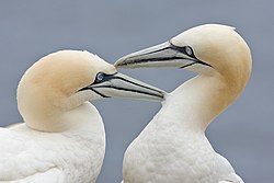
The birds are back. Artful composition illustrating two Northern Gannets, likely an example of pair bonding also. 1440x960.
- Nominate and support edit 2, particular object edit 1 (loss of file size, spots not yet removed) or 3 (unnecessary saturation, poorer bokeh). - –Outʀiggʀ 04:30, 12 September 2006 (UTC)
 Support Either version. Love the monotone background! --Fir0002 10:57, 12 September 2006 (UTC)
- Support Great detail, crisp, endearing interaction between subjects. --Bridgecross 12:13, 12 September 2006 (UTC)
- Support original version. —freak(talk) 12:51, Sep. 12, 2006 (UTC)
- Support. Fir's edit (increased contrast?). However, Fir, can you please clone out those small circular "smudges" on the background? One just left and down from center, and the other left and up from the left bird's head. --Dante Alighieri | Talk 17:11, 12 September 2006 (UTC)
- Actually, there's at least four smudges now that I look closer. Anyone else see them? --Dante Alighieri | Talk 17:12, 12 September 2006 (UTC)
- Yes, I do. Nauticashades 17:32, 12 September 2006 (UTC)
- I've removed them. I worked from the original so as not to lose image data, and then re-applied something close to Fir's edit as well. –Outriggr § 00:58, 13 September 2006 (UTC)
- Support Edit 3. Per nomination and Bridgecross. Nauticashades 17:32, 12 September 2006 (UTC)
- Support
both,Edit 1 and 3 but edit 1 makes the colors pop a bit more. PPGMD 22:06, 12 September 2006 (UTC) - Support both, but I prefer the original. Some P. Erson 22:21, 12 September 2006 (UTC)
- Support Edit 2 per above reasons and because the problem is fixed now. Arad 03:48, 13 September 2006 (UTC)
- Support Edit 2. Wonderful colors. --S0uj1r0 04:05, 13 September 2006 (UTC)
 Support edit 3 or Fir's edit 1. I made the third version by using outriggr's edit 2, modified to be closer to Fir's version with respect to contrast and color (though with a tiny bit more saturation). Like PPGMD said, the colors should "pop a bit more." ♠ SG →Talk 05:01, 13 September 2006 (UTC)
- Well, we're all getting the chance to alter this picture to our tastes, which is great. I'm sticking with edit 2 because I don't feel the colors need to "pop". There is a subdued beauty in the blues and yellows of 1 & 3, especially the relation between eye color and the bokeh. Now, additional saturation turns these gannets' heads into the color of a heavy smoker's fingers, if you will. :-) –Outriggr § 05:42, 13 September 2006 (UTC)
- Support edit 2 by Outriggr. --KFP 19:16, 13 September 2006 (UTC)
- Support edit 3 HighInBC 14:19, 14 September 2006 (UTC)
- Support edit 2 -- very nice shot of subjects, and subtle color TotoBaggins 20:04, 14 September 2006 (UTC)
- Support edit 2 - colouration is closer to reality than the contrastier/saturated versions. A lovely photo. --Yummifruitbat 01:03, 15 September 2006 (UTC)
