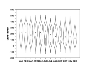
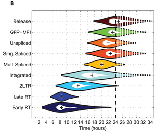
Violin plot


A violin plot is a method of plotting numeric data. It is a box plot with a rotated kernel density plot on each side.[1]
The violin plot is similar to box plots, except that they also show the probability density of the data at different values (in the simplest case this could be a histogram). Typically violin plots will include a marker for the median of the data and a box indicating the interquartile range, as in standard box plots. Overlaid on this box plot is a kernel density estimation.
Violin plots are available as extensions to a number of software packages, including R through the vioplot, wvioplot, caroline, UsingR, lattice, matplotlib, and ggplot2 libraries, Stata through the vioplot add-in,[2] and the Python libraries Matplotlib[3] and Seaborn.[4]
Violin plots are also quite similar to the turnip graph used in STATA.[5]
References
- ^ VIOLIN PLOT. www.itl.nist.gov. Retrieved 14 October 2008.
- ^ Hintze, Jerry L., and Ray D. Nelson. 1998. "Violin Plots: A Box Plot-Density Trace Synergism." The American Statistician 52(2):181-84.[1]
- ^ "What's new in matplotlib: violin plots"
- ^ Violinplots showing observations
- ^ gr45 - A turnip graph engine, Steve Woloshin, VA Outcomes Group, VA Medical Center, White River Junction, VT [2]
External links
![]() This article incorporates public domain material from Dataplot reference manual: Violin plot. National Institute of Standards and Technology.
This article incorporates public domain material from Dataplot reference manual: Violin plot. National Institute of Standards and Technology.
