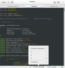
Popover (GUI)

A Popover is a container-type graphical control element that hovers over its parent window and blocks any other interaction with until it is selected. It can contain various other graphical control element such as checkboxes, radio buttons or a list box. Like any container-type graphical control element, it is meant to group elements that belong together and is not meant to be extensive.
Popover graphical control element were introduced in GTK+ 3.12[1]
References
- ^ "Popovers in GTK+". 2014-01-22.
