Wikipedia:Featured picture candidates/Coriolanus
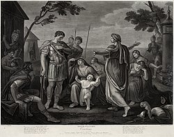
Coriolanus, Act V, Scene III[edit]


- Reason
- We need good-quality images for all of Shakespeare's works, in my opinion. This is an excellent-quality image of Coriolanus. Hence, I think that it was both worth working on, and worth featuring.
- Articles this image appears in
- Coriolanus, Coriolanus (play), Gavin Hamilton
- Creator
- Gavin Hamilton. The restoration should be credited to the uploader on Commons.
- Support original or Edit 2 as nominator, oppose edit 1 --Shoemaker's Holiday (talk) 09:36, 3 February 2009 (UTC)
- By the way, there's also an excellent Troilus, and several other Shakespeare works. Expect to see a few more, in between the Doré. Figured that, while I don't want to stop doing engravings, I can mix 'em up a bit =) Shoemaker's Holiday (talk) 09:47, 3 February 2009 (UTC)
- Support Sasata (talk) 07:13, 4 February 2009 (UTC)
- Support
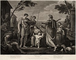
edit 1edit 2 At the distinct risk of sounding like a cracked record... I realise it's not crucial to a monochrome image, engraving or otherwise, but it just looks more authentic without the cast. I've shifted the colour on this to roughly the same extent as other LoC scans with reliable white references and hope you agree it appears to "reveal" something in the resulting image that was clouded before. Lovely illustration, either way. mikaultalk 13:54, 7 February 2009 (UTC)Um... Mikaul? This one had a colourbox. The white was not yellow-tinted.I also work with a lot of original engravings from this perid - I own several hundred - and this is pretty normal paper tone.Shoemaker's Holiday (talk) 01:49, 8 February 2009 (UTC)- Sorry, my mistake. But this did have a white table under it, if no colour box, and the table wasn't yellow-cast. The edit just isn't believable colours for a book of this period with the paper such books tend to use - if we were going down that route, it'd be better to remove the paper grain entirely and call it a printable version. Hence Oppose edit 1.
- Er, no, my mistake! Your dead right, I'm not sure how, but I missed out a crucial step (ie sampling the LoC original) and made a rather sweeping edit as a result. I've gone back and – carefully! – sampled it and cross-referenced your original, which has led to edit 2. Really sorry to mess you around; I can only recommend this edit as a very critical edit probably way beyond what it really needs (aka nitpicking :/) but... well, there it is. Discussion at talk page, if anyone's still interested. mikaultalk 06:36, 8 February 2009 (UTC)
- Well, the image itself looks pretty good in Edit 2, but, in my experience working with originals, the colours of my original are pretty typical, but I haven't seen paper take a pinksh tone. Maybe nudge the hue a little more towards yellow? Remember that most paper *does* yellow when it ages, so a bit of yellow is expected. Shoemaker's Holiday (talk) 06:54, 8 February 2009 (UTC)
- It looks pretty good because it's nigh-on the same as your original image! It's not appreciably less yellow than your original, but it was quite a bit less green: sampling the original white border on the LoC image, a green cast was the one thing that needed correcting, along with a small highlight clipping. I've taken out a little more magenta and uploaded over the old edit 2, which might deal with the pinkishness you're seeing. Quite honestly this is almost irrelevant now anyway, as the minute differences between edits is probably less than the difference in hues between our monitors, let alone everyone else's... mikaultalk 07:59, 8 February 2009 (UTC)
- Well, the image itself looks pretty good in Edit 2, but, in my experience working with originals, the colours of my original are pretty typical, but I haven't seen paper take a pinksh tone. Maybe nudge the hue a little more towards yellow? Remember that most paper *does* yellow when it ages, so a bit of yellow is expected. Shoemaker's Holiday (talk) 06:54, 8 February 2009 (UTC)
- Er, no, my mistake! Your dead right, I'm not sure how, but I missed out a crucial step (ie sampling the LoC original) and made a rather sweeping edit as a result. I've gone back and – carefully! – sampled it and cross-referenced your original, which has led to edit 2. Really sorry to mess you around; I can only recommend this edit as a very critical edit probably way beyond what it really needs (aka nitpicking :/) but... well, there it is. Discussion at talk page, if anyone's still interested. mikaultalk 06:36, 8 February 2009 (UTC)
- Sorry, my mistake. But this did have a white table under it, if no colour box, and the table wasn't yellow-cast. The edit just isn't believable colours for a book of this period with the paper such books tend to use - if we were going down that route, it'd be better to remove the paper grain entirely and call it a printable version. Hence Oppose edit 1.
- Support original. The yellowing looks more authentic. ~ ωαdεstεr16«talkstalk» 08:00, 8 February 2009 (UTC)
- Support any Going wishy-washy here. Not certain which version is preferable and willing to blow with the winds, but this is certainly a highly encyclopedic image that deserves an FP nod. DurovaCharge! 05:47, 10 February 2009 (UTC)
- Support - with a preference for edit 2 - I don't think it needs the yellowing Peripitus (Talk) 03:13, 12 February 2009 (UTC)
- Support original --Jf268 (talk) 11:36, 12 February 2009 (UTC)
Promoted File:Gavin Hamilton - Coriolanus Act V, Scene III edit2.jpg MER-C 03:28, 13 February 2009 (UTC)
