
Talk:Statewide opinion polling for the 2008 United States presidential election
Note from the Editor
I want to thank you all for your suggestions and work on this article. You have contributed greatly to the success and professional appearance of the site. Note that I consider every suggestion with as much care as you took in writing them. Please continue to make suggestions and comments about the article. Your friend PollShark (talk) 06:32, 22 April 2008 (UTC)
Predicted Results
This is a response to JamesMLane's edit summary content about the need for this section: YES. It's not particularly relevant who is ahead in a single state, as the presidency is decided by an aggregation of the state results through the Electoral College. Sure, individual readers could aggregate the results for themselves if they want to know how the big picture looks (and realize that national opinion polls which do not segregate their results by state are dubious indicators at best), but as PollShark has been so diligent as to keep the aggregation up to date for everyone, no one else has to duplicate the work (unless they want to check PS's work). Sketch051 (talk) 18:43, 20 March 2008 (UTC)
- An aggregation is interesting -- in the runup to 2004 I myself was addicted to http://www.electoral-vote.com for that type of total (except that the Votemaster there averages the most recent polls instead of just using one). Nevertheless, that doesn't mean it's appropriate Wikipedia content. We generally avoid, as unencylopedic, compilations of this sort that change constantly. There's no guarantee that PollShark or anyone else will continue the updating.
- At a minimum, to let the reader know how current the information is, I suggest that the compilation note when it was last updated. JamesMLane t c 02:57, 21 March 2008 (UTC)
State Links
I've made two substantial changes to the state links, neither of which affects the data reflected: (1) The links in the summary (Predicted Results) now point to the state-specific poll results in the main article (2) The state name headers of the state-specific poll result sections are now links to the state's article.
I did this for a string of reasons: the article is long, and scrolling is a nuisance; if you are clicking on a state's name in the results summary, you're more likely interested in the poll results which put that state in a particular candidate's column than in general information about the state; but if you're already looking at a state-specific set of results, you very likely might want to read more about the state to gain a greater understanding of the significance of the poll results.
Hopefully PollShark will still be able to easily cut & paste state references into the appropriate candidate's column as new data are available without any significant increase in the workload.Sketch051 (talk) 00:08, 27 March 2008 (UTC)
New York
The latest poll shouldn't be included in the electoral thing because it includes Condoleezza Rice.
The poll does include Secretary Rice, however the particular questions that include the general election matchup does not and is not the information I placed on the website. PollShark
?
What is the difference between the wikipedia article that we are talking about now and this one http://en.wikipedia.org/wiki/Opinion_polling_by_state_for_the_United_States_presidential_election%2C_2008
68.45.9.206 (talk) 20:25, 11 April 2008 (UTC)
That one has a color-coded map for the hypothetical matchups, this one has tabular data. I see no particular reason why they need to be kept separate, as long as a merged version has: 1) the state-by-state poll data, 2) the tabular aggregate of electoral votes, and 3) the color-coded map. Sketch051 (talk) 16:24, 14 April 2008 (UTC)
I agree. Marshie71 (talk) 21:27, 14 April 2008 (UTC)
Electoral Map
It's inaccurate for the state of Michigan, Minnesota, New Jersey, New York, Oregon, and Wisconsin. I propose getting rid of it as we already have a text comparison section, and maintaining the graphic isn't being done. —Preceding unsigned comment added by ChPr (talk • contribs) 19:37, 15 April 2008 (UTC)

Old version 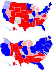
New version


- Uploaded a new map. New version is higher quality, language-neutral, easier to edit, can be seen side by side, and includes map showing electoral strength. I don't know how recent the data is, though. I just copied the data from the old map, which said April 17.
CT should be colored light blue for Clinton vs McCain. Jayavarman1 (talk) 05:46, 29 April 2008 (UTC)
- Clinton is in fact winning by an average of 5.3%, which is within the margin of darker red. The Evil Spartan (talk) 07:54, 29 April 2008 (UTC)
The most recent electoral map is inaccurate, only reflecting the single most recent poll (ie, Obama only won VA by a large margin once, but McCain won VA the two polls before that). Also, Obama isn't winning SC or WV. —Preceding unsigned comment added by Compsci10 (talk • contribs) 23:30, 9 June 2008 (UTC)
Size of Polls
The page that was merged with this one listed how many people were polled in each poll; I find that information useful when doing statistical analysis, and I'd like to see it return. PsyMar (talk) 00:30, 16 April 2008 (UTC)
Map redux
I have yet another version of the map. Fairly similar to the one above, except that now we indicate states with very heavy learnings (>10%). Thus the text might look something like this:
| Clinton vs. McCain | Obama vs. McCain |

|

|
| Clinton leads by over 10% (40) | Obama leads by over 10% (56) |
| Clinton leads by over 5% (191) | Obama leads by over 5% (202) |
| Clinton leads over 1%(229) | Obama leads over 1% (217) |
| Within 1% (50) | Within 1% (46) |
| McCain leads over 1% (259) | McCain leads over 1% (275) |
| McCain leads by over 5% (206) | McCain leads by over 5% (215) |
| McCain leads by over 10% (126) | McCain leads by over 10% (120) |
| Totals | Totals |
| McCain leads: 259 electoral votes
Clinton leads: 229 electoral votes |
McCain leads: 275 electoral votes
Obama leads: 217 electoral votes |
What do you think of the new format? Do you like the really dark states and the appearance? If not, we might try a scheme like this one. The Evil Spartan (talk) 08:11, 29 April 2008 (UTC)
- Hi Spartan, thanks for taking the map and running with it!
- As a map junkie I really like your additional colors, but I wonder if it may be too busy/complex for normal people. Any normal people have an opinion?
- Szu (talk) 18:16, 2 May 2008 (UTC)
- I was feeling the same way. So you like the color schemes? Waiting additional responses. The Evil Spartan (talk) 21:02, 2 May 2008 (UTC)
- Yes I like the colors, but they definitely make the image more complex, so I think you're right to wait for additional opinions. If any random people are reading this, go ahead share your thoughts.
- Szu (talk) 01:10, 4 May 2008 (UTC)
- I'm also a fan of maps,but red is red and blue is blue. Anyone who just wants to know who wins can get that easy enough from this map. Those who want more detail also get that. I vote ys as well. --Aranae (talk) 06:10, 4 May 2008 (UTC)
- Red is brown and blue is almost purple here... —Preceding unsigned comment added by Rakunus (talk • contribs) 20:55, 29 May 2008 (UTC)
Time for some structural revision
I figure, given that Obama is now presumed to be the nominee, that it's time we focus solely on McCain vs Obama. Also, there has to be time period in which polls have to have been taken to continue being considered valid. It's now May, and some states' latest data goes as far back as February and March. Finally, we have to be sure we update the top of the article along with the bottom. There have been discrepancies between the maps/individual state polling sections and the predicted results section. Fifty7 (talk) 14:22, 8 May 2008 (UTC)
- To your three points:
- 1) Obama is not the presumed nominee, and it would be a failure of WP:NPOV to assume as much
- 2) For the maps, data older than 45 days is ignored if possible; if there aren't many polls, however, the older ones are necessary to establish averages.
- 3) The maps work on a different scale than the bottom results. On the bottom, the latest result is simply used. The maps try to work out more of an average - read the blurb below them (I have done this because too many polls will see large variations, and this keeps those in check). I've updated the maps almost daily. I don't understand why people (of which you are certainly not the first) continue to claim they're wrong or behind when the algorithm is explicitly stated to be different under the image. The Evil Spartan (talk) 08:06, 9 May 2008 (UTC)
North Carolina too close to call?
I don't think so, a lot of polls gave the win to McCain and then one gives a tie between Obama and McCain, I think McCain still wins this state, or at least until two polls in a row place Obama ahead. Someone, please update the states and electoral votes. This is especially considering the fact that a poll made the same day gave McCain a 9 point lead over Obama. So yeah, McCain is winning North Carolina, not too close to call. —Preceding unsigned comment added by 68.243.98.35 (talk) 19:09, 10 May 2008 (UTC)
- In fact, you may have a point as to how the numbers are tallied. The way I've been tallying the maps is different from the way PollShark has done the totals on the bottom. He simply uses the latest poll. Perhaps you can point him to this thread. I explained on the page how I did the maps. The Evil Spartan (talk) 00:43, 11 May 2008 (UTC)
Beautification
Thought I would add some color to our site. Hope you like. Your friend PollShark (talk) 08:00, 29 May 2008 (UTC)
Flawed approach
I have to say that the way this article projects electoral vote totals is flawed. FiveThirtyEight.com's process is much more accurate, as it takes into account everything from the date polls were taken with different weight to the past accuracy of polling organizations. I propose that this article follow the fivethirtyeight.com model rather than simply basing a prediction on the latest poll taken with no regard for how close or how far apart, on average, various state races are. -- Fifty7 (talk) 16:34, 31 May 2008 (UTC)
- We're not really predicting results in the bottom section, simply summarizing the current outlook. Predictions, you're right, should be made on more than just the most recent poll. However since we're not predicting results the current format is fine. PollShark (talk) 11:15, 1 June 2008 (UTC)
- Eh, I don't think the common reader will make that distinction. I've been following this article for awhile, and I even made the mistake. I think we should, at the very least, make an effort to put up an accurate predictions section then. -- Fifty7 (talk) 14:18, 1 June 2008 (UTC)
- Also, it should be noted that, in the Maps of most recent polling data section, the bottom section is referred to as "predicted results". -- Fifty7 (talk) 14:21, 1 June 2008 (UTC)
Clinton
What should we do about Hillary Clinton? She has not dropped out, and she's actually relatively close in number of delegates (compared with, say, Ron Paul vs. McCain). I do not believe the content should be removed as this juncture. 64.178.96.168 (talk) 17:37, 4 June 2008 (UTC)
I was thinking the time has come to separate the polls. From now on, as Survey USA has done recently, most of the polls will be only between McCain and Obama. She's now begun her campaign for Vice President and seems to be resigned to the fact that she's not going to be the nominee. Last night was as close to a concession speech as you'll get from the Clintons. I say lets seperate. PollShark (talk) 20:31, 4 June 2008 (UTC)
- Perhaps we should hold our own little poll here to establish consensus? The Evil Spartan (talk) 20:56, 4 June 2008 (UTC)
- Two notes:
- 1)PollShark, I have no idea where you tried to just vote. If it's Clinton out now, put it under that heading; if it's in until concedes, please put a # in front of your name.
- 2)See http://fivethirtyeight.com for a great explanation of why this may be premature. The Evil Spartan (talk) 21:10, 4 June 2008 (UTC)
Poll
- Leave in Clinton until Democratic convention
- Leave in Clinton until if/when she concedes
- Take out Clinton now
Breaking News
New York Times just reported that Clinton has suspended her campaign effective tommorrow. I guess this moots the point of the poll. PollShark (talk) 23:24, 4 June 2008 (UTC)
- I heard it was leaked that it would be effective as of Friday. We can wait two days; really. The Evil Spartan (talk) 23:51, 4 June 2008 (UTC)
- Since it's already done and every major news service on earth and Howard Wolfson, chief Clinton strategist, has confirmed the story we'll leave it :) PollShark (talk) 00:44, 5 June 2008 (UTC)
- Formal campaign statement has now been released from Clinton confirming stories. PollShark (talk) 00:52, 5 June 2008 (UTC)
Images
I would just like to know how the presidential seal, white house logo, party logos and campaign symbols are not fair use images. PollShark (talk) 13:28, 6 June 2008 (UTC)
- The presidential seal and white house logo are public domain because they belong to the federal government. The logos belonging to the individual parties and campaigns are copyrighted. The Evil Spartan (talk) 15:58, 7 June 2008 (UTC)
- Not to make a point of constitutional law but we are the federal government according to the theory of democracy. PollShark (talk) 18:55, 7 June 2008 (UTC)
- I don't think you understand what fair use means. Please read up on WP:FU. If you still don't understand, please come back. The Evil Spartan (talk) 04:47, 9 June 2008 (UTC)
South Carolina and West Virginia?
South Carolina and West Virginia definitely in McCain's hands, but the map shows SC blue. Can someone please change the map and the Electoral Vote count too? Thank you. —Preceding unsigned comment added by Cchow2 (talk • contribs) 05:26, 10 June 2008 (UTC)
 Done - map redone. The Evil Spartan (talk) 21:03, 17 June 2008 (UTC)
Projection based on weighted averages of aggregate statewide polling data
I added the pretty darn credible projections out of Nate Silver's FiveThirtyEight.com, as it is a highly accurate representation of the information presented in the whole article. I'll keep the map updated each day as new polls come in. -- Fifty7 (talk) 23:36, 12 June 2008 (UTC)
- I am a bit worried we are stepping on the toes of copyright infringement by using someone else's methodology to construct a map. The map may fall under fair use, however. I am going to ask for administrator clarification. The Evil Spartan (talk) 21:01, 17 June 2008 (UTC)
Name of Article
Why is this article called "Statewide..." instead of "State..." or "State by state..."? "Statewide" means "at the state level rather than the local". Either of the others would means what's intended, i.e., "at the state rather than national level". -Rrius (talk) 08:30, 14 June 2008 (UTC)
- By all means make an alternate proposal. The Evil Spartan (talk) 21:01, 17 June 2008 (UTC)
More visible last update date
I think the date on which maps and final results were last updated should be more visible for all those political junkies who come on the site more than once. —Preceding unsigned comment added by 89.212.193.29 (talk) 11:43, 14 June 2008 (UTC)
Florida, Florida, Florida
Someone needs to change the color of Florida on the map. A poll was released today that shows Obama leading McCain for the first time ever. RIP Tim Russert. --Hobie Hunter (talk) 18:51, 18 June 2008 (UTC)
- FiveThirtyEight updated accordingly, I'd have updated earlier but I was at work all day. 'Tis done. -- Fifty7 (talk) 04:35, 19 June 2008 (UTC)
- It was no nesscary to put RIP Tim Russert at the end was it? America69 (talk) 15:35, 28 June 2008 (UTC)
whats up with the MAP ?
What is going on with the map? (and I don't mean which state is shaded for which candidate..) It seems like every other day the structure of the map changes or the key changes or the color scheme changes. (i am not referring to the fivethirtyeight map) The map is an incredible resource that I check daily to see updates and general trends, when I do not have the time to digest all of the individual statewide polls. Why can't we just keep it one way and then update it as the polls change accordingly. Why do we need to continuously change the colors and layout of the map? Marshie71 (talk) 00:47, 20 June 2008 (UTC)
- I was updating it daily; someone else came along and added what he thought was a more attractive map, but categorically refused to ever update it, so I've undone the change. The Evil Spartan (talk) 06:08, 28 June 2008 (UTC)
Map
I would like to raise two issues with this map. 1. is what The Evil Spartan raised above. 2. is the fact that this map seems political bias to me. NOT ONE other political website that I have covered down to the detail rates Ohio as "Safe Obama". Not one othere website list Colorado and New Mexico as "Safe Obama", but as "Tossup" or "Leaning Obama". This map is definently not right. I ask that all of you look at Nate Silver's Wikipedia page. It says "Beginning in October 2007, Silver began to publish a diary under the pseudonym "Poblano" on the progressive political blog Daily Kos. Daily Kos is a far left blog. If we are going to put maps on Wikipedia, let's make sure that they are politically correct, and none of the far left, or far right leaning stuff. This just looks like another liberal blog, making liberal maps. America69 (talk) 01:42, 20 June 2008 (UTC)
- Comment - Electoral-Vote has a very interesting map, that is non-partisan on this election. This would be a better map, as it is actually based on polling data. Is it possible to attempt to retrieve this map for Wikipedia, with permission?? America69Sh (talk) 01:45, 20 June 2008 (UTC)
- The website for electoral-vote is here [1]. Look at it and see what I mean. America69 (talk) 01:48, 20 June 2008 (UTC)
The map is getting ridiculous. I'm not here to promote a certain candidate, but there is no way Montana and West Virginia are undecided based on the current polls that are listed - they are for McCain, either safe or solid. Also, North Carolina and Nevada are not undecided either - they are swing McCain. Someone already pointed out Ohio is not solid Obama, but I'd also like to add I wouldn't even consider VA or MI swing Obama - they're closer to undecided. Furthermore, I don't know why several states along the southern border have changed from safe McCain to solid McCain - it is clearly obvious they are safe, not solid. Everytime I come back to this page there's an even more liberal slant than before, and it's reached the point where it's inaccurate. —Preceding unsigned comment added by Compsci10 (talk • contribs) 04:10, 21 June 2008 (UTC)
I'm the Wikipedia editor who has been managing the FiveThirtyEight map in this article. First, let me say that the worded-assignments in the map (for example, that a margin of 8% or more makes a state "safe") were my own doing, not Silver's, and as we can all agree, that was definitely a mistake. Now, the map currently says Ohio is "Solid Obama", not "Safe", and while the color is correct (the current statistical projection is that Obama would win Ohio by 6.8 points, FiveThirtyEight.com says Ohio is "Lean DEM". Please be assured, I am not here to defend my map as infallible, but only to point out a few things. One is that this map was put together for my own private purposes, and I assigned the titles for margins of victory ("Safe", "Solid", etc.) long before I ever considered putting it up on Wikipedia. In order to put it up on Wikipedia, I obtained permission from 270toWin.com to use their map model here, and then I simply color coded the states according to the day's projections on FiveThirtyEight.com. Now, and this has to be said, to call DailyKos far-left, or at least to assert that by association that Silver has some sort of inherent bias, is just plain uninformed. Silver's a statistician, and the only reason his blog has gotten any attention is that it's been pretty damn accurate so far. I don't consider it to be biased, nor am I trying to push a partisan agenda here. I think I've shown that by admitting the dumb mistake I made, and I'm definitely open to suggestions as to how to improve the map. Note that I'm asking how to improve how to present the reliable, credible information from FiveThirtyEight.com, and not what would be a good substitute for it, as I don't believe such a thing exists. Should the map simply be two colors, red or blue, no matter how small or large the margin is, with the margin of projected victory within each state typed in below the electoral vote total? Or perhaps try to color code it according to the newly-worded designations being used at FiveThirtyEight ("Toss-Up", "Lean", "Likely", "Safe"), which had already led me to consider altering the map this morning? Or maybe some combination (which is where I'm leaning)? Thanks. -- Fifty7 (talk) 04:48, 21 June 2008 (UTC)
- Responded on Fifty7's talk page. America69 (talk) 15:18, 21 June 2008 (UTC)
- Map updated. It's just two colors and the margins of projected victory are clearly presented with each state, so as to not misrepresent any information. The percentage font may be a bit too small; that was necessary just to make the map without any complications. If the font is too small, clicking on the map for the full size will fix that (although right now if you click on it, the image is still updating and you'll get the old one). -- Fifty7 (talk) 03:01, 22 June 2008 (UTC)
- I dont know how appropriate projections are for an encyclopedia. I think that the purpose of this page is to give the available polling data, rather than using the projections of one random statistician... it is hardly a consensus of expert opinions. I mean, I visit Nate's site daily, but I am just questioning if it belongs on this page.-Luckydevil713 (talk) 00:03, 23 June 2008 (UTC)
- Nate revamped the 538 model today to factor in timing bias. It's now projecting what Nate's methodology has determined to be the most likely outcome in November, with IN, MO, NV, and FL reverting to red. My guess is that the new model is still in beta and might change around a little bit yet, but it's worth noting. --Kudzu1 (talk) 00:38, 27 June 2008 (UTC)
As I type this, based on the average of the last three polls in Michigan which is a six point lead for Obama, that state should be colored medium blue. NOT the light blue that shows as I type this. Steelbeard1 (talk) 11:48, 28 June 2008 (UTC)
- Thanks for the heads up. In fact, if you read the scheme, you will note that if there are more than 3 polls in the last 45 days, it uses all of those. In this case, we have 5 polls in 45 days, with an average of +1.6 for Obama. The Evil Spartan (talk) 18:53, 28 June 2008 (UTC)
District of Columbia
Shouldn't there be a poll listed for the District of Columbia. ⁂†Poison the Well†⁂ (talk) 21:58, 24 June 2008 (UTC)
- There haven't be any yet. America69 (talk) 22:38, 24 June 2008 (UTC)
- On the projection map Dc is listed with a 58.2% going towards Mr. Obama. ⁂†Poison the Well†⁂ (talk) 06:05, 25 June 2008 (UTC)
- That is data from another site, based off previous years. No Democrat has ever had less than 85% of the DC vote, even in landslide years. The Evil Spartan (talk) 00:53, 27 June 2008 (UTC)
- On the projection map Dc is listed with a 58.2% going towards Mr. Obama. ⁂†Poison the Well†⁂ (talk) 06:05, 25 June 2008 (UTC)
the MAP!!!
why do we have to keep on changing the map ??? adding the different shades of red/blue just make it more confusing and much harder to read. PLEASE PLEASE PLEASE stop making it more complicated and keep things they way they were. —Preceding unsigned comment added by 138.16.29.197 (talk) 21:46, 28 June 2008 (UTC)
- I received feedback above that it was better that way. You should have said something then. The Evil Spartan (talk) 02:28, 29 June 2008 (UTC)
- Well, I don't monitor the discussion page as much as I monitor the actual article. Maybe I should pay attention to the discussion more closely, but I personally think that the map is not an improvement and that it actually more confusing and less helpful this way. 138.16.29.197 (talk) 04:55, 29 June 2008 (UTC)
- Anyone else care to opine? The Evil Spartan (talk) 04:58, 29 June 2008 (UTC)
- I have weighed in before, but here it is again. The map is laid out in shades of red and blue. For those only interested in simple colors, it shouldn't be too difficult to figure out red vs. blue whether that red happens to be pink, rose, burgandy, etc. and the blue is powder, sky, or midnight. For those that want more information out of the map, it's there. The new maps are an improvement, because they add a lot more information while adding minimal complexity. --Aranae (talk) 05:35, 29 June 2008 (UTC)
- I think the map should be simplified. Seven different shades are too much. Five was just right. --Hobie Hunter (talk) 02:17, 30 June 2008 (UTC)
- I disagree, the seven shades are just right--three shades of blue for Obama, three shades of red for McCain and off-white for ties. Steelbeard1 (talk) 12:03, 30 June 2008
- I like the five shades MUCH better than the seven shades. it just gets too complicated.138.16.29.197 (talk) 17:53, 5 July 2008 (UTC)
- I disagree, the seven shades are just right--three shades of blue for Obama, three shades of red for McCain and off-white for ties. Steelbeard1 (talk) 12:03, 30 June 2008
- I think the map should be simplified. Seven different shades are too much. Five was just right. --Hobie Hunter (talk) 02:17, 30 June 2008 (UTC)
- I have weighed in before, but here it is again. The map is laid out in shades of red and blue. For those only interested in simple colors, it shouldn't be too difficult to figure out red vs. blue whether that red happens to be pink, rose, burgandy, etc. and the blue is powder, sky, or midnight. For those that want more information out of the map, it's there. The new maps are an improvement, because they add a lot more information while adding minimal complexity. --Aranae (talk) 05:35, 29 June 2008 (UTC)
- Anyone else care to opine? The Evil Spartan (talk) 04:58, 29 June 2008 (UTC)
Pollshark Tank
There is a link at the very bottom of the external link section. I was looking at it, and I really don't see why that is there. It is a blog. Why is his blog there. If it stays there, why is the Daily Kos not there, or Politics 1 not there. All of them have polls. I want to know what you think. America69 (talk) 19:16, 29 June 2008 (UTC)
- Removed. Henrymrx (talk) 20:28, 29 June 2008 (UTC)
- Thank you. America69 (talk) 22:31, 30 June 2008 (UTC)
Obama v. McCain charts in battleground states
Using Wikipedia data from this article and Excel, I crunched the numbers in states where the lead in the polls for any one candidate is close or has shown signs of swinging back and forth between Obama and McCain. At this point, I've selected Florida, Pennsylvania, Ohio, Michigan, Virginia, Indiana and Missouri for additional analysis using charts and trendlines. I believe that these seven states are, as it happens, a good representative example, because three of the states are currently leaning toward Obama (Ohio, Michigan and Pennsylvania), three are currently leaning toward McCain (Florida, Indiana and Missouri) and Virginia is virtually tied. Incidentally, between these seven states, there are 120 electoral votes at stake, which represents 44% of the total (270) needed to secure the nomination. In most of the states, there are still at least about 10% of the voters with no opinion yet between the two candidates (or are supporting a third candidate). Your thoughts, suggestions and general input are greatly appreciated. If time is available, I will work to create these charts in the more visually friendly PNG format.--Robapalooza (talk) 23:31, 7 July 2008 (UTC)
Zogby polls shouldn't be included
Zogboy polls should not be included, as you know they are very inaccurate...