Jan Tschichold
This article includes a list of general references, but it lacks sufficient corresponding inline citations. (February 2008) |
Jan Tschichold | |
|---|---|
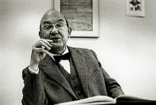
 Jan Tschichold in 1963 | |
| Born | Johannes Tzschichhold 2 April 1902 |
| Died | 11 August 1974 (aged 72) Locarno, Switzerland |
| Occupation(s) | Calligrapher, typographer, book designer |
Jan Tschichold (German pronunciation: [jan ˈtʃɪçɔlt]; born Johannes Tzschichhold; 2 April 1902 – 11 August 1974), also known as Iwan Tschichold or Ivan Tschichold, was a German calligrapher, typographer and book designer.[1][2] He played a significant role in the development of graphic design in the 20th century – first, by developing and promoting principles of typographic modernism, and subsequently idealizing conservative typographic structures. His direction of the visual identity of Penguin Books[3] in the decade following World War II served as a model for the burgeoning design practice of planning corporate identity programs. He also designed the typeface Sabon.[4]
Life
[edit]
Tschichold was the son of a provincial signwriter, and he was trained in calligraphy. In 1919, he began in the class of Hermann Delitzsch a study on the Leipziger Akademie der Künste (Leipzig Academy of the Arts). Due to his extraordinary achievements, he soon became a master pupil of the rector of Walter Tiemann, a type designer with the Gebr.-Klingspor foundry, and was given the task of teaching his fellow students. At the same time, he received the first orders as part of the Leipzig Trade Fair and in 1923 set up his own business as a typographic consultant to a print shop.
This artisan background and calligraphic training set him apart from almost all other noted typographers of the time, since they had inevitably trained in architecture or the fine arts. It also may help explain why he never worked with handmade papers and custom typefaces as many typographers did, preferring instead to use stock faces on a careful choice from commercial paper stocks.
Although, up to this moment, he had only worked with historical and traditional typography, he radically changed his approach after his first visit to the Bauhaus exhibition at Weimar.[5] After being introduced to important artists such as László Moholy-Nagy, El Lissitzky, Kurt Schwitters and others who were carrying out radical experiments to break the rigid schemes of conventional typography. He became sympathetic to this attempt to find new ways of expression and to reach a much more experimental way of working, but at the same time, felt it was important to find a simple and practical approach.
He became one of the most important representatives of the "new typography"[6] and in a special issue of Typographischen Mitteilungen (typographic communications) in 1925 with the title of "Elementare Typografie" (elementary typography), he summarized the new approaches in the form of theses.
After the election of Hitler in Germany, all designers had to register with the Ministry of Culture, and all teaching posts were threatened for anyone who was sympathetic to communism. Soon after Tschichold had taken up a teaching post in Munich at the behest of Paul Renner, they were both denounced as "cultural Bolshevists". Ten days after the Nazis surged to power in March 1933, Tschichold and his wife were arrested. During the arrest, Soviet posters were found in his flat, casting him under suspicion of collaboration with communists. After six weeks a policeman somehow found him tickets for Switzerland, and he and his family managed to escape Nazi Germany in August 1933.
Apart from two longer stays in England in 1937 (at the invitation of the Penrose Annual), and 1947–1949 (at the invitation of Ruari McLean, the British typographer, with whom he worked on the design of Penguin Books), Tschichold lived in Switzerland for the rest of his life. He died in the hospital at Locarno in 1974.[7]
Design
[edit]

Tschichold had converted to Modernist design principles in 1923 after visiting the first Weimar Bauhaus exhibition. He became a leading advocate of Modernist design: first with an influential 1925 magazine supplement mentioned above); then a 1927 personal exhibition; then with his most noted work Die neue Typographie.[9] This book was a manifesto of modern design, in which he condemned all typefaces but sans-serif (called Grotesk in Germany). He also favoured non-centered design (e.g., on title pages), and codified many other Modernist design rules. The idea of the New was the basis for the transformation of the entire system of printed graphics and graphic design.[10] He advocated the use of standardised paper sizes for all printed matter, and made some of the first clear explanations of the effective use of different sizes and weights of type in order to quickly and easily convey information. This book was followed with a series of practical manuals on the principles of Modernist typography, which had a wide influence among ordinary workers and printers in Germany.[11] Yet, despite his visits to England just before the war, only about four articles by Tschichold had been translated into English by 1945.
Although Die neue Typographie remains a classic, Tschichold slowly abandoned his rigid beliefs from around 1932 onwards (e.g. his Saskia typeface of 1932, and his acceptance of classical Roman typefaces for body-type) as he moved back towards Classicism in print design.[12] He later condemned Die neue Typographie as too extreme. He also went so far as to condemn Modernist design in general as being authoritarian and inherently fascistic.
Between 1947 and 1949 Tschichold lived in England, where he oversaw the redesign of 500 paperbacks published by Penguin Books, leaving them with a standardized set of typographic rules, the Penguin Composition Rules.[13] Although he gave Penguin's books (particularly the Pelican range) a unified look and enforced many of the typographic practices that are taken for granted today, he allowed the nature of each work to dictate its look, with varied covers and title pages. In working for a firm that made inexpensive mass-market paperbacks, he was following a line of work — in cheap popular culture forms (e.g. film posters) — that he had always pursued during his career.[citation needed] He was succeeded at Penguin by Hans Schmoller.
His abandonment of Modernist principles meant that, even though he was living in Switzerland after the war, he was not at the centre of the post-war Swiss International Typographic Style. Unimpressed by the use of realist or neo-grotesque typefaces, which he saw as a revival of poorly designed models, his survey of typefaces in advertising deliberately made no mention of such designs, save for a reference to 'survivals from the nineteenth-century which have recently enjoyed a short-lived popularity.'[14]
Typefaces
[edit]
Between 1926 and 1929, he designed a “universal alphabet” to clean up the few multigraphs and non-phonetic spellings in the German language. For example, he devised brand new characters to replace the multigraphs ch and sch. His intentions were to change the spelling by systematically replacing eu with oi, w with v, and z with ts. Long vowels were indicated by a macron below them, though the umlaut was still above. The alphabet was presented in one typeface, which was sans-serif and without capital letters.
Typefaces Tschichold designed include:
- Transit (1931) for "Lettergieterij Amsterdam, voorheen Tetterode",
- Saskia (1931/1932), for: Schelter & Giesecke, Leipzig
- Zeus (1931) for: Schriftguss AG, Dresden
- Uhertype-Standard-Grotesk (1931), for an early phototypesetting machine. Essentially a modified Gill Sans.[15][16]
- Sabon (1966/1967) [1].
Sabon was designed to be a typeface that would give the same reproduction on both Monotype and Linotype systems and there were also matrices made for type foundries. All type produced could be interchanged. It was used early after its release by Bradbury Thompson to set the Washburn College Bible. A “Sabon Next” was later released by Linotype as an ‘interpretation’ of Tschichold's original Sabon.
Bibliography
[edit]- Die neue Typographie. Ein Handbuch für zeitgemäß Schaffende, Verlag des Bildungsverbandes der Deutschen Buchdrucker, Berlin 1928.
- English translation: The New Typography. New edn. Berkeley: University of California Press, 2006.
- Eine Stunde Druckgestaltung: Grundbegriffe der Neuen Typografie in Bildbeispielen für Setzer, Werbefachleute, Drucksachenverbraucher und Bibliofilen (in German), Stuttgart: Akademischer Verlag Dr. Fritz Wedekind & Co., 1930
- Eine Stunde Druckgestaltung. Stuttgart: Akademischer Verlag Dr. Fritz Wedekind & Co., 1930.
- Schriftschreiben für Setzer. Frankfurt a.M.: Klimsch & Co., 1931.
- Typografische Entwurfstechnik. Stuttgart: Akademischer Verlag Dr Fritz Wedekind & Co., 1932.
- Typografische Gestaltung. Basel: Benno Schwabe & Co., 1935.
- Gute Schriftform. Basel: Lehrmittelverlag des Erziehungsdepartements, 1941/42, 1943/44, 1945/46.
- Geschichte der Schrift in Bildern. Basel: Holbein-Verlag, 1941/1946 (reprint: Hamburg: Hauswedell, 1951/1961).
- English translation: An Illustrated History of Lettering and Writing. London: o.V., 1947.
- Chinesisches Gedichtpapier vom Meister der Zehnbambushalle. Basel: Holbein-Verlag, 1947.
- Was jemand vom Buchdruck wissen sollte. Basel: Birkhäuser-Verlag, 1949.
- Schatzkammer der Schreibkunst, 2nd edn. Basel: Birkhäuser Verlag, 1949.
- Im dienste des buches, SGM-Bücherei, St. Gallen 1951.
- Chinesischer Farbendruck aus dem Lehrbuch des Senfkorngartens, Holbein-Verlag, Basel 1941 u. 1951.
- Schriftkunde, Schreibübungen und Skizzieren für Setzer, Holbein-Verlag, Basel 1942. – Reprint: Schriftkunde, Schreibübungen und Skizzieren, expanded edn. Berlin: Verlag des Druckhauses Tempelhof, 1951.
- Der Holzschneider und Bilddrucker Hu Cheng-yen. Basel: Holbein-Verlag, 1943/1952.
- Chinesische Farbendrucke der Gegenwart. Basel: Holbein-Verlag, 1944/1953.
- English translation: Chinese Colour Printing of the present day. London–New York: o.V., 1953.
- Formenwandlungen der Et-Zeichen. Frankfurt, Stempel, 1953
- 1st English translation: The Ampersand: Its Origin and Development, London, Wodhuysen, 1957.
- 2nd English translation: A Brief History of the Ampersand, Paris, Zeug, 2017. ISBN 979-10-95902-06-5
- Erfreuliche Drucksachen durch gute Typografie. Ravensburg: Otto Maier-Verlag, 1960 [Reprint]. – Auch: Augsburg: Maro-Verlag, 1988, ISBN 3-87512-403-0.
- Meisterbuch der Schrift: Ein Lehrbuch mit vorbildlichen Schriften aus Vergangenheit und Gegenwart für Schriftenmaler, Graphiker, Bildhauer, Graveure, Lithographen, Verlagshersteller, Buchdrucker, Architekten und Kunstschulen (in German) (3. unv. Nachdruck der 2 ed.), Ravensburg: Otto Maier-Verlag, 1965, ISBN 3-473-61100-X
- English edition: Treasury of Alphabets and Lettering. A handbook of type and lettering. New York: Norton Books. 1992. ISBN 0-393-70197-2.
- Die Bildersammlung der Zehnbambushalle, Eugen-Rentsch-Verlag, Zürich/Stuttgart 1970.
- foto-auge [zusammen mit Franz Roh], Akademischer Verlag Dr. Fritz Wedekind & Co., Stuttgart 1929 [Reprint]. – Auch: Ernst Wasmuth, Tübingen 1973.
- Ausgewählte Aufsätze über Fragen der Gestalt des Buches und der Typographie, Birkhäuser-Verlag, Basel 1975 u. 1987, ISBN 3-7643-1946-1.
- De proporties van het boek (Die Proportionen des Buches), Amsterdam, Amst., Intergrafia, 1955, de buitenkant, 1991
- Schriften: 1925–1974 Band 1/2. Berlin, 1992.
- The Form of the Book: Essays on the Morality of Good Design. Roberts, WA: Hartley and Marks, 1995.
- Jan Tschichold, Posters of the Avantgarde, Martijn F. Le Coultre, Alston W. Purvis, VK-projects, Laren, The Netherlands, 2007, ISBN 978-90-5212-003-4
- Jan Tschichold — Master Typographer: His Life, Work & Legacy, Cees W. de Jong, Alston W. Purvis, Martin F. Le Coultre, Richard B. Doubleday, Hans Reichardt, London: Thames & Hudson, 2008, ISBN 978-0-500-51398-9
- Jan Tschichold, and the New Typography, Paul Stirton, Yale, 2019, ISBN 978-0-300-24395-6
See also
[edit]References
[edit]- ^ Vasilieva E. (2022) Jan Tschichold and the concept of the new: a picture of the world and an artistic program // Terra Artis. Arts and Design, 3, 34-49.
- ^ Stirton, Paul (2019). Jan Tschichold and the New Typography: graphic design between the World Wars. Bard Graduate Center Gallery. New York City: Yale University Press.
- ^ Doubleday, Richard B. Jan Tschichold, Designer: The Penguin Years (2006. Oak Knoll Press & Lund Humphries)
- ^ Haley, Allan; Poulin, Richard; Tselentis, Jason; Seddon, Tony; Leonidas, Gerry; Saltz, Ina; Henderson, Kathryn (2012). Typography, referenced : a comprehensive visual guide to the language, history, and practice of typography. Beverly, MA: Rockport Publishers. p. 105. ISBN 9781610582056. OCLC 785574282.
- ^ McLean, Ruari (1997). Jan Tschichold: A Life in Typography. Princeton Architectural Press. pp. 7–8. ISBN 9781568980843.
- ^ Fiell, Charlotte; Fiell, Peter (2005). Design of the 20th Century (25th anniversary ed.). Köln: Taschen. p. 695. ISBN 9783822840788. OCLC 809539744.
- ^ Jan Tschichold—Posters of the AvantGarde written by Martijn F. Le Coultre and Alston W. Purvis page 21
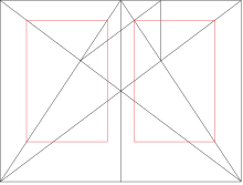
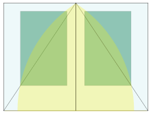
- ^ Jan Tschichold—Posters of the AvantGarde written by Martijn F. Le Coultre and Alston W. Purvis, p. 43, Fig 4. "Framework of ideal proportions in a medieval manuscript without multiple columns. Determined by Jan Tschichold 1953. Page proportion 2:3. margin proportions 1:1:2:3, Text area proportioned in the Golden Section. The lower outer corner of the text area is fixed by a diagonal as well."
- ^ Tschichold J. Die neue Typographie. Ein Handbuch für zeitgemäß Schaffende, Verlag des Bildungsverbandes der Deutschen Buchdrucker, Berlin 1928.
- ^ Vasilieva E. (2022) Jan Tschichold and the concept of the new: a picture of the world and an artistic program // Terra Artis. Arts and Design, 3, 34-49.
- ^ Stirton, Paul (2019). Jan Tschichold and the New Typography: graphic design between the World Wars. Bard Graduate Center Gallery. New York City: Yale University Press.
- ^ "Jan Tschichold : Design Is History". www.designishistory.com. Retrieved 2019-05-30.
- ^ Richard Doubleday. "Jan Tschichold at Penguin Books" (PDF).
- ^ Hollis, Richard (2006). Swiss Graphic Design: The Origins and Growth of an International Style. New Haven, CT: Yale University Press.
- ^ Horn, Frederick A. (1936). "Gutenberg on his Metal: c". Art & Industry. pp. 42–3. Archived from the original on 2019-07-31. Retrieved 12 August 2017.
- ^ Richard Hollis (2006). Swiss Graphic Design: The Origins and Growth of an International Style, 1920-1965. Laurence King Publishing. p. 199. ISBN 978-1-85669-487-2.
Sources
[edit]- Aynsley, Jeremy. Graphic Design in Germany, 1890–1945 (2000. University of California Press) ISBN 0-520-22796-4.
- Blackwell, Lewis. 20th Century Type (2004. Yale University Press) ISBN 0-300-10073-6.
- Günter Bose und Erich Brinkmann (Hrsg.): Jan Tschichold: Schriften 1925–1974. (Zwei Bände) Band 1: 1925–1947, Band 2: 1948–1974, Brinkmann & Bose, Berlin, 1992. ISBN 3-922660-37-1.
- Hans Rudolf Bosshard: Max Bill kontra Jan Tschichold. Der Typografiestreit in der Moderne. Niggli, Zürich, 2012, ISBN 978-3-721-20833-7.
- Bringhurst, Robert. The Elements of Typographic Style (1992. Hartley & Marks) ISBN 0-88179-033-8.
- Burke, Christopher. Active literature. Jan Tschichold and New Typography (2007. Hyphen Press) ISBN 978-0-907259-32-9.
- de Jong, Cees W., Alston W. Purvis, Martijn F. Le Coultre, Richard B. Doubleday and Hans Reichart. Jan Tschichold—Master Typographer: His Life, Work & Legacy (2008. Thames & Hudson) ISBN 978-0-500-51398-9.
- Doubleday, Richard B. Jan Tschichold, Designer: The Penguin Years (2006. Oak Knoll Press & Lund Humphries) ISBN 978-1-58456-178-1; ISBN 1-58456-178-5.
- Gerd Fleischmann: Tschichold – na und?, Göttingen, Wallstein Verlag, 2013 (Ästhetik des Buches; 3), ISBN 978-3-8353-1353-8
- Friedl, Friederich, Nicholas Ott and Bernard Stein. Typography: An encyclopedic survey of type design and techniques through history (1998. Black Dog & Leventhal) ISBN 1-57912-023-7.
- Leben und Werk des Typographen Jan Tschichold, mit einer Einleitung von Werner Klemke, der Bibliographie aller Schriften und fünf großen Aufsätzen von Jan Tschichold sowie über zweihundert, teils bunten Abbildungen. Dresden : Verlag der Kunst, 1977.
- Macmillan, Neil. An A–Z of Type Designers (2006. Yale University Press) ISBN 0-300-11151-7.
- McLean, Ruari. Jan Tschichold: A Life in Typography (1997. Princeton Architectural Press) ISBN 1-56898-084-1
- Julia Meer: Neuer Blick auf die Neue Typographie – Die Rezeption der Avantgarde in der Fachwelt der 1920er Jahre. Transcript, Bielefeld 2015, insbes. S. 206–216 und 219 ff. ISBN 978-3-8376-3259-0.
- Meggs, Philip B. History of Graphic Design (1998. John Wiley & Sons) ISBN 0-470-04265-6.
- Vasilieva E. (2022) Jan Tschichold and the concept of the new: a picture of the world and an artistic program // Terra Artis. Arts and Design, 3, 34-49.
- IDEA Magazine No 321: Works of Jan Tschichold. [2]
- Stirton, Paul (2019). Jan Tschichold and the New Typography: graphic design between the World Wars. Bard Graduate Center Gallery. New York City: Yale University Press. ISBN 978-0-300-24395-6. OCLC 1048946723.
External links
[edit]- www.tschichold.de (requires Flash plug-in).
- Short biography of Jan Tschichold at Textism.
- Jan Tschichold: a titan of typography
- Finding aid for Jan and Edith Tschichold papers, Getty Research Institute
- Presentation Jan Tschichold and New Typography by Paul Stirton at SlidesLive.com
