
User:Tldegrate
Overview
Data can be visualized using various charts and dashboards. The key to effectively displaying data through the use of charts and dashboards is to ensure that the design principles are utilized. Organizations implement “fancy” dashboards versus easy to read dashboards, which is one of the flaws mentioned by Few. Let’s take a look at a dashboard that commits some of the common visualization error, identify those errors, and mock up an improved design.
Screen 1

http://www.perceptualedge.com/blog/wp-content/uploads/2007/07/oracle-dashboard-1.jpg
Screen 2

http://www.perceptualedge.com/blog/wp-content/uploads/2007/07/oracle-dashboard-2.jpg
The above dashboard is intended to be used to monitor call center activity. Various metrics are displayed in the dashboard. These metrics include:
- Call volume
- Call capacity
- Calls by (originating) region
Mistakes and/or Opportunities for Improvement
On the first screen there is data, a bar and pie chart. There is limited information on this screen to visualize. The information on the screen must be read which is a slow process. Additionally, there are both bar and pie charts which can be confusing for the end-user viewing the information. According to Few, “most dashboards fail to communicate efficiently and effectively, not because of inadequate technology, but because of poorly designed information displays” (2013). In the charts used on the above dashboard this holds true with the use of charts that are potentially confusing and 3-D effects. Both the bar and pie chart contain 3-D effects that add no value to the visual display of information.
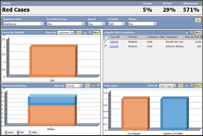
The second screen contains color (blue, light green and red) coded bar charts and data with a legend. An issue with color coding is that individuals who are color blind or in general may not be able to differentiate good versus bad. In reviewing the legend, the colors are mislabeled. The blue bar is labeled red, the light green is labeled yellow and the red is labeled green, which is misleading. All of the bars are transparent, which adds no value to the visualization of the data. Gridlines, additionally are not needed to effectively display the data.
Proposed Improved Dashboard

Explanation of Changes
The data links were replaced with a table. This table contains the total call for each agent. The data in the table is easy to read and understand. Additionally, there would be a legend with the definition of each column heading (time, agents, calls, answered, abandoned, ASA, LWC, GOS and average talk duration). There would be separate charts displaying pieces of the information in the table. For, example there would be a table called “calls by agent”. In the table there would be the total calls, calls answered and abandoned called. The dashboard would also contain a line graph with the total calls. This would give a easy to read visual of the total calls. Each category can be easily differentiated with varying colors that are not similar. These improvements are easy on the eyes and follow the dashboard design principle outlined by Few.
References Dashboard Zone. Retrieved November 21, 2017, from http://www.dashboardzone.com/bad-dashboard-design Few, S. (2013). Information dashboard design: Designing data for at-a-glance monitoring (2nd ed.). Burlingame, CA: Analytic Press.