Wikipedia:Featured picture candidates/Bibliothèque Sainte-Geneviève
Appearance
Voting period is over. Please don't add any new votes. Voting period ends on 8 Apr 2013 at 22:16:05 (UTC)


- Reason
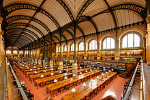
- Very high EV, providing a good overview of the whole reading room, its layout and proportions, as well as an extraordinary level of detail.
- Articles in which this image appears
- Sainte-Geneviève Library
- FP category for this image
- Wikipedia:Featured pictures/Places/Architecture
- Creator
- Marie-Lan Nguyen
- Support as nominator --ELEKHHT 22:16, 30 March 2013 (UTC)
- Support. The picture is quite nice, does not have significant distortions, and depicts the subject in a compelling manner. The only technical flaw I can see is some green-magenta chromatic aberration but that's not too serious. dllu (t,c) 05:23, 31 March 2013 (UTC)
- Neutral aesthetically pleasing as a thumbnail, but at full size it lacks sharpness especially on the right side of the image. --Pine✉ 18:24, 31 March 2013 (UTC)
- Support Sharpness looks fine to me. This is a 12MP image that hasn't been downsampled. Interesting that it's mirror image pic is the featured one on Commons.Colin°Talk 11:38, 2 April 2013 (UTC)
- Comment I doubt whether File:Salle de lecture Bibliotheque Sainte-Genevieve n02.jpg has more EV as the Sainte-Geneviève Library reading room. JKadavoor Jee 15:33, 2 April 2013 (UTC)
- We are lucky in this case to have three almost equally good images. What I would like to appeal to is not to get distracted by this, but use it as an opportunity to discuss the merits of each. I find all three appealing, but the nominated image is the version which has been in the article for more than a year. The oblique perspective is the more natural one in some regards, as seldom do people stand in the very centre of a space to contemplate its symmetry. The central perspective (Alt2) obscures the central row of columns (a main feature of the design), but shows that the reading room is not perfectly symmetric, with the staircases on the northern side, allowing less light to come in. This is also visible in the third version currently featured on Commons. In terms of composition the central perspective is a bit clumsily framed, so my preference stays with the nomination, or Alt3. --ELEKHHT 00:09, 3 April 2013 (UTC)
- Agree. I think all three are great and would support whichever one is in the article. Colin°Talk 06:59, 3 April 2013 (UTC)
- Agree and support any. JKadavoor Jee 11:34, 3 April 2013 (UTC)
- We are lucky in this case to have three almost equally good images. What I would like to appeal to is not to get distracted by this, but use it as an opportunity to discuss the merits of each. I find all three appealing, but the nominated image is the version which has been in the article for more than a year. The oblique perspective is the more natural one in some regards, as seldom do people stand in the very centre of a space to contemplate its symmetry. The central perspective (Alt2) obscures the central row of columns (a main feature of the design), but shows that the reading room is not perfectly symmetric, with the staircases on the northern side, allowing less light to come in. This is also visible in the third version currently featured on Commons. In terms of composition the central perspective is a bit clumsily framed, so my preference stays with the nomination, or Alt3. --ELEKHHT 00:09, 3 April 2013 (UTC)
- Comment the presently nominated picture is a slightly different white balance than the other two picture. It seems somewhat more reddish. Which is closer to the actual colour of the library? dllu (t,c) 08:15, 3 April 2013 (UTC)
- I can't really see much difference, other than that in the nominated image more of the reddish floor is visible, while in the Alts less. --ELEKHHT 09:35, 3 April 2013 (UTC)
- It seems that both Alt 2 and Alt 3 have been edited in April 2012 to have the less reddish white balance and some perspective distortion correction; whereas the original has not been thus edited. dllu (t,c) 18:45, 3 April 2013 (UTC)
- First, thanks ELEKHH for nominating my pic. All original pictures were taken with the same white balance settings (daylight if I remember correctly). I don't know what changes were made by Paris16, who uploaded the new versions. Jastrow (Λέγετε) 18:25, 5 April 2013 (UTC)
- It seems that both Alt 2 and Alt 3 have been edited in April 2012 to have the less reddish white balance and some perspective distortion correction; whereas the original has not been thus edited. dllu (t,c) 18:45, 3 April 2013 (UTC)
- I can't really see much difference, other than that in the nominated image more of the reddish floor is visible, while in the Alts less. --ELEKHHT 09:35, 3 April 2013 (UTC)
Not Promoted --Armbrust The Homunculus 22:18, 8 April 2013 (UTC)
