Wikipedia:Featured picture candidates/Palais Garnier
Appearance

- Reason
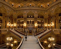
- Excellent wide angle mosaic image of the interior or the Grand Opera House in Paris. It is detailed, very aesthetic and I think the projection actually helps rather than being a necessary evil.
- Articles this image appears in
- Palais Garnier
- Creator
- User:Blieusong - Commons:User:Benh
- Support as nominator Diliff | (Talk) (Contribs) 16:05, 7 May 2008 (UTC)
- Weak support. I might have preferred a slightly more daylight vintage - this one feels a bit "beiged out". Papa Lima Whiskey (talk) 19:27, 7 May 2008 (UTC)
- Yeah, it does look a bit monochromatic but I'm not sure what you mean by daylight vintage. Diliff | (Talk) (Contribs) 19:36, 7 May 2008 (UTC)
- I was hoping that getting a bit more cold light in there would promote chromatic contrast. For the basement, the lack of contrast is understandable, but much less so for the gallery and middle levels. Papa Lima Whiskey (talk) 19:50, 7 May 2008 (UTC)
- Well, that depends how well lit by sunlight it is. I did a quick search and wasn't able to find any photos of it that were particularly naturally lit (This gives you an idea of how much window space there is, and this seems to be about the same resultant ambient light as the FPC). Diliff | (Talk) (Contribs) 20:09, 7 May 2008 (UTC)
- I was hoping that getting a bit more cold light in there would promote chromatic contrast. For the basement, the lack of contrast is understandable, but much less so for the gallery and middle levels. Papa Lima Whiskey (talk) 19:50, 7 May 2008 (UTC)
- Yeah, it does look a bit monochromatic but I'm not sure what you mean by daylight vintage. Diliff | (Talk) (Contribs) 19:36, 7 May 2008 (UTC)
- omg there are people in the image!! Support. Dorftrottel (troll) 22:14, May 7, 2008
- Support Wonderful image! Bewareofdog 03:08, 8 May 2008 (UTC)
- Support Image is great and I can't see anything majorly negative in the image. --Kalyan (talk) 04:31, 8 May 2008 (UTC)
- Strong Support Certainly the classical FP picture archtype. Exceeds all guidelines. EgraS (talk) 07:14, 8 May 2008 (UTC)
- Strong Support Great image, good comp, good exposure and the few people in the frame add life to the image.Capital photographer (talk) 11:44, 8 May 2008 (UTC)
- Support Very well done picture, specially with the dark lighting. The people in the picture are a definite plus to give a sense of scale. victorrocha (talk) 10:44, 8 May 2008 (UTC)
- Support Great photo, but the guy posing on the steps is a little annoying – maybe it's just my opinion. crassic![talk] 02:45, 10 May 2008 (UTC)
- Support the magnificence of the photo outways the man standing on the steps --St.daniel Talk 11:12, 10 May 2008 (UTC)
Promoted Image:Opera Garnier Grand Escalier.jpg MER-C 12:49, 13 May 2008 (UTC)
