
Talk:2009 swine flu pandemic in the United Kingdom: Difference between revisions
m Signing comment by 70.29.210.130 - "restore talk deleted by user:wuku" |
→User:Wuku: new section |
||
| Line 124: | Line 124: | ||
</gallery> |
</gallery> |
||
:::USA uses four maps, now that the map is all red and black, the number of deaths work better; but that only works when there are atleast two shades used. [[Special:Contributions/70.29.208.129|70.29.208.129]] ([[User talk:70.29.208.129|talk]]) 05:15, 6 June 2009 (UTC) |
:::USA uses four maps, now that the map is all red and black, the number of deaths work better; but that only works when there are atleast two shades used. [[Special:Contributions/70.29.208.129|70.29.208.129]] ([[User talk:70.29.208.129|talk]]) 05:15, 6 June 2009 (UTC) |
||
== User:Wuku == |
|||
[[User:Wuku]] has deleted several discussions from this talk page before they had a chance to be archived. I have restored these sections. They will likely be archived at the next MiszaBot archival sweep. [[Special:Contributions/70.29.210.130|70.29.210.130]] ([[User talk:70.29.210.130|talk]]) 06:50, 9 June 2009 (UTC) |
|||
Revision as of 06:50, 9 June 2009
| This is the talk page for discussing improvements to the 2009 swine flu pandemic in the United Kingdom article. This is not a forum for general discussion of the article's subject. |
Article policies
|
| Find medical sources: Source guidelines · PubMed · Cochrane · DOAJ · Gale · OpenMD · ScienceDirect · Springer · Trip · Wiley · TWL |
| Archives: 1Auto-archiving period: 14 days |
| This article is of interest to the following WikiProjects: | |||||||||||||||||||||||||||||||||||||||||||||||||||||
| |||||||||||||||||||||||||||||||||||||||||||||||||||||


| A special barnstar is available for editors who make especially fine contributions to this article and/or its talk page. This barnstar may be awarded by any editor as they see fit. See User:ThaddeusB/Swine Flu Barnstar for more information. |
Table sources
The table lists many different sources for information on each region. Many of these are news items, so become out of date when there is a new case in a region. The BBC are publishing a map in their flu reports which seems to be updated (with a new URL) as new cases are reported. It would make sense to use the latest version of this map for all the information in the table so long as is is maintained by the BBC; the URL will change, but this single URL could be updated for the whole table. Here is the map current at the moment (with 28 cases UK-wide). If publishing the URL in this form is not acceptable, a link to the BBC report with the latest map would be OK.
This would involve removing all the individual references for the map, and adding a single one at the top. Hopefully adding up the numbers for the regions within each of the United Kingdoms could be done without it being considered original research? Pol098 (talk) 20:24, 6 May 2009 (UTC)
- It is a good source of data, and I agree that a central source would work better. Though there is no guarantee that the BBC will keep such a map up to date and I can see that at some future point the breakdown of cases by county may be too unreliable to keep maintained here and only the figure for the countries within the UK would have to do (based on HPA or ECDC official figures). I would recommend a reference to a top level BBC news page such as http://news.bbc.co.uk/1/hi/uk/8034260.stm as it is a better reference than the gif directly as the image is not actually dated as might be suspect as a source. As for the total figure, it would probably be best to stick to the latest published HPA or ECDC total for the UK rather than adding up the BBC figures by county as there are likely to be errors in reporting all cases at that level (for example some cases may reside in one county but be diagnosed in another or be diagnosed while travelling) and such a calculation, albeit a very simple one, probably would fall foul of WP:OR. Another small issue is that the BBC map does not consistently use county names but refers to towns and cities and this might be slightly confusing; considering the mention of "as it is presented" in WP:BURDEN.—Teahot (talk) 22:24, 6 May 2009 (UTC)
- >at some future point the breakdown of cases by county may be too unreliable to keep maintained here and only the figure for the countries within the UK would have to do
- obviously the article will have to change if the outbreak continues; accurate numbers of cases will cease to be available
>reference to a top level BBC news page...not the GIF
- Yes
>As for the total figure, it would probably be best to stick to the latest published HPA or ECDC total for the UK
- Actually irrelevant, as the BBC displays the HPA total below the map, but HPA and ECDC are better as the primary sources for UK totals; it's the county figures I suggest are best single-sourced
>the BBC map does not consistently use county names but refers to towns and cities
- I don't think we need to worry unduly about whether a case is in Greater Manchester or in the next road in Cheshire. Pol098 (talk) 23:38, 6 May 2009 (UTC) - The BBC uses WHO information anyway (it says underneath tha maps on the pags). The UK map is no longer updated (or hasnt been for nearly a week when I last checked. I think that the BBC is also a less reliable source. Personally i would just use HPA. All cases reported as confirmed are actual laboratory confirmations and the data has been updated daily without fail since the first cases in the UK. HPA authority on the subject compaired to BBC is almost too obvious to bother mentioning. Wuku (talk) 16:31, 14 May 2009 (UTC)
- >at some future point the breakdown of cases by county may be too unreliable to keep maintained here and only the figure for the countries within the UK would have to do
References in templates
Is there any guideline for not putting references in templates where possible? I ask because I moved the details of a commonly used and edited reference (HPAinfo) to the first place in the article where it was used, which happened to be in a template. I moved it to the first use on purpose, as it makes it a bit easier for a future editor to find it by searching from the beginning of the file; I paid no attention to it being in a template. I've done this on other occasions; maybe I shouldn't? Whatever the outcome I'm not going to bother to move it again here, it's not important. Pol098 (talk) 21:31, 10 May 2009 (UTC)
- I don't think there would be any issue. If a reference was orphaned then someone probably renamed a reference that another reference called. I doubt that the problem was it being embedded inside an infobox. Logically it would make sense for the citation to be named on its first occurrence on the page but again, if it were not, this would still not cause an error.—Teahot (talk) 21:51, 10 May 2009 (UTC)
- There was no question of error; it worked fine, and exactly the same before and after it was moved out of the template. But somebody saw fit to move the definition of the reference out of the template, commenting "Moving refs out of templates", and I wondered if there's a guideline or body of opinion. (The same edit also dealt with an orphaned reference, but it was totally unrelated to this point). Pol098 (talk) 23:21, 10 May 2009 (UTC)
AnomieBOT, a bot which fixes up orphaned references amongst other things, moves references out of templates unless there is
<!-- AnomieBOT: Don't move -->
anywhere inside the <ref></ref>. See the link for the reasoning behind this. Pol098 (talk) 15:22, 22 May 2009 (UTC)
Map up to date?
I have noticed that the map of UK flu spread has remained constant for a few days. Is the map up to date? If not how come? I have spotted one fault. North Lanarkshire is not shaded. http://en.wikipedia.org/wiki/North_Lanarkshire as far as i can tell the rest are good. —Preceding unsigned comment added by 128.243.253.113 (talk) 15:29, 13 May 2009 (UTC)
- North Lanarkshire was shaded but the first couple where actually from the neighbouring Falkirk, It's hard to update the map now since most sources are no longer telling which county they are in but the region instead. So I was thinking about merging the map to regions instead. -- [[ axg ⁞⁞ talk ]] 16:49, 18 May 2009 (UTC) —Preceding unsigned comment added by 70.29.210.130 (talk)
Policy on listing reported cases
The detail of reported cases is looking a bit tired. It's impossible to continue to report the details of how many people caught flu, where and on what day. Apart from key events (such as a particular outbreak) I suggest the daily reporting idea is dropped and the section is reformatted into a summary only.
On a similar note, the table of cases by county is out of date and will probably stay out of date as the HPA is only giving figures by wider region. I suggest the figures are only retained for countries in the UK.
Any other suggestions?—Teahot (talk) 20:40, 14 May 2009 (UTC)
Map (May 23 update, etc) & confirmed cases
-

-
 number of cases map
 -
 standard map


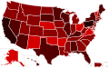
Perhaps instead of adding numbers to the UK map, a second UK map should be created, like the US map. 70.29.208.129 (talk) 03:28, 24 May 2009 (UTC)
- Agreed, the current map is a bit garish compared to the USA graduated style map.—Teahot (talk) 07:58, 24 May 2009 (UTC)
- I think that would be a better idea, I'll have a go. -- [[ axg ⁞⁞ talk ]] 10:32, 24 May 2009 (UTC)
I don't like it, change it back The C of E (talk) 10:58, 24 May 2009 (UTC)
- I agree, changing the current map to a new colour scheme is unproductive, since it requires updates across many languages. Right now, legend keys are broken across several languages because of that change. That's why I said a second map should be created. Then you could choose to use the old colour scheme or the new one. 70.29.208.129 (talk) 12:17, 24 May 2009 (UTC)
- Right:

-- [[ axg ⁞⁞ talk ]] 16:37, 24 May 2009 (UTC)
Use the origional one, its better than the current one The C of E (talk)
Disregard my last comment, I didn't look at the page first The C of E (talk) 17:22, 24 May 2009 (UTC)
New Map
Seriously, this new map is rubbish Bring back the old one! you need to see the amount of cases per county for ease of understanding. The C of E (talk) 10:57, 24 May 2009 (UTC)
- th old map is too far out of date. We only have up to date data for regions not counties! The new maps with larger regions are less precise but more accurate. The new map with pink/red scale should be used because it highlights how heavily infected a region is. Wuku (talk) 10:14, 25 May 2009 (UTC)
- No no no. If the map is out of date then just update it but don't use the pink/red scale because we can't see which individual counties are infected. And we can see the amount of infections anyway on the cases by region box in the Detailed reports section The C of E (talk) 11:45, 25 May 2009 (UTC)
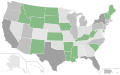
- I added the regions map instead because the counties map would result in endless updating, it is way out of date and the HPA are reporting cases in regions, not in counties. Mirrorme22 (talk) 17:38, 26 May 2009 (UTC)
- The regions map is useless at this stage. Everything apart from Wales and North-East England is one shade of red. It adds almost nothing to what the world map already tells you and that is that there are confirmed cases in the UK. Either revert to an out of date county based map, or move to a county based map with varied shading. You might as well as just have a single red coloured UK, pointless. (on the plus side this would negate the need to update the map at all from now) Further more it also impairs adding the Isle of Man as it is not part of the EU and hence does not form a region that has the same status as the others. .--Lexxus2010 (talk) 12:15, 28 May 2009 (UTC)
- I agree with lexxus2010. Still, if people do not update it at a steady pace, I suggest we go to regions map. Notelitten (talk) 12:31, 28 May 2009 (UTC)
- Maybe so, but the Health Protection Agency is confirming cases in regions and not in counties. I agree that the region map doesent show very much, but nobody has updated the counties map in quite a while. I suggest we use the shaded regions map then, instead of the current one. Mirrorme22 (talk) 15:13, 28 May 2009 (UTC)
- I agree with lexxus2010. Still, if people do not update it at a steady pace, I suggest we go to regions map. Notelitten (talk) 12:31, 28 May 2009 (UTC)
- The regions map is useless at this stage. Everything apart from Wales and North-East England is one shade of red. It adds almost nothing to what the world map already tells you and that is that there are confirmed cases in the UK. Either revert to an out of date county based map, or move to a county based map with varied shading. You might as well as just have a single red coloured UK, pointless. (on the plus side this would negate the need to update the map at all from now) Further more it also impairs adding the Isle of Man as it is not part of the EU and hence does not form a region that has the same status as the others. .--Lexxus2010 (talk) 12:15, 28 May 2009 (UTC)
- I added the regions map instead because the counties map would result in endless updating, it is way out of date and the HPA are reporting cases in regions, not in counties. Mirrorme22 (talk) 17:38, 26 May 2009 (UTC)
- No no no. If the map is out of date then just update it but don't use the pink/red scale because we can't see which individual counties are infected. And we can see the amount of infections anyway on the cases by region box in the Detailed reports section The C of E (talk) 11:45, 25 May 2009 (UTC)
- th old map is too far out of date. We only have up to date data for regions not counties! The new maps with larger regions are less precise but more accurate. The new map with pink/red scale should be used because it highlights how heavily infected a region is. Wuku (talk) 10:14, 25 May 2009 (UTC)
people have to realise, the maps can only be updated using the data we are provided by reliable sources. It is not about having the most precise map if the data is less accurate and less reliable. The HPA (currently the most reliable and regular source) gives data by region and it is no longer possible to produce an accurate map by county. As a result all maps will have to be be regions. I agree that the plain red map is of little value, as it only identifies the few regions that have not confirmed cases, and that the red/pink scale map should be used. The current maps are fine, and should only need updating to show the current data, i can't imagine any further work needs doing untill any confirmed deaths arise. Wuku (talk) 22:55, 28 May 2009 (UTC)
Another map ... File:Swine_Flu_United_Kingdom_Regions_Map.svg
Another map has shown up... Image:Swine_Flu_United_Kingdom_Regions_Map.svg 70.29.208.129 (talk) 12:19, 1 June 2009 (UTC)
Maps.... confirmed cases everywhere!
The first map seen on the page is the completely red map. This is currently the less useful of the two (untill a death occurs it doesn't really say anything; of course it will be useful when/if that happens). I suggest we place the red/pink scale map in its place, at the top of the article. Also the map (red/pink scale) could also be modified to have a black spot in the centre of the region when a death occurs. This way the red/black map is no longer needed. Any thoughts? Wuku (talk) 10:22, 4 June 2009 (UTC)
- Compltelely agree. A completely filled in red map is useless until/if there is a death. The red-pink would be better until then. Jozal (talk) 08:33, 5 June 2009 (UTC)
- Yep completely agree, so when it does come to editing and adding black to the map are you suggesting that a black spot should be added, would this look a bit odd comparing this map with other maps that just fill in the whole area black? Also the dot would be a bit odd in the London region with it being a small area. I was think about since deaths are more likely to be reported, would it be possible just to use black in the counties in which it was reported? -- [[ axg ⁞⁞ talk ]] 09:18, 5 June 2009 (UTC)
- If we do the same as the USA maps we would have two maps; one for cases and one for deaths, in the style of the currnt red/pink scale maps (but with better colour scale hopefully). But only if there are multiple deaths per region is this practical. That is why i suggested the balck spots on the red/pink scale map to show the deaths while they are still in low numbers. It would just make it tidier using one map. Wuku (talk) 13:22, 5 June 2009 (UTC)
-
Yellow-Red-Black map (case type map)
-
Pink-scale map (confirmed cases map)
-
 Grey-scale map (deaths map)
 -
 Multicolour map (total cases map)


- USA uses four maps, now that the map is all red and black, the number of deaths work better; but that only works when there are atleast two shades used. 70.29.208.129 (talk) 05:15, 6 June 2009 (UTC)
User:Wuku
User:Wuku has deleted several discussions from this talk page before they had a chance to be archived. I have restored these sections. They will likely be archived at the next MiszaBot archival sweep. 70.29.210.130 (talk) 06:50, 9 June 2009 (UTC)
- Start-Class United Kingdom articles
- Unknown-importance United Kingdom articles
- WikiProject United Kingdom articles
- Start-Class medicine articles
- Low-importance medicine articles
- All WikiProject Medicine pages
- Start-Class virus articles
- Unknown-importance virus articles
- WikiProject Viruses articles
- Start-Class Disaster management articles
- Unknown-importance Disaster management articles