Wikipedia:Featured picture candidates/Roman Baths in Bath
Appearance


- Reason
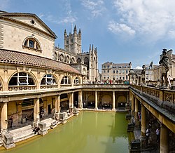
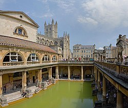
- Firstly, yes, this is already a FP, but I was never really happy with the sky (too pale and slightly purple), the colour of the water (too green) or the contrast. I've been going through some of my old work and improving on it where possible, putting more time into it and using new techniques. I think I've been able to improve significantly on the colour reproduction and contrast of this shot. I'm not sure what we eventually decided last time this issue was raised, but I'm proposing that if this version is supported, we replace the old FP with it. From memory, consensus seemed to point towards doing it all within this nomination, but I'm not fussed.
For the record, the original nomination is here.
Oh, and rather than adding a new image, I've overwritten the original image that was not promoted (an edit was eventually promoted). I noticed that Mediawiki seems to be displaying the old thumbnail still. Be sure to load the full image to compare. It should be visibly different, probably even from the thumbnail.
- Articles this image appears in
- None as yet, but thecurrent FP is in Tourism, Aquae Sulis, Bath and North East Somerset, Thermae, Roman Baths (Bath) and History of Somerset.
- Creator
- User:Diliff
- Support as nominator Diliff | (Talk) (Contribs) 15:52, 25 April 2008 (UTC)
- Comment please purge the generated thumbnails when doing a comparison between old and new files. Otherwise it is misleading due to the changed thumbnail generation parameters which apply a sharpening filer now. --Dschwen 16:17, 25 April 2008 (UTC)
Wasn't aware of how previously, although I've tried following those steps and I'm still seeing the old thumbnail of the proposed replacement. Hmm. Diliff | (Talk) (Contribs) 16:31, 25 April 2008 (UTC)Nevermind, it kicked in and is displaying ok now. Diliff | (Talk) (Contribs) 16:32, 25 April 2008 (UTC)- Support replacement. WP:BYPASS. I was talking of the thumbnail of the to-be-replaced version, and I already purged that one :-). I like new version for its better projection (showing slightly more of the buildings) and removal of the grayish haze. --Dschwen 16:33, 25 April 2008 (UTC)
- Ah right. Yeah, I could have included slightly more of the building but I couldn't get rid of a parallax-induced stitching error on the arch, and cropped it out instead. ;-) Yeah, some of my old photos do have a bit of a 'haze' - it was my inexperience in squeezing dynamic range out of a RAW file. The result was often poor contrast. Diliff | (Talk) (Contribs) 16:41, 25 April 2008 (UTC)
- So what are you doing differently now? --Dschwen 16:49, 25 April 2008 (UTC)
- Ah right. Yeah, I could have included slightly more of the building but I couldn't get rid of a parallax-induced stitching error on the arch, and cropped it out instead. ;-) Yeah, some of my old photos do have a bit of a 'haze' - it was my inexperience in squeezing dynamic range out of a RAW file. The result was often poor contrast. Diliff | (Talk) (Contribs) 16:41, 25 April 2008 (UTC)
- Support replacement. WP:BYPASS. I was talking of the thumbnail of the to-be-replaced version, and I already purged that one :-). I like new version for its better projection (showing slightly more of the buildings) and removal of the grayish haze. --Dschwen 16:33, 25 April 2008 (UTC)
- Support replacement New one is indeed much better - already as a thumb. --Janke | Talk 16:24, 25 April 2008 (UTC)
- Support replacement New one is great, even looking at the thumb, colours are richer and the definition far greater. Capital photographer (talk) 16:59, 25 April 2008 (UTC)
- I think consensus was to do a "Delist and replace" as I did recently with your Big Ben image. Anyway, I guess it gets more traffic up here... --jjron (talk) 17:19, 25 April 2008 (UTC)
- Support replacement Replacement is just MUCH better quality. crassic![talk] 21:18, 25 April 2008 (UTC)
- Support Replacement. An improvement on an already impressive picture. NauticaShades 22:34, 25 April 2008 (UTC)
- Support. A nice improvement on a great picture. Kaldari (talk) 22:38, 25 April 2008 (UTC)
- Support replacement Much better quality, richer and deeper colors, sharper, etc. The original FP is good, this one is excellent. Juliancolton Tropical Cyclone 00:13, 26 April 2008 (UTC)
- Replace better colours and more realistic --H92110 (talk) 07:40, 27 April 2008 (UTC)
- Support Replacement And I'm liking the facial hair in your new picture. ;-) -Fcb981(talk:contribs) 16:29, 27 April 2008 (UTC)
- Support Replacement —αἰτίας •discussion• 23:04, 27 April 2008 (UTC)
- Support Replacement - no question. Motmit (talk) 20:21, 28 April 2008 (UTC)
- Comment. In both the current FP and the proposed replacement, some of the the (upper left to lower right) lines in the building to the left look curved. Is this unavoidable? Spikebrennan (talk) 14:55, 29 April 2008 (UTC)
- Not sure specifically which lines you refer to, but yes, any curved lines are due to the projection used. Rectilinear projection would protect the straight lines but distort the view too much. Diliff | (Talk) (Contribs) 15:05, 29 April 2008 (UTC)
- I was referring to the "bottom" of the triangular pediment, and the top and bottom of the tiled roof. Your explanation makes sense, though. Support replacement. Spikebrennan (talk) 15:10, 29 April 2008 (UTC)
- Not sure specifically which lines you refer to, but yes, any curved lines are due to the projection used. Rectilinear projection would protect the straight lines but distort the view too much. Diliff | (Talk) (Contribs) 15:05, 29 April 2008 (UTC)
- Oppose - I think the colours are too bold, and don't look natural. The original is therefore better in my opinion. 84.69.242.57 (talk)
