Complementary colors
Complementary colors are pairs of colors that are of “opposite” hue in some color model. The exact hue “complementary” to a given hue depends on the model in question, and perceptually uniform, additive, and subtractive color models, for example, have differing complements for any given color.
Color theory

In color theory, two colors are called complementary if, when mixed in the proper proportion, they produce a neutral color (grey, white, or black).
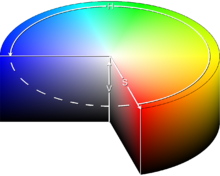
In roughly-perceptual color models, neutrals (white, greys, and black) lie along a central axis of the color space, and complementary colors will lie roughly opposite each other, across this axis. For example, in the HSV color space, complementary colors (as defined in HSV) lie opposite each other on any vertical cross-section.
In most discussions of complementary color, only fully saturated, bright colors are considered.[citation needed] However, under the formal definition, brightness and saturation are also factors.[citation needed] Thus, in the CIE 1931 color space, a color of a particular “dominant” wavelength can be mixed with a particular amount of the “complementary” wavelength to produce a neutral color (grey or white).
In the RGB color model (and derived models such as HSV), primary colors and secondary colors are paired in this way:
- red and cyan ( red cyan ) (where cyan is the mixture of blue and green)
- green and magenta ( green magenta ) (where magenta is the mixture of red and blue)
- blue and yellow ( blue yellow ) (where yellow is the mixture of green and red)
Afterimages
When one stares at a single color (red for example) for a sustained period of time (thirty seconds to a minute should suffice), then looks at a white surface, an afterimage of the complementary color (in this case cyan) will appear. This is one of several aftereffects studied in the psychology of visual perception which are generally ascribed to fatigue in specific parts of the visual system.[1]
In the case above the photoreceptors for red light in the retina are fatigued, lessening their ability to send the information to the brain. When white light is viewed, the red portions of light incident upon the eye are not transmitted as efficiently as the other wavelengths (or colors), and the result is the illusion of viewing the complementary color. As the receptors are given time to rest, the illusion vanishes. In the case of looking at white light, red light is still incident upon the eye (as well as blue and green), however since the receptors for other light colors are also being fatigued, the eye will reach an equilibrium.
Art and design

Because of the limited range of colors that was available throughout most of the history of art, many artists still use a traditional set of complementary pairs, including:
The complement of each primary color (red, blue, or yellow) is roughly the color made by mixing the other two in a subtractive system:
- red complements (blue + yellow) = green
- blue complements (red + yellow) = orange
- yellow complements (red + blue) = purple
When two complements are mixed they produce a grey or brown.
The use of complementary colors is an important aspect of aesthetically pleasing art and graphic design. This also extends to other fields such as contrasting colors in logos and retail display. When placed next to each other, complements make each other appear brighter. On an artistic color wheel, complementary colors are placed opposite one another. Although these artistic complements may not be precise complements under the scientific definition, most artistic color wheels are laid out roughly like the HSV color wheel discussed above.
The difference between green and cyan as complements for red, and blue and violet as complements for yellow is an upward shift in the spectrum. A model of color perception that explains it is called the opponent-color system. It is also a subject of controversy that distinguishing complementary color from negative color can resolve: blue for the negative with violet for the complement of yellow; cyan for the negative with green for the complement of red.
In aesthetics, both negative colors and complementary colors offer contrast that ganglia in the eye accentuate in a center versus surround fashion.[2] Carlson offers the opponent-color system as a basis for the eye's initial conversion of color to a rate of firing.
Rods in the eye have maximal sensitivity at 496 nanometres, barely inside the range of cyan, while blue cones are maximally sensitive at a much higher frequency corresponding to 440 nanometres. Green cones contain a pigment that absorbs most strongly at 531 nanometres. Red cones, presumably, fire most frequently to light with a wavelength of 559 nanometres.
References
- ^ "Color & The Absorption Spectrum". Retrieved 2007-01-14.
- ^ Carlson, Neil R. (1988). Foundations of Physiological Psychology. University of Massachusetts at Amherst. p. 158.
