Contour line
It has been suggested that contour interval be merged into this article. (Discuss) Proposed since May 2008. |
A contour line (also level set, isopleth, isoline, isogram or isarithm) is a function of two variables is a curve connecting points where the function has a same particular value. A contour map is a map illustrated with contour lines, for example a topographic map. The prefix iso-, from the Greek prefix ισος ("equal"), is used from descriptive names for map lines that join points of equal value.

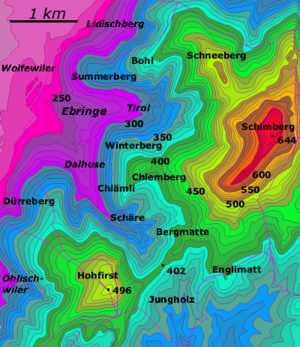
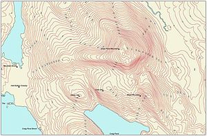
Most everyday use of the term is in cartography. A contour map (topographic map) uses contour lines (often just called a "contour") to join points of equal elevation (height) and thus show valleys and hills, and the steepness of slopes.

More generally, a contour line for a function of two variables is a curve connecting points where the function has a same particular value. The prefix iso-, from the Greek prefix ισος ("equal"), is used from descriptive names for map lines that join points of equal value. The gradient of the function is always perpendicular to the contour lines. When the lines are close together the length of the gradient is large: the variation is steep. If adjacent contour lines are of the same line width, the direction of the gradient cannot be determined from the contour lines alone. However if contour lines rotate through three or more widths, or if the lines are numerically labelled, then the direction of the gradient can also be determined from the contour lines.
Contour lines are curved or straight lines on a map describing the intersection of a real or hypothetical surface with one or more horizontal planes. The configuration of these contours allows map readers to infer relative gradient of a parameter and estimate that parameter at specific places. Contour lines may be either traced on a visible three-dimensional model of the surface, as when a photogrammetrist viewing a stereo-model plots elevation contours, or interpolated from estimated surface elevations, as when a computer program threads contours through a network of observation points ot area centroids. In the latter case, the method of interpolation affects the reliability of individual isolines and their portrayal of slope, pits and peaks (see Davis, 1986, Statistics and data analysis in geology).
Types of contour lines
Contour lines are often given specific names beginning "iso-" (from Greek ισος (isos), meaning 'equal') according to the nature of the variable being mapped, although in many usages the word "contour line" is most commonly used. Specific names are most common in meteorology, where multiple maps with different variables may be viewed simultaneously.
In general, an isogon is a line along which an angle is held constant. "Iso-" can be replaced with "isallo-" to specify a contour line connecting points where a variable changes at the same rate during a given time period.
Meteorology

Meteorological contour lines are based on generalization from point data received from weather stations. Weather stations are seldom exactly positioned at a contour line (when they are, this indicates a measurement precisely equal to the value of the contour). Instead, lines are drawn to best approximate the locations of exact values, based on the scattered information points available.
Meteorological countour maps may present collected data such as actual air pressure at a given time, or generalized data such as average pressure over a period of time, or forecast data such as predicted air pressure at some point in the future
Thermodynamic diagrams use multiple overlapping contour sets (including isobars and isotherms) to present a picture the major thermodynamic factors in a weather system.
Barometric pressure
An isobar (from βαρος or baros, meaning 'weight') is a line of equal or constant pressure on a graph, plot, or map; an isopleth or contour line of pressure. In meteorology, the barometric pressures shown are reduced to sea level, not the surface pressures at the map locations. The distribution of isobars is closely related to the magnitude and direction of the wind field, and can be used to predict future weather patterns. Isobars are commonly used in television news weather reporting, though more commonly in Europe than in the United States.
An isostere is a line of constant atmospheric density
Temperature and related subjects

An isotherm (from θερμη or thermē, meaning 'heat') is a line that connects points on a map that have the same temperature. Therefore, all points through which an isotherm passes have the same temperatures at the time indicated. Generally, isotherms representing 5°C or 10°F temperature differences are used, but any interval may be chosen.
An isogeotherm is a line of equal mean annual temperature. An isocheim is a line of equal mean winter temperature, and an isothere is a line of equal mean summer temperature.
An isohel (from έλιος or helios, meaning 'sun') is a line of equal or constant solar radiation.
Precipitation and air moisture
An isohyet or isohyetal line (from ύετος or huetos, meaning 'rain') is a line joining points of equal precipitation on a map. A map with isohyets is called an isohyetal map.
An isohume is a line of constant relative humidity, while a isodrosotherm (from δροσος or drosos, meaning 'dew', and θερμη or therme, meaning 'heat') is a line of equal or constant dew point.
An isoneph is a line indicating equal cloud cover.
An isochalaz is a line of constant frequency of hail storms.
Snow cover is frequently shown as a contour-line map.
Wind
An isotach (from ταχ or tach, meaning 'speed') is a line of constant wind speed. In general, an isogon is a line along which an angle is held constant. In meteorology, the term refers to a line of constant wind direction.
Freeze and thaw
An isopectic line denotes equal dates of ice formation each winter, and an isotac denotes equal dates of thawing.
Physical geography and oceanography
Elevation and depth

Contours are one of several common methods used to denote elevation or altitude and depth. From these contours, a sense of the general terrain can be determined. They are used at a variety of scales, from large-scale engineering drawings and architectural plans, through topographic maps up to continental-scale maps.
"Contour line" is the most common usage in cartography, but isobath for underwater depths on bathymetric maps and isohypse for elevations are also used. The process of drawing isohypse contour lines on a map is called isopletion.
Magnetism
In general, an isogon is a line along which an angle is held constant. In geomagnetism, the term refers to a line of constant magnetic declination (variance of magnetic north from geographic north). Isogonic lines are lines connecting those parts where the declination of the Earth's magnetic field is the same in amount. They are similar to isoclinic lines, which are lines connecting points of equal magnetic inclination. The line drawn through the points of zero magnetic declination is called the agonic line.
Oceanography
Besides ocean depth, oceanographers use contour to describe diffuse variable phenomena much as meteorologists do with atmospheric phenomena. In particular, isobathytherms are lines showing depths of water with equal temperature, and isohalines show lines of equal ocean salinity.
Environmental science
In discussing pollution, density maps can be very useful in indicating sources and areas of greatest contamination. Contour maps are especially useful for diffuse forms or scales of pollution. Acid precipitation is indicated on maps with isoplats. Some of the most widespread applications of environmental science contour maps involve mapping of environmental noise, air pollution, soil contamination, thermal pollution and groundwater contamination.
Social sciences
In economics, contour lines can be used to describe features which vary quantitatively over space. An isochrone shows lines of equivalent drive time or travel time to a given location. An isotim shows equivalent transport costs from the source of a raw material, and an isodopane shows equivalent cost of travel time.
Indifference curves are used to show bundles of goods to which a person would assign equal utility. In political science an analogous method is used in understanding coalitions (for example the pretty pictures in Laver and Shepsle's work[1])
Isolines can also be used to delineate qualitative differences. An isogloss, for example, is used in mapping the geographic spread of linguistic features.
Contour lines are also used in non-geographic charts in economics. An isoquant is a line of equal production quantity, and an isocost shows equal production costs.
Thermodynamics, engineering, and other sciences
Various types of graphs in thermodynamics, engineering, and other sciences use isobars (for showing constant pressure), isotherms (for constant temperature), isochors (for constant specific volume), or other types of iso-lines (or curves), even though these graphs are usually not related to maps. Such iso-lines are useful for representing more than two dimensions (or quantities) on two-dimensional graphs. Common examples in thermodynamics are some types of phase diagrams.
Other phenomena
- isochasm: aurora equal occurrence
- isochor: volume
- isodose: radiation intensity
- isophene: biological events occurring with coincidence such as plants flowering
- isophote: illuminance
History
The idea of lines that join points of equal value was rediscovered several times. In 1701, Edmond Halley used such lines (isogons) on a chart of magnetic variation.[2] The Dutch engineer Nicholas Cruquius drew the bed of the river Merwede with lines of equal depth (isobaths) at intervals of 1 fathom in 1727, and Philippe Buache used them at 10-fathom intervals on a chart of the English Channel that was prepared in 1737 and published in 1752. The use of such lines to describe a land surface (contour lines) was studied theoretically by Ducarla in 1771, and Charles Hutton used them when calculating the volume of a hill in 1777. In 1791, a map of France by J. L. Dupain-Triel used contour lines at 20-metre intervals, hachures, spot-heights and a vertical section. In 1801, the chief of the Corps of Engineers, Haxo, used contour lines at the larger scale of 1:500 on a plan of his projects for Rocca d'Aufo. [3] [4] [5]
By around 1843, when the Ordnance Survey started to regularly record contour lines in Great Britain and Ireland, they were already in general use in European countries. Isobaths were not routinely used on nautical charts until those of Russia from 1834, and those of Britain from 1838. [6] [7] [3]
When maps with contour lines became common, the idea spread to other applications. Perhaps the latest to develop are air quality and noise pollution contour maps, which first appeared in the USA, in approximately 1970, largely as a result of national legislation requiring spatial delineation of these parameters. In 2007, Pictometry was the first to allow users to dynamically generate elevation contour lines to be laid over oblique images.
Technical construction factors
To maximize readability of contour maps, there are several design choices available to the map creator, principally line weight, line color, line type and method of numerical marking.
Line weight is simply the darkness or thickness of the line used. This choice is made based upon the least intrusive form of contours that enable the reader to decipher the background information in the map itself. If there is little or no content on the base map, the contour lines may be drawn with relatively heavy thickness. Also, for many forms of contours such as topographic maps, it is common to vary the line weight and/or color, so that a different line characteristic occurs for certain numerical values. For example, in the topographic map above, the even hundred foot elevations are shown in a different weight from the twenty foot intervals.
Line color is the choice of any number of pigments that suit the display. Sometimes a sheen or gloss is used as well as color to set the contour lines apart from the base map. Line colour can be varied to show other information; on some Swiss maps, the contour lines are changed from brown to grey to indicate bare rock and scree.
Line type refers to whether the basic contour line is solid, dashed, dotted or broken in some other pattern to create the desired effect. Dotted or dashed lines are often used when the underlying base map conveys very important (or difficult to read) information. Broken line types are used when the location of the contour line is inferred.
Numerical marking is the manner of denoting the arithmetical the values of contour lines. This can be done by placing numbers along some of the contour lines, typically using interpolation for intervening lines. The direction of these text labels is often used to indicate the direction of the slope. Alternatively a map key can be produced associating the contours with their values.
Plan view versus profile view
Most commonly contour lines are drawn in plan view. or as an observer in space would view the earth's surface: ordinary map form. However, some parameters can often be displayed in profile view showing a vertical profile of the parameter mapped. Some of the most common parameters mapped in profile are air pollutant concentrations and sound levels. In each of those cases it may be important to analyze (air pollutant concentrations or sound levels) at varying heights so as to determine the air quality or noise health effects on people at different elevations, for example, living on different floor levels of an urban apartment. One can see an example of vertical contours in the article on noise barriers. In actuality, both plan and profile view contour maps are used in air pollution and noise pollution studies.
Labeling contour maps

Labels are a critical component of elevation maps. A properly labeled contour map helps the reader to quickly interpret the shape of the terrain. If numbers are placed close to each other, it means that the terrain is steep. Labels should be placed along a slightly curved line "pointing" to the summit or nadir, from several directions if possible, making the visual identification of the summit or nadir easy.[8][9]
Manual labeling of contour maps is a time-consuming process, however, there are a few software systems that can do the job automatically and in accordance with cartographic conventions, called automatic label placement.
References
- ^ Laver, Michael and Kenneth A. Shepsle (1996) Making and breaking governments pictures
- ^ Thrower, N. J. W. Maps and Civilization: Cartography in Culture and Society, University of Chicago Press, 1972, revised 1996, page 97; and Jardine, Lisa Ingenious Pursuits: Building the Scientific Revolution, Little, Brown, and Company, 1999, page 31.
- ^ a b R. A. Skelton, "Cartography", History of Technology, Oxford, vol. 6, pp. 612-614, 1958.
- ^ Colonel Berthaut, La Carte de France, vol. 1, p. 139, quoted by Close (see below).
- ^ C. Hutton, "An account of the calculations made from the survey and measures taken at Schehallien, in order to ascertain the mean density of the Earth", Philosophical Transactions of the Royal Society of London, vol. 68, pp. 756-757
- ^ C. Close, The Early Years of the Ordnance Survey, 1926, republished by David and Charles, 1969, ISBN 0-7153-4477-3, pp. 141-144.
- ^ T. Owen and E. Pilbeam, Ordnance Survey: Map Makers to Britain since 1791, HMSO, 1992, ISBN 0-11-701507-5.
- ^ Imhof, E., “Die Anordnung der Namen in der Karte,” Annuaire International de Cartographie II, Orell-Füssli Verlag, Zürich, 93-129, 1962.
- ^ Freeman, H., “Computer Name Placement,” ch. 29, in Geographical Information Systems, 1, D.J. Maguire, M.F. Goodchild, and D.W. Rhind, John Wiley, New York, 1991, 449-460.
External links
- Drawing Contour Plots. A lesson plan that deals with drawing various isopleths.
- See also Forthright's Phrontistery for many more different types of isopleths.
- National Science Digital Library - Isobar
