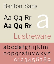
Benton Sans
 | |
| Category | Realist Sans-serif |
|---|---|
| Designer(s) | Tobias Frere-Jones, Cyrus Highsmith |
| Commissioned by | Martha Stewart Living, Worth |
| Foundry | Font Bureau |
Benton Sans is a digital typeface family begun by Tobias Frere-Jones in 1995, and expanded by Cyrus Highsmith of Font Bureau. It was a reworked version of Benton Gothic developed for various corporate customers, under Frere-Jones's guidance. In developing the typeface, Frere-Jones studied drawings of Morris Fuller Benton's 1908 typeface News Gothic at the Smithsonian Institution. The typeface began as a proprietary type, initially titled MSL Gothic, for Martha Stewart Living magazine and the website for Martha Stewart Living Omnimedia. As Benton Gothic, there are 7 weights from Thin to Black and only 2 widths.
When working for retail version of the font, the family was harmonized and given the new name called Benton Sans. In 2002-2003, Cyrus Highsmith added additional widths, weights, and italics to the typeface family, and the face was released for public use under the name Benton Sans. The extra weight and widths also served as optically-corrected replacements for Franklin Gothic, Alternate Gothic, Lightline Gothic.
Like News Gothic, Benton Sans follows the neo-grotesque model. Distinct characters are the two-story lowercase a, the two-story lowercase g, and a blunt terminus at the apex of the lowercase t. The tail of the uppercase Q is distinct for being located completely outside the bowl. The character set is compact, and descenders are shallow. The typeface differs from other realist sans-serifs in its organic shapes and subtle transitions of stroke width, all contributing to a less severe, humanist tone of voice. Benton Sans has a wider, less compact character set than News Gothic. The typeface includes text figures (old style figures) providing a refinement not available in News Gothic.
Benton Sans font family originally consists of 26 fonts in 8 weights, and 4 widths for all but Extra Light and Thin families, which only include the widest width. On December 18, 2008, The Font Bureau Inc. announced the expansion of the font family. The expanded family has 128 fonts in 8 weights, and 4 widths for all weights, with complementary italic and small caps.[1]
Usage examples
Corporate branding
- Primary font used in frog design documents
- Primary font used in IA Collaborative documents
- Primary font used in 2013 Myspace redesign
- Primary font of Indiana University, along with Georgia Pro and Salvo Serif[2]
- Primary font used by Heroku
- Font of Marvel Comics logo
- Font of The University of Texas at Austin for print publications [3]
References
- ^ New Fonts: Zocalo, Whitman Display, and Benton Sans
- ^ "Fonts: Applying the Brand". Indiana University. Retrieved 2014-12-16.
- ^ "UT Brand Guidelines: Fonts". The University of Texas at Austin. Retrieved 10/9/2014.
{{cite web}}: Check date values in:|accessdate=(help)- On Screen Graphics Font of Formula 1 Television Coverage as of 2015
- Blackwell, Lewis. 20th Century Type. Yale University Press: 2004. ISBN 0-300-10073-6.
- Fiedl, Frederich, Nicholas Ott and Bernard Stein. Typography: An Encyclopedic Survey of Type Design and Techniques Through History. Black Dog & Leventhal: 1998. ISBN 1-57912-023-7.
- Macmillan, Neil. An A–Z of Type Designers. Yale University Press: 2006. ISBN 0-300-11151-7.
- Meggs, Phillip B. Revival of the Fittest. RC Publications, Inc: 2002. ISBN 1-883915-08-2.
