Wikipedia:Featured picture candidates/El Capitan
Appearance


- Reason
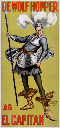
- An amusing, cartoonish poster from its original run, which gives a good flavour of what the production would have been like. Eye-catching and interesting. The original image, pre-restoration, can be seen at File:John_Phillip_Sousa_-_De_Wolf_Hopper_-_El_Capitan_unrestored.png - given the aspect ratios, I think that I'd best just link.
- Articles this image appears in
- El Capitan (operetta), DeWolf Hopper. (John Phillip Sousa used a different image already, and I decided to leave it to the editors there what to do)
- Creator
- Metropolitan Job Print, 222 West 26th St., New York, NY.
- Support either as nominator --Shoemaker's Holiday (talk) 19:40, 28 February 2009 (UTC)
- Comment Submitted an alternate version. Recusing from reviewing. DurovaCharge! 23:09, 28 February 2009 (UTC)
- I much prefer the colour balance of the alternative, but I noticed that the lettering (particularly on the top right corner but also patches elsewhere) seems a bit faded in parts and that doesn't seem to be the case on the original. Diliff | (Talk) (Contribs) 00:11, 1 March 2009 (UTC)
- Luckily, that's very easy to fix. I've gone ahead and done it, and just uploaded over Durova's, as it's a minor and very localised change. Shoemaker's Holiday (talk) 00:28, 1 March 2009 (UTC)
- I much prefer the colour balance of the alternative, but I noticed that the lettering (particularly on the top right corner but also patches elsewhere) seems a bit faded in parts and that doesn't seem to be the case on the original. Diliff | (Talk) (Contribs) 00:11, 1 March 2009 (UTC)
- Support original - Both are FP quality, but there's something (I don't know) about the first one that's more appealing. Xclamation point 02:52, 2 March 2009 (UTC)
- Support Alternate 1, Oppose original. It looks much better with the colors corrected. Kaldari (talk) 00:53, 3 March 2009 (UTC)
- Oppose Technically it's pretty good (perhaps a little lower res than other's you've submitted but not materially so) but I just don't see much EV in a poster for an opera. If this was illustrating some aspect of Poster I'd support. I'd like to have seen a shot of the actual production in full swing - perhaps something from the upcoming 2009 production --Fir0002 10:05, 7 March 2009 (UTC)
- Support alt1. Good quality, I like the second one better. SpencerT♦Nominate! 02:31, 8 March 2009 (UTC)
- Support either: great quality and I think it has good ev. That guy looks scary! Maedin\talk 19:29, 9 March 2009 (UTC)
- Weak Oppose per Fir. I just don't think the EV is high enough. Makeemlighter (talk) 00:17, 10 March 2009 (UTC)
- ...But it's from the original production? Shoemaker's Holiday (talk) 01:40, 10 March 2009 (UTC)
- Yeah I know but still... a poster is just a piece of advertisment and does not, IMO, illustrate the subject at all. As mentioned above I would much prefer to see a photo of the 2009 production in action --Fir0002 23:18, 10 March 2009 (UTC)
- Fair enough. Shoemaker's Holiday (talk) 02:52, 11 March 2009 (UTC)
- Yeah I know but still... a poster is just a piece of advertisment and does not, IMO, illustrate the subject at all. As mentioned above I would much prefer to see a photo of the 2009 production in action --Fir0002 23:18, 10 March 2009 (UTC)
- ...But it's from the original production? Shoemaker's Holiday (talk) 01:40, 10 March 2009 (UTC)
- Support Alternate 1. Per nom. Diliff | (Talk) (Contribs) 22:40, 10 March 2009 (UTC)
Promoted File:John Phillip Sousa - De Wolf Hopper - El Capitan1.png MER-C 08:20, 12 March 2009 (UTC)
