Wikipedia:Featured picture candidates/Erik Karlsson
Appearance


- Reason
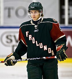
- High quality sports photograph
- Articles this image appears in
- Erik Karlsson
- Creator
- Krm500
- Support as nominator —Krm500 (Communicate!) 00:36, 11 January 2009 (UTC)
- weak support Is a less tight crop available, something showing the rest of the hockey stick, or some of the crowd? de Bivort 01:35, 11 January 2009 (UTC)
- I had looked at a few different crops and decided to go with a tight 1x1 to be as clear as possible at thumb size. But comparing head to head with a slightly less tight crop it looks better with the less tight crop, I replace it with that.—Krm500 (Communicate!) 03:57, 11 January 2009 (UTC)
- Support I really like it. I actually prefer to see the stick cut off where it is than to see the whole stick because when you do that you get too much open background which can be distracting. Its too bad wiki's release criteria is a bad as it is cause I would love to see more of your work on here. -Djsasso (talk) 02:28, 15 January 2009 (UTC)
- Support Size and sharpness are both sufficient. I don't think the inclusion of the stick would necessarily make it a better photograph. Cacophony 13:10, January 18, 2009 (UTC)
- Weak Support We have very little sports photos as FPs which I guess is indicative of the (relative) difficulty in taking them. So for that reason I'm feeling a bit lenient towards the cut off hockey stick. But it seems as though a lot of texture (particularly in the face) was nuked with NR software - could you please upload a less edited version (which I would full support)? --Fir0002 23:13, 18 January 2009 (UTC)
- Support Edit 2 --Fir0002 05:07, 20 January 2009 (UTC)
- Oppose I just don't think this is a good shot of the subject, lighting doesn't seem that great, the subject appears to be grimacing, the hockey stick is cut off... --Pstanton 07:38, 19 January 2009 (UTC) —Preceding unsigned comment added by Pstanton (talk • contribs)
- Weak oppose. I noticed the same issue with texture, especially on the face, that Fir0002 brought up. It looks great in thumbnail (and I think the cropping is good), but it's kind of a Monet.--ragesoss (talk) 16:58, 19 January 2009 (UTC)
- Oppose as per Ragesoss. Omnibus (talk) 00:54, 20 January 2009 (UTC)
- Support I'd go with Fir here, in fact I'd go with a noisy version in preference to the NR one; that's what sports shots tend to look like. I'd also point out that even as it appears here, if you view it at ca. 1600x1200 processing artifacts aren't an issue. It would be a pity to penalise larger uploads simply because they're big enough to see otherwise invisible faults, wouldn't it? mikaultalk 01:18, 20 January 2009 (UTC)
- Great to get some input, I will upload the non prepossessed version, and maybe someone can do a better job with it or simply go with that version for voting. —Krm500 (Communicate!) 01:29, 20 January 2009 (UTC)
- Oppose The cut off hockey stick isn't a big deal, seeing as this photo of Gretzky didn't have much problem getting featured. However, the overall photo isn't terrific. Something went bad taking it, I believe, as the face just looks terrible. – LATICS talk 02:14, 20 January 2009 (UTC)
Original reviewers please comment on the unprocessed version. Wronkiew (talk) 01:44, 20 January 2009 (UTC)
- Weak support unprocessed version or a better noise reduced version. Definitely more pleasing textures.--ragesoss (talk) 02:29, 20 January 2009 (UTC)
- Support either. Good EV and very few sort pictures makes this a worthy picture. --Muhammad(talk) 03:27, 20 January 2009 (UTC)
- Strong Oppose I've been thinking about this one and oppose it even more than initially. Lack of "game situation" (e.g. a photo with the puck in play) or even facial expression displaying the emotion of the sport (e.g. this photo) makes this only "okay" for a sports photo. It's decent resolution, but is in no way a "best of the best" photo, composition-wise or EV-wise, on Wikipedia for sports photography. Omnibus (talk) 19:40, 20 January 2009 (UTC)
- It is certainly not an action shot, but I was looking for an image which would fit nicely in to an infobox. Thus the lack of game situation, facial expression and etc, but hopefully it adds some EV. I think we can close this nomination since we don't have consensus, but I'll be back with more soon! :) Also thanks to Fir0002 for your help with the editing. —Krm500 (Communicate!) 03:25, 22 January 2009 (UTC)
Not promoted --Wronkiew (talk) 07:11, 22 January 2009 (UTC)
