
Wikipedia:Featured picture candidates/File:Stockwell Bus Garage 1, London, UK - Diliff.jpg
File:Stockwell_Bus_Garage_1,_London,_UK_-_Diliff.jpg[edit]
Voting period is over. Please don't add any new votes. Voting period ends on 16 Nov 2013 at 09:40:02 (UTC)

- Reason
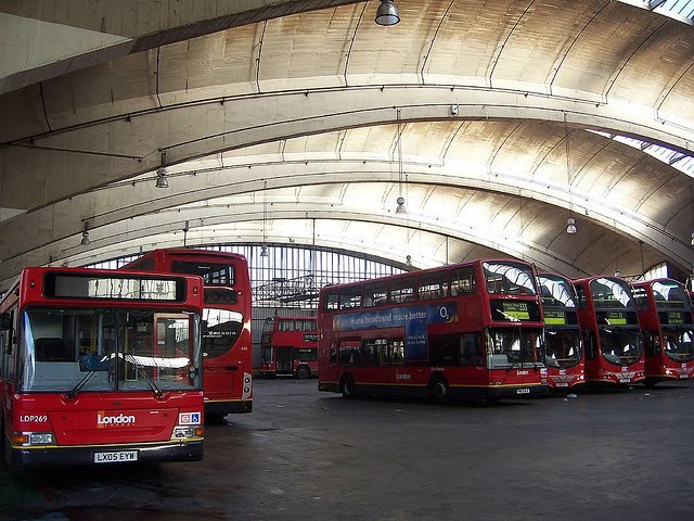
- It's an interesting panoramic view of the interior of the Stockwell Garage in London. It might appear at first to be a relatively obscure industrial building (and in some ways it is), but it is also a Grade II* listed building in the UK (the second highest importance) and at the time of completion in 1952 was the largest unsupported roof in Europe.
- Articles in which this image appears
- Stockwell Garage
- FP category for this image
- Wikipedia:Featured pictures/Places/Architecture
- Creator
- User:Diliff
- Support as nominator --Ðiliff «» (Talk) 09:40, 6 November 2013 (UTC)
Weakoppose - Are those structures on the ceiling actually curved? Or are they actually straight? This is why I'm generally not a fan of these panoramas. They blow natural perspecive to hell and the result is a curvy mess. It may make for groovy art... but not an encyclopedic photograph. The article would look soooo much better with a couple well done normal photos. Also, it has been inserted into the article only in the last few days. – JBarta (talk) 13:36, 6 November 2013 (UTC)- Yes, the structure is curved. If you read the article, the roof is made of barrel vaults that sit on top of the large arches. I haven't been there but I think the space might actually be "groovy". A very similar version has been added a week ago, and than changed to this one -which I agree is better- about five days ago, so I don't think that's an issue. --ELEKHHT 22:31, 6 November 2013 (UTC)
- In addition to what Elekhh already mentioned, I just wanted to note that there is no such thing as 'natural perspective'. There is only perspective distortion of varying degrees, and there are trade-offs on all perspectives and compositions. Forget stitched panoramas for a second, and consider individual photos taken with a regular rectilinear lens. They still show perspective distortion. The only way to minimise perspective distortion is to take a photo from extremely far away with an extremely telephoto lens, but is this a possibility in interior architectural photography? Absolutely not. Distortion is a natural consequence of trying to photograph any significant portion of an enclosed space. Ðiliff «» (Talk) 08:54, 7 November 2013 (UTC)
- Totally disagree. Natural perspective enables us to accurately reconstruct the original 3D geometry in our brains. Distorted prespective causes us to fail to understand the 3D geometry or to construct a false or ambiguous representation. Of course, we are quite dependent also on recognising familiar objects and understanding their likely shapes and sizes, and also interpreting other visual cues. This may enable us to detect and compensate for distorted perspective. Nevertheless, it is common sense that distorted and natural perspectives are meaningful concepts. 86.171.174.169 (talk) 13:56, 7 November 2013 (UTC)
- I understand that certain projections are more difficult to visualise 'naturally', and the cylindrical projection used in this image takes a curved space and flattens it so that it can be displayed on a flat display. But that doesn't mean that perspective distortion doesn't exist in all photos. In any case, it would not be possible to show a wide enough view of the interior without distortion of some kind. A lens capable of capturing a wide enough view to include both the building as well as the roof structure would be significantly distorted at the edges, as all ultrawide angle photography is. This does not look 'natural' either. If you keep the camera horizontal, the roof is distorted (and probably not significantly in the frame either). If you tilt the camera up, the vertical lines become horribly tilted. There is no real solution to this problem - any 'correction' distorts something. As I said originally, there are trade-offs in every perspective and projection. Anyway, I could go on but I guess we can agree to disagree on this. Ðiliff «» (Talk) 23:07, 7 November 2013 (UTC)
- So do those buses look unnatural to you? (other than being double-deckers)? Regarding how our brain reconstructs what our eyes see, just take it easy :). @Diliff: As the lens spects do not show up in the EXIF, can you just let us know, or add that to the file description? --ELEKHHT 23:54, 7 November 2013 (UTC)
- After looking online at other photos of this garage, I'm changing my vote from 'weak oppose' to 'oppose'. This image is simply not a realistic/accurate portrayal of the inside of that garage. While it's a pretty image, the EV is blown. – JBarta (talk) 23:48, 7 November 2013 (UTC)
- Could you please explain what you find unrealistic and point to an example you think is better? --ELEKHHT 23:54, 7 November 2013 (UTC)
- Images I think better represent the garage: 1,2,3. Reasons I noted above. Also, 86.171.174.169 made good points. The image simply tries to capture too many degrees of view and squish them into a narrow image causing an unnatural amount of distortion and causing the viewer to question what he's looking at. On looking at it, my first question was are the vaults parallel or do they splay out? I had to look elsewhere to get a better idea of what the garage actually looked like. – JBarta (talk) 00:26, 8 November 2013 (UTC)
- Thanks for the explanation, I see now what you mean. It is the curved projection of the top of the back wall that might have given you that impression. From the examples you link at (1) and (2) I find much inferior in terms of illustrating the structure and the space. (3) is an interesting perspective that focuses on the cross-section, in a way complementary to the longitudinal section illustrated in this nomination. I still think this image is very well illustrating the structure, the space and its use, and the smooth sunset lighting is quite successful, so I continue to support. --ELEKHHT 00:51, 8 November 2013 (UTC)
- Images I think better represent the garage: 1,2,3. Reasons I noted above. Also, 86.171.174.169 made good points. The image simply tries to capture too many degrees of view and squish them into a narrow image causing an unnatural amount of distortion and causing the viewer to question what he's looking at. On looking at it, my first question was are the vaults parallel or do they splay out? I had to look elsewhere to get a better idea of what the garage actually looked like. – JBarta (talk) 00:26, 8 November 2013 (UTC)
- Could you please explain what you find unrealistic and point to an example you think is better? --ELEKHHT 23:54, 7 November 2013 (UTC)
- After looking online at other photos of this garage, I'm changing my vote from 'weak oppose' to 'oppose'. This image is simply not a realistic/accurate portrayal of the inside of that garage. While it's a pretty image, the EV is blown. – JBarta (talk) 23:48, 7 November 2013 (UTC)
- Totally disagree. Natural perspective enables us to accurately reconstruct the original 3D geometry in our brains. Distorted prespective causes us to fail to understand the 3D geometry or to construct a false or ambiguous representation. Of course, we are quite dependent also on recognising familiar objects and understanding their likely shapes and sizes, and also interpreting other visual cues. This may enable us to detect and compensate for distorted perspective. Nevertheless, it is common sense that distorted and natural perspectives are meaningful concepts. 86.171.174.169 (talk) 13:56, 7 November 2013 (UTC)
- Support High EV, nicely capturing the structure, including the skylights. --ELEKHHT 22:31, 6 November 2013 (UTC)
- Support dllu (t,c) 22:37, 6 November 2013 (UTC)
- Support Nikhil (talk) 01:55, 7 November 2013 (UTC)
- Oppose This angle doesn't really give you a sense of how large the building is. Also gives the illusion that the spandrels (or whatever they are called) are bending away from the photographer, but in the architectural drawing above appear to be straight. Mattximus (talk) 00:58, 8 November 2013 (UTC)
- I would have though the buses give a pretty good sense of the scale of the space. In terms of perspective effects, for consistency you might wish to nominate images like this and this for delist as big way more confusing. Also I think this image should have been nominated for the category Wikipedia:Featured pictures/Places/Interiors. --ELEKHHT 01:06, 8 November 2013 (UTC)
- Please compare this nomination and image "3" linked above. Before seeing that new image, I thought there was quite a shallow roof to this building. The nomination really doesn't give the sense of scale. Mattximus (talk) 01:18, 8 November 2013 (UTC)
- The second you mention is absurdly awful. How it got to be a FP is beyond me. The first, if those arched transom windows are in real life parallel, then that image is a bit absurd as well. If those images are the low form of life that is FP worthy, then who am I to oppose this one? This one is no worse. Might as well throw this in with the others, slap a star on it and happy trails to all. – JBarta (talk) 01:29, 8 November 2013 (UTC)
- Actually, in defense of the terminal panorama, someone on the nomination page suggested looking at only a small section at a time while scrolling it and it looks like you're looking around. In that manner, I'll admit it does look kinda neat. – JBarta (talk) 01:45, 8 November 2013 (UTC)
- I would have though the buses give a pretty good sense of the scale of the space. In terms of perspective effects, for consistency you might wish to nominate images like this and this for delist as big way more confusing. Also I think this image should have been nominated for the category Wikipedia:Featured pictures/Places/Interiors. --ELEKHHT 01:06, 8 November 2013 (UTC)
- Oppose Agree with mattximus, moreover lots of better pics of this terminal were found in google search so cannot support this. Godhulii 1985 (talk) 14:23, 8 November 2013 (UTC)
- Could you be more specific about which photos are better than this one? Also, just because they exist, doesn't mean they are available to upload to Wiki. I urge you to find an image that is high resolution, shows the shape and size of the building sufficiently, and is freely licensed. And when you find one, upload it to Wikipedia. But until then, I don't think "there are better images on google image search" is a valid argument. Ðiliff «» (Talk) 19:26, 8 November 2013 (UTC)
- I read your previous comment and it seems to me that I cannot agree with you regarding perspective. With a reply to 86, you've justified your position but I really don't think that a panorama from this position is necessary to depict this garage. Rather this pic is more clear: [1]
For me, in a panorama the perfect symmetry is very necessary unless lack of symmetry returns as a WOW factor. In this pic, the buses are not symmetrical, the roofs do not give me an idea about its shape (I had to search in google to check what are they: stretched like this pic or parallel). So, to me it has no WOW effect for which I should support this. You cannot force me to say that it is a WOW pic.
About unavailability of pics: this is a pic from london, not from a place which is v.difficult to go.
What if no one correct this in a significant time: well, you can see mentos-diet-coke featured pic. Initially that was rejected in 2006 with a reason: "easily reproducible", for next 7 years no one did that and it was elected in 2013. So, if no one upload a better pic in significant time then obviously this can be judged again, for now Oppose. Godhulii 1985 (talk) 10:36, 9 November 2013 (UTC)- I'm afraid we are dealing here with an example of systemic bias at FPC that is detrimental to conveying our readers a better understanding of architecture. No building can be fully understood from one image, and while very simple symmetric frontal perspectives are commonly promoted, it has to be clear that such images only depict one particular (and seldom experienced as such) aspect of the building. Same way we understand that an article about ducks can have multiple FPs (female, male, baby duck, mating, eating, etc), it should be clear that articles about architecture should have the potential to incorporate multiple FP quality perspectives. Of course duck images are also easy to support because perspective effects of any kind are much less apparent. Anyway, note that the image you link to places the emphasis on the buses, whereas this image places it on the structure - that is what is most notable about this building. --ELEKHHT 11:54, 9 November 2013 (UTC)
- I read your previous comment and it seems to me that I cannot agree with you regarding perspective. With a reply to 86, you've justified your position but I really don't think that a panorama from this position is necessary to depict this garage. Rather this pic is more clear: [1]
- Could you be more specific about which photos are better than this one? Also, just because they exist, doesn't mean they are available to upload to Wiki. I urge you to find an image that is high resolution, shows the shape and size of the building sufficiently, and is freely licensed. And when you find one, upload it to Wikipedia. But until then, I don't think "there are better images on google image search" is a valid argument. Ðiliff «» (Talk) 19:26, 8 November 2013 (UTC)
- I can see both sides. I wanted to say that because there's some hectoring here. The difference between this picture and the airport terminal one is that that's a rectangular room, so it's easy to reconstruct what it must look like in your head. I have no problem with perspective distortion in architecture if it allows us to see a larger space in more detail, but in this case, given a curved ceiling to begin with, it's rather confusing. Chick Bowen 01:16, 10 November 2013 (UTC)
- But none of the other images of this building avoid the distortion of the ceiling vaults either. There's nothing special about this being a stitched panorama that results in distortion that wouldn't be there in a regular photo. I just feel that the opposers are exaggerating the issue. Yes there is divergence of straight lines as occurs in ANY three dimensional scene, and yes it tends to make it harder to visualise the shape of the building, but I don't believe any other images can eliminate this issue because it's a visually confusing building to begin with. Ðiliff «» (Talk) 03:19, 11 November 2013 (UTC)
- Support. Great image, high enough EV. Angle is a little bit off, but still FP quality. -- ТимофейЛееСуда. 20:30, 10 November 2013 (UTC)
- Support I think the "Does it splay out like that or is it the projection?" question is a valid one and a problem for this image. But it is a problem for other images too that aren't wide-angle or from this viewpoint. I've looked at lots of images on Commons and elsewhere online and none of them individually answer the question to me about what it actually looks like. Smaller images can show accurate detail of a portion but you don't, literally, get the full picture. I like the WLM nominee File:Stockwell Bus Garage skylight reflections.JPG as an image but its EV for the garage is lower. One of the problems with WP:FP that it expects a lot from a single picture. This is an article that really needs a set of pictures working together to not only help visualise the building but also tell its story. Currently the article is a bit crap and not long enough. Now, if you'll all excuse me, I must go fetch my fisheye lens and arrange a visit :-) -- Colin°Talk 12:24, 11 November 2013 (UTC)
- Physically/geometrically, while looking at it along its axis, it obviously does not splay like that. But when you're there in the building looking at it, yes it does 'appear' to splay because of the fundamental laws of perspective. As I've said above already, this is nothing to do with the fact that it's panoramic, or that it's cylindrically stitched (although that does 'bow' the vaults somewhat). It would be the case for any wide angle field of view from that central position. For this image's slightly wider than average field of view, it does splay slightly more than normal. But I think we are (or should be) sophisticated enough to understand that there is distortion inherent in all images. Some of the above commenters seem to imply that some perspectives are more natural than others. 50mm rectilinear may be presumed to be close to the way we view the world with our eyes but I think that's an oversimplification and a narrow-minded way of thinking. Yes, the image might be confusing for some to understand at first glance, but I never expected this image to judged as the be the be-all-and-end-all of photos of the building. No single photo can encapsulate every aspect and detail of a three dimension structure. I think it's fine as the lead image, however, because there are no similarly detailed images in the Wiki Commons archives that improve on it IMO. But as for going there with a fisheye, watch out! The peanut gallery (joke) will be after you because we don't have eyes like fish! ;-) Also, FYI, the interior of the building is apparently off limits to the public. Many of the photos do appear to be taken from inside but there are signs at the entrance forbidding entrance to non-staff members. Whether that's waived if you ask nicely, I don't know. I guess it's a H&S issue due to the buses passing in and out. I didn't spot any staff to ask so I just hung around at the entrance. I looked around and I didn't find better compositions elsewhere anyway though. In some of the google image shots, the buses are nicely lined up in a row. I wasn't so fortunate to find that the case on my visit. ;-) Ðiliff «» (Talk) 13:58, 11 November 2013 (UTC)
- I'm in agreement with you. The buses help give the reader some clue that it isn't very distorted but still there's an discomfort among someone unfamiliar with the building about how faithful it is -- even though it may well be. Anyway, you are preaching-to-the-converted with me about not minding a few curves. Who says our pics have to look like architect's drawings? -- Colin°Talk 14:22, 11 November 2013 (UTC)
- Physically/geometrically, while looking at it along its axis, it obviously does not splay like that. But when you're there in the building looking at it, yes it does 'appear' to splay because of the fundamental laws of perspective. As I've said above already, this is nothing to do with the fact that it's panoramic, or that it's cylindrically stitched (although that does 'bow' the vaults somewhat). It would be the case for any wide angle field of view from that central position. For this image's slightly wider than average field of view, it does splay slightly more than normal. But I think we are (or should be) sophisticated enough to understand that there is distortion inherent in all images. Some of the above commenters seem to imply that some perspectives are more natural than others. 50mm rectilinear may be presumed to be close to the way we view the world with our eyes but I think that's an oversimplification and a narrow-minded way of thinking. Yes, the image might be confusing for some to understand at first glance, but I never expected this image to judged as the be the be-all-and-end-all of photos of the building. No single photo can encapsulate every aspect and detail of a three dimension structure. I think it's fine as the lead image, however, because there are no similarly detailed images in the Wiki Commons archives that improve on it IMO. But as for going there with a fisheye, watch out! The peanut gallery (joke) will be after you because we don't have eyes like fish! ;-) Also, FYI, the interior of the building is apparently off limits to the public. Many of the photos do appear to be taken from inside but there are signs at the entrance forbidding entrance to non-staff members. Whether that's waived if you ask nicely, I don't know. I guess it's a H&S issue due to the buses passing in and out. I didn't spot any staff to ask so I just hung around at the entrance. I looked around and I didn't find better compositions elsewhere anyway though. In some of the google image shots, the buses are nicely lined up in a row. I wasn't so fortunate to find that the case on my visit. ;-) Ðiliff «» (Talk) 13:58, 11 November 2013 (UTC)
Promoted File:Stockwell Bus Garage 1, London, UK - Diliff.jpg --Armbrust The Homunculus 09:57, 16 November 2013 (UTC)
- There is a 2/3 majority support for promotion. Armbrust The Homunculus 09:57, 16 November 2013 (UTC)