Wikipedia:Wikipedia logos
| This page in a nutshell: Wikipedia had a series of logos before the current puzzle ball was created. |

Wikipedia had a series of logos in its history before arriving at the current puzzle logo.
The first official logo
[edit]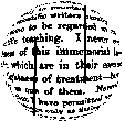
Wikipedia's first true logo was an image that was originally submitted by Bjørn Smestad[1] for a Nupedia logo competition which took place in 2000.[2] It continued to be used after this time on Special Pages, such as search results.
The logo included a quote from the preface of the 1879 book Euclid and his Modern Rivals by Lewis Carroll; due to the fisheye effect, only part of the text can be read:
In one respect this book is an experiment, and may chance to prove a failure: I mean that I have not thought it necessary to maintain throughout the gravity of style which scientific writers usually affect, and which has somehow come to be regarded as an ‘inseparable accident’ of scientific teaching. I never could quite see the reasonableness of this immemorial law: subjects there are, no doubt, which are in their essence too serious to admit of any lightness of treatment – but I cannot recognise Geometry as one of them. Nevertheless it will, I trust, be found that I have permitted myself a glimpse of the comic side of things only at fitting seasons, when the tired reader might well crave a moment’s breathing-space, and not on any occasion where it could endanger the continuity of the line of argument.
The second logo
[edit]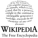
In November 2001, Wikipedians began suggesting new logos. A short list of 24 leading candidates was chosen in the first Wikipedia logo contest, which took place from November to December 2001. The winner was the last logo (#24), contributed by The Cunctator.
The logo included the following quote, taken from Thomas Hobbes's 1651 book Leviathan, Part I, Chapter VI:
Desire to know why, and how, curiosity; such as is in no living creature but man: so that man is distinguished, not only by his reason, but also by this singular passion from other animals; in whom the appetite of food, and other pleasures of sense, by predominance, take away the care of knowing causes; which is a lust of the mind, that by a perseverance of delight in the continual and indefatigable generation of knowledge, exceedeth the short vehemence of any carnal pleasure.
International adaptations
[edit]Because of its English text, this logo was not ideal for the Wikipedias in other languages. Some wikis chose a similar design with text in their own languages (e.g. the Dutch Wikipedia that used a text from the classic book Max Havelaar). Others used the English logo but added the color of a national flag (most of the Nordic language projects, Danish, for example) or simply a translation of "The Free Encyclopedia" (e.g. German). Still others designed a completely different logo (e.g. the French Wikipedia).
The third logo (the puzzle ball)
[edit]The international contest
[edit]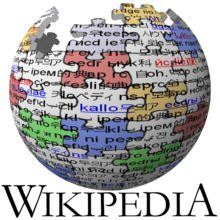
Following a suggestion by Erik Möller, an International logo contest was conducted to find a new logo that was suitable for all languages. After a two-stage vote, a design by Paul Stansifer (at the time known as Paullusmagnus) won with considerable support. The English Wikipedia switched to it on September 26, 2003.
Stansifer's logo depicted a globe constructed of puzzle pieces, of multiple colors. Covered by text with links, the logo was to symbolize the continuous construction and development of the project. The logo was made in POV-Ray, using a puzzle image wrapped around a sphere. The .pov file is available here.
The variants
[edit]

A ratification vote was held soon after, to confirm community consensus. As a result, twelve direct adaptations of the design were created by members of the community.
One of David Friedland's (Nohat) modifications, occasionally referred to as the "silver ball", was soon chosen. The revision of Stansifer's concept removed the color and changed the overlaid text into one letter or symbol per puzzle piece. Both Friedland and Stansifer have assigned copyrights to the logo to the Wikimedia Foundation.
Whilst symbolizing a globe the new logo also loosely resembled a typeball as used in some electric typewriters, a former metaphor for the liberation of the process of professional writing.
The finalized logo
[edit]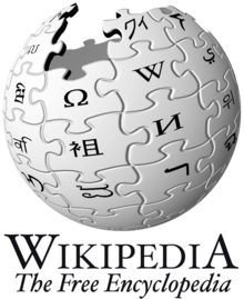
There was some controversy over switching the English Wikipedia to this logo for several reasons, one of which was the fact Wikipedia's servers were flickering throughout most of the process.
Before being released to all Wikipedias, the logo was lightened up slightly.
After the John Seigenthaler, Sr. Wikipedia biography controversy, a column in The Times[3] insinuated the logo as being a metaphor for the entire project. Rosemary Righter wrote "Just above the omega, at the point where, on human heads, they used to perform frontal lobotomies, bits of the jigsaw are missing."
Alphabets represented in the logo
[edit]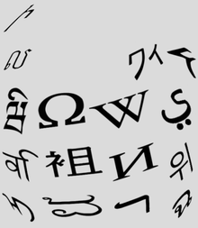
The puzzle logo includes 16 letters from 16 different alphabets, many of which—but not all—represent a letter from that alphabet that most closely resembles the English "W", as in "Wikipedia". The alphabets represented are as follows:
Armenian ini (Ի) |
— | — | — |
Khmer lô (ល) |
— | Japanese Katakana wa + i (ワィ)[4] |
Klingon r ()[5] |
 Tibetan wa + i (ཝི) |
Greek omega or omega+tonos (Ω or Ώ) |
 Latin W (W) |
 Arabic yeh (ي) |
Devanagari va + i (वि)[6] |
Chinese radical 145 (衣/衤)+5 more strokes in 且 (袓) |
Cyrillic I or Short I (И or Й)[7] |
 Korean Hangul wi (위) |
 Mongolian Todo I (rotated 90 degrees) (ᡅ) |
Kannada va + i (ವಿ)[8] |
Hebrew resh (ר) |
 Thai cho ching (ฉ) |
There have, over the years, been suggestions that some of these characters should be changed to reflect the actual spellings of "Wikipedia" in various languages.[9]
The May 2010 redesign
[edit]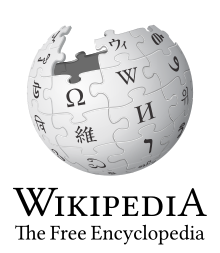
In late 2009, the Wikimedia Foundation undertook to fix some errors that had been noted in the design of the puzzle globe. In particular, it did not scale well and some letters appeared distorted.[10] For the new logo, the Wikimedia Foundation defined which characters appear on the "hidden" puzzle pieces, and had a three-dimensional computer model of the globe created to allow the generation of other views.
The new logo was unveiled in May 2010. It is commonly referred to as "v2" or "2.0", since it represents the second (official) version of the puzzle globe logo to be adopted. It features the new 3D rendering of the puzzle globe, with corrected characters (and the Klingon character replaced by a Geʿez character). The wordmark has been modified from the Hoefler Text font to the open-source Linux Libertine font, and the subtitle is no longer italicized. The only error is that the Khmer letter "vo+i" is lying on its side instead of being straight. It is most likely that this error will not be fixed.
The Wikimedia blog has more information on the unveiling, and the WMF Wiki has more detailed information on the new logo.
The characters of the v2 logo
[edit]| — | — | — | |||||||
| — | — | — | |||||||
| — | — | — | — |  Armenian vev (Վ) |
— | — | — | — | — |
| — | — | — |  Telugu va + (i) (వి) |
 Khmer vo + i (វិ) |
— |  Katakana u + small i (ウィ) |
 Gəʿəz wə (ው) |
— | — |
 Javanese wa + i (ꦮꦶ) |
 Gujarati va + i (વિ) |
 Gothic vinja (𐍅) |
 Latin E-acute (É) |
 Bengali short u (উ) |
 Greek omega (Ω) |
 Latin W (W) |
 Arabic wāw (و) |
 Gurmukhī vava + sihari (ਵਿ) |
![the last LETTER of most Wikipedias using the Cyrillic Alphabet [citation needed]](http://upload.wikimedia.org/wikipedia/commons/thumb/6/67/Cyrillic_%D0%AF.svg/60px-Cyrillic_%D0%AF.svg.png) Cyrillic ya (Я) |
 Syriac wāw (ܘ) |
 Lontara w + i (ᨓᨗ) |
 Oriya U (ଉ) |
 Burmese script v + i (‹See Tfd›ဝီ) |
 Devanagari va + i (वि) |
 Traditional Chinese (維) |
 Cyrillic i (И) |
 Hangul/Chosongul wi (위) |
 Tāna vaavu + (i) (ވި) |
 Laotian w + i (ວິ) |
 Cyrillic ve (В) |
 Glagolitic vědě (Ⰲ) |
 Malayalam va + short i (വി) |
 Inuktitut short u (ᐅ) |
 Georgian vin (ვ) |
 Kannada va + (i) (ವಿ) |
 Hebrew vav (ו) |
 Thai wo waen + sara i (วิ) |
 Latin H (H) |
 Cyrillic u (У) |
 Tagalog Baybayin wi (ᜏᜒ) |
 Latin U (U) |
 Mongolian wa (ᠸ) |
 Limbu wa + i (ᤘᤡ) |
 Cherokee wi (Ꮻ) |
 Tibetan wa + (i) (ཝི) |
 Tamil va + (i) (வி) |
 Sinhala va + i (වි) |
 Latin A-umlaut (Ä) |
 Chinese character (典) |
 Tai Nüa wa (ᥝ) |
 Latin V (V) |
 Cyrillic de (Д) |
|||||||
 Greek pi (Π) |
 Arabic yāʾ + ʾalif (يا) |
 Latin dotted I (İ) |
|||||||
Anniversary logos
[edit]10th anniversary logo
[edit]
On January 15, 2011, a special logo replaced the standard globe in order to mark the tenth anniversary of Wikipedia's founding. The logo depicts a single jigsaw piece, representing the addition of another piece to the puzzle.
20th anniversary logo
[edit]
On January 14, 2021, a 4-sectioned logo was used instead of the puzzle globe, in order to mark the 20th anniversary of Wikipedia. The 4 sections depict, from top-to-bottom, left-to-right:
Yellow background, a woman reading a book with the "W" on it, signifying Wikipedia. Blue background, a computer showing a blue screen with a "W" on it, signifying Wikipedia. Red background, a phone showing a blue screen with a "W" on it, signifying Wikipedia. Finally, on green background, the normal Wikipedia globe, in blue, but with most letters aside from the "W" being replaced with various other objects and symbols.
Some users complained about the visual notoriety of the logo which was found to be striking in contrast to the remainder of the Wikipedia site.
On the Czech Wikipedia, a different "cake" logo is shown, with 2, W, O, stuck in the cake.
20th anniversary second logo
[edit]
On January 22, 2021, the previous 20th anniversary logo was replaced with a less striking version, consisting of the normative Wikipedia globe above the text "20 years of Wikipedia - Over One Billion Edits".
3D versions
[edit]The first two versions of the logo were made to resemble a globe by the use of the fish-eye effect.
The third version (puzzle ball logo) was made in POV-Ray, a ray tracing program which generates 2D images from a 3D scene description. The original 3D scene consisted of a sphere on which a puzzle image was projected, as described here. Nohat's version introduced a bump map to the setup, to provide 3D relief and simulate separate puzzle pieces.
Truly tridimensional models have been created in a few variations. One provides each puzzle piece sculpted independently, to allow alternative renderings; Files are available on GitHub in an animated version and a 3D printable version. Additional 3D printable versions are available in commons:Category:STL official Wikimedia logos.
See also the thread What is on the back of the logo? at the foundation-l mailing list.
Physical versions
[edit]-
A concrete version of the logo being lowered into Lake Sevan in Armenia to create an artificial reef
-
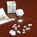
Puzzle ball distributed to Wikimania 2007 attendees
-
A 3D printed globe
A very large puzzle globe, dubbed the Wikiball, featured in Wikimania 2007, depicted an approximation of the Wikipedia logo. A smaller version was distributed to the participants. The large ball was dismantled after the closing ceremony, and many participants kept a piece or more of the puzzle.
In 2017, a concrete version of the logo was submerged in Lake Sevan to create an artificial reef.[11]
See also
[edit]- Wikipedia logo
- commons:Category:Characters in the Wikipedia logo
- meta:Logo history
- meta:Errors in the Wikipedia logo
- meta:Logos
- User talk:Nohat/archive_2005-02-22#Logo
- Wikipedia:Banners and buttons
- Wikipedia:Slogans
- List of writing systems
- Content guideline: using logos on Wikipedia
Notes and references
[edit]- ^ Bjørn Smestad created the first Wikipedia logo according to this archived page of submitted logos from Nupedia site - as is seen in that page at the bottom "Logo ideas posted with permission of their designers. Click on a logo to go to its designer's website." Image link in that page is pointing to this archived page: "Assistant Professor Bjørn Smestad".
- ^ "User talk:Mosca: Difference between revisions". wikipedia.org.
- ^ Righter, Rosemary (9 December 2005). "Unreliable (adj): log on and see". Times Online.
- ^ Apparently a typing error for u & small i (ウィ). This should be ウィ(pronounced as wi): ウ(u) and ワ(wa) are different letters. ヰ in David Friedland's puzzle ball logo is an old Japanese Kana character pronounced as wi, but this letter is not used now. See also: commons:Category:Japanese character for Wikipedia logo
- ^ This character is in the Private Use Area area of Unicode and may not display without the correct fonts. It is registered in the ConScript Unicode Registry, thus fonts which follow the CSUR should function correctly.
- ^ Due to a formatting error, the characters are reversed on the globe image, showing as (वि). There are problems with this in some web browsers as well.
- ^ Given as capital i (И) in some logos; see User talk:Nohat for more information.
- ^ This is a Kannada va with a i diacritic vowel on top. The diacritic was attached to the wrong place by the font used. It should have been rendered as ವಿ. See http://bachodi.wordpress.com/2007/06/30/a-typo-in-wikipedia-logo-fractures-the-kannada-too/
- ^ m:Talk:Errors in the Wikipedia logo
- ^ UnderConsideration LLC. "Brand New: Around the World in 51 Characters". underconsideration.com.
- ^ "CEE/Newsletter/October 2017/Full - Meta". meta.wikimedia.org. Retrieved 22 April 2020.


