
Wikipedia:Graphics Lab/Illustration workshop
The Graphics Lab is a project to improve the graphical content of the Wikimedia projects. Requests for image improvements can be added to the workshop pages: Illustrations, Photographs and Maps. For questions or suggestions one can use the talk pages: Talk:Graphics Lab, Talk:Illustrations, Talk:Photographs and Talk:Maps.
This specific page is the requests page for the illustration workshop. Anyone can make a request for an illustration to be improved or created for a Wikipedia article. Clicking the "New Request" button will bring you to a standard template for submitting requests, as well as general advice that should be followed.
| Advice to requesters |
|---|
|
All requests:
SVG requests:
|
|
Requests from recent years:
| |
| For graphists: |
| If you have completed work and not received a reply you may use the {{GL Illustration reply}} template to inform the requester. |
| Graphists and other visitors to the Graphic Lab may be interested in the RSS feed of changes to this page. You may find it here. |
Good article and featured article topicon redesign
-
 Current good article icon
 -
 Current featured content icon


- Article(s)
- 5,859 featured articles
- 3,696 featured lists
- 32,507 good articles
- Assorted additional talk, help, and process pages
- Request
- Yes, this one is a big one.
- Background: The current symbols for good articles and featured content have been used since those systems were introduced way back in Wikipedia's early days. They have significant problems. The featured article icon is too skeuomorphic, giving it an outdated look, and its excessive detail causes it to render poorly at small scale. The good article icon, meanwhile, has been adopted throughout the rest of Wikimedia (and in some places on Wikipedia) as the "support vote" icon, leading to conflicting usage. Far worse than the issues with them individually, however, is the fact that there is no shared visual language between them (the GA icon uses the norro style, and the FA icon does not use any style). When compounded by their overall lack of prominence (a separate issue that we're trying to address), this has led to the unfortunate situation where many (perhaps most) non-editing readers could not tell you whether a star or a green badge is a higher distinction. Given how much effort we put into the GA/FA systems, there's more than a bit of tragic irony to that.
- Process: This is the first stage in the process of redesigning the icons (after informal discussions in various places). Ideally, several proposals will be put forth that can be compared against the status quo in a more formal and widely-advertised round of !voting (similar to the process for the MediaWiki logo redesign), with the winner adopted.
- Design details: The redesigned icons could end up being anything from checkmarks (a la the Twitter verification badge) to a silver star for GAs to a multi-star system that begins with one star for stubs and increases thereafter; feel free to get creative.
- Also, since the whole idea here is to unify the symbology, the redesign will need to include the associated symbols in addition to the main icons. You don't have to design them all now, but candidates with at least an articulated vision of what they should look like may be more likely to win support once we reach the formal !voting stage. Here are the current icons still in use that I could find (there may be a few more fringe ones):
Related icons
|
|---|
|


- In truth, the potential scope of this project could be a lot bigger, trying to unify all of the icons used anywhere on Wikipedia. However, recent attempts to do so have failed, and their utility is questionable, given that most icons do not appear in reader-facing areas and thus have a vastly more limited reach. Redesigning these two icons is a more feasible task with clear and significant benefits for readers across tens of thousands of pages.
- Cheers, {{u|Sdkb}} talk 05:08, 7 October 2020 (UTC)
- Discussion
- @Sdkb: I would recommend posting this at the Commons graphics lab as well, as it is significantly more active over there. Pbrks (talk) 14:50, 16 October 2020 (UTC)
- @Pbrks: Thanks for the tip. Since this request is specific to en-WP, I'd prefer the main discussion be hosted here, but I'll copy the request there and invite folks over. {{u|Sdkb}} talk 21:38, 17 October 2020 (UTC)
- Consider color blindness (esp. red-green): In data visualization circles, there is increasing awareness of how graphics should be crafted to allow color blind individuals to distinguish through shading, what normally sighted individuals distinguish directly through color perception. (One can test shading in Photoshop etc by removing saturation.) It's my understanding that red-green color blindness is a common type, though not the only type of color blindness. Some color scales are better than others: see Scientific American. —RCraig09 (talk) 22:53, 17 October 2020 (UTC)
Resolved discussion about mandate for change
|
|---|
|
- This is my passing opinion. There is a ooui icon called "articleCheck" () and this is what I think a "GA" icon should look similar to. Basically a sheet (representing a page) with a check on it. And in a green color instead of black. For the FA icon, a simple star/medal design on a sheet with an appropriate color would make sense to keep the two icons inline with each other. SInce I believe that most users could understand a star is more important than a check icon. Basic icons such as these are the only way to keep them readable when used as topicons. Terasail[✉] 17:00, 11 January 2021 (UTC)
Update: Mandate acquired
The formal Village Pump proposal has been archived, and per here, it successfully acquired a mandate for the icons to be redesigned, so I am removing the "on hold" box around this section. I'll leave it up to others to decide how precisely to proceed from here; I hope that someone steps up to take the lead on shepherding the process from here forward, since I'm not sure I can do it myself. This thread can be archived once (and only once) we've moved to the next stage. {{u|Sdkb}} talk 22:09, 24 December 2020 (UTC)
- As a note, there is also a proposal about it.Ahmetlii (talk) 10:33, 29 December 2020 (UTC)
- @Ahmetlii: That's a much more ambitious but still underdeveloped proposal that's been sitting for a while; in my view, it would need a lot of work to become comprehensive enough to become useful, and I don't see that amount of work forthcoming or really worth the effort. I think we should focus on this one, much more feasible task that we have agreed to do, rather than dreaming about bringing all of Wikipedia in line with a universal standard that, realistically, is not likely to happen any time soon. {{u|Sdkb}} talk 23:53, 31 December 2020 (UTC)
- The icons should be changed to something the average reader is familiar with. The current icons are nice, but they're nice to Wikipedians. The average reader probably has no idea what this means. We should aim to use images which readers will understand. For example: silver star, gold star. A tick / double tick. Or something along those lines. It should be obvious to a reader what it symbolises. ProcrastinatingReader (talk) 02:55, 20 March 2021 (UTC)
Wikipedia logo resize request
-
 Meitei script Wikipedia logo
- Article(s)
- wikipedia:Slogans
- Request
- Is there someone that could gently resize Wikipedia logo to 135x155 px? It will be very appreciated! Thanks in advance!!! -- 2001:B07:6442:8903:25D4:FB4D:B41C:B957 (talk) 10:08, 2 February 2021 (UTC)
- Discussion
- This one cannot be trivially resized using
viewboxbecause it does not have the correct aspect ratio. Let me raise the issue to whoever made this. Oh and it's just a big fat raster?? Gosh this work is sloppy. Raising the issue on m:Requests_for_new_languages/Wikipedia_Meitei#Settings. --Artoria2e5 🌉 21:55, 3 February 2021 (UTC)
Request
-
 SVG shape
 -
 JPG coa
 -
 SVG flag
 -
 SVG coa
 Done
Done


- Article(s)
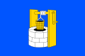
- Studenec (Třebíč District)
- Request
- Is there someone that could gently make SVG of the coa using the SVG of the flag based on the SVG shape? Many many many thanks in advance!!! -- 93.35.184.189 (talk) 14:57, 12 February 2021 (UTC)
- Discussion
- Done --Mrmw (talk) 17:47, 5 March 2021 (UTC)
Hear ye! Excel .xlsx spreadsheets that automatically generate XML code for .SVG graphs


(five examples compared)


I've uploaded .xlsx (Microsoft Excel) spreadsheets that automatically generate XML code for charts in SVG format.
You simply paste or enter your data into the spreadsheet, and specify image dimensions, number of grid lines, font sizes, etc. The spreadsheet instantly and automatically generates a column of XML code that you simply copy and paste into a text editor and save as an ".svg" file. The spreadsheets produce lean SVG code, avoiding the "extra stuff" that Inkscape inserts. They should save you time in creating SVG charts.
Feedback and suggestions on my talk page are welcome. RCraig09 (talk) 23:41, 19 February 2021 (UTC)
- Warming stripes — Accepts a single dataset and converts to SVG code portraying Ed Hawkins' warming stripes graphics. User chooses vertical or horizontal stripes; normal or reverse data ordering; or from a variety of geometric shapes (updated 17 May 2023). . . . . Click here to see examples of warming stripes embedded in different shapes.
- Warming stripes bar chart — Accepts a single dataset and creates a conventional bar chart whose individual bars/columns are coloured according to Dr. Hawkins' warming stripes colour scheme. Alternate option: choose one colour for ascending bars and another colour for descending bars. (updated 28 August 2023)
- Line charts — Accepts up to six datasets. (updated 30 August 2023)
- Vertical bar charts (column charts) — Accepts up to six datasets. Toggle between clustered and stacked charts; user can adjust "Yfloor"—the Y level (usually=0) from which columns rise or fall; user chooses to keep or ignore negative input values. (updated 27 August 2023)
- Horizontal bar charts — Accepts up to six datasets. Toggle between clustered and stacked charts; user can adjust "Yfloor"—the value (usually=0) from which bars extend; user chooses to keep or ignore negative input values. (updated 27 August 2023)
- Scatter plots — Accepts up to five datasets. (updated 28 August 2023)
- Pie charts — Accepts a single dataset of up to 36 items. (updated 17 May 2023)
- Variable-width bar charts — Accepts up to six datasets; is like "Vertical bar charts", above, but user can choose different widths for different bars. (updated 27 August 2023)
SVG flag
-
 SVG COA
 -
 PNG FLAG
 -
 SVG FLAG Done


- Article(s)
- Burtnieki Municipality
- Request
- Is there someone that could gently make SVG of the flag using the SVG of the coa? Many many many thanks in advance!!! -- 2001:B07:6442:8903:49B7:290D:7323:9B8E (talk) 17:40, 3 March 2021 (UTC)
- Discussion
- Done --17:32, 5 March 2021 (UTC)
BAA USA logo
-
 BAA logo
 -
 BAA USA logo Done
- Article(s)
- Heathrow Airports Holdings
- Request
- Can a copy of this be made with USA (in the same typeface) after BAA for the BAA USA logo seen here please? The C of E God Save the Queen! (talk) 10:59, 7 March 2021 (UTC)
- Discussion
- @The C of E: Done --Mrmw (talk) 17:43, 7 March 2021 (UTC)
Map of the United States with flags and Map of Russia with flags
-
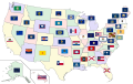 Map of the United States with flags
 -
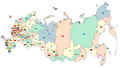
 Map of Russia
 -
 SVG Done

.svg)

- Article(s)
- Flags of the U.S. states and territories
- Flags of the federal subjects of Russia
- Request
- Can you update this? Missippi has a new flag and New York modified its flag last year. Also, can you make the same thing but with Russia with flags of the federal subjects? -- SpinnerLaserzthe2nd (talk) 03:52, 9 March 2021 (UTC)
- Discussion
- @SpinnerLaserzthe2nd: Done --Mrmw (talk) 07:51, 17 March 2021 (UTC)
Request
-
La Settimana Enigmistica logo
- Article(s)
- La Settimana Enigmistica
- Request
- I analized this svg on Corel Draw and I have noticed some strange and useless nodes, that I marked with red circle. Also, the letters S and E are not perfectly hooked... Is there someone that could gently fix this? Many thanks in advance!!! -- Gatto bianco (talk) 11:03, 18 March 2021 (UTC)
- Discussion
- @Gatto bianco: Done --Mrmw (talk) 12:27, 18 March 2021 (UTC)
- Thanks! --Gatto bianco (talk) 14:09, 18 March 2021 (UTC)
Requests on Commons
Two requests related to en.wiki articles are pending on Commons:
Est. 2021 (talk · contribs) 13:11, 18 March 2021 (UTC)
SL Police logo (convert to SVG and Quality)
-
 Old Somaliland Police logo.
 -
 New Somaliland Police Force Logo.
 -
 third draw it if you can.
- Article(s)
- en:Somaliland Police
- Request
- Please, convert the old Somaliland Police logo to SVG and As for the second logo, I found it weak. Help me make the quality high and a third draw it if you can.
- No background. Many Thanks --

- Discussion
Flagge Landkreis Ludwigslust-Parchim
-
 Flag of Ludwigslust-Parchim
 -
 Coat of arms of Ludwigslust-Parchim


- Request
- Can you fix the leaves and align it to the center of the red stripe. Also, aligned the bull's head to the center of the yellow stripe? Thanks -- SpinnerLaserzthe2nd (talk) 20:55, 25 March 2021 (UTC)
- Discussion