
Wikipedia:Graphics Lab/Images to improve/Archive/Oct 2007
 | This page, part of the Graphics Lab Wikiproject, is an archive of requests for October 2007. Please do not edit the contents of this page. You can submit new requests here. |
 Done Amusement park icon
-

-
 I made a start on something, but couldn't get the background right.
 -
 modified OCAL image


Article(s): Various amusement park and roller coaster related articles and template.
Request: I'm looking for for an icon for the amusment park portal and other various templates. Initially, I thought the above image would look good upside-down (maybe with arms) but I'm very open to suggestions - ideally the outline of a roller coaster would be great but I understand that's a bit of a tall order! Seaserpent85Talk 15:25, 16 September 2007 (UTC)
Graphist opinion: I've made a start, but I'm not very good at this, and couldn't quite visualise the twisty tracks that should be visible in the top half of the icon. Or, for that matter, the tracks that should be visible in the gaps.Adam Cuerden talk 12:48, 17 September 2007 (UTC)
- Many thanks for the quick response! I do really like the style of what you've come up with, though I'm not sure it conveys that it's a roller coaster track rather than a train. As I said before I'm not really sure what I'm after, just an icon that you'd associate with being a roller coaster. Do you think the 2 images would look good combined? Seaserpent85Talk 15:48, 18 September 2007 (UTC)
If it's any help, I found an OpenClipart SVG that includes a roller coaster image. > Rugby471 talk ⚔ 17:27, 18 September 2007 (UTC)
- I had a quick go with the image from OCAL, (see Image:Roller_Coaster_Icon.svg but there are some fixes needed. --Dave the Rave (DTR)talk 18:27, 22 September 2007 (UTC)
- ...and I see Rugby made those fixes. Thanks a lot! --Dave the Rave (DTR)talk 19:13, 24 September 2007 (UTC)
- Many thanks for all the replies everyone. I like the look of the second one, however the colours are fairly strange! If the train and passengers could be coloured "realistically" then it would be brilliant! Thanks again, Seaserpent85Talk 18:42, 25 September 2007 (UTC)
- I tried changing the colours, but if I'm honest I think I might have made things worse. --Dave the Rave (DTR)talk 19:06, 26 September 2007 (UTC)
- Thanks for the heads up DTR. I do like the image and appreciate your hard work, the only concern I have is that it doesn't look too good when used as an icon - say 50px. I'm not sure what I'm asking for is actually achievable - ideally something related to the image I put up first. If that's too tall an order then not to worry, I'm grateful for everyones work! Many thanks, Seaserpent85Talk 14:45, 5 October 2007 (UTC)
- I tried changing the colours, but if I'm honest I think I might have made things worse. --Dave the Rave (DTR)talk 19:06, 26 September 2007 (UTC)
- Many thanks for all the replies everyone. I like the look of the second one, however the colours are fairly strange! If the train and passengers could be coloured "realistically" then it would be brilliant! Thanks again, Seaserpent85Talk 18:42, 25 September 2007 (UTC)

- ...and I see Rugby made those fixes. Thanks a lot! --Dave the Rave (DTR)talk 19:13, 24 September 2007 (UTC)
Yeah, I see what you mean. I've made the image smaller and tried to focus more on the train and occupants, so it should look better (although perhaps not perfect) at low res. And if I've been useless sorry about that, I am pretty useless. --Dave the Rave (DTR)talk 15:33, 5 October 2007 (UTC)
I have just added the heads from the Tango theme you specified earlier, is this any better ? (i could also try to do the same, but instead of just one expression, some more from the Tango smilies collection > Rugby471 talk ⚔ 17:00, 5 October 2007 (UTC)
- Definitely an improvement, I like it. However I still think it's a bit too complicated, maybe just have the yellow face with the arms, on the track made by Adam Cuerden (with a small box for the car). Again, apologies for being so picky! Thanks in advance, Seaserpent85 14:44, 7 October 2007 (UTC)
- Like this ? (Sorry if we went a bit off the plot before :-) ) > Rugby471 talk ⚔ 14:19, 14 October 2007 (UTC)
- Yeah, we do that sometimes. --Dave the Rave (DTR)talk 14:25, 14 October 2007 (UTC)
- That's perfect! Thanks very much for all of your hard work both of you, I'll mark this as Done :) Seaserpent85 15:12, 14 October 2007 (UTC)
- That's perfect! Thanks very much for all of your hard work both of you, I'll mark this as
- Yeah, we do that sometimes. --Dave the Rave (DTR)talk 14:25, 14 October 2007 (UTC)
- Like this ? (Sorry if we went a bit off the plot before :-) ) > Rugby471 talk ⚔ 14:19, 14 October 2007 (UTC)
Done Help?:)

The file File:Fdsfsd.jpg has an uncertain copyright status and may be deleted. You can comment on its removal.
Hello I am working on a ethnic wiki and I am writing on race and human body so I wonder if you can draw those breasts separately every each size you see on the picture I posted, very appreciate it and thanks in advance. Nick10000 15:59, 25 September 2007 (UTC)
Graphist's opinion It says, on the image tag, that you're the copyright holder, which makes your request a little strange. Can you clarify where the image came from? Adam Cuerden talk 21:45, 26 September 2007 (UTC)
- It came from myweb.dal.ca thanks again. --Nick10000 10:10, 29 September 2007 (UTC)
- The original image seems to have been deleted, so I'm marking this as "done" due to the request becoming obsolete. --Slashme 06:57, 16 October 2007 (UTC)
- It came from myweb.dal.ca thanks again. --Nick10000 10:10, 29 September 2007 (UTC)
Done Commonwealthery
-
To Help
-
 Attempt
 -
 Royal CoA
 -
 Scottish CoA
 -
 Another one
.svg)


Article(s): Lord Protector and others
Request: While SVG would be ideal, anything would be better then the current image, especially in respect to the gryffin on the right-hand size which is extremely out of place, even when thumbnailed. 68.39.174.238 19:37, 30 September 2007 (UTC)
Opinion: I am not claiming this request, but the COA of the UK incorporates some of the elements of this one. Maybe it will help. > Rugby471 talk ⚔ 16:35, 1 October 2007 (UTC)
- I'd like to hold back too, for the moment, but [1] might be useful. --Dave the Rave (DTR)talk 16:52, 1 October 2007 (UTC)
- I will try this one. Chabacano 00:47, 2 October 2007 (UTC)
- Done. is it ok? Chabacano 00:29, 3 October 2007 (UTC)
- That looks very okay, if you ask me. --Dave the Rave (DTR)talk 17:36, 3 October 2007 (UTC)
- I agree, very nice > Rugby471 talk ⚔ 17:38, 3 October 2007 (UTC)
- That looks very okay, if you ask me. --Dave the Rave (DTR)talk 17:36, 3 October 2007 (UTC)
- Done. is it ok? Chabacano 00:29, 3 October 2007 (UTC)
- I will try this one. Chabacano 00:47, 2 October 2007 (UTC)
- That's an AMAZZING work; if I file a request for you to replace the Royal coat of arms (The 2nd one in the gallery), would you be willing to? That's one of the most visible Crown Copyrighted images that could be replaced with a free SVG... 68.39.174.238 21:42, 4 October 2007 (UTC)
- Thanks! I did this request as well. Doing these was fun :) Chabacano 23:59, 5 October 2007 (UTC)
- Wow, these truly are amazing! By the way, if you'd like to do more, there's always the Scottish one too, plus of course a whole bunch of variations listed on Royal coat of arms of the United Kingdom and related articles... —Ilmari Karonen (talk) 13:35, 7 October 2007 (UTC)
- Scottish done :) I think that I am going to stop doing variations of this CoA for some time, too much lions and unicorns. Chabacano 07:55, 8 October 2007 (UTC)
- Wow, thanks, that was fast! Anyway, I'd just like to note that it seems you forgot to change the quartering... —Ilmari Karonen (talk) 17:57, 8 October 2007 (UTC)
- Quartering ? > Rugby471 talk ⚔ 18:44, 8 October 2007 (UTC)
- Ooops. Fixed. He meant the four quarters of the smaller CoA in the center of the big thing. I forgot that. Chabacano 19:34, 8 October 2007 (UTC)
- You deserve a barnstart for that. Also, if you feel like more (later obviously, I read your comment above) you can try the Canadian ones. Nunavut has a caribou and narwhal ;) 68.39.174.238 21:56, 8 October 2007 (UTC)
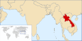
Done Flag of Thailand

Article(s): Flag of Thailand, Thailand, etc.
Request: The current flag colours don't represent the Thai flag properly (See Talk:Thailand#Flag - color is poor and Commons:Image talk:Flag of Thailand.svg). There are no official specifications for colours of the Thai flag other than red white and dark blue, but altering the flag colours to those of Image:Flag of the United Kingdom.svg should be close enough. Also, reducing the default size to something not so overwhelming when viewed in Firefox with 1024*768 resolution would be nice. -- Paul_012 (talk) 13:23, 3 October 2007 (UTC)
Graphist opinion: I've uploaded it separately so it won't get reverted immediately. How's this ? > Rugby471 talk ⚔ 15:55, 3 October 2007 (UTC)
- That's great, though upon further inspection I feel the red could still be brighter (thinking along the lines of this page). My monitor's calibration is too bad to judge precisely though. Paul_012 (talk) 19:58, 4 October 2007 (UTC)
- I made it brighter, how's this ? > Rugby471 talk ⚔ 07:35, 5 October 2007 (UTC)
- Yes, I think we can upload this version over the old name. Thanks a lot! Paul_012 (talk) 17:26, 5 October 2007 (UTC)
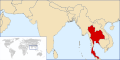
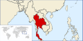
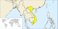
Done Thailand locator map
-
 Current locator map for Thailand
 -
 Correct Location ?
 -
 Thailand
 -
 Cambodia
 -
 Burma
Burma -
 Laos
Laos -
 Vietnam
 -
 Better?


Article(s): Thailand
Request: Thailand is usually geographically and politically grouped within the Southeast Asia subregion, therefore I believe a locator map featuring Thailand's location within Southeast Asia would be more suitable and familiar. Also, the current map was taken from a map of the entire Earth, and though the country's tropical location lessens the effect, quite obvious skewing due to the map centre being far to the west is plainly visible. (A map based on a regional projection would be favorable, but this may be difficult to achieve given the current blank maps available on Commons.) The same would also apply for maps of Laos, Burma (Myanmar), Cambodia and Vietnam -- Paul_012 (talk) 14:31, 3 October 2007 (UTC)
Graphist opinion: Is this the location you were more looking for ? > Rugby471 talk ⚔ 14:10, 4 October 2007 (UTC)
- Agree with nom, rugby's perspective looks good, also, useful for countries like Burma, Laos, Vietnam, Cambodia which all use the same perspective, but are geographically within southeast Asia. aliasd·U·T 14:36, 4 October 2007 (UTC)
- I can pick this one up over the weekend if nobody attacks it sooner. aliasd·U·T 14:49, 4 October 2007 (UTC)
- Yes, that projection is very okay indeed. Paul_012 (talk) 20:04, 4 October 2007 (UTC)
- Finished it, but it seems fit page to selection doesn't work after my last inkscape upgrade... weird! aliasd·U·T 12:03, 6 October 2007 (UTC)
- Yes, that projection is very okay indeed. Paul_012 (talk) 20:04, 4 October 2007 (UTC)
- I can pick this one up over the weekend if nobody attacks it sooner. aliasd·U·T 14:49, 4 October 2007 (UTC)
- Just set the page size, manually. > Rugby471 talk ⚔ 12:23, 6 October 2007 (UTC)
- Stupid me didn't realise there was a manditory doc size :( redoing aliasd·U·T 13:42, 6 October 2007 (UTC)
- Is this good, or would we be better off "zooming out"? aliasd·U·T 04:39, 7 October 2007 (UTC)
- Well, I would have preferred maps based on the second image by Rugby471 (less distortion) but those are improvements anyway. Burma/Myanmar is cropped off at the top, and Thailand's south is almost touching the edge, so I'd suggest zooming out a bit if we're going to use these ones. (Or making individual crops for each, but that would be excessive work.) Paul_012 (talk) 09:21, 7 October 2007 (UTC)
- I did attempt to create some based on Rugby's projection, look at the revision history of any of my images, but they have to be 2:1 to work with the country infobox sadly :( aliasd·U·T 14:42, 7 October 2007 (UTC)
- How about this? aliasd·U·T 15:05, 7 October 2007 (UTC)
- Sorry, I've been away; that looks fine to me, anyway. Paul_012 (talk) 11:58, 14 October 2007 (UTC)
Done Papua New Guinea Coat of Arms
Article(s): Papua New Guinea (see article for blotchy gif resizing goodness) and many others on numerous projects
Request: This is a horribly small and low quality gif image that doesn't resize well. I have attempted a svgify of this a couple times, but feel I probably can't make a derivative work of it due to licencing, and I have found recreating difficult. aliasd·U·T 14:46, 4 October 2007 (UTC)
- Comment: Vector-images.com pics have been here before, and I think that you're in the clear as far as licensing is concerned as long as you base work on a raster preview image, like this one. See Wikipedia:Graphic_Lab/Images_to_improve/Archive/Aug_2007#Coat_of_arms_of_Laos in the archives.
Graphist opinion: I've reuploaded the image in PNG form. Does using that image solve the resizing problems? CountingPine 01:15, 5 October 2007 (UTC)
- It does, but would still be nice to see this as a vector. aliasd·U·T 03:45, 5 October 2007 (UTC)
I'm 3/4 through the SVG, bear with me ... > Rugby471 talk ⚔ 15:23, 5 October 2007 (UTC)
- I'm done ! The only thing I need to do now is the extra detail (the feathers). But so far, is this okay ? > Rugby471 talk ⚔ 16:16, 5 October 2007 (UTC)
- ... and the text... --Dave the Rave (DTR)talk 16:33, 5 October 2007 (UTC)
- Oh. Is that actually part of the COA ? I thought it had been added as decoration while on vector-images.com > Rugby471 talk ⚔ 16:48, 5 October 2007 (UTC)
- Oh, I see what you mean. Yeah, I think you're right. It's not on here. --Dave the Rave (DTR)talk 16:55, 5 October 2007 (UTC)
- Oh. Is that actually part of the COA ? I thought it had been added as decoration while on vector-images.com > Rugby471 talk ⚔ 16:48, 5 October 2007 (UTC)
I went ahead an put in the feathers anyway. How is it ? > Rugby471 talk ⚔ 18:49, 5 October 2007 (UTC)
- Awesome work! This one is done! aliasd·U·T 02:17, 6 October 2007 (UTC)
- I wish I had thought of the banknotes when I was trying to reconstruct :( aliasd·U·T 02:22, 6 October 2007 (UTC)
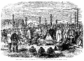
Done Stitching
- Image:1863 Meeting of Settlers and Maoris at Hawke's Bay, New Zealand - Left.png
- and Image:Waikato - 002a.PNG
-
-
by Ilmari Karonen

Yeah, I messed up that title.
Request: Anyway, can you stitch it together and fix the tilt? I'd like to have a copy of the full-sized stitch, if possible, but it'll probably have to be converted to jpg or shrunk in order to show anywhere on Wikipedia. Adam Cuerden talk 04:29, 5 October 2007 (UTC)
Graphist opinion: How's this ? > Rugby471 talk ⚔ 14:11, 5 October 2007 (UTC)
- There's an awful lot of Moiré in the sky. Now, I know the sky wasn't that good even in the original printing (one of the reasons I wanted a full-sized version was to try and fix the sky), but it seems a little excessive. Adam Cuerden talk 19:19, 5 October 2007 (UTC)
- Here's my take, how's that? I stitched it at the maximum size supported by Wikipedia, since I didn't notice you asked for full size, but I can easily redo it at a larger size (hugin suggests 8353×5986) if you want. By the way, I'm not sure if you've noticed already, but there's some pretty obvious blurring along a horizontal line near the top right of the left image. Looks like another paper slip or scanner error to me, fortunately it didn't affect the stitching much. —Ilmari Karonen (talk) 22:37, 5 October 2007 (UTC)
- I think I've figured out what those are, by the way: The top part of the scasnner isn't pushign the paper flat enough. I've been putting a book atop the paper. But the sky on these was already pretty bad, due to printing errors in this copy, so I'll just fix that when I fix the sky. E-mail me the big one? I'll send you a e-mail. Adam Cuerden talk 02:31, 6 October 2007 (UTC)
- Nah, I just uploaded it as Image:1863_Meeting_of_Settlers_and_Maoris_at_Hawke's_Bay,_New_Zealand large.png. —Ilmari Karonen (talk) 03:21, 6 October 2007 (UTC)
- I think I've figured out what those are, by the way: The top part of the scasnner isn't pushign the paper flat enough. I've been putting a book atop the paper. But the sky on these was already pretty bad, due to printing errors in this copy, so I'll just fix that when I fix the sky. E-mail me the big one? I'll send you a e-mail. Adam Cuerden talk 02:31, 6 October 2007 (UTC)
- Here's my take, how's that? I stitched it at the maximum size supported by Wikipedia, since I didn't notice you asked for full size, but I can easily redo it at a larger size (hugin suggests 8353×5986) if you want. By the way, I'm not sure if you've noticed already, but there's some pretty obvious blurring along a horizontal line near the top right of the left image. Looks like another paper slip or scanner error to me, fortunately it didn't affect the stitching much. —Ilmari Karonen (talk) 22:37, 5 October 2007 (UTC)
- Oh, sorry, I didn't see you wanted a full size version. I'll leave to Ilmari though, he's more experienced with Hugin than I am > Rugby471 talk ⚔ 07:02, 6 October 2007 (UTC)
- Sorry! I forgot to thank you and mark this as done - I've been quietly editing the image in the background. It's nearly done now, but... well, never mind. Thanks a lot! Adam Cuerden talk 16:16, 13 October 2007 (UTC)
Done SVG of Plimsoll line


Articels: Plimsoll line and others.
Request: SVGification 68.39.174.238 20:06, 12 October 2007 (UTC)
Opinion: Done, how's this > Rugby471 talk ⚔ 08:06, 13 October 2007 (UTC)
- Looks fine. 68.39.174.238 13:33, 13 October 2007 (UTC)
Done Crop out the Logo of Deutsches Jagd- und Fischereimuseum
-
 Okay?
Okay?
Article(s):
Request: Please crop it out towards a round image-- Scriberius 21:52, 12 October 2007 (UTC)
Graphist opinion: Done, how's this? > Rugby471 talk ⚔ 07:22, 13 October 2007 (UTC)
- Looks good - thanks! --Scriberius 16:46, 13 October 2007 (UTC)
Done Perspective correction, possibly a trim
-
 Somewhat distorted; distracting background from the rest of the book.
 -
 An attempt at correcting the distortion (GIMP, "curve bend" filter); crop.


Article(s):
Request: Unless you think that this presentation adds something significant, could you do a perspective correction and extract just the actual article? Thanks! Adam Cuerden talk 16:20, 13 October 2007 (UTC)
Graphist's opinion:
- Someone else will have to do this one; I don't think I can persuade hugin to do anything useful to the distortion on the right, nor do I have any other software that could fix it. —Ilmari Karonen (talk) 05:32, 15 October 2007 (UTC)
- I'll give it a bash. --Slashme 05:37, 15 October 2007 (UTC)
- OK, I gave it my best shot. Not perfect, but better.--Slashme 07:47, 15 October 2007 (UTC)
- Not bad! Nice work! Adam Cuerden talk 12:43, 16 October 2007 (UTC)
- Thanks! --Slashme 13:02, 16 October 2007 (UTC)
Done Image:Three Gorges Dam.jpg
-
 Colours the same now

Article(s): Three_Gorges_Dam
Request: Hello Wikigraphists ! I came to the Three Gorges Dam article after seeing the current main page's news about the ongoing ecological disaster in this area. I then found this image, which may be more valuable if the both component images (1987 & 2007 images) had the same happy colors. So, the request is to :
- improve the colors of this images, especially the 1987's one, and...
- to harmonized the both photo colors.
Many thanks to you ! -- Lyhana8 17:57, 14 October 2007 (UTC)
Graphist opinion:
I could try to improve the images, but i wouldn't know how to give them a similar colouring 'scheme', perhaps using palettes or something ? Is what I said before I worked out how to do it, I created an image with two layers, on the top the greenish image, the bottom, the purple-ish image. I set the top layer to 'Color' in the layers dialog and lowered the opacity a bit. (all done in GIMP). If anyone wants to improve the colours from here be my guest, at least now both images are at a common starting point. How is it ? > Rugby471 talk ⚔ 18:55, 14 October 2007 (UTC)
- I've reuploaded a version with slightly fewer color artifacts. What I did was take the difference of the two images and apply, after levels changes, as a layer mask for the recoloring. That way, areas with large changes in intensity didn't get (incorrectly) recolored. I also resynthesized away the scale marked in the corner of the upper image first. —Ilmari Karonen (talk) 05:28, 15 October 2007 (UTC)
- Both versions have some problems, though. In particular, the recoloring method emphasizes the parts of the rivers in the 1987 version that are under the dam lake in the 2007 version, which in some ways affects the factual accuracy of the image. It might be preferable to try to match the colors using only global adjustments instead. In the end, I'm not sure how closely that can be done without introducing serious distortion: the fact remains that one of the photos was taken in April and the other in November, so one can't really expect the colors of the vegetation to match. —Ilmari Karonen (talk) 09:32, 15 October 2007 (UTC)
- Many thanks to both of you for your time and work ! That's better. The bottom one is still more "white" than the top one, but that can be because os real-world seasons (one picture take in april, the other in september). So thanks work the work done. -- Lyhana8 17:24, 15 October 2007 (UTC) —Preceding unsigned comment added by 210.203.52.130 (talk)
Done Image:DykeMarchToronto.jpg
-
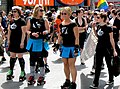 Cropped out advertisements and bystander, improved contrast.

Article(s): Dyke March
Request: -- Hi, please crop image from top down midway through the business advert signs (like right below the "zz"'s in the words pizza pizz) this will obscure the phone number and signs a bit. also crop from the left side eliminating th person with their back to the veiwer and the additional business sign. Then could the whole picture quality be amped a bit to provide some definition and contrast? This is, as of yet, the only phtot for the article that was just added today so I'd love for it to have improved quality. Thank you!!! Benjiboi 22:02, 14 October 2007 (UTC)
Graphist opinion:
- Is this what you had in mind? I prefer the composition without cropping (mostly because the whole gay flag is still included, and the subjects are not staring at the edge of the photo), but the blur is a bit distracting, I guess. --Slashme 08:18, 15 October 2007 (UTC)
- The second one is exactly what I was hoping for! The blurs are a bit odd but so was the giant phone number. Thank you so much! Benjiboi 08:24, 15 October 2007 (UTC)
- Glad you like it! --Slashme 08:36, 15 October 2007 (UTC)
Done Image:Gw_donkeykong.PNG
Article(s): Todays featured article Donkey Kong
Request: Quickly clean up this image's background, this ugly image being in the main page today !!! -- Lyhana817:21, 15 October 2007 (UTC)
Graphist opinion:
This Good ? > Rugby471 talk ⚔ 18:19, 15 October 2007 (UTC)
Couldn't was protected oh well. Maybe an admin can ? > Rugby471 talk ⚔ 19:01, 15 October 2007 (UTC)
- Done.Geni 20:29, 15 October 2007 (UTC)
- Congratulation ! This clean up was visible 3 hours and 31 minutes on the main pages, and many readers have probably notice the change ;). Such visible actions are especially welcome !
- But I'm a bit worry : How many wikigraphists are also admin on commons ?? We need 3 at least... Yug 05:29, 16 October 2007 (UTC)
Done SVG + GIF(!) = SVG
-
 SVG to work from (?)
 -
 To convert from
 -
 How's this?
 -
 Though this might be too complex for our purposes.


Articles: Slave state and Free state (USA)
Request: Could someone take the currently detailed breakdown of states in the war and create a simplified version of it based on the GIF so we can replace the GIF with an SVG? Basically all that's needed are the slave states (Confederate + Border), free states (Union), and territories. 68.39.174.238 01:54, 27 September 2007 (UTC)
Opinion: How's this? Adam Cuerden talk 22:59, 27 September 2007 (UTC)
- Could you re-add the border states? I'm thinking of a caption along the lines of "Blue = free, red = slave. The four [color] states were slave states but did not join the Confederacy in the war. Kansas (teal) was admitted as a free state just prior to the war and following the pitched battle known as Bleeding Kansas", or words to that effect (Obviously not as terse). 68.39.174.238 13:22, 28 September 2007 (UTC)
- I've done it, but the text won't show? Also, technically, I guess Virginia and West Virginia should be one state... Adam Cuerden talk 16:12, 28 September 2007 (UTC)
- That's mediaWiki. Try Text/Convert to Text, or Path/Convert to Path in Inkscape. --Dave the Rave (DTR)talk 16:43, 28 September 2007 (UTC)
- Right. Just to check, though: Should Nevada be one of the states? Adam Cuerden talk 17:51, 28 September 2007 (UTC)
- That's mediaWiki. Try Text/Convert to Text, or Path/Convert to Path in Inkscape. --Dave the Rave (DTR)talk 16:43, 28 September 2007 (UTC)
- I've done it, but the text won't show? Also, technically, I guess Virginia and West Virginia should be one state... Adam Cuerden talk 16:12, 28 September 2007 (UTC)
- Since this is pre-Civil War stuff, I'm taking the listed start date of the war as the cutoff here. So: Nevada was a territory and so has no distinction from the rest. West Virginia is a quandary, since it was part of Virginia but a very unwilling one once the war broke out. Here's a thought: Merge the two Virginias and change the border states back to red, then the caption can just explain why Kansas was so strange and link to Border states, which would then explain the divisions as they ended up during the war. 68.39.174.238 15:18, 29 September 2007 (UTC)
What still needs to be done here? --Slashme 06:58, 16 October 2007 (UTC)
- Rectify the ill-displaying color legend in Image:Slave and Free States before the American Civil War 2.svg? 68.39.174.238 03:02, 18 October 2007 (UTC)
- Like DTR said, it's because Media Wiki doesn't support flowed text (text that provides a bit more formatting) therefore you have to convert it to path, or the more size efficient one, convert it to normal text. I have done so and so unless anything else needs to be done, this case is closed. :-) > Rugby471 talk ⚔ 18:32, 18 October 2007 (UTC)
- Anything's better then a GIF, so OK. 68.39.174.238 15:47, 19 October 2007 (UTC)
Done Reflections from a painting
-
 1st map
 -
 SVG version. Picked colours out with GIMP, cleaned up, traced each section individually in inkscape.
 -
 2nd map
 -
 Cleaned up with the GIMP, then traced with Inkscape, then removed redundant paths.


Article(s): Several articles, Check usage. For example: History of ancient Israel and Judah
Request: -- Conversion to SVG. 213.186.238.211 18:28, 2 October 2007 (UTC)
Graphist opinion: I can pick this one up over the weekend if nobody attacks it sooner. aliasd·U·T 14:50, 4 October 2007 (UTC)
- I'm working on the second map. --Slashme 08:26, 16 October 2007 (UTC)
- OK, done second map. --Slashme 10:47, 16 October 2007 (UTC)
- OK, now I'll do the first map. --Slashme 10:52, 16 October 2007 (UTC)
Done the outline and the red dots for the cities. Still needs text and scale indicator. Someone else can take over now. --Slashme 12:09, 16 October 2007 (UTC)
- IMHO, other (smoother) colors would be better. --QWerk.fi 14:22, 16 October 2007 (UTC)
Probably true, but I was just copying the maps to SVG. Re-colouring is quick and easy in SVG, so if you want to change the colours around, go ahead. --Slashme 14:42, 16 October 2007 (UTC)
I'm going to put the text on the first map now. --Slashme 14:54, 16 October 2007 (UTC)
- Done. --Slashme 15:24, 16 October 2007 (UTC)
Done Clean up SVG
-
 Redone
Articles: AT Attachment
Request: Check the numbers, they look very fuzzy and pixelated when zoomed in; very unSVGlike. 68.39.174.238 17:39, 14 October 2007 (UTC)
Opinion: I suspect another automatic tracing, i've redone it. Looking Good ? > Rugby471 talk ⚔ 18:28, 14 October 2007 (UTC)
Done Various state quarters
-
 Utah
Utah
(convert to png and transparency)

-
 Utah
Utah
Transparent

Article(s): 50 State Quarters
Request: Is it possible to improve these images to be as per the other quarter images on the article? Regards - Ανέκδοτο 03:47, 16 October 2007 (UTC)
Graphist opinion:
:No problem, I'm on it. --Slashme 06:51, 16 October 2007 (UTC)
- Sorry, no, I didn't realise how big the files were. My company monitors internet traffic volume, and I'm already a bit high for the month... --Slashme 06:55, 16 October 2007 (UTC)
- Done, everything okay ? > Rugby471 talk ⚔ 16:44, 16 October 2007 (UTC)
- Pity JNG doesn't have more support, these would be ideal candidates. But, to lessen the PNG file sizes a bit, I've converted them to greyscale - since there wasn't any significant colour information - and optimised the results with PNGOUT. CountingPine 17:49, 20 October 2007 (UTC)
Done Harvey Milk Plaza inscription
Article(s): Harvey Milk
Request: Hi, is it possible to improve image quality, remove graffiti, trim some excess framing and boost contrast so quote and entire image is more readable? - Benjiboi 23:28, 18 October 2007 (UTC)
Graphist opinion:
- That's a pretty low-quality image. It almost looks as if it had been converted to GIF format and back. Assuming you took this with a digital camera, is there any chance you could provide us with the original image file straight from the camera? —Ilmari Karonen (talk) 08:08, 19 October 2007 (UTC)
- Hehe, I just recently moaned on benjiboi's talk page about a 1MB photo direct from a digital camera which he had uploaded, saying that a bit of JPEG compression would reduce the size to 250KB with no reduction in image quality. But yes, this image is low quality, and a better picture would give a better chance of success. --Slashme 09:07, 19 October 2007 (UTC)
- I had a go at it, how is it ? > Rugby471 talk ⚔ 18:48, 19 October 2007 (UTC)
- Actually I didn't take either of those images in question (small slap on wrist) but simply trying to improve images others have shared as they do help the articles. And yes, the image is much better, readable and all that, thank you! Benjiboi 23:26, 19 October 2007 (UTC)
- Oh, right, sorry. I didn't notice you weren't the uploader. I've left a note on Baranxtu's talk page. —Ilmari Karonen (talk) 06:54, 20 October 2007 (UTC)
- Unfortunately, neither my then nor my current equipment ("traditional" and also cheap camera and, uh, not-so-good scanner) allow me to put up a higher quality version of this picture. I could try and see if I can find the original photo to provide an unresized version for editing, though; resizing it back then did not do any good for it, I agree. Baranxtu 07:21, 23 October 2007 (UTC)
- Also Slashme I'm glad you did mention that's what you were referring to as I totally didn't understand it then but now get it a bit more. I don't as of yet have a digital camera but work with images from others on a regular basis in various capacities so appreciate that insight. Benjiboi 23:28, 19 October 2007 (UTC)
Done World Scout Committee
-
 something akin to this
 -
but with the depth of _this_ purple, used in WOSM and World Crest
-
Ilmari's purple version, now we just need svg, please help

Article(s): World Scout Committee
Request: For the image, it should really be in the proportions of the sepia badge, but with the coloration scheme of the purple one. -- Chris 01:22, 19 October 2007 (UTC)
Graphist opinion:
- You mean something like this one here? —Ilmari Karonen (talk) 08:01, 19 October 2007 (UTC)
- That's the modern one and doesn't have the geographic information around it, but the color scheme is right, white fleur-de-lis on purple. Chris 03:51, 20 October 2007 (UTC)
- Okay, how about this? I took the red channel from the sepia version, adjusted levels slightly to clean up the background and recolored it to white on purple like in the modern one. If that's what you want, feel free to upload it. (I've left it off-wiki so that you get to deal with all the fun and wacky issues that come with uploading non-free images.) —Ilmari Karonen (talk) 06:42, 20 October 2007 (UTC)
- That's the modern one and doesn't have the geographic information around it, but the color scheme is right, white fleur-de-lis on purple. Chris 03:51, 20 October 2007 (UTC)
- That is it, except can it be made round without the square purple background, and can it be made svg so scalable? It's great, thank you for your hard work! Chris 12:33, 20 October 2007 (UTC)
- I've made the outside transparent, is that how you wanted it? Making an SVG out of that file would take some work, mainly due to the low resolution, and I'm not really convinced it's worth it. Maybe someone else may want to do it. —Ilmari Karonen (talk) 13:28, 20 October 2007 (UTC)
- Thanks, Ilmari, you've got it! Would someone else please convert this to scalable svg? I will be happy to deal with all the fun and wacky issues that come with uploading non-free images. :) It will, by the way, fall under the same copyright rules as the original lavender version. Chris 18:10, 20 October 2007 (UTC)
- I've made the outside transparent, is that how you wanted it? Making an SVG out of that file would take some work, mainly due to the low resolution, and I'm not really convinced it's worth it. Maybe someone else may want to do it. —Ilmari Karonen (talk) 13:28, 20 October 2007 (UTC)
- I cannot get it to upload. If you will upload it, I will source and credit it properly. Thanks! Chris 18:14, 20 October 2007 (UTC)
- Got it, now just need svg. Chris 22:30, 20 October 2007 (UTC)
- I created an svg from the first Image:Worldcrest1957.jpg, I can do Image:Worldcrest1957purple.png as well, since the real hard part is the text in the circle. I won't take too much time. -- Kaboom88 00:44, 21 October 2007 (UTC)
- Text on Image:World Crest 1957 purple.svg was much easier because I had correct font loaded already. Keep which ever file you want. -- Kaboom88 02:32, 21 October 2007 (UTC)
- I created an svg from the first Image:Worldcrest1957.jpg, I can do Image:Worldcrest1957purple.png as well, since the real hard part is the text in the circle. I won't take too much time. -- Kaboom88 00:44, 21 October 2007 (UTC)
- Perfect, the last one is it, thank you so much, this one is complete! That was easy! Chris 03:48, 21 October 2007 (UTC)
Done Pakistan Coat of Arms
-
 Start
Start -
text at the bottom

Article(s): Too many to list here.
Request: Convert this image to SVG format. -- Jerry 19:36, 7 October 2007 (UTC)
Graphist opinion: I'll have a go, in the mean time, could you try and find out the text at the bottom f the emblem. Cheers > Rugby471 talk ⚔ 16:01, 8 October 2007 (UTC)
- Just realised I am quite busy at the moment, but I have started it off for anyone who wishes to take it up. Sorry > Rugby471 talk ⚔ 16:20, 8 October 2007 (UTC)
- The scroll at the bottom contains the national motto in Urdu, coined by Muhammad Ali Jinnah, which reads from right to left: (Urdu: ایمان ، اتحاد ، نظم ) Iman, Ittehad, Nazm translated as "Faith, Unity, Discipline". Jerry 01:36, 9 October 2007 (UTC)
Put the text on, but waiting for someone else to take this up > Rugby471 talk ⚔ 16:43, 9 October 2007 (UTC)
I'll leave it up to User:Shandris then, who seems to have been editing without us knowing ! :-) > Rugby471 talk ⚔ 11:39, 13 October 2007 (UTC)
- You just had weird colors and your's was badly traced. You can continue on mine if you like...I cba... --Shandristhe azylean 22:10, 16 October 2007 (UTC)
- Great progress! JERRY talk contribs 23:25, 20 October 2007 (UTC)
- I think "I cba" is uk-speak ("I can't be arsed"), meaning that he will not be finishing it. JERRY talk contribs 23:30, 20 October 2007 (UTC)
- Great progress! JERRY talk contribs 23:25, 20 October 2007 (UTC)
Somebody PLEASE PLEASE PLEASE finish it. It is so close to being done and is looking so good! JERRY talk contribs 03:29, 25 October 2007 (UTC)
I updated a little further. -- Kaboom88 12:37, 25 October 2007 (UTC)
- I've just added the wreath, added a stroke to part of the bottom part of the emblem, added fill to the ends of the bottom part. However the wreath may need to be cleaned up a bit because parts of it are auto-tracing. > Rugby471 talk ⚔ 11:52, 26 October 2007 (UTC)
I'll take a look at doing the sheaf and cleaning up the wreath a bit. --Slashme 12:22, 26 October 2007 (UTC)
- Well, I ended up re-doing the calligraphy to match the style on the coat of arms better, and the best I could do with the sheaf was an auto-trace. If someone here can do better, feel free! As for the wreath, I just went around executing nodes at random, but didn't find a way to improve it radically. --Slashme 15:13, 26 October 2007 (UTC)
- I think it is perfect! Thanks, guys! JERRY talk contribs 01:40, 27 October 2007 (UTC)
- I just redid the hay by enlarging in GIMP, then sharpening, then tracing by using brightness cutoff, and filling with green ! > Rugby471 talk ⚔ 08:20, 27 October 2007 (UTC)
- Very nifty! I'll try that trick in future when I need to do something like this. --Slashme 12:19, 28 October 2007 (UTC)
Thanks again everyone. I just substituted all instances of the old image, and updated the image decription page with the deprecated image redirect template. There is still one article listed as using the old file, but I just can't figure out why. I have purged both the Article, the template the image was transcluded from, but it is still there. Oh, well, the other 100+ are substituted. If any of you can see what I missed, please leave me a note on my talk page. Thanks, JERRY talk contribs 17:17, 27 October 2007 (UTC)
Free SVGs for a Free Territory!


Articles: Free Territory of Trieste
Request: SVGify both (Should be pretty easy) 68.39.174.238 23:14, 22 October 2007 (UTC)
Opinion: OK, I'll take these. --Slashme 13:55, 24 October 2007 (UTC)
- Not as easy as I thought. This is my best shot. --Slashme 15:48, 24 October 2007 (UTC)
- I tried changing the images to use embedded bitmaps, since the traced versions weren't scaling down very nicely, but it doesn't seem to have been much of an improvement. I think the motif would really need to be redrawn by hand. —Ilmari Karonen (talk) 20:12, 24 October 2007 (UTC)
- If we're going to re-draw, we really should get an authentic copy to work from. For example, I'm not sure how much of the roughness of the shading on the motif is necessary.--Slashme 06:51, 25 October 2007 (UTC)
- Not as easy as I thought. This is my best shot. --Slashme 15:48, 24 October 2007 (UTC)
- According to FotW, it doesn't have to be anything beyond a shape! 68.39.174.238 19:19, 26 October 2007 (UTC)
- I'll have a quick go at a manual trace. --Dave the Rave (DTR)talk 20:44, 26 October 2007 (UTC)
- Okay, I did a version with the emblem on the shield. Any good?. Also, I had a problem getting the right 'fork' to blend into the middle bit, Could someone else help? --Dave the Rave (DTR)talk 21:19, 26 October 2007 (UTC)
If you meant the section of arc that is showing through, I sorted that. As for the colour change, I don't know whether that's an issue. Nice drawing, BTW. (or are my standards just low? I liked the battleship blur as well 8-P )--Slashme 09:45, 27 October 2007 (UTC)
- I just noticed that where the right arc met the main pole there was the 'light colour' instead of the 'dark colour'. I tried to find a way to add this in, but it was awkward (esp. without blur). And the battle ship 'blur' was me being lazy :-). --Dave the Rave (DTR)talk 10:09, 27 October 2007 (UTC)
Looks nice... if noone has any future changes they want to make, I'll mark the PNGs as superseded. 68.39.174.238 02:59, 28 October 2007 (UTC)
Unfortunately, this flag is wrong :) I'm from Trieste, and it's time to update it to the correct version. it actually has WRONG colours! This is the actual flag waving in Trieste http://www.flickr.com/photos/alexsap/5848265439/ and you can clearly see the symbol in it is WHITE. I have created years ago the 100% correct SVG version, and I can upload it anytime. How can it be updated, then? (I'm fairly new to wikipedia)
I also SVGed the coat of arms (this one is unfortunately wrong, too!), which is this one http://www.languagesmeetsport.eu/images/common/logo_comune_ts.jpg confirmed at the bottom of the pace of the city council here http://www.retecivica.trieste.it and I'm willing to give this to wikipedia, too; I just don't know how to update the existing files.
Aarska (talk) 11:54, 25 January 2013 (UTC)
Done India old Scout emblem
-
age has stretched and distorted the original design
-
 map, colored correct shade and essential perspective

Article(s): The Bharat Scouts and Guides
Request: correct for perspective (as Ilmari Karonen did with the Argentine flags, using http://hugin.sourceforge.net/tutorials/perspective/en.shtml or somehow) and lighten coloration. It's close, but not exactly right. Even if it needs to be made from a photo into a graphic. -- Chris 07:29, 26 October 2007 (UTC)
Graphist opinion: It looks like I'm the official "can't do guy" today, but this one is harder to correct for perspective than a flag, as it is unclear what the correct perspective would be. Do you have even a poor-quality image with the correct perspective to compare it with? If not, maybe you could make a sketch indicating what the correct perspective would be? --Slashme 09:57, 26 October 2007 (UTC)
- I also tried it with hugin, but couldn't get it to correct it, so I went to GIMP and did it manually, I also corrected the lighting, but to be honest, the lighting wasn't that bad to begin with so it didn't make so much of a difference. > Rugby471 talk ⚔ 12:45, 26 October 2007 (UTC)
- Sorry I got so eager I started on an SVG, though it is pretty rough. I do need however need the phrase at the bottom as I can't quite make it out. Please do state any changes you wish to be made. > Rugby471 talk ⚔ 13:37, 26 October 2007 (UTC)
Well done on the perspective. The text to my untrained eye seems to say "Boy scouts India". --Slashme 15:19, 26 October 2007 (UTC)
Good? > Rugby471 talk ⚔ 18:05, 26 October 2007 (UTC)
- That is _great_, Rugby, (both the perspective one and the svg) and both faithful to the original badge and to the geography itself. I goofed around with a subcontinent map, there are very few differences, you may or may not want to tweak the India shape. The text is actually ALL CAPS, and does indeed read BOY SCOUTS INDIA. The stars on the fleur-de-lis are actually hollow, and could be either khaki-tan like the base cloth, or gold like the scroll, I have seen both. Thanks, this is beautiful!
- ps-once there, the green should be deeper and the red a bit more primary. Thanks again! Chris 02:48, 27 October 2007 (UTC)
- I uploaded over Rugby's, because of the non free thing(feel free to revert), the text got lost but I tweaked it so it will be easy for him to finish up if he likes my version. Think of this as a hit and run improvement. Cheers—Cronholm144 05:05, 27 October 2007 (UTC)
- PS I just realized that I gave it the wrong shade of green... o_0 Cronholm144 05:07, 27 October 2007 (UTC)
Changed colours and the text wouldn't display because it was a text on a path, mediawiki doesn't support that (among other things..) and so you have to convert it to path. Anything else ? > Rugby471 talk ⚔ 07:24, 27 October 2007 (UTC)
- Oops forgot to switch to path... like I said, this is a drive by, so I leave the rest to you. ;)—Cronholm144 08:26, 27 October 2007 (UTC)
- Oww !!
 ° °
° °  <---- Drive-by
- Oww !!

> Rugby471 talk ⚔ 08:37, 27 October 2007 (UTC)
- Gentlemen (Cronholm thank you also for your drivebys, you two are anchors!)
- Can the emblem be moved sukoshi up on the map image? It seems like more of the bottom peninsula sticks out at the bottom. I would estimate it needs moved only about the height of one of the stars on the badge, so the whole is a little more centered top-to-bottom on the map.
*Can you dial back the green two shades lighter? It should be about the depth of the donation thermometer presently displayed at the top of all pages for the fund-drive.
*Can you replace the text BOY SCOUTS INDIA, or does that really need to wait until the end?
- There's a little blip that looks like an island on the west side. It's not really there. My map was crude. Can it be removed?
- Thanks again for all your hard work! Chris 22:27, 27 October 2007 (UTC)
- Done ! > Rugby471 talk ⚔ 07:36, 28 October 2007 (UTC)
- Beautiful, you guys, thank you! A round of Photoshop for everyone, on me! :) Chris 11:33, 28 October 2007 (UTC)
- Done ! > Rugby471 talk ⚔ 07:36, 28 October 2007 (UTC)
(this is used in two articles, one I'm using the graphic, the other the actual badge, both improved here) Chris 12:01, 28 October 2007 (UTC)
- Oh sorry! :-) > Rugby471 talk ⚔ 13:59, 28 October 2007 (UTC)
London Midland maps
-
 SVG
SVG -
 SVG
SVG -
Total routes (pdf file)


Article(s): London Midland
Request: Hi, there are two replaceable copyrighted maps being used on the article London Midland: these are Image:Pic birmingham.gif and Image:Pic express.gif. Would it be possible for someone to create replacements? --RFBailey 14:11, 26 October 2007 (UTC)
- There is also the pdf map of the whole london Midland network. Could this also be improved. It is not yet being used in an article. Thanks, Dewarw 16:56, 26 October 2007 (UTC)
Info They are rail network maps, so the names along the lines are station names. Could you indicate with a - where the stops are. Thanks, Dewarw 19:17, 26 October 2007 (UTC)
Graphist Opinion: I've done the two green & black maps. Any prefered colours/ changes? > Rugby471 talk ⚔ 11:13, 27 October 2007 (UTC)
Thanks, you have done a great job! Could you add dashes where the stations are? This would clarify the map. And then the same again for the pdf. Dewarw 20:05, 27 October 2007 (UTC)
Colours Could you do the following to the colours:
City map:
- Birmingham to Hereford, Birmingham to Lemington, Birmingham to Stratford -Lime Green
- Birmingham to Northampton -Orange
- B'ham to Redditch and B'ham to Lichfield -Red
- B'ham to Shrewsbury -Purple
- B'ham to Stafford and B'ham to Rugely - Blue
Express Map:
- B'ham to Liverpool - Green
- London to Bham and Crewe - Red
These colours are the ones that are on other rail maps of the network. Dewarw 20:42, 27 October 2007 (UTC)
Done, i'll see if I have time to do the PDF > Rugby471 talk ⚔ 07:28, 28 October 2007 (UTC)
Sorry to be a pain, but could you make the Redditch to Lichfield line Red please? Many thanks, Dewarw 15:13, 28 October 2007 (UTC)
Done Seikan Tunnel profile diagram, SVG
Article(s):
Request: I just created this SVG in Inkscape. The problem is that it has a lot of blank space at the bottom, I don't know how to fix it. If someone could upload a fixed version over the top (on Commons) that would be great. -- Commander Keane 07:47, 27 October 2007 (UTC)
Graphist opinion: Done, for reference if you ever come across this again, all you need to do is select everything (Ctrl+A), go to File > Document Properties and where is says Custom Size, click the 'Fit page to selection' button. (By the way, you do know the document is kinda semi-transparent (because of how you placed the gradients) > Rugby471 talk ⚔ 08:25, 27 October 2007 (UTC)
Done Current Event icon
-
 Example of style.
 -
 Current general icon, main issue here.
 -
 Related icon in use.*
 -
 Related icon in use.*
 -
 Another Related Icon.*
 -
 1
1 -
 2
2 -
 3
3


Articles:Everything that uses {{Current}} and related templates.
Request: I was wondering if some artist can tweak this design a little. I would like the smoothness of the first icon with the color scheme of the second. The current icon doesn't scale well (The outline's too heavy and it's a little fuzzy).
Example of it in use:
This article documents a current event. Information may change rapidly as the event progresses. |
Having a red clock is requested but the globe colors are up to the artist. (Like blue and green, blue and white, or light blue and green.) So is the shadows/lightning. I would like more detail with the land area on the globe (like the first has), but this isn't necessary. Whatever looks the best. Matching other icons used on templates would be a big plus, though.
* Personally, I don't think sports and videogames need their own "current event" icon, but since they are being used, maybe they can be updated as well so they all match.
Thank you. -- Rocket000 00:02, 28 September 2007 (UTC)
Graphist opinion: I don't really see any problems with the current ones. Can you clarify? Adam Cuerden talk 00:35, 28 September 2007 (UTC)
- The one on the left looks less grainy; I think that styling is what he wants added to the current icon—Cronholm144 00:39, 28 September 2007 (UTC)
- The first icon is included just as an example of style. I think it looks great, however the second icon (and possibly the 3rd and 4th) is what I'm asking to be improved upon (especially at 42px). This icon is widely used in templates, and unlike other template messages, the ones that include this icon are seen on any type of article (like FA's) not just ones that need work anyway. I just think it's important to look good. --Rocket000 01:28, 28 September 2007 (UTC)
I've added a similar icon that might need redoing, but also a Tango icon of a globe hope that helps. > Rugby471 talk ⚔ 07:22, 29 September 2007 (UTC)
- Thank you. Yes, I missed those. Rocket000 10:08, 29 September 2007 (UTC)
Hmm. I had a go at the first one on the list. It works in inkscape, and Mozilla interprets it fine, but Mediawiki doesn't understand the SVG "blur" effect, so the globe and the clock vanished. If you're interested, here is the image: ![]() --Slashme 07:45, 16 October 2007 (UTC)
--Slashme 07:45, 16 October 2007 (UTC)
- I remade what Slashme did without the blur effect. Feel free to modify it now. > Rugby471 talk ⚔ 06:53, 20 October 2007 (UTC)
:::Here are the two images side to side :
EDIT: I came across these two images on the Commons and I thought they might be useful, so I've created 3 variations of the current event icon, which is best ? > Rugby471 talk ⚔ 08:56, 26 October 2007 (UTC)
This article documents a current event. Information may change rapidly as the event progresses. |
This article documents a current event. Information may change rapidly as the event progresses. |
This article documents a current event. Information may change rapidly as the event progresses. |
This article documents a current event. Information may change rapidly as the event progresses. |
They're all nice, I'm not sure which one I like more yet, but do think you can make the clock less pixely? That was my main consern. Here's the original Nuvola clock: ![]() and here's another original with a smaller clock:
and here's another original with a smaller clock: ![]() . I'm not sure if it's possible, but can you use the boarder off one of these and make it red with the current clock face? See the first icon I posted - that's the smoothness I would like to see. Maybe I'm just being picky, so if this is too much work, then it's ok, the ones we have will do. Thanks. Rocket000 05:07, 27 October 2007 (UTC)
. I'm not sure if it's possible, but can you use the boarder off one of these and make it red with the current clock face? See the first icon I posted - that's the smoothness I would like to see. Maybe I'm just being picky, so if this is too much work, then it's ok, the ones we have will do. Thanks. Rocket000 05:07, 27 October 2007 (UTC)
I have resized the clock you offered just above, and as you can see, it goes slightly pixely as well, when ever something is as small as that, there is so little room that's the effect it has. So if we were to convert the blue one to SVG, it would still give the same effect. > Rugby471 talk ⚔ 09:04, 27 October 2007 (UTC)
- I see what you mean. I zoomed in on the original and around 20x it stops looking pixely, and it's an SVG, so I guess there's nothing you can do about it, ecept for making a whole new SVG based on the 22px PNG icon, which I didn't even bother uploading because it's not worth it. I guess the clock is ok as it is. Thanks for your help! Cheers, Rocket000 04:16, 31 October 2007 (UTC)
Thanks for your help. Rocket000 04:16, 31 October 2007 (UTC)
Done Thai garuda emblem
-
 Garuda emblem from the Royal Government Gazette
 -
 SVG
SVG


Article(s): Thailand, Emblem of Thailand, Thai politics and royal family series
Request: The current garuda emblem was taken from an official source, but its original authorship and copyright status remain unclear. A free alternative is desired to alleviate all the copyright problems due to this image. SVGification would be great too. -- Paul_012 (talk) 09:21, 7 October 2007 (UTC)
Graphist opinion: I'm having a go at an SVG of the image on the left. --Dave the Rave (DTR)talk 11:43, 7 October 2007 (UTC)
- Whoa, more work than I anticipated there. I've done the head, crown-thing, arms and torso. I'll work some more on it if I get chance but no promises. --Dave the Rave (DTR)talk 17:15, 7 October 2007 (UTC)
- I've done the wings properly now. --Dave the Rave (DTR)talk 08:49, 13 October 2007 (UTC)
According to the Thailand's Law, for its copyright, this garuda emblem can be freely distributed for public education purposes only. The distribution should be within these rules: Do not use as the part of the letter and/or mail and/or envelope without the permission of the government. Do not modify or change the shape of it. (Except redrawing of picture for the education purposes which can be done) The education purposes was included the non-commercial encyclopedia publishing, and thesis/report/worksheet compilation.
And my suggestion is that you should avoid redrawing the black-white outline picture without color filling.(As you have done was already correct) For more information about its copyright, I'll ask the lawyer here in Thailand and I'll post here again soon. If you have anything to ask, please leave the message to me at my discussion page. Thank you. Worapon F.S.Boonkerd 14:02, 13 October 2007 (UTC)
- That sounds more like usage restrictions then copyright... and we have the standard CoA warning template for that... 68.39.174.238 23:12, 22 October 2007 (UTC)
Okay, I know I've been slow but I am still working on this. --Dave the Rave (DTR)talk 14:20, 26 October 2007 (UTC)
- Took long enough, that's pretty much everything, but some areas might need refining. --Dave the Rave (DTR)talk 15:57, 26 October 2007 (UTC)
- Wow good work, I just added something on the belt you overlooked :-) > Rugby471 talk ⚔ 18:31, 26 October 2007 (UTC)
Wow. You guys rock. How do you go to work on something like that? I downloaded the partial SVG, drew two lines,and realized that it was way to hard for me.--Slashme 07:52, 27 October 2007 (UTC)
- I've also been experimenting with pattern along path and I got some feathers to work, how are they? @Slashme: except for the feathers this is all DTR's work, nothing to do with me :-) > Rugby471 talk ⚔ 08:12, 27 October 2007 (UTC)
- Hurrah! for Pattern Along Path!. That's much better. Is it worth doing the same with the side-bits next to the belt? And @Slashme, it's mostly just lots of practice drawing over images. And using infinite quantities of bezier curves. It didn't help that this image was insanely detailed... --Dave the Rave (DTR)talk 09:39, 27 October 2007 (UTC)
- I don't think it is worth it (unless someone wants to do it) the feathers would have to be very very small and so visible only really as black spots > Rugby471 talk ⚔ 10:26, 27 October 2007 (UTC)
Amazing work. I'll go ahead and change the image references; mark this as done when you're satisfied :). Paul_012 (talk) 19:58, 27 October 2007 (UTC)
Done London Midland maps
-
SVG
-
SVG
Article(s): London Midland
Request: Hi, there are two replaceable copyrighted maps being used on the article London Midland: these are Image:Pic birmingham.gif and Image:Pic express.gif. Would it be possible for someone to create replacements? --RFBailey 14:11, 26 October 2007 (UTC)
- There is also the pdf map of the whole london Midland network. Could this also be improved. It is not yet being used in an article. Thanks, Dewarw 16:56, 26 October 2007 (UTC)
Info They are rail network maps, so the names along the lines are station names. Could you indicate with a - where the stops are. Thanks, Dewarw 19:17, 26 October 2007 (UTC)
Graphist Opinion: I've done the two green & black maps. Any prefered colours/ changes? > Rugby471 talk ⚔ 11:13, 27 October 2007 (UTC)
Thanks, you have done a great job! Could you add dashes where the stations are? This would clarify the map. And then the same again for the pdf. Dewarw 20:05, 27 October 2007 (UTC)
Colours Could you do the following to the colours:
City map:
- Birmingham to Hereford, Birmingham to Lemington, Birmingham to Stratford -Lime Green
- Birmingham to Northampton -Orange
- B'ham to Redditch and B'ham to Lichfield -Red
- B'ham to Shrewsbury -Purple
- B'ham to Stafford and B'ham to Rugely - Blue
Express Map:
- B'ham to Liverpool - Green
- London to Bham and Crewe - Red
These colours are the ones that are on other rail maps of the network. Dewarw 20:42, 27 October 2007 (UTC)
Done, i'll see if I have time to do the PDF > Rugby471 talk ⚔ 07:28, 28 October 2007 (UTC)
Sorry to be a pain, but could you make the Redditch to Lichfield line Red please? Many thanks, Dewarw 15:13, 28 October 2007 (UTC)
Done Admiral Arthur W. Radford High School Logo
Article(s):Admiral Arthur W. Radford High School
Request: Create svg version of this raster image, b ecause it is used as a small logo, and does not reduce well. JERRY talk contribs 18:41, 27 October 2007 (UTC)
- What exactly is on it? I see the map of Hawaii, and some bird... We can't create a good SVG if we can't tell what the original image is! 68.39.174.238 03:01, 28 October 2007 (UTC)
I uploaded a larger version > Rugby471 talk ⚔
Graphist opinion:
I'm unsure why this needs to be converted to svg? It definitely is more a picture than a diagram, and it would be too messy as an svg... Anyone else have thoughts on this? XcepticZP 10:13, 28 October 2007 (UTC)
- The original is fair use, so converting it to SVG would be hard to justify from a copyright perspective. Time3000 11:27, 28 October 2007 (UTC)
- I think with the one I uploaded, it no longer requires a SVG, this is good enough quality > Rugby471 talk ⚔ 11:49, 28 October 2007 (UTC)
Done Scouts de España
-
 Original
 -
First attempt

Article(s): Scouts de España
Request: lighten, cut to circular, bring out lettering and center detailing -- Chris 19:51, 28 October 2007 (UTC)
Graphist opinion: I posted my first attempt. With or without shadow? What else needs to be done on this? I think it needs a little more contrast in general. Also, the license on the new version of the image needs to be fixed. Maybe even the original needs the license fixed, I'm not sure that it's proper. XcepticZP 20:29, 28 October 2007 (UTC)
- Oh, that rocks! Without the shadow on the right side, just a clear background please, although that looks snazzy, too. Thank you so much! Chris 20:53, 28 October 2007 (UTC)
- Oh, and on the next iteration, maybe you want to remove Hebilla from the name, it means "belt buckle" :) Chris 20:55, 28 October 2007 (UTC)
- And yes, just a little more contrast, especially the lower left lettering. The licensing I am trying to figure out. If nothing else, we have a Scoutlogo tag which will do, but if it is a modification of a Commons image, I think you are okay. Chris 23:23, 28 October 2007 (UTC)
- Oh, and on the next iteration, maybe you want to remove Hebilla from the name, it means "belt buckle" :) Chris 20:55, 28 October 2007 (UTC)
- thought it just struck me, I am bumming, you guys are so good at this, soon I will run out of arcane graphic requests. :( This is the best part of Wikipedia, you guys know that? Chris 02:38, 29 October 2007 (UTC)
- I always thought a subtle shadow makes it look more realistic, but no problems. Glad you like it!! There isn't a whole lot I can do about the contrast on the bottom left. Mostly because I'm unsure where it needs it. I just increased contrast overall. XcepticZP 14:00, 30 October 2007 (UTC)
- To be honest, I prefer the one with the shadow :-) > Rugby471 talk ⚔ 18:01, 30 October 2007 (UTC)
- You rock, that's great! Oh, I totally love the shaded version, but per the Scouting WP manual of style, national emblems and badges should have plain white backgrounds. Thank you so much! Chris 21:24, 30 October 2007 (UTC)
- To be honest, I prefer the one with the shadow :-) > Rugby471 talk ⚔ 18:01, 30 October 2007 (UTC)
Done Central Railway map
-
Image to Improve
-
 SVG
SVG

Article: Central Railway
Request: Hi, could you produce a simplified version of this map please. It can just be an outline of France and the UK with the rough route and places served on it. At the moment the image is subject to copyright laws. Your improvement would:
- (a) - Remove this problem
- (b) - Make the image easier to understand
Thanks, Dewarw 15:22, 29 October 2007 (UTC)
Graphist opinion: How's this ? > Rugby471 talk ⚔ 20:00, 29 October 2007 (UTC)
Great! Thanks, Dewarw 20:13, 30 October 2007 (UTC)
Done Add Color?
-

-
 Random Coloured Elements
 -
 as of September 2007


Article(s): Dawn (spacecraft)
Request: At thumbnail size it is difficult, to see the difference between the dotted and solid lines. Perhaps some color would help? Rmhermen 17:09, 28 September 2007 (UTC)
Graphist opinion:
Cool, I'll get to work on a SVG immediately > Rugby471 talk ⚔ 17:59, 28 September 2007 (UTC)
- Okay, i've done the outline & text in various random colours, what colours do you suggest for
1) lines
2) the inside of the ellipses
> Rugby471 talk ⚔ 18:20, 28 September 2007 (UTC)
- Note: There's an updated version of the trajectory here. Since it's clearly been drawn in a vector graphics program, it might be worth e-mailing NASA to a) confirm that the image is PD, and b) ask for a vector version. —Ilmari Karonen (talk) 20:18, 28 September 2007 (UTC)
- Meanwhile, I've converted the latest version to PNG format and uploaded it to Commons as Image:Dawn trajectory as of September 2007.png. —Ilmari Karonen (talk) 20:44, 28 September 2007 (UTC)
OK, I've asked NASA about the copyright status of the image, and whether a vector version is available, at their website. I'll let you know if I hear anything. --Slashme 07:29, 17 October 2007 (UTC)
- It's been a while now, and no word from NASA :-( Ah well.--Slashme 12:17, 28 October 2007 (UTC)
Done Aquarium Nitrogen Cycle
-

-

-
 the original as SVG


Article(s): Nitrogen Cycle Aquarium One of those, but they removed it because the svg isn't good. The png is the original version that I converted to svg.
Request: --
Could someone please fix up this svg? I did it, but I'm unsure how to get these fonts right. Any advice on doing svg fonts properly is also very welcome on my talk page. Thanks. XcepticZP 19:55, 28 October 2007 (UTC)
Graphist opinion: Unfortunately, as far as I know (which isn't a whole lot), in order to correct your text problems that arise in the preview of the above svg image, you'll have to convert the text to paths/outlines in order for them to stay in position. The downside to this is that the file size will approximately triple its original size. For instance, converting all of the text in the above .svg file will balloon the file size to 113 kb. If however, you use a different font (like Arial, something very basic without many extra curves/paths), file size can be reduced to around 90 kb. Here's some more info on text to paths: Wikipedia_talk:Graphic_Lab/Images_to_improve#Text to path. -- Kaboom88 04:58, 29 October 2007 (UTC)
Stop !! Don't convert them to paths, I recently discovered a way to embed the font face (eg Arial, Times New Roman) in the SVG file. One of the problems you have is that in Inkscape the font you choose doesn't show up the same on MediaWiki, however if you follow the steps below, they will look exactly the same in both instances.
Once you have created your SVG, make sure all text objects are text and not flowed text (to convert them, go to the Text menu and select Convert to text). Then, go to the Edit Menu and select XML Editor.
Navigate in the pane on the left to your text objects (they will be called <svg:text id="something">) and do the following for each text object :
1) Click on the text object in the left pane
2) Some attributes should now appear in the right pane, click on the style attribute
3) You can now edit the attribute in the right hand bottom corner, add to the end of the arguments (add to the box at the very bottom with things in like font-size:52pt)
;font-family:Bitstream Vera Sans
(with the semicolon in front)
4) Once you have done this, remember to click the Set button, otherwise it won't save the changes
Do this for every one and save your file and now (if Media Wiki has that font installed) it should display properly
Phew !
> Rugby471 talk ⚔ 07:43, 29 October 2007 (UTC)
- Fixed it. Size is now approx ~60 kb+ --Shandristhe azylean 11:37, 29 October 2007 (UTC)
- This was one of my older ones: I don't think I quite did it before MediaWiki started supporting SVG, but I'm sure I did it before I was experienced enough with Inkscape and MediaWiki to get them render right, so what I did back then was upload the PNG here and put the original SVG on my own website, linking to it from the image description. Anyway, I just cleaned up the SVG original, uploaded it to Commons as Image:Aquarium Nitrogen Cycle.svg and marked the PNG as superseded. Compared to your version, it does look rather dark, though... I think I'll see if I can tweak the colors a little later. —Ilmari Karonen (talk) 12:28, 29 October 2007 (UTC)
- I tried embedding the fonts as well (though it's a bit different with Illustrator), but it increased the file size as well. I think what Shandris did was the best in-between solution, that is, just convert the formulas to paths, and leave the rest as text. If you do that with [[:Image:Aquarium Nitrogen Cycle.svg]}, the file size jumped to around 30 kb, and as you can tell, with Image:Aquarium Nitrogen CycleZP.svg, the file size jumped to around 60 kb. That being said, I think that if you were concerned about file size, there are other things with the image that you could do to fix that as well. -- Kaboom88 00:10, 30 October 2007 (UTC)
I use Illustrator. I still don't get the font problem. Is it because the svg support only includes basic fonts? So if I use plain ones like Times New Roman and Arial, it should be fine, right? XcepticZP 14:04, 30 October 2007 (UTC)
I also use basic fonts, but in Inkscape (the editor most people around here use) it doesn't seem to work like that. > Rugby471 talk ⚔ 18:07, 30 October 2007 (UTC)
- Sigh, at least if we knew what the actual problem was? That way, we'd at least know how to avoid it. Has anyone figured it out yet? Thanks for the input, you guys :) XcepticZP 18:21, 30 October 2007 (UTC)