
Wikipedia:Graphics Lab/Photography workshop: Difference between revisions
→watermarks: new section |
→watermarks: take |
||
| Line 151: | Line 151: | ||
'''Request:''' Remove watermarks and signatures. [[User:Andres rojas22|Andres rojas22]] ([[User talk:Andres rojas22|talk]]) 21:06, 9 March 2013 (UTC) |
'''Request:''' Remove watermarks and signatures. [[User:Andres rojas22|Andres rojas22]] ([[User talk:Andres rojas22|talk]]) 21:06, 9 March 2013 (UTC) |
||
'''Graphist opinion(s):''' |
'''Graphist opinion(s):'''{{I take|[[User:Centpacrr|Centpacrr]] ([[User talk:Centpacrr|talk]]) 21:48, 9 March 2013 (UTC)} |
||
<!-- This area is for wikigraphists: |
<!-- This area is for wikigraphists: |
||
{{I take|~~~~}}: when you accept the request ; |
{{I take|~~~~}}: when you accept the request ; |
||
Revision as of 21:48, 9 March 2013
The Graphics Lab is a project to improve the graphical content of the Wikimedia projects. Requests for image improvements can be added to the workshop pages: Illustrations, Photographs and Maps. For questions or suggestions one can use the talk pages: Talk:Graphics Lab, Talk:Illustrations, Talk:Photographs and Talk:Maps.
This specific page is the requests page for the photography workshop. Anyone can make a request for a photograph to be improved for a Wikipedia article. The standard format for making a request is shown below, along with general advice, and should be followed.
| Advice to requesters |
|---|
|
All requests:
SVG requests:
|
This page is automatically archived by ClueBot III. | |
| For graphists: |
| Graphists and other visitors to the Graphics Lab may be interested in the RSS feed of changes to this page. You may find it here. |
Graphists, if you have completed work and have not received a reply from the requester, you may place the {{GL Photography reply}} template on their talk page. |
| If you are looking for something to do, there are plenty of images with watermarks to be removed and files that need cleanup. See also our sister Photography workshop at Commons |
Nordicism
Article(s): Nordicism
Request: Three things-1) fix orangy tinting. 2) remove three-sided border since 4th is missing. 3) is this one eligible for copytoCommons? Looks like it may be. Kintetsubuffalo (talk) 08:26, 25 February 2013 (UTC)
Graphist opinion(s):
Image will remain under copyright 70 years after the death of Ewald Banse. He died in 1953 so it's non-free until 2024. It can however be used on individual wikis with certain limitations. To answer your question specifically, no it cannot be coped to Commons. Further, unless it's used within WP non-free content rules, it will be deleted from here as well. I might add that the only legitimate use of the map here on en:WP is an article about the map specifically. None of the articles it's currently used in satisfies that rule. I'll add even further that a user-created map somewhat based on this map (and even others) (as long as it's not a direct copy) could be freely licensed and uploaded to Commons. If it were done in the SVG format it could also be customised to different languages. So all is not lost... you just cannot use that image. – JBarta (talk) 15:52, 25 February 2013 (UTC)
Harold Wilson

Article(s): Harold Wilson
Request: Please remove all of the white marks and blemishes and sharpen/clear up the image. Thanks -- Hazhk Talk to me 19:03, 6 March 2013 (UTC)
Graphist opinion(s): Image has been "flyspecked" as requested.
Affiche troupes coloniales


Article(s): Colonial troops, French Colonial Forces
Request: Straighten, reduce shading differences, reduce squiggly lines (reflections?) – JBarta (talk) 22:41, 6 March 2013 (UTC)
Graphist opinion(s): Uploaded a couple of edits. The latest is by no means finished (and not even very good, IMO) but I ran out of steam after a while. This is a hard nut to crack! Feel free to improve on my edit/start from scratch. I may continue tomorrow. Regards, nagualdesign (talk) 03:34, 7 March 2013 (UTC)
- ...The difficulty lies in choosing what colour the paper ought to be. I tried to match it to about half-way down the original, away from any reflection. Looks a bit cartoony, eh? Maybe a different approach altogether's required. I'd also crop the frame from the final image but thought I'd leave it for now as it makes it easier to compare versions. Night night. nagualdesign (talk) 03:38, 7 March 2013 (UTC)
- I think the colors in the original image are artificially orange. It's more drastic than I had in mind at first, but I think Centpacrr has picked a good route to go and is on the right track. – JBarta (talk) 03:48, 7 March 2013 (UTC)
- The problem there is that the smallprint at the bottom is barely legible. Perhaps, starting with the straightened image, each problem could be addressed individually; remove the 'striping' with cloning/healing, reduce the specular reflection on the right, remove the fading toward the bottom, alter the colour of the lighting... Ideally it should look either natural (which mine doesn't) or 'artificial', like Centpacrr's. I'd be impressed to see the former accomplished. nagualdesign (talk) 03:57, 7 March 2013 (UTC)
- I think the colors in the original image are artificially orange. It's more drastic than I had in mind at first, but I think Centpacrr has picked a good route to go and is on the right track. – JBarta (talk) 03:48, 7 March 2013 (UTC)
Centpacrr, why do you keep reverting yourself? What goes on in that brain of yours?? – JBarta (talk) 04:19, 7 March 2013 (UTC)
- Study withdrawn because the approach appeared to be rejected by Mr. Haythornthwaite. Centpacrr (talk) 04:37, 7 March 2013 (UTC)
- Yet other times you persist and persist and and keep coming back like a bad penny, and now one little peep of criticism and you're packing your crayons and going home? That about right? It's your call I suppose, but sometimes working together good things can be accomplished. – JBarta (talk) 05:00, 7 March 2013 (UTC)
- That's okay, Mr. Cooper.
 Little by little we make progress... I've had another go at a more naturalistic rendering. I've only given it a delicate restoring, leaving many of the crinkly edges and such, so the finished image is still a photograph (of sorts) of the poster in its display case, as it would look in real life. Obviously having had so much work done it's no longer a photograph at all, and more an artistic rendering, but the idea (in my mind) is that people see it and can instantly see that it's an old poster. As long as the image description says that it's had work done it's still encyclopedic, IMO. A derivative file could also be uploaded of the cropped black and white version for other purposes. nagualdesign (talk) 05:31, 7 March 2013 (UTC)
- You have to ask yourself... is it an image that is supposed to show the document or is it an image that's supposed to show a photo of the document. I think it's the former. – JBarta (talk) 05:54, 7 March 2013 (UTC)
- That's precisely the right question! I think we should have both, then leave others to decide where to employ either one. Of course another question would be, is my version authentic/encyclopedic or does it go too far to be considered realistic? If it's OTT it shouldn't be used, but if it looks okay then keep both. (Upload one or the other as a derivative.) nagualdesign (talk) 06:03, 7 March 2013 (UTC)
- Well both is an option of course... but I can't imagine anyone would turn down a cleaned copy for that bad photo. Your latest is good. Centpacrr's is good too. Maybe the ideal is somewhere in the middle. – JBarta (talk) 06:18, 7 March 2013 (UTC)
- I think it has more of a flavour of a museum exhibit, which it may well be. And if the image is of good quality (and I'm not saying mine is!) then it looks quite good on a page when it's displayed frameless. Ultimately it's just me not being fond of Wikipedia showing mostly small thumbnails everywhere, but I realize I may be going against the grain. nagualdesign (talk) 06:37, 7 March 2013 (UTC)
- ...I've made a bold edit to Colonial troops to show you what I mean. Perhaps it's not the best example, but I think that using images like that can make WP look more interesting. I know I'm probably breaking all the guidelines, right? But how does it look? (Be as brutal as you like! ) nagualdesign (talk) 07:03, 7 March 2013 (UTC)
- I took Centpacrr's last upload, cropped the frame off and uploaded it as an alternate version. I'll put it into French Colonial Forces and see how it looks... nagualdesign (talk) 07:19, 7 March 2013 (UTC)
- Well both is an option of course... but I can't imagine anyone would turn down a cleaned copy for that bad photo. Your latest is good. Centpacrr's is good too. Maybe the ideal is somewhere in the middle. – JBarta (talk) 06:18, 7 March 2013 (UTC)
- That's precisely the right question! I think we should have both, then leave others to decide where to employ either one. Of course another question would be, is my version authentic/encyclopedic or does it go too far to be considered realistic? If it's OTT it shouldn't be used, but if it looks okay then keep both. (Upload one or the other as a derivative.) nagualdesign (talk) 06:03, 7 March 2013 (UTC)
- You have to ask yourself... is it an image that is supposed to show the document or is it an image that's supposed to show a photo of the document. I think it's the former. – JBarta (talk) 05:54, 7 March 2013 (UTC)
@Centpacrr, just to be clear, nobody reverted any of your contributions to this image apart from yourself. You uploaded, reverted, uploaded then reverted, leaving the original. I uploaded a straightened version and an adjusted version in quick succession. You then reverted my edit back to one of your previous edits (which you'd previously reverted), then reverted again leaving us back at square one. And finally I uploaded my final edit. That's as clear as mud, right? So when you said, "Study withdrawn because the approach appeared to be rejected by Mr. Haythornthwaite", (emphasis mine) I'm not sure where you got that impression. To be honest I think you were ready to revert me come what may because you feel so often rejected, and the explanation you gave spoke volumes. I'm sorry if you feel that way. I only ever wish to make constructive criticism, and that may come across as victimisation given the frequency of reverts you get on here. I assure you that's not the case. Having said that please take this onboard; 4 out of the 9 changes to this image file were reverts, without any explanation as to why, and that is not an effective way to collaborate. nagualdesign (talk) 11:39, 7 March 2013 (UTC)
- ..Oh wait, was it because I said the smallprint at the bottom [of your edit] is barely legible? Well it is! Use your own eyes if you don't believe me. The sensible thing for you to do would have been to address the issue rather than abandoning it. And as you'd used your own resizing settings anybody else would have to start from scratch. Ideally you'd have had one of your interim edits to use to address the smallprint issue. nagualdesign (talk) 11:56, 7 March 2013 (UTC)
- If you now believe that this study may now be useful in some way after all then feel free to play with it any manner you care to. Centpacrr (talk) 14:45, 7 March 2013 (UTC)
- Chin up, Scoop. I also said Ideally it should look ... like Centpacrr's, but you seem to have glossed over that bit. nagualdesign (talk) 16:42, 7 March 2013 (UTC)
- If you now believe that this study may now be useful in some way after all then feel free to play with it any manner you care to. Centpacrr (talk) 14:45, 7 March 2013 (UTC)
I changed the article back to the way it was, though still left the image a bit bigger. It was an interesting thought, but fell quite outside the norm for no good reason. People need to see the full size version to read it anyway so bumping it up to 350px won't do much in that regard. The two versions above are better than I imagined when I posted this request, so from my perspective you both did a great job and not only do we have a respectable version of the photo, we also have a copy of the document as it was probably printed. Folks may do with them as they may. I won't mark it resolved just yet in case you guys or anyone else wants to fiddle with them a little more. – JBarta (talk) 15:09, 7 March 2013 (UTC)
- Fair comments. nagualdesign (talk) 16:42, 7 March 2013 (UTC)
John Hubler Stover

Article(s): John Hubler Stover
Request: Clean up. (Don't reduce in size, don't cut out the guy or replace the background... just lovingly clean up the blemishes) – JBarta (talk) 17:33, 7 March 2013 (UTC)
Graphist opinion(s): ![]() Done nagualdesign (talk) 18:44, 7 March 2013 (UTC)
Done nagualdesign (talk) 18:44, 7 March 2013 (UTC)
Perfect. – JBarta (talk) 00:15, 8 March 2013 (UTC)
- Oooh.. High praise indeed! Though I tend to agree.
 nagualdesign (talk) 00:39, 9 March 2013 (UTC)
JB, I think you may have inadvertantly removed a mole/freckle on his cheek. nagualdesign (talk) 02:03, 9 March 2013 (UTC)
- That wasn't inadvertant. I thought about it before removing it and figured it was either a blemish on the photo and I didn't mind removing it, or it was a blemish on his face and he wouldn't mind removing it. I leaned toward blemish on the photo and removed it. Either way it stuck out like a sore thumb and I figured only the most diehard purist would leave it. I'm a purist... but not that much so... – JBarta (talk) 02:28, 9 March 2013 (UTC)
- The original tif image at the LOC contains two images. The blemish is on one, but not the other. So, the blemish is on the photo rather than on the face. – JBarta (talk) 02:37, 9 March 2013 (UTC)
- Oh good. I once inadvertantly removed a prominent mole. She was a paying client and she wasn't amused. Think she took it as a slight. Ooops! nagualdesign (talk) 02:50, 9 March 2013 (UTC)
- The original tif image at the LOC contains two images. The blemish is on one, but not the other. So, the blemish is on the photo rather than on the face. – JBarta (talk) 02:37, 9 March 2013 (UTC)
Susanna Kallur

Article(s): Susanna Kallur
Request: I cropped and color adjusted this photo, but I'm not entirely happy with the result. If anyone else wants to take a whack at it... – JBarta (talk) 22:33, 7 March 2013 (UTC)
Graphist opinion(s): ![]() Done I did a really straightforward edit that effectively colour adjusted the photo with a single click! (See image description) I chose the white area right next to the number 2 for the sample. nagualdesign (talk) 00:45, 9 March 2013 (UTC)
Done I did a really straightforward edit that effectively colour adjusted the photo with a single click! (See image description) I chose the white area right next to the number 2 for the sample. nagualdesign (talk) 00:45, 9 March 2013 (UTC)
- Nagualdesign, she still has a bit of that Oompa-Loompa orange glow (except for her palm)... or am I seeing things? Maybe that's just how her skin looks? Maybe that's as good as it's going to get? – JBarta (talk) 00:46, 9 March 2013 (UTC)
- I think that probably came out of a bottle. I think if the whites are white we have to accept that that's a fairly accurate representation of her skin colour (and that something to her right is reflecting red light onto her). There is a little latitude; the white of the signage in the background is now cyan (4~5% saturated). However, if we adjust for that she gets more orangy. I suppose you could make local adjustments, but then you're moving into artistic territory. nagualdesign (talk) 01:04, 9 March 2013 (UTC)
- I tried dropping the saturation but it strongly affected the colours of the signage, the hi-viz jacket and the blue ribbon, so I took the areas most affected as a mask, inverted it, then drastically reduced the vibrance of the image using the mask, increased the saturation slightly to preserve the original saturation range, and increased the overall contrast to avoid flattening. So the adjustment is local but the mask is created naturally, rather than just painting her skin. Looks better, eh? nagualdesign (talk) 01:31, 9 March 2013 (UTC)
- [In English] Basically, this time I didn't affect the hue at all, I just reduced the saturation. It's remarkable how much that affected the overall skin colour really. nagualdesign (talk) 01:42, 9 March 2013 (UTC)
- Better. Good enough ;-) – JBarta (talk) 01:43, 9 March 2013 (UTC)
- I think that probably came out of a bottle. I think if the whites are white we have to accept that that's a fairly accurate representation of her skin colour (and that something to her right is reflecting red light onto her). There is a little latitude; the white of the signage in the background is now cyan (4~5% saturated). However, if we adjust for that she gets more orangy. I suppose you could make local adjustments, but then you're moving into artistic territory. nagualdesign (talk) 01:04, 9 March 2013 (UTC)
Many watermarks
This is a general request for a large number of pictures, namely all the contributions of this user: [1]. All of these have a watermark near the bottom that is a link to a company's website.
Request: Is it doable in some way to make these contributions suitable for use in wikipedia without this watermark? What are the options? --VanBurenen (talk) 14:12, 8 March 2013 (UTC)
Graphist opinion(s):
The option at this point is to leave them. Unfortunately, one of the problems Commons suffers from is lack of a good and strong watermark policy. Guidelines are written in such a way as to give uploaders the impression that watermarks might be ok. I went and tagged them {{watermark}} which will add them to the huge mountain of other watermarked images. As far as removing the watermarks, there are two options... some sort of mass crop (don't even know if that's possible) which will remove the bottoms of the images (not an appealing idea), or whittle away at the watermarks one at a time as the images are used. For now, they will simply sit on Commons unused. Used even less because of the watermarks actually. In an amateurish effort to bring attention to his web site, the uploader has ensured that even fewer of his images will ever see the light of day. – JBarta (talk) 15:39, 8 March 2013 (UTC)
watermarks
-
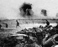 The PLA attacks Jinzhou, Manchuria in 1948.
 -
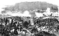 The Battle of Solferino


Article(s): Battle of Jinzhou, Battle of Solferino
Request: Remove watermarks and signatures. Andres rojas22 (talk) 21:06, 9 March 2013 (UTC)
Graphist opinion(s):{{I take|Centpacrr (talk) 21:48, 9 March 2013 (UTC)}