
Wikipedia:How to create charts for Wikipedia articles


Graphs and other pictures can contribute substantially to an article. Here are some hints on how to create a graph. The source code for each of the example images on this page can be accessed by clicking the image to go to the image description page.
Guidelines
- Use the SVG format whenever possible. If you can't, use any software to create the plot in a bitmap format but make it very large, for instance 6000 x 4500 pixel size with Postscript Times or Symbol font size 48 and a line thickness of 17 pixels. Then use software like Photoshop or GIMP to Gaussian blur it at 2 pixels. Finally reduce it down to about 1000 pixels on a side (e.g. 1300 x 975) using bicubic interpolation. This gives a plot with no jagged lines that is also big enough so that someone could download it and use it for projection purposes without apparent pixellation. Save the image as PNG.
- Plots should be as language-free as possible, and uploaded to Wikimedia Commons, so that they may be used in any language version of Wikipedia.
- The descriptive text should be confined to the caption as much as possible. Try to put as little text as possible in the image itself. You can also place additional text on the image description page if needed.
- For SVG images, it is important to use only the fonts supported by MediaWiki (listed here), and to not convert the text into paths. Here are some additional recommendations for text legibility.
- It is best if color coding is not the only thing that differentiates parts of the graph. The graph should be understandable even when the article is printed on a gray-scale printer, viewed by the colorblind, or seen on a monochrome display. Use dashed or dotted lines or differently-shaped symbols to identify different objects. In order to make the picture clearer and nicer, you can certainly use color to add redundant information: for example you could plot two different functions with a solid and a dotted line in two different colors. If you use only colors to convey information, choose them so that, if the picture is converted to gray-scale, you still can distinguish them thanks to the evident contrast. You can test your choices with Vischeck. See Wikipedia:Manual of Style#Color_coding.
- Include the commands by which you created the plot on the image description page so others can replicate your work to make additions, fixes, translations, and so on. Ideally someone else can copy and paste the commands and obtain the same result. One way to test that is to write a script and execute the script (instead of interactively typing the commands). Then just copy and paste the script into the image description page. Commenting your code is also helpful to make your code more understandable.
- Be sure to include a licensing tag (GFDL, CC, public domain, etc.) on the image description page.
- If you are creating an SVG image and want to insert Greek and other special characters, please make sure first that it will display correctly when uploaded and converted to a raster image by the MediaWiki software. The most common problems are with characters in the Symbol font which does not display correctly in MediaWiki. If, for instance, "π" is rendered as "p" in Mediawiki's output, your software is generating characters with the Symbol font and needs to be reconfigured. Unicode characters usually display correctly, and are supported by most programs including Inkscape. Or, you can convert the characters to paths as a last resort. You can find the complete Greek alphabet on Commons which you can then copy and paste into your application as they are already in the correct format. (Make sure to copy directly from the SVG image, not the raster output.)
See also the graphics tutorials on how to create pictures, and the picture tutorial on how to include them in articles. There is additional discussion of plotting on Template talk:Probability distribution#Standard_Plots.
Plotting
gnuplot
Many of the graphs on Wikipedia were made with the free software program gnuplot. It can be used by itself or in conjunction with other software.
For example, to plot the data in file "data":
set xlabel "steps"
set ylabel "result"
unset key
#use bars in plot: with boxes
#choose line color/style in plot: linetype n
#plot filled bars (fs): pattern n
set style fill pattern 2
plot "data" with boxes linetype 3 fs
-
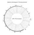
 List of line and symbols types in the gnuplot svg terminal
 -
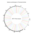
 The lines and symbols availables on gnuplot with the postscript terminal and the options by default
 -
 The lines and symbols availables on gnuplot with the postscript terminal and the option color
 -
 The lines and symbols availables on gnuplot with the postscript terminal and the options color and solid


Now that Mediawiki supports SVG, it's usually best to generate SVG images directly. SVG images have many advantages, like being fully resizable, easier to modify, and so on, though they are sometimes inferior to raster images. Decide on a case-by-case basis.
A typical plot file could start with:
set terminal svg enhanced size 1000 1000 fname "Times" fsize 36
set output "filename.svg"
- size
- Sets the size of the plot. This controls the size of features in the PNG rendered by Wikipedia.
- fname
- Sets the font
- fsize
- Sets the font size. Also sets the size of plotted points
- set output
- Sets the filename for saving the SVG information

Gnuplot can also generate raster images (PNG):
For the best results, a PostScript file should be generated and converted into PNG in an external program, like the GIMP. PostScript is generated with the line set terminal postscript enhanced:
set terminal postscript enhanced color solid lw 2 "Times-Roman" 20
set output "filename.ps"
- color
- Make a color plot instead of black-and-white
- solid
- Make all lines solid instead of dashed. You may want to remove this to make dashed lines which are distinguishable on both color and black and white versions of the same plot.
- lw 2
- Sets the linewidth of all the lines at once.
- "Times-Roman" 20
- Sets the font and font size
- set output
- Sets the filename for saving the Postscript information
You should use a large number of samples for high-quality plots:
set samples 1001
This is important to prevent aliasing or jagged linear interpolation (see Image:Exponentialchirp.png and its history for an example of aliasing). Labels are helpful, but remember to keep language-specific information in the caption if it's not too inconvenient. Including the source code and/or an image without text helps other users create versions in their own language, if text is included in the image.
set xlabel "Time (s)"
set ylabel "Amplitude"
The legend or key is positioned according to the coordinate system you used for the graph itself:
set key 4,0
Most other options are not Wikipedia-graph-specific, and should be gleaned from documentation or the source code included with other plots. An example of a plot generated with gnuplot is shown on the right, with source code on the image description page.
Maxima
Maxima is a computer algebra system licensed under the GPL, similar to Mathematica or Maple. It uses gnuplot as its default plotter, though others are available, such as openmath. Plotting directly to PostScript from Maxima is supported, but gnuplot's PostScript output is more powerful.
The most-used commands are plot2d and plot3d:
plot2d (sin(x), [x, 0, 2*%pi], [nticks, 500]);
plot3d (x^2-y^2, [x, -2, 2], [y, -2, 2], [grid, 12, 12]);
Since the plot is sent to gnuplot as a series of samples, not as a function, the Maxima nticks option is used to set the number of sampling points instead of gnuplot's set samples. Additional plot options are included in brackets inside the plot command. To use the same options as in the above gnuplot example, add these lines to the end of the plot command:
PostScript output:
[gnuplot_term, ps]
[gnuplot_ps_term_command, "set term postscript enhanced color solid lw 2 'Times-Roman' 20"]
SVG output:
[gnuplot_term, ps]
[gnuplot_ps_term_command, "set terminal svg enhanced size 1000 1000 fname 'Times' fsize 36"]
Output filename:
[gnuplot_out_file, "filename.ps"]
Additional gnuplot commands:
[gnuplot_preamble, "set xlabel 'Time (s)'; set ylabel 'Amplitude'; set key 4,0"]
Like so:
 plot2d (sin(x), [x, 0, 2*%pi], [nticks, 500], [gnuplot_term, ps],
         [gnuplot_ps_term_command, "set term postscript enhanced color solid lw 2 'Times-Roman' 20"],
         [gnuplot_out_file, "filename.ps"],
         [gnuplot_preamble, "set xlabel 'Time (s)'; set ylabel 'Amplitude'; set key 4,0"]);
Similar for svg output:
 plot2d (sin(x), [x, 0, 2*%pi], [nticks, 500], [gnuplot_term, ps],
         [gnuplot_ps_term_command, "set terminal svg enhanced size 1000 1000 fname 'Times' fsize 36"],
         [gnuplot_out_file, "filename.svg"]);
Note that the font and labels are in single quotes now, nested inside double quotes. Multiple commands are separated by semicolons.
An example of a plot generated with gnuplot in Maxima is shown on the right, with source code on the image description page.
GNU Octave

GNU Octave is a numerical computation program; effectively a MATLAB clone. It uses gnuplot extensively (though also offers interfaces to Grace and other graphing software).
The commands are plot (2D) and splot (surface plot), or gplot and gsplot ("almost exactly" the same).
gnuplot settings are accessed with the gset command:
t = [0 : .01 : 1];
y = sin (2*pi*t);
gset terminal postscript enhanced color solid lw 2 "Times-Roman" 20
gset output "filename.ps"
gset xlabel "Time (s)"
gset ylabel "Amplitude"
gset key 4,0
plot (t,y)
If x functions are plotted, separated by commas, they will all appear on page x of the resulting .ps file.
Octave uses Gnuplot for plotting, which generates SVG output that triggers a bug in Inkscape. The issue can be corrected with a simple Perl script
Matplotlib

Matplotlib is a plotting package for the free programming language Python. Its pylab interface is procedural and modeled after MATLAB, while the full Matplotlib interface is object-oriented.
Python and Matplotlib are cross-platform, and are therefore available for Windows, OS X, and the Unix-like operating systems like Linux and FreeBSD.
Matplotlib can create plots in a variety of output formats, such as PNG and SVG. (Numerous examples with Python source code are available at http://matplotlib.sourceforge.net/gallery.html)
Matplotlib mainly does 2-D plots (such as line, contour, bar, scatter, etc.), but 3-D functionality is also available in some releases.
Here is a simple line plot in pylab (output image is shown on the right):
from pylab import *	# import the Pylab module

x = [1,2,3,4]		# list of x values
y1 = [8,3,5,6]		# list of y values
y2 = [1,6,4,6]		# another list of y values

plot(x, y1, 'o-')		# do a line plot of data
plot(x, y2, 's--')		# plot the other data with a dashed line

xlabel("foo")		# add axis labels
ylabel("bar")		#

xticks(x)		# set x axis ticks to x values
title("Pylab Demo")			# set plot title
grid(True, ls = '-', c = '#a0a0a0')	# turn on grid lines

savefig("pylab_example.svg")	# save as SVG

show()			# show plot in GUI (optional)
Save this script as e.g. pylab_demo.py and then run it with python pylab_demo.py. After a few seconds, a window with the interactive graphical output should pop up.
Xfig
Xfig is an open source vector graphics editor that runs under X on most Unix platforms. In xfig, figures may be drawn using objects such as circles, boxes, lines, spline curves, text, etc. It is possible to import images in many formats, such as GIF, JPEG, SVG, and EPSF. An advantage of Xfig consists in its ability to display nice mathematical formula in the labels and legends using the TeX language.
R

The free statistical package R (see R programming language) can make a wide variety of nice-looking graphics. It is especially effective to display statistical data. On Wikimedia Commons, the category Created with R contains many examples, often including the corresponding R source code. Other examples can be found in the R Graph Gallery.
In order to output postscript, use “postscript” command:
postscript(file = "myplot.ps")
plot(...)
graphics.off()
The last command will close the postscript file; it won't be ready until it's closed.
With an additional (free) package, it's also possible to generate SVG-graphs with R directly. See an example with code on Image:Circle area Monte Carlo integration2.svg.
Other packages (lattice, ggplot2) provide alternative graphics facilities or syntax.
Here is another example with data.
Gri
The Gri graphical language can be used to generate plots and figures using a script-like commands. Unlike other tools Gri is not point and click, and requires learning the Gri script syntax.
Maple
Maple is a popular proprietary computer algebra system. Maple can export graphs in Encapsulated PostScript format, which can then be converted to SVG for example in Inkscape. To do this using the standard GUI interface, follow these steps:
- Display the graph and adjust it until it looks like you want it to.
- Right-click on the graph and select "Export" → "Encapsulated Postscript" from the menu which appears. Choose a file name to save the graph as.
- In Inkscape, import the graph using "File" → "Import...". After importing, select "File" → "Document Properties..." and click "Fit page to selection". Save the SVG file and upload it.
Dynamic geometry
GeoGebra


GeoGebra is a dynamic geometry program that can be used to create geometric objects free-hand using compass-and-ruler tools. It can also be used to plot points functions, parametric curves and loci. It supports SVG, PNG, EPS, PDF, EMF, PGF/TikZ and PSTricks as export formats and has support for LaTeX formulas within text objects. When exporting to PNG all objects are antialiased (including functions and loci).
Since GeoGebra is not a drawing tool,[1][2] there are some caveats:
- When exporting as SVG, the program 1) stores one set of values for SVG element positions; 2) stores another set of values to scale and reposition the elements to match what is seen in the application window; and 3) stores a third set of values for determining the size of the output image's viewport. Meaning you will have to juggle all three sets of values when trying to modify the image for external rendering.
PNG output suffers from antialiasing issues when exporting as a 32-bit image file. The mask utilizes only 1 bit of color information instead of all 8 bits that are available, and the "antialiasing" itself is done in the body of the image instead of the alpha channel where it belongs. Meaning that image is transparency is effectively limited to what you see in GIF images with 1 bit transparency, and that you will see traces of the original document's background color when overlaying the image over another image or document.
[This issue has been fixed in the 4.0 beta version. [3]]- There is no way to enter color values directly using RGB components using the standard palette but you can enter RGB values in the Advanced Tab of Object Properties in the Dynamic Color Section as a ratio (eg 0.1 or 43/256). The default colors for objects do not exist in the palette (although you can use Undo or the Copy Visual Style Tool to change back),
and there is no way to specify a different set of values as the defaults.[This issue has been fixed in the 4.0 beta version. [4]] .
The best way to determine the export area is simply to adjust the window size to show exactly what you want displayed. However does GeoGebra does also have a feature whereby you can define the export area inside a drawing by defining the points Export_1 and Export_2 as the corners[5]. You can then adjust the scale in the Export Dialog to achieve the dimensions you want (the dimension in pixels is displayed there - see image at right).
If your requirements with regard to creating pixel-perfect results are not too stringent, then you can safely ignore these issues, as PNG and SVG export is otherwise dead simple.

C.a.R. (standing for "compass and ruler") is very similar to GeoGebra in that both programs are free, point-and-click, dynamic geometry applications running under Java and supporting PNG, SVG and other output formats. It is generally not as feature-rich as GeoGebra, but at the same time overcomes a number of GeoGebra's limitations with respect to vector and raster image export. For instance:
- You can enter RGB and HSL color values directly, meaning the range of possible colors (e.g. palette) is much greater.
- For PNG images you can specify a number of additional parameters to control output dimensions (though it may still be necessary to manually convert from centimeters to inches at some point if you are trying to achieve pixel-perfect results).
- Sizes and dimensions are exported more directly into the SVG file without the need for adjusting three separate sets of values when editing the file by hand as in GeoGebra's SVG output.
- You can set the dimensions of the drawing pane to exact amounts in pixels.
However, some caveats:
- You cannot set the coordinate units to exact amounts in pixels, though by default the coordinate axes are set to fill the drawing pane (which can be configured) exactly with plus/minus eight units along the horizontal.
- The image export options for SVG are not as detailed as for PNG.
- There's no way of specifying the export rectangle directly from within the drawing itself as in GeoGebra, other than by resizing the drawing pane.
- If a shape such as a circle is filled, there's no way to specify the color of the filled region explicitly. Filled regions always use a lighter version of the shape's stroke color.
- The toolbar may require more time to familiarize yourself with, since similar commands are not grouped together as in GeoGebra or GSP.
- Requesting and receiving support may be difficult, as the discussion forums are inactive and no mailing list exists.
Like GeoGebra, C.a.R. is also capable of plotting algebraic and parametric curves, and features support for LaTeX in formulas.
Surfaces
POV-Ray


POV-Ray is a free general-purpose ray-tracing package with a scene description language very similar to many programming languages. It can render parametric surfaces and algebraic surfaces of degree up to seven, as well as triangle mesh approximations using the "mesh" and "mesh2" object types. An updated version of the file "screen.inc" can be used to output the exact two-dimensional screen coordinates of any three-dimensional object so as to facilitate the addition of labels or other 2D elements in post-processing, for instance in Inkscape.
Other surface tools
Other usable tools include:
- surf, which is specialized for algebraic curves and surfaces;
- surfex, which is built on top of surf.
These tools are only capable of producing raster output.
- Blender (software) is a free triangle-based 3D modeler. It's possible to create mathematical surfaces in tools such as K3DSurf and import them into Blender. It's also possible to export Blender renders to SVG using a third-party plugin.
Figures, diagrams & charts


Graphviz
For graph-theory diagrams and other "circles-and-arrows" pictures, Graphviz is quick and easy, and also able to make SVGs.
Inkscape
Next to being useful for post-processing (see the next section), Inkscape is a point-and-click tool that can be used to create high-quality figures. It is a particularly easy tool for creating vector graphics, though GeoGebra and C.a.R. may be better suited for mathematical graphics. Also, Inkscape's design concepts differ in some fundamental ways from SVG. For instance, in SVG element widths are applied before stroke widths, whereas in Inkscape they are applied after.
OpenOffice.org


OpenOffice.org is a free office suite that contains among other things means of creating line, bar and pie charts based on data contained in spreadsheets and databases, as well as a program for drawing vector graphics called Draw. There is also a plugin for importing SVG images into OpenOffice.org. However, support for the full range of options offered by Inkscape and many other vector formats is still preliminary at best.
- See also
- SVG User Experiences - A wiki page compiling users' experiences with SVG in OpenOffice.org.
- Graphics in OpenOffice.org: SVG, EPS and WMF - A blog article describing one user's efforts with vector formats in OpenOffice.org.
Post-processing
Modifying SVG images
SVG images can be post-processed in Inkscape. Line styles and colors can be changed with the Fill and Stroke tool. Objects can be moved in front of other objects with the Object→Raise and Lower menu commands.
Saving from Inkscape also adds information that isn't present in Gnuplot's default output – neither Firefox nor Mozilla will render the file natively without it. These browsers can be persuaded to render Gnuplot's SVG output if the <svg> tag has the following attribute: xmlns="http://www.w3.org/2000/svg", as described at the Mozilla FAQ.
Converting PostScript to SVG
- PostScript can be converted to SVG with pstoedit (it works both on Linux and Microsoft Windows). On Linux, this tool can be invoked for example as
pstoedit -f plot-svg Picture.ps Picture.svg
- Also you can use Scribus.
Direct SVG output is probably better if the program supports it. See Wikipedia:WikiProject Electronics/How to draw SVG circuits using Xcircuit for an example.
Editing PostScript colors and linestyles manually
Setting colors and linestyles in gnuplot is not easy. They can more easily be changed after the PostScript file is generated by editing the PostScript file itself in a regular text editor.
This avoids needing to open in proprietary software, and really isn't that difficult (especially if you are unfamiliar with other PS editing software).
Find the section of the .ps file with several lines starting with /LT. Identify the lines easily by their color ("the arrow is currently magenta and I want it to be black. Ah, there is the entry with 1 0 1, red + blue = magenta") or by using the gnuplot linestyle−1 (for instance, gnuplot's linestyle 3 corresponds to the ps file's /LT2). Then you can edit the colors and dashes by hand.
/LT0 { PL [] 1 0 0 DL } def
/LT0 corresponds to gnuplot's linestyle 1. The [] represents a solid line. 1 0 0 is the color of the line; an RGB triplet with values from 0 to 1. This line is red.
/LT2 { PL [2 dl 3 dl] 0 0 1 DL } def
/LT2 corresponds to gnuplot's linestyle 3. The [2 dl 3 dl] represents a dashed line. There are 2 units of line followed by 3 units of empty space, and so on. 0 0 1 represents the color blue.
/LT5 { PL [5 dl 2 dl 1 dl 2 dl] 0.5 0.5 0.5 DL } def
/LT5 corresponds to gnuplot's linestyle 6. The [5 dl 2 dl 1 dl 2 dl] represents a dash-dot line. There are 5 units of line (the dash) followed by 2 units of empty space, 1 unit of line (the dot), 2 more units of empty space, and then it starts over again. 0.5 0.5 0.5 represents the color gray.
/LTb is the graph's border, and /LTa is for the zero axes.
Converting PostScript to PNG and editing with the GIMP
To post-process PostScript files for raster output (vector is preferred):
- Open the file in the GIMP (make sure you have ghostscript installed! — Windows Ghostscript installation instructions)
- Enter 500 in the "resolution" input box
- You may need to uncheck "try bounding box", since the bounding box sometimes cuts off part of the image.
- Enter large values for Height and Width if not using the bounding box
- Select color
- Select strong anti-aliasing for both graphics and text
- Crop off extra whitespace (shift+C if you can't find it in the toolbox)
- Image → Transform → Rotate 90 degrees clockwise
Filters → Blur → Gaussian blur(No need to blur if you use strong anti-aliasing during conversion. No significant difference between end results.)2.0 px
- Image → Scale Image...
- 25%
- Cubic interpolation
- You can view at normal size if you want by pressing 1, Ctrl+E
- Save as File_name.png
Converting PostScript to PNG with ImageMagick
Another route to convert a PS or EPS file (postscript) in PNG is to use ImageMagick, available on many operating systems. A single command is needed:
convert -density 300 file.ps file.png
The density parameter is the output resolution, expressed in dots per inch. With the standard 5x3.5in size of a gnuplot graph, this results in a 1500x1050 pixels PNG image. ImageMagick automatically applies antialiasing, so no post-processing is needed, making this technique especially suited to batch processing. The following Makefile automatically compiles all gnuplot files in a directory to EPS figures, converts them to PNG and then clears the intermediate EPS files. It assumes that all gnuplot files have a ".plt" extension and that they produce an EPS file with the same name, and the ".eps" extension:
GNUPLOT_FILES = $(wildcard *.plt)
# create the target file list by substituting the extensions of the plt files
FICHIERS_PNG = $(patsubst %.plt,%.png,  $(GNUPLOT_FILES))

all: $(FICHIERS_PNG)

%.eps: %.plt
	@ echo "compillation of "$<
	@gnuplot $<

%.png: %.eps
	@echo "conversion in png format"
	@convert -density 300 $< $*.png
	@echo "end"