Wikipedia:Collaboration to convert graphs to SVG
| This page is currently inactive and is retained for historical reference. Either the page is no longer relevant or consensus on its purpose has become unclear. To revive discussion, seek broader input via a forum such as the village pump. |
Due to the inactivity of this project, you're recommended to make your requests at the English Graphics Lab or at the Commons Graphics Lab. |


Many graphs and charts on Wikipedia are currently displayed in a raster format. That has two problems:
- The images cannot be resized without visible pixellation.
- The results are not easily editable.
Scalable Vector Graphics are the best solution to images like graphs and charts that can be described through simple shapes and text. Look at the two smiley faces at right. The top one is in SVG format – it resizes perfectly. In comparison, the raster format cannot be resized elegantly.
By converting graphs and charts to SVG format, we can guide Wikipedia's content to a higher calibre, and help to keep the material up-to-date and accessible.
Modifying the graphs[edit]
Until instructions are posted, you'll need to be fairly proficient in SVG to take part in this project.
Please don't use graphics programs like Inkscape, Adobe Illustrator or the GIMP to edit these SVGs. They need to be edited in a text editor (SVG is a pure XML file from core, thus can be edited in e.g. Notepad).
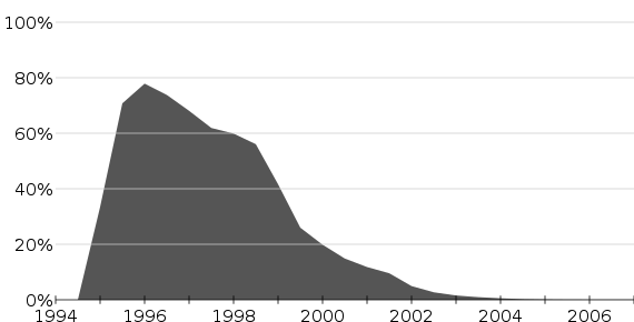
For the time being please use the chart of Netscape Navigator's usage share as the model:
Tips for good graphs[edit]
The following tips are based on good practice for charts generally (including the work of Edward Tufte) and the requirements of Wikipedia in particular.
- Avoid putting in a chart title. That's the role of the caption.
- Avoid colour as much as possible. The graph should still be useable when printed then photocopied in grayscale.
- Try to use the smallest discernible difference – e.g., clearly different shades of grey are better than red, green, and blue.
- Try to keep lines fairly thin. Thick, chunky lines typically make for ugly graphs.
- The X- and Y-axes need to be carefully considered:
- Don't listen to Excel – the scale along the axes do not have to emphasise the first and last records; rather, choose logical, neat values to display.
- Don't listen to your teacher, either – you should only label the axes if it's not patently obvious. So if the X-axis scale is clearly years, there's no need to explain that; the audience is smart enough to figure it out! But if it might be in doubt (like if you're graphing something many years ago, or which covers a large expanse of history) then it may be necessary.
- If your scale crosses a major numerical division, it should be marked. So a graph of the years 1892 through 1905, for example, should definitely mark the year 1900.
- For example, if you are graphing a variable between the years 1999 and 2004, the best scale is probably one that has the years 2000, 2002, and 2004 marked. If there's enough space, then you could add in the odd-numbered years, too.
- As per the Wikipedia style guide, don't abbreviate years (e.g., "2011, 2012, 2013, 2014", not "1998, '99, 2000, '01").
- As per the Wikipedia style guide, don't use numbers to express a month.
- Try not to use keys and legends. Instead, try to include the explanatory material on the graph. (Because it's in SVG, anyone can easily translate it into other languages!)
Labelling graphs[edit]
Marking a target[edit]
If you find a graph that should be in SVG format, please add the following to the top of its page:
{{SVG graph project}}
When you're done[edit]
Remove the {{SVG graph project}} tag and replace it with {{SVGNowAvailable|Name of new image.svg}}.
Images so far converted[edit]
- OPEC declared reserves [BP data]: PNG version → SVG version
- World total oil production: PNG version → SVG version
- Internet Explorer usage share: PNG version → SVG version
- Mozilla Firefox usage share: PNG version → SVG version
- Netscape Navigator usage share: PNG version → SVG version
- Graph minor A example: PNG version → SVG version
- Graph minor B example: PNG version → SVG version
- World population growth: PNG version → SVG version
- World population: PNG version → SVG version
- Population and population rank of Detroit, Michigan: JPG version → SVG version
- Time taken to add each billion to world population: JPG version → SVG version
- Increase in the population of Middlewich, Cheshire, England, in the last 200 years: GIF version → SVG version
- Population of Baja, Hungary, 1870-2005: JPG version → SVG Version
- Albania Population Pyramid for 2005: PNG Version → SVG Version
- Andora Population Pyramid for 2005: PNG Version → SVG Version
- Australia Population Pyramid for 2005: PNG Version → SVG Version
- Triangular Population Pyramid: PNG Version → SVG Version
- Components of the US money supply: PNG Version → SVG Version
- United States population, 1790-2000: PNG Version → SVG Version
- Example of Babylonian method of square root calculation: GIF Version → SVG Version
- Population and gender composition of Białystok, Poland: PNG version → SVG Version
- Populations of the countries comprising the United Kingdom: PNG version → SVG version
- Bandwidth: PNG version → SVG version
- Demographics of the Netherlands: PNG version → SVG version
- Goodison Park average yearly attendance: (no original) → SVG version

