Wikipedia:Featured picture candidates/Shuffle
Appearance

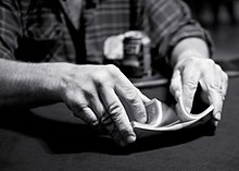
I discovered this image from wikipedia commons while looking at the page for shuffle, in which it is the header image. The image author is Todd Klassy. Both very detailed and high resolution while displaying the way the shuffle is performed, both in hand positioning and due to the blur of the card that had just been shuffled along with the intertwining cards below. The image is taken during a game at a bar need Madison, Wisconsin.
- Nominate and support. –– Lid(Talk) 14:56, 2 October 2006 (UTC)
- Oppose, extremely low depth of field means only one hand is in focus. The cards aren't just blurry from the motion, they're out of the focus of the camera. The fine focused details are on his left knuckles, bringing attention to them instead of the cards. The photo is arty instead of encyclopedic, and as far as resolution, it's nothing special. Night Gyr (talk/Oy) 15:23, 2 October 2006 (UTC)
- Oppose Per Gyr. I usually have no problem with narrow DOF as long as the intended subject is clear, but one hand is barely in focus. Could be more encyclopedic if it were an animation showing shuffling technique. --160.79.219.133 16:14, 2 October 2006 (UTC)
- Weak Support. I love the picture, but the DOF and black and white really don't help the encyclopedic value. NauticaShades(talk) 16:29, 2 October 2006 (UTC)
- Support The blurred hand is fine by me because the shuffle is so beautifully displayed - Adrian Pingstone 18:35, 2 October 2006 (UTC)
- Comment, What's the copyright status on this image? The flickr page states "all rights reserved" and nowhere does it mention a special permission for wikipedia. Night Gyr (talk/Oy) 21:25, 2 October 2006 (UTC)
- I'll email the photographer for clarification. howcheng {chat} 23:15, 2 October 2006 (UTC)
- The photographer's profile says "My photographs were once licensed for general use through Creative Commons, however, some people abused those rights." It looks like this was uploaded before he changed the license, so technically it's valid to continue using it under CC-BY, though it makes verification more difficult. --Davepape 04:18, 3 October 2006 (UTC)
- Weak support - the DOF is imperfect, but not to the point of completely killing the encyclopedic value. --Davepape 04:23, 3 October 2006 (UTC)
 Support Great image, has a real character to it. Would like to see it in higher res though. --Fir0002 08:15, 3 October 2006 (UTC)
- Oppose, much too dark. I believe there could be a much better picture of this type of shuffle. Not FP standard.--Andeh 16:37, 3 October 2006 (UTC)
- Support. Great pic, and geez it's always the same chant about DOF, how does it lessen the encyclopedic value? It doesn't it enhances it, by making pats that matter clearly stand out! --Dschwen 09:36, 6 October 2006 (UTC)
- The part that matters is the cards, and that's out of focus...so it's drawing attention away from them. Night Gyr (talk/Oy) 19:09, 6 October 2006 (UTC)
- The cards are out of focus??? Huh? Sorry, I cannot confirm this observation. The right side has a tad of motion blur, but if you look at the top line shadow/brightness transition you'll have to concur that it is perfectly in focus! --Dschwen 10:39, 7 October 2006 (UTC)
- compare the sharpness of the near hand, the cards, and the far hand. the sharpest focus is on the near knuckles, dropping off from there. That draws attention away from what we're trying to show. Night Gyr (talk/Oy) 11:01, 7 October 2006 (UTC)
- Night Gyr, you may want to add in my humble opinion, given that your views are not representative of the wikipedia community Ahadland 20:59, 7 January 2007 (UTC)
- compare the sharpness of the near hand, the cards, and the far hand. the sharpest focus is on the near knuckles, dropping off from there. That draws attention away from what we're trying to show. Night Gyr (talk/Oy) 11:01, 7 October 2006 (UTC)
- The cards are out of focus??? Huh? Sorry, I cannot confirm this observation. The right side has a tad of motion blur, but if you look at the top line shadow/brightness transition you'll have to concur that it is perfectly in focus! --Dschwen 10:39, 7 October 2006 (UTC)
- The part that matters is the cards, and that's out of focus...so it's drawing attention away from them. Night Gyr (talk/Oy) 19:09, 6 October 2006 (UTC)
- Support --James 21:00, 7 October 2006 (UTC)
Promoted Image:Riffle shuffle.jpg, but it was right on the border. howcheng {chat} 18:22, 13 October 2006 (UTC)
