Wikipedia:Featured picture candidates/The Starry Night
Appearance


- Reason
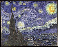
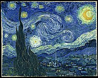
- My main reason is that is very pleasing to my eye and encyclopedic. Meets criteria: High quality (though it is jpeg, I see no artifacts, feel free to correct me, I'm not terribly experienced in image quality detection); useful to its article (The Starry Night); high resolution (more than 1000px each side); in the public domain; I think it shows as one of Wikipedia's best work.
- Articles this image appears in
- The Starry Night
- Creator
- Vincent van Gogh (uploaded by User:Thebrid on Commons[1])
- Nominator
- WillMak050389
- Support — WillMak050389 03:45, 14 February 2007 (UTC)
- support - does the saturation match the original? I haven't seen it. Debivort 05:06, 14 February 2007 (UTC)
- I'm inclined to think the original is more greenish-blue, like this version. ~ trialsanderrors 05:13, 14 February 2007 (UTC)
- The colour balance of this image was discussed in this previous nomination. I don't think anything definitive came of it back then. Raven4x4x 06:09, 14 February 2007 (UTC)
- I'm inclined to think the original is more greenish-blue, like this version. ~ trialsanderrors 05:13, 14 February 2007 (UTC)
- Oppose Even more problematic than the colors is the provenance ('Can no longer find web site"). If we feature well-known paintings we should stick to official reproductions done by the owner or a source known for accuracy and not something found somewhere on the internets. ~ trialsanderrors 06:44, 14 February 2007 (UTC)
- Comment I still oppose the current version on the same grounds. There is no deadline to finding an authorative version of this picture. ~ trialsanderrors 07:34, 25 February 2007 (UTC)
- Withdraw I was unaware that there was a previous nomination of this image that failed. No more of a chance to get promoted now. --WillMak050389 09:48, 14 February 2007 (UTC)
- I don't think you should withdraw the nomination. I think you should let it go, and since no consensus was reached on color ballance last time, I would suggest we not engage in an edit orgy but just vote on this version. I'd bet there is a reasonably good chance it passes.Debivort 02:45, 15 February 2007 (UTC)
- Well, I guess if we keep long enough to get a proven proper color scan. I was withdrawing this edit of the picture until it could be proven at least. --WillMak050389 04:31, 15 February 2007 (UTC)
- We need a proper scan of this great painting --frothT 01:33, 15 February 2007 (UTC)
- Perhaps this could be a chance to have a go at figuring out what the proper colouring should be? The discussion last time didn't seem to get anywhere conclusive. Raven4x4x 03:00, 15 February 2007 (UTC)
- Maybe this photo could help. We could use the lady to establish the gray value. Maybe part of her scarf is an actual gray. That would seem to indicate a color balance closer to the cyan edit of the last nomination. Debivort 07:28, 15 February 2007 (UTC)
- The MoMA website doesn't help. They got four versions, all in different hues, although the biggest one comes somewhat close to the one we have here. ~ trialsanderrors 07:33, 15 February 2007 (UTC)
- All right - here's a shot at an objective color ballance. I took the image with the lady and the scarf, took 8 of the gray subpanels of her scarf and averaged them and then set the gray point of the image to that color. Then I matched the nominated image to the corrected image as best I could by eye. Seems pretty aesthetic, and it matches my recollection of the image. Debivort 22:58, 15 February 2007 (UTC)
- We can't know that the light falling on the scarf is identical to the light on the painting - and do we know the scarf really is a true grey? In edit 1, the painting looks a bit too blue-green. I made an experiment, assuming the wall is white, and depending on where on the wall the white balance is checked, I can get thew painting from anything between reddish orange to dark blue. So, it is almost impossible to determine the correct color without having a true grey card (Kodak 18% type) directly in front of the painting. OTOH, I think edit 1 is the best so far, so I'll weak support that one. (PS: Why did you GNU licence the edit, when the original is PD? A simple color correction isn't reason enough for changing the PD status.) --Janke | Talk 08:41, 16 February 2007 (UTC)
- Hi Janke - I know what you mean about different pixels on the wall. I think the variability is just color noise in that image. - that's why I chose several regions of the scarf to average. You could try averaging a region of the wall. As for different light on her and the painting, yes it's abslolutely possible. But most walls are slightly creamy versions of white, and that I ended up with that color on the walls after correcting based on her scarf is suggestive that the correction is somewhat close. I GNU licensed it because I couldn't figure out a better license, mostly because I thought VVG had died within 70 years, checking that, it isn't the case - I'll go PD it. Debivort 13:53, 16 February 2007 (UTC)
- We can't know that the light falling on the scarf is identical to the light on the painting - and do we know the scarf really is a true grey? In edit 1, the painting looks a bit too blue-green. I made an experiment, assuming the wall is white, and depending on where on the wall the white balance is checked, I can get thew painting from anything between reddish orange to dark blue. So, it is almost impossible to determine the correct color without having a true grey card (Kodak 18% type) directly in front of the painting. OTOH, I think edit 1 is the best so far, so I'll weak support that one. (PS: Why did you GNU licence the edit, when the original is PD? A simple color correction isn't reason enough for changing the PD status.) --Janke | Talk 08:41, 16 February 2007 (UTC)
- All right - here's a shot at an objective color ballance. I took the image with the lady and the scarf, took 8 of the gray subpanels of her scarf and averaged them and then set the gray point of the image to that color. Then I matched the nominated image to the corrected image as best I could by eye. Seems pretty aesthetic, and it matches my recollection of the image. Debivort 22:58, 15 February 2007 (UTC)
- The MoMA website doesn't help. They got four versions, all in different hues, although the biggest one comes somewhat close to the one we have here. ~ trialsanderrors 07:33, 15 February 2007 (UTC)
- Maybe this photo could help. We could use the lady to establish the gray value. Maybe part of her scarf is an actual gray. That would seem to indicate a color balance closer to the cyan edit of the last nomination. Debivort 07:28, 15 February 2007 (UTC)
- Perhaps this could be a chance to have a go at figuring out what the proper colouring should be? The discussion last time didn't seem to get anywhere conclusive. Raven4x4x 03:00, 15 February 2007 (UTC)
- Support any version that gains concensus. - Mgm|(talk) 09:59, 19 February 2007 (UTC)
- Support edit 1. howcheng {chat} 05:59, 26 February 2007 (UTC)
- Support all of them! --frothT 04:53, 27 February 2007 (UTC)
- yay! I'm glad this nom hasn't been closed promptly, as the consensus is converging... Debivort 05:15, 27 February 2007 (UTC)
Support Edit 1 -this is the best one -Nelro
Promoted Image:VanGogh-starry night ballance1.jpg --KFP (talk | contribs) 22:22, 1 March 2007 (UTC)
