
Wikipedia:Graphics Lab/Illustration workshop: Difference between revisions
mNo edit summary |
|||
| Line 848: | Line 848: | ||
: I asked first this problem at Commons, but got it archived without being solved. I would like a pure SVG (possible plain text) of the first image; it should look like the second (PNG) but what I was able to get is the third image (no text). Could you please help me? Thanks.-- [[User:Carnby|Carnby]] ([[User talk:Carnby|talk]]) 05:39, 27 April 2022 (UTC) |
: I asked first this problem at Commons, but got it archived without being solved. I would like a pure SVG (possible plain text) of the first image; it should look like the second (PNG) but what I was able to get is the third image (no text). Could you please help me? Thanks.-- [[User:Carnby|Carnby]] ([[User talk:Carnby|talk]]) 05:39, 27 April 2022 (UTC) |
||
;Discussion: |
;Discussion: |
||
:{{reply|Carnby}} Unfortunately [[phab:T11420|<code>textPath</code> is not supported]]. I uploaded a new version of [[:File:Farmaco senza obbligo di ricetta (Italia).svg|Farmaco senza obbligo di ricetta (Italia).svg]], which should match [[:File:Farmaco senza obbligo di ricetta.png|Farmaco senza obbligo di ricetta.png]] more closely, is about 10 kB smaller, and has invisible <code>textPath</code> text to make it easier to edit. [[User:TilmannR|TilmannR]] ([[User talk:TilmannR|talk]]) 14:17, 27 April 2022 (UTC) |
|||
Revision as of 14:18, 27 April 2022
The Graphics Lab is a project to improve the graphical content of the Wikimedia projects. Requests for image improvements can be added to the workshop pages: Illustrations, Photographs and Maps. For questions or suggestions one can use the talk pages: Talk:Graphics Lab, Talk:Illustrations, Talk:Photographs and Talk:Maps.
This specific page is the requests page for the illustration workshop. Anyone can make a request for an illustration to be improved or created for a Wikipedia article. Clicking the "New Request" button will bring you to a standard template for submitting requests, as well as general advice that should be followed.
| Advice to requesters |
|---|
|
All requests:
SVG requests:
|
|
Requests from recent years:
| |
| For graphists: |
| If you have completed work and not received a reply you may use the {{GL Illustration reply}} template to inform the requester. |
| Graphists and other visitors to the Graphic Lab may be interested in the RSS feed of changes to this page. You may find it here. |
Good article and featured article topicon redesign
-
 Current good article icon
 -
 Current featured content icon


- Article(s)
- 5,859 featured articles
- 3,696 featured lists
- 32,507 good articles
- Assorted additional talk, help, and process pages
- Request
- Yes, this one is a big one.
- Background: The current symbols for good articles and featured content have been used since those systems were introduced way back in Wikipedia's early days. They have significant problems. The featured article icon is too skeuomorphic, giving it an outdated look, and its excessive detail causes it to render poorly at small scale. The good article icon, meanwhile, has been adopted throughout the rest of Wikimedia (and in some places on Wikipedia) as the "support vote" icon, leading to conflicting usage. Far worse than the issues with them individually, however, is the fact that there is no shared visual language between them (the GA icon uses the norro style, and the FA icon does not use any style). When compounded by their overall lack of prominence (a separate issue that we're trying to address), this has led to the unfortunate situation where many (perhaps most) non-editing readers could not tell you whether a star or a green badge is a higher distinction. Given how much effort we put into the GA/FA systems, there's more than a bit of tragic irony to that.
- Process: This is the first stage in the process of redesigning the icons (after informal discussions in various places). Ideally, several proposals will be put forth that can be compared against the status quo in a more formal and widely-advertised round of !voting (similar to the process for the MediaWiki logo redesign), with the winner adopted.
- Design details: The redesigned icons could end up being anything from checkmarks (a la the Twitter verification badge) to a silver star for GAs to a multi-star system that begins with one star for stubs and increases thereafter; feel free to get creative.
- Also, since the whole idea here is to unify the symbology, the redesign will need to include the associated symbols in addition to the main icons. You don't have to design them all now, but candidates with at least an articulated vision of what they should look like may be more likely to win support once we reach the formal !voting stage. Here are the current icons still in use that I could find (there may be a few more fringe ones):
Related icons
|
|---|
|


- In truth, the potential scope of this project could be a lot bigger, trying to unify all of the icons used anywhere on Wikipedia. However, recent attempts to do so have failed, and their utility is questionable, given that most icons do not appear in reader-facing areas and thus have a vastly more limited reach. Redesigning these two icons is a more feasible task with clear and significant benefits for readers across tens of thousands of pages.
- Cheers, {{u|Sdkb}} talk 05:08, 7 October 2020 (UTC)
- Discussion
- @Sdkb: I would recommend posting this at the Commons graphics lab as well, as it is significantly more active over there. Pbrks (talk) 14:50, 16 October 2020 (UTC)
- @Pbrks: Thanks for the tip. Since this request is specific to en-WP, I'd prefer the main discussion be hosted here, but I'll copy the request there and invite folks over. {{u|Sdkb}} talk 21:38, 17 October 2020 (UTC)
- Consider color blindness (esp. red-green): In data visualization circles, there is increasing awareness of how graphics should be crafted to allow color blind individuals to distinguish through shading, what normally sighted individuals distinguish directly through color perception. (One can test shading in Photoshop etc by removing saturation.) It's my understanding that red-green color blindness is a common type, though not the only type of color blindness. Some color scales are better than others: see Scientific American. —RCraig09 (talk) 22:53, 17 October 2020 (UTC)
Resolved discussion about mandate for change
|
|---|
|
- This is my passing opinion. There is a ooui icon called "articleCheck" () and this is what I think a "GA" icon should look similar to. Basically a sheet (representing a page) with a check on it. And in a green color instead of black. For the FA icon, a simple star/medal design on a sheet with an appropriate color would make sense to keep the two icons inline with each other. SInce I believe that most users could understand a star is more important than a check icon. Basic icons such as these are the only way to keep them readable when used as topicons. Terasail[✉] 17:00, 11 January 2021 (UTC)
Update: Mandate acquired
The formal Village Pump proposal has been archived, and per here, it successfully acquired a mandate for the icons to be redesigned, so I am removing the "on hold" box around this section. I'll leave it up to others to decide how precisely to proceed from here; I hope that someone steps up to take the lead on shepherding the process from here forward, since I'm not sure I can do it myself. This thread can be archived once (and only once) we've moved to the next stage. {{u|Sdkb}} talk 22:09, 24 December 2020 (UTC)
- As a note, there is also a proposal about it.Ahmetlii (talk) 10:33, 29 December 2020 (UTC)
- @Ahmetlii: That's a much more ambitious but still underdeveloped proposal that's been sitting for a while; in my view, it would need a lot of work to become comprehensive enough to become useful, and I don't see that amount of work forthcoming or really worth the effort. I think we should focus on this one, much more feasible task that we have agreed to do, rather than dreaming about bringing all of Wikipedia in line with a universal standard that, realistically, is not likely to happen any time soon. {{u|Sdkb}} talk 23:53, 31 December 2020 (UTC)
- The icons should be changed to something the average reader is familiar with. The current icons are nice, but they're nice to Wikipedians. The average reader probably has no idea what this means. We should aim to use images which readers will understand. For example: silver star, gold star. A tick / double tick. Or something along those lines. It should be obvious to a reader what it symbolises. ProcrastinatingReader (talk) 02:55, 20 March 2021 (UTC)
Proposal 1
The following discussion is closed. Please do not modify it. Subsequent comments should be made on the appropriate discussion page. No further edits should be made to this discussion.
-
 Proposal
 -
 Prop with assessments
@Sdkb: I've went ahead and made some icon ideas and where I think they would be appropriate. Let me know your thoughts. Pbrks (talk) 14:44, 2 April 2021 (UTC)
- Pbrks, there are some nice icons in that set; thanks for putting it together! I think the next step would be arranging a large-scale discussion for those and any other proposals. {{u|Sdkb}} talk 16:53, 2 April 2021 (UTC)
Tol's icons


I don't know if people still want to implement this, but I was working on some icons for personal use that render better at smaller sizes and recalled the village pump proposal to do something similar. I'm a terrible graphic designer, but I figured I'd post them here in case anybody is interested. I based them on Wikimedia's OOUI icons; I converted the <path>s in the icons to more human-readable SVG elements and colored them based on Wikimedia Design's color palette. I used a star for the featured icon because it is similar to the existing one, but used a check for the good icon so distinguish it from a support !vote icon. I plan to make more for A/B/C classes. My main problem is that I am unsure how to best represent former, former candidate, candidate, and reassessment icons. I'm currently thinking a cross for former, a question mark for candidate, and both combined in some way for former candidate. I have no good idea for reassessment — magnifying glass, maybe? I'd appreciate some other opinions on how these look and what to do. Thanks for your time! Tol (talk | contribs) @ 00:31, 3 September 2021 (UTC)
- All of the icons so far in small icon form:


 . I put something in the "start" icon instead of making it blank like the existing symbol (
 ). As for "stub", I am unsure if I should model it off the existing symbol (
 ) and do a partial circle, or use something else like
  (perhaps too close to the list icon?). Tol (talk | contribs) @ 17:41, 3 September 2021 (UTC)
- @Tol: These are nice, although I'm not sold on a tick for GA. Question mark works well for candidates (presumably in the gold or green circles), and I don't see why reassessment couldn't use the same icon given it's an assessment of some sort in both cases. I'm not sure a former candidate icon is that important in the grand scheme of things. I would prefer stubs use a partial circle to lines, just so all article rating have a similar aesthetic which distinguishes them from lists. CMD (talk) 15:57, 6 September 2021 (UTC)
- @Chipmunkdavis: Thanks for the feedback. For the GA icon, I was trying to avoid a star like the FA icon (which would have accessibility problems) and a plus sign (some people thought having the same icon for support votes and good articles is confusing). I haven't been able to get the question mark to look good, but I think I'm close to getting it (I'll probably upload an FA candidate icon soon). I'll do the partial circle for stub. Thank you again! Tol (talk | contribs) @ 18:48, 6 September 2021 (UTC)
- Hi Tol! Sorry, I'm just seeing this now. My first thought is that, as we saw with Pbrk's proposal, editors are instinctively resistant to design changes. We managed to eek out a mandate for the GA/FA icons, but I think any current proposal that also tries to handle other classes beyond that will unfortunately be dead on arrival. Regarding the GA/FA icons, I think we need something more fundamental. The biggest problem is still that there's nothing in particular signaling that FA is one step above GA. {{u|Sdkb}} talk 18:56, 16 October 2021 (UTC)
- @Tol: These are nice, although I'm not sold on a tick for GA. Question mark works well for candidates (presumably in the gold or green circles), and I don't see why reassessment couldn't use the same icon given it's an assessment of some sort in both cases. I'm not sure a former candidate icon is that important in the grand scheme of things. I would prefer stubs use a partial circle to lines, just so all article rating have a similar aesthetic which distinguishes them from lists. CMD (talk) 15:57, 6 September 2021 (UTC)
- I think personally that what we saw with Pbrk's proposal was a bunch of people who would oppose any change what so ever and were rightfully miffed that a discussion affecting over 40,000+ pages had small participation. JMHO casualdejekyll 20:40, 25 March 2022 (UTC)
Center Lane Left Turn Only text sign
![]() Done DeVosMax [ contribs • talk • created media ] 00:05, 5 April 2022 (UTC)
Done DeVosMax [ contribs • talk • created media ] 00:05, 5 April 2022 (UTC)
-
 DeVosMax's submission.

- Article(s)
- Center Lane Left Turn Only text sign
- Request
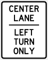
- Would somebody good with geometry/math/text be willing to recreate the text on the sign seen in this source? Please? -- Gohkenytp926 (talk) 23:51, 1 March 2022 (UTC)
- Discussion
- If you don't mind me asking, what are you using this for? The text-only center-lane left-turn only sign isn't specified in the Manual on Uniform Traffic Control Devices, that sign is a graphic like this. Is it for a country outside of North America? If so, which one? DeVos Max (talk) 21:34, 27 March 2022 (UTC)
- That source image is a bit suspicious, not centered, doesn't match the sign aspect ratio of any English-speaking country I can find, etc. Nonetheless, I converted it into a SVG. The font I used is Highway Gothic. Wikipedia absolutely refuses to let me upload this file for whatever reason, so while I work on trying to resolve that issue, here's an external link to the file I created.DeVos Max (talk) 22:35, 27 March 2022 (UTC)
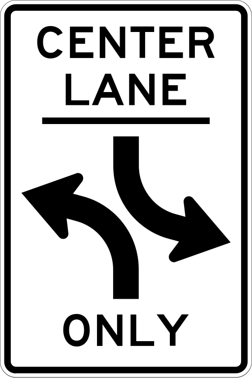
- Hello @DeVos Max: here is an official figure (but the left turn is illustrated):
- The traffic sign is for sale here as only text and here with Left turn being an illustration. more links present [1][2]. VScode fanboy (talk) 08:48, 31 March 2022 (UTC)
- Hello @DeVos Max: here is an official figure (but the left turn is illustrated):
- It's used in the 1971 edition of the MUTCD. Also I'd like it to be on this site, fair and square. That's why I'm requesting it. Gohkenytp926 (talk) 21:31, 4 April 2022 (UTC)
- The problem with Wikipedia's uploading seems to have resolved itself. I have added the file above. Please mark this request as complete if you are satisfied, otherwise let me know what you want to see changed. DeVosMax [ contribs • talk • created media ] 00:05, 5 April 2022 (UTC)

Italian coa
Huge number of images
|
|---|
|
|


.jpg)


.png)
.png)


_stemma_frescobaldi.JPG)


.jpg)


.png)


.jpg)


.jpg)


.jpg)
.jpg)
.jpg)
.jpg)


.png)


.jpg)


_e_suoi_discendenti.jpg)

_d%27Aragona.jpg)


.jpg)


,_Duchess_of_Parma.jpg)
,_Duchess_of_Parma.jpg)
,_Duchess_of_Parma.jpg)


,_Queen_of_Sardinia.jpg)
,_Queen_of_Sardinia.jpg)

,_Duchess_of_Savoy.jpg)
,_Duchess_of_Savoy.jpg)
,_Duchess_of_Savoy.jpg)
,_Duchess_of_Savoy.jpg)


.jpg)


.png)
.png)


.png)


.png)


.jpg)


.jpg)


- Request
- Hello, if it were possible I think it would be good to make new versions of these badges on the model of those already made. I think you need to use the Inkscape application, but I'm not familiar with that. For any clarification I am available
- Discussion
- Just for future reference, I would recommend not putting so many images into a request at once. A bot clears out stale requests every so often, and the volume here basically makes it impossible to complete in a timely fashion, as well as track which have been completed and what has priority. 47.19.150.58 (talk) 15:50, 7 March 2022 (UTC)
Wa State emblem vectorization
![]() Request taken by DeVosMax [ contribs • talk • created media ] 04:55, 8 April 2022 (UTC).
Request taken by DeVosMax [ contribs • talk • created media ] 04:55, 8 April 2022 (UTC).

-
 Emblem of Wa State, SVG version

- Article(s)
- Wa State
- Request
- The current SVG file is tagged under
BadSVG, and is a raster graphic without vector coding. The PNG file (previously deleted) was restored on the page until this image could be converted with actual vector coding, but an editor later replaced it with no summary, and the PNG file got deleted again. Could someone make a proper vector version? -- HapHaxion (talk / contribs) 16:00, 7 March 2022 (UTC) - Discussion
Hi, I am the person who made the original request. I had the original file undeleted to allow a proper vectorization of the emblem. However, it wasn't vectorized and I only found out about the PNG file getting deleted when I read HapHaxion's message and I've made the request to have it undeleted once again so maybe this time we can get a proper vector version of the Wa State emblem. I kindly ask that the request of both myself and HapHaxion is fulfilled. I would appreciate the person who done it and I think that HapHaxion would too. Please do it soon before the PNG file is deleted yet again. Thanks in advance.--109.78.2.90 (talk) 21:33, 16 March 2022 (UTC)
- Is it possible for you to link to an external PNG instead of trying to host copyrighted material on WikiMedia servers? Then we would be able to help you. Cheers. DeVosMax [ contribs • talk • created media ] 02:50, 5 April 2022 (UTC)
- Sorry for taking so long, this file is one of the most *interesting* that I've ever seen on here. It's so interesting in fact that it is proving to require a complete recreation, and the reference material is anything but consistent. Plus, I've been incredibly busy off-site. I'll keep chipping away at it. DeVosMax [ contribs • talk • created media ] 05:36, 18 April 2022 (UTC)
I've made the request to have it undeleted again if that helps you out. I hope it does.--109.78.61.76 (talk) 22:00, 26 April 2022 (UTC)
Flag of the President of Ukraine

- Article(s)
- Request
- Might anyone be willing to improve this image? As we can see from numerous photos, there is more detail to this flag. File:Serhii Bubka and Petro Poroshenko - 2016-10-05 - 1.jpg provides an excellent high-res example of the detail added to the floral border and the darker outline of the trident symbol as well. Fry1989 eh? 23:43, 17 March 2022 (UTC)
- Discussion
Hi @Fry1989:, I've made an attempt at creating a more detailed version based upon the image you provided, hopefully its better. A gold outline has been added to the trident, the leaves have been redrawn and the triangle now has the correct number of circles Tsange (Talk) 16:32, 22 March 2022 (UTC)
- @Tsange: That is wonderful! Thank you very much. Fry1989 eh? 16:46, 22 March 2022 (UTC)
.svg)
I've also made correction to the original image as well. -- Great Brightstar (talk) 04:24, 28 March 2022 (UTC)
- @Great Brightstar: Do you think we should harmonise the two versions, one with and one without the extra detail but otherwise the same? Fry1989 eh? 14:53, 28 March 2022 (UTC)
- I agree. -- Great Brightstar (talk) 01:22, 29 March 2022 (UTC)
Nintendo Switch Sports
![]() Done DeVosMax [ contribs • talk • created media ] 09:54, 4 April 2022 (UTC)
Done DeVosMax [ contribs • talk • created media ] 09:54, 4 April 2022 (UTC)
-
 Logo of Nintendo Switch Sports
 -
 Bad vectorization of the logo.
 -

-
 Logo of Spocco Square in Nintendo Switch Sports
 -
 Vectorization by DeVosMax
 -
Vectorization by DeVosMax

- Article(s)
- Nintendo Switch Sports
- Request
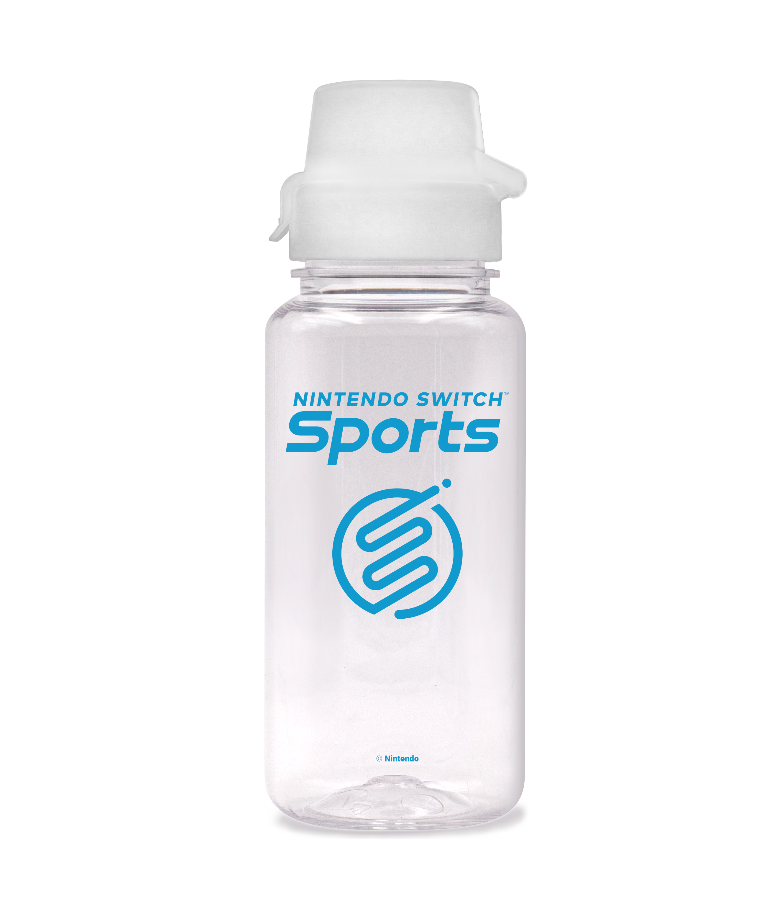
- Please vectorize Nintendo Switch Sports logo. I've found a vector version of the Wii Sports logo, which uses the same wordmark, which may be of help.
- Make image #3 not translucent, and vectorize, please
 . New info: Found a higher quality version of the logo in an unexpected source. Thanks, -- QuickQuokka [talk • contribs] 23:06, 18 March 2022 (UTC)
- Discussion
- I have created a vectorized version and added it to the gallery above. Let me know what you think, and mark it as done if you think it is adequate. Please create another request for the other things you want done, it's kinda unclear. DeVosMax [ contribs • talk • created media ] 09:59, 4 April 2022 (UTC)
- I ended up doing the other one as well. Cheers. DeVosMax [ contribs • talk • created media ] 09:08, 5 April 2022 (UTC)
- @DeVos Max: I am sorry but I have to question about the coloring of File:Nintendo Switch Sports.svg. The gradient color at the top-right corner is obviously different from the raster version. MilkyDefer 09:22, 23 April 2022 (UTC)
- I apologize, my monitor colors are out of whack, so I sincerely couldn't tell. I have since sorted this out and uploaded a fixed file. Hope this updated version is acceptable. DeVosMax [ contribs • talk • created media ] 22:59, 23 April 2022 (UTC)
Request for military colours of Malta
-
 Base image

- Article(s)
- List of flags of Malta
- Request
- It would be awesome to reproduce the military colours of Malta, the descriptions are already available at List of flags of Malta#Military flags. -- Great Brightstar (talk) 12:29, 27 March 2022 (UTC)
- Discussion
Gold Version of the Wikipedia Administrator Emblem
-
 It's the Mop!

- Article(s)
- Template:User wikipedia/Retired Administrator
- Request
- I lack the artistic skill to recolor this emblem, so I'm here to seek help. It is (or was) customary to present a long-time employee with a gold watch upon their retirement, so I would like a gold version of this emblem to include in the retired administrator userbox. — Jkudlick ⚓ (talk) 21:15, 31 March 2022 (UTC)
- Discussion
Stitch! anime logo
- Article(s)
- Stitch!
- Request
- Please convert the official English logo of this anime TV series to SVG. This logo was found on Disney+ earlier this year. The drop shadow is not necessary; it was likely added for Disney+. –WPA (talk) 17:19, 2 April 2022 (UTC)
- Discussion
- Unfortunately, I think what you're describing violates WP:FREER. I say this *after* having gone through the labor-intensive process of creating an SVG version of this logo. Even though significantly more complex files have been uploaded under Threshold of Originality justification, I can't with in good faith claim this logo is made only of "simple geometric shapes". As for trying to find an authentic SVG file, I haven't had any success yet, but I'll keep looking. DeVosMax [ contribs • talk • created media ] 08:38, 4 April 2022 (UTC)
Adjustments needed for the Seal of the Marshall Islands
-
 Seal of the Marshall Islands

- Request
- Could someone fix a few issues with the Seal of the Marshall Islands over on Commons? I listed items that require revisions on the cleanup template there: "Letters in motto are not the same size or on the same curvature (the "KE" is also not centered), bronze border is not symmetrical (the ribbon that says "seal" is also not centered), and some lines appear inconsistent (such as the boat or rays emanating from the angel) or have gaps (such as the land on the lower-left)". -- HapHaxion (talk / contribs) 19:42, 4 April 2022 (UTC)
- Discussion
- I think we've got a problem on our hands. It seems that the embassy of the Republic of the Marshall Islands has claimed this user-created seal to be their official seal? Take a look. They even are going so far as to protect it with the threat of legal repercussions even though its been released under public domain?
"Protection of the Seal: A person who uses the seal or a representation of it, or anything that so resembles the seal as to be calculated to deceive or advertise or promote any commercial purposes, or for any purpose whatsoever without the permission of the Cabinet, shall be guilty of a misdemeanor and shall, upon conviction, be subject to a fine of not less than $500 and no more than $2,500, a term of imprisonment of not less that 6 months nor more than one year or both. Each individual use of the seal shall be considered a separate offense."
- I went to google to try to find the official seal for reference only to realize that this has become the official seal. What do we do from here? Obviously I'm not going to perform the requested clean-up, since it is impossible to more accurately represent the "official" seal than this.DeVosMax [ contribs • talk • created media ] 03:15, 5 April 2022 (UTC)
- @DeVos Max: After doing some research it appears that the seal is official and was created prior to the existence of Wikipedia, as seen in the Republic of the Marshall Islands Seal Act of 1992, and that the SVG was just based off of the pre-existing seal. It can also be seen on a page of Charles Sturt University in Australia, which was last updated in 2005. Also, the Marshall Islands falls under the umbrella of countries not participating in the Berne Convention or Universal Copyright Convention per U.S. Circ. 38a (see here). I'll also @Ericmetro as the creator of the file. HapHaxion (talk / contribs) 15:24, 5 April 2022 (UTC)
Wikipedia logo
-
 Wikipedia logo in Otomi language
 -
 SVG version
- Article(s)
- https://meta.wikimedia.org/wiki/Requests_for_new_languages/Wikipedia_Queretaro_otomi
- Request
- Is there someone that can kindly make svg of this logo? Text is:
Wikipedia
Enciclopedia mpe̲fi
Many, many and many thanks in advance for all you can do!!!
--Gatto bianco (talk) 07:40, 7 April 2022 (UTC)
- Discussion
- @Gatto bianco:
 Done. TilmannR (talk) 00:11, 26 April 2022 (UTC)
Socialist Soviet Republic of Byelorussia
-
 Make by source
 -

-

.svg)
.png)
.gif)
- Article(s)
- Socialist Soviet Republic of Byelorussia
- Request
- Make by source-https://crwflags.com/FOTW/FLAGS/su-by_h.html - Налевайкин (talk) 06:09, 10 April 2022 (UTC)
- Discussion
Request circuit map for full circuit at Ozarks International Raceway
Bottom image at [2]
- Article(s)
- Ozarks International Raceway
- Request
- I request an image of the primary "full" circuit (both inner and outer circuits) in black. A comparable image would be File:Road America.svg. This is a new racing circuit with unnamed corners. I don't know the north arrow direction, the direction that the cars travel, the turn numbers, etc. The image would include the two connecting roads in the upper right in a lighter gray as the Road America image does. The shortcut through the hairpin turn near the center image would also be the same lighter gray. Similar to the second last image from the source but the 4 colored sections would be gray. -- Royalbroil 03:45, 25 April 2022 (UTC)
- Discussion
Taliban flag design improvements
-
 Flag of the Taliban

- Article(s)
- Flag of Afghanistan
- Afghanistan
- Taliban
- Request
- This might be a difficult request. Currently, the design of the text on the flag is lifted from the Saudi flag. There is no standard design in the flag law; only the 1:2 ratio and color are fixed. The Saudi Shahada has been observed, but what is more common is a mixture of this and elements from File:Flag of Taliban (variant).svg (which should not be changed, as it matches exactly with an observed variant). I'd like someone to edit File:Flag of the Taliban.svg to match the flags used at the flag raising ceremony in Kabul, which has the most common design used in official settings: [3], [4], [5], [6], [7], [8], [9]. This is also the design being used for official diplomatic meetings: [10]. Note the hoist is always to the right. ― Tartan357 Talk 03:51, 25 April 2022 (UTC)
- Discussion
Pure SVG Farmaco senza obbligo di ricetta (Italian logo for pharmaceutical drugs)

-
 Drawn with Inkscape
 -
This is how it should be
-
Pure SVG
.svg)
.svg)
- Article(s)
- Medication
- Request
- I asked first this problem at Commons, but got it archived without being solved. I would like a pure SVG (possible plain text) of the first image; it should look like the second (PNG) but what I was able to get is the third image (no text). Could you please help me? Thanks.-- Carnby (talk) 05:39, 27 April 2022 (UTC)
- Discussion
- @Carnby: Unfortunately
textPathis not supported. I uploaded a new version of Farmaco senza obbligo di ricetta (Italia).svg, which should match Farmaco senza obbligo di ricetta.png more closely, is about 10 kB smaller, and has invisibletextPathtext to make it easier to edit. TilmannR (talk) 14:17, 27 April 2022 (UTC)