
Talk:Climate change feedbacks: Difference between revisions
Sjsmith757 (talk | contribs) Tags: Mobile edit Mobile app edit Android app edit |
Sjsmith757 (talk | contribs) Tags: Mobile edit Mobile app edit Android app edit |
||
| Line 119: | Line 119: | ||
:::::::Panel 3 of this figure could also be considered https://www.ipcc.ch/report/ar6/wg1/figures/technical-summary/figure-ts-14/. we'd need to make sure use is okay under the IPCC's copyright policy. |
:::::::Panel 3 of this figure could also be considered https://www.ipcc.ch/report/ar6/wg1/figures/technical-summary/figure-ts-14/. we'd need to make sure use is okay under the IPCC's copyright policy. |
||
:::::::[[User:Sjsmith757|Sjsmith757]] ([[User talk:Sjsmith757|talk]]) 03:15, 20 July 2023 (UTC) |
:::::::[[User:Sjsmith757|Sjsmith757]] ([[User talk:Sjsmith757|talk]]) 03:15, 20 July 2023 (UTC) |
||
::::::::A final figure |
|||
::::::::https://www.ipcc.ch/report/ar6/wg1/figures/technical-summary/figure-ts-17/ |
|||
::::::::[[User:Sjsmith757|Sjsmith757]] ([[User talk:Sjsmith757|talk]]) 03:17, 20 July 2023 (UTC) |
|||
== Feedbacks to humans == |
== Feedbacks to humans == |
||
Revision as of 03:17, 20 July 2023
| This is the talk page for discussing improvements to the Climate change feedbacks article. This is not a forum for general discussion of the article's subject. |
Article policies
|
| Find sources: Google (books · news · scholar · free images · WP refs) · FENS · JSTOR · TWL |
| This article is of interest to the following WikiProjects: | ||||||||||||||||||||||||||||||||||||||||||||||||||||||||||||||||||||||||
| Template:Vital article
Please add the quality rating to the {{WikiProject banner shell}} template instead of this project banner. See WP:PIQA for details.
Please add the quality rating to the {{WikiProject banner shell}} template instead of this project banner. See WP:PIQA for details.
Please add the quality rating to the {{WikiProject banner shell}} template instead of this project banner. See WP:PIQA for details.
Please add the quality rating to the {{WikiProject banner shell}} template instead of this project banner. See WP:PIQA for details.
Please add the quality rating to the {{WikiProject banner shell}} template instead of this project banner. See WP:PIQA for details.
| ||||||||||||||||||||||||||||||||||||||||||||||||||||||||||||||||||||||||


| The contentious topics procedure applies to this page. This page is related to climate change, which has been designated as a contentious topic. Editors who repeatedly or seriously fail to adhere to the purpose of Wikipedia, any expected standards of behaviour, or any normal editorial process may be blocked or restricted by an administrator. Editors are advised to familiarise themselves with the contentious topics procedures before editing this page. |
|
|
|
This page has archives. Sections older than 31 days may be automatically archived by Lowercase sigmabot III when more than 5 sections are present. |
Cleanup and references
Cleaned up some refs and code, switched some to LDR, others to {{Cite doi}}. We're using the latest AFAIK. Some references I think could be improved. For example, #2 from the University of Texas are lecture notes, and #4 is about planetary science in general—not really focused on climate change feedback.[1] ChyranandChloe (talk)
Brown University EEPS1960X course assignment
This article is or was the subject of a class project aimed at updating IPCC references to the most recent report (AR6). More details can be found on the course page. Student editor(s): JF726. Updates will be made according to the IPCC citation guide. — Preceding undated comment added 00:42, 17 May 2022 (UTC)
New figure for the lede?


RCraig09 does great graphics work, but I wonder if the current lede graphic is the most appropriate image to have here. I think the nuances of this issue may be better captured by Figure TS.17 (p.96) in the WGI Technical Sumary report. I also think the current caption is somewhat misleading, based on that IPCC figure. I’d propose something myself, but I don’t have much experience with WP graphics. Dtetta (talk) 20:12, 24 July 2022 (UTC)
- @Dtetta: I think Figure TS.17 is a bit too techy for a lead image. But I can also see how the existing "Comprehensive diagram" (at right) has a fair amount of detail that's not specifically related to feedback.
- I propose that I make a simplified diagram that reduces the green "Effects on the environment" and the blue "Effects on humans" to smaller respective blocks, each with no content other than these two green and blue labels. I would also omit the three smaller boxes at the very top. In this manner, the content of the feedback sub-blocks will have greater prominence. Does that sound like a plan? I won't proceed without some consensus here, as it will take some tweaking work. —RCraig09 (talk) 23:05, 24 July 2022 (UTC)
- @RCraig09: -thanks for considering this. In terms of complexity, I don’t know that Figure TS.17 is much different than the figure for the “Drivers of recent temperature rise” section in the main CC article, and the lead text in this article (particularly the last paragraph) is already pretty techy. But I get that a lead image would ideally be a little more accessible. I see a few options. One would be to do a figure similar to what you have here, but list some of the processes on TS.17 in a more plain English form. Another would be to just make a graphic focused on one examples each for positive and negative feedbacks, like is done on this Portland State University page, focusing on the positive and negative examples in the last paragraph of the lead. I guess another possibility would be to use the PSU image ideas, and then revise the last paragraph text to match those examples. I defer to you on what would be the best approach.Dtetta (talk) 00:04, 25 July 2022 (UTC)
- Thanks. This will take some head-scratching. —RCraig09 (talk) 04:48, 25 July 2022 (UTC)
- @Dtetta: I've made a new, more focused diagram. The different processes from Fig. TS.17 are similar to the processes in my diagrams. I felt it was important to show more than one process. If you see any substantive issues, let me know. —RCraig09 (talk) 05:15, 27 July 2022 (UTC)
- I think it would be great to use the TS.17 Figure of the IPCC to define the major feedbacks. Our audience will not know that the Planck effect is not a feedback, so we should omit that one. There is a trade-off with understandability, as the carbon-land feedback is more easy to understand than the completely uncertain but possibly larger 'Other non−CO2 biogeochemical' feedback. It would be great if we can have the same three categories as the IPCC in the figure.
- I also like the Portland State one, even if it looks a bit amateurish.
- On the new block diagram figure, definitely an improvement, but the problem of low readability / small font size remains. I've not found any adequate software for these types of block diagrams, but consider using +/- rather than words. Cut out the "other effects", choose either global warming or climate change. Femke (talk) 16:27, 27 July 2022 (UTC)
- @RCraig09: Since you asked me if I had substantive issues, I figured I’d respond to this latest version. I appreciate the effort you’ve made to revise the graph. But the new graph seems to only list the positive feedbacks that are described on TS.17. That figure clearly shows a number of negative feedbacks as well. So both the graphic and the caption are significantly biased towards giving the reader the impression that climate feedbacks are of the positive kind, and move the overall Earth system toward tipping points. That’s not really the case, from my reading of the TS. Although the radiative feedbacks overall are positive, when you add the Plank response, the net climate feedback parameter, as described on page 95, is negative. So the idea in the caption that feedbacks are moving us towards tipping points is just not correct, as far as I can tell, and it seems kind of alarmist.
- I think the graphic would work much better if you just had a balanced presentation of both the positive and negative feedbacks, without getting into the overall net effect (since the exclusion of the Planck response seems like a bit of a technocratic sleight of hand). It would be nice if we could capture the major categories, as Femke has proposed, but it would also be helpful if you could just add the land and ocean responses to CO2 (since those seem relatively easy to mention in plain english terms), perhaps on the bottom right side of the graphic, as a way of balancing the positive feedback loops listed on the bottom left side. That would give the reader a more balanced perspective on the kinds of feedbacks that are significant, even if we don’t provide a complete coverage in the graphic.
- And just to build on Femke’s opinion about the Portland graphic, I think it’s value is in having a circular depiction of that A to B back to A dynamic that is happening with most of these feedbacks. I think that’s a visually more powerful way of capturing feedbacks (as a loop). And I think if you just picked a couple of examples (one positive, one negative), maybe you could have a larger font size. Again, appreciate your willingness to consider all this. Dtetta (talk) 19:26, 27 July 2022 (UTC)
- Thanks to all.
- Preliminarily: I had included only positive feedbacks since the chart is about global warming, and I didn't think it was alarmist. I have removed reference to tipping points as I can see that might be perceived as alarmist even though the caption recited "toward tipping points".
- I had paid attention only to the top panel in the Tech Report, since it was labeled "(a) Feedbacks in the climate system".
- After reading your comments, and better appreciating the bottom panel of Figure TS.17, per your suggestion I'm thinking of adding boxes with "Land carbon response to CO2" and "Ocean carbon response to CO2" in blocks on the right side, in place of the green and blue blocks. That way, positive feedbacks would be labeled on the left side and negative feedbacks would be on the right side. I'd welcome expert suggestion as to exactly what specific wording to use.
- The current diagram does show "loops", even if they're rectangular loops distinguished from the circular loops in the Portland reference. Adding curved arrows would take up space that would make fonts be smaller.
I'll await some more specific suggestions before I proceed with a next version.—RCraig09 (talk) 20:12, 27 July 2022 (UTC)
- @RCraig09: -thanks for considering this. In terms of complexity, I don’t know that Figure TS.17 is much different than the figure for the “Drivers of recent temperature rise” section in the main CC article, and the lead text in this article (particularly the last paragraph) is already pretty techy. But I get that a lead image would ideally be a little more accessible. I see a few options. One would be to do a figure similar to what you have here, but list some of the processes on TS.17 in a more plain English form. Another would be to just make a graphic focused on one examples each for positive and negative feedbacks, like is done on this Portland State University page, focusing on the positive and negative examples in the last paragraph of the lead. I guess another possibility would be to use the PSU image ideas, and then revise the last paragraph text to match those examples. I defer to you on what would be the best approach.Dtetta (talk) 00:04, 25 July 2022 (UTC)
- I have plunged ahead with the next version. However, I don't quite understand "Land carbon response to CO2" and "Ocean carbon response to CO2". Should arrows from those blocks point back to "Greenhouse gases" (reducing CO2) or to "Global Warming" (intrinsically cooling)? I think it's to "GHGs", but please verify before I upload. —RCraig09 (talk) 20:24, 28 July 2022 (UTC)
- Faversham! I'm convinced the arrows should point to "GHGs", so I uploaded Version 3. Suggestions welcome; please be graphically specific. —RCraig09 (talk) 21:11, 28 July 2022 (UTC)
- I think this is looking pretty good. For the negative feedback‘s I might say “CO2 uptake by plants and soils”, and then “CO2 uptake in oceans”. This would make those two elements a little more specific, like the positive feedbacks you list. On the top area, rather than plus and minus signs, I might say, for the left side, “Increased water vapor and methane (or CH4)”, and , on the right side, “Decreased CO2”. Guessing you can straddle the dotted line with those texts.
- For the caption underneath the graphic, I suggest: “Some effects of global warming can either enhance (positive feedbacks) or inhibit (negative feedbacks) future warming.
- Thanks for all your work on this! Dtetta (talk) 22:00, 28 July 2022 (UTC)
- I've added simplified wording to the negative feedbacks, and increased color-coding of text (red=positive feedback and blue=negative feedback). I couldn't enhance the descriptions of text to left and right of "Greenhouse gases" because of a lack of physical space for fonts. —RCraig09 (talk) 05:35, 29 July 2022 (UTC)
Moved content about oceans
This paragraph was in the section on net primary production. It probably contains some nuggets of relevant info but in its current form I find it more confusing than anything, which is why I have cut it out:
++++++++
The climate change-exacerbated 2019–2020 Australian wildfires caused oceanic deposition of wildfire aerosols, enhancing marine productivity and thereby caused widespread phytoplankton blooms. While these increased oceanic carbon dioxide uptake, the amount likely pales in comparison to the ~715 million tons[1] of CO2 the fires emitted[2][3] and can[additional citation(s) needed] contribute to ocean acidification[4] which, in turn, may induce toxic algal blooms[5] but is thought to generally closely follow future atmospheric CO2 concentrations as climate change feedbacks on ocean pH approximately cancel.[6] EMsmile (talk) 10:35, 18 July 2023 (UTC)
References
- ^ van der Velde, Ivar R.; van der Werf, Guido R.; Houweling, Sander; Maasakkers, Joannes D.; Borsdorff, Tobias; Landgraf, Jochen; Tol, Paul; van Kempen, Tim A.; van Hees, Richard; Hoogeveen, Ruud; Veefkind, J. Pepijn; Aben, Ilse (September 2021). "Vast CO2 release from Australian fires in 2019–2020 constrained by satellite". Nature. 597 (7876): 366–369. Bibcode:2021Natur.597..366V. doi:10.1038/s41586-021-03712-y. hdl:1871.1/c4f7bd8b-1e9b-49bb-9604-ba873e5a4d52. ISSN 1476-4687. PMID 34526704. S2CID 237536364.
- ^ "Australian fires in 2019–2020 had even more global reach than previously thought". Science News. 15 September 2021. Retrieved 19 October 2021.
- ^ Tang, Weiyi; Llort, Joan; Weis, Jakob; Perron, Morgane M. G.; Basart, Sara; Li, Zuchuan; Sathyendranath, Shubha; Jackson, Thomas; Sanz Rodriguez, Estrella; Proemse, Bernadette C.; Bowie, Andrew R.; Schallenberg, Christina; Strutton, Peter G.; Matear, Richard; Cassar, Nicolas (September 2021). "Widespread phytoplankton blooms triggered by 2019–2020 Australian wildfires". Nature. 597 (7876): 370–375. Bibcode:2021Natur.597..370T. doi:10.1038/s41586-021-03805-8. hdl:2117/351768. ISSN 1476-4687. PMID 34526706. S2CID 237536378.
- ^ "Understanding the Science of Ocean and Coastal Acidification". www.epa.gov. 8 September 2016.
- ^ Riebesell, Ulf; Aberle-Malzahn, Nicole; Achterberg, Eric P.; Algueró-Muñiz, María; Alvarez-Fernandez, Santiago; Arístegui, Javier; Bach, Lennart T.; Boersma, Maarten; Boxhammer, Tim; Guan, Wanchun; Haunost, Mathias; Horn, Henriette G.; Löscher, Carolin R.; Ludwig, Andrea; Spisla, Carsten; Sswat, Michael; Stange, Paul; Taucher, Jan (December 2018). "Toxic algal bloom induced by ocean acidification disrupts the pelagic food web". Nature Climate Change. 8 (12): 1082–1086. Bibcode:2018NatCC...8.1082R. doi:10.1038/s41558-018-0344-1. ISSN 1758-6798. S2CID 91926706.
- ^ McNeil, Ben I.; Matear, Richard J. (27 June 2006). "Projected climate change impact on oceanic acidification". Carbon Balance and Management. 1 (1): 2. doi:10.1186/1750-0680-1-2. ISSN 1750-0680. PMC 1513135. PMID 16930458.
{{cite journal}}: CS1 maint: unflagged free DOI (link)
EMsmile (talk) 10:35, 18 July 2023 (UTC)
Query about the image in the lead and the article overall
Noting the previous discussion from a year ago which User:Dtetta had started (see above), I'd like to come back to the image that is used in the lead (see on the right). My comments:
- I am in particular concerned about the two boxes that are shown under "negative feedbacks"; I find them very unclear. Perhaps they could be clarified at least in the caption of the image. Is this really a "feedback" thing? Isn't it just an effect of CC that the additional CO2 in the atmosphere can enhance growth of plants and leads to ocean acidification? In which sense would this be much of a "negative feedback", i.e. having a significant impact on slowing climate change?
- These terms of positive and negative feedbacks are actually confusing for the general public. For this reason, in the text of the article I have changed the section headings now to "Reinforcing feedbacks" and "balancing feedbacks". Could this be added into the chart as well? I know in science we talk about "positive feedback" but can we give our readers a little hint that positive is not a good thing here.
- I think the graph is quite misleading because it gives the impression that the positives and negatives are almost in balance. This is far from the truth!
- The image is also not very well synched with the words in the article. When you look at the text under "negative feedbacks" (now called "balancing feedbacks") it is actually very weak and says different things than what the image has there.
- Personally, I think we are better off replacing that graph with a 2x2 image collage showing: permafrost melting, ice caps melting, increased water vapour and clouds, and then one showing an increase in net primary productivity in oceans (so 3 images for the positive feedback, one for the negative feedback).
Apart from this image, what do you all think of the status of this article? Where are its weaknesses? It doesn't have high pageviews (about 160 per day) so probably not worth sinking too much time into it. How well is it in synch with the article on tipping points in the climate system? From looking at it superficially, I don't see too much overlap with the tipping points article which is good but the two articles should refer to each other and be what I call "in sync". Pinging also User:InformationToKnowledge, User:Rhwentworth and User:ASRASR for their opinion. EMsmile (talk) 10:50, 18 July 2023 (UTC)
References
- ^ "The Study of Earth as an Integrated System". nasa.gov. NASA. 2016. Archived from the original on November 2, 2016.
- ^ Fig. TS.17, Technical Summary, Sixth Assessment Report (AR6), Working Group I, IPCC, 2021, p. 96. Archived from the original on July 21, 2022.
EMsmile (talk) 10:50, 18 July 2023 (UTC)
- Yes, absorption of atmospheric carbon dioxide absorption is "a feedback thing", since reducing carbon dioxide in the atmosphere amounts to reducing a greenhouse gas that causes global warming. The scientific terms positive feedback and negative feedback are well understood and used extensively throughout reliable sources. Here, the caption recites "enhance" and "inhibit" specifically explain their meaning—specifically preventing any inference that positive feedbacks are a "good thing". Further, the caption's terms have wikilinks for science newbies to learn more. Replacing them with your own personal terms reinforcing feedbacks and balancing feedbacks actually avoids reliable source usage against fundamental Wikipedia policy. I will not be changing a diagram's accepted scientific terminology to comport with your personal terms. Conceptual block diagrams do not convey quantities, so, no, the diagram does not state, imply or suggest opposites are in balance. Much of this diagram is derived from and modeled after File:20200118 Global warming and climate change - vertical block diagram - causes effects feedback.svg which was the result of extensive group discussion at Talk:Climate change about three years ago. Lastly, pictures do not convey feedback mechanisms that are the subject of this article. —RCraig09 (talk) 17:36, 18 July 2023 (UTC)
- I've just seen (in Google search results) that a few sources use reinforcing feedback and balancing feedback, but even general-public Google searches turn up massively more hits of positive feedback and negative feedback than the other terms. —RCraig09 (talk) 19:14, 18 July 2023 (UTC)
- The Glossary of the 3949-page IPCC document that is used as a source at the end of the lead's first paragraph defines "Climate feedback An interaction in which a perturbation in one climate quantity causes a change in a second and the change in the second quantity ultimately leads to an additional change in the first. A negative feedback is one in which the initial perturbation is weakened by the changes it causes; a positive feedback is one in which the initial perturbation is enhanced." Your favored terms are apparently not used. —RCraig09 (talk) 19:28, 18 July 2023 (UTC)
- I am not going to argue with you over this, as there is no point. I do think it's tech jargon to have a section heading called "Positive feedbacks". A good compromise could have been a section heading called "Positive feedbacks (enhancing climate change)" but I already know that I wouldn't be able to change your mind on this. So never mind.
- In your reply you didn't address this point of mine "The image is also not very well synched with the words in the article. When you look at the text under "negative feedbacks" it is actually very weak and says different things than what the image has there." So either the image should be adjusted to include content of that section, or that section needs to be adjusted to include content that is summarised in the image. Currently, the section on negative feedbacks talks about these topics:
- Blackbody radiation (not shown in the image)
- Carbon cycle
- Le Chatelier's principle (this is actually about oceans taking up CO2 which is in the image but I think the section sub-heading should be changed; and also it needs updating. It was written in 2010...)
- Chemical weathering (not shown in the image)
- Net primary productivity (mentioned in the image but without using this term)
- Lapse rate (not shown in the image) - Pinging User:Sjsmith757 because they had added content there
Can someone who understands the negative feedbacks better than I do ensure that either the image is improved or the content in that section is improved, or both? EMsmile (talk) 08:56, 19 July 2023 (UTC)
- Here, I must agree with RCraig09 that changing the terms which have been in use in tens of thousands of papers and other articles is not a good idea.
- As for the rest, I would have to say that this article is unfortunately full of weaknesses. Many sections are so outdated that much of the article is essentially outright misleading. In regards to the image in particular, the main issue is that it appears to portray CO2 absorption by land and ocean as the main (or rather, the only) kind of negative feedback. In fact, while those sinks are certainly important, blackbody radiation is far more so. According to the leading expert on climate feedback loops and tipping points, Dr. Adam Armstrong McKay (the lead author of last year's Science assessment of tipping points):
- Outgoing longwave radiation acts as the main major negative feedback, as hot things radiate more heat away. Positive feedbacks do not inevitably lead to runaway warming, as negative feedbacks will eventually counter them – if there were no negative feedbacks Earth would have become as hot as Venus long ago.
- I was already planning to set aside time to update this article once I was able to update some of the more visible pages. Perhaps I should consider it a higher priority. InformationToKnowledge (talk) 15:43, 19 July 2023 (UTC)
- — User:InformationToKnowledge, can you suggest particular concise wording I could add to the diagram that would capture the essence of the radiative counterbalance issue—but expressed in layman's terms? I'm initially thinking of "Earth's emanation to space of infrared (longwave) radiation", even though I'd prefer something less jargony if possible.
- — EMsmile, the diagram's "Plants ... absorbing carbon dioxide" is part of the carbon cycle. Lapse rate is a quantification of temperature, related to radiation, as a function of altitude, and is not a separate phenomenon in this context. I've just asked InformationToKnowledge for a specific wording suggestion. . . . Separately, "positive feedback" and "negative feedback" are not jargony terms, as a Google search will attest; in a technical article, the scientifically dominant terms should be explained (as they are in the diagram caption and the lead) rather than being avoided or de-emphasized. As a matter of Wikipedia style, section names should be as concise as possible; their narrative text explains the section's subject.
- — As I remember, the two negative feedback blocks included in the diagram were those suggested by User:Femke, who may have additional thoughts now. The two blocks were never presented as all-inclusive. With the addition of a radiative energy block, the diagram would better summarize the feedback concept—rather than "sync"ing to text that has been substantively criticized. —RCraig09 (talk) 16:40, 19 July 2023 (UTC)
- Can we use the wording in the summary of this hot-off-the-presses (published a mere two days ago!) paper?
- Earth's climate is stable because a warmer planet loses more energy to space, at infrared wavelengths invisible to the naked eye.
- "Warmer planet loses more heat to space" sounds simple enough to fit on a graphic. (And the paper is CC-BY-4.0, so close paraphrasing shouldn't be a problem.) InformationToKnowledge (talk) 17:39, 19 July 2023 (UTC)
- The JAMES article is a good find. However, in Talk:Greenhouse effect, there has been much debate as to how to characterize what gets radiated anywhere, and I'm disinclined to say "heat" (somewhat of a colloquial term) goes into space. I'm thinking that much of the public has seen the word infrared associated with warmth (as in infrared heat lamp), so I'm inclined to use it even though it is also "scientific". To link the concept to global warming itself, how about: "
Warmed substances radiate more infrared energy into space
"? (It will fit into a three-line block.) —RCraig09 (talk) 20:11, 19 July 2023 (UTC)- I am so happy to see InformationToKnowledge to join us here, thank you! As for the diagram I am really concerned that we are trying now to build up a new diagram more or less from scratch, rather than just using one that has already been published. Surely if we look hard enough we'll find a published diagram (under a compatible licence) and don't have to make one up ourselves? Wouldn't it be WP:OR if we developed our own diagram rather than staying at least very very close to one that has already been published? Or, if there is no such image available and nothing in the IPCC reports then perhaps the reason is that it's not so easy to show these complexities in a simple schematic?
- I still think we could probably make 4 pictures to work (for the lead) if we had a suitable caption for a 2x2 image collage. Especially the permafrost thawing picture would be very easy to explain as a positive feedback effect. - Or otherwise perhaps it's "safer" to simply have no image in the lead at all.
- (and by the way, a term can still be a jargon type term in the Wikipedia logic even if it gets a high amount of Google hits; perhaps lots of people are looking it up as they are confused about what "positive feedback" means. Or it could also be the kind of feedback that people get by their HR department about their performance at work etc. We don't have to avoid the term "positive feedback" altogether but I still think it could be helpful to explain it better in the section headings (yes, I know they are meant to be short). Even "enhancing" is not great as it's normally used for something that makes something better. Well perhaps some light copy editing could be done at the end where we ensure that people understand, and can read in more than one place in the article, that a positive feedback loop is one that makes the world more doomed, not better! (it might be abundantly logical for us but may not be so logical for people who are new to this topic) EMsmile (talk) 21:06, 19 July 2023 (UTC)
- @EMsmile I will offer my opinion, but I just want to preface that my expertise is in climate science but not in the usage/policies of Wikipedia and so I can't speak to some of the points brought up here.
- On the subject of the language positive/negative feedback:
- I think I agree with most of what has been said here. These are standard terms in science, but they are definitely not easily understood by a lay audience. To a lay audience, "positive feedback" is when your employer tells you "good job". So I think I would lean towards categorizing it as jargon. However, there are times (and I believe this is one) where it is appropriate to teach the jargon. The purpose of the article is to explain climate feedbacks. I think I would suggest referring to positive feedbacks as destabilizing and negative feedbacks as stabilizing. I think that might capture the connotation and meaning a bit better. As pointed out in one of the quotes, we expect the stabilizing to win out eventually, unless we cross a tipping point. I would support section headings titled Positive (destabilizing) Feedbacks and Negative (stabilizing) Feedbacks, or something to that effect.
- Regarding negative feedbacks:
- @InformationToKnowledge is correct that the Planck feedback is the dominant negative feedback. Something along the lines of what has been suggested by @RCraig09 seems reasonable. Perhaps "a warmer Earth emits/loses more (infrared) energy to space".
- However, one current issue with the article from a scientific perspective is that it confuses carbon cycle feedbacks and climate change feedbacks. Specifically, climate feedbacks refer to processes that directly modify the amount of energy absorbed or released by the Earth, whereas carbon cycle feedbacks modify the amount of carbon dioxide in the atmosphere. In general, changes in the amount of carbon dioxide in the air are not considered climate feedbacks - the amount of CO2 is the input that is changed, and the feedbacks respond. This means that changes in CO2 held by land and ocean are not strictly climate feedbacks. This may sound a bit picky but it is important to consider the systems separately as they are distinct despite interacting. The IPCC does separate feedbacks from the carbon cycle (see this Figure from AR6 which might be useful for this page: https://www.ipcc.ch/report/ar6/wg1/figures/chapter-7/figure-7-10). But the entire page seems to combine them, and I think it might be worth considering separating the pages. Also because of this, the intro figure to this page is not really accurate. And I am not convinced editing it is the way to go, I think it should be possible to turn up an IPCC figure that would work. I'm happy to assist with that.
- The lapse rate feedback is a tricky feedback overall because it is generally negative, except in polar regions where it is positive and it strongly contributed to polar amplified warming, one of the biggest consequences of climate change. I think @InformationToKnowledge is correct that the page could use some overall updates.
- I hope those thoughts are of some help!
- Sjsmith757 (talk) 03:04, 20 July 2023 (UTC)
- Panel 3 of this figure could also be considered https://www.ipcc.ch/report/ar6/wg1/figures/technical-summary/figure-ts-14/. we'd need to make sure use is okay under the IPCC's copyright policy.
- Sjsmith757 (talk) 03:15, 20 July 2023 (UTC)
- The JAMES article is a good find. However, in Talk:Greenhouse effect, there has been much debate as to how to characterize what gets radiated anywhere, and I'm disinclined to say "heat" (somewhat of a colloquial term) goes into space. I'm thinking that much of the public has seen the word infrared associated with warmth (as in infrared heat lamp), so I'm inclined to use it even though it is also "scientific". To link the concept to global warming itself, how about: "
- — As I remember, the two negative feedback blocks included in the diagram were those suggested by User:Femke, who may have additional thoughts now. The two blocks were never presented as all-inclusive. With the addition of a radiative energy block, the diagram would better summarize the feedback concept—rather than "sync"ing to text that has been substantively criticized. —RCraig09 (talk) 16:40, 19 July 2023 (UTC)
Feedbacks to humans

I do think that a feedback analysis of the links in Al Gore (2006). An inconvenient truth: the planetary emergency of global warming and what we can do about it. would be a useful contribution and i guess i agree that File:Gore inconvenient truth loops.png isn't high quality, so i've put it in the article about the book itself. i'd hoped that somebody might improve the image as it's a useful contribution to understanding the ultimately negative consequences of human population growth and technological development. if you know of anyone who'd like to pursue this, please let me know. Lee De Cola (talk) 13:52, 19 July 2023 (UTC)
- Thanks for contributing, User:Ldecola. Al Gore's diagram may be less-than-professional in its graphical presentation, but it does begin to show the complexity of feedbacks in the climate system. I see its main value is to demonstrate "Climate feedbacks are complicated!"—a proposition that can be stated in text backed up by reliable sources. Other than improving the graphical representation a bit, I can't conceive of a way to improve the graphic in a way that would crystallize readers' understanding of feedbacks. —RCraig09 (talk) 16:51, 19 July 2023 (UTC)
Actually I regard the graphic's main point as that most of the important feedbacks to humans are negative and will reduce their numbers during this century, and we are seeing this playing out now. I think I'll post a similar graphic with page numbers on the AN INCONVENIENT TRUTH page, and see who reacts.Lee De Cola (talk) 18:27, 19 July 2023 (UTC)
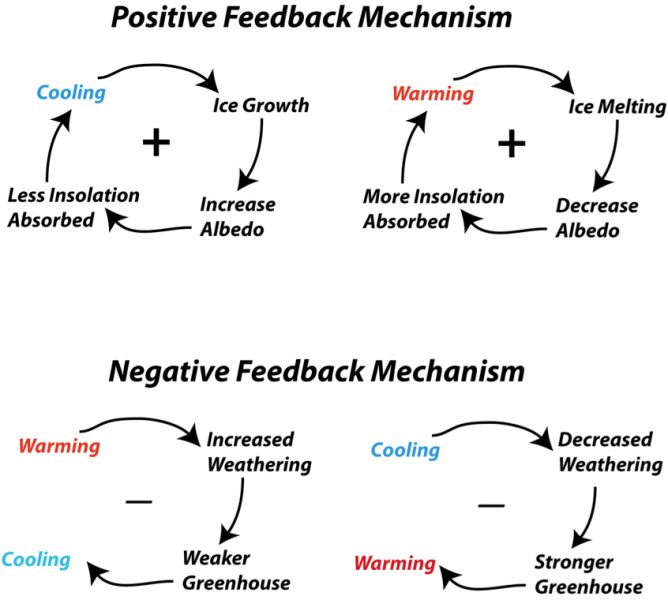
- Hi Ldecola, that "Al Gore" graphic looks to me like a layperson or teacher has drawn it up - it just doesn't look very professional (unless its main point is to say "it's complicated!"...) I think there are better ones out there already, like this one on the right:
- Also we have better articles for this topic, like effects of climate change and effects of climate change on human health. This article here is meant to be very much focused on only those very specific feedback effects, and will remain rather techy and sciency. The easier-to-understand information is more likely available to people at the range of articles that we already, which are called "effects of climate change on...". EMsmile (talk) 20:30, 19 July 2023 (UTC)
- OK, we can drop the discussion of the graphic(s); but tho i'm an expert on global change, i AM anxious that Wikipedia may not be doing a good job of laying out the basics - but i expect that better heads than i are also aware of this. Lee De Cola (talk) 21:58, 19 July 2023 (UTC)
References
- ^ "The Causes of Climate Change". climate.nasa.gov. NASA. Archived from the original on 2019-12-21.
- ^ "Climate Science Special Report / Fourth National Climate Assessment (NCA4), Volume I". science2017.globalchange.gov. U.S. Global Change Research Program. Archived from the original on 2019-12-14.
- ^ Cite error: The named reference
:26was invoked but never defined (see the help page). - ^ "The Study of Earth as an Integrated System". nasa.gov. NASA. 2016. Archived from the original on 2016-11-02.
- C-Class Environment articles
- Mid-importance Environment articles
- C-Class Climate change articles
- High-importance Climate change articles
- WikiProject Climate change articles
- C-Class Geology articles
- Mid-importance Geology articles
- Mid-importance C-Class Geology articles
- WikiProject Geology articles
- C-Class Arctic articles
- Mid-importance Arctic articles
- WikiProject Arctic articles
- C-Class Weather articles
- Mid-importance Weather articles
- C-Class Climate articles
- Mid-importance Climate articles
- WikiProject Weather articles