
Italic type
This article needs additional citations for verification. (June 2006) |
In typography, italic type /ɪˈtælɪk/ or /aɪˈtælɪk/ refers to cursive typefaces based on a stylized form of calligraphic handwriting. The influence from calligraphy can be seen in their usual slight slanting to the right. Different glyph shapes from roman type are also usually used—another influence from calligraphy.
It is distinct therefore from oblique type, in which the font is merely distorted into a slanted orientation. However uppercase letters are often oblique type or swash capitals rather than true italics.
Examples
An example of normal (roman) and true italics text:

The same example, as oblique text:

Some examples of possible differences between roman and italic type, besides the slant, are below. The transformations from roman to italics are illustrated.
 a "round" or one-storey a,
 an e whose bowl is curved rather than pointed,
 an f with a tail (known as a descender),
 a k with a looped bowl, a k with a ball terminal,
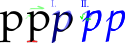 a p with an intersection at the stem (ascender),
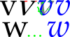 a v and w with swashes and curved bottoms,
 and a z with the stress on the horizontal strokes as opposed to the diagonal vertical one.


None of these differences are required in an italic; some, like the p variant, don't show up in the majority of italic fonts, while others, like the a and f variants, are in almost every italic. Other common differences include:
- Double-loop g replaced by single-loop version.
- Different closing height where the forked stroke intersects with the stem (eg: a, b, d, g, p, q, r, þ).
- Bracketed serifs (if any) replaced by hooked serifs.
- Tail of Q replaced by tilde (eg: Garamond).
Less common differences include a descender on the z and a ball on the finishing stroke of an h, which curves back to resemble a b somewhat. Sometimes the w is of a form taken from old German typefaces, in which the left half is of the same form as the n and the right half is of the same form as the v in the same typeface. There also exist specialized ligatures for italics, such as a curl atop the s which reaches the ascender of the p in sp.
In addition to these differences in shape of letters, italic lowercases usually lack serifs at the bottoms of strokes since in drawing the letter a pen would bounce up to continue making the letter. Instead they usually have one-sided serifs that curve up on the outstroke (contrast the flat two-sided serifs of a roman font). One uncommon exception to this is Hermann Zapf's Melior. (Its outstroke serifs are one-sided, but they don't curve up.)
Outside the regular alphabet, there are other italic types for symbols:
- Ampersand resembles eT ligature more than the Roman version (eg: ITC Garamond)
- Question mark resembles a reversed Latin S.
- Asterisk is rotated instead of slanted (eg: Bookman Old Style, ITC Garamond).
Usage
When to use
- Emphasis: "Smith wasn't the only guilty party, it's true."
- The titles of works that stand by themselves, such as books or newspapers: "He wrote his thesis on The Scarlet Letter." Works that appear within larger works, such as short stories, poems, or newspaper articles, are not italicized, but merely set off in quotation marks.
- The names of ships: "The Queen Mary sailed last night."
- The title of an epic poem: "The Iliad is thought to be the first Greek writing."
- Foreign words, including the Latin binary nomenclature in the taxonomy of living organisms: "A splendid coq au vin was served"; "Homo sapiens".
- Using a word as an example of a word rather than for its semantic content (see use-mention distinction): "The word the is an article."
- Using a letter or number mentioned as itself:
- John was annoyed: they had forgotten the h in his name once again.
- When she saw her name beside the 1 on the rankings, she finally had proof that she was the best.
- Using a letter or number mentioned as itself:
- Introducing or defining terms, especially technical terms or those used in an unusual or different way:[1] "Freudian psychology is based on the ego, the super-ego, and the id."; "An even number is one that is a multiple of 2."
- Sometimes in novels to indicate a character's thought process: "This can't be happening, thought Mary."
- Symbols for physical quantities and other mathematical variables: "The speed of light, c, is approximately equal to 3.00×10⁸ m s-1."
Alternative representations
Oblique type
In computing interfaces, the text leaning effect is called Italic, whether or not an italic font is used to render the text. The start of this confusion possibly appeared when Adrian Frutiger named the slanted versions of his typefaces Univers and Frutiger as italic. In the case of Univers, only Univers 65 Bold has a italic-named counterpart. Since then, many font families, primarily sans-serif fonts, have called the oblique fonts italic. Although updated version of those font families begin to incorporate italic features, some font families, such as Avenir Next, Linotype Univers, Neue Helvetica, do not.
Although oblique font can be generated by simply tilting base font, some designers use optical correction to correct the distorted curves introduced by the tilting alone. In addition, the tilting angle used by GUI may be different than the oblique or italic font. Some font families even have fonts in both italic and oblique variants, regardless of the presence of italic type. In addition, the oblique font can have different tilting angle from the italic font. For example, Univers 65 Bold Oblique has a smaller leaning angle than the Univers 66 Bold Italic.
Italics within italics
If something within a run of italics needs to be italicized itself, the type is switched back to non-italicized (roman) type: That sounds like something from The Scarlet Letter, thought Mary.
Left-leaning italics
In certain Arabic fonts (eg: Adobe Arabic, Boutros Ads), the italic font has the top of the letter leaning to the left, instead of leaning to the right. Some font families, such as Venus, Roemisch, Topografische Zahlentafel, include left leaning fonts and letters designed for German cartographic map production, even though they do not support Arabic characters.
Parentheses
The Chicago Manual of Style suggests that to avoid problems such as overlapping and unequally spaced characters, parentheses and brackets surrounding text that begins and ends in italic or oblique type should also be italicized. An exception to this rule applies when only one end of the parenthetical is italicized (in which case roman type is preferred).
Substitutes
In media where italicization is not possible, alternatives are used as substitutes:
- In typewritten or handwritten text, underlining is typically used.
- In plain-text computer files, including e-mail communication, italicized words are often indicated by surrounding them with slashes or other matched delimiters. For example:
- I was /really/ annoyed.
- They >completely< forgot me!
- I had _nothing_ to do with it.
- It was *absolutely* horrible.
- Where the italics do not indicate emphasis, but are marking a title or where a word is being mentioned or defined as a direct object, quotation marks may be substituted:
- The word "the" is an article.
- The term "even number" refers to a number that is a multiple of 2.
- The story "A Sound of Thunder" was written by Ray Bradbury.
Web pages
In HTML, the i element is used to produce italic (or oblique) text. When the author wants to indicate emphasized text, the em element, often rendered in italics, should be used instead because it is more meaningful to user agents that cannot display italics. If the italics are ornamental rather than semantic, then the Cascading Style Sheets declaration font-style: italic should be used instead of the i element.
History
Italic type was first produced by Aldus Manutius and the Aldine Press in 1501 as a condensed type for simple, compact volumes.[2] The punches for these types were cut by Francesco da Bologna (whose name was Griffi). In 1501 Aldus wrote to his friend Scipio:
We have printed, and are now publishing, the Satires of Juvenal and Persius in a very small format, so that they may more conveniently be held in the hand and learned by heart (not to speak of being read) by everyone.
The Aldine italic was modeled on the handwriting of Italian humanist Poggio Bracciolini who wrote in a beautiful and legible style, who was himself emulating the cursive handwriting of blackletter, which Poggio Bracciolini (mistakenly) believed to be the style of Ancient Rome. When we read italic type to this day we are basically reading the handwriting of Poggio Bracciolini.[3]
Unlike the italic type of today, the capital letters were upright roman capitals which were shorter than the ascending lower-case italic letters and used about 65 tied letters (ligatures) in the Aldine Dante and Virgil of 1501.
This Aldine italic become the model for most italic types. It was very popular in its own day and was widely (and inaccurately) imitated. The Venetian Senate gave Aldus exclusive right to its use, a patent confirmed by three successive Popes, but it was widely counterfeited.[2] The Italians called the character Aldino, while others called it Italic.
The slanting italic capital was first introduced by printers in Lyons, and is now used in nearly all italic fonts.
References
- ^ "University of Minnesota Style Manual"
- ^ a b D.B. Updike, Printing Types: their history, form and use, Harvard University Press, 1927
- ^ Bartlett, Kenneth R. (2005), The Italian Renaissance. Part 1. Lecture 6 [sound recording], Great courses (Library ed.), Chantilly, VA: Teaching Company, ISBN 1598030590
| Page | |||||||||||
|---|---|---|---|---|---|---|---|---|---|---|---|
| Paragraph | |||||||||||
| Character |
| ||||||||||
| Typeface classifications |
| ||||||||||
| Punctuation | |||||||||||
| Typesetting | |||||||||||
| Typographic units | |||||||||||
| Digital typography | |||||||||||
| Typography in other writing systems | |||||||||||
| Related articles | |||||||||||
| Related tables | |||||||||||