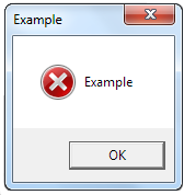
Error message
This article needs additional citations for verification. (September 2008) |

An error message is information displayed when an unexpected condition occurs, usually on a computer or other device. On modern operating systems with graphical user interfaces, error messages are often displayed using dialog boxes. Error messages are used when user intervention is required, to indicate that a desired operation has failed, or to relay important warnings (such as warning a computer user that they are almost out of hard disk space). Error messages are seen widely throughout computing, and are part of every operating system or computer hardware device. Proper design of error messages is an important topic in usability and other fields of human–computer interaction.
Common error messages
The following error messages are commonly seen by modern computer users:
- Access denied
- This error occurs if the user has insufficient privileges to a file, or if it has been locked by some program or user.
- Device not ready
- This error most often occurs when there is no floppy disk (or a bad disk) in the disk drive and the system tries to perform tasks involving this disk.
- File not found
- The file concerned may have been damaged, moved, deleted, or a bug may have caused the error. Alternatively, the file simply might not exist, or the user has mistyped its name. More frequent on command line interfaces than on graphical user interfaces where files are presented iconically and users do not type file names.
- Low Disk Space
- This error occurs when the hard drive is (nearly) full. To fix this, the user should close some programs (to free swap file usage) and delete some files (normally temporary files, or other files after they have been backed up), or get a bigger hard drive.
- Out of memory
- This error occurs when the system has run out of memory or tries to load a file too large to store in RAM. The fix is to close some programs, or install more memory.
- [program name] has encountered a problem and needs to close. We are sorry for the inconvenience.
- This message is displayed by Microsoft Windows XP when a program causes a general protection fault or invalid page fault. In Windows 7 it is changed into a more simple "[program name] has stopped working".
Notable error messages
- Abort, Retry, Fail? - A notoriously confusing error message seen in MS-DOS

An example of an Error message .vbs script - Bad command or file name - Another notoriously common and confusing error message seen in MS-DOS
- The Blue Screen of Death - On Microsoft Windows and ReactOS operating systems, this screen appears when Windows or ReactOS can no longer run because of a severe error. It is roughly analogous to a kernel panic on Linux, Unix or Mac OS X.
- Can't extend - an error message from Acorn DFS. DFS stores files in non-fragmented contiguous disk space, this error is caused when trying to extend an open random-access file into space that is already occupied by another file.
- Guru Meditation - an error message from the Commodore Amiga, roughly analogous to a kernel panic or Blue Screen of Death, also adopted by more recent products such as VirtualBox
- HTTP 404 - A file not found error seen on the World Wide Web, usually resulting from a link to a page that has been moved or deleted, or a mistyped URL
- Lp0 on fire - A Unix warning that the printer may be on fire
- Not a typewriter - A Unix error message that is confusing due to its now obsolete use of the word typewriter, and which is sometimes output when the nature of error is entirely different
- PC LOAD LETTER - An error on several HP laser printers that simply asked the user to add "Letter" size paper in a confusing way
- SYNTAX ERROR - Seen on many computer systems when the received instructions are in a format they don't understand
- HTTP 504 - An error found on the World Wide Web stating that a gateway timeout occurred in the internet link.
- Error 1603 - An error that states that a problem during installation of a computer program, this error particularly occurs on Windows computer systems.
- <application name> has stopped - An error message commonly found on Android devices, which states a current running application unexpectedly stops working or crashes.
- Success - one of the error messages (in this instance, POSIX) that occurs when the program has detected an error condition, yet the actual error message printing routine relies on C library to print the error reported by the operating system (in this case, errno.h), while the underlying system calls have succeeded and report no errors (in this case,
errno == 0). This is a form of sloppy error handling that is particularly confusing for the users.
Fail pets

With the rise of Web 2.0 services such as Twitter, end-user facing error messages such as HTTP 404 and HTTP 500 started to be displayed with whimsical characters, termed Fail Pets or Error Mascots. The term "Fail Pet" was coined, or at least first used in print, by Mozilla Engineer Fred Wenzel in a post on his blog entitled "Why wikipedia might need a fail-pet — and why mozilla does not."[1] Dr. Sean Rintel argues that error messages are a critical strategic moment in brand awareness and loyalty. Fail pets are of interest to marketers because they can result in brand recognition (especially through earned media). "However, that same recognition carries the danger of highlighting service failure."[2] The most famous fail pet is Twitter's Fail Whale (see Twitter service outages). Other fail pets include:
- Ars Technica: Moon Shark
- FarmVille on Facebook: Sad cow.
- GitHub: Octocat
- Google: Broken robot
- iCloud: Cloud with Apple System 7 emoticon-style face
- Macintosh: Sad Mac
- Tumblr: Tumbeasts
- Twitter: Fail Whale / Twitter Robot
- YouTube: Televisions (on main site), light static inside video window (embedded video)
- Cartoon Network:BMO [Asia]: Domo
- Google Chrome: T-Rex
Message format
The form that error messages take varies between operating systems and programs.
Error messages on hardware devices, like computer peripherals, may take the form of dedicated lights indicating an error condition, a brief code that needs to be interpreted using a look-up sheet or a manual, or via a more detailed message on a display.
On computers, error messages may take the form of text printed to a console, or they may be presented as part of a graphical user interface. Error messages are often presented as a dialog box, which makes them cause a following mode error in the user interaction. In many cases the original error can be avoided by error prevention techniques. Instead of raising an error message the system design should have avoided the conditions that caused the error.[3]
While various graphical user interfaces have different conventions for displaying error messages, several techniques have become common:
- A dialog box, or pop-up message, appears in a window on the screen, blocking further interaction with the computer until it is acknowledged. On Mac OS X, sheets are a form of dialog box that are attached to a specific window.
- Notification icons appear to notify a user about a condition without interrupting their work. On Windows, notification icons appear in the System Tray. On Mac OS X, notification icons may appear in the menu bar, or may take the form of an application's icon "bouncing" in the Dock. The GNOME user interface for Unix systems can display notification icons in a panel.
- Minor errors may be displayed in a status bar, a small portion of an application's window that can display brief messages to the user.
The three main factors[4] that influence the design of error messages are technical limitations, the amount of information to be presented, and what kind of user input is required.
Some systems have technical limitations that may constrain the amount of information an error message can contain. For example, a printer with a sixteen-character alphanumeric display can only show a very limited amount of information at once, so it may need to display very terse error messages. Even with computer monitors, the programmer must consider the smallest monitor that a user might reasonably use, and ensure that any error messages will fit on that screen.
The nature of the error determines the amount of information required to effectively convey the error message. A complex issue may require a more detailed error message in order to adequately inform the user of the problem.
Security
When designing error messages, software designers should take care to avoid creating security vulnerabilities. The designer should give the user enough information to make an intelligent decision, but not so much information that the user is overwhelmed or confused. Extraneous information may be hidden by default or placed in a separate location. Error message should not expose information that can be exploited by a cracker to obtain information that is otherwise difficult to obtain. Examples are systems which may show either "invalid user" or "invalid password" depending on which is incorrect, and the error page in the web server IIS 5.0 which provides a complete technical description of the error including a source code fragment.
See also
- Alert dialog box
- Human–computer interaction
- Interaction design
- Usability
- User error
- User interface design
- Exception handling
References
- ^ Wenzel, Fred. "why wikipedia might need a fail-pet — and why mozilla does not". Retrieved 8 February 2012.
- ^ Rintel, Sean. "The Evolution of Fail Pets : Strategic Whimsy and Brand Awareness in Error Messages". UX Magazine. Retrieved 8 February 2012.
- ^ Raskin, Jef 2000.The Humane Interface, Addison-Wesley ISBN 0-201-37937-6. See chapter 6-4-2, Messages to the User
- ^ "Non-Fatal Errors: Creating usable, effective error messages". Retrieved 2007-02-16.

