Graphical user interface
This article needs additional citations for verification. (May 2022) |

A graphical user interface, or GUI (/ˈɡuːi/[1][2] GOO-ee), is a form of user interface that allows users to interact with electronic devices through graphical icons and visual indicators such as secondary notation. In many applications, GUIs are used instead of text-based UIs, which are based on typed command labels or text navigation. GUIs were introduced in reaction to the perceived steep learning curve of command-line interfaces (CLIs),[3][4][5] which require commands to be typed on a computer keyboard.
The actions in a GUI are usually performed through direct manipulation of the graphical elements.[6][7][8] Beyond computers, GUIs are used in many handheld mobile devices such as MP3 players, portable media players, gaming devices, smartphones and smaller household, office and industrial controls. The term GUI tends not to be applied to other lower-display resolution types of interfaces, such as video games (where head-up displays (HUDs)[9] are preferred), or not including flat screens like volumetric displays[10] because the term is restricted to the scope of 2D display screens able to describe generic information, in the tradition of the computer science research at the Xerox Palo Alto Research Center.
GUI and interaction design
[edit]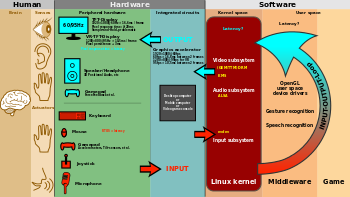
Designing the visual composition and temporal behavior of a GUI is an important part of software application programming in the area of human–computer interaction. Its goal is to enhance the efficiency and ease of use for the underlying logical design of a stored program, a design discipline named usability. Methods of user-centered design are used to ensure that the visual language introduced in the design is well-tailored to the tasks.
The visible graphical interface features of an application are sometimes referred to as chrome or GUI.[11][12][13] Typically, users interact with information by manipulating visual widgets that allow for interactions appropriate to the kind of data they hold. The widgets of a well-designed interface are selected to support the actions necessary to achieve the goals of users. A model–view–controller allows flexible structures in which the interface is independent of and indirectly linked to application functions, so the GUI can be customized easily. This allows users to select or design a different skin or theme at will, and eases the designer's work to change the interface as user needs evolve. Good GUI design relates to users more, and to system architecture less. Large widgets, such as windows, usually provide a frame or container for the main presentation content such as a web page, email message, or drawing. Smaller ones usually act as a user-input tool.
A GUI may be designed for the requirements of a vertical market as application-specific GUIs. Examples include automated teller machines (ATM), point of sale (POS) touchscreens at restaurants,[14] self-service checkouts used in a retail store, airline self-ticket and check-in, information kiosks in a public space, like a train station or a museum, and monitors or control screens in an embedded industrial application which employ a real-time operating system (RTOS).
Cell phones and handheld game systems also employ application specific touchscreen GUIs. Newer automobiles use GUIs in their navigation systems and multimedia centers, or navigation multimedia center combinations.
Examples
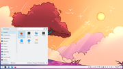
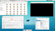
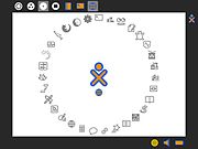
[edit]- Sample graphical environments
-
Windows on an example Wayland compositor
-
A twm X Window System environment
Components
[edit]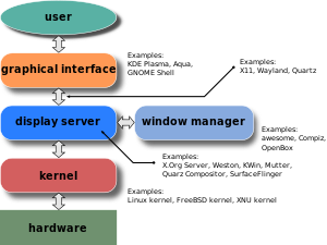
A GUI uses a combination of technologies and devices to provide a platform that users can interact with, for the tasks of gathering and producing information.
A series of elements conforming a visual language have evolved to represent information stored in computers. This makes it easier for people with few computer skills to work with and use computer software. The most common combination of such elements in GUIs is the windows, icons, text fields, canvases, menus, pointer (WIMP) paradigm, especially in personal computers.[15]
The WIMP style of interaction uses a virtual input device to represent the position of a pointing device's interface, most often a mouse, and presents information organized in windows and represented with icons. Available commands are compiled together in menus, and actions are performed making gestures with the pointing device. A window manager facilitates the interactions between windows, applications, and the windowing system. The windowing system handles hardware devices such as pointing devices, graphics hardware, and positioning of the pointer.
In personal computers, all these elements are modeled through a desktop metaphor to produce a simulation called a desktop environment in which the display represents a desktop, on which documents and folders of documents can be placed. Window managers and other software combine to simulate the desktop environment with varying degrees of realism.
Entries may appear in a list to make space for text and details, or in a grid for compactness and larger icons with little space underneath for text. Variations in between exist, such as a list with multiple columns of items and a grid of items with rows of text extending sideways from the icon.[16]
Multi-row and multi-column layouts commonly found on the web are "shelf" and "waterfall". The former is found on image search engines, where images appear with a fixed height but variable length, and is typically implemented with the CSS property and parameter display: inline-block;. A waterfall layout found on Imgur and TweetDeck with fixed width but variable height per item is usually implemented by specifying column-width:.
Post-WIMP interface
[edit]Smaller app mobile devices such as personal digital assistants (PDAs) and smartphones typically use the WIMP elements with different unifying metaphors, due to constraints in space and available input devices. Applications for which WIMP is not well suited may use newer interaction techniques, collectively termed post-WIMP UIs.[17]
As of 2011, some touchscreen-based operating systems such as Apple's iOS (iPhone) and Android use the class of GUIs named post-WIMP. These support styles of interaction using more than one finger in contact with a display, which allows actions such as pinching and rotating, which are unsupported by one pointer and mouse.[18]
Interaction
[edit]Human interface devices, for the efficient interaction with a GUI include a computer keyboard, especially used together with keyboard shortcuts, pointing devices for the cursor (or rather pointer) control: mouse, pointing stick, touchpad, trackball, joystick, virtual keyboards, and head-up displays (translucent information devices at the eye level).
There are also actions performed by programs that affect the GUI. For example, there are components like inotify or D-Bus to facilitate communication between computer programs.
History
[edit]Early efforts
[edit]Ivan Sutherland developed Sketchpad in 1963, widely held as the first graphical computer-aided design program. It used a light pen to create and manipulate objects in engineering drawings in realtime with coordinated graphics. In the late 1960s, researchers at the Stanford Research Institute, led by Douglas Engelbart, developed the On-Line System (NLS), which used text-based hyperlinks manipulated with a then-new device: the mouse. (A 1968 demonstration of NLS became known as "The Mother of All Demos".) In the 1970s, Engelbart's ideas were further refined and extended to graphics by researchers at Xerox PARC and specifically Alan Kay, who went beyond text-based hyperlinks and used a GUI as the main interface for the Smalltalk programming language, which ran on the Xerox Alto computer, released in 1973. Most modern general-purpose GUIs are derived from this system.
The Xerox PARC GUI consisted of graphical elements such as windows, menus, radio buttons, and check boxes. The concept of icons was later introduced by David Canfield Smith, who had written a thesis on the subject under the guidance of Kay.[19][20][21] The PARC GUI employs a pointing device along with a keyboard. These aspects can be emphasized by using the alternative term and acronym for windows, icons, menus, pointing device (WIMP). This effort culminated in the 1973 Xerox Alto, the first computer with a GUI, though the system never reached commercial production.
The first commercially available computer with a GUI was the 1979 PERQ workstation, manufactured by Three Rivers Computer Corporation. Its design was heavily influenced by the work at Xerox PARC. In 1981, Xerox eventually commercialized the ideas from the Alto in the form of a new and enhanced system – the Xerox 8010 Information System – more commonly known as the Xerox Star.[22][23] These early systems spurred many other GUI efforts, including Lisp machines by Symbolics and other manufacturers, the Apple Lisa (which presented the concept of menu bar and window controls) in 1983, the Apple Macintosh 128K in 1984, and the Atari ST with Digital Research's GEM, and Commodore Amiga in 1985. Visi On was released in 1983 for the IBM PC compatible computers, but was never popular due to its high hardware demands.[24] Nevertheless, it was a crucial influence on the contemporary development of Microsoft Windows.[25]
Apple, Digital Research, IBM and Microsoft used many of Xerox's ideas to develop products, and IBM's Common User Access specifications formed the basis of the GUIs used in Microsoft Windows, IBM OS/2 Presentation Manager, and the Unix Motif toolkit and window manager. These ideas evolved to create the interface found in current versions of Microsoft Windows, and in various desktop environments for Unix-like operating systems, such as macOS and Linux. Thus most current GUIs have largely common idioms.

Popularization
[edit]
GUIs were a hot topic in the early 1980s. The Apple Lisa was released in 1983, and various windowing systems existed for DOS operating systems (including PC GEM and PC/GEOS). Individual applications for many platforms presented their own GUI variants.[26] Despite the GUIs advantages, many reviewers questioned the value of the entire concept,[27] citing hardware limits, and problems in finding compatible software.
In 1984, Apple released a television commercial which introduced the Apple Macintosh during the telecast of Super Bowl XVIII by CBS,[28] with allusions to George Orwell's noted novel Nineteen Eighty-Four. The goal of the commercial was to make people think about computers, identifying the user-friendly interface as a personal computer which departed from prior business-oriented systems,[29] and becoming a signature representation of Apple products.[30]
In 1985, Commodore released the Amiga 1000, along with Workbench and Kickstart 1.0 (which contained Intuition). This interface ran as a separate task, meaning it was very responsive and, unlike other GUIs of the time, it didn't freeze up when a program was busy. Additionally, it was the first GUI to introduce something resembling Virtual Desktops.
Windows 95, accompanied by an extensive marketing campaign,[31] was a major success in the marketplace at launch and shortly became the most popular desktop operating system.[32]
In 2007, with the iPhone[33] and later in 2010 with the introduction of the iPad,[34] Apple popularized the post-WIMP style of interaction for multi-touch screens, and those devices were considered to be milestones in the development of mobile devices.[35][36]
The GUIs familiar to most people as of the mid-late 2010s are Microsoft Windows, macOS, and the X Window System interfaces for desktop and laptop computers, and Android, Apple's iOS, Symbian, BlackBerry OS, Windows Phone/Windows 10 Mobile, Tizen, WebOS, and Firefox OS for handheld (smartphone) devices.[37][38]
Comparison to other interfaces
[edit]Command-line interfaces
[edit]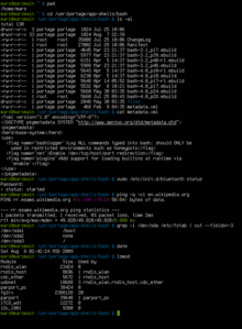
Since the commands available in command line interfaces can be many, complex operations can be performed using a short sequence of words and symbols. Custom functions may be used to facilitate access to frequent actions. Command-line interfaces are more lightweight, as they only recall information necessary for a task; for example, no preview thumbnails or graphical rendering of web pages. This allows greater efficiency and productivity once many commands are learned.[3] But reaching this level takes some time because the command words may not be easily discoverable or mnemonic. Also, using the command line can become slow and error-prone when users must enter long commands comprising many parameters or several different filenames at once. However, windows, icons, menus, pointer (WIMP) interfaces present users with many widgets that represent and can trigger some of the system's available commands.
GUIs can be made quite hard when dialogs are buried deep in a system or moved about to different places during redesigns. Also, icons and dialog boxes are usually harder for users to script.
WIMPs extensively use modes, as the meaning of all keys and clicks on specific positions on the screen are redefined all the time. Command-line interfaces use modes only in limited forms, such as for current directory and environment variables.
Most modern operating systems provide both a GUI and some level of a CLI, although the GUIs usually receive more attention.
GUI wrappers
[edit]GUI wrappers find a way around the command-line interface versions (CLI) of (typically) Linux and Unix-like software applications and their text-based UIs or typed command labels. While command-line or text-based applications allow users to run a program non-interactively, GUI wrappers atop them avoid the steep learning curve of the command-line, which requires commands to be typed on the keyboard. By starting a GUI wrapper, users can intuitively interact with, start, stop, and change its working parameters, through graphical icons and visual indicators of a desktop environment, for example. Applications may also provide both interfaces, and when they do the GUI is usually a WIMP wrapper around the command-line version. This is especially common with applications designed for Unix-like operating systems. The latter used to be implemented first because it allowed the developers to focus exclusively on their product's functionality without bothering about interface details such as designing icons and placing buttons. Designing programs this way also allows users to run the program in a shell script.
Three-dimensional graphical user interface
[edit]Many environments and games use the methods of 3D graphics to project 3D GUI objects onto the screen. The use of 3D graphics has become increasingly common in mainstream operating systems (ex. Windows Aero, and Aqua (MacOS)) to create attractive interfaces, termed eye candy (which includes, for example, the use of drop shadows underneath windows and the cursor), or for functional purposes only possible using three dimensions. For example, user switching is represented by rotating a cube with faces representing each user's workspace, and window management is represented via a Rolodex-style flipping mechanism in Windows Vista (see Windows Flip 3D). In both cases, the operating system transforms windows on-the-fly while continuing to update the content of those windows.
The GUI is usually WIMP-based, although occasionally other metaphors surface, such as those used in Microsoft Bob, 3dwm, File System Navigator, File System Visualizer, 3D Mailbox,[39][40] and GopherVR. Zooming (ZUI) is a related technology that promises to deliver the representation benefits of 3D environments without their usability drawbacks of orientation problems and hidden objects. In 2006, Hillcrest Labs introduced the first ZUI for television.[41] Other innovations include the menus on the PlayStation 2, the menus on the Xbox, Sun's Project Looking Glass, Metisse, which was similar to Project Looking Glass,[42] BumpTop, where users can manipulate documents and windows with realistic movement and physics as if they were physical documents, Croquet OS, which is built for collaboration,[43] and compositing window managers such as Enlightenment and Compiz. Augmented reality and virtual reality also make use of 3D GUI elements.[44]
In science fiction
[edit]3D GUIs have appeared in science fiction literature and films, even before certain technologies were feasible or in common use.[45]
- In prose fiction, 3D GUIs have been portrayed as immersible environments, coined as William Gibson's "cyberspace" and Neal Stephenson's "metaverse" and "avatars".
- The 1993 American film Jurassic Park features Silicon Graphics' 3D file manager File System Navigator, a real-life file manager for Unix operating systems.
- The film Minority Report has scenes of police officers using specialized 3D data systems.
See also
[edit]- Apple Computer, Inc. v. Microsoft Corp.
- Console user interface
- Computer icon
- Distinguishable interfaces
- General Graphics Interface (software project)
- GUI tree
- Human factors and ergonomics
- Look and feel
- Natural user interface
- Ncurses
- Object-oriented user interface
- Organic user interface
- Rich web application
- Skeuomorph
- Theme (computing)
- Text entry interface
- Transportable Applications Environment
- User experience design
- User interface design
- Vector-based graphical user interface
References
[edit]- ^ Wells, John (2009). Longman Pronunciation Dictionary (3rd ed.). Pearson Longman. ISBN 978-1-4058-8118-0.
- ^ "How to pronounce GUI in English". Cambridge Dictionary. Retrieved 2020-04-03.
- ^ a b "Command line vs. GUI". Computer Hope. Retrieved 2020-04-03.
- ^ "The GUI versus the Command Line: Which is better? (Part 1)". Microsoft.com Operations. Microsoft Learn. 2007-03-12. Retrieved 2024-01-30.
- ^ "The GUI versus the Command Line: Which is better? (Part 2)". Microsoft.com Operations. Microsoft Learn. 2007-03-26. Retrieved 2024-01-30.
- ^ "Graphical user interface". ScienceDaily. Retrieved 2019-05-09.
- ^ Levy, Steven. "Graphical User Interface (GUI)". Britannica.com. Retrieved 2019-06-12.
- ^ "GUI". PC Magazine Encyclopedia. pcmag.com. Retrieved 2019-06-12.
- ^ Greg Wilson (2006). "Off with Their HUDs!: Rethinking the Heads-Up Display in Console Game Design". Gamasutra. Archived from the original on January 19, 2010. Retrieved February 14, 2006.
- ^ "GUI definition". Linux Information Project. October 1, 2004. Retrieved 12 November 2008.
- ^ "chrome". www.catb.org. Retrieved 2020-04-03.
- ^ Nielsen, Jakob (January 29, 2012). "Browser and GUI Chrome". Nngroup. Archived from the original on August 25, 2012. Retrieved May 20, 2012.
- ^ Martinez, Wendy L. (2011-02-23). "Graphical user interfaces: Graphical user interfaces". Wiley Interdisciplinary Reviews: Computational Statistics. 3 (2): 119–133. doi:10.1002/wics.150. S2CID 60467930.
- ^ Bisson, Giselle. "The ViewTouch restaurant system".
- ^ "What is a graphical user interface (GUI)?". IONOS Digitalguide. 14 September 2020. Retrieved 2022-02-25.
- ^ Babich, Nick (30 May 2020). "Mobile UX Design: List View and Grid View". Medium. Retrieved 4 September 2021.
- ^ Van Dam, A. (2000). "Beyond WIMP". IEEE Computer Graphics and Applications. 20: 50–51. doi:10.1109/38.814559.
- ^ "Reality-Based Interaction: A Framework for Post-WIMP Interfaces".
- ^ Lieberman, Henry. "A Creative Programming Environment, Remixed", MIT Media Lab, Cambridge.
- ^ Salha, Nader. "Aesthetics and Art in the Early Development of Human-Computer Interfaces" Archived 2020-08-07 at the Wayback Machine, October 2012.
- ^ Smith, David (1975). "Pygmalion: A Creative Programming Environment".
- ^ The first GUIs
- ^ Xerox Star user interface demonstration, 1982
- ^ "VisiCorp Visi On".
The Visi On product was not intended for the home user. It was designed and priced for high-end corporate workstations. The hardware it required was quite a bit for 1983. It required a minimum of 512k of ram and a hard drive (5 megs of space).
- ^ A Windows Retrospective, PC Magazine Jan 2009. Ziff Davis. January 2009.
- ^ "Magic Desk I for Commodore 64".
- ^ Sandberg-Diment, Erik (1984-12-25). "Value of Windowing is Questioned". The New York Times.
- ^ Friedman, Ted (October 1997). "Apple's 1984: The Introduction of the Macintosh in the Cultural History of Personal Computers". Archived from the original on October 5, 1999.
- ^ Friedman, Ted (2005). "Chapter 5: 1984". Electric Dreams: Computers in American Culture. New York University Press. ISBN 978-0-8147-2740-9. Retrieved October 6, 2011.
- ^ Grote, Patrick (October 29, 2006). "Review of Pirates of Silicon Valley Movie". DotJournal.com. Archived from the original on November 7, 2006. Retrieved January 24, 2014.
- ^ Washington Post (August 24, 1995). "With Windows 95's Debut, Microsoft Scales Heights of Hype". Washington Post. Retrieved November 8, 2013.
- ^ "Computers | Timeline of Computer History | Computer History Museum". www.computerhistory.org. Retrieved 2017-04-02.
- ^ Mather, John. iMania, Ryerson Review of Journalism, (February 19, 2007) Retrieved February 19, 2007
- ^ "the iPad could finally spark demand for the hitherto unsuccessful tablet PC" --Eaton, Nick The iPad/tablet PC market defined? Archived 2011-02-01 at the Wayback Machine, Seattle Post-Intelligencer, 2010
- ^ Bright, Peter Ballmer (and Microsoft) still doesn't get the iPad, Ars Technica, 2010
- ^ "The iPad's victory in defining the tablet: What it means". InfoWorld. 2011-07-05.
- ^ Hanson, Cody W. (2011-03-17). "Chapter 2: Mobile Devices in 2011". Library Technology Reports. 47 (2): 11–23. ISSN 0024-2586.
- ^ "What is a Graphical User Interface? Definition and FAQs | OmniSci". omnisci.com. Retrieved 2022-01-26.
- ^ "3D Mailbox – 3-Dimensional Email Software. Bring e-mail to life! Email just got cool and fun". 3dmailbox.com. Archived from the original on 2019-07-21. Retrieved 2022-07-14.
- ^ "3D Mailbox". Download.com. Retrieved 2022-07-14.
- ^ Macworld.com November 11, 2006. Dan Moren. CES Unveiled@NY ‘07: Point and click coming to set-top boxes? Archived 2011-11-08 at the Wayback Machine
- ^ "Metisse – New Looking Glass Alternative". 29 June 2004. Retrieved 2 July 2020.
- ^ Smith, David A.; Kay, Alan; Raab, Andreas; Reed, David P. "Croquet – A Collaboration System Architecture" (PDF). croquetconsortium.org. Archived from the original (PDF) on 2007-09-27. Retrieved 2022-09-17.
The efforts at Xerox PARC under the leadership of Alan Kay that drove the development of [...] powerful bit-mapped display based user interfaces was key. In some ways, all we are doing here is extending this model to 3D and adding a new robust object collaboration model.
- ^ Purwar, Sourabh (2019-03-04). "Designing User Experience for Virtual Reality (VR) applications". Medium. Retrieved 2022-05-06.
- ^ Dayton, Tom. "Object-Oriented GUIs are the Future". OpenMCT Blog. Archived from the original on 10 August 2014. Retrieved 23 August 2012.
External links
[edit]- Evolution of Graphical User Interface in last 50 years by Raj Lal
- The men who really invented the GUI by Clive Akass
- Graphical User Interface Gallery, screenshots of various GUIs
- Marcin Wichary's GUIdebook, Graphical User Interface gallery: over 5500 screenshots of GUI, application and icon history
- The Real History of the GUI by Mike Tuck
- In The Beginning Was The Command Line by Neal Stephenson
- 3D Graphical User Interfaces (PDF) by Farid BenHajji and Erik Dybner, Department of Computer and Systems Sciences, Stockholm University
- Topological Analysis of the Gibbs Energy Function (Liquid-Liquid Equilibrium Correlation Data). Including a Thermodinamic Review and a Graphical User Interface (GUI) for Surfaces/Tie-lines/Hessian matrix analysis – University of Alicante (Reyes-Labarta et al. 2015–18)
- Innovative Ways to Use Information Visualization across a Variety of Fields by Ryan Erwin Digital marketing specialist (CLLAX) (2022-05)


