
Wikipedia:Graphics Lab/Illustration workshop: Difference between revisions
ClueBot III (talk | contribs) m Archiving 1 discussion to Wikipedia:Graphics Lab/Illustration workshop/Archive/Aug 2022. (BOT) |
Villarreal9 (talk | contribs) →Canary Wiki Order: new section |
||
| Line 307: | Line 307: | ||
:I'm just kindly asking, what's wrong with the current one? Is it false? I really don't know (kinda clueless)! :) [[User:Smartcom5|<b><font color="red">Smart</font><font color="CCCCCC">com</font><font color="green">5</font></b>]] <sup>([[User talk:Smartcom5|Talk ?]])</sup> 13:51, 29 August 2022 (UTC) |
:I'm just kindly asking, what's wrong with the current one? Is it false? I really don't know (kinda clueless)! :) [[User:Smartcom5|<b><font color="red">Smart</font><font color="CCCCCC">com</font><font color="green">5</font></b>]] <sup>([[User talk:Smartcom5|Talk ?]])</sup> 13:51, 29 August 2022 (UTC) |
||
:By the way, I'm the one who fixed [https://en.wikipedia.org/w/index.php?title=Wikipedia:Graphics_Lab/Illustration_workshop&diff=prev&oldid=1091657766#Wikipedia_logo_fix_request your very request from June on the former logo] a week ago. Didn't got any reply yet… ;) [[User:Smartcom5|<b><font color="red">Smart</font><font color="CCCCCC">com</font><font color="green">5</font></b>]] <sup>([[User talk:Smartcom5|Talk ?]])</sup> 13:55, 29 August 2022 (UTC) |
:By the way, I'm the one who fixed [https://en.wikipedia.org/w/index.php?title=Wikipedia:Graphics_Lab/Illustration_workshop&diff=prev&oldid=1091657766#Wikipedia_logo_fix_request your very request from June on the former logo] a week ago. Didn't got any reply yet… ;) [[User:Smartcom5|<b><font color="red">Smart</font><font color="CCCCCC">com</font><font color="green">5</font></b>]] <sup>([[User talk:Smartcom5|Talk ?]])</sup> 13:55, 29 August 2022 (UTC) |
||
== Canary Wiki Order == |
|||
{{GLNF|Non-free image.ext|Description of the image}} |
|||
<gallery> |
|||
BoNM - Spain Hires.png|Spanish Wiki Order |
|||
Flag of the Canary Islands.svg|Flag of the Canary Islands |
|||
</gallery> |
|||
;Article(s): |
|||
: Discussion pages of participants |
|||
;Request: |
|||
: Please create an image of the Canary Wiki Order to be awarded for significant contributions on this topic. Can be created based on the Spanish Wikiorden (attached): create a new file by replacing the flag of Spain with the flag of the Canary Islands (attached) -- [[User:Villarreal9|Villarreal9]] ([[User talk:Villarreal9|talk]]) 15:01, 4 September 2022 (UTC) |
|||
;Discussion: |
|||
Revision as of 15:01, 4 September 2022
The Graphics Lab is a project to improve the graphical content of the Wikimedia projects. Requests for image improvements can be added to the workshop pages: Illustrations, Photographs and Maps. For questions or suggestions one can use the talk pages: Talk:Graphics Lab, Talk:Illustrations, Talk:Photographs and Talk:Maps.
This specific page is the requests page for the illustration workshop. Anyone can make a request for an illustration to be improved or created for a Wikipedia article. Clicking the "New Request" button will bring you to a standard template for submitting requests, as well as general advice that should be followed.
| Advice to requesters |
|---|
|
All requests:
SVG requests:
|
|
Requests from recent years:
| |
| For graphists: |
| If you have completed work and not received a reply you may use the {{GL Illustration reply}} template to inform the requester. |
| Graphists and other visitors to the Graphic Lab may be interested in the RSS feed of changes to this page. You may find it here. |
Good article and featured article topicon redesign
-
 Current good article icon
 -
 Current featured content icon


- Article(s)
- 5,859 featured articles
- 3,696 featured lists
- 32,507 good articles
- Assorted additional talk, help, and process pages
- Request
- Yes, this one is a big one.
- Background: The current symbols for good articles and featured content have been used since those systems were introduced way back in Wikipedia's early days. They have significant problems. The featured article icon is too skeuomorphic, giving it an outdated look, and its excessive detail causes it to render poorly at small scale. The good article icon, meanwhile, has been adopted throughout the rest of Wikimedia (and in some places on Wikipedia) as the "support vote" icon, leading to conflicting usage. Far worse than the issues with them individually, however, is the fact that there is no shared visual language between them (the GA icon uses the norro style, and the FA icon does not use any style). When compounded by their overall lack of prominence (a separate issue that we're trying to address), this has led to the unfortunate situation where many (perhaps most) non-editing readers could not tell you whether a star or a green badge is a higher distinction. Given how much effort we put into the GA/FA systems, there's more than a bit of tragic irony to that.
- Process: This is the first stage in the process of redesigning the icons (after informal discussions in various places). Ideally, several proposals will be put forth that can be compared against the status quo in a more formal and widely-advertised round of !voting (similar to the process for the MediaWiki logo redesign), with the winner adopted.
- Design details: The redesigned icons could end up being anything from checkmarks (a la the Twitter verification badge) to a silver star for GAs to a multi-star system that begins with one star for stubs and increases thereafter; feel free to get creative.
- Also, since the whole idea here is to unify the symbology, the redesign will need to include the associated symbols in addition to the main icons. You don't have to design them all now, but candidates with at least an articulated vision of what they should look like may be more likely to win support once we reach the formal !voting stage. Here are the current icons still in use that I could find (there may be a few more fringe ones):
Related icons
|
|---|
|


- In truth, the potential scope of this project could be a lot bigger, trying to unify all of the icons used anywhere on Wikipedia. However, recent attempts to do so have failed, and their utility is questionable, given that most icons do not appear in reader-facing areas and thus have a vastly more limited reach. Redesigning these two icons is a more feasible task with clear and significant benefits for readers across tens of thousands of pages.
- Cheers, {{u|Sdkb}} talk 05:08, 7 October 2020 (UTC)
- Discussion
- @Sdkb: I would recommend posting this at the Commons graphics lab as well, as it is significantly more active over there. Pbrks (talk) 14:50, 16 October 2020 (UTC)
- @Pbrks: Thanks for the tip. Since this request is specific to en-WP, I'd prefer the main discussion be hosted here, but I'll copy the request there and invite folks over. {{u|Sdkb}} talk 21:38, 17 October 2020 (UTC)
- Consider color blindness (esp. red-green): In data visualization circles, there is increasing awareness of how graphics should be crafted to allow color blind individuals to distinguish through shading, what normally sighted individuals distinguish directly through color perception. (One can test shading in Photoshop etc by removing saturation.) It's my understanding that red-green color blindness is a common type, though not the only type of color blindness. Some color scales are better than others: see Scientific American. —RCraig09 (talk) 22:53, 17 October 2020 (UTC)
Resolved discussion about mandate for change
|
|---|
|
- This is my passing opinion. There is a ooui icon called "articleCheck" () and this is what I think a "GA" icon should look similar to. Basically a sheet (representing a page) with a check on it. And in a green color instead of black. For the FA icon, a simple star/medal design on a sheet with an appropriate color would make sense to keep the two icons inline with each other. SInce I believe that most users could understand a star is more important than a check icon. Basic icons such as these are the only way to keep them readable when used as topicons. Terasail[✉] 17:00, 11 January 2021 (UTC)
Update: Mandate acquired
The formal Village Pump proposal has been archived, and per here, it successfully acquired a mandate for the icons to be redesigned, so I am removing the "on hold" box around this section. I'll leave it up to others to decide how precisely to proceed from here; I hope that someone steps up to take the lead on shepherding the process from here forward, since I'm not sure I can do it myself. This thread can be archived once (and only once) we've moved to the next stage. {{u|Sdkb}} talk 22:09, 24 December 2020 (UTC)
- As a note, there is also a proposal about it.Ahmetlii (talk) 10:33, 29 December 2020 (UTC)
- @Ahmetlii: That's a much more ambitious but still underdeveloped proposal that's been sitting for a while; in my view, it would need a lot of work to become comprehensive enough to become useful, and I don't see that amount of work forthcoming or really worth the effort. I think we should focus on this one, much more feasible task that we have agreed to do, rather than dreaming about bringing all of Wikipedia in line with a universal standard that, realistically, is not likely to happen any time soon. {{u|Sdkb}} talk 23:53, 31 December 2020 (UTC)
- The icons should be changed to something the average reader is familiar with. The current icons are nice, but they're nice to Wikipedians. The average reader probably has no idea what this means. We should aim to use images which readers will understand. For example: silver star, gold star. A tick / double tick. Or something along those lines. It should be obvious to a reader what it symbolises. ProcrastinatingReader (talk) 02:55, 20 March 2021 (UTC)
Proposal 1
The following discussion is closed. Please do not modify it. Subsequent comments should be made on the appropriate discussion page. No further edits should be made to this discussion.
-
 Proposal
 -
 Prop with assessments
@Sdkb: I've went ahead and made some icon ideas and where I think they would be appropriate. Let me know your thoughts. Pbrks (talk) 14:44, 2 April 2021 (UTC)
- Pbrks, there are some nice icons in that set; thanks for putting it together! I think the next step would be arranging a large-scale discussion for those and any other proposals. {{u|Sdkb}} talk 16:53, 2 April 2021 (UTC)
Tol's icons


I don't know if people still want to implement this, but I was working on some icons for personal use that render better at smaller sizes and recalled the village pump proposal to do something similar. I'm a terrible graphic designer, but I figured I'd post them here in case anybody is interested. I based them on Wikimedia's OOUI icons; I converted the <path>s in the icons to more human-readable SVG elements and colored them based on Wikimedia Design's color palette. I used a star for the featured icon because it is similar to the existing one, but used a check for the good icon so distinguish it from a support !vote icon. I plan to make more for A/B/C classes. My main problem is that I am unsure how to best represent former, former candidate, candidate, and reassessment icons. I'm currently thinking a cross for former, a question mark for candidate, and both combined in some way for former candidate. I have no good idea for reassessment — magnifying glass, maybe? I'd appreciate some other opinions on how these look and what to do. Thanks for your time! Tol (talk | contribs) @ 00:31, 3 September 2021 (UTC)
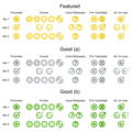
- All of the icons so far in small icon form:


 . I put something in the "start" icon instead of making it blank like the existing symbol (
 ). As for "stub", I am unsure if I should model it off the existing symbol (
 ) and do a partial circle, or use something else like
  (perhaps too close to the list icon?). Tol (talk | contribs) @ 17:41, 3 September 2021 (UTC)
- @Tol: These are nice, although I'm not sold on a tick for GA. Question mark works well for candidates (presumably in the gold or green circles), and I don't see why reassessment couldn't use the same icon given it's an assessment of some sort in both cases. I'm not sure a former candidate icon is that important in the grand scheme of things. I would prefer stubs use a partial circle to lines, just so all article rating have a similar aesthetic which distinguishes them from lists. CMD (talk) 15:57, 6 September 2021 (UTC)
- @Chipmunkdavis: Thanks for the feedback. For the GA icon, I was trying to avoid a star like the FA icon (which would have accessibility problems) and a plus sign (some people thought having the same icon for support votes and good articles is confusing). I haven't been able to get the question mark to look good, but I think I'm close to getting it (I'll probably upload an FA candidate icon soon). I'll do the partial circle for stub. Thank you again! Tol (talk | contribs) @ 18:48, 6 September 2021 (UTC)
- Hi Tol! Sorry, I'm just seeing this now. My first thought is that, as we saw with Pbrk's proposal, editors are instinctively resistant to design changes. We managed to eek out a mandate for the GA/FA icons, but I think any current proposal that also tries to handle other classes beyond that will unfortunately be dead on arrival. Regarding the GA/FA icons, I think we need something more fundamental. The biggest problem is still that there's nothing in particular signaling that FA is one step above GA. {{u|Sdkb}} talk 18:56, 16 October 2021 (UTC)
- @Tol: These are nice, although I'm not sold on a tick for GA. Question mark works well for candidates (presumably in the gold or green circles), and I don't see why reassessment couldn't use the same icon given it's an assessment of some sort in both cases. I'm not sure a former candidate icon is that important in the grand scheme of things. I would prefer stubs use a partial circle to lines, just so all article rating have a similar aesthetic which distinguishes them from lists. CMD (talk) 15:57, 6 September 2021 (UTC)
- I think personally that what we saw with Pbrk's proposal was a bunch of people who would oppose any change what so ever and were rightfully miffed that a discussion affecting over 40,000+ pages had small participation. JMHO casualdejekyll 20:40, 25 March 2022 (UTC)
Request translation of existing image c:File:Chronologie_constitutions_françaises.png
- Article(s)
- Constitutions of France
- French Constitution of 27 October 1946
- Constitution of the Year VIII
- French Constitution of 1852
- Draft:List of political systems in France
- numerous others (such as those in Category:Constitutions of France)
- Request
Please create a new image, "File:Timeline of French constitutions" based on the existing French c:File:Chronologie_constitutions_françaises.png, as follows:
- Extend the image (which currently ends at 2006) slightly to the right so it ends at 2022. (As of 2022, we are still in the "Fifth Republic".)
- use the same purple color as currently used for Cinquième République (Fifth Republic)
- add tick marks and labels for 2010 and 2020.
- Add a few pixels to the right end of the diagram beyond the new '2020' tick mark, to an approximate endpoint of 2022.
- Translate callouts above the image, and labels within the image. In a couple of cases, two labels get merged into one.
- Save the English version as "Timeline of French constitutions", using svg if that seems best, otherwise png or your choice.
Translations of callouts above the image
|
|---|
|
Translation of labels inside the image
|
|---|
|
Thanks, Mathglot (talk) 22:13, 3 July 2022 (UTC)
- Discussion
- Please see c:Commons:Graphic_Lab/Illustration_workshop#Replacement_of_text_in_translation_of_existing_image_File:Chronologie_constitutions_françaises.png
- or permalink 2022-08-08
- @Mathglot:
- En rouge (talk) 23:24, 8 August 2022 (UTC)
![]() Done. This can be archived. Mathglot (talk) 09:07, 28 August 2022 (UTC)
Done. This can be archived. Mathglot (talk) 09:07, 28 August 2022 (UTC)
Request - flags for California and Texas
-
 Alvarado/lone star flag of California

- Article(s)
- * Flag of California
- * Flag of Texas
- Request
Flag image requests
I have NO such design skills, or I'd do it myself. I have two flag requests:
- Alvarado/lone star flag of California
- Flag of the 1986 Texas Sesquicentennial
1. Here is some info for the Alvarado/lone star flag of California, which merely consisted of a single red star on a white background:
- Talk:Flag_of_California#Request_for_image:_Alvarado/lone_star_flag
- "Flags Over California: A History Guide" (PDF). California State Military Museum. State of California, Military Department. 2002. p. 2. Retrieved 2022-03-09.
Except for a few brief months in late 1836 and early 1837, when a lone red star flag on a white background was raised in recognition of the efforts of Juan Bautista Alvarado and Isaac Graham's capture of Monterey from the Mexican government...
2. Here is some images of the flag of the 1986 Texas Sesquicentennial:
Thanks in advance, TuckerResearch (talk) 18:57, 9 August 2022 (UTC)
- Discussion
The first flag (the Alvarado/lone star flag) already exists here. HapHaxion (talk / contribs) 15:41, 10 August 2022 (UTC)
- @HapHaxion - Thanks! I feel dumb for not having found that! I really did look for it! TuckerResearch (talk) 18:10, 10 August 2022 (UTC)
Nobody? TuckerResearch (talk) 18:19, 19 August 2022 (UTC)
Penguin Scout
-
 Penguin Scout

- Article(s)
- Request
- Please convert this to an clean SVG for future use. Thanks. --evrik (talk) 23:45, 19 August 2022 (UTC)
 Bumping thread. --evrik (talk) 20:22, 28 August 2022 (UTC) --evrik (talk) 20:22, 28 August 2022 (UTC)
- Discussion
Map of volcanoes in Guatemala
-
 Map of the volcanoes in Guatemala
 -
 Map of Guatemala in Inari Sámi


- Article(s)
- smn:Listo Guatemala tullâvaarijn
- Request
- I would like only the Guatemalan volcano symbols and labels in the first image to be added to the Inari Sámi map of Guatemala in the second image and saved as a new file so we can use it in an article on the Inari Sámi wikipedia. The volcano labels are missing the diacritics in the gif and the following labels would need to be fixed: Santa María, Atitlán, and Tolimán. I would also appreciate if the symbol and label colors could match the SVG image color scheme better than the bright red of the GIF. Takkâ! :) -- Yupik (talk) 07:21, 20 August 2022 (UTC)
- Discussion
Prussia within the borders of 1945
-
 Prussian expansion 1807-1871 (№ 1)
 -
 Occupation map of Germany after WW2 (№ 2)


- Article(s)
- Prussia
- Request
- Good afternoon. Can you please tell me if it is possible to superimpose the map of Prussia on the political borders of 1945 (the contours of the second map on the basis of the first map)? I wanted to know what was left of Prussia in Germany and what went to the GDR and what to the FRG? --Vyacheslav84 (talk) 07:31, 22 August 2022 (UTC)
- Discussion
Request
-
 Central/Carpathian romani Wikipedia logo
- Article(s)
- Request
- Is there someone that can make corrections to this logo?
Text now is:
WikipedijA
E phuterďi enciklopedija
and should be
WikipedijA
E phuterďi enciklopedija
after the correction please make text to svg.
Many, many and many thanks in advance!!!
--158.148.121.39 (talk) 13:31, 22 August 2022 (UTC)
- Done. Is it, as you've hoped? Smartcom5 (Talk ?) 22:06, 25 August 2022 (UTC)
- Discussion
Help needed with fixing Korean text
-
 Kaesong Industrial Management Committee variant flag
 -
 Kaesong Industrial Management Committee flag
.svg)

- Article(s)
- Request
- In both images listed, there seems to be some errors in Korean text. I do not speak or read Korean, so I can't really tell if text is correct or not.
- Some corrections seem to have been made by a user, though many elements are clearly autotraced.
- Thank you. Flagvisioner (talk) 03:19, 25 August 2022 (UTC)
- Discussion
Wikipedia logo build request
Is there someone that can kindly build Wikipedia logo and upload on commons with name Wikipedia-logo-v2-bgn.svg?
Text is:
Wikipedia: ویکیپیڈیا
The free encyclopedia: آزاتݔن زانت نامه
Many, many and many thanks in advance for all you can do!!! --94.247.8.9 (talk) 09:44, 29 August 2022 (UTC)
- I'm just kindly asking, what's wrong with the current one? Is it false? I really don't know (kinda clueless)! :) Smartcom5 (Talk ?) 13:51, 29 August 2022 (UTC)
- By the way, I'm the one who fixed your very request from June on the former logo a week ago. Didn't got any reply yet… ;) Smartcom5 (Talk ?) 13:55, 29 August 2022 (UTC)
Canary Wiki Order

-
 Spanish Wiki Order
 -
 Flag of the Canary Islands


.svg)
- Article(s)
- Discussion pages of participants
- Request
- Please create an image of the Canary Wiki Order to be awarded for significant contributions on this topic. Can be created based on the Spanish Wikiorden (attached): create a new file by replacing the flag of Spain with the flag of the Canary Islands (attached) -- Villarreal9 (talk) 15:01, 4 September 2022 (UTC)
- Discussion