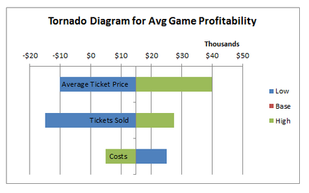
Tornado diagram
This article is written like a manual or guide. (June 2013) |

Tornado diagrams, also called tornado plots or tornado charts, are a special type of Bar chart, where the data categories are listed vertically instead of the standard horizontal presentation, and the categories are ordered so that the largest bar appears at the top of the chart, the second largest appears second from the top, and so on. They are so named because the final chart visually resembles either one half of or a complete tornado.
Purpose
Tornado diagrams are useful for deterministic sensitivity analysis - comparing the relative importance of variables. For each variable/uncertainty considered, you will need estimates for what the low, base, and high outcomes would be. The sensitive variable is modeled as uncertain value while all other variables are held at baseline values (stable). - Reference/source: PMBOK Guide Fifth Edition (2013) pg. 338 (4th Ed.,2008, pg. 298). This allows us to test the sensitivity/risk associated with one uncertainty/variable. For example, if a decision maker needs to visually compare 100 budgetary items, and wishes to identify the ten items (s)he should focus on, it would be nearly impossible to do using a standard bar graph. In a tornado diagram of the budget items, the top ten bars would represent the items that contribute the most to the variability of the outcome, and therefore what the decision maker should focus on.
Building a Tornado Diagram in Microsoft Excel
Populate low-base-high Values

The low value for an uncertainty is the value where there is only a 10% estimated chance that the realized value will be less than said value. The base value would be the average expected value. The high value for an uncertainty is the value where there is only a 10% estimated chance that the realized value will be above said value. It is good to ask the decision maker to provide these values.
We will use an example where a minor league sports team wants to evaluate the uncertainties that contribute to their profitability for the next year. The three uncertainties are as follows…
1) Number of tickets sold: The stadium has 6,000 seats. The decision maker believes the low-base-high values to be 3,800-5,000-5,500.
2) Average ticket price: The price that the market will allow next year is unknown. The decision maker gives the low-base-high values as $20–$25-$30 for what the anticipated average ticket price will be next year.
3) Average cost per game: The estimated average variable costs associated with producing one game are estimated to have low-base-high values of $100,000-$110,000-$120,000
Calculate Profit Forecasts

Next, we want to calculate the profit forecast for each low-base-high value for each uncertainty. This is done by assuming a base value for all uncertainties except the one being tested.
We will assume that profit for a game is calculated by (tickets sold*ticket price)-costs. For example, to calculate the profit for the low value of tickets sold: 3,800*$25–$110,000=-$15,000
Calculate Swing & % Variance

Create three new columns, titled swing, swing ^2, and % variance. The swing is simply the range of profit forecasts for a given uncertainty. The equation in excel would be =max(low,base,high)-min(low,base,high), where low,base,high are cell references for the given uncertainty. To calculate swing ^2, square the swing by raising the resulting number to the power of 2. Then sum the swing ^2 values to get ∑. Calculate the % variance for each uncertainty by dividing the respective swing^2 value by ∑.
For tickets sold we calculate [=$27,500-(-$15,000)], for a swing of $42,500. Squaring this value yields $1,806,250,000. ∑ of the three values is $4,706,250,000. % variance for tickets sold is then $1,806,250,000/$4,706,250,000= 38.38%
Sort Data
Sort the uncertainties by % variance, from largest to smallest.In Excel: Highlight the rows with the uncertainties and the corresponding data. Right click & select sort, then custom sort (shown in 4.1 screen shot). Column= % Variance, Sort On= Values, Order= Largest to Smallest (This screen shot is highlighted in the red box in the 4.1 image).
Now the chart in Excel should have Average ticket price as the top row and costs as the bottom.

Create Chart
1) Highlight the data (including row & column labels) and click 'insert', 'bar chart', 'clustered bar' (2d). The below chart should be produced.

You are almost there, just some formatting now...
2) Select the chart and select the 'design' tab in Excel under chart tools. Select 'Switch Row/Column'.
3) Double click any of the bars in the plot. The Format Data Point box will come up, select Series Options. Slide the bar for series overlap to 100%
4) Right click on the horizontal axis & select format axis.
 Under 'Number' select currency
 Under 'Number' select desired decimal places (for this example we use 0)

 Under 'Axis Options' select the appropriate display units (For this example, we select thousands)

    - make sure you have show display units if you do this

 Under 'Axis Options' select vertical axis crosses: axis value @ your base value (for this example, it is $15,000)
5) Right click on the vertical axis & select format axis. Check the box 'categories in reverse order' to put the horizontal axis and the uncertainty that generates the highest sensitivity on the top.
6) Add a title and modify any formatting necessary, and you are done

References
- Technical note: constructing tornado diagrams with spreadsheets. Engineering Economist | June 22, 2006 | Eschenbach, Ted G
