
Wikipedia:Graphics Lab/Illustration workshop: Difference between revisions
Peter Ormond (talk | contribs) No edit summary |
|||
| Line 334: | Line 334: | ||
;Article(s): |
;Article(s): |
||
;Request: |
;Request: |
||
: Is there someone that can kindly capitalize Wikipedija word and make text to path |
: Is there someone that can kindly capitalize Wikipedija word and make text to path? |
||
Text is: |
Text is: |
||
Revision as of 15:38, 5 June 2022
The Graphics Lab is a project to improve the graphical content of the Wikimedia projects. Requests for image improvements can be added to the workshop pages: Illustrations, Photographs and Maps. For questions or suggestions one can use the talk pages: Talk:Graphics Lab, Talk:Illustrations, Talk:Photographs and Talk:Maps.
This specific page is the requests page for the illustration workshop. Anyone can make a request for an illustration to be improved or created for a Wikipedia article. Clicking the "New Request" button will bring you to a standard template for submitting requests, as well as general advice that should be followed.
| Advice to requesters |
|---|
|
All requests:
SVG requests:
|
|
Requests from recent years:
| |
| For graphists: |
| If you have completed work and not received a reply you may use the {{GL Illustration reply}} template to inform the requester. |
| Graphists and other visitors to the Graphic Lab may be interested in the RSS feed of changes to this page. You may find it here. |
Good article and featured article topicon redesign
-
 Current good article icon
 -
 Current featured content icon


- Article(s)
- 5,859 featured articles
- 3,696 featured lists
- 32,507 good articles
- Assorted additional talk, help, and process pages
- Request
- Yes, this one is a big one.
- Background: The current symbols for good articles and featured content have been used since those systems were introduced way back in Wikipedia's early days. They have significant problems. The featured article icon is too skeuomorphic, giving it an outdated look, and its excessive detail causes it to render poorly at small scale. The good article icon, meanwhile, has been adopted throughout the rest of Wikimedia (and in some places on Wikipedia) as the "support vote" icon, leading to conflicting usage. Far worse than the issues with them individually, however, is the fact that there is no shared visual language between them (the GA icon uses the norro style, and the FA icon does not use any style). When compounded by their overall lack of prominence (a separate issue that we're trying to address), this has led to the unfortunate situation where many (perhaps most) non-editing readers could not tell you whether a star or a green badge is a higher distinction. Given how much effort we put into the GA/FA systems, there's more than a bit of tragic irony to that.
- Process: This is the first stage in the process of redesigning the icons (after informal discussions in various places). Ideally, several proposals will be put forth that can be compared against the status quo in a more formal and widely-advertised round of !voting (similar to the process for the MediaWiki logo redesign), with the winner adopted.
- Design details: The redesigned icons could end up being anything from checkmarks (a la the Twitter verification badge) to a silver star for GAs to a multi-star system that begins with one star for stubs and increases thereafter; feel free to get creative.
- Also, since the whole idea here is to unify the symbology, the redesign will need to include the associated symbols in addition to the main icons. You don't have to design them all now, but candidates with at least an articulated vision of what they should look like may be more likely to win support once we reach the formal !voting stage. Here are the current icons still in use that I could find (there may be a few more fringe ones):
Related icons
|
|---|
|


- In truth, the potential scope of this project could be a lot bigger, trying to unify all of the icons used anywhere on Wikipedia. However, recent attempts to do so have failed, and their utility is questionable, given that most icons do not appear in reader-facing areas and thus have a vastly more limited reach. Redesigning these two icons is a more feasible task with clear and significant benefits for readers across tens of thousands of pages.
- Cheers, {{u|Sdkb}} talk 05:08, 7 October 2020 (UTC)
- Discussion
- @Sdkb: I would recommend posting this at the Commons graphics lab as well, as it is significantly more active over there. Pbrks (talk) 14:50, 16 October 2020 (UTC)
- Consider color blindness (esp. red-green): In data visualization circles, there is increasing awareness of how graphics should be crafted to allow color blind individuals to distinguish through shading, what normally sighted individuals distinguish directly through color perception. (One can test shading in Photoshop etc by removing saturation.) It's my understanding that red-green color blindness is a common type, though not the only type of color blindness. Some color scales are better than others: see Scientific American. —RCraig09 (talk) 22:53, 17 October 2020 (UTC)
Resolved discussion about mandate for change
|
|---|
|
- This is my passing opinion. There is a ooui icon called "articleCheck" () and this is what I think a "GA" icon should look similar to. Basically a sheet (representing a page) with a check on it. And in a green color instead of black. For the FA icon, a simple star/medal design on a sheet with an appropriate color would make sense to keep the two icons inline with each other. SInce I believe that most users could understand a star is more important than a check icon. Basic icons such as these are the only way to keep them readable when used as topicons. Terasail[✉] 17:00, 11 January 2021 (UTC)
Update: Mandate acquired
The formal Village Pump proposal has been archived, and per here, it successfully acquired a mandate for the icons to be redesigned, so I am removing the "on hold" box around this section. I'll leave it up to others to decide how precisely to proceed from here; I hope that someone steps up to take the lead on shepherding the process from here forward, since I'm not sure I can do it myself. This thread can be archived once (and only once) we've moved to the next stage. {{u|Sdkb}} talk 22:09, 24 December 2020 (UTC)
- As a note, there is also a proposal about it.Ahmetlii (talk) 10:33, 29 December 2020 (UTC)
- @Ahmetlii: That's a much more ambitious but still underdeveloped proposal that's been sitting for a while; in my view, it would need a lot of work to become comprehensive enough to become useful, and I don't see that amount of work forthcoming or really worth the effort. I think we should focus on this one, much more feasible task that we have agreed to do, rather than dreaming about bringing all of Wikipedia in line with a universal standard that, realistically, is not likely to happen any time soon. {{u|Sdkb}} talk 23:53, 31 December 2020 (UTC)
- The icons should be changed to something the average reader is familiar with. The current icons are nice, but they're nice to Wikipedians. The average reader probably has no idea what this means. We should aim to use images which readers will understand. For example: silver star, gold star. A tick / double tick. Or something along those lines. It should be obvious to a reader what it symbolises. ProcrastinatingReader (talk) 02:55, 20 March 2021 (UTC)
Proposal 1
The following discussion is closed. Please do not modify it. Subsequent comments should be made on the appropriate discussion page. No further edits should be made to this discussion.
-
 Proposal
 -
 Prop with assessments
@Sdkb: I've went ahead and made some icon ideas and where I think they would be appropriate. Let me know your thoughts. Pbrks (talk) 14:44, 2 April 2021 (UTC)
- Pbrks, there are some nice icons in that set; thanks for putting it together! I think the next step would be arranging a large-scale discussion for those and any other proposals. {{u|Sdkb}} talk 16:53, 2 April 2021 (UTC)
Tol's icons


I don't know if people still want to implement this, but I was working on some icons for personal use that render better at smaller sizes and recalled the village pump proposal to do something similar. I'm a terrible graphic designer, but I figured I'd post them here in case anybody is interested. I based them on Wikimedia's OOUI icons; I converted the <path>s in the icons to more human-readable SVG elements and colored them based on Wikimedia Design's color palette. I used a star for the featured icon because it is similar to the existing one, but used a check for the good icon so distinguish it from a support !vote icon. I plan to make more for A/B/C classes. My main problem is that I am unsure how to best represent former, former candidate, candidate, and reassessment icons. I'm currently thinking a cross for former, a question mark for candidate, and both combined in some way for former candidate. I have no good idea for reassessment — magnifying glass, maybe? I'd appreciate some other opinions on how these look and what to do. Thanks for your time! Tol (talk | contribs) @ 00:31, 3 September 2021 (UTC)
- All of the icons so far in small icon form:


 . I put something in the "start" icon instead of making it blank like the existing symbol (
 ). As for "stub", I am unsure if I should model it off the existing symbol (
 ) and do a partial circle, or use something else like
  (perhaps too close to the list icon?). Tol (talk | contribs) @ 17:41, 3 September 2021 (UTC)
- @Tol: These are nice, although I'm not sold on a tick for GA. Question mark works well for candidates (presumably in the gold or green circles), and I don't see why reassessment couldn't use the same icon given it's an assessment of some sort in both cases. I'm not sure a former candidate icon is that important in the grand scheme of things. I would prefer stubs use a partial circle to lines, just so all article rating have a similar aesthetic which distinguishes them from lists. CMD (talk) 15:57, 6 September 2021 (UTC)
- @Chipmunkdavis: Thanks for the feedback. For the GA icon, I was trying to avoid a star like the FA icon (which would have accessibility problems) and a plus sign (some people thought having the same icon for support votes and good articles is confusing). I haven't been able to get the question mark to look good, but I think I'm close to getting it (I'll probably upload an FA candidate icon soon). I'll do the partial circle for stub. Thank you again! Tol (talk | contribs) @ 18:48, 6 September 2021 (UTC)
- Hi Tol! Sorry, I'm just seeing this now. My first thought is that, as we saw with Pbrk's proposal, editors are instinctively resistant to design changes. We managed to eek out a mandate for the GA/FA icons, but I think any current proposal that also tries to handle other classes beyond that will unfortunately be dead on arrival. Regarding the GA/FA icons, I think we need something more fundamental. The biggest problem is still that there's nothing in particular signaling that FA is one step above GA. {{u|Sdkb}} talk 18:56, 16 October 2021 (UTC)
- @Tol: These are nice, although I'm not sold on a tick for GA. Question mark works well for candidates (presumably in the gold or green circles), and I don't see why reassessment couldn't use the same icon given it's an assessment of some sort in both cases. I'm not sure a former candidate icon is that important in the grand scheme of things. I would prefer stubs use a partial circle to lines, just so all article rating have a similar aesthetic which distinguishes them from lists. CMD (talk) 15:57, 6 September 2021 (UTC)
- I think personally that what we saw with Pbrk's proposal was a bunch of people who would oppose any change what so ever and were rightfully miffed that a discussion affecting over 40,000+ pages had small participation. JMHO casualdejekyll 20:40, 25 March 2022 (UTC)
Wa State emblem vectorization
![]() Request taken by DeVosMax [ contribs • talk • created media ] 04:55, 8 April 2022 (UTC).
Request taken by DeVosMax [ contribs • talk • created media ] 04:55, 8 April 2022 (UTC).

-
 Emblem of Wa State, SVG version
 -
 Emblem of Wa State, JPG Version
 -
 DeVos_Max's Work-in-Progress


- Article(s)
- Wa State
- Request
- The current SVG file is tagged under
BadSVG, and is a raster graphic without vector coding. The PNG file (previously deleted) was restored on the page until this image could be converted with actual vector coding, but an editor later replaced it with no summary, and the PNG file got deleted again. Could someone make a proper vector version? -- HapHaxion (talk / contribs) 16:00, 7 March 2022 (UTC) - Discussion
Hi, I am the person who made the original request. I had the original file undeleted to allow a proper vectorization of the emblem. However, it wasn't vectorized and I only found out about the PNG file getting deleted when I read HapHaxion's message and I've made the request to have it undeleted once again so maybe this time we can get a proper vector version of the Wa State emblem. I kindly ask that the request of both myself and HapHaxion is fulfilled. I would appreciate the person who done it and I think that HapHaxion would too. Please do it soon before the PNG file is deleted yet again. Thanks in advance.--109.78.2.90 (talk) 21:33, 16 March 2022 (UTC)
- Is it possible for you to link to an external PNG instead of trying to host copyrighted material on WikiMedia servers? Then we would be able to help you. Cheers. DeVosMax [ contribs • talk • created media ] 02:50, 5 April 2022 (UTC)
- Sorry for taking so long, this file is one of the most *interesting* that I've ever seen on here. It's so interesting in fact that it is proving to require a complete recreation, and the reference material is anything but consistent. Plus, I've been incredibly busy off-site. I'll keep chipping away at it. DeVosMax [ contribs • talk • created media ] 05:36, 18 April 2022 (UTC)
I've made the request to have it undeleted again if that helps you out. I hope it does.--109.78.61.76 (talk) 22:00, 26 April 2022 (UTC) The request was made but Graeme Bartlett (the admin who reviewed the request) decided not to undelete it but instead gave another image of the emblem which I have posted here. If DeVosMax feels that the PNG version is necessary then you might want to talk to Graeme Bartlett. Since there's a basic official design for the Wa State emblem but no exact rendition of it, it does feel we're doing the Wa State Government a favor by creating one. Keep up the good work DeVosMax! Thanks again.--109.79.14.62 (talk) 22:45, 1 May 2022 (UTC)
 Bumping thread. HapHaxion (talk / contribs) 19:17, 16 May 2022 (UTC)
- An update on this: this is a massive undertaking and I've only been able to spend a few minutes at a time on it due to real-life stuff. I've uploaded a file showing the progress I've made so far into the gallery above, I'll finish it eventually, life-stuff permitting. DeVosMax [ contribs • talk • created media ] 21:09, 19 May 2022 (UTC)
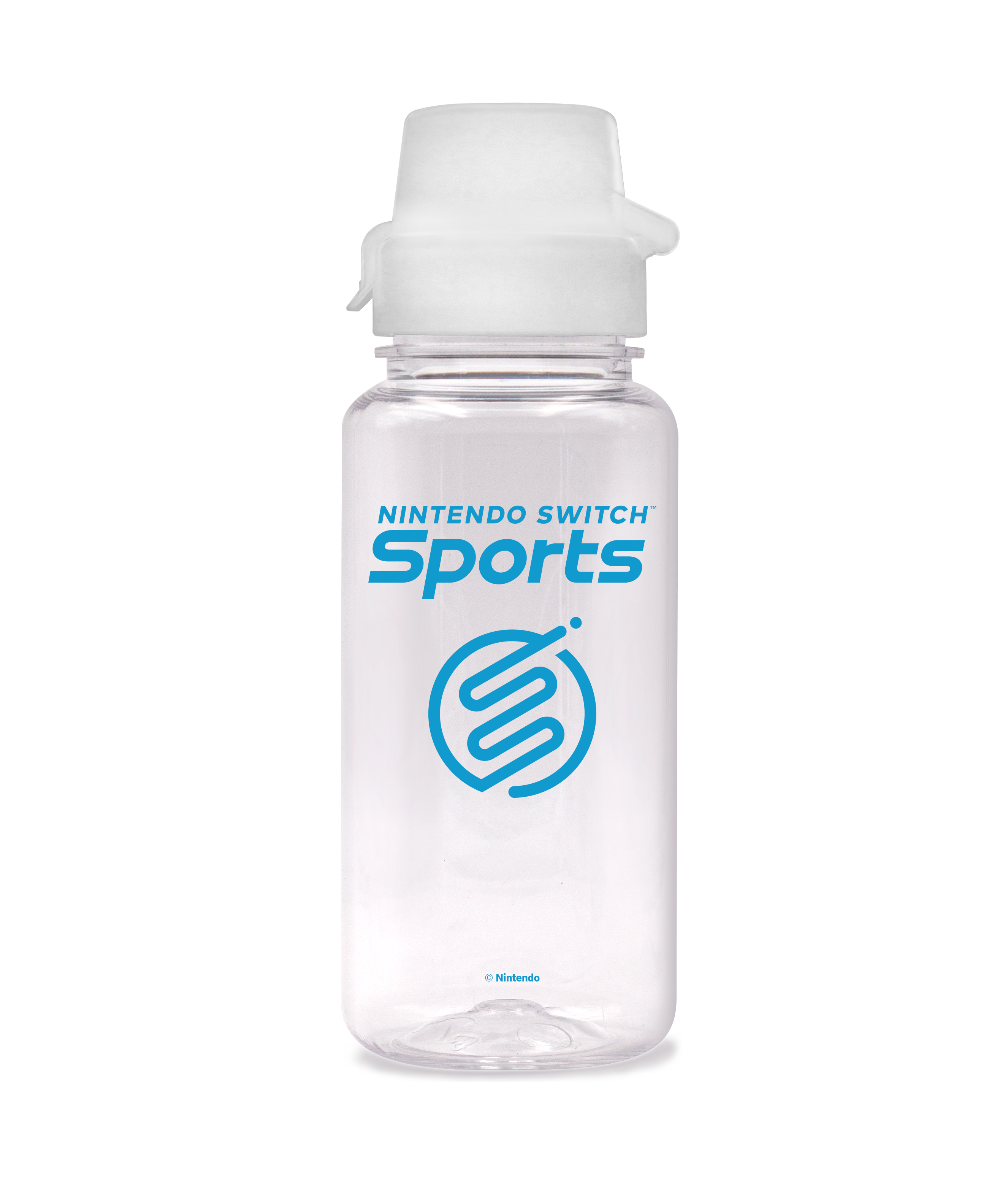
Nintendo Switch Sports
![]() Done DeVosMax [ contribs • talk • created media ] 09:54, 4 April 2022 (UTC)
Done DeVosMax [ contribs • talk • created media ] 09:54, 4 April 2022 (UTC)
-
 Logo of Nintendo Switch Sports
 -
 Bad vectorization of the logo.
 -

-
 Logo of Spocco Square in Nintendo Switch Sports
 -
Vectorization by DeVosMax
-
Vectorization by DeVosMax

- Article(s)
- Nintendo Switch Sports
- Request
- Please vectorize Nintendo Switch Sports logo. I've found a vector version of the Wii Sports logo, which uses the same wordmark, which may be of help.
- Make image #3 not translucent, and vectorize, please
 . New info: Found a higher quality version of the logo in an unexpected source. Thanks, -- QuickQuokka [talk • contribs] 23:06, 18 March 2022 (UTC)
- Discussion
- I have created a vectorized version and added it to the gallery above. Let me know what you think, and mark it as done if you think it is adequate. Please create another request for the other things you want done, it's kinda unclear. DeVosMax [ contribs • talk • created media ] 09:59, 4 April 2022 (UTC)
- I ended up doing the other one as well. Cheers. DeVosMax [ contribs • talk • created media ] 09:08, 5 April 2022 (UTC)
- @DeVos Max: I am sorry but I have to question about the coloring of File:Nintendo Switch Sports.svg. The gradient color at the top-right corner is obviously different from the raster version. MilkyDefer 09:22, 23 April 2022 (UTC)
- I apologize, my monitor colors are out of whack, so I sincerely couldn't tell. I have since sorted this out and uploaded a fixed file. Hope this updated version is acceptable. DeVosMax [ contribs • talk • created media ] 22:59, 23 April 2022 (UTC)
Taliban flag design improvements
-
 Flag of the Taliban

- Article(s)
- Flag of Afghanistan
- Afghanistan
- Taliban
- Request
- This might be a difficult request. Currently, the design of the text on the flag is lifted from the Saudi flag. There is no standard design in the flag law; only the 1:2 ratio and color are fixed. The Saudi Shahada has been observed, but what is more common is a mixture of this and elements from File:Flag of Taliban (variant).svg (which should not be changed, as it matches exactly with an observed variant). I'd like someone to edit File:Flag of the Taliban.svg to match the flags used at the flag raising ceremony in Kabul, which has the most common design used in official settings: [1], [2], [3], [4], [5], [6], [7]. This is also the design being used for official diplomatic meetings: [8]. Note the hoist is always to the right. ― Tartan357 Talk 03:51, 25 April 2022 (UTC)
- Discussion
![]() Bumping thread. HapHaxion (talk / contribs) 19:17, 16 May 2022 (UTC)
Bumping thread. HapHaxion (talk / contribs) 19:17, 16 May 2022 (UTC)
Seal of the Marshall Islands adjustments
-
 Description of first image

- Request
- Bumping my previous request for adjustments to the Seal of the Marshall Islands. Problems include: "Letters in motto are not the same size or on the same curvature (the "KE" is also not centered), bronze border is not symmetrical (the ribbon that says "seal" is also not centered), and some lines appear inconsistent (such as the boat or rays emanating from the angel) or have gaps (such as the land on the lower-left)". Previous discussion can be found at the archive. Also pinging @DeVos Max and Ericmetro as they participated in the prior discussion and created the original file, respectively. -- HapHaxion (talk / contribs) 18:22, 9 May 2022 (UTC)
- Discussion
![]() Bumping thread. HapHaxion (talk / contribs) 18:54, 24 May 2022 (UTC)
Bumping thread. HapHaxion (talk / contribs) 18:54, 24 May 2022 (UTC)
Wikipedia logo resize request
-
 Standard Wikipedia logo
 -
 Wikipedia logo 2.0 for Western Baluchi Wikipedia
- Article(s)
- Request
- Is there someone that can kindly remake (localized puzzle logo is different) logo to 135 × 155? Many, many and many thanks in advance for all you can do!!!
Text is:
Wikipedia: ویکیپیڈیا
The free encyclopedia: آزاتݔن زانت نامه
Many, many and many thanks in advance for all you can do!!!
-- 2001:B07:6442:8903:ACF1:21E7:A0C6:7FE9 (talk) 16:44, 11 May 2022 (UTC)
- Discussion
- I'm really sorry, and it may be a shortcoming on my end, but I don't understand what it is that you are requesting. Are you wanting a raster version of the image posted at 135x155 px? Or are you wanting a version of the right image with the left logo on it? Sorry again for the clairification question. DeVosMax [ contribs • talk • created media ] 12:15, 23 May 2022 (UTC)
- @DeVos Max: Take the logo without words and you add the localized text. When you finish you should upload on commons with the file name Wikipedia-logo-v2-bgn.svg --2001:B07:6442:8903:984:CD13:DF84:A606 (talk) 14:13, 23 May 2022 (UTC)
Signature of British royal family members
- Requested Media


- Article(s)
- Mary of Teck
- Queen Elizabeth The Queen Mother
- Camilla, Duchess of Cornwall
- Sophie, Countess of Wessex
- Prince Edward, Earl of Wessex
- Prince Andrew, Duke of York
- Request
- Please convert all signatures to SVG. Note that the signatures of all family members (whether they are on the Commons or the English Wikipedia) have been properly vectorized (see Anne, Princess Royal, Meghan, Duchess of Sussex, etc.) Many thanks in advance to anyone who volunteers to do the job. Keivan.fTalk 14:25, 15 May 2022 (UTC)
- DeVos Max's Proposals


- Discussion
![]() Done DeVosMax [ contribs • talk • created media ] 22:17, 22 May 2022 (UTC)
Done DeVosMax [ contribs • talk • created media ] 22:17, 22 May 2022 (UTC)
- I have completed the vectorizing signatures for Elizabeth, Camilla, and Sophie. Edward and Andrew's signatures were recently marked for potential deletion, so I am going to hold off on vectorizing those until that is resolved. DeVosMax [ contribs • talk • created media ] 21:40, 21 May 2022 (UTC)
- @DeVos Max: Thank you so much. I think Sophie's was also nominated for deletion at some point and to the best of my knowledge the user who initiated the discussion had a problem with the signatures being uploaded to the Commons. I think if you upload the vectorized versions on the English Wikipedia the way you did with the ladies' signatures there shouldn't be any problem. Looking forward to seeing the results, and many thanks for the other three which look fantastic. Keivan.fTalk 23:30, 26 May 2022 (UTC)
- Just realized that I forgot to put Queen Mary's signature on the list. I would really appreciate it if someone could vectorize that one too. Keivan.fTalk 06:49, 27 May 2022 (UTC)
Request for vectorization of Gusinje, Plav and Rozaje Municipality emblems
![]() Request taken by DeVosMax [ contribs • talk • created media ] 20:32, 21 May 2022 (UTC).
Request taken by DeVosMax [ contribs • talk • created media ] 20:32, 21 May 2022 (UTC).
-
 Gusinje
 -
 Plav
Plav -
 Rožaje


- Article(s)
- Municipalities of Montenegro, Gusinje Municipality, Plav Municipality, Rožaje Municipality
- Request
- The emblems are already in png or jpg, but having them in SVG would be better. -- AT44 (talk) 07:50, 16 May 2022 (UTC)
- Discussion
-
 Rožaje

- I have completed the Rozaje Coat of Arms and added it to the gallery above. Let me know if you have any concerns. DeVosMax [ contribs • talk • created media ] 06:04, 21 May 2022 (UTC)
- @DeVos Max Thank you, it looks great. There might be some minor differences from the offical version, but its quite representative. AT44 (talk) 11:51, 25 May 2022 (UTC)
Three Flags → SVG
![]() Done DeVosMax [ contribs • talk • created media ] 20:43, 19 May 2022 (UTC)
Done DeVosMax [ contribs • talk • created media ] 20:43, 19 May 2022 (UTC)
-
 Flag of MPAIAC, a political party seeking independence from Spain for the Canary Islands
 -
 The "Unity Flag" of Saint Martin, used in both halves of the island
 -
 Flag of Los Cabos

.jpg)

- Article(s)
- Canary Islands Independence Movement
- Unification of Saint Martin
- Los Cabos Municipality
- Request
- Conversion of three flags to SVG. -- 152.157.78.174 (talk) 16:11, 16 May 2022 (UTC)
- Discussion
- I have completed the Los Cabos flag and started swapping for it on various pages. I have the MPAIAC flag complete and will upload it later. The last one will take a bit more time and effort, but I will get to it.


DeVosMax [ contribs • talk • created media ] 23:10, 17 May 2022 (UTC)
- Now that I am looking at it in my browser, the color seems to be a little bit different (which seems impossible to me). I will fix this later today, do not sweat it. DeVosMax [ contribs • talk • created media ] 23:11, 17 May 2022 (UTC)
- I have added the MPAIAC flag as well, and have set up the conversion bot to start switching them over. DeVosMax [ contribs • talk • created media ] 00:59, 19 May 2022 (UTC)
- I have added the Unity Flag of St. Martin. I have also repaired the color issues in the Los Cabos flag. The seal is rather detailed with low detail, but I believe I have accurately recreated it. Let me know if you see any issues, and please mark this as resolved if you believe it to be adequate. DeVosMax [ contribs • talk • created media ] 20:43, 19 May 2022 (UTC)
- I am the IP address that made the original request. I have noticed when comparing the jpg and the svg that the color of the swan, the sword, and the right-face of the pyramid in the seal are all a second slightly different shade of yellow from the yellow band. These three objects are all roughly the same second shade of yellow. Because of the poor quality of the jpg image uploaded to Wikipedia, the hex color picker indicates several different similar colors that are being used. Using a higher quality version of the flag, one color that I have found that seems reasonably accurate is #f4ee66. There are some others as well, and all of them have varying degrees of accuracy. I believe that this color works the best.
- It should be noted that a higher quality version of the seal can be found in this image, which is apparently a picture of a plaque on the island itself. The sword is completely enclosed, the fern plant has more detail, etc. Unfortunately, I could not find a representation of this online (otherwise, a more accurate version of the seal could be vectorized). I am not sure why the seal is placed in the center rather than in the top left, because every other publicly available image of the Saint Martin Unity flag has the seal in the top left. However, perhaps slight modifications could be made to the seal if possible, such as fully enclosing the sword (connecting the blade to the hilt). This would make it easier to recolor the sword.
- If recoloring is not possible, the existing svg version can be left as is, as it is already very accurate. 16052022m (talk) 00:29, 22 May 2022 (UTC)
- Confirming that 16052022m is the same person as me. 152.157.78.174 (talk) 15:24, 23 May 2022 (UTC)
Adding on to the Canary flag request above
![]() Done DeVosMax [ contribs • talk • created media ] 01:45, 19 May 2022 (UTC)
Done DeVosMax [ contribs • talk • created media ] 01:45, 19 May 2022 (UTC)
-
 The MPAIAC flag was adopted by FREPIC with slight changes (This is the flag that I am requesting.)
 -
 This flag is mentioned in the above request, and is placed here for a comparison.
 -
DeVos_Max's proposal

- Article(s)
- Popular Front of the Canary Islands
- Request
- Noticed this very similar flag that also needs vectorization. The flag on the right is the one mentioned in the above request. I have put it there for a comparison. -- 16052022m (talk) 00:26, 19 May 2022 (UTC)
- Discussion
I have completed the request and added it to the gallery above. Let me know if you have any concerns. DeVosMax [ contribs • talk • created media ] 01:45, 19 May 2022 (UTC)
- I noticed that the Los Cabos flag colors seem a bit off. Additionally, the central blue band for the Canary Islands flags seems like slightly the wrong color and the stars for MPAIAC.svg may be off center, but this could be due to the fact that MPAIAC.svg has this small blank space between the right edge of the white band and the left edge of the blue band (MPAIAC_FREPIC_Accepted.svg also has the blank space problem). You can notice the blank space problem for the Canary Islands flags when you open them in Wikipedia's image viewer because the checkerboard pattern is visible. 16052022m (talk) 01:56, 19 May 2022 (UTC)
- Thanks for pointing this out. I will fix all of these issues in the morning. I apologize. DeVosMax [ contribs • talk • created media ] 07:32, 19 May 2022 (UTC)
- I have resolved all three of these issues. Let me know if you see anything else that needs attention. DeVosMax [ contribs • talk • created media ] 19:03, 19 May 2022 (UTC)
- There is no need to apologize, as you have done a very good job for all four flags, especially the Saint Martin Unification flag. I am not sure if this change is possible to make, but there are specific hex colors for both of the Canary Islands flags (the colors for these two very similar flags are the same), which would be good for the existing versions to be changed to. I will list these colors. This google hex color picker can help you to differentiate. You can have each color in a different tab and switch between the tabs to compare the colors.
- Current (incorrect) flag colors for MPAIAC and FREPIC:
- Blue - #A2CBED
- Green - #03823E
- Yellow - #FEE855
- Note that the existing white (#FFFFFF) in both flags is correct.
- Desired (correct) flag colors for MPAIAC and FREPIC:
- Blue - #9BCDFF
- Green - #008000
- Yellow - #FFE755
- Google's hex color picker displays the RGB, CMYK, HSV, and HSL approximations for these colors. I believe that once these colors are changed, there won't be any other issues that need to be fixed. However, if you are unable to make the colors exactly correct, then perhaps try to find a close approximation. 16052022m (talk) 01:21, 20 May 2022 (UTC)
- Done. All of the flags should match their source colors exactly. I discovered the issue; my vector editor was in CMYK mode which was causing weird color distortions. That shouldn't happen again. Let me know what you think DeVosMax [ contribs • talk • created media ] 22:16, 21 May 2022 (UTC)
- The website that I have been using states that the colors are very slightly different, but they look exactly the same to me, so no further changes are necessary. You've done excellent work. 16052022m (talk) 23:48, 21 May 2022 (UTC)
- This is due to an artifact of SVG rendering. The source images match the colors exactly, there is nothing that can be done about this. Thank you for your kind words :) DeVosMax [ contribs • talk • created media ] 02:41, 22 May 2022 (UTC)
- The website that I have been using states that the colors are very slightly different, but they look exactly the same to me, so no further changes are necessary. You've done excellent work. 16052022m (talk) 23:48, 21 May 2022 (UTC)
- Done. All of the flags should match their source colors exactly. I discovered the issue; my vector editor was in CMYK mode which was causing weird color distortions. That shouldn't happen again. Let me know what you think DeVosMax [ contribs • talk • created media ] 22:16, 21 May 2022 (UTC)
USS Enterprise (CVN-65) coat of arms
-
 USS Enterprise (CVN-65) coat of arms
_coat_of_arms.png)
- Article(s)
- USS Enterprise (CVN-65)
- Request
- Conversion to .svg if possible. -- 16052022m (talk) 19:17, 25 May 2022 (UTC)
- Discussion
Wikipedia logo fix request
-
 Central/Carpathian romani Wikipedia logo
- Article(s)
- Request
- Is there someone that can kindly capitalize Wikipedija word and make text to path?
Text is:
Wikipedija
E phuterďi enciklopedija
Many, many and many thanks in advance!!!
--2001:B07:6442:8903:31C4:3E4:A2F6:1990 (talk) 09:21, 3 June 2022 (UTC)
- Discussion
Logo of Saint Kitts and Nevis Defence Force

.svg)
.jpg)
- Article(s)
- Saint Kitts and Nevis Defence Force
- Request
- Please convert this logo to SVG. The crown used can be taken from here, and the details of the emblems can be seen here. Peter Ormond 💬 09:57, 3 June 2022 (UTC)
.svg)