Jan van Krimpen
This article needs additional citations for verification. (January 2013) |
You can help expand this article with text translated from the corresponding article in Dutch. (August 2011) Click [show] for important translation instructions.
|
Jan van Krimpen (12 February 1892, in Gouda – 20 October 1958, in Haarlem) was a Dutch typographer and type designer. He worked for the printing house Koninklijke Joh. Enschedé; he also worked with Monotype in England, who issued or reissued many of his designs outside the Netherlands.
Type designs


Van Krimpen's type designs are elegant book typefaces, originally made for manual printing and the Monotype machine. Although a good few have been digitised (Romulus, Haarlemmer, Spectrum), the typefaces are only rarely used in publications. Van Krimpen had a strong interest in the sharp-seriffed designs of traditional Dutch Baroque type design, although he preferred to avoid direct revivals. His approach was continued by Sem Hartz, his successor at Enschedé, and has been of interest to more recent Dutch designers such as Martin Majoor.[1][2]
Of special note is the Romulus 'superfamily', consisting of a seriffed font, a cursive, a chancery italic (Cancelleresca Bastarda), a sans-serif, and a Greek in a range of weights. Such an extensive family would have been a first, comparable to today's Scala family by Majoor. The outbreak of the Second World War disrupted the project before completion. After the war, Van Krimpen was not interested in resuming it.
Foundry Type
These foundry types were designed by Jan van Krimpen:[3]
- Lutetia (1925 Enschedé Foundry, 1928 Monotype)[4]
- Romanée (1928-1949, Enschedé)
- Open Roman Capitals (1929, Enschedé)
- Romulus type family[5]
- Romulus (1931, Enschedé, also 1936 Monotype)
- Cancelleresca Bastarda (1934, Enschedé)[6]
- Romulus Sans (never released)
- Romulus Greek
- Van Dijck Roman (1935, Monotype); Van Krimpen's level of involvement in this project was apparently mostly that of a consultant.[7][8]
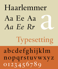
- Haarlemmer (1938, Monotype); release cancelled due to the war[9][10]
- Sheldon (1947), designed for a Bible made by Oxford University Press and named for Archbishop Gilbert Sheldon.[11]
- Spectrum (1952 Enschedé, also 1955 Monotype)[12]
Some initials designed by van Krimpen for the Curwen Press have also been digitised by ARTypes of Chicago.[13] ARTypes also digitised some sets of van Krimpen initial designs that are no longer on sale.[14][15][16][17]
Van Krimpen was renowned for his perfectionism and temper. Monotype's archives preserve a letter to Stanley Morison to say that 'I do not want to be taken for the man who designed something so ridiculously poor as the sloped Romulus bold' that Monotype had produced without his involvement while he was trapped in the Netherlands during the war.[18] Some of his papers are held by the University of Amsterdam.[19]
References

- ^ Majoor, Martin. "My type design philosophy". Retrieved 12 September 2014.
- ^ "Juliana". Font Bureau. Retrieved 17 September 2015.
- ^ Jaspert, W. Pincus, W. Turner Berry and A.F. Johnson. The Encyclopedia of Type Faces. Blandford Press Lts.: 1953, 1983, ISBN 0-7137-1347-X, p. 2408-249
- ^ Unger, Ralph. "RMU Lutetia". MyFonts. RMU Fonts. Retrieved 17 September 2015.
- ^ "DTL Romulus Text". Dutch Type Library. Retrieved 17 September 2015.
- ^ Impallari, Pablo. "Cancelleresca Bastarda Impallari (open-source revival, in beta)". ArchLinux repository. Impallari Type. Retrieved 17 September 2015.
- ^ Macmillan, Neil (2006). An A-Z of type designers. New Haven: Yale University Press. p. 74. ISBN 9780300111514.
- ^ Hoeflake, Netty (1973). A tally of types (postscript on Van Dijck by Hoeflake) (New ed. with additions by several hands ed.). Cambridge: Cambridge University Press. p. 114. ISBN 9780521097864.
- ^ "DTL Haarlemmer". DTL. Retrieved 17 September 2015.
- ^ "Haarlemmer MT". MyFonts. Monotype. Retrieved 17 September 2015.
- ^ Middendorp, Jan (2004). Dutch type. Rotterdam: 010 Publishers. p. 62. ISBN 9789064504600.
{{cite book}}:|access-date=requires|url=(help) - ^ "Spectrum MT". MyFonts. Retrieved 17 September 2015.
- ^ "Curwen Initials". MyFonts. ARTypes. Retrieved 17 September 2015.
- ^ "Open Roman Capitals (dead link)". MyFonts. ARTypes. Retrieved 17 September 2015.
- ^ "Lutetia Open (dead link)". MyFonts. ARTypes. Retrieved 17 September 2015.
- ^ "Romulus Open (dead link)". MyFonts. ARTypes. Retrieved 17 September 2015.
- ^ "Romulus Capitals". MyFonts. ARTypes. Retrieved 17 September 2015.
- ^ van Krimpen, Jan. "Letter from van Krimpen to Morison". Monotype Archive. Retrieved 17 September 2015.
- ^ "Beschrijving van het archief Jan van Krimpen ca. 1915-1958". Universiteit van Amsterdam. Retrieved 17 September 2015.
External links
- J. van Krimpen, On designing and devising type (New York: The Typophiles 1957).
- R. Bringhurst, The Elements of Typographic Style 3rd ed. (Vancouver Hartley & Marks: 2004).
- Klingspor Museum, notes on van Krimpen's career with samples of several designs not digitally available
- Dutch Type Library, a company which has digitised several van Krimpen designs
- Jan Middendorp, "Dutch Type" (010 Publishers, 2004) (pages 54–64)
- Michael Russem, "A Checklist of the 100-Cent Postage Stamps Designed by Jan van Krimpen" (Kat Ran Press, 2015)
