
Talk:Color vision
{{WikiProject banner shell}} to this page and add the quality rating to that template instead of this project banner. See WP:PIQA for details.| Color B‑class Top‑importance | ||||||||||
| ||||||||||
.png)
Mathematics of color perception
Would anyone like to properly format this section? Commander Nemet 03:36, 5 April 2007 (UTC)
- Stevebumstead (talk) 01:20, 18 January 2008 (UTC)Does anyone know how to approximate how many colors the human eye is capable of perceiving?
- In bright light, 10 million discrete colors for a normal adult trichromatic human is a number that is often thrown about.--McGatney (talk) 21:12, 20 April 2009 (UTC)
There is a lack of citations on this section. Also, what element of this section is OR?--Dchem (talk) 17:55, 11 December 2008 (UTC)
How is our view of color at all a Hilbert Space, there is nothing infinite dimensionnal here. There is just a 1-dimensional (wavelength ) color line and our 3-dimensional (red,blue,yellow) view of it. Those whole first 2 paragraphs of the math section are just superflous. 24.201.18.145 (talk) 18:03, 1 January 2009 (UTC)
- It is not just a one-dimensional line, it is an infinite-dimensional spectrum with an infinite number of intensities, one for each wavelength, . We "project" that infinite-dimensional spectrum down to a three-component (three-dimensional) subspace. I agree that the article does a poor job at explaining this, though. This is a little better explained at CIE_1931_color_space#Experimental_results.E2.80.94the_CIE_RGB_color_space. —Ben FrantzDale (talk) 12:19, 2 January 2009 (UTC)
- Hmmm... that CIE diagram is one nasty curve. Are there other, more intuitive representations that benifit from modern computers? (The article describes how all sorts of transformations and shortcuts were taken to make hand calculations easier, but at the expense of comprehensibility.) SharkD (talk) 04:40, 3 January 2009 (UTC)
- Infinite dimensional implies that an infinite number of co-ordinates are required to locate a point in the space, which is not the case; it is not infinite dimensional.--McGatney (talk) 05:13, 20 April 2009 (UTC)
- A spectrum has, in theory, an infinite number of frequencies, or wavelengths, at which a number needs to be specified to locate a point in spectral space. The 3D subspace that defines color only needs 3 dimensions. Here's a book about that. Dicklyon (talk) 05:06, 20 April 2009 (UTC)
- All linearly independent sets of vectors in the subject space (sets which span the space) are finite, meaning that the subject vector space has a finite basis and thus is a finite-dimensional vector space.--McGatney (talk) 21:08, 20 April 2009 (UTC)
- I'm not sure why you say that. You can divide the wavelength axis as finely as you like, to get as many independent vectors as you like, and they still won't form a complete basis because any subdivision (e.g. from 500 to 501 nm) can always be further subdivided. Dicklyon (talk) 07:01, 22 April 2009 (UTC)
- Why do I say that, good question. The photons which strike our cones have a (perceived) color proportional to their energy, and while this energy can have many values, depending upon the source (the specific transition that created them), the energies (and thus the wavelengths) do not form an infinite and continuous set of linearly independent vectors. To take one example, sodium lamps, like those used in parking lots, emit photons with energy inversely proportional to wavelengths 589.0 and 589.6 nm. But there is no continuum of infinite photon energies corresponding inversely to 588 nm to 590 nm that take part in human color vision. Photon energies in the electromagnetic spectrum are separated by very small (but finite) values.--McGatney (talk) 19:31, 23 April 2009 (UTC)
- No, there is no finite energy spacing. The spectrum is a continuum. Dicklyon (talk) 21:31, 23 April 2009 (UTC)
- I believe you are correct, and I am wrong.--McGatney (talk) 04:33, 26 April 2009 (UTC)
- No, there is no finite energy spacing. The spectrum is a continuum. Dicklyon (talk) 21:31, 23 April 2009 (UTC)
- Why do I say that, good question. The photons which strike our cones have a (perceived) color proportional to their energy, and while this energy can have many values, depending upon the source (the specific transition that created them), the energies (and thus the wavelengths) do not form an infinite and continuous set of linearly independent vectors. To take one example, sodium lamps, like those used in parking lots, emit photons with energy inversely proportional to wavelengths 589.0 and 589.6 nm. But there is no continuum of infinite photon energies corresponding inversely to 588 nm to 590 nm that take part in human color vision. Photon energies in the electromagnetic spectrum are separated by very small (but finite) values.--McGatney (talk) 19:31, 23 April 2009 (UTC)
- I'm not sure why you say that. You can divide the wavelength axis as finely as you like, to get as many independent vectors as you like, and they still won't form a complete basis because any subdivision (e.g. from 500 to 501 nm) can always be further subdivided. Dicklyon (talk) 07:01, 22 April 2009 (UTC)
- All linearly independent sets of vectors in the subject space (sets which span the space) are finite, meaning that the subject vector space has a finite basis and thus is a finite-dimensional vector space.--McGatney (talk) 21:08, 20 April 2009 (UTC)
- A spectrum has, in theory, an infinite number of frequencies, or wavelengths, at which a number needs to be specified to locate a point in spectral space. The 3D subspace that defines color only needs 3 dimensions. Here's a book about that. Dicklyon (talk) 05:06, 20 April 2009 (UTC)
- Infinite dimensional implies that an infinite number of co-ordinates are required to locate a point in the space, which is not the case; it is not infinite dimensional.--McGatney (talk) 05:13, 20 April 2009 (UTC)
- Hmmm... that CIE diagram is one nasty curve. Are there other, more intuitive representations that benifit from modern computers? (The article describes how all sorts of transformations and shortcuts were taken to make hand calculations easier, but at the expense of comprehensibility.) SharkD (talk) 04:40, 3 January 2009 (UTC)

Though I agree that infinite-dimensional vector space, or Hilbert space is accurate for describing physical color, I am having hard time seeing the need of resorting to such abstract description. Physical color is essentially the spectral profile or curve in the visible range of the light entering the eye corresponding to the observed object. This profile is determined by either the object's spectral radiance if it is a light source, or its spectral reflectance and the light shone on it. Using a few spectral curves would make the concept much clearer than all the cones referred to in the article. The perceived color is determined by the integration of such spectral curve with the three cones' spectral sensitivity or spectral absorptance resulting in three quantities representing the stimuli to the three cones respectively. Again, using a chart showing the spectral curves and equations showing the integration would make the concept much clearer. I suggest rewrite this section without using the concept of Hilbert space, or put Hilbert space based interpretation in a separate section for those who prefer using this linear algebra concept. I love math but I found such interpretation somewhat interesting but not appealing. Zipswich (talk) 22:54, 13 December 2009 (UTC)
- I agree that the formality of Hilbert spaces is not needed to understand the idea; as the book I linked above says, nobody much bothers with the formality, though it underlies their equations. If you'd like to work on a simpler presentation, feel free. Dicklyon (talk) 04:07, 14 December 2009 (UTC)
- I think equation (5.4) in your referred book is very informative, useful and rigorous. I will draft one following the line of the current section but completely avoiding Hilbert space and post it here for discussion next week.Zipswich (talk) 01:28, 15 December 2009 (UTC)
Red cone colour perception
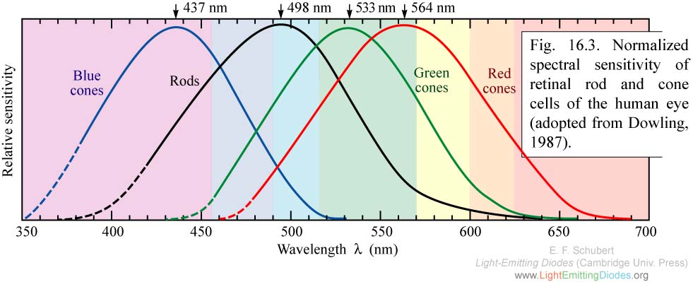
Something that confuses me here: this article states that the red cone is most sensitive in the "yellow" part of the spectrum, but the table later on states that this cone is stimulated most by "yellowish-green". This seems to be a contradiction. Since the "colour" assigned to each part of the spectrum is just based on what our eyes eventually see (i.e. it's the end result not the stimulus), then surely there can only be one colour we see at 564 nm? So is this yellow or yellowish-green? (unsigned by 10:31, April 7, 2007 86.148.113.162).
You are referring to the L-cone. It is confusing to refer to it as the red cone, as it is not most responsive to red as you pointed out. The yellow color is generally considered to be at 575nm. The sensation of yellow is caused by the zero-crossing of the L-M opponent functions (different between L-cone and M-cone). So judging by this, the description of yellowish-green is accurate; 564 is just a bit off 575nm, towards the green side. Notice that you shouldn't take the S/M/L cone chart in this article and do subtraction to try to get the L-M curve; this graph is normalized. This article and many other color-related articles should be greatly enhanced. I'll probably work on that in a month's time. Fred Hsu 21:44, 7 April 2007 (UTC)
Thanks for clearing that up. And I did notice the graph was normalized, but I assumed the normalization was equal for all three curves, keeping the proportions the same. Now you've pointed out that yellow occurs at the zero-crossing of L-M, I guess I can see why the colour yellow is a relatively small part of the visual spectrum!
- In most humans, each cone can contain only one of three pigments, a violet-sensitive pigment, cyanolabe, a green-sensitive pigment, chlorolabe, and a yellow sensitive pigment, erythrolabe. When a cone with a particular pigment is stimulated, it doesn't have the vaguest idea what color has stimulated it; e.g., a cone with the yellow pigment may have been stimulated by 100 photons of orange or 1,000 photons of red. (Cones have a broad, overlapping range of sensitivity.) It is the difference between the signals received from all three types of cones that allows our visual system to differentiate between the ten million or so colors that we see.--McGatney (talk) 07:29, 21 April 2009 (UTC)
Red/Green/Blue cones?
It indeed seems to me that this article should refer to L/M/S cones instead of R/G/B. The latter is very misleading.
Fred Hsu and others: I wonder if there's some kind of todo list that can be made of color-related articles in desperate need of improvement (almost all of them), and what needs improving. I've been adding many "lack of citations" and "disputed" tags, but it's going to take a serious effort to really fix WP's color coverage. --jacobolus (t) 06:33, 24 April 2007 (UTC)
- I bought 5 books on color vision (and deficiency thereof). They have been sitting on my shelf for almost a month now. I have read and hightlighted almost one book by now. I plan to enhance many color-related articles in another month, if no one gets to them before me. The books have been added as references to some articles already. I am just really busy this month, writing music and hiring musicians to play for a wedding. Once I have more free time, I'll come back to look at this matter. Fred Hsu 04:17, 27 April 2007 (UTC)
cie chromaticity diagram
I'm not really sure this is the most appropriate image to have added to this article. CIE XYZ, xyY, L*u*v*, etc. may be approximately linear transformations of the responses of cones, but just showing it here without more extensive explanation could be misleading. If users want to see what the CIE chromaticity diagram looks like, they can look up the CIE XYZ/xyY space, etc. But there are many other diagrams which would be more useful for this page, it seems to me. --jacobolus (t) 06:34, 17 May 2007 (UTC)
Proposed merger of Imaginary color
The new Imaginary color article only has one reference, and the link to it is broken. Similar material is found in the 1972 "Human Information Processing" by Peter Lindsay and Donald Norman (Academic Press) and doubtlessly in many other books on color vision. It does not appear to need to be a standalone article, especially since it would have to pretty much duplicate most of the material here. Per Lindsay and Norman p 206, if you view a green spectral light until the receptors are fatugued, then you view a complementary spectral (saturated) light, you will perceive an impossibly saturated color, which would map outside the CIE diagram. The Imaginary color article goes on to claim that imaginary colors are required as primaries if all the colors in the CIE color space are to be reproduced, an argument which seems less clear. Using a primary of the same hue and greater or equal saturation should allow reproducing any given color. Three real primaries cannot reproduce all hues and saturations faithfully, but a clever choice of 3 primaries can cover a large triangle in the space. More primaries or different primaries could reproduce more colors. Edison 14:31, 21 May 2007 (UTC)
- I'm opposed to the merge proposal. The information in a filled-out imaginary colors article would not belong in a general article about color vision. Imaginary colors are indeed required as primaries to reproduce all spectral colors, as no combination of two spectral colors can produce a third spectral color. So either imaginary primaries, or an infinite number of real primaries, are needed. And the latter is much more useful for locating colors within a comprehensible (3-dimensional or similar) space. --jacobolus (t) 03:02, 22 May 2007 (UTC)
- Well said. Could you look over Imaginary color and fix anything I got wrong? —Keenan Pepper 03:31, 22 May 2007 (UTC)
- I'm also opposed. As a general rule, I tend to find multiple short and clearly focused articles preferable to a few huge all-encompassing ones, and I see nothing in this particular case that would change this. The imaginary color article stands just fine on its own. —Ilmari Karonen (talk) 16:35, 22 May 2007 (UTC)
- Note that “if you view a green spectral light until the receptors are fatugued, then you view a complementary spectral (saturated) light, you will perceive an impossibly saturated color,” while relevant to the imaginary color article, is not really what it is about. The (current) point of the article is not actually perceiving slightly impossibly saturated colors, but using quite impossibly saturated colors as primaries, such as the XYZ primaries. Additionally, it would be good to talk about the “imaginary colors” which can be located in the L*a*b* color space, and can be used as intermediate steps in, e.g., modifying an image in Photoshop. Dan Margulis’ book Photoshop LAB Color discusses this at length, and while I don't completely agree with his reasoning, it is relevant to the article (and note, completely out of place at “color vision”). --jacobolus (t) 00:29, 24 May 2007 (UTC)
- Oppose – I think the merge would be wrong, because an imaginary color is more properly a notion in colorimetry than in vision. I disagree with the current definition in terms of cone cells, since that gets into complicated wetware as pointed out above. Rather, an imaginary color is one that can not be achieved in the CIE space (or other colorimetric space) without negative regions in the spectrum. That's the more physical/mathematical definition that useful in the math and calculations. It's true that you need at least one (maybe two?) non-physical primary to get a color triangle to contain all real colors. Dicklyon 16:31, 27 May 2007 (UTC)
- Can we close this discussion now? The merge proposal doesn't seem to have much support. —Keenan Pepper 04:20, 10 June 2007 (UTC)
Human cone response
Please provide the complete un-normalized response curves of the three types of humans color receptors, and show how this adds up to (or differs from) the Luminosity function.-69.87.203.133 02:20, 25 May 2007 (UTC)
Chromatic adaptation
This section could be hugely expanded - perhaps as a WP page by itself so the list of references and external links here dont get out of hand. Rod57 09:13, 5 June 2007 (UTC)
- Go for it! Also see color constancy, color balance, color temperature, white point. If you want to improve any of those, or create an article about chromatic adaptation, contributions are certainly welcome. --jacobolus (t) 08:07, 6 June 2007 (UTC)
I propose we split this into a separate article so we can get into the mathematics without glazing over the eyes of the average reader. If we do, I can write about XYZ scaling and Bradford too.--Adoniscik (talk) 00:22, 20 January 2008 (UTC)
"mathematics" section too technical
The current "Mathematics of color perception" section is unnecessarily technical. Any mathematically-inclined wikipedians will easily understand what's going on, without needing to read that “More technically, the space of physical colors may be considered to be the (mathematical) cone over the simplex whose vertices are the spectral colors”, or that “Thus human color perception is determined by a specific, non-unique linear mapping from the infinite-dimensional Hilbert space Hcolor to the 3-dimensional Euclidean space R3color” and these descriptions are bound to confuse less mathematically-knowledgeable readers. These concepts should be put in as plain-as-possible english (the current descriptions make even me read them twice to figure out what they're saying, after having studied university-level analysis); those who wish to learn more can click a link or two about the mathematics involved. --jacobolus (t) 19:41, 23 September 2007 (UTC)
- (and i'm not really even convinced it's accurate: I wouldn't really describe every point in the so-defined Hcolor to be a "color". It's more properly called a "spectral distribution", because as Bruce MacEvoy explains quite well, “…light itself has no color. Color is fundamentally a complex judgment experienced as a sensation. It is not an objective feature of the physical world…”. --jacobolus (t) 19:58, 23 September 2007 (UTC) )
- I agree. The math jargon is way overboard, though we ought to try to point out those mathematical concepts, just more plainly. And yes, a spectral distribution is not a color, and we should also make that clear. Work on it? Dicklyon 20:33, 23 September 2007 (UTC)
Here is the diff that originally brought us that mathy section as a big unsourced essay. It really needs to be started over, written with some source in hand. I've done various tweaks on it, but it's hard to fix it that way. Dicklyon 20:44, 23 September 2007 (UTC)
I do not think it is too technical but it is hard to read.--Adoniscik (talk) 00:23, 20 January 2008 (UTC)
- Exactly. If you already understand it, like we do, you can figure out what it's saying, but for someone trying to learn, it's a bitch. Here is the set of all books that approach it that way. OK, maybe these] then. Dicklyon (talk) 00:39, 20 January 2008 (UTC)
- I didn't already understand it, and this was the clearest explanation I've found yet. Leave the math! In fact, use equations. --18.239.6.189 (talk) 03:41, 26 February 2008 (UTC)
Violet vs. magenta
- Subsection inserted into old section #Red cone colour perception above was moved here.
It's difficult to find an explanation why we perceive violet and magenta the same way. In [1] Bart Hickman gives an explanation which makes sense to me: "The red cone sees from green to red (with a peak in the yellow/orange range), but it also has a passband up at violet." I think the "red cone" refers to L-cone, however there is no such peak in the L-curve of the graph of this article. So, is the graph simplified in this sense or is the explanation incorrect?
- There are two things wrong with that explanation. First, we don't see violet and magenta as same color. They're about as different as red and orange, at least. Second, the red or L cone does not have a sensitivity bump in the violet. He's probably confused by the plots of the red color-matching function in RGB spaces, which is a linear combination of the cone curves in which the S cone is added with a positive weight to make a bump at violet. Dicklyon 17:03, 1 December 2007 (UTC)
- What I'm after is an explanation to: Why can we (roughly, with additive RGB system) represent violet by adding some red component to blue, as red is just at the opposite end of the visible spectrum? Didn't find much by googling with "red color-matching function" either. —Preceding unsigned comment added by 80.222.21.12 (talk) 18:10, 6 December 2007 (UTC)
- Stimulating the S-cones without stimulating the other two types, as is the case at about 400 nm, is perceived as violet. Shifting the wavelength to 440 nm makes the M-cones respond also, giving blue. Adding more L-stimulation gives purple. I short, purple (violet to cerise) is the impression one gets when the M-cones are stimulated less then the other two types. KoenB (talk) 21:09, 20 August 2008 (UTC)
Diagram
The diagram of the horseshoe-shaped locus of color doesn't show any units on the x and y axes. What are the units? Thanks! SharkD (talk) 23:17, 14 January 2008 (UTC)
- Those are dimensionless. Dicklyon (talk) 23:23, 14 January 2008 (UTC)
section split proposal
I agree there's too much technical detail in the color constancy and von Kries section and we should move it elsewhere. I figured that would become obvious as I was trying to add enough to the new von Kries section to make it make sense in this context. So where should we put it? Color constancy? Color balance? other? Dicklyon (talk) 01:20, 20 January 2008 (UTC)
- Chromatic adaptation, of course. It's an article waiting to happen. Right now it merely forwards here. (I also mentioned this in a heading above.)--Adoniscik (talk) 04:17, 20 January 2008 (UTC)
- Well, if overlapping content is what bugs you, adding another overlapping article topic is probably not the best way to help. Dicklyon (talk) 04:54, 20 January 2008 (UTC)
- It's not overlapping content; it's content beyond the scope of an overview.--Adoniscik (talk) 05:45, 20 January 2008 (UTC)
Books removed
Back in Feb. 2007, User:Fred Hsu added a bunch of books to the bibliograpy here and at color blindness; but he didn't add much else to the article, so it appears that none of them were actual sources. So I removed them all, after User:Adoniscik fixed all the other refs inline. Dicklyon (talk) 05:24, 6 February 2008 (UTC)
No mention of opsins
Surely opsins should be mentioned in this article, as they are such a crucial part of colour vision and perception? Cheers, Jack (talk) 12:17, 30 May 2008 (UTC)
Spectral response curves for other animals?
Are there known or even estimated response curves for other animals? —Ben FrantzDale (talk) 16:55, 12 June 2008 (UTC)
rhodopsin
Rod cells actually have a small role in color vision, as they have absorption peaks in the 500-550 nm range (depending on whether the eye is dark adapted or not), so it might be worth including them here. I don't know of the recent work, but the Purkinje phenomenon in color vision used to be (long ago) partly attributed to the effects of rod cells on color vision in low light. digfarenough (talk) 20:17, 30 November 2008 (UTC)
Excitation of individual eye cones
The article mentions how the L cone for example peaks in the greenish-yellow region of the spectrum, despite often being called the red cone. However, there is no mention of any experiments which excite each cone individually (without exciting the other cones). Is it possible that exciting the L cone by itself would produce a reddish sensation, and not a greenish-yellow one as implied? —Preceding unsigned comment added by Skytopia (talk • contribs) 11:44, 27 December 2008 (UTC)
- Exciting the L cone alone gives a pure red perception. Is there anything in the article that suggests otherwise? Dicklyon (talk) 22:11, 27 December 2008 (UTC)
- There does not seem to be anything to suggest otherwise; but it is a good question all the same. The answer is not utterly obvious. More interesting questions, perhaps: What sensation of colour would stimulation of only the M cones yield, for a normal subject? How would we go about answering this with assurance?
- –⊥¡ɐɔıʇǝoNoetica!T– 22:40, 27 December 2008 (UTC)
- Indeed, that's harder, since no wavelength of light will stimulate only the M cones. Kind of makes the question moot, no? But surely the answer would be "intensely greenish". Dicklyon (talk) 00:57, 28 December 2008 (UTC)
- Yep, the other cones I was interested in also. In the article, the statement I found potentially misleading was "Similarly, the S- and M-cones do not directly correspond to blue and green". But in a very important way, if what some of the above comments saying are true, then, perhaps they DO correspond to what we call 'blue' and 'green'. Maybe one way to fake stimulating the M cones would be to tire out the red and blue cones with strong red and blue hues. The other way of course would be in the lab... --Skytopia (talk) 07:04, 28 December 2008 (UTC)
- Good work, Skytopia. These are important matters, in an area where misconceptions run deep. We could wish for definitive answers to all such questions, but as Dicklyon points out they are empirically hard to investigate. I would argue that they are conceptually and analytically difficult, also.
- Dicklyon, I do not share your confidence that the answer "intensely greenish" is secured. We'd need a detailed argument, and we'd surely need to know something more about how the three-cone system feeds into the three-opponent-process system (or at least, the red-green–blue-yellow system). I do not regard the answer for the L cones ("a pure red perception") as entirely secured, either: though it certainly seems safe enough compared with anything we might say about the M cones. And we'd want the S cones included in a full account, as well. More research needed! These are not moot questions: there may, for all we know, be indirect methods available for isolating one cone system for stimulation; and examination of low-level neural mechanisms should at least in theory yield answers.
- –⊥¡ɐɔıʇǝoNoetica!T– 07:30, 28 December 2008 (UTC)
- For the L and S cones, it's easy, just use light of 700 nm and 400 nm respectively; the answers are red and violet. For the M cones, I withdraw my flip answer, since there is no name for this "greenish" sensation outside the visible gamut. Dicklyon (talk) 17:34, 28 December 2008 (UTC)
- That answer about the L and S cones is of course highly plausible. Does light at those extremes of the visible spectrum stimulate only one type of cone, or is there some slight excitation of other cones also? The fact that the sensitivity curves for the S and L cones are, in their peaks and in their bulks, located left and right of the curve for the M cones does not in itself guarantee that this will be so. But simple inspection of an accurate spectrum does seem to confirm it.
- I doubt that the hypothetical "greenish" sensation, for the M cones alone, would be "outside the visible gamut". If we are to take opponency seriously, it is highly likely that all positions in the red–green and blue–yellow ranges are occupied in some or other actual sensation, so that novel combinations could not occur no matter what input there were from the cones in a normal subject. The question remains, though: what colour sensation would there be from pure M-cone input, even if it is one that can occur from other inputs as well? So far we have no articulated argument that it must be "greenish": just a vague and possibly ill-founded plausibility. Why not "yellowish", or, more plausibly, "bluish" or even "violetish"? (We might want to drop all those -ishes!)
- –⊥¡ɐɔıʇǝoNoetica!T– 21:51, 28 December 2008 (UTC)
- For the L and S cones, it's easy, just use light of 700 nm and 400 nm respectively; the answers are red and violet. For the M cones, I withdraw my flip answer, since there is no name for this "greenish" sensation outside the visible gamut. Dicklyon (talk) 17:34, 28 December 2008 (UTC)
- Yep, the other cones I was interested in also. In the article, the statement I found potentially misleading was "Similarly, the S- and M-cones do not directly correspond to blue and green". But in a very important way, if what some of the above comments saying are true, then, perhaps they DO correspond to what we call 'blue' and 'green'. Maybe one way to fake stimulating the M cones would be to tire out the red and blue cones with strong red and blue hues. The other way of course would be in the lab... --Skytopia (talk) 07:04, 28 December 2008 (UTC)
- Indeed, that's harder, since no wavelength of light will stimulate only the M cones. Kind of makes the question moot, no? But surely the answer would be "intensely greenish". Dicklyon (talk) 00:57, 28 December 2008 (UTC)
- Could one just ask someone who is color blind? They suffer from non-working cones, don't they? Process of elimination? Also, the second image in the article is missing the curve (typically dotted) that fills the gap between S and M, and is picked up by the rods, I believe. SharkD (talk) 22:36, 28 December 2008 (UTC)
- Eh, here's one. SharkD (talk) 22:46, 28 December 2008 (UTC)
- No, they don't suffer from non-working cones, just have fewer different types of cones. It's really unclear how the rest of their visual nervous system differs in response to having effectively one less dimension of opponent color. Dicklyon (talk) 23:56, 28 December 2008 (UTC)
- Eh, here's one. SharkD (talk) 22:46, 28 December 2008 (UTC)
What is needed for color?
In the second paragraph, it says: "Three things are needed to see color: a light source, a detector (e.g. the eye) and a sample to view."
I believe a colored light source (such as a red LED) can be perceived by a color sensitive detector (e.g. an eye). Reelrt (talk) 16:40, 5 May 2009 (UTC)
- In that case the light source is also the sample to view; viewing a source is an odd special case of the usual vision problem of viewing an object (the "sample" here). Dicklyon (talk) 16:44, 5 May 2009 (UTC)
- I believe Reelrt is right. A sample that reflects light from one or more sources is just another (albeit secondary) source of light, indistinguishable from an object emitting light itself. To see a color, one only needs eyes and light that reaches the eyes. KoenB (talk) 19:06, 7 May 2009 (UTC)
- Well, nobody said he was wrong, but it's also not that simple. Dicklyon (talk) 03:04, 8 May 2009 (UTC)
Color sensitivity curves indicate we cannot perceive violet
I have seen on a discussion here [2] that it is important to indicate that the L cone has a secondry but small absorption peak at short wavelengths otherwise we wouldn't be able to perceive violet (which we perceive when we look at 400nm or if we look at red and blue light together). This seems to be missing from the cone sensitivity image, maybe this is because the red curve stops about at this. Any ideas? 89.168.123.190 (talk) 14:20, 17 May 2009 (UTC)
- 1. Absorption is not the same as sensitivity - the L-cones have no sensitivity peak at short wavelengths.
- 2. Short wave light ("violet") will stimulate the S-cones only, yielding the color impression violet. A bit longer waves stimulate the M-cones also, producing blue. KoenB (talk) 13:54, 20 May 2009 (UTC)
Newton and color bands
Newton’s famous prism experiment showed how the eye responds to monochromatic light as a function of frequency. The variation is not continuous. There are six bands. (Newton claimed seven.)
It would add considerably to the diagram showing the normalized response spectra of human cones if alongside the x axis we had not only the frequency in nanometers but also the perceived colour. This must be possible if it is true that every perceived colour can be replicated by three numbers R G B. Bukovets (talk) 18:49, 14 August 2009 (UTC)
- Nonsense. Newton knew nothing of frequency or monochromatic, and there are no discrete bands. He just came up with some divisions based on color names he liked. He originally had just 5, omitting orange and indigo. But he wanted 7, so he added those. Dicklyon (talk) 23:54, 14 August 2009 (UTC)
Misleading graphic
The graphic "Normalized response spectra of human cones" uses blue, green and red traces, suggesting one of the peaks is right on the red color. However, the third trace actually peaks in some greenish yellow. It should be accompanied with the spectrum superimposed, use different trace colors, or replaced by a different image. Perhaps using this graphic instead would be better (Guillep2k (talk) 05:19, 23 August 2009 (UTC)):

- That looks like a good way to do it. How about adding the S, M, and L labels? Dicklyon (talk) 05:36, 23 August 2009 (UTC)
- I added labels—is this okay? -- BenRG (talk) 21:16, 23 August 2009 (UTC)
- Looks great to me! Thanks. Dicklyon (talk) 22:58, 23 August 2009 (UTC)
- Now why not put this image in the article? KoenB (talk) 13:15, 15 December 2009 (UTC)
Number of colours discernable to humans
Can human really discern 10,000,000 colours? I thought we could see only 300,000.
2010-06-22 Lena Synnerholm, Märsta, Sweden.