Histogram
| Histogram | |
|---|---|
 | |
| One of the Seven Basic Tools of Quality | |
| First described by | Karl Pearson |
| Purpose | To roughly assess the probability distribution of a given variable by depicting the frequencies of observations occurring in certain ranges of values |
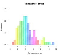
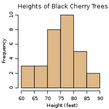
In statistics, a histogram is a graphical representation, showing a visual impression of the distribution of data. It is an estimate of the probability distribution of a continuous variable and was first introduced by Karl Pearson.[1] A histogram consists of tabular frequencies, shown as adjacent rectangles, erected over discrete intervals (bins), with an area equal to the frequency of the observations in the interval. The height of a rectangle is also equal to the frequency density of the interval, i.e., the frequency divided by the width of the interval. The total area of the histogram is equal to the number of data. A histogram may also be normalized displaying relative frequencies. It then shows the proportion of cases that fall into each of several categories, with the total area equaling 1. The categories are usually specified as consecutive, non-overlapping intervals of a variable. The categories (intervals) must be adjacent, and often are chosen to be of the same size.[2]
Histograms are used to plot density of data, and often for density estimation: estimating the probability density function of the underlying variable. The total area of a histogram used for probability density is always normalized to 1. If the length of the intervals on the x-axis are all 1, then a histogram is identical to a relative frequency plot.
An alternative to the histogram is kernel density estimation, which uses a kernel to smooth samples. This will construct a smooth probability density function, which will in general more accurately reflect the underlying variable.
The histogram is one of the seven basic tools of quality control.[3]
Etymology

The etymology of the word histogram is uncertain. Sometimes it is said to be derived from the Greek histos 'anything set upright' (as the masts of a ship, the bar of a loom, or the vertical bars of a histogram); and gramma 'drawing, record, writing'. It is also said that Karl Pearson, who introduced the term in 1895, derived the name from "historical diagram".[4]
Examples
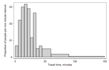
As an example we consider data collected by the U.S. Census Bureau on time to travel to work (2000 census, [1], Table 2). The census found that there were 124 million people who work outside of their homes. An interesting feature of this graph is that the number recorded for "at least 15 but less than 20 minutes" is higher than for the bands on either side. This is likely to have arisen from people rounding their reported journey time.[original research?] This rounding is a common phenomenon when collecting data from people.

| Interval | Width | Quantity | Quantity/width |
|---|---|---|---|
| 0 | 5 | 4180 | 836 |
| 5 | 5 | 13687 | 2737 |
| 10 | 5 | 18618 | 3723 |
| 15 | 5 | 19634 | 3926 |
| 20 | 5 | 17981 | 3596 |
| 25 | 5 | 7190 | 1438 |
| 30 | 5 | 16369 | 3273 |
| 35 | 5 | 3212 | 642 |
| 40 | 5 | 4122 | 824 |
| 45 | 15 | 9200 | 613 |
| 60 | 30 | 6461 | 215 |
| 90 | 60 | 3435 | 57 |
This histogram shows the number of cases per unit interval so that the height of each bar is equal to the proportion of total people in the survey who fall into that category. The area under the curve represents the total number of cases (124 million). This type of histogram shows absolute numbers, with Q in thousands.

| Interval | Width | Quantity (Q) | Q/total/width |
|---|---|---|---|
| 0 | 5 | 4180 | 0.0067 |
| 5 | 5 | 13687 | 0.0221 |
| 10 | 5 | 18618 | 0.0300 |
| 15 | 5 | 19634 | 0.0316 |
| 20 | 5 | 17981 | 0.0290 |
| 25 | 5 | 7190 | 0.0116 |
| 30 | 5 | 16369 | 0.0264 |
| 35 | 5 | 3212 | 0.0052 |
| 40 | 5 | 4122 | 0.0066 |
| 45 | 15 | 9200 | 0.0049 |
| 60 | 30 | 6461 | 0.0017 |
| 90 | 60 | 3435 | 0.0005 |
This histogram differs from the first only in the vertical scale. The height of each bar is the decimal percentage of the total that each category represents, and the total area of all the bars is equal to 1, the decimal equivalent of 100%. The curve displayed is a simple density estimate. This version shows proportions, and is also known as a unit area histogram.
In other words, a histogram represents a frequency distribution by means of rectangles whose widths represent class intervals and whose areas are proportional to the corresponding frequencies. The intervals are placed together in order to show that the data represented by the histogram, while exclusive, is also continuous. (E.g., in a histogram it is possible to have two connecting intervals of 10.5–20.5 and 20.5–33.5, but not two connecting intervals of 10.5–20.5 and 22.5–32.5. Empty intervals are represented as empty and not skipped.)[5]
Shape or form of a distribution
The histogram provides important informations about the shape of a distribution. According to the values presented, the histogram is either highly or moderately skewed to the left or right. A symmetrical shape is also possible, although a histogram is never perfectly symmetrical. If the histogram is skewed to the left, or negatively skewed, the tail extends further to the left. An example for a distribution skewed to the left might be the relative frequency of exam scores. Most of the scores are above 70 percent and only a few low scores occure. An example for a distribution skewed to the right or positively skewed is a histogram showing the relative frequency of housing values. A relatively small number of expensive homes create the skeweness to the right. The tail extends further to the right. The shape of a symmetrical distribution mirrors the skeweness of the left or right tail. For example the histogram of data for IQ scores. Histograms can be unimodal, bi-modal or multi-modal, depending on the dataset.
Activities and demonstrations
The SOCR resource pages contain a number of hands-on interactive activities demonstrating the concept of a histogram, histogram construction and manipulation using Java applets and charts.
Mathematical definition

In a more general mathematical sense, a histogram is a function mi that counts the number of observations that fall into each of the disjoint categories (known as bins), whereas the graph of a histogram is merely one way to represent a histogram. Thus, if we let n be the total number of observations and k be the total number of bins, the histogram mi meets the following conditions:
Cumulative histogram
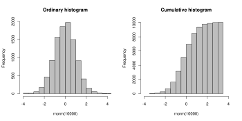
A cumulative histogram is a mapping that counts the cumulative number of observations in all of the bins up to the specified bin. That is, the cumulative histogram Mi of a histogram mj is defined as:
Number of bins and width
There is no "best" number of bins, and different bin sizes can reveal different features of the data. Some theoreticians have attempted to determine an optimal number of bins, but these methods generally make strong assumptions about the shape of the distribution. Depending on the actual data distribution and the goals of the analysis, different bin widths may be appropriate, so experimentation is usually needed to determine an appropriate width. There are, however, various useful guidelines and rules of thumb.[7]
The number of bins k can be assigned directly or can be calculated from a suggested bin width h as:
The braces indicate the ceiling function.
- Sturges' formula[8]
which implicitly bases the bin sizes on the range of the data, and can perform poorly if n < 30.
- Scott's choice[9]
where is the sample standard deviation.
- Square-root choice
which takes the square root of the number of data points in the sample (used by Excel histograms and many others).
- Freedman–Diaconis' choice[10]
which is based on the interquartile range.
- Choice based on minimization of an estimated L2 risk function[11]
where and are mean and biased variance of a histogram with bin-width , and .
See also
- Data binning
- Freedman–Diaconis rule
- Image histogram
- Density estimation
- Kernel density estimation, a smoother but more complex method of density estimation
- Pareto chart
- Seven Basic Tools of Quality
References
- ^ Attention: This template ({{cite doi}}) is deprecated. To cite the publication identified by doi:10.1098/rsta.1895.0010, please use {{cite journal}} (if it was published in a bona fide academic journal, otherwise {{cite report}} with
|doi=10.1098/rsta.1895.0010instead. - ^ Howitt, D. and Cramer, D. (2008) Statistics in Psychology. Prentice Hall
- ^ Nancy R. Tague (2004). "Seven Basic Quality Tools". The Quality Toolbox. Milwaukee, Wisconsin: American Society for Quality. p. 15. Retrieved 2010-02-05.
- ^ M. Eileen Magnello (1856). "Karl Pearson and the Origins of Modern Statistics: An Elastician becomes a Statistician". The New Zealand Journal for the History and Philosophy of Science and Technology. 1 volume. ISSN 1177–1380.
{{cite journal}}: Check|issn=value (help); Unknown parameter|month=ignored (help) - ^ Dean, S., & Illowsky, B. (2009, February 19). Descriptive Statistics: Histogram. Retrieved from the Connexions Web site: http://cnx.org/content/m16298/1.11/
- ^ Anderson, David R. "Statistics for Business and Economics", 2010, volume 2, p. 32–33.
- ^ e.g. § 5.6 "Density Estimation", W. N. Venables and B. D. Ripley, Modern Applied Statistics with S, Springer, 4th edition
- ^ Sturges, H. A. (1926). "The choice of a class interval". J. American Statistical Association: 65–66.
- ^ Scott, David W. (1979). "On optimal and data-based histograms". Biometrika. 66 (3): 605–610. doi:10.1093/biomet/66.3.605.
- ^ Freedman, David (1981). "On the histogram as a density estimator: L2 theory". Zeitschrift für Wahrscheinlichkeitstheorie und verwandte Gebiete. 57 (4): 453–476. doi:10.1007/BF01025868.
{{cite journal}}: Unknown parameter|coauthors=ignored (|author=suggested) (help) - ^ Shimazaki, H. (2007). "A method for selecting the bin size of a time histogram". Neural Computation. 19 (6): 1503–1527. doi:10.1162/neco.2007.19.6.1503. PMID 17444758.
{{cite journal}}: Check|authorlink=value (help); External link in|authorlink=|coauthors=ignored (|author=suggested) (help)
Further reading
- Lancaster, H.O. An Introduction to Medical Statistics. John Wiley and Sons. 1974. ISBN 0 471 51250-8
External links
- Journey To Work and Place Of Work (location of census document cited in example)
- Understanding histograms in digital photography
- Smooth histogram for signals and images from a few samples
- Histograms: Construction, Analysis and Understanding with external links and an application to particle Physics.
- A Method for Selecting the Bin Size of a Histogram
- Interactive histogram generator
- Matlab function to plot nice histograms
- Digital Photography For Beginners-Histograms


