Box plot

In descriptive statistics, a box plot or boxplot is a convenient way of graphically depicting groups of numerical data through their quartiles. Box plots may also have lines extending vertically from the boxes (whiskers) indicating variability outside the upper and lower quartiles, hence the terms box-and-whisker plot and box-and-whisker diagram. Outliers may be plotted as individual points.
Box plots display differences between populations without making any assumptions of the underlying statistical distribution: they are non-parametric. The spacings between the different parts of the box help indicate the degree of dispersion (spread) and skewness in the data, and identify outliers. In addition to the points themselves, they allow one to visually estimate various L-estimators, notably the interquartile range, midhinge, range, mid-range, and trimean. Boxplots can be drawn either horizontally or vertically.
Types of boxplots


Box and whisker plots are uniform in their use of the box: the bottom and top of the box are always the first and third quartiles, and the band inside the box is always the second quartile (the median). But the ends of the whiskers can represent several possible alternative values, among them:
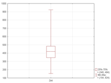
- the minimum and maximum of all of the data[1] (as in Figure 2)
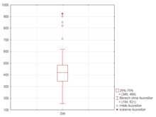
- the lowest datum still within 1.5 IQR of the lower quartile, and the highest datum still within 1.5 IQR of the upper quartile[2][3] (as in Figure 3)
- one standard deviation above and below the mean of the data
- the 9th percentile and the 91st percentile
- the 2nd percentile and the 98th percentile.
Any data not included between the whiskers should be plotted as an outlier with a dot, small circle, or star, but occasionally this is not done.
Some box plots include an additional character to represent the mean of the data.[2]
On some box plots a crosshatch is placed on each whisker, before the end of the whisker.
Rarely, box plots can be presented with no whiskers at all.
Because of this variability, it is appropriate to describe the convention being used for the whiskers and outliers in the caption for the plot.
The unusual percentiles 2%, 9%, 91%, 98% are sometimes used for whisker cross-hatches and whisker ends to show the seven-number summary. If the data is normally distributed, the locations of the seven marks on the box plot will be equally spaced.
Variations

Several variations on the traditional box plot have been described. Two of the most common are variable width box plots and notched box plots (see figure 4).
Variable width box plots illustrate the size of each group whose data is being plotted by making the width of the box proportional to the size of the group. A popular convention is to make the box width proportional to the square root of the size of the group.[1]
Notched box plots apply a "notch" or narrowing of the box around the median. Notches are useful in offering a rough guide to significance of difference of medians; if the notches of two boxes do not overlap, this offers evidence of a statistically significant difference between the medians.[1] The width of the notches is proportional to the interquartile range of the sample and inversely proportional to the square root of the size of the sample. However, there is uncertainty about the most appropriate multiplier (as this may vary depending on the similarity of the variances of the samples).[1] One convention is to use .[3]
Visualization

The boxplot is a quick way of examining one or more sets of data graphically. Boxplots may seem more primitive than a histogram or kernel density estimate but they do have some advantages. They take up less space and are therefore particularly useful for comparing distributions between several groups or sets of data (see Figure 1 for an example). Choice of number and width of bins techniques can heavily influence the appearance of a histogram, and choice of bandwidth can heavily influence the appearance of a kernel density estimate.
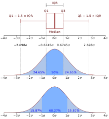
As looking at a statistical distribution is more intuitive than looking at a boxplot, comparing the boxplot against the probability density function (theoretical histogram) for a normal N(0,1σ2) distribution may be a useful tool for understanding the boxplot (Figure 5).
See also
References
- ^ a b c d McGill, Robert; Tukey, John W.; Larsen, Wayne A. (1978). "Variations of Box Plots". The American Statistician. 32 (1): 12–16. doi:10.2307/2683468. JSTOR 2683468.
{{cite journal}}: Unknown parameter|month=ignored (help) - ^ a b Frigge, Michael; Hoaglin, David C.; Iglewicz, Boris (1989). "Some Implementations of the Boxplot". The American Statistician. 43 (1): 50–54. doi:10.2307/2685173. JSTOR 2685173.
{{cite journal}}: Unknown parameter|month=ignored (help) - ^ a b "R: Box Plot Statistics". R manual. Retrieved 26 June 2011.
Further reading
- John W. Tukey (1977). Exploratory Data Analysis. Addison-Wesley.
- Benjamini, Y. (1988). "Opening the Box of a Boxplot". The American Statistician. 42 (4): 257–262. doi:10.2307/2685133. JSTOR 2685133.
- Rousseeuw, P. J.; Ruts, I.; Tukey, J. W. (1999). "The Bagplot: A Bivariate Boxplot". The American Statistician. 53 (4): 382–387. doi:10.2307/2686061. JSTOR 2686061.
External links
- Visual Presentation of Data by Means of Box Plots
- On-line box plot calculator with explanations and examples (Has beeswarm example)
- Beeswarm Boxplot - superimposing a frequency-jittered stripchart on top of a boxplot

