
Wikipedia:Graphics Lab/Map workshop/Archive/Oct 2013
Stale[edit]
-
 This SVG file...
 -
 ...is replacing this.


Article(s): International Civil Aviation Organization airport code
Request:
- Just did the vector image above, and wonder whether the colours are suitable (e.g. to colour-blind users). I used six colours to separate the regions.
- I tried to request in Commons since the file is uploaded there, but got no response after nearly a week. Hytar (talk) 09:24, 1 August 2013 (UTC)
Graphist opinion(s):
- Comment:
- This is useful, and I've used it in the past: Vischeck - but it wasn't working when I tried it a few minutes ago.
- I also found this - http://www.etre.com/tools/colourblindsimulator/ which lets you check for 3 kinds of colour blindness by uploading a jpeg of your image. When I tried yours it looked pretty good to me, with perhaps the only potential issues seeming to be your green vs. yellow, and the lilac at 'H' on the second test. It can be quite tricky to find something that works for all the tests. Give it a go yourself, and I recommend the "Vischeck" one if they fix it and it starts working again. Begoon talk 10:08, 5 August 2013 (UTC)
Senegal and the Commonwealth[edit]
.png)

Article(s): Commonwealth of Nations membership criteria
Request:
- Would someone please colour Senegal in green on both these maps to show its eligibility to join the Commonwealth, as it was occupied by the British from 1758 to 1779 (see Capture of Senegal). — Preceding unsigned comment added by 5.134.89.17 (talk • contribs) (please SIGN your posts. Thank you. Begoon talk 03:38, 25 August 2013 (UTC))
Graphist opinion(s):
Resolved[edit]
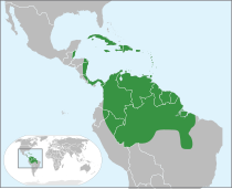
Area of Carapa guianensis[edit]
-
Badly drawn image by myself showing the area of Carapa GuianensisNew version showing requested changes -

alternate "base map"? -
just a baseprototypeColouring ver. 2
.svg)

Article(s): Carapa
Request:
- I would like to have a world map showing the area where Carapa guianensis trees grow. In the above image I've tried to draw something quickly; I had to puzzle it together from different scientific sources. The idea is:
- South-America: The second map in this image, without the areas in the North-East of Brazil
- Panama: everything except the Azuero Peninsula (same source)
- Costa Rica, Nicaragua: Atlantic coast (source)
- Honduras: Gracias a Dios department (same source)
- Belize: everything (same source)
- Caribbean: all countries/islands except the Bahama's (same source)
- Would it be possible to create a smooth, filled-in area like the other vegetation areas on Wikipedia? I don't know if it's better in png or in svg. Thank you, -- LeRoc (talk) 17:18, 4 October 2013 (UTC)
Graphist opinion(s):
- My first thought is that you seem to be using about 10 - 15% of the visual area on a flat map like that, which is fine in one way - it shows the relative scarcity of worldwide coverage, but it does mean it will be difficult to show the detailed areas.
- Why not consider something like File:Americas (orthographic projection).svg as a base map (if it covers everything)? That gives some "world" context while focusing a bit. You could even have a little 'inset' indicating/picking that area out of a "world" map for further context if you think that's important. I don't personally feel that 'inset' would add much, but it's an option, I guess.
- Then the only things to do are: define the areas, decide on shading for "non-extent" and "extent" areas. Anything within reason is possible there, and its svg so editable.
- Just food for thought... Begoon talk 03:14, 6 October 2013 (UTC)
- I'm not sure if the Amazon Region doesn't become very deformed in this projection, I guess we'd have to see how it works fist. I tried to define the areas in the image above. (I'm sorry, after taking a second look at my sources I took out the coastal regions of Peru and Ecuador; I tried to indicate that in the image.) The non-extent areas could be grey and the extent areas dark green as in your picture above. I like it when it still shows the national boundaries. LeRoc (talk) 16:58, 6 October 2013 (UTC)
- You're probably right. I did actually think that after I suggested that image. (and that image still "wastes" a lot of space). There are flat projections of the Americas in svg form that would work too, and be even better in terms of visibility of your "extents" - my main drift was to try to get away from tiny green dots on a vast grey map... The "globe" projection was a germ of an idea to still give it some "world" context, if you felt that was important to define.
If you do, there's probably a good way to use basically the style of what you've done as the "inset" on a larger blow up of the relevant area. There's plenty of "spare" ocean space in sensible places around the area that would be blown up to accommodate the world map as an inset "key". I'm just going offline tonight, but I'll take a look tomorrow and see what I can come up with, if you like. Begoon talk 17:17, 6 October 2013 (UTC)
- I like the 'inset' idea. One thing that would be important is that we could get the Carribbean Islands more or less clearly. Perhaps not all the smaller ones, but at least Trinidad and Tobago. I'll be travelling within the Amazon forest for the next two days; I don't know if I'll have internet access. I'm curious to see what you'll come up with. LeRoc (talk) 17:50, 6 October 2013 (UTC)
- I've not got a lot of time today, but I had a quick "play" and this will work ok, I think. Give me a day or so to have something as a prototype. Begoon talk 07:45, 7 October 2013 (UTC)
- Actually, I did get a few minutes, just time to make a "base" map to show you the proportions etc. No colouring or legends added to the "key inset" or the map, just the base map (I used File:BlankMap-World7.svg) scaled and positioned, so it's very bland - just really so you can see the "shape" I was talking about. I'll try and get more done tomorrow.
The Carrribean will be a bit more visible when coloured, and if you really wanted to I guess there's room top right to blow that small area up again as a further inset, using a more detailed local outline (with a tasteful "arrow" or indicator to show what's going on...)... Begoon talk 15:12, 7 October 2013 (UTC)
- (I'm sorry, I was without internet connection the last two days.) The base map looks very nice. I'd suggest to try the colouring in first (including the islands) and we'll see how it looks. I don't think another inset for the Caribbean islands will be necessary, it would suggest a level of detail for which we don't have sources. Do you have enough information about which parts of the map I would like to be drawn green? LeRoc (talk) 19:12, 8 October 2013 (UTC)
- Ok - I threw some green at it. Have a look and tell me where I went wrong...
 . Begoon talk 02:17, 9 October 2013 (UTC)
- So you didn't like the translucent radioactive lime green overlay, huh? Good - neither did I - and it was badly done with horrid clipping masks and duplicated, unnecessary, bloated code, because it was a quick hack for the prototype... So I redid the colouring. How's that now? Begoon talk 04:16, 10 October 2013 (UTC)
- Heh, I may have liked radioactive lime when I was a teenager, but I'm more of a conservative, dark green type now . I hope you'll agree that it's much clearer with the new colour. As far as I'm concerned it's very good now, thank you very much! I'll add the picture to Carapa and I think I'll make a quick article on Carapa guianensis too (I'm trying to get C. guianensis to FA status on the Dutch Wikipedia.) Thank you, LeRoc (talk) 11:32, 10 October 2013 (UTC)
- That's ok - I wasn't sure about them. Fixed now. Yes, the darker green is far superior. Begoon talk 12:08, 10 October 2013 (UTC)
- Cool. I'll mark it as resolved, then - if you do decide it needs something else, just let us know. Cheers. Begoon talk 15:11, 10 October 2013 (UTC)
- Heh, I may have liked radioactive lime when I was a teenager, but I'm more of a conservative, dark green type now
- You're probably right. I did actually think that after I suggested that image. (and that image still "wastes" a lot of space). There are flat projections of the Americas in svg form that would work too, and be even better in terms of visibility of your "extents" - my main drift was to try to get away from tiny green dots on a vast grey map... The "globe" projection was a germ of an idea to still give it some "world" context, if you felt that was important to define.
- I'm not sure if the Amazon Region doesn't become very deformed in this projection, I guess we'd have to see how it works fist. I tried to define the areas in the image above. (I'm sorry, after taking a second look at my sources I took out the coastal regions of Peru and Ecuador; I tried to indicate that in the image.) The non-extent areas could be grey and the extent areas dark green as in your picture above. I like it when it still shows the national boundaries. LeRoc (talk) 16:58, 6 October 2013 (UTC)
Jason Islands[edit]
-
 Thinking of something like this, but only including the Jason Islands (in the NW corner).
 -


Article(s): Jason Islands
Request:
- Hello,
- Would it be possible to create a topographic map of the Jason Islands please? This would help us cut down on the flurry of measurements that makes up most of the geography section of the article. It may be worthwhile generating two maps, with English and Spanish toponymy. -- Kahastok talk 10:19, 8 September 2013 (UTC)
Graphist opinion(s):
- Because nothing had been done with this, I cropped and resized the larger map as File:Jason Islands topographic map-en.svg. It's a bit bland, because there's no more topographic detail in there than the SRTM3 data in the original, and it's a lot of water - but that's the thing with groups of islands, I guess...
- Might not be useful, but might be better than nothing. Begoon talk 06:46, 1 October 2013 (UTC)
- Thank you very much. I will put it on the page. Though I don't suppose we can have a miles scale on there as well please? Kahastok talk 19:54, 1 October 2013 (UTC)
List of countries by life expectancy[edit]

Article(s): List of countries by life expectancy
Request:
- As the CIA treats the Falkland Islands as being a separate territory to Argentina, would it be possible to clean up the line to connecting them to Argentina and turning the Falkland Islands to a grey colour as their value is currently not given on the CIA list? — Preceding unsigned comment added by 188.29.166.87 (talk • contribs) 01:41, 11 September 2013 (UTC)
Graphist opinion(s):
President of the United Nations General Assembly[edit]

Article(s): President of the United Nations General Assembly
Request:
- Can someone paint Ugana in green, and also Antigua and Barbuda and Germany. -- Lihaas (talk) 19:18, 27 September 2013 (UTC)
- I started to do this as a "quick job" on the png. It was all going well, Uganda was fine, Germany sure, but when I got to Antigua and Barbuda I can't for the life of me figure out which of the dots in that area corresponds to what. It almost looks to me like it's already coloured, which makes no sense, but I really can't work out what's going on in that area, even comparing it to the list in the article and overlaying the png on other maps to figure it out...
- What I'd rather do is recreate the whole thing using one of the svgs set up for that purpose (like the Age of consent map linked below File:Age of Consent - Global.svg, because that will be better for future editability, and scalability, but that will take me a day or so to fit in, if you can wait, unless someone does it first. It's easy enough - just takes a little time to run through the list of countries from the article page to set it up, and then check it. (oh, and add that little inset...). Begoon talk 17:26, 7 October 2013 (UTC)
- No rush. Just replace is with the updated map to automaically change on that page. ThanksLihaas (talk) 19:32, 7 October 2013 (UTC)
 Done File:UNGA President states.svg Begoon talk 07:30, 8 October 2013 (UTC)
Map of Ontario should include Manitoulin Island[edit]
-
 Map of Ontario

Article(s): Ontario
Request:
- According to Manitoulin Island, the island is part of Ontario, yet in the Ontario map, is it yellow not red. Could the red be extended to the island? -- SPhilbrick(Talk) 15:28, 21 October 2013 (UTC)
Graphist opinion(s):
- Done Begoon talk 16:27, 21 October 2013 (UTC)
- Thanks, that was quick! I'll let the person who contacted Wikimedia know.--SPhilbrick(Talk) 17:07, 21 October 2013 (UTC)