
Ultramarine: Difference between revisions
| Line 36: | Line 36: | ||
''Electric ultramarine'' is the tone of ultramarine that is halfway between [[blue]] and [[Violet (color)#Color wheel violet|violet]] on the [[RGB color model|RGB (HSV) color wheel]], the expression of the [[HSV color space]] of the [[RGB color model]].<ref>Maerz and Paul ''A Dictionary of Color'' New York:1930--McGraw Hill Color Sample of Ultramarine: Page 105 Plate 41 Color Sample F12 Ultramarine is shown as being one of the colors on the bottom of the plate representing the most highly saturated colors between blue and violet (the colors on the right of the plate represent the most highly saturated colors between violet and rose); ultramarine is shown as being situated at a position exactly one-half of the way between blue and violet.</ref> |
''Electric ultramarine'' is the tone of ultramarine that is halfway between [[blue]] and [[Violet (color)#Color wheel violet|violet]] on the [[RGB color model|RGB (HSV) color wheel]], the expression of the [[HSV color space]] of the [[RGB color model]].<ref>Maerz and Paul ''A Dictionary of Color'' New York:1930--McGraw Hill Color Sample of Ultramarine: Page 105 Plate 41 Color Sample F12 Ultramarine is shown as being one of the colors on the bottom of the plate representing the most highly saturated colors between blue and violet (the colors on the right of the plate represent the most highly saturated colors between violet and rose); ultramarine is shown as being situated at a position exactly one-half of the way between blue and violet.</ref> |
||
=== |
=== International Klein Blue (IKB) === |
||
[[International Klein Blue|International Klein Blue |
[[International Klein Blue|International Klein Blue]] a deep blue hue first mixed by the French artist [[Yves Klein]]. |
||
=== Blue vs violet vs pink ultramarines === |
=== Blue vs violet vs pink ultramarines === |
||
Revision as of 06:36, 20 May 2014

Ultramarine is a deep blue color and a pigment which was originally made by grinding lapis lazuli into a powder.[1] The pigment consists primarily of a zeolite-based mineral containing small amounts of polysulfides. It occurs in nature as a proximate component of lapis lazuli. The pigment color code is P. Blue 29 77007. Ultramarine is the most complex of the mineral pigments, a complex sulfur-containing sodio-silicate (Na8-10Al6Si6O24S2-4) containing a blue cubic mineral called lazurite (the major component in lapis lazuli). Some chloride is often present in the crystal lattice as well. The blue color of the pigment is due to the S3− radical anion, which contains an unpaired electron.[2]
Production
The raw materials used in the manufacture are:
- iron-free kaolin, or some other kind of pure clay, which should contain its silica and alumina as nearly as possible in the proportion of SiO2:Al2O3 demanded by the formula assigned to ideal kaolin (a deficit of silica, however, it appears can be made up for by addition of the calculated weight of finely divided silica);
- Anhydrous Na2SO4;
- Anhydrous Na2CO3;
- Powdered sulfur; and
- Powdered charcoal or relatively ash-free coal, or colophony in lumps.[3]
The mixture is heated in a kiln, sometimes in brick-sized amounts. The resultant solids are then ground and washed as per any other insoluble pigment manufacturing process. The chemical reaction produces large amounts of sulfur dioxide meaning that Flue gas desulfurization is an essential part of its manufacture to comply with pollution regulations. Large chimneys were used to disperse sulfur dioxide produced in the process, resulting in ultramarine tinting the surrounding ground surfaces and roof vents with a blue color. Google Maps offers views of two such synthetic ultramarine manufacturing sites, one near Hull, England, another in Comines, France and another in Ambattur, Chennai, Tamil Nadu India.
"Ultramarine poor in silica" is obtained by fusing a mixture of soft clay, sodium sulfate, charcoal, sodium carbonate and sulfur. The product is at first white, but soon turns green "green ultramarine" when it is mixed with sulfur and heated. The sulfur burns, and a fine blue pigment is obtained. "Ultramarine rich in silica" is generally obtained by heating a mixture of pure clay, very fine white sand, sulfur and charcoal in a muffle-furnace. A blue product is obtained at once, but a red tinge often results. The different ultramarines—green, blue, red and violet—are finely ground and washed with water.[3]
Synthetic ultramarine is a more vivid blue than natural ultramarine, since the particles in synthetic ultramarine are smaller and more uniform than natural ultramarine and therefore diffuse light more evenly. Its color is unaffected by light nor by contact with oil or lime as used in painting. Hydrochloric acid immediately bleaches it with liberation of hydrogen sulfide. Even a small addition of -white (oxide of zinc) to the reddish varieties especially causes a considerable diminution in the intensity of the color.[3]
-
 Lapis lazuli specimen (rough), Afghanistan
 -
 Natural ultramarine
 -
 Synthetic ultramarine blue
 -
 Synthetic ultramarine violet


Structure and classification of ultramarines
Ultramarine is the aluminosilicate zeolite with the sodalite structure. Sodalite consists of interconnected aluminosilicate cage. Some of these cages contain polysulfide (Sxn-) groups that are the chromophore (color centre). The negative charge on these ions is balanced by Na+ ions that also occupy these cages.[2]
Electric ultramarine
| Electric Ultramarine | |
|---|---|
| Hex triplet | #3F00FF |
| sRGBB (r, g, b) | (63, 0, 255) |
| HSV (h, s, v) | (255°, 100%, 100%) |
| CIELChuv (L, C, h) | (35, 133, 268°) |
| Source | Maerz and Paul[4] |
| B: Normalized to [0–255] (byte) | |
Electric ultramarine is the tone of ultramarine that is halfway between blue and violet on the RGB (HSV) color wheel, the expression of the HSV color space of the RGB color model.[5]
International Klein Blue (IKB)
International Klein Blue a deep blue hue first mixed by the French artist Yves Klein.
Blue vs violet vs pink ultramarines
The nature of the polysulfide dictates the color of the solid. The usual blue ultramarine is thought to contain S2- as the chromophore. In violet ultramarine (C.I. Pigment Violet 15:77007) and pink ultramarine (C.I. Pigment Red 259:77007) the chromophore is proposed to be S4- or S4.[2]
Applications
Synthetic ultramarine, being very cheap, is largely used for wall painting, the printing of paper hangings and calico, etc., and also as a corrective for the yellowish tinge often present in things meant to be white, such as linen, paper, etc. Bluing or "Laundry blue" is a solution of synthetic ultramarine (sometimes, prussian blue) that is used for this purpose when washing white clothes. Also often found in make up such as mascaras or eye shadows. Large quantities are used in the manufacture of paper, and especially for producing a kind of pale blue writing paper which was popular in Britain.[3] During World War I, the RAF painted the outer roundels with a color which was made on Ultramarine Blue. This became BS 108(381C) Aircraft Blue. It was replaced in the 1960s by a new color made on Phthalocyanine Blue, BS110(381C) Roundel Blue.
History
The name derives from Middle Latin ultramarinus, literally "beyond the sea" because it was imported from Asia by sea.[6] In the past, it has also been known as azzurrum ultramarine, azzurrum transmarinum, azzuro oltramarino, azur d'Acre, pierre d'azur, Lazurstein. Current terminology for ultramarine includes natural ultramarine (English), outremer lapis (French), Ultramarin echt (German), oltremare genuino (Italian), and ultramarino verdadero (Spanish). The first recorded use of ultramarine as a color name in English was in 1598.[7]
The first noted use of lapis lazuli as a pigment can be seen in the 6th and 7th-century AD cave paintings in Afghanistani Zoroastrian and Buddhist temples, near the most famous source of the mineral. Lapis lazuli has also been identified in Chinese paintings from the 10th and 11th centuries, in Indian mural paintings from the 11th, 12th, and 17th centuries, and on Anglo-Saxon and Norman illuminated manuscripts from c.1100.
Ultramarine in the Middle Ages and the Renaissance
-
 The Wilton Diptych (1395-1399) is an example of the use of ultramarine in 14th century England
 -
 The blue robes of the Virgin Mary by Masaccio (1426) were painted with ultramarine.
 -
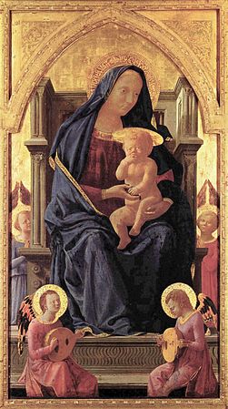
 Pietro Perugino economized on this painting of the Virgin Mary (about 1500) by using azurite for the underpainting of the robe, then adding a layer of ultramarine on top.
 -
 Titian made dramatic use of ultramarine in the sky and draperies of Bacchus and Ariadne (1520–23).
.jpg)


.jpg)
During the Renaissance, ultramarine was the finest and most expensive blue that could be used by painters. The 15th century artist Cennino Cennini wrote in his famous handbook for painters: "Ultramarine blue is a color illustrious, beautiful, the most perfect, beyond all other colors; one could not say anything about it, or do anything with it, that its quality would not still surpass."[8] Natural ultramarine is the most difficult pigment to grind by hand[citation needed], and for all except the highest quality of mineral, sheer grinding and washing produces only a pale grayish blue powder. At the beginning of the 13th century, an improved method came into use, described by Cennino Cennini in the 15th century. This process consisted of mixing the ground material with melted wax, resins, and oils, wrapping the resulting mass in a cloth, and then kneading it in a dilute lye solution. The blue particles collect at the bottom of the pot, while the impurities and colorless crystals remain. This process was performed at least three times, with each successive extraction generating a lower quality material. The final extraction, consisting largely of colorless material as well as a few blue particles, brings forth ultramarine ash which is prized as a glaze for its pale blue transparency.[9]
The pigment was most extensively used during the 14th through 15th centuries, as its brilliance complemented the vermilion and gold of illuminated manuscripts and Italian panel paintings. It was valued chiefly on account of its brilliancy of tone and its inertness in opposition to sunlight, oil, and slaked lime. It is, however, extremely susceptible to even minute and dilute mineral acids and acid vapors. Dilute HCl, HNO3, and H2SO4 rapidly destroy the blue color, producing hydrogen sulfide (H2S) in the process. Acetic acid attacks the pigment at a much slower rate than mineral acids. Ultramarine was only used for frescoes when it was applied "secco" because fresco's absorption rate made its use cost prohibitive. The pigment was mixed with a binding medium like egg to form a tempra and applied over dry plaster (such as Giotto di Bondone's frescos in the Cappella degli Scrovegni or Arena Chapel in Padua).
European artists used the pigment sparingly, reserving their highest quality blues for the robes of Mary and the Christ child. As a result of the high price, artists sometimes economized by using a cheaper blue, azurite, for under painting. Most likely imported to Europe through Venice, the pigment was seldom seen in German art or art from countries north of Italy. Due to a shortage of azurite in the late 16th and 17th century, the demand for the already-expensive ultramarine increased dramatically.[citation needed]
In the 17th and 18th Century


Johannes Vermeer made extensive use of ultramarine in his paintings. In Lady standing at a virginal, the young woman's dress is painted with a mixture of ultramarine and green earth, and ultramarine was also used to add shadows in the flesh tones.[11]
While it made a magnificent blue, it did have its defects; scientific analysis by the National Gallery in London of Lady standing at a virginal showed that the ultramarine in the blue seat cushion in the foreground had degraded and become paler with time; it would have been a deeper blue when originally painted.[12]
The 19th Century - the invention of synthetic ultramarine
In 1814, Tassaert observed the spontaneous formation of a blue compound, very similar to ultramarine, if not identical with it, in a lime kiln at St. Gobain, which caused the Societé pour l'Encouragement d'Industrie to offer, in 1824, a prize for the artificial production of the precious color. Processes were devised by Jean Baptiste Guimet (1826) and by Christian Gmelin (1828), then professor of chemistry in Tübingen; while Guimet kept his process a secret, Gmelin published his, and thus became the originator of the "artificial ultramarine" industry.[3]
Ultramarine blue is now commonly used by many types of contemporary artists, with Yves Klein being prominent. Klein produced striking monochromatic sculptures from his own patented pigment International Klein Blue which relied heavily on ultramarine blue.
References
- ^ Webster's New World Dictionary of American English, Third College Edition 1988.
- ^ a b c G. Buxbaum et al. "Pigments, Inorganic, 3. Colored Pigments" in Ullmann's Encyclopedia of Industrial Chemistry, 2012, Wiley-VCH, Weinheim. doi:10.1002/14356007.n20_n02
- ^ a b c d e One or more of the preceding sentences incorporates text from a publication now in the public domain: Chisholm, Hugh, ed. (1911). "ultramarine". Encyclopædia Britannica (11th ed.). Cambridge University Press.
- ^ The color displayed in the color box above matches the color called ultramarine in the 1930 book by Maerz and Paul A Dictionary of Color New York:1930 McGraw-Hill; the color ultramarine is displayed on page 105, Plate 41, Color Sample F12 and is shown as the color lying exactly halfway between blue and violet.
- ^ Maerz and Paul A Dictionary of Color New York:1930--McGraw Hill Color Sample of Ultramarine: Page 105 Plate 41 Color Sample F12 Ultramarine is shown as being one of the colors on the bottom of the plate representing the most highly saturated colors between blue and violet (the colors on the right of the plate represent the most highly saturated colors between violet and rose); ultramarine is shown as being situated at a position exactly one-half of the way between blue and violet.
- ^ "ultramarine". Online Etymology Dictionary. Retrieved 2011-06-30.
- ^ Maerz and Paul A Dictionary of Color New York:1930--McGraw Hill Page 206
- ^ Cennino Cennini, The Craftsman's Handbook (Il Libro dell' Arte, pg. 36.
- ^ Cennino Cennini, The Craftsman's Handbook (Il Libro dell' Arte), pg. 36.
- ^ [1] Description of the painting at www.girl-with-a-pear-earring.info/pallette.htm.
- ^ [2] National Gallery of London discussion of Vermeer's palette
- ^ [3] National Gallery essay on the altered appearance of ultramarine in the paintings of Vermeer
See Also
- Cennini, Cennino (1933). The Craftsman's Handbook (Il Libro dell'Arte). Dover Books. ISBN 978-0-486-20054-5.
- Bomford, David (2000). A Closer Look - Colour. National Gallery Company Limited. ISBN 978-1-85709-442-8.
External links
- Discussion of ultramarine in an article on blue pigments in early Sienese paintings from The Journal of the American Institute for Conservation
- National Gallery essay on the altered appearance of ultramarine in the paintings of Vermeer