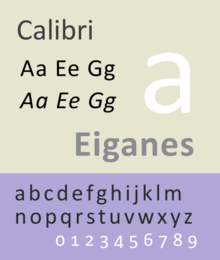
Calibri
 | |
| Category | Sans-serif |
|---|---|
| Classification | Humanist |
| Designer(s) | Lucas de Groot |
| Foundry | Microsoft |
| Date created | 2004 |
| License | Proprietary |
Calibri (/kəˈliːbri/) is a humanist sans-serif typeface family designed by Lucas de Groot. In Microsoft Office 2007, it replaced Times New Roman as the default typeface in Word[1] and replaced Arial as the default in PowerPoint, Excel, Outlook, and WordPad. It continues to be the default in Microsoft Office 2010, 2013 and 2016, and it is now the default font in Office for Mac 2016. A subtly rounded design, de Groot described it as having "a warm and soft character".
Calibri is part of the ClearType Font Collection, a suite of fonts from various designers released with Windows Vista. All start with the letter C to reflect that they were designed to work well with Microsoft's ClearType text rendering system, a text rendering engine designed to make text clearer to read on LCD monitors. The other fonts in the same group are Cambria, Candara, Consolas, Constantia and Corbel.[2]
Characteristics
The font features subtly rounded stems and corners that are visible at larger sizes. Its italic includes calligraphic influences, which are common in modern typefaces.[3]
The typeface includes characters from Latin, Latin extended, Greek and Cyrillic scripts. Developed using sophisticated OpenType formatting, Calibri features a range of ligatures as well as lining and text figures, and extra features such as indices (numbers enclosed by circles) up to 20 and an alternate f and g accessible by enabling the fourth and fifth stylistic sets.[4] Some features in Calibri remain unsupported by Office, including true small caps, all-caps spacing, superscript and subscript glyphs and the ability to create arbitrary fractions; these may be accessed using programs such as InDesign.
One problem with the font is a visible homoglyph, a pair of easily confused characters: the lowercase letter L and the uppercase letter i (l and I) of the Latin script are effectively indistinguishable.
The design has clear similarities to de Groot's famous and much more extensive commercial family TheSans, although this has straight ends rather than rounding.
Availability
The typeface is distributed with Windows Vista, Windows 7, Windows 8, Windows 8.1, Windows 10, Microsoft Office 2007, Microsoft Office 2008 for Mac, Microsoft Office 2010, Microsoft Office 2011 for Mac, Microsoft Office 2013 and, Microsoft Office 2016. The current version is 6.18.
The typeface is available in Google Docs as of September 2010.[5]
Calibri Light is introduced in Microsoft Windows 8 and later. Calibri and Calibri Light are the default fonts of Microsoft Word 2013 and after for body text and headings respectively. The font Calibri Light is also commonly used in Powerpoint templates.
This font, along with Cambria, Candara, Consolas, Corbel and Constantia, is also distributed with Microsoft Excel Viewer, Microsoft PowerPoint Viewer,[6][7] the Microsoft Office Compatibility Pack[8] for Microsoft Windows and the Open XML File Format Converter for Mac.[9] For use in other operating systems, such as GNU/Linux, cross-platform use and web use it is not available as a freeware.
The typeface is licensed by Ascender Corporation for sale to end users, consumer electronics device manufacturers and other users. The typeface is also licensed by Monotype Imaging to printer manufacturers as part of the Vista 8 Font Set package.
Carlito

In 2013, as part of Chrome, Google released a freely-licensed font called Carlito, which is metric-compatible to Calibri.[10] It is a modification of popular open-source font Lato, created by Łukasz Dziedzic, and so does not specifically resemble Calibri particularly strongly. Carlito was not designed by or with the involvement of de Groot.
Awards
Calibri won the TDC2 2005 award from the Type Directors Club under the Type System category.[11]
References
- ^ "Microsoft typography: Calibri". Microsoft. Retrieved 10 Dec 2011.
- ^ "Case Study: Calibri and Consolas". LucasFonts. Retrieved 26 May 2011.
- ^ Levien, Raph. "Microsoft's ClearType Font Collection: A Fair and Balanced Review". Typographica. Retrieved 24 November 2014.
- ^ Batchelor, Lee. "Opentype Features in Microsoft Word". Leeviathan. Retrieved 7 July 2015.
- ^ "Official Google Blog: A more fontastic Google Docs". Official Google Blog.
- ^ "Download Excel Viewer from Official Microsoft Download Center". Microsoft.
- ^ "Download PowerPoint Viewer from Official Microsoft Download Center". Microsoft.
- ^ "Download Microsoft Office Compatibility Pack for Word, Excel, and PowerPoint File Formats from Official Microsoft Download Center". Microsoft.
- ^ "Download Open XML File Format Converter for Mac 1.2.1 from Official Microsoft Download Center". Microsoft.
- ^ "A thank you to Google from Desktop Linux". GNOME blog.
- ^ TDC2 2005: Winning Entries
