
Wikipedia:Graphics Lab/Photography workshop/Archive/Mar 2012
Stale[edit]
Tehaapapa (cont..)[edit]
-

-
 upload here


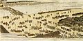
Article(s): Tehaapapa III
Request: Can someone circle crop the figure on the right and make a png version of it? But leave this jpg version and crop it to the group photo, instead, and if possible recreate the portion covered by the circle in the process. Thanks.--KAVEBEAR (talk) 02:23, 26 February 2012 (UTC)
Graphist opinion(s): ![]() Done on circle crop png version. --Jenith (talk) 04:16, 26 February 2012 (UTC)
Done on circle crop png version. --Jenith (talk) 04:16, 26 February 2012 (UTC)
- Could you add a border around the circle or something and/or make the lines of her body more distinct? I can't make out anything in all that white.--KAVEBEAR (talk) 04:26, 26 February 2012 (UTC)
- Just took a look at these at 100%. They might benefit from FFT filtering before any cropping is done. There is nothing to make out in all that white. Literally - there's nothing there. nagualdesign (talk) 04:53, 26 February 2012 (UTC)
- ..My browser must have been at 125% before. Viewed at 100% in Photoshop I noticed that an FFT filter will probably not help at all - this is a (no-good) 2-bit image. I recommend that you replace it with a better version. nagualdesign (talk) 06:21, 26 February 2012 (UTC)
Charlie Patton[edit]
-
Christmas decoration with Charlie Patton
Article(s): Charlie Patton
Request: Please crop out the Charlie Patton pic, rotate and maybe retouch. Maybe add a better background (cream or something), and remove the Charlie Patton lettering. Thanks. ♫GoP♫TCN 13:27, 28 February 2012 (UTC)
Graphist opinion(s):
You might be stepping into a copyright issue here. The whole photo may be free, but the image on the decoration by itself may not be. The image seems to have been taken (more or less) from an old photo, the copyright may have expired from that old photo (I don't know), but this somewhat stylized decoration image might be creative enough that it's considered a new copyrighted work. (By the way, here is a much better version of that image.) – JBarta (talk) 13:55, 28 February 2012 (UTC)
- The first link goes to a cropped version of a picture which was deleted weeks ago. I prefer the decoration version, but I will try to contact him to upload at least this file. Regards.--♫GoP♫TCN 15:38, 28 February 2012 (UTC)
William Willis Blackford[edit]
-
 William Willis Blackford

Article(s): User:Albacore/WWB, eventually William Blackford
Request: Touch up, remove blurriness. Albacore (talk) 23:54, 28 February 2012 (UTC)
Graphist opinion(s):
Seems like an ok image just as it is. You're not going to get much improvement out of it... if any at all. – JBarta (talk) 03:39, 29 February 2012 (UTC)
Marcus Pollard[edit]

Article(s): Marcus Pollard
Request: Do something with them... Crop. 67.121.105.124 (talk) 11:20, 5 March 2012 (UTC)
Graphist opinion(s):
![]() Done Did something with them... – JBarta (talk) 14:04, 5 March 2012 (UTC)
Done Did something with them... – JBarta (talk) 14:04, 5 March 2012 (UTC)
![]() Question: So... I guess the guy on the left is Marcus Pollard, and you'd like someone to attempt to crop a portrait of him for the article out of the group picture? Is that right? Begoon talk 00:35, 7 March 2012 (UTC)
Question: So... I guess the guy on the left is Marcus Pollard, and you'd like someone to attempt to crop a portrait of him for the article out of the group picture? Is that right? Begoon talk 00:35, 7 March 2012 (UTC)
- I figure if he can't even be bothered to string together a few words to let us know what he wants, then screw 'em. (and I mean that in the most civil way possible) – JBarta (talk) 04:38, 9 March 2012 (UTC)
Resolved[edit]
Rastrojos logo[edit]
Article(s): Los Rastrojos
Request: need grey background for the logo leave white center with soldier please thanks Vjiced (talk) 21:30, 22 February 2012 (UTC)
- Why gray background? In addition, I found this and this which indicates the logo should be circular. On top of that, I believe there are copyright questions... you Vjiced are the copyright holder for that group's logo? You actually designed that logo? If not, then it's (possibly) a non-free file and cannot be on commons. – JBarta (talk) 23:27, 22 February 2012 (UTC)
Well i scanned it from a brochure they were distibuting everyewhere in town internet and emails so yes its free and must be on commons what do you want me to go ask the criminal group if i have A copyright over their logo ARE YOU NUTS ?Vjiced (talk) 17:45, 23 February 2012 (UTC)
- The folks who contribute their time and talents to the Graphic Lab project, Vjiced, do so gratis and to both assist others who need their help in this area as well as to develop the image collections on Wikipedia. Please therefore treat them respectfully or you will soon find that your requests will be ignored. Centpacrr (talk) 18:27, 23 February 2012 (UTC)
- Well said, Centpacrr. Furthermore, "they were distibuting everyewhere in town internet and emails so yes its free" is a ludicrous statement. Logos and other copyrighted material are of course freely distributed (see brand) but they retain their copyright status. That said, you don't need a gray background, you need a transparent background. And perhaps the logo may be used on WP under fair use policy provided that it's low-res and is an accurate representation of a logo (ie, if it should be round it must be round to qualify for fair use). nagualdesign (talk) 18:37, 23 February 2012 (UTC)
- To spell it out, Vjiced, you have claimed that this is your 'Own Work' and that you are 'the copyright holder of this work', when if fact you have simply copied this logo and have no affiliation with Los Rastrojos. That about right? nagualdesign (talk) 19:18, 23 February 2012 (UTC)
Vjiced, you didn't create the work and you don't own the copyright. That's settled. Now here's what you can do to keep the image... upload the logo (preferrably a round version of it) to en:Wikipedia (not commons) as a fair use logo of an organization. It's then available for use on en:Wikipedia with a few restrictions. Then request the commons image be speedily deleted. I realize this is a bit of work, but that's what is necessary to get that image into compliance so you can use it. If you need assistance along the way, leave a note on my talk page. – JBarta (talk) 20:38, 23 February 2012 (UTC)
- Non-free file deleted from commons, re-uploaded to en:WP under fair use, is now round with transparent background. – JBarta (talk) 20:25, 4 March 2012 (UTC)
William Pitt Kīnau[edit]
.jpg)
Article(s): John William Pitt Kinau
Request: Clean up some major scratches and marks?KAVEBEAR (talk) 16:52, 26 February 2012 (UTC)
Graphist opinion(s):
![]() Done: Done as requested. PawełMM (talk) 10:20, 27 February 2012 (UTC)
Done: Done as requested. PawełMM (talk) 10:20, 27 February 2012 (UTC)
- The job on his face and hands seems a little messy...--KAVEBEAR (talk) 00:10, 28 February 2012 (UTC)
- He's done a decent job so far. Just a few more sittings and he'll have nailed it. Sometimes you have to stop, reflect and re-focus. nagualdesign (talk) 00:49, 28 February 2012 (UTC)
- I agree.--KAVEBEAR (talk) 06:04, 28 February 2012 (UTC)
- I did a little corrections. PawełMM (talk) 08:01, 28 February 2012 (UTC)
- Very good. 2 more pointers; The right edge of the image looks a little bit puckered in places, and the back of his left hand is a bit ..odd. Regards, nagualdesign (talk) 05:31, 29 February 2012 (UTC)
 Redone: Background corrected and hand cleared a bit. Odd hand could you compare with original. IMHO it is nothing to do more. PawełMM (talk) 09:06, 29 February 2012 (UTC)
- I did a little corrections. PawełMM (talk) 08:01, 28 February 2012 (UTC)
- I agree.--KAVEBEAR (talk) 06:04, 28 February 2012 (UTC)
- He's done a decent job so far. Just a few more sittings and he'll have nailed it. Sometimes you have to stop, reflect and re-focus. nagualdesign (talk) 00:49, 28 February 2012 (UTC)
- The job on his face and hands seems a little messy...--KAVEBEAR (talk) 00:10, 28 February 2012 (UTC)
Cleanup Request[edit]
.jpg)
Article(s): Walter T. Galligan
Request: Cleanup - I plan to try for FP with this one. Thanks. – Connormah (talk) 04:30, 29 February 2012 (UTC)
Graphist opinion(s):
All in all it's not a bad picture. Maybe a tiny bit on the faded-blueish side, but nothing else that I can see. What sort of "cleanup" did you have in mind? – JBarta (talk) 14:31, 1 March 2012 (UTC)
I suppose I should have looked more closely before I opened my piehole. I see assorted minor blemishes and dust specks. Those can be cleaned up easily enough. Is that what you were looking for? – JBarta (talk) 14:39, 1 March 2012 (UTC)
- There's a weird background defect that becomes more visible when you adjust levels in the top left corner - I couldn't get rid of it - perhaps I should have said that right off the bat. Thanks. – Connormah (talk) 16:08, 1 March 2012 (UTC)
- I see what you mean. There's also a couple light splotches on the right side. Speaking for myself, I'm not sure I could fix that without making things worse. Maybe one of the other talented folks here can work some subtle magic. – JBarta (talk) 01:27, 2 March 2012 (UTC)
- Done splotch removal. Still needs dust and scratches removing. nagualdesign (talk) 09:06, 2 March 2012 (UTC)
- Dust & spots cleanup done. Fantasic job on that background cleanup btw. To Connormah, regarding a featured picture nomination, I'm not so sure. It suffers from quite visible jpg compression at zoom. At some point before we got it, it got saved as a slightly high compression jpg (fine for casual web use, but FP?) If I were voting, I would vote against it for that reason. Unfortunately, there's not a whole lot that can be done to fix that. Sure, there are "jpg artifact reduction" filters, but those basically just blur it slightly. Sort of like fixing a black eye by punching the other one so they're even. At any rate, go ahead and nominate it anyway. I've been wrong before <shudder> and I may be wrong again. Good luck. – JBarta (talk) 11:57, 2 March 2012 (UTC)
- I did an okay job, but Quibik really did do a fantastic job on the background (I'd love to know how you did that, BTW). As JBarta said, this image is highly compressed (50%!). Not sure it's worth making a song and dance about, but then I am British. ;-) Regards, nagualdesign (talk) 23:09, 2 March 2012 (UTC)
- Explaining exactly how he did this would probably take a couple of thousand words because it is not a simple process and employed many proprietary techniques that he has personally developed over the last dozen years. – JBarta (talk) 02:34, 3 March 2012 (UTC)
- LOL! Oh JBarta, you are naughty. ;-) ..By the way, are you having any sign-in issues today? I keep getting signed out (of Wikipedia), but iGoogle and wotnot are working fine so I guess it's not a cookie issue. And I noticed at the sign-in page that you can stay signed in for 180 days, whereas it used to be 30 days. nagualdesign (talk) 02:48, 3 March 2012 (UTC)
- Explaining exactly how he did this would probably take a couple of thousand words because it is not a simple process and employed many proprietary techniques that he has personally developed over the last dozen years. – JBarta (talk) 02:34, 3 March 2012 (UTC)
- I did an okay job, but Quibik really did do a fantastic job on the background (I'd love to know how you did that, BTW). As JBarta said, this image is highly compressed (50%!). Not sure it's worth making a song and dance about, but then I am British. ;-) Regards, nagualdesign (talk) 23:09, 2 March 2012 (UTC)
- Dust & spots cleanup done. Fantasic job on that background cleanup btw. To Connormah, regarding a featured picture nomination, I'm not so sure. It suffers from quite visible jpg compression at zoom. At some point before we got it, it got saved as a slightly high compression jpg (fine for casual web use, but FP?) If I were voting, I would vote against it for that reason. Unfortunately, there's not a whole lot that can be done to fix that. Sure, there are "jpg artifact reduction" filters, but those basically just blur it slightly. Sort of like fixing a black eye by punching the other one so they're even. At any rate, go ahead and nominate it anyway. I've been wrong before <shudder> and I may be wrong again. Good luck. – JBarta (talk) 11:57, 2 March 2012 (UTC)
- I see what you mean. There's also a couple light splotches on the right side. Speaking for myself, I'm not sure I could fix that without making things worse. Maybe one of the other talented folks here can work some subtle magic. – JBarta (talk) 01:27, 2 March 2012 (UTC)
R. H. Tawney portrait[edit]
-
 Portrait of Richard Henry Tawney
 -
 Transparent background version


Article(s): R. H. Tawney, Liberal socialism
Request: Please can you oval crop and lighten the image (a lot). Thanks in advance. -- Peter (Talk page) 21:51, 29 February 2012 (UTC)
Graphist opinion(s):
- Sorry to be fussy - I know it's a very small thing, but could you also remove the small line/crease going across the upper face (if that's possible). Thanks for the work already though, much appreciated. --Peter (Talk page) 23:30, 29 February 2012 (UTC)
- Tweaked. Centpacrr (talk) 23:55, 29 February 2012 (UTC)
- I created a png from this image with a transparent background, as it's being used in the article's infobox. Unfortunately I can't 'upload a derivative file' at the Commons as I ordinarily would because the file has copyright issues. I hate all that legal bumf and can't understand how to do it (upload the image). Any ideas? nagualdesign (talk) 07:43, 2 March 2012 (UTC)
- The "derivative work" script does not understand some license templates. As a quick fix, I added
{{PD-old}}to unlock the script. I would selectively despeckle this image (too noisy - maybe you have done that already) Materialscientist (talk) 08:01, 2 March 2012 (UTC)- Thanks. I did a more-or-less straight copy. I thought it was a bit noisy, too, but I didn't want Centpacrr to think I was deliberately targeting him. Seems like I'm always following him around with a proverbial dustpan and brush! nagualdesign (talk) 09:10, 2 March 2012 (UTC)
- Done. Despeckled. Uploaded png without a problem. Thanks again, Materialscientist. :-) nagualdesign (talk) 09:40, 2 March 2012 (UTC)
- Thanks. I did a more-or-less straight copy. I thought it was a bit noisy, too, but I didn't want Centpacrr to think I was deliberately targeting him. Seems like I'm always following him around with a proverbial dustpan and brush! nagualdesign (talk) 09:10, 2 March 2012 (UTC)
- The "derivative work" script does not understand some license templates. As a quick fix, I added
- I created a png from this image with a transparent background, as it's being used in the article's infobox. Unfortunately I can't 'upload a derivative file' at the Commons as I ordinarily would because the file has copyright issues. I hate all that legal bumf and can't understand how to do it (upload the image). Any ideas? nagualdesign (talk) 07:43, 2 March 2012 (UTC)
- Tweaked. Centpacrr (talk) 23:55, 29 February 2012 (UTC)
Panorama tweaks[edit]
-
 Krkonoše mountain range
Article(s): Krkonoše
Request: Will someone help me finish this panorama? It was only stitched with hugin so far. Maybe crop top or bottom a bit, then do some common image edits (levels, contrast, brightness etc.). I have also a special request to remove the kind of haze the mountains in very back are in, in general the contrast could probably be "normalized" all accross the depth of the image so that the mountains in the back are nicely visible. Thanks in advance! Kozuch (talk) 22:56, 3 March 2012 (UTC)
Graphist opinion:Adjusted as requested. Centpacrr (talk) 23:22, 3 March 2012 (UTC)
- Kozuch, you can only remove so much of that haze before the picture begins to look unreal. I've upoaded 2 versions, the first 'natural' (which I prefer), the second with slightly enhanced contrast on the mountains (at the loss of some detail in the trees). I'll let you be the judge. Nice panorama, BTW. I see that you took it yourself - did you use a UV filter at all? Or polarizing filter? nagualdesign (talk) 00:15, 4 March 2012 (UTC)
- RE: Let's allow the requester to decide if he likes this one first before posting another version 20 minutes later; this more closely fits his request.
Centpacrr, there's really no need to get defensive or start scent marking your contributions. As is often the case I began editing when I read the request, took my time making adjustments and promptly uploaded. It was only afterwards that I discovered you had also uploaded. Big deal. Yes, let's of course let the requester decide, but surely that implies having a decision to make. Now they have several versions to choose from. Is your latest upload even any different from your first? If not, stop pissing around. nagualdesign (talk) 00:27, 4 March 2012 (UTC)- Centpacrr, as is often the case, you've overdone it. Your sky is an unnatural blue and coloring of the structures in the distance is fried. That said, Nagualdesign, I believe your image could be improved with a little richer color and contrast. And to anyone who cares... the mountains in the distance are supposed to be hazy. – JBarta (talk) 00:38, 4 March 2012 (UTC)
- The colour is a little bit low, yes, but if you look closely at the little house towards the left (russet roof and a green thing nearby) they look okay, so I guess the field, or whatever that is that's growing there, is fairly colourless. The histogram is fairly centre-weighted too. Perhaps a little more S-curve might help... nagualdesign (talk) 00:50, 4 March 2012 (UTC)
- Increased contrast, as per JBarta's advice. (Starting with my first version, which I assume you'd prefer.) Any more and it starts to look a bit stark. It is a slight improvement I guess. The increased contrast sort of makes up for the low colour-contrast of the scene. nagualdesign (talk) 01:04, 4 March 2012 (UTC)
- I hadn't noticed the pinkish light against the snow caps and a few of the buildings. It's hard to make out in the original so it somehow got lost along the way. I've restored it and it looks much better, I think. You can see that it was taken around dawn (or dusk) now. nagualdesign (talk) 02:17, 4 March 2012 (UTC)
- Hi guys, thanks so much for your efforts, even if you seem to argue a bit ;-) I had a little hard time following all of your edits, I did unfortunatelly have no time to review last version of you, Nagualdesign. But because you told it is based on your first version (which did not have the extra contrast on mountains), I took your second version and cropped it a bit yet and put autolevels on it (sorry if you do not like this, I can imagine you think it ruins the image). Hopefully I will review your last version soon... Thanks again.--Kozuch (talk) 11:19, 4 March 2012 (UTC)
- No worries, Kozuch. Arguing a bit is par for the course around here. ;-) You were right about me not approving though. Although I uploaded the version with extra contrast on the mountains, I only did it to show you what it looked like, so that you'd understand why the request was flawed (only my opinion, of course). Also, the sky suffers from fairly severe graininess (which could be corrected) and the pink glow on the snowcaps, which I thought looked quite lovely, is gone. I'd kind of expected you to say, "Yes, you're right. I was up quite early and the rising Sun on the distant mountains looked so appealing that I had to get my camera out." I guess that I was wrong. Never mind, eh. nagualdesign (talk) 20:46, 4 March 2012 (UTC)
- Hi guys, thanks so much for your efforts, even if you seem to argue a bit ;-) I had a little hard time following all of your edits, I did unfortunatelly have no time to review last version of you, Nagualdesign. But because you told it is based on your first version (which did not have the extra contrast on mountains), I took your second version and cropped it a bit yet and put autolevels on it (sorry if you do not like this, I can imagine you think it ruins the image). Hopefully I will review your last version soon... Thanks again.--Kozuch (talk) 11:19, 4 March 2012 (UTC)
- I hadn't noticed the pinkish light against the snow caps and a few of the buildings. It's hard to make out in the original so it somehow got lost along the way. I've restored it and it looks much better, I think. You can see that it was taken around dawn (or dusk) now. nagualdesign (talk) 02:17, 4 March 2012 (UTC)
- Increased contrast, as per JBarta's advice. (Starting with my first version, which I assume you'd prefer.) Any more and it starts to look a bit stark. It is a slight improvement I guess. The increased contrast sort of makes up for the low colour-contrast of the scene. nagualdesign (talk) 01:04, 4 March 2012 (UTC)
- The colour is a little bit low, yes, but if you look closely at the little house towards the left (russet roof and a green thing nearby) they look okay, so I guess the field, or whatever that is that's growing there, is fairly colourless. The histogram is fairly centre-weighted too. Perhaps a little more S-curve might help... nagualdesign (talk) 00:50, 4 March 2012 (UTC)
- Centpacrr, as is often the case, you've overdone it. Your sky is an unnatural blue and coloring of the structures in the distance is fried. That said, Nagualdesign, I believe your image could be improved with a little richer color and contrast. And to anyone who cares... the mountains in the distance are supposed to be hazy. – JBarta (talk) 00:38, 4 March 2012 (UTC)
- RE: Let's allow the requester to decide if he likes this one first before posting another version 20 minutes later; this more closely fits his request.
Hare Pomare[edit]


Article(s): Hare Pomare
Request: Clean up and oval crop into png version... KAVEBEAR (talk) 02:20, 4 March 2012 (UTC)
Graphist opinion(s): ![]() Done. Also made a png version for infoboxes. I made a typo in the summary (on the image page) resulting in a broken link. Not for the first time either! Does anyone know how to amend those summaries? nagualdesign (talk) 02:43, 4 March 2012 (UTC)
Done. Also made a png version for infoboxes. I made a typo in the summary (on the image page) resulting in a broken link. Not for the first time either! Does anyone know how to amend those summaries? nagualdesign (talk) 02:43, 4 March 2012 (UTC)
- Cannot make any changes to the summaries as far as I know. – JBarta (talk) 02:48, 4 March 2012 (UTC)
- Hey ho. I added the correct link to the image description instead. nagualdesign (talk) 02:56, 4 March 2012 (UTC)
- Cannot make any changes to the summaries as far as I know. – JBarta (talk) 02:48, 4 March 2012 (UTC)
David Guetta[edit]

Article(s): David Guetta
Request: Remove excess materials and ensure that the overall figure as-well as the face appears bigger in the biography.--(talk→ Kkm010 ←track) 04:35, 4 March 2012 (UTC)
Graphist opinion(s):![]() Done
Done
William Richards Castle[edit]
.jpg)
Article(s): William Richards Castle
Request: Clean up noise... KAVEBEAR (talk) 19:25, 4 March 2012 (UTC)
Graphist opinion(s): FFT filter? nagualdesign (talk) 20:47, 4 March 2012 (UTC)
Uploaded a better version from source. Where he finds these crap versions of images I'll never know. I take it back, he wasn't the uploader. Why I keep shooting off my mouth before I know what I'm talking about I'll never know.... – JBarta (talk) 22:34, 4 March 2012 (UTC)
remove background[edit]
-

-
 remove also the description plates on the lower left side. That can be made black or grey like the existing background.
 -
 Maybe sharpen a little as well? Done
 -
 the "floating city" Done
 -
 any suggestions? Feel free to experiment.
 -
 Not too sure about this one, please feel free to improve.


.JPG)
.jpg)

Article(s): Kamiyashiki of Matsudaira Tadamasa, Matsu no Ōrōka
Request: Please remove the background in both cases and make it white. See further request on second image about the description plates. Gryffindor (talk) 21:59, 27 February 2012 (UTC)
Graphist opinion(s):
I made a couple quick & dirty mockups just to see what they would look like. (My first thought was they'd look awful, but I was wrong, they don't look all that bad.) Gryffindor, this about what you're expecting? If and when someone takes takes this request, please just overwrite mine. – JBarta (talk) 23:47, 27 February 2012 (UTC)
- I was just making the same assessment, and I concur that they don't look too bad (provided that the final masks are nicely feathered to follow the varying focus - ie, sharp in the foreground, feathered into the distance). 2 things though; the small amount of 'foreground' in the first picture (triangle at lower left) should be removed, and the upper/background and lower/foreground mask should match in the second image. That is, the grey foreground areas should be made white, or the white bit at the top made gray (I prefer white). Only my opinion, of course. Regards, nagualdesign (talk) 23:58, 27 February 2012 (UTC)
- How about gray? (the left front corner of the first) – JBarta (talk) 00:05, 28 February 2012 (UTC)
- As it is, the white background has a "sky" look to it. that's what makes it look ok. If the foreground is also made white, it would kill the sky effect, no? – JBarta (talk) 00:08, 28 February 2012 (UTC)
- Exactly my thoughts. :-) I've also made another (similarly crude) mock-up for the second image. nagualdesign (talk) 00:10, 28 February 2012 (UTC)
- White foreground makes it look like a floating city. I guess not all bad though. – JBarta (talk) 00:11, 28 February 2012 (UTC)
- As a large, frameless, centre-aligned image (on a white page) it would look quite striking*, no? nagualdesign (talk) 00:14, 28 February 2012 (UTC)
- *See the Flourine article for some good examples of large graphics.
- Actually, it's rather growing on me. Yes, striking. Though I wouldn't get too crazy with the blur in the rear. – JBarta (talk) 00:15, 28 February 2012 (UTC)
- Hmm.. Having said that, this very large image is currently only used as a very small thumbnail on the article page. Perhaps all gray would be okay. Yes, I made the blur stand out like a sore thumb! But you get the idea. nagualdesign (talk) 00:18, 28 February 2012 (UTC)
- Try all gray and see what it looks like. – JBarta (talk) 00:19, 28 February 2012 (UTC)
- Maybe I misunderstood, you mean gray foreground, or gray foreground AND sky? – JBarta (talk) 00:25, 28 February 2012 (UTC)
- Try the gradient the other way... light on top. (very light on top) – JBarta (talk) 00:26, 28 February 2012 (UTC)
- Perhaps I should have used the original foreground and tried to make the background match. The frameless white image (and editing the article to better use it) is looking better. Will do. Give me a couple of minutes... nagualdesign (talk) 00:28, 28 February 2012 (UTC)
- You might also give it a wee more headroom at the top. – JBarta (talk) 00:30, 28 February 2012 (UTC)
- Howzat? I'd love to see the white background image 600px wide across the article page, but at small size the gray is okay, maybe even better. Dunno. nagualdesign (talk) 00:36, 28 February 2012 (UTC)
- I left a message on Gryffindor's talk page. I'd be interested to hear his thoughts. – JBarta (talk) 00:38, 28 February 2012 (UTC)
- Good idea. Might also be worth reverting the image to the white one and trying it out (large) on the article page before making any final decision. The finished mask is the hard part - uploading a B&W lossless image of the finished mask layer might save time later. nagualdesign (talk) 00:43, 28 February 2012 (UTC)
- I've had a couple of goes at redoing the panorama (mostly out of sheer curiosity). The first version I uploaded I didn't rate, but the second (current) version I think is preferable to the original, particularly the roof of the large building in the centre (which is slightly kinked in the original). Revert if you disagree, no problem. nagualdesign (talk) 01:58, 28 February 2012 (UTC)
- Actually, the more I look at them, the more I'm preferring the first edit (the one I uploaded)... with a pavement looking foreground and the white "sky". The all white background and the gradients give it a little too much of a "fantasy" look when it's supposed to have a "historical" look. – JBarta (talk) 02:08, 28 February 2012 (UTC)
- The background isn't really 'sky' though, is it. The perspective is looking down, so the horizon is outside the image and the background is 'ground'. It's going to look artificial whatever we do (hence our initial reactions) but if we make it a 'feature', like the all white cut-out, it looks more intentional. I can imagine the same image (on white) would look great with annotations - text with arrows pointing out the various buildings or whatever. Just thinking out loud really. nagualdesign (talk) 02:38, 28 February 2012 (UTC)
- I made a full page mock-up of the all white idea. I'm not trying to push the idea, mind. Gray looks okay too (or white/pale gray at the top, gray at the bottom - s'all good.) nagualdesign (talk) 05:04, 28 February 2012 (UTC)
- The background isn't really 'sky' though, is it. The perspective is looking down, so the horizon is outside the image and the background is 'ground'. It's going to look artificial whatever we do (hence our initial reactions) but if we make it a 'feature', like the all white cut-out, it looks more intentional. I can imagine the same image (on white) would look great with annotations - text with arrows pointing out the various buildings or whatever. Just thinking out loud really. nagualdesign (talk) 02:38, 28 February 2012 (UTC)
- Actually, the more I look at them, the more I'm preferring the first edit (the one I uploaded)... with a pavement looking foreground and the white "sky". The all white background and the gradients give it a little too much of a "fantasy" look when it's supposed to have a "historical" look. – JBarta (talk) 02:08, 28 February 2012 (UTC)
- I've had a couple of goes at redoing the panorama (mostly out of sheer curiosity). The first version I uploaded I didn't rate, but the second (current) version I think is preferable to the original, particularly the roof of the large building in the centre (which is slightly kinked in the original). Revert if you disagree, no problem. nagualdesign (talk) 01:58, 28 February 2012 (UTC)
- Good idea. Might also be worth reverting the image to the white one and trying it out (large) on the article page before making any final decision. The finished mask is the hard part - uploading a B&W lossless image of the finished mask layer might save time later. nagualdesign (talk) 00:43, 28 February 2012 (UTC)
- I left a message on Gryffindor's talk page. I'd be interested to hear his thoughts. – JBarta (talk) 00:38, 28 February 2012 (UTC)
- Howzat? I'd love to see the white background image 600px wide across the article page, but at small size the gray is okay, maybe even better. Dunno. nagualdesign (talk) 00:36, 28 February 2012 (UTC)
- You might also give it a wee more headroom at the top. – JBarta (talk) 00:30, 28 February 2012 (UTC)
- Perhaps I should have used the original foreground and tried to make the background match. The frameless white image (and editing the article to better use it) is looking better. Will do. Give me a couple of minutes... nagualdesign (talk) 00:28, 28 February 2012 (UTC)
- Try the gradient the other way... light on top. (very light on top) – JBarta (talk) 00:26, 28 February 2012 (UTC)
- Hmm.. Having said that, this very large image is currently only used as a very small thumbnail on the article page. Perhaps all gray would be okay. Yes, I made the blur stand out like a sore thumb! But you get the idea. nagualdesign (talk) 00:18, 28 February 2012 (UTC)
- Actually, it's rather growing on me. Yes, striking. Though I wouldn't get too crazy with the blur in the rear. – JBarta (talk) 00:15, 28 February 2012 (UTC)
- White foreground makes it look like a floating city. I guess not all bad though. – JBarta (talk) 00:11, 28 February 2012 (UTC)
- Exactly my thoughts. :-) I've also made another (similarly crude) mock-up for the second image. nagualdesign (talk) 00:10, 28 February 2012 (UTC)
I love this fading grey background on the second image! Could we try a fading blue on the first image, something reminiscent of a sky? That would be awesome, thank you all. Gryffindor (talk) 07:10, 28 February 2012 (UTC) ps: I know the resolution is not good, the lighting was quite dark in the museum. But for the first image could you try to cut a little cleaner, for example the details of the shingles on the roof, also the roofs in the back parts have details that need to be cut out in detail. Sorry for all this work, it's greatly appreciated. Gryffindor (talk) 07:23, 28 February 2012 (UTC)
- Those were just rough edits to see what they might look like, so yes, the final versions would be cut out much more carefully. As far as my involvement, I'm happy to let Nagualdesign take the lead here since he's more skilled and creative at this than I. – JBarta (talk) 12:58, 28 February 2012 (UTC)
- Oh ok, I will wait for the results then. Gryffindor (talk) 20:16, 28 February 2012 (UTC)
- Flattery will get you nowhere, JB! ..Yes, this is going to be a hard one to cut out well (a ball ache, as we Brits say), but as I said, I'll upload the mask too so that it can be easily reworked if needs be. This is going to take a wee while.. nagualdesign (talk) 20:25, 28 February 2012 (UTC)
- ..I'll assume that you're happy with the reworking of the original image that I did and that you didn't rate the mock-up. The mock-up doesn't really matter but It's important that you let me know if the original image is okay - if you change your mind later it's a lot of work to redo the mask. I'm gonna jump in the shower now and start work in earnest when I get out... nagualdesign (talk) 20:34, 28 February 2012 (UTC)
- Okay, I've uploaded my efforts. I've got to be honest though, I put a lot of effort into the mask and the new background but I think both look pretty awful, and I'm not pleased with the final image. Perhaps I'll have another go tomorrow when I've got fresh eyes. If anyone else wishes to have a go at tweaking the mask or altering the background please do. I'm out of ideas right now. nagualdesign (talk) 02:15, 29 February 2012 (UTC)
- ..I couldn't help having another look at the white background version, which I've uploaded. I also made a test edit of the article page. The perimeter is very difficult. It's the combination of shadows from several light sources, each (should be) showing the wavy edge of the roof tiles, and also some sort of shallow moat running along one wall at least. My mask doesn't have the serrations that it ought to. nagualdesign (talk) 02:47, 29 February 2012 (UTC)
- Could you show us how the page would look like with the grey gradient version? Gryffindor (talk) 06:55, 29 February 2012 (UTC)
- Sure. I just reverted to the gray version on the image page (at the Commons). I never meant the gray version to be used so large, mind. nagualdesign (talk) 07:14, 29 February 2012 (UTC)
- ..And since the image is no longer 'frameless' I have replaced the border and caption in the article. nagualdesign (talk) 07:24, 29 February 2012 (UTC)
- ....You might also want to try replacing the edited image with the original. Since I played with it I'd say it's a nice photograph of a model in a museum setting, which is how the related paragraph describes it anyway, that would look quite good at 600px wide. nagualdesign (talk) 07:34, 29 February 2012 (UTC)
- Well, either one looks good, the gradient or the white, I leave it up to the majority to decide which looks better. Could we have a gradient light blue sky for the second image of the gate though please? Gryffindor (talk) 11:14, 29 February 2012 (UTC)
- Having blurred the background of the first image (original), and placed a large version of the second image (original) on the article page I'd have to vote against any of the alternative versions that we made. I realise that I'm back-peddling here but I'm back to how I felt before we tried anything. The original pictures are good, and they're honest. Replacing them isn't an improvement, IMO. Regards, nagualdesign (talk) 19:20, 29 February 2012 (UTC)
- You mean the floating city is dead? Say it isn't so. The original photos *are* more encyclopedic. Personally, I don't have any strong views either way. If it were up to me, I'd lean towards the originals. I guess I'm a bit prejudiced against obviously doctored images that are just trying to be stylish or kewl. – JBarta (talk) 19:56, 29 February 2012 (UTC)
- Sorry Nagualdesign, I disagree. Your edited versions are better and if anyone wants to see how it looks like in the museum, they can just click on the original image which is linked in the edited one anyways. People looking at the model or blurry backgrounds of the museum are not something that I want for this article. Such original images can go into Edo-Tokyo Museum instead. Gryffindor (talk) 21:05, 29 February 2012 (UTC)
- Okay, I'll have another go at the mask. Perhaps if that looked better the whole photo might. If anyone else has an opinion please chime in. nagualdesign (talk) 07:36, 2 March 2012 (UTC)
- Sorry Nagualdesign, I disagree. Your edited versions are better and if anyone wants to see how it looks like in the museum, they can just click on the original image which is linked in the edited one anyways. People looking at the model or blurry backgrounds of the museum are not something that I want for this article. Such original images can go into Edo-Tokyo Museum instead. Gryffindor (talk) 21:05, 29 February 2012 (UTC)
- You mean the floating city is dead? Say it isn't so. The original photos *are* more encyclopedic. Personally, I don't have any strong views either way. If it were up to me, I'd lean towards the originals. I guess I'm a bit prejudiced against obviously doctored images that are just trying to be stylish or kewl. – JBarta (talk) 19:56, 29 February 2012 (UTC)
- Having blurred the background of the first image (original), and placed a large version of the second image (original) on the article page I'd have to vote against any of the alternative versions that we made. I realise that I'm back-peddling here but I'm back to how I felt before we tried anything. The original pictures are good, and they're honest. Replacing them isn't an improvement, IMO. Regards, nagualdesign (talk) 19:20, 29 February 2012 (UTC)
- Well, either one looks good, the gradient or the white, I leave it up to the majority to decide which looks better. Could we have a gradient light blue sky for the second image of the gate though please? Gryffindor (talk) 11:14, 29 February 2012 (UTC)
- Could you show us how the page would look like with the grey gradient version? Gryffindor (talk) 06:55, 29 February 2012 (UTC)
I think if the main gate cutout is going to be used in the article it should probably be redone. The image as it is was only intended to be a rough mockup just to see what it looked like. – JBarta (talk) 12:53, 2 March 2012 (UTC)
- Yes, please add a sky to the gate, thank you. Gryffindor (talk) 22:01, 3 March 2012 (UTC)
- Sky added. Not bad actually.... – JBarta (talk) 00:26, 4 March 2012 (UTC)
- LOL! Good one. X-D Made laugh a lot. nagualdesign (talk) 00:41, 4 March 2012 (UTC)
- Removed cartoon sky from museum exhibit image as grossly unencyclopedic. It looks just ridiculous on the article page. Centpacrr (talk) 02:20, 4 March 2012 (UTC)
- I thought it looked grossly kinda funny. I was sort of hoping Gryffindor might get an eyeful and be mildly amused, but oh well. Glad you're on the job Centpacrr keeping things properly sorted. – JBarta (talk) 08:38, 4 March 2012 (UTC)
- I requested earlier above to add a gradient sky like the grey in the other model, not a cartoon sky. Would that be possible please? Gryffindor (talk) 09:03, 4 March 2012 (UTC)
- I guess it was an amusement of limited appeal. Either that or we're taking ourselves much too seriously. To answer your question, yes a gradient sky is possible. If no one else jumps on it first, I'll get to it shortly. – JBarta (talk) 09:16, 4 March 2012 (UTC)
- Centpacrr, I overwrote your sky upload. Unfortunately you simply added sky to the rough mockup and uploaded that. The whole point was that it needed a more proper cutout first. – JBarta (talk) 19:24, 4 March 2012 (UTC)
- The white background file I reverted to was your (Jbarta's) last such version of the image, not mine, as I never had uploaded such a file. There was therefore no way for me to know that it is faulty as I did not create the file and it is not so marked. Centpacrr (talk) 00:43, 5 March 2012 (UTC)
- There was no way for you to know? Nonsense. Certainly you may have blundered through without paying attention (as I do myself sometimes). After your second to last upload I mentioned doing a proper cutout, then you did it again and I mentioned it more forcefully. Add to that, it's mentioned several times above that they were only rough mockups. If you want to claim cluelessness or clumsiness, that's fine... we all get a little thick-headed from time to time.... but don't play innocent saying there was just no way for you to know. – JBarta (talk) 01:24, 5 March 2012 (UTC)
- The white background file I reverted to was your (Jbarta's) last such version of the image, not mine, as I never had uploaded such a file. There was therefore no way for me to know that it is faulty as I did not create the file and it is not so marked. Centpacrr (talk) 00:43, 5 March 2012 (UTC)
- Centpacrr, I overwrote your sky upload. Unfortunately you simply added sky to the rough mockup and uploaded that. The whole point was that it needed a more proper cutout first. – JBarta (talk) 19:24, 4 March 2012 (UTC)
- I guess it was an amusement of limited appeal. Either that or we're taking ourselves much too seriously. To answer your question, yes a gradient sky is possible. If no one else jumps on it first, I'll get to it shortly. – JBarta (talk) 09:16, 4 March 2012 (UTC)
- I requested earlier above to add a gradient sky like the grey in the other model, not a cartoon sky. Would that be possible please? Gryffindor (talk) 09:03, 4 March 2012 (UTC)
- I thought it looked grossly kinda funny. I was sort of hoping Gryffindor might get an eyeful and be mildly amused, but oh well. Glad you're on the job Centpacrr keeping things properly sorted. – JBarta (talk) 08:38, 4 March 2012 (UTC)
- Removed cartoon sky from museum exhibit image as grossly unencyclopedic. It looks just ridiculous on the article page. Centpacrr (talk) 02:20, 4 March 2012 (UTC)
- LOL! Good one. X-D Made laugh a lot. nagualdesign (talk) 00:41, 4 March 2012 (UTC)
- Sky added. Not bad actually.... – JBarta (talk) 00:26, 4 March 2012 (UTC)
- I have not been following or read any of the thread above as I had no interest whatsoever in involving myself in this project. I only did so when I saw the ridiculous, unencyclopedic "cartoon sky" version linked to and improperly in use "in line" on a WP article. I reverted that to the only other version ("white sky") on the image's page that you had created and posted earlier on which the only notation is "bottom left corner to gray". There is nothing at all, however, on that image's page about it not being a "proper cutout" or a "rough mockup", so again, sir or madame, you appear to have jumped to unjustified conclusions about what anyone should have known about it only being faulty as it was linked to and in use in the article. It was only logical therefore to assume that it was was not supposed to be some sort of mockup but was instead intended by its poster for "in line" use.
- That being said, in my view that this whole exercise is actually unjustified as it fundamentally disguises what the image really is supposed to illustrate which is a 1:30 scale model of an historic building which is on exhibit in a museum in Japan. Removing the background and then substituting a false sky misrepresents it as instead being of the real thing which it clearly is is not. For that reason I have also reverted the illustration on the article page to the original image of how it actually appears in the museum's exhibit area (which is not misleading) and have also rewritten the caption to identify it as a scale model and not the actual building itself. Let's just leave it at that. Centpacrr (talk) 02:44, 5 March 2012 (UTC)
- If you feel a false sky is a bad idea, then why did you jump in and give it a false sky? – JBarta (talk) 02:58, 5 March 2012 (UTC)
- And, as long as you're replacing unrealistic museum images on the article page, why did you not replace the giant floating city as well? Personally, I think that one looks even more unrealistic. – JBarta (talk) 03:07, 5 March 2012 (UTC)
- After I saw the results and thought about how they appeared I realized that it was clearly misleading and so returned to the image page to revert it back to the only other version (the "white" version) that had been there before which I did. Upon then looking at its "in line" use and caption, I decided that this even version was misleading in that context and thus reverted that as well to the original unambiguous image of how the model appears in the museum. All of my few actions in this matter were based solely on what is on the host page for the image file and how I found it was being used as an "in line" illustration in an article, nothing else. There is nothing about "mockups" or "cut outs" of that version in either place. Centpacrr (talk) 03:21, 5 March 2012 (UTC)
- So you did it, then changed your mind. Fair enough. And if you look at the comment sections on the image page, you'll note that after you uploaded your sky image, I uploaded over you with the comment "proper cutout, *then* add sky". I understand if you didn't notice that, especially since you jumped in without reviewing the discussion we'd been having over these images. We all jump in without looking sometimes.... no harm done. Now, I still can't help but be curious, why did you not replace the floating city image as well? – JBarta (talk) 03:38, 5 March 2012 (UTC)
- After I saw the results and thought about how they appeared I realized that it was clearly misleading and so returned to the image page to revert it back to the only other version (the "white" version) that had been there before which I did. Upon then looking at its "in line" use and caption, I decided that this even version was misleading in that context and thus reverted that as well to the original unambiguous image of how the model appears in the museum. All of my few actions in this matter were based solely on what is on the host page for the image file and how I found it was being used as an "in line" illustration in an article, nothing else. There is nothing about "mockups" or "cut outs" of that version in either place. Centpacrr (talk) 03:21, 5 March 2012 (UTC)
That image is clearly an "illustration" that would not likely to ever be confused as being an unaltered photograph of a real building. Its caption also makes it clear that it is a "1/30 scale architectural model" so it does not misrepresent what the image is. Centpacrr (talk) 04:05, 5 March 2012 (UTC)
- Sounds reasonable and well put. – JBarta (talk) 04:09, 5 March 2012 (UTC)
- As expected this request is a right ball ache, which is why I still haven't pulled my finger out to do the second image yet. Seems like a lot of effort for what experience tells me will look like complete rubbish. At least the first image is now nicely cut out, so we're making progress. I'd still like to know what others think of the 'floating city' versus the 'gray fade' version (or if they have any better ideas). Comments would be appreciated - what say you, Centpacrr? nagualdesign (talk) 04:42, 5 March 2012 (UTC)
- Gryffindor seems to like the gray fade version. Personally, I don't care much either way. They all slightly suck in their own way. I say leave the floating city as it is and let Gryffindor pick whichever version he wants. As far as the gate, again, I personally don't care. We have the original, we have a decent blue sky and a decent white sky. I say let anyone who cares fight over which one to use. (I suppose I could clarify again what I mentioned earlier... that in both cases I somewhat prefer the original versions of the images as they are more realistic and encyclopedic.... but I'm not going to argue if someone else wants to use one of the edits.) – JBarta (talk) 05:16, 5 March 2012 (UTC)
- Yes, I much prefer the original images but can also accept Gryffindor's reasoning (above). I'm just finding it difficult because on the one hand I've become an 'enabler' and on the other hand I don't want to have done a bad job and just leave it at that. Oh, the pain.. the pain.. nagualdesign (talk) 05:38, 5 March 2012 (UTC)
- No pain. Thank you Nagualdesign and JBarta for fulfilling the requests, they are done. Any thoughts on the other two images of the frontal gate as well as the Ohiroma? Gryffindor (talk) 07:47, 5 March 2012 (UTC)
- I think numbers 3 & 4 are much too dark in the roof for similar cutout treatment. – JBarta (talk) 13:14, 5 March 2012 (UTC)
- I concur. nagualdesign (talk) 19:31, 5 March 2012 (UTC)
- I think numbers 3 & 4 are much too dark in the roof for similar cutout treatment. – JBarta (talk) 13:14, 5 March 2012 (UTC)
- No pain. Thank you Nagualdesign and JBarta for fulfilling the requests, they are done. Any thoughts on the other two images of the frontal gate as well as the Ohiroma? Gryffindor (talk) 07:47, 5 March 2012 (UTC)
- Yes, I much prefer the original images but can also accept Gryffindor's reasoning (above). I'm just finding it difficult because on the one hand I've become an 'enabler' and on the other hand I don't want to have done a bad job and just leave it at that. Oh, the pain.. the pain.. nagualdesign (talk) 05:38, 5 March 2012 (UTC)
- Gryffindor seems to like the gray fade version. Personally, I don't care much either way. They all slightly suck in their own way. I say leave the floating city as it is and let Gryffindor pick whichever version he wants. As far as the gate, again, I personally don't care. We have the original, we have a decent blue sky and a decent white sky. I say let anyone who cares fight over which one to use. (I suppose I could clarify again what I mentioned earlier... that in both cases I somewhat prefer the original versions of the images as they are more realistic and encyclopedic.... but I'm not going to argue if someone else wants to use one of the edits.) – JBarta (talk) 05:16, 5 March 2012 (UTC)
- As expected this request is a right ball ache, which is why I still haven't pulled my finger out to do the second image yet. Seems like a lot of effort for what experience tells me will look like complete rubbish. At least the first image is now nicely cut out, so we're making progress. I'd still like to know what others think of the 'floating city' versus the 'gray fade' version (or if they have any better ideas). Comments would be appreciated - what say you, Centpacrr? nagualdesign (talk) 04:42, 5 March 2012 (UTC)
Flag raising at Fort Sumter[edit]

Article(s): Fort Sumter
Request: Found this and thought someone might like to give it a little TLC and clean it up nice. There's a higher resolution copy at the LOC. Upload over the original, but do it in two stages... do the crop/cleanup first and upload it. Then upload any brightness/contrast/gamma change. – JBarta (talk) 22:34, 5 March 2012 (UTC)
Graphist opinion(s): ![]() Request taken by PawełMM.
Request taken by PawełMM.
![]() Done: Cleaned only. PawełMM (talk) 18:13, 6 March 2012 (UTC)
Done: Cleaned only. PawełMM (talk) 18:13, 6 March 2012 (UTC)
- It's certainly an improvement over the original, but I was a little disappointed to see that you had blurred the whole thing in addition to cleaning it up. – JBarta (talk) 20:55, 6 March 2012 (UTC)
- Comparing Pawel's version (at 100%) to the 23.4mb tiff it looks pretty good to me. The blurring is extremely slight, probably the result of a dust & scratches removal process. It's gotten rid of the film grain, which isn't too bad, but all of the details remain intact. I never checked the larger tiff though.. nagualdesign (talk) 21:19, 6 March 2012 (UTC)
- It's not awful, but some of the finer detail is blurred. I'm just not so sure it was necessary. – JBarta (talk) 21:27, 6 March 2012 (UTC)
- Could you point out an area where the detail is lost. I can't see it myself, and I thought I was supposed to have eagle eyes when it comes to that sort of thing! Regards, nagualdesign (talk) 02:11, 7 March 2012 (UTC)
- When I compare versions, I'll put one directly on top of the other as a second layer, then switch back and forth between the layers so the differences jump out. Granted, some may view that as splitting hairs, but it's the best way to see changes. Anyhow, if you do that and look around, especially at low zoom, you'll see what I mean. It's not huge, but fine detail does get a little munged and like I said, I'm not sure it was necessary. That said, just looking at it by itself at 100% it looks fine and the cleanup was quite thorough. – JBarta (talk) 03:19, 7 March 2012 (UTC)
- Sorry if I wasn't clear, JB. I too put one directly on top of the other as a second layer, then switch back and forth. And by "100%" what I meant is "zoomed in". Having done that and then scrolled around the image I still couldn't see any loss of detail. Where exactly are you looking? nagualdesign (talk) 03:37, 7 March 2012 (UTC)
- Here and there throughout the image. If we're both looking at it in the same way and seeing the same thing, maybe I'm calling it loss of detail and you're not. How can you blur and not get any loss of detail? Maybe we can call it loss of "crispness" (however crisp a 150 year old photo can be). And actually, as I look at it again, some of the spots were not removed by cloning, they were just blurred out. In some places what were once little spots, are now little smudges. Again, it's a small thing. – JBarta (talk) 03:56, 7 March 2012 (UTC)
- Dust & Scratches seems to work by 'closing in' on small spots. Yes it is a form of blurring (of which there are many) but if it's done well it shouldn't cause loss of detail. The first thing that usually suffers are thin details such as guy ropes, which simply disappear, but I can't see any (pardon the pun). The loss of crispness, as you describe it, may be a loss of acutance, which might be restored using an unsharp mask. I don't think that there's been an actual loss of information, as such. Acutance has more to do with how we perceive sharpness. And for the record, I don't think that you're 'splitting hairs' or being in any way OTT - I'd call it 'due diligence'. nagualdesign (talk) 04:10, 7 March 2012 (UTC)
- Restored acutance using unsharp mask. Restored film grain to match original. Is that better, or are there details missing (buttons, guy ropes, etc.)? nagualdesign (talk) 05:12, 7 March 2012 (UTC)
- It does seem a little better. Some of the crispness is back and I think the "grainy" look is a little better than the smooth/blurry look. As far as guy wires, they seem to be all there chief. – JBarta (talk) 05:36, 7 March 2012 (UTC)
- I prefer to be able to see the grain too. Fashion photographers use it a lot (not that I'm into fashion!) - first they blur away any real skin texture to give a smooth complexion, then they replace it with artificial grain so you can't tell it's been doctored. Though to be fair, all fashion models have their photographs doctored at all times! Still, impressionable young women seem to fall for it. nagualdesign (talk) 05:46, 7 March 2012 (UTC)
- It does seem a little better. Some of the crispness is back and I think the "grainy" look is a little better than the smooth/blurry look. As far as guy wires, they seem to be all there chief. – JBarta (talk) 05:36, 7 March 2012 (UTC)
- Restored acutance using unsharp mask. Restored film grain to match original. Is that better, or are there details missing (buttons, guy ropes, etc.)? nagualdesign (talk) 05:12, 7 March 2012 (UTC)
- Dust & Scratches seems to work by 'closing in' on small spots. Yes it is a form of blurring (of which there are many) but if it's done well it shouldn't cause loss of detail. The first thing that usually suffers are thin details such as guy ropes, which simply disappear, but I can't see any (pardon the pun). The loss of crispness, as you describe it, may be a loss of acutance, which might be restored using an unsharp mask. I don't think that there's been an actual loss of information, as such. Acutance has more to do with how we perceive sharpness. And for the record, I don't think that you're 'splitting hairs' or being in any way OTT - I'd call it 'due diligence'. nagualdesign (talk) 04:10, 7 March 2012 (UTC)
- Here and there throughout the image. If we're both looking at it in the same way and seeing the same thing, maybe I'm calling it loss of detail and you're not. How can you blur and not get any loss of detail? Maybe we can call it loss of "crispness" (however crisp a 150 year old photo can be). And actually, as I look at it again, some of the spots were not removed by cloning, they were just blurred out. In some places what were once little spots, are now little smudges. Again, it's a small thing. – JBarta (talk) 03:56, 7 March 2012 (UTC)
- Sorry if I wasn't clear, JB. I too put one directly on top of the other as a second layer, then switch back and forth. And by "100%" what I meant is "zoomed in". Having done that and then scrolled around the image I still couldn't see any loss of detail. Where exactly are you looking? nagualdesign (talk) 03:37, 7 March 2012 (UTC)
- When I compare versions, I'll put one directly on top of the other as a second layer, then switch back and forth between the layers so the differences jump out. Granted, some may view that as splitting hairs, but it's the best way to see changes. Anyhow, if you do that and look around, especially at low zoom, you'll see what I mean. It's not huge, but fine detail does get a little munged and like I said, I'm not sure it was necessary. That said, just looking at it by itself at 100% it looks fine and the cleanup was quite thorough. – JBarta (talk) 03:19, 7 March 2012 (UTC)
- Could you point out an area where the detail is lost. I can't see it myself, and I thought I was supposed to have eagle eyes when it comes to that sort of thing! Regards, nagualdesign (talk) 02:11, 7 March 2012 (UTC)
- It's not awful, but some of the finer detail is blurred. I'm just not so sure it was necessary. – JBarta (talk) 21:27, 6 March 2012 (UTC)
- Comparing Pawel's version (at 100%) to the 23.4mb tiff it looks pretty good to me. The blurring is extremely slight, probably the result of a dust & scratches removal process. It's gotten rid of the film grain, which isn't too bad, but all of the details remain intact. I never checked the larger tiff though.. nagualdesign (talk) 21:19, 6 March 2012 (UTC)
- I took the liberty of increasing the contrast in the top half where it was looking a little faded. All in all, and despite my misgivings about the blurring, I think you did a fine job PawełMM. – JBarta (talk) 21:40, 6 March 2012 (UTC)
- It's certainly an improvement over the original, but I was a little disappointed to see that you had blurred the whole thing in addition to cleaning it up. – JBarta (talk) 20:55, 6 March 2012 (UTC)
N. T. Rama Rao[edit]
Article(s):
Request: Please remove the black line down the right hand side. Thanks. Dianna (talk) 20:55, 6 March 2012 (UTC)
Graphist opinion(s):
![]() Done – JBarta (talk) 20:59, 6 March 2012 (UTC)
Done – JBarta (talk) 20:59, 6 March 2012 (UTC)
Eike Batista[edit]
-

-
 Done
Done

.jpg)
Article(s): Eike Batista
Request: Remove excess materials from the image and ensure that the persons overall appearance and face must appear bigger in his biography.--(talk→ Kkm010 ←track) 04:41, 7 March 2012 (UTC)
Graphist opinion(s): Err.. Sorry, I did that at the same time. I'll undo my version as the full image is quite nice - the whiteboard says a lot about the subject. nagualdesign (talk) 04:52, 7 March 2012 (UTC)
- Agreed. I made the separate crop for this image because the full version is such a nice photo. Actually, it might even be better in the infobox than the crop. – JBarta (talk) 05:03, 7 March 2012 (UTC)
- Or use the cropped version in the infobox but link it to the uncropped version? nagualdesign (talk) 05:14, 7 March 2012 (UTC)
- ..Thinking about it, {{Css Image Crop}} would have done the trick without having to upload a 'hard' cropped version. Just a thought. nagualdesign (talk) 05:21, 7 March 2012 (UTC)
- Go ahead and try it ;-) – JBarta (talk) 05:46, 7 March 2012 (UTC)
- Done. It wasn't easy, and the caption and padding have been lost. Perhaps using the cropped version linked to the uncropped would be wiser (though I don't know how to do that). nagualdesign (talk) 06:10, 7 March 2012 (UTC)
- I'm surprised it worked. Sometimes using a template inside a template makes a mess. I fully expected you to come back and say it doesn't work in the infobox. Glad I was wrong and glad it worked. Well... I take that back... I'm not glad I was wrong. I have issues about being wrong. Luckily though I seem to have plenty of opportunities to work through them ;-) – JBarta (talk) 06:48, 7 March 2012 (UTC)
- I could see that you were setting me up for a fall with the ol' wink-wink, but I took it as a challenge. Having coded a lot of websites I have a feel for the 'quirks' and how to get around them. The CSS Image Crop is actually part of the infobox name field now, and I just removed the image field altogether. Bodge it and scarper, I say! (Only kidding - that's perfectly accepatable Wikimarkup that produces perfectly acceptable HTML.) nagualdesign (talk) 07:07, 7 March 2012 (UTC)
- At least until someone changes the infobox template code. As I think on it, sometimes the safe and simple route is the better way to go. – JBarta (talk) 07:13, 7 March 2012 (UTC)
- And... as I think about it further... maybe I wasn't actually wrong. You had to fudge the infobox code to get it to work because it doesn't work the normal way. So... technically... I was at least half right!
 – JBarta (talk) 14:43, 7 March 2012 (UTC)
- Hah! Okay, I'll half give you that. Although I like to think of it as a novel solution - a single, well-formatted line of code - rather than a fudge. If you can find out how to link the cropped image to the uncropped image it would certainly reduce download time. At the moment the whole image is sent (400px wide) then cropped by the browser. nagualdesign (talk) 16:25, 7 March 2012 (UTC)
- I could see that you were setting me up for a fall with the ol' wink-wink, but I took it as a challenge. Having coded a lot of websites I have a feel for the 'quirks' and how to get around them. The CSS Image Crop is actually part of the infobox name field now, and I just removed the image field altogether. Bodge it and scarper, I say! (Only kidding - that's perfectly accepatable Wikimarkup that produces perfectly acceptable HTML.) nagualdesign (talk) 07:07, 7 March 2012 (UTC)
- I'm surprised it worked. Sometimes using a template inside a template makes a mess. I fully expected you to come back and say it doesn't work in the infobox. Glad I was wrong and glad it worked. Well... I take that back... I'm not glad I was wrong. I have issues about being wrong. Luckily though I seem to have plenty of opportunities to work through them ;-) – JBarta (talk) 06:48, 7 March 2012 (UTC)
- Done. It wasn't easy, and the caption and padding have been lost. Perhaps using the cropped version linked to the uncropped would be wiser (though I don't know how to do that). nagualdesign (talk) 06:10, 7 March 2012 (UTC)
- Go ahead and try it ;-) – JBarta (talk) 05:46, 7 March 2012 (UTC)
U.S. Marines, 1864[edit]

Article(s): United States Marine Corps
Request: Great old photo in need of cleanup. I'm thinking it would benefit from a slight rotation to the left... maybe using the window as a guide. Grab the high resolution tif from the LOC (link is on the image page). Please upload in two stages... first the crop, rotate & cleanup, then any brightness/contrast changes in a second upload. In all cases just upload over this original. – JBarta (talk) 14:40, 6 March 2012 (UTC)
Graphist opinion(s):
Centpacrr, looking at your latest "study" (19:57, 6 March 2012) yes it's an improvement over the raw original, but I have to be honest... the cleanup job looks hurried and leaves almost as many spots as when you started. Plus there are circular marks on the left side. Can and should be done a WHOLE lot better. – JBarta (talk) 21:26, 6 March 2012 (UTC)
- A "study" is not a finished version of anything, only an interim one. Centpacrr (talk) 02:25, 7 March 2012 (UTC)
- So basically you did five "interim" versions, none of which were impressive. Your first "interim" was for "restoration & crop". I guess you'll finish the restoration somewhere down the line? I'm only rough on you because not only did you do a half-assed job, now you pretend that you're only just in the middle of it and the half-assed job is only an "interim". Anyhow, I'm reverting to your last edit for now because it's at least better than the LOC original. – JBarta (talk) 03:11, 7 March 2012 (UTC)
- With respect, sir or madame, I don't really see how you expect to get any co-operation from others with a constant "holier then thou" and "never assuming good faith" attitude about the efforts of others. I called these interim versions studies because that's what they are. I began work on this image this afternoon but then had to put it aside for awhile because I had leave to go to work covering an NHL hockey game tonight (Detroit @ Philadelphia) at which my friend of thirty years, Mark Howe, was also having his number retired, with the intention of finishing it up when I got home. Based on your attitude, however, I am now no longer really interested in working on this particular image any further and will leave it to you to do with what you want. No reply to this comment is expected or required. Centpacrr (talk) 03:57, 7 March 2012 (UTC)
- I would at think at least out of some sense of pride you'd want to finish it or redo it instead of leaving half-assed or half-done or half-whatever work lying around. If it were me, at this point I'd pick it back up, do an exemplary job, then tell me to go get bent. But to tell me to go get bent with nothing? That's your choice I guess. Someone else will do it, maybe I'll do it, who knows. But it's a fine photo and it's deserving of a decent restoration. – JBarta (talk) 04:16, 7 March 2012 (UTC)
Hah! Reminds me of this:
| “ | If I'm curt with you it's because time is a factor. I think fast, I talk fast and I need you guys to act fast if you wanna get out of this. So, pretty please... with sugar on top. Clean the fucking car. | ” |
| — "The Wolf", Pulp Fiction | ||
Perhaps you're not used to being criticized, Centpacrr, but you're old enough to know better that to have a hissy fit every time someone pulls you up on something. So you're a big-shot in the ice hocky world. So what? Pull your socks up! nagualdesign (talk) 04:46, 7 March 2012 (UTC)
- I guess perhaps neither of you have other obligations besides this. I don't mind constructive criticism once I have indicated that i have finished something, but these are clearly marked as "studies" and I explained that I had not finished as yet because I had to go to work for which I was then excoriated. Why should I have to put up with that? What do you have against simple civility in your comments to others? Centpacrr (talk) 06:01, 7 March 2012 (UTC)
- Look, JB can be a little 'curt'. I get that. But that's hardly a good reason for a grown man such as yourself to say, "Based on your attitude, however, I am now no longer really interested in working on this particular image." That's what children do. And what I get up to in my own life is irrelevant, as is what you get up to in yours. nagualdesign (talk) 06:16, 7 March 2012 (UTC)
- Centpacrr, I was unnecessarily rough and critical of you and your work. I can't take it back, but I can apologize. I'm sorry. Fix up the image if you wish and as you see fit. – JBarta (talk) 06:52, 7 March 2012 (UTC)
- I will resume work on the image again when I get the time tomorrow. I would appreciate it, however, if you would in the future avoid making assumptions about my actions, intentions, motives, or my acting in good faith. As does every other Wikipedian (including yourself), I contribute to the project as a volunteer -- not an employee -- without any compensation other than the enjoyment and satisfaction I may get from doing so. As WP is a collaborative endeavor, no contributor is a supervisor, employer, master, superintendent, overseer, or boss of any other and therefore it is not appropriate to mock, denigrate, elder, or disparage any member of the community based on a disagreement with another's editorial judgement, style, or approach. All I ever ask for is to be treated with respect and the assumption that I am acting in good faith as I always endeavor to do to others. Centpacrr (talk) 09:34, 7 March 2012 (UTC)
- Good stuff. :-) And if I ever pull you up on something in future I'll endevour to be nice as pie about it, and hope that you will accept that it's for the good of Wikipedia, and nothing personal against you. Kind regards, nagualdesign (talk) 14:18, 7 March 2012 (UTC)
- I have done additional flyspecking and tweaks to this image which is about all I am planning to do to it. Centpacrr (talk) 20:48, 7 March 2012 (UTC)
- I've done some additional small spot removal and straightened the image, but I'm having some trouble uploading. Anyone would think I'm uploading a 100mb file considering the time it's taking.......... nagualdesign (talk) 23:21, 7 March 2012 (UTC)
- ..Seems that they uploaded okay (didn't take too long) but the browser just got trapped in an endless loop and didn't send me to the image page when the uploads completed. I guess it was probably my laptop at fault. nagualdesign (talk) 23:33, 7 March 2012 (UTC)
- I have done additional flyspecking and tweaks to this image which is about all I am planning to do to it. Centpacrr (talk) 20:48, 7 March 2012 (UTC)
- Good stuff. :-) And if I ever pull you up on something in future I'll endevour to be nice as pie about it, and hope that you will accept that it's for the good of Wikipedia, and nothing personal against you. Kind regards, nagualdesign (talk) 14:18, 7 March 2012 (UTC)
- I will resume work on the image again when I get the time tomorrow. I would appreciate it, however, if you would in the future avoid making assumptions about my actions, intentions, motives, or my acting in good faith. As does every other Wikipedian (including yourself), I contribute to the project as a volunteer -- not an employee -- without any compensation other than the enjoyment and satisfaction I may get from doing so. As WP is a collaborative endeavor, no contributor is a supervisor, employer, master, superintendent, overseer, or boss of any other and therefore it is not appropriate to mock, denigrate, elder, or disparage any member of the community based on a disagreement with another's editorial judgement, style, or approach. All I ever ask for is to be treated with respect and the assumption that I am acting in good faith as I always endeavor to do to others. Centpacrr (talk) 09:34, 7 March 2012 (UTC)
Okay, now that all the drama is over with and we're all friends again I'd like to offer some genuine advice, without wishing to sound condescending. Comparing the first upload by Centpacrr to his next-to-last upload I think I can see what went wrong here, and why JBarta commented on the quality of the work. This photo had millions of small black spots all over it (flyspecks, as CP put it). So many, in fact, that using the healing brush tool would simply shuffle those spots around the screen. Annoying, isn't it? This is because the healing brush looks around for texture to replace whatever is under the brush, and unfortunately there were so many spots on this image that they are simply treated as texture. Ergo, the healing brush was not the right tool for the job. There's some evidence of Centpacrr's frustration to the left side of the image too, where a large section appears to have been rotated unnecessarily. If you compare my first upload (with the summary, "Small spots removed") to the previous version by CP you may notice that I didn't use the healing brush at all. Here's what I did:
First of all I selected the spots (or at least the most contrasty spots, which was most of them). I did this by first taking a high-pass filter of the image, which gave a more uniform mid-gray image with more obvious spots. Then using the magic wand tool (with contiguous unchecked) I selected the darkest spots. That was perhaps half of them, so I continued adding to the selection less dark spots until I was satisfied that I had selected quite a lot of them, including all of the most obvious ones, as well as some details which I didn't want to affect (like the texture on the ground, but I'll get to that shortly). Once I was satisfied with my selection I discarded the high-pass and went back to the image. I expanded my selection by 2 pixels, then feathered it by 1 pixel. This gave me a slightly over-sized selection around each spot and, importantly, protected the majority of the image. To the selection (the spots) I ran a dust & scratches removal, which closed the spots without the need for cloning. It worked great on the spots, but now there were details lost here and there and the texture on the ground was blurred. Switching the layer that I had worked on to difference with the original on a layer beneath I could see exactly what effect I'd achieved and where I had removed texture unnecessarily. The spots I'd removed now showed up as white spots on a black background, and any lines or other shapes were where I'd blurred other details. I then took the eraser tool and cut out the details that I wanted to restore. When I switched the layer back from difference to normal and flattened the image those bits I'd cut out were filled back in with the original layer beneath. Voila! The flyspecks were gone. Sure there were plenty of large blobs and other things that were best tackled using healing or cloning, but the dust & scratches applied to the spots and only the spots gave a very good result, I'm sure you'll agree.
Well that's enough from me. I hope you learned something from this. Like I said, I don't wish to patronize anybody, I'm just openly sharing the techniques that I use, and I hope that you'll do the same sometime. Never mind all this 'proprietary techniques' secrecy, eh? Let's use the Graphic Lab as an opportunity to learn from one another. Kind regards, nagualdesign (talk) 06:53, 8 March 2012 (UTC)
- Err.. Okay, I guess I'm talking to myself then. Perhaps you think that we're in competition against each other, even though a thousand miles of ocean separates my catchment area and yours. Fair enough - you can't be too careful I suppose. ;-) I'll keep my 'proprietary techniques developed over more that 10 years' to myself! (I jest.) nagualdesign (talk) 04:51, 9 March 2012 (UTC)
I took the liberty of cloning out more spots. Certainly not all... but quite a few more. Also took the liberty of adjusting it to be less contrasted. Personally I think that was an improvement. Unless someone else wants to pick over it a little more, I'll consider it done. All in all and after 17 edits, the result is a fine job gentlemen. – JBarta (talk) 21:41, 8 March 2012 (UTC)
- Reducing the contrast has certainly improved the details in the soldiers' gloves, particularly the man on the far right. I approve. :-) nagualdesign (talk) 22:08, 8 March 2012 (UTC)
Burt Glinn[edit]
Article(s): Burt Glinn
Request: Please remove black lines along left and top. Thanks! Dianna (talk) 06:11, 9 March 2012 (UTC)
Graphist opinion(s):
![]() Done I also cropped and enlarged it. Certainly could use a better image though. Why not this one instead? – JBarta (talk) 06:21, 9 March 2012 (UTC)
Done I also cropped and enlarged it. Certainly could use a better image though. Why not this one instead? – JBarta (talk) 06:21, 9 March 2012 (UTC)
- Sorry, doesn't work. Commercial news agency picture; fails WP:NFCC#2/WP:CSD#F7b. Fut.Perf. ☼ 07:18, 9 March 2012 (UTC)
Boki and Liliha[edit]

Article(s): Boki (Hawaiian chief), Kuini Liliha
Request: Could someone recreate the corners of this image? Thanks.KAVEBEAR (talk) 03:26, 11 March 2012 (UTC)
Graphist opinion(s):
![]() Done – JBarta (talk) 04:23, 11 March 2012 (UTC)
Done – JBarta (talk) 04:23, 11 March 2012 (UTC)
Tokugawa[edit]
-
 Original art work with 3 panels
 -
 Digitally altered; Restitched as single canvas

.jpg)
Article(s): Tokugawa
Request: cut and restitch so no seam... Kintetsubuffalo (talk) 12:36, 11 March 2012 (UTC)
Graphist opinion(s): ![]() Done with restitching some level:
Done with restitching some level:
According to this, the image is a "folding screen". It never was, nor never was really meant to be a single seamless image. I think we do a disservice by altering an old work of art in such an important way simply to satisfy our modern "widescreen" notions of how it could and should be. I think the panels of these multi-paneled artworks should remain just that... multi-paneled. (Examples) That said, if someone wants to upload a separate version of the artwork showing it digitally stitched together, that would be fine, as long as such material alterations to the work are clearly noted. – JBarta (talk) 20:12, 11 March 2012 (UTC)
- As Jbarta commented, I have reverted the original work with paneled as it was, and uploaded the stitched version in a separate file File:Tokugawa Seiseiroku 001 (Restitched).jpg with the comment Restitched the 3 panels art work as in a single canvas. --Jenith (talk) 08:18, 12 March 2012 (UTC)
- Yjenith-thank you for the nice job!
- JBarta-no thank you for the soapboxing on my supposed motivations, and thoroughly trashing WP:AGF. It's unnecessary and rude. Just say upload a second version, it's enough.--Kintetsubuffalo (talk) 11:31, 12 March 2012 (UTC)
Seward Highway[edit]
-
 Seward Highway at mile marker 97

Article(s): Seward Highway
Request: Should be fairly self-evident: giant crack in the windshield, too much dashboard visible, and the timestamp. It's a gray day in the shot, so I'm not sure if any color correction will help. –Fredddie™ 02:14, 14 March 2012 (UTC)
Graphist opinion(s):
- Done - some quick fixes, not sure about color correction. Materialscientist (talk) 04:38, 14 March 2012 (UTC)
File for upload[edit]
Article(s): The Crucified Soldier
Request: Please upload this tif with the data from File:Amorsoloposter.jpg. I have a derivative work to upload, but my upload of the original has failed 3 times due to my sh*** connection. Crisco 1492 (talk) 03:43, 14 March 2012 (UTC)
Graphist opinion(s):
- Clarifying your goal would help: as it stands, you're asking to upload a 50+ Mb tiff file (without rotation, cropping, converting to jpg?), which might be problematic even on a nominally fast connection. What is wrong with the File:Amorsoloposter.jpg copy? Materialscientist (talk) 04:11, 14 March 2012 (UTC)
- I restored the original, as I was concerned about the possible jpg artifacts in the currently uploaded file, but for attribution's sake (and for other people interested in restoring the poster) we need a copy of the tif at commons before I can upload my restoration. Crisco 1492 (talk) 06:04, 14 March 2012 (UTC)
- Ugh .. I usually don't bother with such details (99.9% of my uploads are tweaked from the source), i.e., if I were to upload my restoration, I would either do it from scratch, saying that it is a tweaked version from the source (which is a stable link, and others can always take it from there) or upload as derivative of File:Amorsoloposter.jpg. Materialscientist (talk) 06:28, 14 March 2012 (UTC)
- Meh. Alright. Crisco 1492 (talk) 06:36, 14 March 2012 (UTC)
- Tried it just for fun: First attempted upload timed out, Second failed whining about MIME types, Third uploaded: File:Amorsoloposter.tif, but Mediawiki isn't rendering it for me. That's about all I can do - if anyone wants to delete the attempt as no use, go ahead. Begoon talk 06:40, 14 March 2012 (UTC)
- No, that's perfect. The lack of rendering is a software issue Crisco 1492 (talk) 06:52, 14 March 2012 (UTC)
- The tif is available at the LOC... it's not going anywhere. – JBarta (talk) 06:46, 14 March 2012 (UTC)
- Thumbs are not generated because the file exceeds the current 12.5 megapixel limit set for some file types [1] (one more reason not to use tiff and png). Materialscientist (talk) 06:51, 14 March 2012 (UTC)
- I thought something like that, because it loads fine in every image software I have, including Photoshop (displaying the tiff progress bar while loading), and I doubted it would be a bad tiff from that source. Begoon talk 07:56, 14 March 2012 (UTC)
- Indeed. Not going to be used as a raw file except for attribution anyways. Crisco 1492 (talk) 06:52, 14 March 2012 (UTC)
- Thumbs are not generated because the file exceeds the current 12.5 megapixel limit set for some file types [1] (one more reason not to use tiff and png). Materialscientist (talk) 06:51, 14 March 2012 (UTC)
- Ugh .. I usually don't bother with such details (99.9% of my uploads are tweaked from the source), i.e., if I were to upload my restoration, I would either do it from scratch, saying that it is a tweaked version from the source (which is a stable link, and others can always take it from there) or upload as derivative of File:Amorsoloposter.jpg. Materialscientist (talk) 06:28, 14 March 2012 (UTC)
- I restored the original, as I was concerned about the possible jpg artifacts in the currently uploaded file, but for attribution's sake (and for other people interested in restoring the poster) we need a copy of the tif at commons before I can upload my restoration. Crisco 1492 (talk) 06:04, 14 March 2012 (UTC)
Rothschild family coat of arms[edit]

Article(s): Rothschild family
Request: Remove watermarking. Make white background (not transparent png, just white and leave as jpg). Remove "THE COAT OF ARMS" from the bottom. Don't adjust/enhance the colors or brightness or contrast. No "studies" or "interim" versions. If you take it, see it through to a quality completion. – JBarta (talk) 18:21, 14 March 2012 (UTC)
Graphist opinion(s):Please see WP:PG and WP:OWN for guidance on how to make "requests" for assistance on WP. Centpacrr (talk) 20:45, 14 March 2012 (UTC)
- I'm happy to see you're finally taking WP:OWN to heart. Tis a wonderful thing. That said, my request stands. – JBarta (talk) 23:00, 14 March 2012 (UTC)
- WP:OWN is not a one way street. Centpacrr (talk) 23:31, 14 March 2012 (UTC)
- Centparr, the last half of the request was aimed at you and intended to save you the trouble of doing it, going wild on the colors or just doing it halfway, then getting reverted and being upset that your efforts were for naught. It's a simple request really... if you're up to it, take it, if not, leave it for someone else. – JBarta (talk) 23:38, 14 March 2012 (UTC)
- WP:OWN is not a one way street. Centpacrr (talk) 23:31, 14 March 2012 (UTC)
- I'm afraid, sir or madame, that you have missed the point of WP:OWN here which is that there is no such concept as "supervising editors" (either self appointed or otherwise) in WP with the authority to unilaterally dictate and/or impose their own personal views as to style, approach, and/or any particular process followed by any or all others who chose to contribute their efforts to the project. No two contributors are ever going to do anything exactly the same way. (If that were the case, this could be done by robots.) It is therefore not appropriate (and shows a failure to WP:AGF) when any contributor takes it upon him or herself to universally review, second guess, materially alter ( or "redo"), or even "bless" the the work of every other contributor who accepts and completes requests in here. Doing so constitutes the inappropriate application of WP:OWN on the part of any such a self appointed supervising editor, discourages others to continue to offer their own efforts, and is inimicable to both the atmosphere and objectives of the overall project. Centpacrr (talk) 01:09, 15 March 2012 (UTC)
- I am well within my my right here as a good Wikipedian to say "Please make this red." I am also within my right to say "Don't make it blue and don't make it yellow, just make it red." As a good contributor, you can then choose to either take the job and make it red, or not. In all fairness, if you really think it should be blue, yellow or whatever and proceed to do it that way, that is of course your prerogative. Just don't be surprised if other editors resist your efforts. And while we're at it, WP:AGF was never intended to be a shield behind which editors may seek protection when criticized for arguably bad behavior. In other words, I realize that you may suggest and even believe you're operating in good faith... but knock it off anyway. – JBarta (talk) 01:28, 15 March 2012 (UTC)
- Expressing differences in opinion is one thing. Taking a position that one is the final reviewing authority on everything that everybody else does is quite another. That is, among other things, WP:OWN.Centpacrr (talk) 01:55, 15 March 2012 (UTC)
- Jesus Christ, talk about I didn't hear that! Can you honestly not see the pattern of behaviour which you indulge in here, Centpacrr? You make some pretty wierd edits at times, or do a 'half-assed job' as JB puts it. Most often this consists of extreme contrast or colour adjustments which were neither requested nor required. When questioned you claim to have put a lot of hard work in, despite evidence to the contrary. You have been pulled up on this on numerous occasions and, sadly, it often ends with you crossing out your own comments, reverting your own edits and taking your proverbial ball and going home. I know that you are capable of much more because I've seen you do some good work, so pull you finger out of your arse and get on with it! Your overly verbose, thesaurus-powered rants are ridiculous, unnecessary and acheive nothing, right? Do they make you feel better? I doubt it. And for God's sake, JBarta is obviously a man! <rant over> nagualdesign (talk) 17:55, 15 March 2012 (UTC)
- Expressing differences in opinion is one thing. Taking a position that one is the final reviewing authority on everything that everybody else does is quite another. That is, among other things, WP:OWN.Centpacrr (talk) 01:55, 15 March 2012 (UTC)
- I am well within my my right here as a good Wikipedian to say "Please make this red." I am also within my right to say "Don't make it blue and don't make it yellow, just make it red." As a good contributor, you can then choose to either take the job and make it red, or not. In all fairness, if you really think it should be blue, yellow or whatever and proceed to do it that way, that is of course your prerogative. Just don't be surprised if other editors resist your efforts. And while we're at it, WP:AGF was never intended to be a shield behind which editors may seek protection when criticized for arguably bad behavior. In other words, I realize that you may suggest and even believe you're operating in good faith... but knock it off anyway. – JBarta (talk) 01:28, 15 March 2012 (UTC)
- I'm afraid, sir or madame, that you have missed the point of WP:OWN here which is that there is no such concept as "supervising editors" (either self appointed or otherwise) in WP with the authority to unilaterally dictate and/or impose their own personal views as to style, approach, and/or any particular process followed by any or all others who chose to contribute their efforts to the project. No two contributors are ever going to do anything exactly the same way. (If that were the case, this could be done by robots.) It is therefore not appropriate (and shows a failure to WP:AGF) when any contributor takes it upon him or herself to universally review, second guess, materially alter ( or "redo"), or even "bless" the the work of every other contributor who accepts and completes requests in here. Doing so constitutes the inappropriate application of WP:OWN on the part of any such a self appointed supervising editor, discourages others to continue to offer their own efforts, and is inimicable to both the atmosphere and objectives of the overall project. Centpacrr (talk) 01:09, 15 March 2012 (UTC)
![]() Done: Done as requested. PawełMM (talk) 23:44, 14 March 2012 (UTC)
Done: Done as requested. PawełMM (talk) 23:44, 14 March 2012 (UTC)
Albert Kamehameha[edit]
-
 Anyway to touch up the left side, cut the background out and upload as another upload?
 -


Article(s): Albert Kamehameha
Request: See above... KAVEBEAR (talk) 01:54, 15 March 2012 (UTC)
Graphist opinion(s):
![]() Done: Background unsharpened & darkened. New file didn't created. PawełMM (talk) 08:06, 15 March 2012 (UTC)
Done: Background unsharpened & darkened. New file didn't created. PawełMM (talk) 08:06, 15 March 2012 (UTC)
Kamehameha III[edit]
-

-

-
 upload over this version, don't save it


Article(s): Kamehameha III
Request: Could someone oval crop the top image and then upload it as another image? Also can someone make a better square/rectangular crop of the second one from the first version to be placed as the lead image in the article? KAVEBEAR (talk) 03:12, 15 March 2012 (UTC)
Graphist opinion(s): ![]() Request taken by PawełMM.
Request taken by PawełMM.
![]() Done: Done as requested. PawełMM (talk) 06:41, 15 March 2012 (UTC)
Done: Done as requested. PawełMM (talk) 06:41, 15 March 2012 (UTC)
- Could the third one be a larger crop, showing more bacground and more of his suit?
Scott McGregor[edit]
-
 Scott McGregor with friend
 -
 Scott McGregor with friends
 -
 Done
Done


Article(s): Scott McGregor (model)
Request: Can someone make a seperate crop out of one of these. I dunno which is best, I'll leave that to the artist. If you cannot remove the woman from his head, keep her - but do something to make it more about him. Want to use it in an infobox - doesn't look good enough atm see. Rain the 1 03:16, 16 March 2012 (UTC)
Graphist opinion(s):
Alfred Thomas Agate[edit]

Article(s): Alfred Thomas Agate
Request: Clean up a little and turn black and white... KAVEBEAR (talk) 05:33, 16 March 2012 (UTC)
Graphist opinion(s): ![]() Done. Need verification. --Jenith (talk) 06:00, 16 March 2012 (UTC)
Done. Need verification. --Jenith (talk) 06:00, 16 March 2012 (UTC)
John Meares[edit]
-
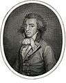 On the original, fix discoloration and restore part of the oval that is cut off; then upload a oval cropped transparent version Done
 -
 Upload transparent version here
 -
 clean up, don't crop Done
 -
 Clean up and crop to the intended original captions with some the captions and borders Done


Article(s): John Meares, Charles William Barkley
Request: Do something with them... KAVEBEAR (talk) 00:09, 18 March 2012 (UTC)
Graphist opinion(s):
- Couldn't you have left the yellow paper appearance on the first image?--KAVEBEAR (talk) 07:17, 18 March 2012 (UTC)
![]() Done: Done as requested (by me 2nd & 3rd). PawełMM (talk) 09:54, 18 March 2012 (UTC)
Done: Done as requested (by me 2nd & 3rd). PawełMM (talk) 09:54, 18 March 2012 (UTC)
Chautauqua lecture series[edit]
-
 1915 announcement for "The Sadlers and Miss Wilmer" lecture series

Article(s): William S. Sadler & Lena Sadler
Request: Hey, could someone crop this to get rid of the border around the flyer? Also, I might be imagining it but it looks like the flyer could use a slight rotation so it's even with the frame. Mark Arsten (talk) 02:25, 19 March 2012 (UTC)
Graphist opinion(s):
![]() Done – JBarta (talk) 02:53, 19 March 2012 (UTC)
Done – JBarta (talk) 02:53, 19 March 2012 (UTC)
- Excellent, thanks for the quick response! Mark Arsten (talk) 05:21, 19 March 2012 (UTC)
Jordan Rodrigues, Tim Pocock, Demi Harman and David Jones-Roberts[edit]
-
 Tim Pocock, Jordan Rodrigues Done: cropped to Jordan Rodrigues
 -
 Demi Harman in a red dress Done: cropped to Demi Harman
 -
 Holly Kagis and David Jones Roberts
 -
 Tim Pocok Done
 -
 David Jones Roberts Done


Article(s): Jordan Rodrigues, Tim Pocock, Demi Harman and David Jones-Roberts
Request: Can you make a crop of Jordan Rodrigues who is the guy in the checkered shirt and then upload it over the existing file. For Tim Pocok, who is standing with Jordan in the white shirt - make a seperate crop. Demi Harman is the girl in the red dress in the second image - a crop and upload it over the existing file please. The third is model Holly Kagis and actor David Jones Roberts, can a seperate crop of David be made of this so Holly is retained in that image.Rain the 1 18:57, 21 March 2012 (UTC)
Graphist opinion(s):
![]() All done. Crystal clear instructions by the way... thank-you. – JBarta (talk) 01:50, 22 March 2012 (UTC)
All done. Crystal clear instructions by the way... thank-you. – JBarta (talk) 01:50, 22 March 2012 (UTC)
John Cleveley the Younger[edit]
-
 Done
Done -
 Done
Done -
 Done
Done -
 Done
Done -
 Done
Done


Article(s): John Cleveley the Younger
Request: Please do you best at cleaning these portraits up especially the first two. Thanks. KAVEBEAR (talk) 06:06, 20 March 2012 (UTC)
Graphist opinion(s):
On the second picture the dark brown stripe was lighted up. The larger demages of paint were removed. Crackes of paint were left, it is natural process of aging. PawełMM (talk) 11:41, 20 March 2012 (UTC)
![]() Done: Done as requested. PawełMM (talk) 09:36, 21 March 2012 (UTC)
Done: Done as requested. PawełMM (talk) 09:36, 21 March 2012 (UTC)
Ralph Lauren[edit]

Article(s): Ralph Lauren
Request: Photographer's...thingy...in lower right (watermark?). Thanks in advance :) Nolelover Talk·Contribs 02:32, 28 March 2012 (UTC)
Graphist opinion:
![]() Done (yes, watermark) – JBarta (talk) 03:23, 28 March 2012 (UTC)
Done (yes, watermark) – JBarta (talk) 03:23, 28 March 2012 (UTC)
Julia Alapai[edit]
.jpg)
.jpg)
Article(s): Julia Alapai
Request: I understand this is a poor quality image, but can someone tilt and crop the frame away from this image. KAVEBEAR (talk) 02:48, 28 March 2012 (UTC)
Graphist opinion(s):
![]() Done This isn't a poor quality image, this is a grease spot. At what point do you decide an image is just so bad the article is simply better off without it? – JBarta (talk) 03:31, 28 March 2012 (UTC)
Done This isn't a poor quality image, this is a grease spot. At what point do you decide an image is just so bad the article is simply better off without it? – JBarta (talk) 03:31, 28 March 2012 (UTC)